Software
Houzz Logo Print
webuser_466268347

Wall paint decision paralysis, Please help!

last year

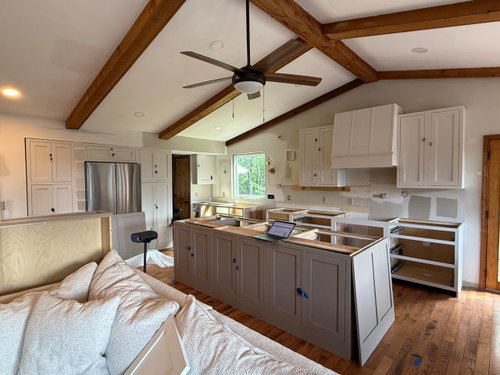
Remodeling our kitchen. Open floor plan great room.


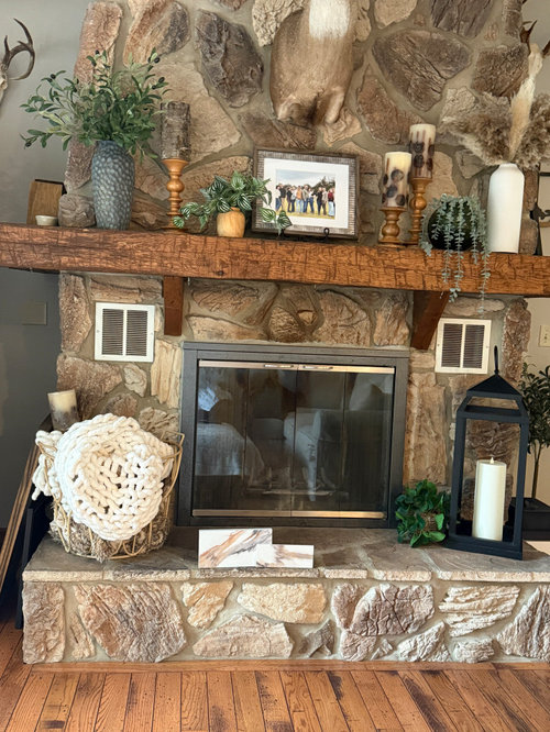
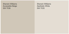
I chose SW aesthetic white for the cabinetry and SW Moth Wing on the island. Calcatta Sonata quartz countertop. We have a huge bossy fireplace which futher adds complication. The cabinets look amazing when they have the warm afternoon sun on them otherwise they seem a bit pasty whitish-grey. Haven't picked a backsplash yet but am leaning towards using the countertop on the backsplash. And I have a North-north west lighting. Using polished brass hardware. Need help choosing a wall color. I want to warm it up so a nice warm color is my preference if possible. Balanced beige and accessible beige both turned grey in my North to northwest lighting. Really too late to regret the cabinet colors so need help with warming them up.


To do so, I was leaning towards loggia but my husband feels it's too dark. he also wants warm so he nixed Accessible beige for being too grey and drab in our northwest lighting. And aesthetic white doesn't seem to love very many similar depth paint colors which is why I'm struggling. Thought about BM Natural Cream or Edgecomb grey but they don't seem to be as warm as they appear online-most likely due to our lighting. Edgecomb is better than Natural cream. With really warm colors- the yellow clashes with the undertones cabinets & island, seems like any color we choose will need to have some grey mixed in. HELLLLLPPPP! I also don't know what to do on the celing.. would white dove be out of the question? I guess I'll have to paint the trim the same or maybe aesthetic white.


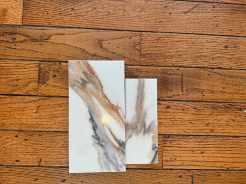
Our new countertop as a whole:


Our honey oak floor, which won't change and close up of pieces of our countertop.


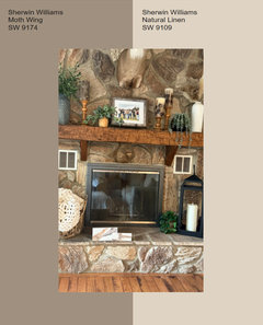
The big bossy fireplace which is on the opposite wall from the cabinets.


Our kitchen in natural daylight, still somewhat dim until the sun is setting then warms up for an hour or two.


Comments (12)

  • last year

    If it were me, I would paint the walls Aesthetic White (as long as it looks good next to the fireplace stone), and use SW Pure White for trim and ceiling. But you might want to read Kylie M.'s blog on AW to get some perspective.


    https://www.kylieminteriors.ca/paint-color-review-sherwin-williams-aesthetic-white-sw-7035/

    HU-466268347 thanked kandrewspa
  • last year
    last modified: last year

    Take a look at SW Virtual Taupe in this site post

    https://www.sherwin-williams.com/en-us/color/color-family/neutral-paint-colors/SW7039-virtual-taupe

    I have this in a sitting area off my primary bedroom, drenched, all walls and trim the same with a full wood ceiling Not just beams like yours, but it's beautiful, shows different throughout the day. ... I'd put it on your fireplace wall too.

    HU-466268347 thanked Lyn Nielson
  • last year
    last modified: last year

    Whites and off-whites are really hard to get right, and they can look very different in different lights.

    I think you're goof here was the island -- it is quite grey on my monitor, and you have nothing else grey going on other than a small amount in the counter, the island doesn't tie in with the fireplace at all. So now your whites/off-whites need to coordinate with both the cabs and the island, and that can be really tricky. Your first step IMO is to repaint the island in a color that doesn't read grey and overall ties in better with the room at large, and then re-assess. You might then easily find that elusive perfect light wall color, or you might need an actual color in a mid to dark tone warm tone -- depends on what you do with teh island.


    ETA: I don't find your fireplace big and bossy at all -- I love it! I especially like the mantel, it looks terrific against the stone and the floors. It's an asset -- work with it, not against it.

    HU-466268347 thanked porkchop_z5b_MI
  • last year

    I like pure white with Aesthetic White, I also might just lighten Aesthetic White by 25% or 50% for the trim. Kylie M suggests using White Dove lightened by 25%.


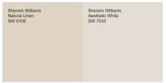
    If Accessible Beige is too dark and too Gray in your northern light you may want to try Natural Linen.


    It is warmer and lighter and still has the more orange rather than yellow undertones that are fighting with Aesthetic White.


    Sometimes, when I am looking for that perfect color and one color feels too dark and another too light - I get the two samples and use an oral medicine syringe to mix the two together

    3 ccs each or 2 ccs of one and 4 of the other. I paint a decent size sample of each mixture till it feels just right. (I get pads of watercolor paper to make my samples - not as expensive as foamcore and is heavy enough it doesn't get warped and wavy.)

    https://www.amazon.com/dp/B004M59O4C?ref_=ppx_hzsearch_conn_dt_b_fed_asin_title_4


    Anything you mix can be color matched by the SW Store. Once they make a sample of the color matched paint have them place a dime sized dab on your larger sample. Wait for it to dry and take it outside in daylight and see how well it matches. It should be very close (nothing is ever perfectly identical). I do this at the store so I can go back in and have them try again or try to fix it if it isn't close enough. This happens once in every 30 samples I have mixed - the rest are close enough that I won't see a difference once it is up on my walls.


    HU-466268347 thanked Jennifer Hogan
  • last year

    BTW - don't ask SW to match BM White Dove - their formula doesn't work and it is not a good match.

    HU-466268347 thanked Jennifer Hogan
  • last year
    last modified: last year

    Kylie M has some excellent videos on Aesthetic White. You may find something else you like. She tends to go grayer vs warmer with the colors she loves, but worth the time to watch.

    HU-466268347 thanked Jennifer Hogan
  • last year
    last modified: last year

    Thank you so much, everyone! I really appreciated every single comment. I agree—Moth Wing might not have been the best pick. Thankfully, most of the time, it does read a bit browner in real life, and when it does, it looks amazing with our fireplace. I absolutely love our fireplace, but it definitely likes to steal the spotlight, so I always say it’s a little bossy when it comes to picking colors 😂

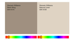
    I was seriously considering Natural Linen but wasn’t sure how it would play with Moth Wing, so your input was super helpful. And I LOVE Virtual Taupe—it’s actually just one shade darker than Moth Wing, so I think it could be a great match. It’s just a little scary to go that dark, but I’m definitely going to check it out now and Natural linen too. Thanks again! 💛

    PS. I was just wondering if white dove could be matched!! I thought surely it could since it's such a common color, so glad you specifically mentioned that!!

  • last year

    I agree with you - the fireplace is the star of the show.


    In my opinion, Natural Linen and Moth Wing are absolutely beautiful together. I actually like it better than Accessible Beige, but you will need to test in your own home with your lighting to see how it works with the fireplace.


  • PRO
    last year

    I think I would either paint the walls the same as one of the cabinet colors or go off the whites as mentioned earlier. Sage green would look amazing in here!

  • last year

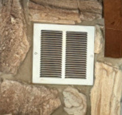
    when you pick a paint please paint those awful vents on your fireplace as well. they look terrible in white. your choice is grout color grey or a paint in the darkest color that matches the stone.


  • last year

    That’s a good idea. I’ll do that thanks