

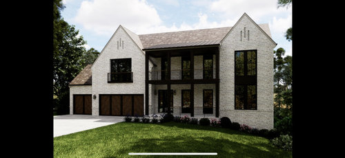
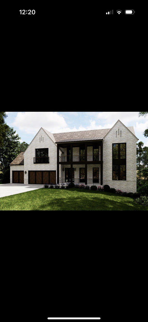
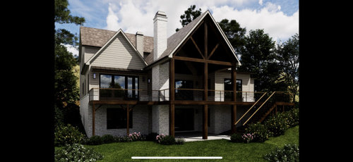
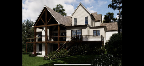
New Construction Exterior
last year
Featured Answer
Sort by:Oldest
Comments (18)
 last year
 last year
Related Professionals
Altoona Interior Designers & Decorators · Bemidji Architects & Building Designers · Magog Architects & Building Designers · Butte Kitchen & Bathroom Designers · Twin Falls Architects & Building Designers · Great Falls Architects & Building Designers · Fort Worth Home Builders · Galveston Home Builders · Stamford Design-Build Firms · Allentown Design-Build Firms · Sterling Design-Build Firms · Saint Joseph Architects & Building Designers · Bismarck Architects & Building Designers · Washington Home Builders · Minneapolis Home Builders last year
 PROlast year
 last yearlast modified: last year
- last year
 last yearlast modified: last year
 last year
- last yearlast modified: last year
- last year
- last year
 PROlast year
 last year
- last year
- PROlast year
- last year
- PROlast year


Related Stories
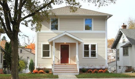
ARCHITECTURENew Construction in Minneapolis Keeps a Familiar Face
With the same exterior look of the previous home on its lot, this new build minimizes disruption while incorporating modern improvements
Full Story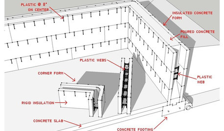
KNOW YOUR HOUSEKnow Your House: The Basics of Insulated Concrete Form Construction
Get peace and quiet inside and energy efficiency all around with this heavy-duty alternative to wood-frame construction
Full Story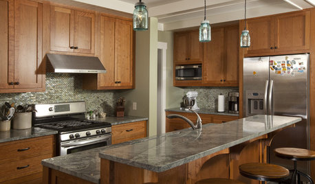
KITCHEN CABINETSCabinets 101: How to Choose Construction, Materials and Style
Do you want custom, semicustom or stock cabinets? Frameless or framed construction? We review the options
Full Story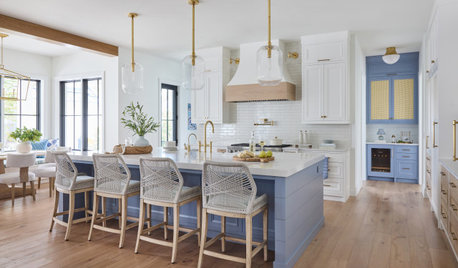
WORKING WITH PROSYour Guide to a Smooth-Running Construction Project
Find out how to save time, money and your sanity when building new or remodeling
Full Story
BUDGETING YOUR PROJECTDesign Workshop: Is a Phased Construction Project Right for You?
Breaking up your remodel or custom home project has benefits and disadvantages. See if it’s right for you
Full Story
REMODELING GUIDESConstruction Timelines: What to Know Before You Build
Learn the details of building schedules to lessen frustration, help your project go smoothly and prevent delays
Full Story
BUDGETING YOUR PROJECTConstruction Contracts: What to Know About Estimates vs. Bids
Understanding how contractors bill for services can help you keep costs down and your project on track
Full Story
REMODELING GUIDESWhat to Consider Before Starting Construction
Reduce building hassles by learning how to vet general contractors and compare bids
Full Story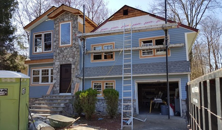
LIFEThe Polite House: How Can I Tell a Construction Crew to Pipe Down?
If workers around your home are doing things that bother you, there’s a diplomatic way to approach them
Full Story
BUDGETING YOUR PROJECTConstruction Contracts: What Are General Conditions?
Here’s what you should know about these behind-the-scenes costs and why your contractor bills for them
Full Story

Celery. Visualization, Rendering images