Software
Houzz Logo Print
eam214

please vote for sage / olive wall color

4 months ago
last modified: 4 months ago
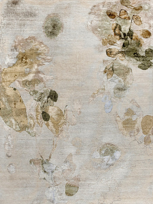
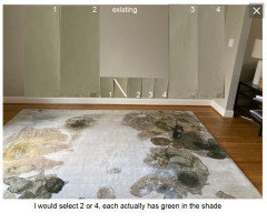
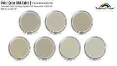
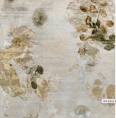
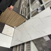
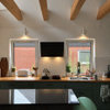
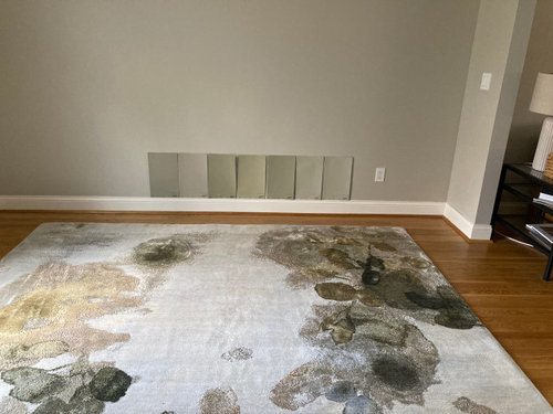
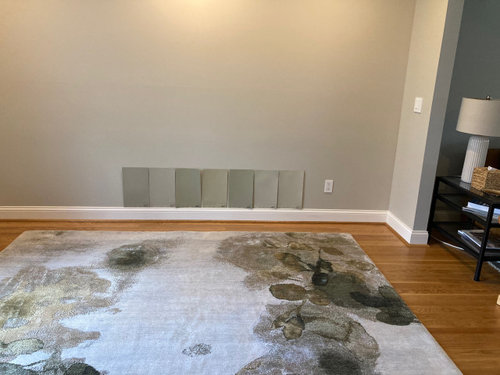
Hello, Houzz friends! My husband and I are redecorating our dining room. A new rug (photo below) is the inspiration piece. The room is north-facing and only has one medium-sized window (to the left of the camera). Some natural light from french doors on the other end of the adjoining room (to the right). Shown below are seven paint options. The first photo is with lights off; the second photo has recessed lights turned on. Both were taken mid afternoon on a sunny day. I would appreciate you voting for the color you think would go best on the walls. All are Benjamin Moore colors. Technical data is from The Land of Color database by @Lori A. Sawaya. (SO helpful! SO worth the subscription!) Trim is Benjamin Moore Cloud White and will not be changing. For reference, the paint currently on the walls is Revere Pewter, which I feel does not have enough value or chroma for this room given the limited light.

hoping to get some help, but also thinking my sample photos might be a useful comparison of popular colors others might be considering.


(1) Jockey Hollow Gray (formerly Sandy Hook Gray) (HC-108) - hue 94.1, chroma 1.25, LRV 39
(2) Senora Gray (1530) - hue 96.9, chroma 1.14, LRV 49
(3) Dried Basil (1510) - hue 98.7, chroma 1.7, LRV 40
(4) Mosaic Tile (1517) - hue 99.5, chroma 1.9, LRV 44
(5) Nantucket Gray (HC-111) aka Cheyenne Green (1502) - hue 101, chroma 1.61, LRV 40
(6) Spanish Olive (1509) - hue 102.9, chroma 1.29, LRV 53
(7) Gray Mirage (2142-50) - hue 103, chroma 1.15, LRV 54

Comments (19)

  • 4 months ago

    What wall color is the adjoining spaces and will that remain? What will your dining chairs be? Are you open to a color vs the gray/neutrals you show?

  • 4 months ago

    I think it looks great with the existing wall color, which isn't very different from your samples. Do you need to paint?

  • PRO
    4 months ago


    Lizzie J thanked BeverlyFLADeziner
  • 4 months ago
    last modified: 4 months ago
    Hi, @Sigrid. Thanks. The Revere Pewter on the walls is new. I had really high hopes for it, but once it was up, it just seemed really ... lifeless. It just comes across as gray / ashy. I strongly feel we need more color - which for me is green, although I could see other colors here - and chroma. I'm also thinking darker - ironic since the issue at hand is low light - but that is where my eye seems to be going.

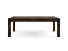
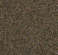
    @thinkdesignlive, great questions. The adjoining space (a family room) is currently Stonington Gray, but I would like to eventually change that out to something lighter and more neutral. Will figure that out once we get the dining room color selected. The dining table will be similar to the photo below - white oak stained "black" (which actually turns out to be a really dark brown). The chairs are upholstered, with the fabric shown, with wood legs in a finish similar to the table.

    Although I say I want more color, I'm not sure I can take a lot, I am really a low-chroma kind of a gal.


  • 4 months ago

    That is a very heavy looking table and chairs so I would lighten things up considerably. Window treatments play a roll too - drapes, shades, etc??? I strongly urge you to take a step back and really consider the adjoining spaces. This room is just a part of a puzzle. If the adjoins rooms are not getting redesigned and only repainted then you can definitely figure out that part of the puzzle now (and paint at your leisure later).

    Lizzie J thanked thinkdesignlive
  • 4 months ago
    last modified: 4 months ago
    Thanks, @BeverlyFLADeziner. Are your 2 and 4 are my original 5 (Nantucket Gray) and 7 (Gray Mirage)? (I just went back and numbered the options.)

  • 4 months ago

    More photos of the room and adjoining rooms are needed for best advice.

  • PRO
    4 months ago

    ♥️ Glad it helped. Here are the digital swatches.


    Based on what you said, Spanish Olive and Gray Mirage. They're very, very similar. Gray Mirage is a tiny bit lighter and slightly more neutral/gray.


  • 4 months ago

    @thinkdesignlive, I hear you re the table and chairs. The ceiling is Cloud White, the field color of the rug is relatively light, and I am thinking to do off white drapes. There is recessed lighting around the perimeter of the room, and we will have a light fixture over the table (not yet installed). Given that, I was hoping we could go a little darker on the walls. The Revere Pewter that is currently up has a LRV of 55. Some of the options are darker - like 40 - but I guess I could get them lightened. thoughts?


    The adjoining room is not getting redesigned, but I feel its furnishings flow with the direction of the dining room, except for that Stonington Gray paint, which as I mentioned, has a bullseye on it!


    I realize the dining room seems to be going in a pretty neutral direction, I plan to add interest and color via art and accessories.

  • PRO
    4 months ago


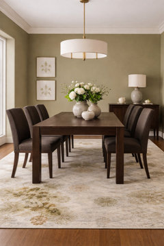
    The wall color in that mockup is a muted olive green—specifically a warm, mid-tone olive with beige undertones.

    your rug’s beige + mossy tones

    the dark wood table

    the brown upholstered chairs


    If you were to match it in real paint terms, it sits in the range of:


    “soft olive,” “olive taupe,” or “khaki green”

    LRV roughly in the mid-range (not too dark for your north-facing room)

    Paint color directions you could sample:

    • Benjamin Moore: Saybrook Sage or Vintage Vogue (lightened)
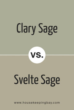
    • Sherwin-Williams: Svelte Sage or Clary Sage (slightly muted)


  • PRO
    4 months ago
    last modified: 4 months ago
    You have two defaults: north light and your Cloud White Trim. Add into the mix, the rug (lovely).

    Cloud White is perfect for a north orientation. It has just the perfect amount of warmth for the cool, blue light that comes into the one window. Suggest you paint the walls Cloud White in eggshell.

    Draperies, the same as the walls.


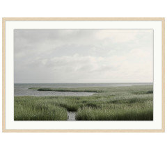
    Add art and incorporate the natural tones in the rug with the frame.


    The Cloud White will work with abutting room colors.


  • PRO
    4 months ago

    Oh I love that last one that Celery posted! The dark color really makes a statement!!

  • 4 months ago

    I love BM Vintage Vogue. And it has already been suggested above, using either full strength or lightened.


    If you don’t want the room to read grey, stay away from greys. :)


    And green is sort of the ’new grey’- and in a way is similar, in terms of lacking warmth.


    Personally, I would not use green in a dining room. I would use red- and there is a reason why this color is often used in restaurants eateries. Or I would use a yellow gold. Or I would use a white that has some warmth- a warm white/ a cream/linen color.


    But if I wanted a fairly light colored sage green in a dining room, I would likely use Farrow & Ball Vert de Terre.


    Lizzie J thanked freedomplace1
  • 4 months ago

    @Lori A. Sawaya, thank you so much for giving your opinion! And thank you again for the database and your website. They have been a huge help to me in understanding paint colors.


    @oncape, thank you for your suggestions. That is my target for the drapes, not sure I could do white on the walls. I can see how that might work but know myself well enough to know I am happier with some color on the walls.


    @Celery. Visualization, Rendering images , thank you for the mockup and paint suggestions. I do like the Svelte Sage. It looks to be similar to the BM colors we are considering in terms of hue, chroma, and LRV (105.4, 1.48, 44) - maybe just a bit greener.

  • 4 months ago
    last modified: 4 months ago

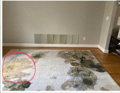
    not a pro but a north facing room would make me want to warm things up a bit, esp a dining room where it should be inviting -i’d probably look for color inspiration from this part of the rug (and also try to add warmth with texture and soft finishes)


    eta i might test Benjamin Moore's French Canvas

    Lizzie J thanked la_la Girl
  • 4 months ago

    Absolutely love the rug. My choice would be more green, less grey.

    Lizzie J thanked auntthelma
  • PRO
    4 months ago

    I think DRs can be very dramatic since almost always ised at night and that rug is fabulous so the darker wall is the direction I would go .The reason red is used in restaurants is it increases appetite a good thing in a restaurant not really needed in a home. Good lighting that lights the table is IMO a must and IMO that upholstery on the chairs will need to change that does nothing for that awesome rug

    Lizzie J thanked Patricia Colwell Consulting
  • 4 months ago
    last modified: 4 months ago

    Thank you all for your time and feedback!!!

    @la_la Girl, that French Canvas is very pretty, thank you. We previously had a similar light color in this room - for 12? 13? years - so I know I want more depth (value). But, we may do a light-ish color in the entryway, which adjoins this room, as it is pretty dark; will definitely keep it in mind for that!

    @Patricia Colwell Consulting, that is my thought, too, to have the room have a bit of a moody/dramatic feel, for the reasons you stated. Chairs won't be changing - just ordered them. The light fixture will add light and also a bit of shine from the metals.

    @oncape - I like that print you suggested, will keep that in mind as we look for art, thank you.