Software
Houzz Logo Print
marska12

Please take pity- DR rug & chairs - advice?

16 days ago

Hello again! I've received great advice on Houzz before, so I'm back!

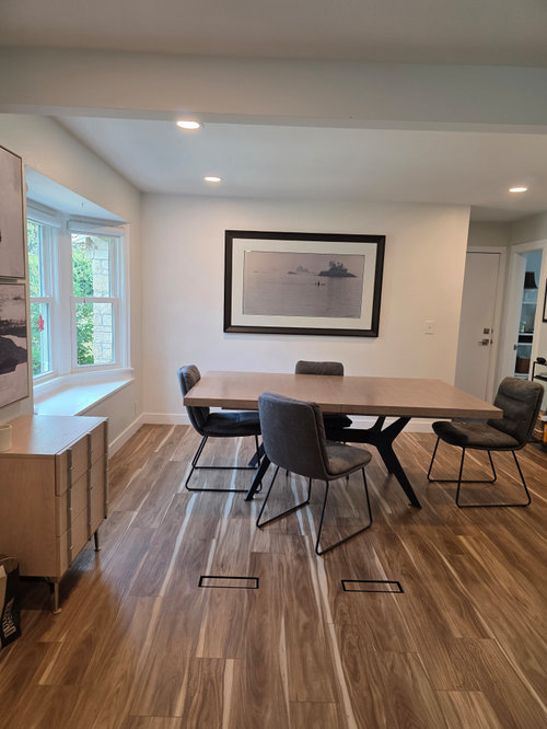
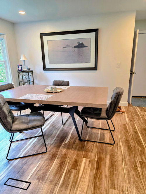
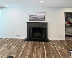
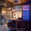
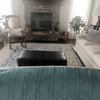
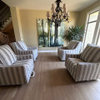
I'm shopping for an area rug to go under my DR table, and 4 new DR chairs. DR is "open" to the LR. I know you will want pics of the LR which I can add later.

This area is crying out for color but I don't want a rug or chairs that will overwhelm the art and I'm pulling my hair out trying to find the right balance.

Table is 47 inches wide and 80 inches long.

The wall with the very large art is 11 feet long.

It is 9 feet from that wall to the floor vents. I do not want to cover the vents.

Also thinking about a very, very narrow console table to sit under the art.

I've look at probably hundreds of rugs and chairs, but I need help finding the "right" combination.

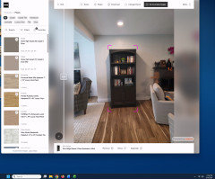
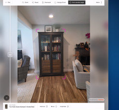
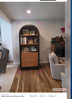
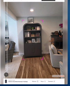
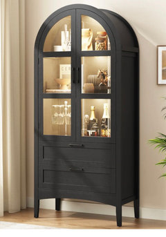
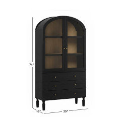
I am also shopping for a tall cabinet to go next to the bay window where the small cabinet now sits, but that is for later.


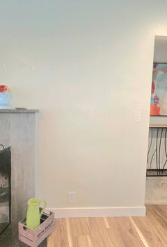
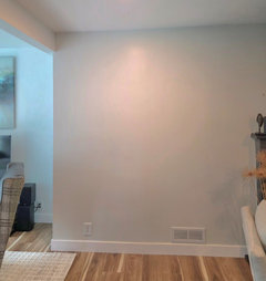
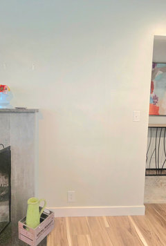
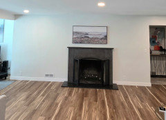
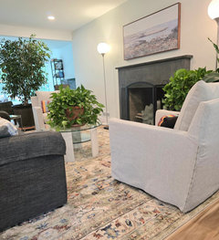
DR area:


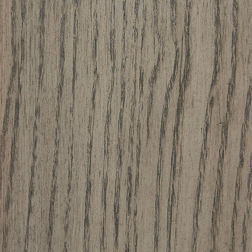
DR table finish:


Comments (109)

  • PRO
    12 days ago
    last modified: 12 days ago

    Excuse the interruption. @RedRyder, would you share info on the two wing chairs? Thanks.

    Abby Marshall thanked JUDY GRAHAM
  • 12 days ago

    Hi All! The rug is NOT staying. It is an indoor/outdoor rug that was in my basement storage that I brough up to judge size and color, as I stated in a previous post. But I do appreciate the comments and suggestions!


    The reason I am asking about slip covers for the PB swivel chairs is that I'd really like fabric with a subtle pattern and color.


  • 12 days ago
    last modified: 12 days ago

    Here is the link to the Thomas Mangelsen gallery. 30% off right now but there are frequent sales.

    https://www.mangelsen.com/


    If you click through to "open edition" you will find the prints are quite inexpensive.

  • 12 days ago

    I struggle a bit to marry the calm serenity of the art with the lively colors you like, but maybe something like this could work (using @Emily's rug)?

    (Sorry, I know you nixed the dark wall, but it's what the art needs!)

  • PRO
    12 days ago

    Abby are those chairs currently slip covered? Are they the Ayden from PB?

    If they are not slip covered then you can’t pop a slip over on them. It will not fit correctly. But if they are then this company will make slip covers and you can COM the fabric of your choice

    https://www.replacementslipcoveroutlet.com/Pottery-Barn-Ayden-Square-Arm-Swivel-Chair-p/99sasc.htm

    If they are upholstered and not slip covered just have them reupholstered in the fabric of your choice. Fair warning often you can replace for less than these options.

    I think before you get too much thrown your way you need to consider which color story you would like to follow in these rooms. Right now the suggestions are all over the place. Which colors do you want to use? Choose one main, one accent, one neutral (your neutral is gray if you’re not changing the sofa) . Too much is too much. Too many colors are going to make the two spaces disjointed and chaotic. You want them to flow with a sense of calm.

    Abby Marshall thanked Design Interior South
  • 12 days ago

    DIS you cannot imagine how much the one main, one neutral, one accent helps!!!! It's SO hard to choose. Obviously gray for the neutral. Contenders for accent and main are: greens, mauve/reddish purple, blues - can you help me choose? I'm looking for color palette generators now.


    I am now shopping for DR chairs, cabinets and a large rug.


    The chairs are slip-covered and they are Ayden. I'll check your link and compare pricing vs new.


    Neutral - gray

    Accent - greens, mauve/reddish purple, blues (cant decide!!)

    Main - greens, mauve/reddish purple, blues (cant decide!!!)


    Using the three choices above, does this rug for the DR still work ? I see beige/tan, gray, green, slate blue/ gray and reddish-purple when looking at this rug on the L&G website. Guess I'll wait for the swatch to get a better idea of what it looks like in my house.

    And good news! The redecorating budget has been approved for an additional 5K! Not a tremendous amount, to be sure, but I think enough to get some things in place.


    We are empty-nesters, no grandchildren (doubt there will ever be any). We have always made-do with whatever was cheap/free/thrifted/estate sale finds and although we have been ok with the arrangement, it's time for more attractive rooms.

  • PRO
    12 days ago
    last modified: 12 days ago

    That rug is still somewhat of a chameleon since we have not seen it in person. I like the pattern as it seems you lean a bit modern in your selections, is that correct? If I were building a color story for your space without fabric as inspiration and without seeing the rug in person…..because currently the rug is somewhat subjective, based on your description of what you are envisioning in combination with your existing art work, sofa color, the colors you mention and fireplace color you can lean in to a darker moodier pallet somewhat. Is this what you’re envisioning? Because if it isn’t then first I suggest nailing down the feeling you want the space to have. My first inclination would be to consider something like this. As far as colors. Your dark gray , light gray, bringing in the olive green, plum and then a touch of the unexpected in the way of an aqua blue. If this isn’t what you envision then my suggestion would be to find some colors you love. Share them then we can work from there.


    Abby Marshall thanked Design Interior South
  • PRO
    12 days ago
    last modified: 12 days ago

    This site is giving me fits
    ignore the styling done here we are just looking at the color story your art the sconces you ordered and the rug


    Abby Marshall thanked Design Interior South
  • 12 days ago
    last modified: 12 days ago

    OMG that's funny because I was looking at Hex - almost the same colors but in a little different shade/tint

    https://www.color-hex.com/color/9da5b6#color-schemes

    Triadic Colors of #9da5b6

    #9da5b6 #b69da5 #a5b69d

    These colors might be the summery version of what you posted.

    I love LOVE the colors you posted! We have an abundance of east/west natural light in these rooms so could maybe pull in those darker, moodier colors. In the winter I love the saturated curl-up-by-the-fireplace colors, but in the warmer months I prefer a little lighter & brighter. Guess I need more than 1 house. Or a change-up of pillows, throws, decorative items summer to winter.


    Feel - airy, comfy, homey, fresh, colorful, calm, intriguing, intimate, "old made new" (house was built in 1948), pretty, thoughtful, delicious, surprising, personal, reflective of our lived lives.

    You are correct that I was going modern. But I've decided that I don't really enjoy living with too much modern influence. I prefer more warmth and some sweet decorative touches but still appreciate clean lines and functional pieces.

    I'm going to take a leap here and proclaim that I am a a garden artist intern - that is- outdoor space is my canvas that I paint and sculpt at the behest of Mother Nature and my media is soil, seeds, roots, rocks, wood, etc. My paid work is Nursing. My husband is a writer and anthropologist. He loves books; sci-fi and fantasy especially. And all the dinosaurs. His paid work is in academia.

  • 12 days ago

    Abby, I'm liking the looks of that rug. After reading your last post, I'm wondering if it will work with the lighter colors you want for spring and summer. I'm eager to see the solution. DIS will have it!

    Abby Marshall thanked dsimber
  • 12 days ago

    Dsimber- did you see my link to the Thomas Mangelsen gallery?

    https://www.mangelsen.com/

  • 12 days ago

    The wall sconces came in today and are very disappointing. Cheap looking. I'll be returning them and looking for something more suitable.

  • 12 days ago

    Yes, thank you, Abby. You had shared it previously, and I had no trouble finding it. What I couldn't find was a water photo similar to yours. I'm going to enjoy following him, though. He's a fantastic nature photographer! Thank you for introducing him to me. 🥰

    Abby Marshall thanked dsimber
  • 12 days ago

    Sorry your sconces were disappointing. Returns are a pain. I've noticed recent changes some stores have, though. Just take it to UPS and show them the QR code from the store. They scan it, then take care of packaging and shipping.


    What are you hoping to find in sconces?

    Abby Marshall thanked dsimber
  • 10 days ago

    @JUDY GRAHAM - Sorry for the late response. I’ve been traveling. My wingback chairs were found on Facebook Marketplace, and my upholstery genius is in Murfreesboro, TN. The ivory fabric was found online.

  • 9 days ago

    Hi Everyone! Im still here. Waiting for the rug sample from L&G and continuing my search for a pair of linear wall sconces for either side of the Mangelsen piece. I'll wait on the FP rug and DR chairs until after the DR rug sample arrives.

    I 'D like to find sconces that are very close to the color of the Mangelsen frame, which is a brownish black . I need to visit my local lighting store & have a look around, which I cannot do until next week.

    PLease hang in there with me!

  • 8 days ago

    You can browse online for furniture designs you love, then upload your room photo and the furniture reference to our AI design tool to see how they would actually look in your space. There are free credits available to get started. If you find a piece you love, we can also help bring it to life — from design development to custom manufacturing. https://morphra.ai/

    Abby Marshall thanked YING1
  • PRO
    8 days ago

    I’d keep the rug fairly quiet and let the chairs bring in the color. An olive or muted moss green would work beautifully with the warm wood tones and black table base, while still allowing that large artwork to remain the focal point. I’d also avoid a high-contrast patterned rug here — something softly textured in warm ivory, greige or muted taupe would give the room more depth without competing with the art.

    Abby Marshall thanked Inprint Designs
  • 8 days ago

    I like the direction you are headed; you are getting great help here.

    @Disimber, the Mangelson photo is still available. https://www.mangelsen.com/calm-morning-orcas-1210.html

    Abby Marshall thanked juliab51
  • PRO
    8 days ago
    last modified: 8 days ago

    Sorry to hear you didnt like the quality of the sconces. There are several companies that make that style. As far as matchign teh drame of the art work I wouldnt. You will never get an exact match and trying to will only look like you were and couldnt. Instead choose the metal choice you want to carry through out. I was using black since you table place is black and it works with your art. You can then choose to mix in a second metal finish as long as they carry the same undertone of warm vs cool.

    example s

    black & Brass = neutral and warm

    Black and Chrome= neutral and cool

    Black and polished nickel = neutral and warm

    or

    brass and polished nickel = warm and warm

    or bronze and polished nickel and brass = warm

    do not mix cool and warm finishes

    example

    no brass and chrome or

    chrome and polished nickel or

    chrome and bronze.

    Abby Marshall thanked Design Interior South
  • 8 days ago

    I suggest you use green as your primary color and accent in blues and mauve. The accents can be change for the seasons. Blue for spring/summer, mauves for fall. Colors from your gardens during the seasons.

    Abby Marshall thanked glschisler
  • 7 days ago

    I will.be away until this Sat. The swatch was delivered but I cant look at it until Sat.  Im shopping online for sconces - so many poor reviews for the cordless (battery) options but would not use them much anyway - they are mostly a decor item I think. ALSO shopping for the cabinets.

    Wondering if open / backless shelves over the cabinets might visually lighten that side of the room vs closed shelves.

  • 3 days ago
    last modified: 3 days ago

    I'm back with swatch pics!!!

    Unfortunately, the background of the rug is too "beigey", however I LOVE the blues, greens, pinkish, and dark maroon colors. The rug itself is very well made. Lovely. This shows me the room needs a gray rather than beige background for a rug. But I want those colors and love the pattern, too.


    These are pics of:

    Marli Flatweave Wool Rug

    by Nina Freudenberger

  • 3 days ago

    That's a stylish fresh looking rug and we'll even look nice for fall and winter it's coziness and freshness all combined and it should go nice with your Decor artwork and I will look nice with the floors

    Abby Marshall thanked happyleg
  • 3 days ago
    last modified: 2 days ago

    I love the rug! I think the beige works well with the floor and looks as though it would work well with your table top color as well. The blues do really well with the gray. It really is a very pretty rug.

    Abby Marshall thanked katinparadise
  • 3 days ago
    last modified: 3 days ago

    I'm just not happy with the biege-y background color. I can't help it.

    Ive been looking for art for above the FP, too. Size is not easy to find - height 20-28 inches and width 40-48 inches. AI says the ideal size for the space is 44x22 (48 x 26 framed).


    Also a rug for the FP area - will a more traditional style be OK near something like the one I posted?

  • 3 days ago

    I found this, but of course it is out of stock! The original artist is not credited, but I believe it is

    Frederick Childe Hassam


  • PRO
    3 days ago

    From what my screen is showing me I like the rug. I think it works well for the dining room. or even the family room. It can be eaiily paired with a traditional rug like I have shown and can anchor the two rooms together. Why do you not care for the tan? WHat about that color do you feel doesnt work?

    Abby Marshall thanked Design Interior South
  • PRO
    3 days ago

    Oops the photo didn’t post.

    Abby Marshall thanked Design Interior South
  • PRO
    3 days ago

    Oh and as far as the art check Etsy. A lot of the artists on there will customize size. Also you may have to get larger and crop down and mat the piece to get the size you want.

    Abby Marshall thanked Design Interior South
  • 3 days ago

    There is beige & white in rug.

    Abby Marshall thanked happyleg
  • 2 days ago

    I ran across this in similar colors and they had a white couch with it

    Abby Marshall thanked happyleg
  • 2 days ago

    @DIS the background, or "main" color is too beige/tan. I feel the rug needs a more grey-toned background. I don't have the vocab to explain exactly why, but the under tones are a bit off. Perhaps if the other pieces were in place it would look better to me.

    Now- I absolutely adore the "mood board" you posted!!!! I hope you will tell me the source for the other rug, the burgundy chair, the hassock, and black distressed cabinet. Or everything! I love it all.


    @happyleg thanks for the post! For me that rug is too busy. But I appreciate the suggestion.

  • 2 days ago
    last modified: 2 days ago

    I'd like something this style - but with a muted green and no nailheads!


    Dining chairs- simple and sturdy, upholstered, green. I want the chairs to hold up to 300lbs (husband is around 250). Son-in-law is 6' 6", so a chair that is reasonably comfy for a taller person. I've looked at hundreds but each one seems to lack something important. I was looking at only black legs, but gave up on that (does it matter much what color the chair legs are if your table legs are black?). Seat should be 19" - 20" from the floor. The tabletop does not allow for chairs with arms.


    I like this too, but we need something a little more substantial.

  • 2 days ago

    ?????? Maybe???


  • PRO
    2 days ago

    The last chair is a no. It looks very Alice in Wonderland. If you like the first chair search for Parsons chairs. Consider having it skirted to the ground instead of a mismatched leg. You are working with two colors there already. Black and the wood tone of the top. I wouldn’t add a third. Something like this one would work.

    https://www.jossandmain.com/furniture/pdp/birch-lane-alayaa-linen-dining-chair-kkah1212.html?piid=108306128

    Abby Marshall thanked Design Interior South
  • PRO
    2 days ago

    Or these https://www.potterybarn.com/products/sloane-upholstered-dining-chair-set-mp/?catalogId=84&sku=5931427&pickuplocation=ST:{store_code}&cm_ven=PLA&cm_cat=Google&cm_pla=Furniture > Dining Chairs&cm_ite=5931427_14546951676_aud-946419291249:pla-548078221140&gad_source=1&gad_campaignid=14546951676&gbraid=0AAAAADr1rYV65zc083uLRCr3xIZne5Dwk&gclid=Cj0KCQjw4orUBhCjARIsAIbF3qwKQjuc3BZopwoCrZa1VMCeWOZTMErMCcA3GhphxmeOyM1sSMc22C0aAvpoEALw_wcB

    Abby Marshall thanked Design Interior South
  • 2 days ago

    Oh wow! Thanks. Gorgeous chairs!

  • 2 days ago

    @DIS ok- just to be clear - no black OR brown legs? Skirting is best? or legs like the PB ones you posted?

  • 2 days ago

    I'm putting up the wall sconces tonight. Will post photos when they are up.

  • 2 days ago

    for FP area - thoughts? Too much red? So hard to tell on a screen. I think the second one is better


  • yesterday

    I installed the wall sconces and took them back down this morning. They dont seem to add anything - I still dont have the right ones.

  • yesterday

    Those rugs look nice I don't think that's too much red it's not like it's completely red and I like that chair it is not an Alice in Wonderland chair Google Alice in wonder chair and you'll see different kind of chairs! I like the chair that you're showing because I like the the back of the chair where your back goes on and it looks sturdy it looks like it's good quality and I like the curved design in it

    Abby Marshall thanked happyleg
  • yesterday

    @happylegs Thank you for the support! I'm going over to the furniture store later today to sit in a few chairs.

    I always second guess myself because I've made SO many mistakes.

  • yesterday
    last modified: yesterday

    I ordered more rug samples today and also s couple DR chairs in green mainly to check color (do I really want green?) I still do not understand about chair leg color. I thought they should match the table legs. Maybe DIS will explain further. I've been looking at cabinets, too.


    I've been in touch with an Etsy art seller as well.

  • yesterday
    last modified: yesterday

    I agree with assessment of that chair by DIS. It looks like doll furniture, imo.

    Personally, I would not use green. And green is my favorite color! If it were me, I would pull a color from the area rug, assuming you choose a colorful one. Maybe neutral or maybe a rich color. Depends on the rug. If the rug is neutral, then I would choose color from your art or from your living area to tie it together. Is the art mostly gray...or blue-gray? Or did you say lavender? I might choose gray...but I've forgotten what your living room looks like. I think the chair color needs to tie into the living room. I think black or brown chair legs would be fine. But I'm not a designer, and I know DIS is an amazing one!

  • yesterday

    Sitting in any chair before you buy is always a good move…and a chair that is paintable ..you will never regret….such as a wicker chair…

  • yesterday

    This also allows for a covered pillow that can be updated/changed from time to time as well

  • yesterday

    “Seat pillow”

  • 15 hours ago

    I pulled out a bunch of old fabric samples this morning as well as a BM paint thingy to try to get a handle on chair colors. It feels impossible. Greens should work, but kinda not really. I went down the RYB rabbit hole for awhile. What I came up with was basically a monochromatic color scheme. Sigh. I need an ID.

Sponsored
Snider & Metcalf Interior Design, LTD
Average rating: 5 out of 5 stars25 Reviews
Leading Interior Designers in Columbus, Ohio & Ponte Vedra, Florida