Software
Houzz Logo Print
mcfaddenmichelle

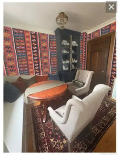
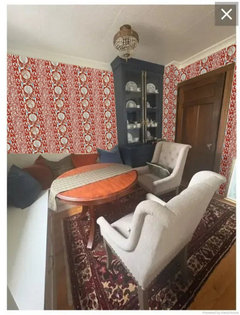
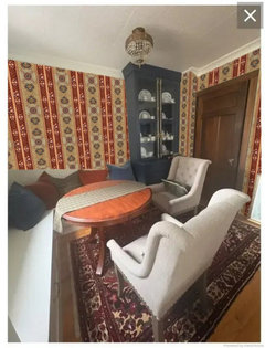
Art Vs Mirror and Wallpaper Advice

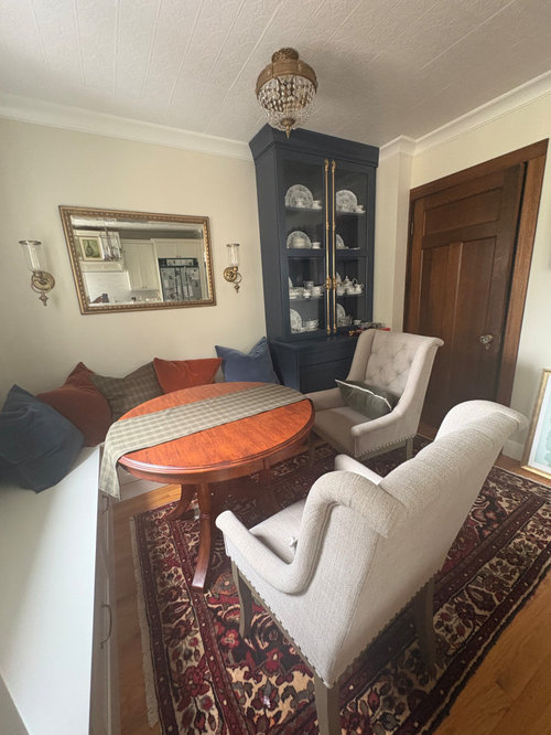
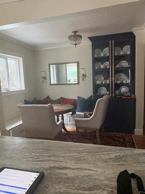
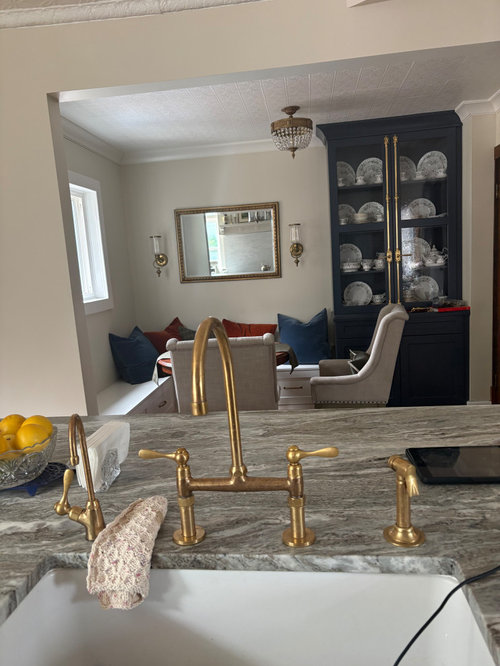
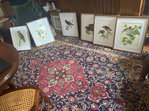
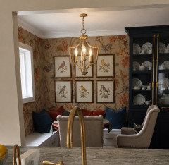
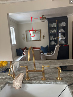
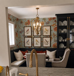
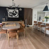
Two things: Wondering about taking this mirror out of this dining nook and putting the series of vintage bird prints instead. I also


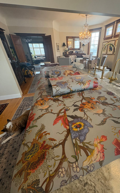
picked out a wallpaper (Artemis - Dove) for this space to give it some visual interest. The sconces can stay or go as well. Please let me know what you think.

Comments (26)

  • 7 days ago

    I’d remove the mirror and the wall sconces if using the wallpaper. I like the bird prints because the white mats help calm the busy, but beautiful, pattern.

    I also like the ceiling fixture but I don’t like that it is not centered over the table, and prefer a chandelier that hangs down to make the space more intimate.

    mcfaddenmichelle thanked Emily
  • 7 days ago

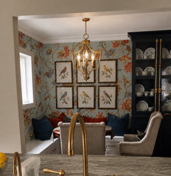
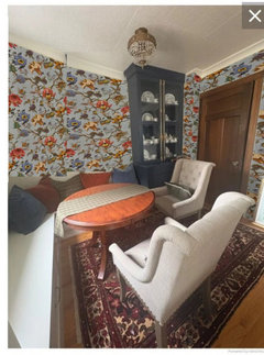
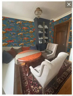
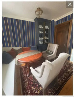
    This is closer in color for the wallpaper.

    mcfaddenmichelle thanked Emily
  • 7 days ago

    Thanks Emily. I love it. I was worried about the birds and the paper looking too busy, but your visual helps reassure me! I agree about the light. It bugs me that it isn’t above the table. The ceiling is a decorative tile and I don’t have a piece to patch the hole where the current light is, but I would like to ultimately remove the tile and just drywall it so the light can be moved. My husband’s ”to do” list is getting pretty long….😜

  • 7 days ago

    Sounds great.

    The prints with the wallpaper with or without the sconces.

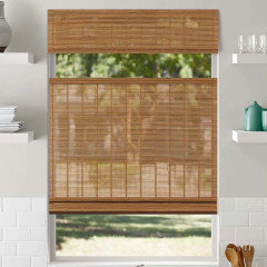
    I'd paint the banquette blue like the hutch. and a bamboo blind for the window.


    mcfaddenmichelle thanked Lyn Nielson
  • 7 days ago
    last modified: 7 days ago

    Lyn, I agree with you 100 percent. It is a regrettable decision to not have the bench painted the same colour. I knew I should have ask you wonderful people on Houzz first! Emily, that second picture looks a little closer to the blue/grey of the paper. Thank you.. Any thoughts on whether or not I need a back panel on the bench, or would that look like too much going on if I wallpaper? Also, I love the bamboo blind!

  • 7 days ago

    I rarely like swagged chandeliers/pendants, but it might actually look better in your space. I don't like how the semi-flush fixture crowds the hutch.

    No mirror.

    Are the sconces hard wired or just hanging?

    Install wallpaper first and then decide what art, and how much art, to add.


    mcfaddenmichelle thanked chispa
  • 7 days ago

    Thank you chispa. Sconces are not hardwired, they are just for candles, so I am not committed to them. I also thought about a swag, but worried it might look cheesy. It might be better than the current fixture and I could live with it until I can get the box moved and ceiling dealt with.

  • 6 days ago

    II like the idea of the back panel. It’ll protect your wallpaper too. I added it in the color of the cabinet but you could keep it white. If you stick with white keep the darker pillows and if you go dark, go with lighter pillows for contrast.

    It pretty traditional to do a swag lamp, so you could get away with it.

  • 6 days ago

    That looks a lot more finished with the bench cushion and thr back panel! I may just consider doing a small cover plate painted in the ceiling colour to cover the hole. It may be inconspicuous enough to be a temporary solution. Thank you so much for the visualizations. It is awesome!

  • 6 days ago
    last modified: 6 days ago

    I think the makeover will look fantasric given some of the mockups rhat werre done . I think it will look very cozy once done.

    love the ideas of backpanel to go along with wallpaper and painting the bech the same blue as rhe hutch.

    i’d like to suggest that instead of all the individual pillows, consider getting two long rectangular back cushions and using just 3 accent pillows ; one to place in the bench corner and the other two to flank the left and right outermost of rhe bench seat. i would imagine that if a few people are sitting on the bench, , it may feel crowded with not knowing where to place the pillows if they dont want it directly behind them. i think the single long back cushions will give a cleaner / neater look and the 3 pillows wouldn’t get in the way of sitting . This space will look great once done . I see the potential!

    mcfaddenmichelle thanked gtdj519
  • 6 days ago

    Good point about the pillows! Good suggestion.

  • 6 days ago

    Post a picture when you get it all done!

  • 6 days ago

    Will do Thank you!

  • 6 days ago

    @Diana Bier Interiors, LLC, have you seen the latest Ballard Design catalog? Traditional and color is back. Ballard never went full in into the Gray Trend, but now they are back to a mix of traditional/transitional with color and pattern.

    Lots of people are going to be sorry they threw out all that "Brown" furniture (like OPs table) that Grandma or their parents had given them.

    My Mom had to sell her beautiful table and hutch (custom made by a craftsman that now restores antiques for museums), because it just did not fit in their last downsize. I already have a table I love and my sibling also didn't have space for it. Mom hates her newer table. It fits, but is generic and the finish is nothing like the older woods.

    mcfaddenmichelle thanked chispa
  • PRO
    6 days ago

    IMO the whole bench seating is wrong with that round table and in no way suits that beautiful wallpaper nor does that busy cabinet belong there . I like the wallpaper and even the prints hung on it but the chairs are too big , if you must have abench then a pretty one with a back and set that are upholstered in a lovely velvet type material then it might work .

  • 6 days ago

    Thank you for your feedback. The table can change if you have another suggestion. Chairs are just the extra dining chairs that can easily pulled over to the dining room table when we need the extra seating, but I agree that they are pretty large and I could change those up for sure. The bench seating and cabinet are not going anywhere, but I was just hoping to improve the space with the paper and some small improvements with wall decor. Glad the wallpaper gets a thumbs up!

  • PRO
    6 days ago

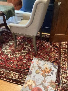
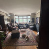
    Does the floral pattern fight with the area rug?


    mcfaddenmichelle thanked BeverlyFLADeziner
  • 6 days ago
    last modified: 6 days ago


    I think the colours look okay. The rust color of the large flowers seems to work with the carpet as well as the green tones in the rug.

  • PRO
    5 days ago

    It's more than okay, it's beautiful and interesting. It looks like it was accumulated over time, perhaps handed down, instead of being all matched perfectly. We in America are so much more obsessed with everything matching--every color has to be "pulled" from the rug or the wallpaper. I much prefer the English approach, where there is a multitude of patterns that may or may not perfectly match in scale and color.

    mcfaddenmichelle thanked Diana Bier Interiors, LLC
  • 5 days ago

    Diana, thank you. You are a woman after my own heart. Out of pure nosiness, I recently attended a neighbour’s recent open house. I always thought that it was one of the prettiest, grand, old historic homes in the neighborhood. I was a little suprised when I went in. It was beautiful and put together, in a many shades of grey sort of way, but something was truly missing, that I knew must have been there once upon a time. This white washed renovation, although beautiful, seem to strip away the very soul of the house.


    The history, the imperfections, and the story are all part of what I love about having an old house. Most importantly, it gives me the perfect place to keep my treasured old junk and rugs.😜

  • PRO
    4 days ago

    I subscribe to House & Garden UK online and receive a link to a story daily. Even if I'm not a total fan of any particular home, I still appreciate the personalized decor. There's not a gray room to be seen, and even if a home is neutral, it still has life. I agree that these white-washed renovations have no soul.

    mcfaddenmichelle thanked Diana Bier Interiors, LLC
  • PRO
    4 days ago

    If a mirror doesn't reflect something interesting I will always discourage clients from having them. In this case it doesn't. Will suggest you go with the prints instead.

    mcfaddenmichelle thanked Norwood Architects
  • 4 days ago

    The wallpaper is great.

    The rug is dark enough (and classic enough) to just be “background” under the table because the wallpaper brings everyone’s eyes up. You can change the rug at a later date if it starts to bother you. Put up the wallpaper and make a decision in 6 months.

    mcfaddenmichelle thanked RedRyder
  • 4 days ago

    Love the paper and love the birds! (i have a similar collection, pics from a vintage book of birds but mine are just tacked to white stretched canvases and yours make me want to get them framed) hope you keep posting pics-


    totally agree with you on soul — we have always lived in old houses but just built a new vacation home and it takes a lot to knock back all the newness (my poor husband loves new houses and kept despairingly asking me why we had to knock back the newness - poor guy! 😅)

    mcfaddenmichelle thanked la_la Girl
  • PRO
    4 days ago
    last modified: 4 days ago

    Funny story, lalagirl! If you and he love old wood, brick, stone, and natural fiber rugs and window treatments, it's easy to "knock back the newness"! Our primary residence is over 100 years old, so we had good bones to work with, but like you, our vacation home was build 30 years ago, relatively new. Over the years we've made it cozy and lived in--most of the furniture is from estate and tag sales, and even though the most of the home is painted white, we have lots of color, pattern and texture in textiles and rugs.