

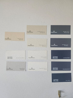
Entryway design ideas
last month
last modified: last month
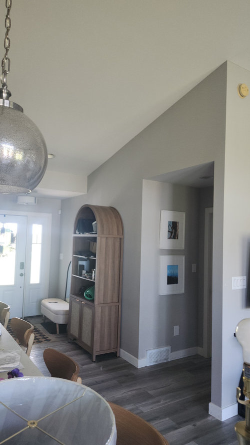
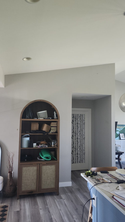
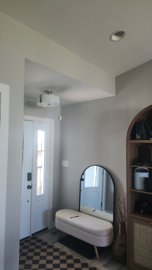
Featured Answer
Sort by:Oldest
Comments (23)
 last month
Related Professionals
Davenport Interior Designers & Decorators · Tupelo Furniture & Accessories · Lawrence Furniture & Accessories · Lake City Interior Designers & Decorators · College Station Interior Designers & Decorators · Willmar Interior Designers & Decorators · Charlottesville Furniture & Accessories · Taunton Furniture & Accessories · Yakima Furniture & Accessories · Anchorage General Contractors · Meridian Interior Designers & Decorators · Annapolis Architects & Building Designers · Worcester Architects & Building Designers · Stockton Architects & Building Designers · Spring Kitchen & Bathroom Designers- PROlast month
- last month
 PROlast month
- last month
- last month
 PRO29 days ago
- 27 days ago
- 27 days ago
- 26 days ago
- 26 days ago
 24 days ago
- 24 days ago
- 23 days agolast modified: 23 days ago
- 23 days ago
- 23 days ago
- 23 days ago
- 23 days ago
 23 days ago
- 22 days ago

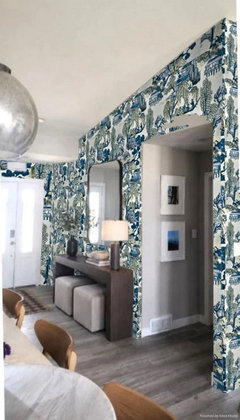
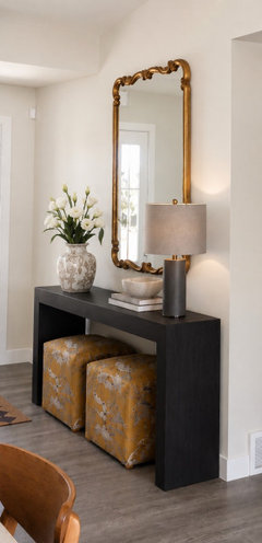
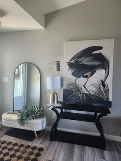
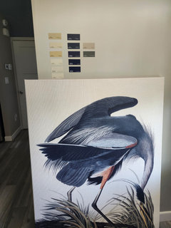
Related Stories
ENTRYWAYS7 Design Ideas for a Small Entry
Banish the clutter — and the last-minute search for keys — with these ideas for organizing your entry
Full Story
PHOTO FLIP105 Ideas for Entryway Mirrors
Enjoy this gallery of mirrors near the front door. Which one can you see yourself in?
Full Story
HOLIDAYSLast-Minute Ideas for Attractive Winter Container Designs
Create a welcoming holiday entryway with ideas from these 9 looks
Full Story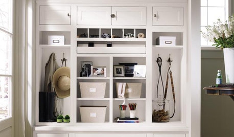
ENTRYWAYSHome Setups That Serve You: Designing the Entryway
Get an entry that works for your particular habits, needs and style with this interior designer's wisdom
Full Story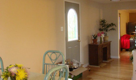
MORE ROOMSDesign Dilemma: Decorating Around an Open Entryway
How Would You Design This Narrow Space?
Full Story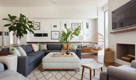
DECORATING GUIDES28 Design Ideas Coming to Homes Near You in 2017
Set to go big: Satin brass, voice assistants, vanity conversions, spring green and more
Full Story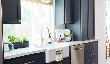
TRENDING NOW10 Great Home Design Ideas From Best of Houzz 2021 Award Winners
These design details helped pros earn attention from the Houzz community — and can help you create a more stylish home
Full Story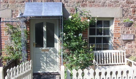
URBAN GARDENSLessons in Small-Garden Design From 11 English Entryways
Unsure how to turn your tiny front yard into something special? Check out these inspirational ways to make an entrance
Full Story
CHRISTMAS10 Easy Decorating Ideas for a Festive Entryway
'Tis the season for welcoming guests with wreaths, special lighting and plenty of comfy seating
Full Story
Double Duty: 14 Smart Design Ideas
These simple ideas will make your décor work twice as hard for you
Full Story


Emily