Software
Houzz Logo Print
webuser_1380410

Project Hhelp

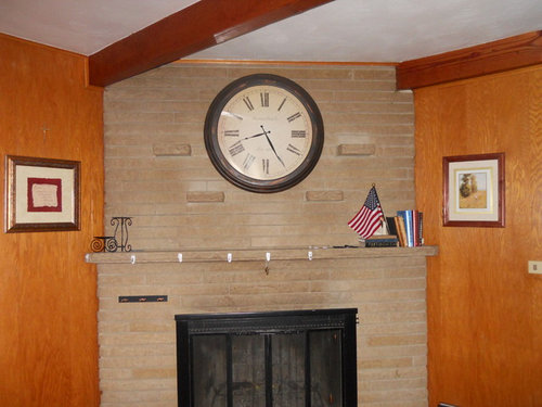
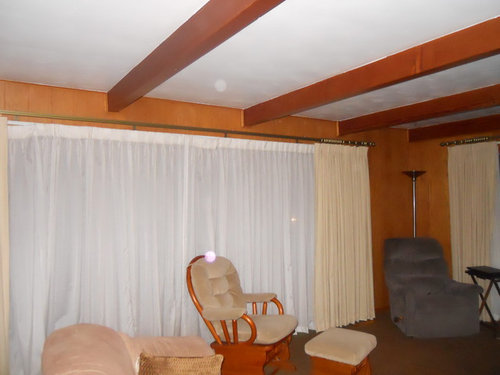
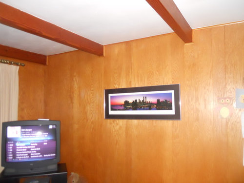
I have a beautiful living room that has awful old wood paneling. Huge windows that need updated window treatments .....

Comments (13)

  • 13 years ago
    wanted to add photos, (maybe canvas) of the family here
  • 13 years ago
    Do you need window treatments? Do you need privacy? What style/colors do you like?
  • 13 years ago
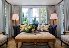
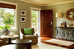
    Tear the wood paneling out or just paint it a simple and nice color. Also, for the window treatments, try something classy but not old like whats below. Also, for the paint try an olive green.
    Dawn Mistovich-Goclano thanked hugob54
  • 13 years ago
    Contemporary Living Room by Portland Interior Designers & Decorators Garrison Hullinger Interior Design Inc.
  • 13 years ago
    Remove paneling. Or paint over it. Do a test on wall to see how this would work first. All items on walls to small to high. Clock on firepl to high lower by 10". Paint walls a gray.d get samples. White wash firepl. Google for directions. Do it a darker color of walls. After you do that repost and we can help with windows, and wall art. Remember go big hang very low. Hang 6-7" above furn.
    Dawn Mistovich-Goclano thanked Nancy Travisinteriors
  • 13 years ago
    Beams are nice might go dark.
  • 13 years ago
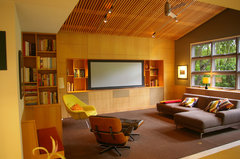
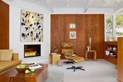
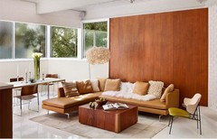
    You could work with that paneling and go towards a midcentury style...something like this
    Alamo · More Info

    Carmel Mid-Century LEED · More Info


    The fireplace needs to be whitewashed as well
    Dawn Mistovich-Goclano thanked printesa
  • 13 years ago
    last modified: 13 years ago
    [houzz=
    Traditional Living Room · More Info
    ]
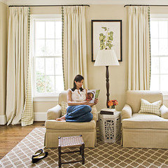
    Is this your inspiration picture?

    You just need a color for your walls that plays off the beautiful stone on your fireplace and the rest will come out easy. There is gold undertone to a few of the bricks, now completely overshadowed by the gold in the paneling. You were resonating with this living room, something about the mix of white and aqua with natural wood / old and new mix of neutrals with muted color? Just to have so many windows in a space makes it ever so much nicer. If your style is more traditional / transitional like this, then let's try some colors on.

    I think if we find you a great wall color, and we switch out the sheers now for some woven wood blinds (they sell them for not too much at HD) even the top layer of neutral ivory drapery will not bother you so much. Then you can change that out later on. You can put a series of blinds in and take down the sheers - here's the kind of thing that will give your room an instant update - http://www.homedepot.com/p/t/202025452 but pick out your tone of blind after you paint.

    You can paint the panelling which is high end book matched grain. This is the least cost solution to your challenge. Your stone is very close to bm bennington gray, and for painted paneled walls like this, I'm going to suggest you test this neutral wall tone http://www.benjaminmoore.com/en-us/paint-color/moonshadow
    Put it on a posterboard and set it next to the stone, then look at it in different lights (day, night, am / afternoon sun). If it were my room, I would be happier with the deeper tone of bm mosaic tile, so if you think you would like to test it too, try it out. http://www.benjaminmoore.com/en-us/paint-color/mosaictile
    You will have to prime first.

    These are neutrals with sage undertones. Green will really compliment the gold tones in your stone, but allow you to choose any color palette. Trying to match the camel tones / gold tones in the stone won't give you a good result - you've been surrounded with gold undertoned panelling and you need a real change.

    For the beams, it will be important to pickle them so they work with the new earthier palette and not stand out as so orange. Using paint watered down 1/2 and 1/2, you mask everything below and brush on as evenly as possible one coat. Here, don't use white - horrors, use a mid-tone color closest to your stone that you can find. I got to
    http://www.benjaminmoore.com/en-us/paint-color/benningtongray and this should work great. The tannins will read through so the wood grain still displays, but the orange cast will be gone and it will be singing harmony with your fireplace. You could also gel stain them darker, but your ceilings are not high, so I suggest pickle for the transitional look you favor.

    Even more important to have area rug with the dark brown carpet you inherited. The colors I gave you will provide a neutral and harmonious updated backdrop so you can add seasonal color accents until you develop more of a color story.
    Dawn Mistovich-Goclano thanked libradesigneye
  • 13 years ago
    [houzz=
    Beach Style Living Room · More Info
    ]
  • 13 years ago
    last modified: 13 years ago
    this was my inspiration until I sampled the paint at S.Williams and matched it next to my fireplace. (looks
    Grey instead of green). Great ideas here from the comments I thank everyone for the time! I really have NO gift when it comes to decorating or style. As far as lowering the clock I have brick-like shelves there. I have visited home depot and seen the exact blinds like the matchstick look
    ! like them alot. My main window measurements are a real challenge also. I was thinking maybe 2 blinds at 56 wide, 1 at 53 wide and 80 long. one main blind ideal but that isnt happening with measurements at 165w and 80l
  • 13 years ago
    A word of encouragement,,,,,,,,,We had VERY dark wood paneling in our old home and only a french door in the room....NO windows. We degreased, sanded, primed and painted the paneling a soft cream color and added an off-white carpet. It made our dark-bricked fire place pop and made the whole room lighter. We even had dark cedar beams in the room with 8 ft. ceilings.....Paint is a magical thing! Good luck.
  • 13 years ago
    If your windows are 165 and 80" - try this - put the widest one - 72" in the center, split the remaining 90+ into 48 and 48 and do two pairs of 24" on each side there. If I knew more about your window mullions / widths / layout, then you could also match those closer. For the 80" try three equally spaced and let them be wider - 28 x 3 is about right . . or again, match what is underneath.

    This is a good inspiration photo - lots of things are going to look gray at first to you because you have so much gold bouncing around but when you are done they will indeed be green. Go back and paint a posterboard with two layers and put it next to the stone again and take a picture and post it here. We'll help.
    Dawn Mistovich-Goclano thanked libradesigneye