Software
Houzz Logo Print
keysfins

Finding the right blue for master BR, and different paint makers

12 years ago
last modified: 12 years ago
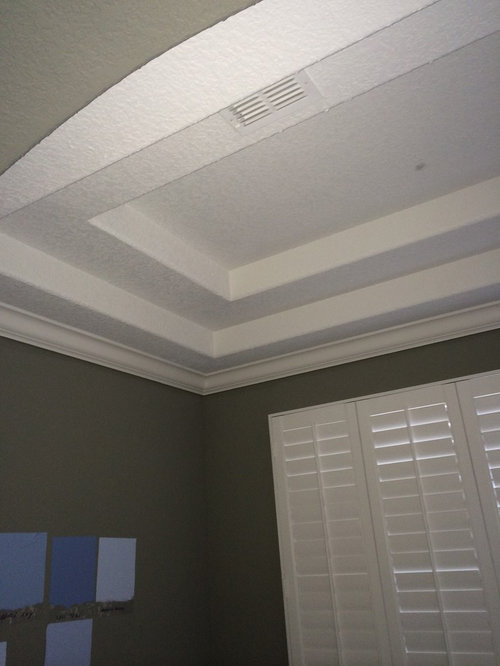
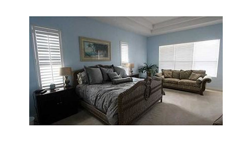
We just bought a house that has a dark grey with brownish undertones on the walls and the ceiling. This room also has a trey ceiling in the main part, and a smaller but deeper (two step) trey ceiling in the sitting area. The grey is completely opposite from the light and airy feeling we want to achieve, the room has lots of natural light.

I'm going nuts trying to find the right color. At the moment, I am looking at Behr "Sparkling Waters" for the walls. White ceiling and trim, and Sparkling Waters cut 50% for the contrast in the trey areas.

1st question: I see many, many of the paints here are Benjamin Moore, and Sherwin Williams, but very few are Behr. There must be a reason, if anyone can tell me. I just went to Home Depot to collect samples, and as you can see in one of the photos, we've tried several samples on swatches in the room.

2nd question: HOW do I find a blue that is not too cool, too green, too lavender, but just right? I am new on this site, so I'm getting lots of ideas. Our previous master br was a light blue, but too intense, too cold.

3rd question: How would you paint the trey areas? Which color on which surfaces? If you can help, I will call the wall color "A", and the contrast color "B", since we have not finalized color choice.

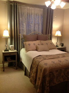
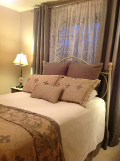
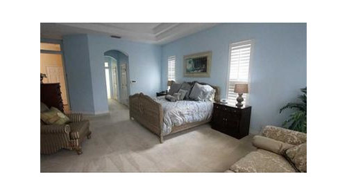
The 3rd and 4th photos show the look I am trying to achieve as it has so many similarities to our layout and windows.

Thanks in advance! Next up will be finding blackout shades to go over plantation shutters.

Comments (162)

  • 12 years ago
    And yes, we do like blues, greens, sea and ocean colors. We plan to create a palette for the entire home, with the help of a professional. Orange, coral and gold, usually complementary to the blues, are among our least favorite colors.
  • 12 years ago
    What about Benjamin Moore Wyeth blue? http://houzz.com/photos/268581
    keysfins thanked Chae
  • PRO
    12 years ago
    I have done a few blue rooms and have tried many blues. Try looking in the grey tones and you will find very grayed down blues that will look soft and not too bright. The room details are really pretty so I would stay with white for the ceiling especially if you want an airy feel. Stay away from the brighter color swatches for the blue
    keysfins thanked patricia sarnataro
  • 12 years ago
    this could be just the right colour for yr large bedroom
    Parkwood Road Residence Master Bedroom · More Info
    keysfins thanked anne dee
  • PRO
    12 years ago
    Take a look at colors like blue heather , manor blue, blue haze, smoke ...... All BM all on grey color cards
    keysfins thanked patricia sarnataro
  • 12 years ago
    Take a look at Benjamin Moore Glass Slipper. We just painted our bedroom with it and it is a very true light blue but not baby blue. It is not gray or green in tone . I really like it!
    keysfins thanked cmcole01
  • 12 years ago
    In the 1990's I painted my entire home inside and out with Behr. I learned recently that professional painters prefer Sherwin Williams or Benjamin Moore because it is possible to get by with one coat instead if two. The professional grade paint covers better and is easier to apply.

    I am a fan of Sherwin Williams' sophisticated color palate. Poised Taupe is one of my most recent selections. There is almost always some type of discount coupon, so print one out before you head to the Sherwin Williams store.
    keysfins thanked Olivia D.
  • 12 years ago
    last modified: 12 years ago
    Thanks for the input!

    @Chaefender, thanks, we will be using Wyeth Blue in the guest suite. I love the color, and the other colors on that strip. The Wyeth Blue was an easy choice, the master has been much more difficult to figure out.

    @Patricia Sarnataro, we did look at the colors you mentioned, and painted 9"x15" swatches to see how they work in the space and light. (Actually, I had about 25 different painted color samples to look at, I love color and light, so it was fun to paint out samples of the many colors that were suggested by others here.) My Other Half is not keen on the softer grey-blues, he would not mind if we did everything in a bright, clear blue. So getting to Silvery Blue was a feat! He still likes the Mediterranean Blue, but I think it is too bright.

    I think I need to revisit the blue grays and maybe paint a few more large swatches. AND find a color consultant/interior designer!

    @Anne Dee, yes!! I was very inspired by the Parkwood Residence photos as you posted. I believe that is the Silver GRAY color. And actually, I don't think I have a swatch for that. Have to check, and put that up. That is one of my favorite rooms I've seen, so crisp but not too cool.
  • 12 years ago
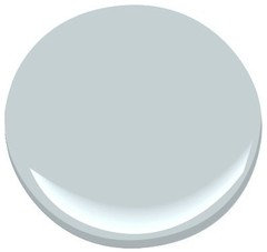
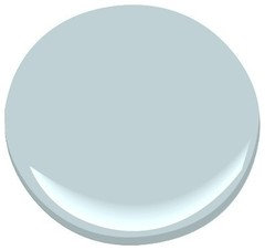
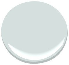
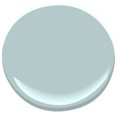
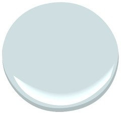
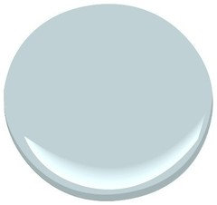
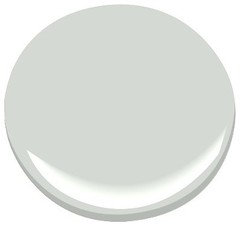
    Here is BjM Silver Gray next to Silvery Blue
  • 12 years ago
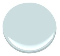
    Glass Slipper
  • 12 years ago
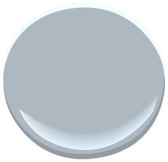
    Gossamer Blue and Blue Haze
  • 12 years ago
    You want to do swatches. Get big pieces of cardboard, paint big swatches of your favorite colors and make sure you like how the paint looks in different lights (morning, noon, evening, artificial) and how it looks when direct sunlight falls on it, versus the shady corner. Paint can vary tremendously over the course of a day.

    For shades that go together, all colors are mixes of pigments. In general, colors will coordinate if they share some underlying pigments. You can ask for the formula at the paint store.
    keysfins thanked Sigrid
  • 12 years ago
    Thank you, Sigrid. We have done that, and some of the large swatches are up on the wall in the photos above. I think we'll need to look at some more, though.
  • 12 years ago
    TOP: Manor Blue and Smoke
    BOTTOM: Summer Shower
  • PRO
    12 years ago
    hi, manor blue and smoke look a little darker here than when i was looking but i think this is a good world to be in. you will find these gray/blue tones to look much softer and less icy than the clear hues...
    keysfins thanked patricia sarnataro
  • PRO
    12 years ago
    i like the silver/grey , and blue haze….
    keysfins thanked patricia sarnataro
  • 12 years ago
    last modified: 12 years ago
    @patricia Sarnataro, exactly! We want bright and airy, but not too cold/icy. This IS, after all, a Florida home, with plenty of light throughout the entire home.


    I have contacted a local professional, and will schedule a color consultation. Perhaps my Other Half will hear the blue-gray suggestions better from a pro! :)

    I think even with the five big samples we did, he cannot see how a color will actually look lighter on the walls, with the light, etc. Plus, we "pre-selected" the five colors from smaller swatches, and maybe did not give some the consideration they deserve. We got to the point of saying "too green, too purple, too this, too that" because we were comparing loads of colors to EACH OTHER, not seeing them as individual colors/tones.

    I'll be going thru the smaller swatches, that we did NOT paint large, to see what I should try on bigger swatches.

    I'm the one who likes to play with color, so I am always open to suggestions. I am hoping that the photos of the actual space will help people here to see what we are working with, for size, light, etc. even if they are just photos with my iPhone. I should mention that the walls are textured, so I'm not sure how that might affect how we see colors.
  • PRO
    11 years ago
    Where do you find the cute little round paint dabs?!? I've looked and looked! Thanks! :)
  • 11 years ago
    Google Benjamin Moore and the name of the color, look at images, there are usually those "cute little round paint dabs" there :))
  • PRO
    11 years ago
    Ah...thanks, mefor! I'm trying to find Sherwin Williams. Their samples are boring but I love their paint!
  • 11 years ago
    @Fluff, yes, I do a Google search for the color, then select the "Images" option, and there you will find the round dabs. :)
  • 11 years ago
    Only Benjamin Moore does the "round dabs"
    But, when looking for any colors, including the Sherwin Williams ones, I look for the ones on the My Perfect Color site, I have a lot of fan decks from the paint companies, I find that the colors on their site seem to match the fan deck very well. And that's on a few different screens, so I feel that for me, it's a very reliable source to find a very true color.
    keysfins thanked mefor
  • 11 years ago
    I should update!

    For the master bedroom, we chose BM Silvery Blue for the walls, and the lightest color on that strip, Lookout Point for the treys. Decorator White for the trim, and a flat white for the rest of the ceiling.

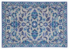
    We also installed hardwood flooring. And found an incredible rug that I had loved from the first time I saw it. I didn't think the rug would work in any space in the home, but I really like it in the sitting area. It has a grey base with all sorts of blues in it in a floral/geometric pattern. We are using silver/grey/nickel as the neutral color in the room.

    There seemed to be a lot of strong horizontal and vertical lines in the suite, with the plantation shutters and sliding doors. We softened that with some brushed nickel, curvy floor lamps, each with a reader' slight. They brighten two of the darker corners in the room.

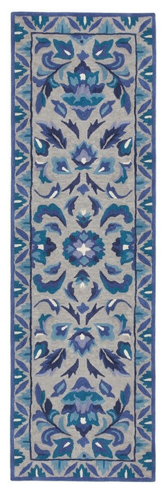
    We used the same rug in a runner for the short hall to the master bath. The master bath continues with the Silvery Blue.

    What was interesting, and FRUSTRATING, was that the previous owners wallpapered the master bath with a butt-ugly dark grey with gold wallpaper, more dreary, awful darkness! When the painters tried to remove it, it was impossible to get off the walls. They tried every trick known, and the labor hours were racking up. They recommended that we seal the wallpaper, prime over it and paint. So we opted for that, and it turned out well.

    Photos when I get a day to take them! We are happy with the results, and we're also happy with how the guest suite turned out. (Will post on that when I have a bit more time.)
  • 11 years ago
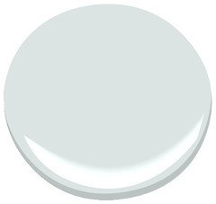
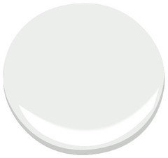
    In order: Silvery Blue, Lookout Point and Decorator White:
  • 11 years ago
    HC-171, Wickham Grey, brightened up the rest of the walls in the main area of the house. It is a perfect grey as our neutral.
  • 11 years ago
    Beautiful color combinations, keysfins. :)
  • 11 years ago
    Thank you, Mefor! I'll post the floor lamps and the rug we used in the sitting area and the short hallway. I'm still looking for the right rugs for next to the bedsides. Something grey/pewter, subtle, that won't clash with the rugs already here.
  • 11 years ago
    The rug is wool, called Chesapeake Ultramarine, the floor lamps are from Overstock.
  • 11 years ago
    I really like the color combo in the rugs, really good with the silvery blues and gray :))
  • 11 years ago
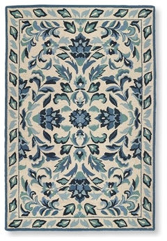
    The crazy thing is that I was looking for rugs for the guest suite, which is done with Wythe Blue on the walls the bath is Stratton Blue, and the ceiling in the bath is Palladian. On LL bean, of all places, I found this rug, called Hooked Wool Cottage Floral. It also works perfectly as a runner for the hall going in to the guest suite. :D
  • 11 years ago
    How does a beige gray background work for you, sometimes a sand background is lovely with those blues

    Maybe something like this?


    http://www.homedecorators.com/P/Montpellier-Area-Rug/30/270/
  • 11 years ago
    They are not identical, but I love that they are such a similar style. We're going to have another consultation about a few other things, including exterior paint, and I can't wait to show how this place has been transformed.
  • 11 years ago
    Or something that has no other colors, just pattern and texture in tone on tone?


    http://www.homedecorators.com/P/Daniella-Area-Rug/40/270/
  • 11 years ago
    Are they both hooked rugs?
  • 11 years ago
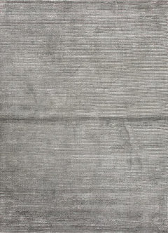
    Mefor, I think we're going to need a solid, or tonal, or sculpted rug for each side of the bed. I think any additional pattern will just be too busy. It's also a place where we can use the pewter/grey color. No bigger than 3x5, I think. I just haven't found the right grey that is soft on the feet.
  • 11 years ago
    They're really close, different borders but the centers are so similar!!
  • 11 years ago
    last modified: 11 years ago
    Mefor, The LL Bean is hooked. The Chesapeake Ultramarine is a traditional wool rug. Isn't it crazy how similar they are?
  • 11 years ago
    I would have thought they were from the same collection, really close!!
    keysfins thanked mefor
  • 11 years ago
    I love this, though it is a pattern, but it is very subtle in this gray combination, it also comes with a more contrasting blue medallion, but I like the look and feel of this for a bedroom. I'm still looking for the ones that I think you'll like better, just passing these on, just in case!! :)


    http://www.homedecorators.com/P/Rosa-Area-Rug/10/270/
  • 11 years ago
  • 11 years ago
    This one is actually oatmeal, but it's very similar to the gray/beige in the rugs you posted.


    http://www.homedecorators.com/P/Katya-Area-Rug/30/270/
  • 11 years ago
    All of these rugs come in smaller sizes, I'm just posting links so you can see the images, there is an option to see the different sizes and prices within the link :)


    http://www.homedecorators.com/P/Barcelo-Area-Rug/40/270/
  • 11 years ago
    This one is very different, though maybe too dark for you


    http://www.homedecorators.com/P/Colorscape-Area-Rug/00/270/
  • 11 years ago
    This one, the Marvelous, looks like it might work. One reviewer complained that it was wool + viscose, but when I was doing "hands on" shopping, I found the combo to be really nice, soft and fluffy.
  • 11 years ago
    I like a mix of wool and silk or rayon or viscose, it adds a silky feel, makes it softer on the feet. Which is pretty good bedside. :)