

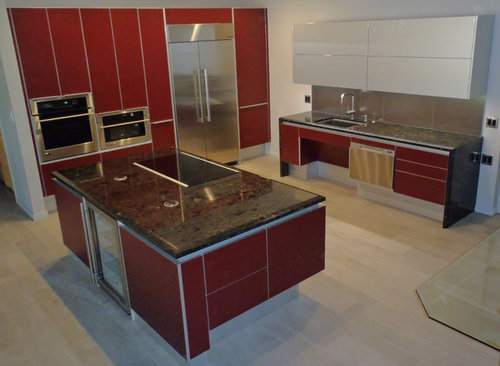
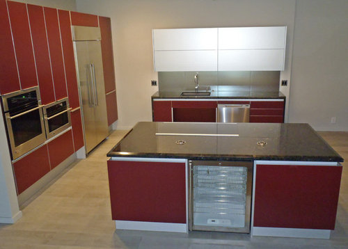
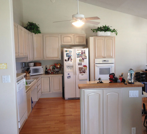
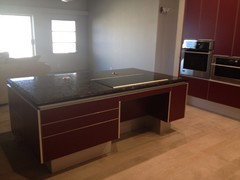
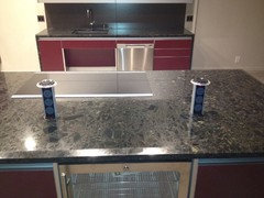
Universal Design kitchen
12 years ago

Featured Answer
Sort by:Oldest
Comments (18)
 PRO12 years ago
- PRO12 years ago
 12 years agolast modified: 12 years ago
- PRO12 years ago
- PRO12 years ago
- 11 years ago
- PRO11 years ago
- 11 years ago
 PRO11 years ago
 PRO11 years ago



Related Stories
UNIVERSAL DESIGNKitchen Cabinet Fittings With Universal Design in Mind
These ingenious cabinet accessories have a lot on their plate, making accessing dishes, food items and cooking tools easier for all
Full Story
KITCHEN DESIGNOptimal Space Planning for Universal Design in the Kitchen
Let everyone in on the cooking act with an accessible kitchen layout and features that fit all ages and abilities
Full Story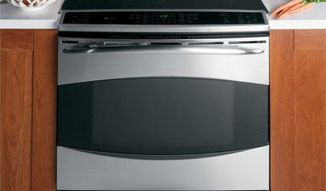
KITCHEN DESIGNHow to Choose Kitchen Appliances for Universal Design
Accessibility and safety features for kitchen appliances let everyone in on the cooking fun
Full Story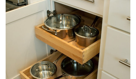
KITCHEN DESIGN9 Kitchen Cabinet Accessories for Universal Design
Retrofit your cabinets without doing a full remodel to make your kitchen more accessible without blowing your budget
Full Story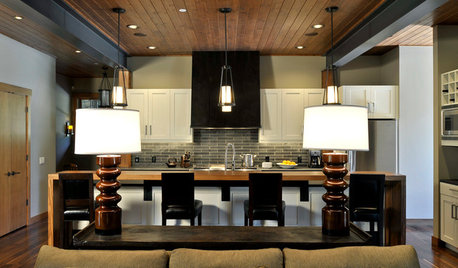
VACATION HOMESRoom of the Day: A Modern Lodge Embraces Universal Design
Homeowners design their Washington family vacation home to be accessible for their daughter with special needs and a mother in a wheelchair
Full Story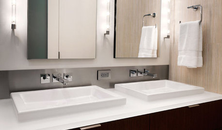
BATHROOM DESIGNUniversal Bath Design: Light Your Bathroom for All Ages and Abilities
Learn about uplighting, downlighting, visual cueing and avoiding glare for a bathroom that's safe and works for all
Full Story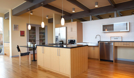
UNIVERSAL DESIGNHouzz Tour: Universal Design Makes a Midcentury Home Accessible
More space for wheelchairs, easier access to appliances and a curbless shower fit a Seattle family's needs
Full Story
UNIVERSAL DESIGNMy Houzz: Universal Design Helps an 8-Year-Old Feel at Home
An innovative sensory room, wide doors and hallways, and other thoughtful design moves make this Canadian home work for the whole family
Full Story
UNIVERSAL DESIGNUniversal Lighting Design Strategies for 4 Key Home Areas
Brighten the way for eyes of any age with ambient and task lighting that supports safety and imparts beauty
Full Story
HOUZZ TOURSHouzz Tour: Universal Design in San Francisco Home
Skylights, grab bars, expanded doorways and more increase safety and accessibility in this Northern California home
Full Story



bungalowmo