Software
Houzz Logo Print
viktoriav

Color puzzle for the design minded; sightline-color matching

13 years ago
last modified: 13 years ago

We've bought and are moving into an older house, that the seller remodeled down to the studs and back again in 2013. The seller painted all the walls a very sterile white, that reminds me more of apartments (which my husband loves, but he lets me paint "my" work spaces!) It looks nice, but for someone like me, who loves some kind of color in a room, it's a little bleak to think of myself cooking and cleaning in a white room. The more energy I need to expend in any given room, the more I like to play with colors, to put it simply.

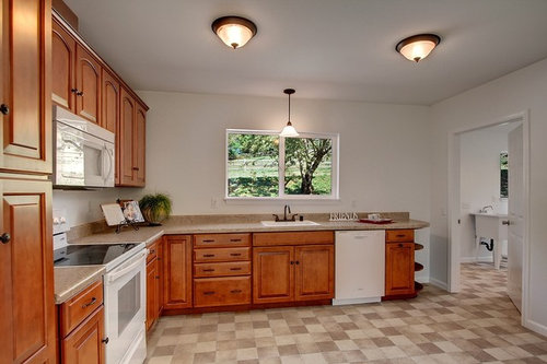
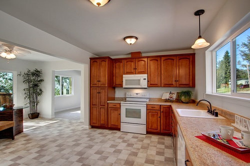
Because of the new, better quality cabinetry, we don't want to alter the kitchen cabinets or current cabinet layout. So we're happily stuck with cabinets that appear to be a reddish cherry shade. Due to the lack of period features in the 1940s cottage, I'd like to give a nod to the historical origins of the house here and there.

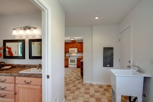
I want to have a color on the two walls with cabinetry in the kitchen, but I never, ever thought I'd be working with "Cherry"-ish cabinet colors, let alone brown vinyl flooring, so I need help figuring the kitchen out! There is a direct line of sight from the kitchen to the laundry, and from the kitchen to the dining room. So the problem is, I've already fallen for shades that work with the laundry, but now I of course need help figuring out what to do with the kitchen. I've thought of a few options, white or greenish glass subway tiles for a backsplash are a maybe, but until budget allows, I'm sticking to wall colors. Which ones will still work, even with the wall color in the laundry visible, though? Any and all ideas will be welcome.

So with sight lines, some of the shades that have to go with the cabinetry, are the ones I'm vying for the laundry room. My laundry room is probably going to be a shade like Sherwin Williams' shade "Optimistic Yellow" SW6900. I am tempted to paint the ceiling in the laundry with SW6219, "Rain", which I'm painting in the master, too, so I could as well order extra... I'm attaching a pic from the SW paint visualizer with the shades I've shortlisted, the way they may end up applied to the laundry.

The one shade I'm not budging on, is that my "neutral" pick for walls to offset the pops of color, is currently Sherwin Williams' shade SW2833 "Roycroft Vellum". The shade will be painted throughout the house to bring some cohesiveness to the open concept areas, as it matches both the carpeting and the brownish vinyl.

Optimistic Yellow · More Info

Rain · More Info

SW2833 Roycroft Vellum by Sherwin-Williams · More Info


(I've used a similar shade to Roycroft Vellum in rooms that would have otherwise been visually busy with color before. A beige looks almost off-white in a north-facing room like the laundry, so that's why I'm sticking with it).

Thanks to everyone for the help.
- Pen

Comments (15)

  • 13 years ago
    I'm having a little bit of a problem with the yellows in this case. Doesn't seem quite right to me. Let me look around for some other color options. It could be my computer monitor, but the yellows and that floor, and your cabs seem to be a mismatch.
    Paulina V. thanked mpoulsom
  • 13 years ago
    [houzz=
    Sleepy Blue SW 6225 Paint · More Info
    ] for your ceiling, or even something a bit paler......

    Have you considered doing a sagey green instead of a yellow for your laundry room?

    [houzz=
    Benjamin Moore Saybrook Sage Paint · More Info
    ]
    Paulina V. thanked mpoulsom
  • 13 years ago
    [houzz=
    Quiet Moments 1563 Paint · More Info
    ]

    Quiet Moments is a pretty color too
    Paulina V. thanked mpoulsom
  • 13 years ago
    Personally I would probably do a light taupe/brown color that went with your floors, if they are staying for a long time, and add colors in your backsplash and art and fabric. That's just me though.
    Paulina V. thanked mpoulsom
  • 13 years ago
    last modified: 13 years ago

    I'm sorry, HERE, that I don't agree with you. However, I still appreciate the input, even suggestions for what to do with the space. Many of your points are in my wishlist, but not my budget right now (although my mom designs and makes custom area rugs, so I'll have to say, those will probably just "magically" appear, if we just figure out how to affordably import those from Europe...) I'd love to do a 100% kitchen overhaul, but money will be tight for a while, since we have repairs and appliances that need to be sorted before we move in. We'll just try to live in the house as-is, and take notes on what does or doesn't work, and then slowly start adding projects, once our savings build up again.

    mpoulsom, the yellow in the laundry/mudroom looks much darker on my computer vs. the app on my phone, vs. the color chip in person. I'll buy a few test cans of shades similar to it as well, and make a choice after I see it on the wall. The yellow is going on first, and once I can afford putting up wainscoting, the yellow won't stand out as much, when it's only shoulder-height to ceiling, not all the wall. All the appliances in our home will be white.

    I'll add Sleepy Blue to my test paint shopping list, I like the way it looks, and it's light enough to be "neutral" in my book.

    I've been trying to figure out shades that will work not only with what exists now, but what will look nice, if we ever finally can afford to replace the cabinet fronts with a more country-appropriate style, maybe Shaker, in a lighter shade, so blues are a likely suspect.

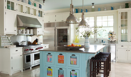
    Something like this could work, a dark and light tone in the same nuance family. I know the wood doesn't match the cabinets in the space, but it gives an idea of what the effect would be, especially with a blue glass tile backsplash with wide white grout lines might look like.

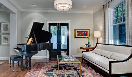
    The other picture is closer to what I'd put in, if I had a blank slate, but I don't, so boo at me.
    https://www.houzz.com/photos/1jpg-phvw-vp~1359256
  • PRO
    13 years ago
    No skin off my nose. ;)

    Enjoy your new house!
  • 13 years ago
    We met the sellers yesterday, and they said they realized after the paint was already up, that the white they selected was too cold for the house. They live across the street and let me exercise their horses, so I will definitely have to show them the end results. : )

    I bought paintable color swatches and eleven different shades of paint to test out, and have been staring at them, and moving them around the house for a week now. "Optimistic Yellow" looks better in artificial light than natural light, to our surprise. A shade called "Butter Up", is in person, much more like what I see on my screen. Both yellows look lighter in person than on the computer.

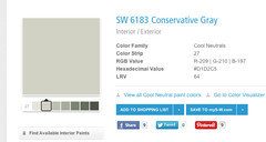
    We seem to have picked Behr's "Scotland Road", a lighter gray-green, for our kitchen. It works well with everything in the space, and is unobtrusive against all neutrals, as well as the red cabinets (the finish is a shade called "cognac", really hard to match when it's never among my choices for wood finishes). Once I mount some wall shelves, and put in a backsplash, we'll have a little more neutrals offsetting the green.

    http://www.homedepot.com/catalog/productImages/400/7e/7e785296-c0d8-4fa6-baad-53841275a1ce_400.jpg
    http://www.homedepot.com/catalog/productImages/300/ca/caa12b09-99ec-458f-909d-bd7baa3401d5_300.jpg
  • 13 years ago
    those look great penny! can't wait to see it all painted! please post pics when you're finished. :)
  • PRO
    13 years ago
    I would definitely go lighter on the yellow and blue. Specially the blue, since it is for the ceiling, you want the effect of a light sky effect, if too dark, it won't reflect enough light and the space will feel shorter, and a lot darker. Colors seem darker when they dry and when they are in a wall as opposed to a color chip.
    I like the quiet moments green suggestion, here is another SW green that I think would look good with the cabinet colors. I think when in doubt always go a shade lighter. Good luck, it comes to personal preference in the end :)
    Paulina V. thanked APM architecture
  • 13 years ago
    i would do a softer blue, actually.
    maybe.... a really pale aqua?
    Paulina V. thanked yoboseiyo
  • PRO
    13 years ago
    here is my blue suggestion
    Paulina V. thanked APM architecture
  • 13 years ago
    last modified: 13 years ago
    APM, and yoboseiyo, we're not painting the ceiling right now, but thanks for the input.
  • 13 years ago
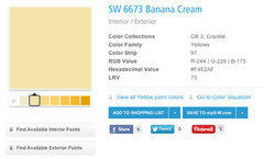
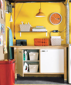
    As far as my idea of a "proper" laundry room color scheme... This is what I have in mind usually when I say "Yellow". My husband haggled until I agreed to go with a much lighter, more buttery shade.
    Barn Light Bedrooms and Bathrooms · More Info
  • 11 years ago

    Another country here. If you have to oust the white, I's go with that soft sage green and maybe put it on the window wall in the kitchen too. It would be easy on the eye, pull both rooms together and bring the outdoor hues inside. Plus it wouldn't fight with your cabinets or counter top. Then when you have the $ you can do a total redo. It's only paint!