Software
Houzz Logo Print
houzzerpolls

Pantone: Emerald VS Orchid

12 years ago
last modified: 12 years ago
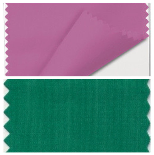
Pantone has just announced Orchid as the official color of 2014!

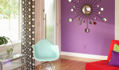
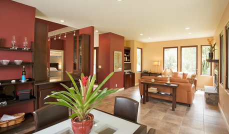
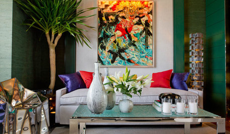
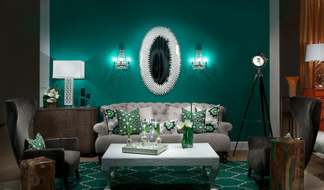
We want to know, do you prefer this year's color, or last year's Emerald? Cast your vote below and show us pictures of your emerald or orchid colored spaces!
Both!
Neither: Tell us below!

Comments (171)

  • 12 years ago
    The best woodwork stabilisers come out of Miami.
  • 12 years ago
    Young folk think the 80s are hot!
  • 12 years ago
    Interesting-we are doing a bedroom remodel and are just about to choose colors. We've been exploring and have about 6 colors we are considering, some of which we chose from another HOUZZ article. One is in the purple family. I found it helpful to see some pictures.
  • 12 years ago
    From Mystery of Color by Rosemary Sadez Friedmann, an excerpt on purple: "Pre-teens are usually thrilled to have their room done in purple or violet. Soft violet walls with white furniture and wispy white drapes can make a room really magical. It works well as an accent. Purples are great companions for metallics. Adding a tinge of purple to a room is like adding a drop of Cajun sauce to a recipe. It is sure to spice up the place. This color stands for luxury, dignity, wealth, and sophistication. It has magic, imagination and romance in its psychology..." I will be adding colors in the purple family to my new office decor.
    From Feng Shui by Sarah Shurety states that "Purple is often considered more auspicious than red...the color belongs to the philosopher, the dreamer, the author and visionary. It is often associated with high ideals, loyalty, truth, love and suffering. It is the color that was adopted by the church and is associated with the maratyr because it can impel the wearer to sacrifice themselves for their ideals. It is the color of the great orator..."

    I have an article about this color on my blog, colorfilled.blogspot.com
  • 12 years ago
    I'm just going to file these 2 colors under "what the heck were they thinking" and move on...
  • 12 years ago
    last modified: 12 years ago
    terrineff mentioned SW Color of the Year 2014, Exclusive Plum. I think it beats Pantone's colors by a country mile! SW has a 30% off coupon good until the end of the month, too. ;)
  • 12 years ago
    last modified: 12 years ago
    I agree, "Exclusive Plum" is a much more subtle, much more versatile color, while still offering lots of visual interest. Unlike Pantone's "Orchid" it doesn't look like it belongs in the room of a pre-teen or someone stuck in a time warp.
  • 12 years ago
    I also agree! Loving that Plum!!!
  • PRO
    12 years ago
    On a lighter note, for anyone interested... this blog discusses the new announcement of Pantone's "Radiant Orchid" and Sherwin Williams's 2014 color of the year, "Exclusive Plum" and how Sherwin William's prediction is based more exclusively on interiors and paint colors, while Pantone's prediction includes fashion as well as home interiors...

    The images on Karen's blog showcase some great photos to show how these can tie in great with interiors... Karen is an industry expert for color trends and a member of the International Color Marketing Group (CMG), she is involved with color forecasting and trend tracking for interior design and has some great insight. I think you all might find it interesting if you are looking at Radiant Orchid.

    View her blog post here:
    http://www.durasupreme.com/blog/color-year

    Sherwin Williams 2014 Color of the Year:
    Exclusive Plum · More Info


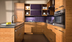
    The Beauty of Bamboo: Modern Purple and Bamboo Kitchen · More Info
  • PRO
    12 years ago
    My eye is drawn more to Emerald, but I would only use them as an accent wall, like stated before. I think a whole room painted in such vibrant, bright colors would be a lot for one room.
  • 12 years ago
    Thanks for the tip about the coupon. I'm going to SW this afternoon, to pick up a gallon of "Topsail" for my kitchen and "Rain" for my powder room. Saving = good!
  • 12 years ago
    Dura Supreme, now that's a colour I could 'see' in my house, I love that Exclusive Plum. It's very rich but not muddy.
  • 12 years ago
    I cast my vote with Emerald, because I love green in just about any variation. I didn't think too much about why until I read the posts about fashion. I am a redhead and do wear green, but would never wear such a "pinky" purple. That is probably why I wouldn't decorate with it either. I did like some of the pictures that illustrated how it could be used...to each his/her own.
  • 12 years ago
    Who said bridesmaid's dress? That's exactly what I see too. Scary!!!!!! :D
  • 12 years ago
    YES! I painted my front door this color last year!
  • 12 years ago
    Interesting comments! I commented earlier that I like the Radiant Orchid as an accent color, and I do. I hafta say, however, that greens are my default most comfortable color, but more toward the muted yellow or blue greens. Most of the rooms in my house are a shade of green. And orchid -- usually I hate orchid! Because what I usually think of as orchid is just a pinkier shade of lilac, and not interesting at all. However -- the Radiant Orchid is bright and zingy and juicy and just perfect as an accent color -- love it with the wood tones, love it as an accent in my green rooms too!
  • 12 years ago
    Iamland... the Green or the Violet?
  • 12 years ago
    Exclusive Plum -- at least on my computer screen, looks too gray, kinda like grape juice and chocolate milk . . . . .
  • 12 years ago
    I didn't like the Emerald Green,,although I've grown used to it over the year. But the Radiant Orchid? Shades of Barbie and pre-teen girls! YUCK
  • 12 years ago
    Nashest, my screen too but if you look at the colour as used in the kitchen (right next to the chip pic) you get a much better view of it. After looking at it here I went and had a look at Sherwin Williams and it's every bit as a gorgeous and rich colour there:

    http://www.sherwin-williams.com/architects-specifiers-designers/inspiration/color-forecast/2014-color-forecast/color-of-the-year/

    Nice slideshow of some possibilities. I think I like the plum over the orchid because the orchid is more of a puce and I've just never liked puce. Ever. Between the name and the shade, puce is just not for me. (ok the bridesmaid dresses didn't help)
  • 12 years ago
    Very true that the plum looks better in the photo, not so gray. I have been thinking about those colors too. Even though green is my favorite color, I much prefer the yellow- or blue-green shades. And I don't have purples or pinks or any shade in between anywhere in my house. But -- that Radiant Orchid does make a pretty cool accent color with the neutral green I have now in my living room. I think it's kind of a subjective thing -- for me in my house, the orchid is groovy. :->
  • PRO
    12 years ago
    ALL colors trend to shades....over the years Warmer, cooler, they go in an out of favor! Gray disappeared for two decades, and returned in an unstoppable trend, replacing to a degree, the over done beiges !!. But "of the year"? think about the very words, stare at the colors. That is why the lord made pillows and flowers..
  • 12 years ago
    Ellen, the violet. Never thought I would do it, but i love it!
  • 12 years ago
    Wish I could put up a photo of my floral fabric. There is just a bit of violet , and I have not thought about adding more to the room. I really do think pillows would spruce up the room. Maybe a vase, or candle holders? I always use plain bees wax candles... they would take on a glow from the orchid!
  • 12 years ago
    last modified: 12 years ago
    Neither of these colours would find there way into my house. Any colour that even hints of being PINK would be rejected and purple reminds me of old ladies (The Queen) while the emerald green makes me feel I'm lost in the deep woods. I am definitely a 'neutral' person so give me light grays, off white, beige, browns and maybe a splash orange, red or burgundy, soft blues and yellows. Add some texture to that and I'd be happy as a clam..
  • PRO
    12 years ago
    sunnie2day - Thank you! We think this will be used slightly more for interior design than Radiant Orchid, although Radiant Orchid is quite the statement maker.
  • 12 years ago
    My experience , selling and framing art , is that is takes a few years before the color trends strongly in home decor. First we will see more of the selected color in clothing and accessories. Here in northeast , these colors will be used in the home in a toned down version.....eventually.
  • 12 years ago
    last modified: 12 years ago
    Jimhip, you're absolutely right. However, I think the original question was "We want to know, do you prefer this year's color, or last year's Emerald? Cast your vote below and show us pictures of your emerald or orchid colored spaces!" If you cast a "neither" vote, the request was to "tell us why." Perhaps I'm a bit literal on this point because my "vote" was based on the colors that appeared on my screen not some smarter variation. Others seemed, at least early on, to have the same opinion of what the question actually was.

    As I've stated, earlier, and many times before that, I'm a color lover. Perhaps Pantone is presenting the pure hues knowing that designers, painters, etc. will tone them down and find more subtle and palatable ways of using them. But at least to me, that wasn't the question. I believe initial responses reflected opinions of the true Pantone colors and sparked some controversy there.

    I do agree that few will use that strong saturation in "real life" situation. Possibly as an accent but not in great quantity. What is amusing to me is that many people, and I include myself here, are already using some variation of purple in their homes but I recoil from that high saturation with both colors.
  • 12 years ago
    I painted the emerald on the back wall of my smallish office- there are no windows in the office. The green reflects back onto everything giving everything a green cast including me!
    Even with adjusting the lighting and counterbalancing with lots of white surfaces, the green cast endures. Lesson: these saturated colors reflect back on everything in the room. Be careful.
  • 12 years ago
    last modified: 12 years ago
    There are no "ugly" or "bad" colors - there is only the unimaginative use of color. Life is too short to live only in a grey or biege world. Though both can be beautiful, like emerald or orchid they have their limits. Paint a SMALL accent area. Use a SMALL amount of the color, (not because it is dictated as fashionable, but because you find it intriguing) in combination with colors you love, and you will find that, like a beautiful floral arrangement, that small pop of color is absolutely necessary to enliven the composition. Look to world class fine art (from many cultures) as inspiration for color and color PROPORTIONS, and you might be inspired to stretch a bit. And keep in mind that orchid and emerald are saturated versions of colors we use as tints, shades, or tones, much as we use grey or biege. Dark grey and deep brown walls are the saturated versions of the grey and biege tints we see in widespread use.

    And keep in mind that ALL colors reflect into the room, changing the hue of every item in the room, even with adjustments to lighting. This is part of the learning curve when you experiment with color - not the fault of the color you have painted on the wall. Don't blame the color. Light biege does the same thing, except it is so saturated with white that you don't notice the effect. If you painted a wall brown (the saturated version of the tint of biege) you would notice a similar effect - everything in the room with a brown cast.
  • 12 years ago
    Emerald is winning at present!
  • 12 years ago
    Looks like Orchid on my screen!
  • 12 years ago
    Close race - 461 orchid 447 emerald at this point
  • 12 years ago
    blech on orchid--unless I had a 7 year old girl
  • 12 years ago
    mgp , green will always win out, it's more sustainable!
  • 12 years ago
    chookchook2... Like I said above, wait and try to purchase towels in those colors. Even some greens are hard to find. The orchid would only be in the most expensive stores.
  • 12 years ago
    last modified: 12 years ago
    I may be a year behind, but I see myself embracing green in 2014.
  • 12 years ago
    I've been searching for years to find a real orchid colour in fabric to use for accent chairs and pillow covers. This should be the year I find it! I cannot see it for anything larger, except an area rug.
  • 12 years ago
    Have a look at Ikea Stockholm green velvet couch, Annie Thornton.
  • 12 years ago
    Emerald and orchid was the color theme for my wedding.
  • 12 years ago
    Orchid is def my fav.
  • 12 years ago
    I always read the comments with glee----there are always those who relegate colors they don't like to either being "Teen age" or "Grandma"----are those the most awful comparisons that they can visualize? Someone said, "Beauty is in the eye of the beholder" and that includes color. My life is filled with color and it has been for 84 years so I have experienced the ages of teen and grandma and if I could choose a time, I would definitely choose the grandma age, being a teen is much too hard these days. My preference here is the orchid, perhaps not in exactly that shade, but it has more possibilities in MY eye. I will use the SW purple in my new bedroom, it is exactly the color I have been looking for. Ellen---re: towels. In the early 70's I chose a beautiful Garnet red carpet by Karastan for my living room and stairway to the second floor. I had a small powder room in the entry way which I felt required towels in Garnet red. The color was not to be found anyplace beyond this one carpet manufacturer but I kept asking for it when I went into a store and guess what---within 6 months there were Garnet red towels in every store in Seattle. The same with an antique gold velvet sofa. It took me 8 months to finally find the exact shade of gold I wanted and by the time that special order sofa arrived, there were antique gold chairs and sofas all over the place. It doesn't take a lot of people asking for something, it just takes one person asking in a lot of places! I applaud Pantene for having the courage to promote a color that is so definitely NOT beige, it may give those who are too timid to follow their own taste to at least try something they secretly like, even if it is only on a sofa pillow.
  • 12 years ago
    Mauve and emerald green--AGAIN?!!! I'm afraid it'll usher back in parachute pants, cut up sweatshirts, and the high-hook hairstyle ( think Mystic Pizza, Julia Roberts, Flashdance, and Jane Fonda exercise videos).
  • 12 years ago
    last modified: 12 years ago
    MobillianDawgs, I was not going to come here, this ideabook is like a vortex that sucks one in! But just the bit my email notification had of your post had me clicking so I could 'like' your comment!
  • 11 years ago
    I AM IN LOVE WITH THE COLOR HOT CORAL!!!!!! :D
  • 11 years ago

    Great, Sylvia. I believe that we should all make use of "hot" colours as well as cools and neutrals (of course, I live in Saskatchewan, Canada). I have BM Dance de Soleil throughout a large part of my main floor. It is a sunny yellow with a red tone. Love it, and find that it "goes" with so many looks. More importantly, it makes me smile.


  • 11 years ago

    Old post from 2013. I guess we don't have to worry whether we like it or not...these have come and most likely gone.

  • 11 years ago

    I grew up in the 70's, they both look dated to me!

  • 11 years ago
    I am gonna be nice and say, "those two colors are hideous!"