Software
Houzz Logo Print
mom2co

Best off-white/cream color for kitchen?

12 years ago
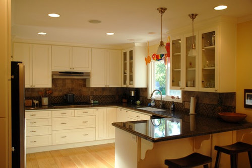
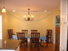
Our dining area is open to the kitchen but has no window. It has been "Butter" yellow for about 5 years. It seems too yellow to me and I'd like to use something warm but neutral. I have used Restoration Hardware's Latte in another and LOVE the color. What is a warm cream color one could use on dining room/ kitchen walls?

Comments (38)

  • 12 years ago
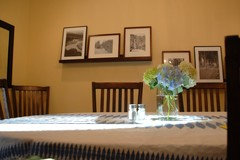
    the dining area
  • PRO
    12 years ago
    Take a look at Valspar's Historic colors collection. It has some that I would consider warm neutrals. One in particular is called Cincinnatian Hotel Briggs Beige. A lighter one, that we used in our kitchen remodel was called Cincinnatian Hotel Hannaford. We actually used Sherwin Williams paint but had them mixed to the Valspar colors.
    mom2co thanked Creative Visual Concepts, Kevin Strader
  • 12 years ago
    Thank you!!!
  • 12 years ago
    Look at Benjamin Moore's Elmira White.
    mom2co thanked User
  • 12 years ago
    http://www.benjaminmoore.com/en-ca/paint-color/elmirawhite
    this is the Elmira White. It doesn't look creamy like butter on my computer.
    here is a creamy white
    http://www.benjaminmoore.com/en-ca/paint-color/birminghamcream
    mom2co thanked Wendy
  • 12 years ago
    Benjamin Moore Linen.
    mom2co thanked fos5
  • 12 years ago
    wonderful. thanks you all. will try on large poster boards soon!
  • 12 years ago
    Farrow & Ball have some extraordinary whites - would you consider Dimity?
    Toronto Restoration · More Info

    Architecta Interiors · More Info

    Toronto Restoration · More Info
    mom2co thanked bubblyjock
  • 12 years ago
    VERY pretty but does look a little "yellowy" to me. will have to test on walls. Thank you!
  • 12 years ago
    I've got the F&B paint chip book here, and Dimity has an almost pinkish tinge - hard to describe, but the comments in the reviews on their website are often quite helpful:

    http://us.farrow-ball.com/dimity/colours/farrow-ball/fcp-product/102008
  • PRO
    12 years ago
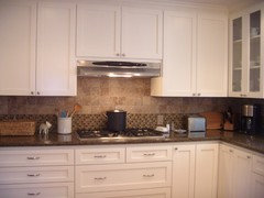
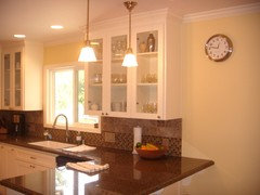
    Can we see a closer photo of your tiles? The color will have to complement them.

    I am assuming you want something darker than your cabinets, more brown tones than yellow tones, but something lighter than your dining room? Is that correct?
    mom2co thanked CDR Design, LLC
  • 12 years ago
    here are the tiles. Yes. The cabinets are an off- white so I need something darker but I do want to move away from the yellow.
  • 12 years ago
    I was even thinking possibly a grey/green/khaki but the dining room opens to two other rooms so I am looking for something neutral.
  • 12 years ago
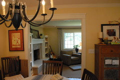
    here is another shot you can kind of see how the little dining area opens to the 2 living rooms on either side. sometimes this Butter looks really yellow.
  • PRO
    12 years ago
    Swiss Coffee is the only white that I can guarantee 2 coats will cover. When you get into brilliant whites you could be looking at 3 or more coats for proper coverage.
    mom2co thanked CertaPro Painters of North San Diego
  • PRO
    12 years ago
    Here is a nuetral that has a subtle green in it to bring out the green in your tile. [houzz=
    Coastal Fog 976 Paint · More Info
    ]
  • 12 years ago
    OK I'm opening this up for discussion again. I am worried a cream color may turn this little room into one big cream box. The cabinets are off-white so I'm thinking a darker color may be necessary. Any suggestions?
  • 12 years ago
    not a great picture but you can see the dining area connected to the kitchen. TIA!
  • 12 years ago
    Can you pull a color out of the counter top that can stand alone?
  • 12 years ago
    Benjamin Moore CC140 barely beige is a neutral warm color that appears to work well with you tile. You cabinets actually look like a warm off white so your wall color should be a bit darker so the colors don't run together but compliment each other..
  • 12 years ago
    is this helpful?
  • 12 years ago
    that shaker beige is pretty
  • 12 years ago
    I love a Valspar color called Oatbran. I have my dining room painted that color and plan to use it in my small bath as well. It is a nice beigy, neutral color but is not weak.
    mom2co thanked dstemple1956
  • 12 years ago
    BM Standish White would be really pretty in a kitchen
    Master suite · More Info
    mom2co thanked trebinje
  • 12 years ago
    Benjamin Moore's Hepplewhite Ivory is the best one I've ever found.
    mom2co thanked Another Thyme
  • PRO
    12 years ago
    The reason I chose Shaker Beige is because:

    -I have used it numerous times and it has no green or red or yellow undertones (many beiges do)
    -It feels warm, without feeling dark.
    -It appears to complement your counter and tile.

    Having said that, choosing paint color is difficult online, because monitor colors are not necessarily accurate. So, when choosing your color, choose a few paint chips that you think will work. Narrow it down to 2 or 3. Then paint a piece of drywall with those colors. Move them around the room at different times of day. Then make your choice.
    mom2co thanked CDR Design, LLC
  • 12 years ago
    I'm considering these BM "darker" neutrals to go in my master bathroom which has tile similar to your backsplash. Then you can add any color accessories.
  • 12 years ago
    last modified: 12 years ago
    You really have to look and test samples of the paint colors in your dining room. Heppplewhite is very yellow which you say you do not want. Barely beige CC-140 is not yellow but is warm and Shaker beige HC45 is darker and not yellow. Try them before purchasing gallons.
    mom2co thanked fos5
  • 12 years ago
    We used Sherwin Williams paint with a Behr color "Creamy White" on the cabinets and it is just off white enough to not look like stark hospital white, but does not appear "yellowy" next to white appliances. We put oil-rubbed bronze hardware with it and it looks great!
  • 12 years ago
    B Moore wool skein or B Moore relaxed knack the wool skein is lighter and both colors pick up whatever colors you have in your room and they go with every color
  • 12 years ago
    Kaki sorry can't spell
  • 12 years ago
    Looking at your room again, floor, furniture, kitchen cabinetry, tile all appear in picture to be very warm. Think perhaps its needs to cool down a little. Check out BM Revere Pewter, it is an between color that seems to be a very versatile neutral. Buy a ittle sample pot and paint in two different spots in the room, where the natural light hits it and where it does not, look at it in the day light and at night under artificial light to determine if you really like it. Do the same with other choices as well.
  • 11 years ago
    have not painted yet! does anyone know how to do a mock-up with coastal fog on these walls? I'd love to get some idea of what it may look like before I paint. Thank you!
  • 11 years ago
    another angle
  • PRO
    11 years ago
    You can go to Benjaminmoore.com and paint a generic room "coastal fog" or you can upload a photo of your own room.


    http://www.benjaminmoore.com/en-us/for-your-home/personal-color-viewer

    However, colors online are not true. I would highly recommend you buy a 2x2 piece of drywall and a sample jar of coastal fog. Paint the drywall. Move it around the room at different times of day.

    I think it is going to look good.
  • 11 years ago
    Hi I used Sherwin Williams Dover white and love it. I like that its not to white/stark. It has a nice warm feel to it. Best of luck.
  • 11 years ago
    I have cream hand painted kitchen and a black starlight Galaxy worktop with an upstand,
    I'm not sure what colour tile and type of tile I should use on the wall.
    I do not want to takeaway from the worktop. Any ideas please.
Sponsored
AIS Renovations
Average rating: 4.5 out of 5 stars15 Reviews
Custom Craftsmanship & Construction Solutions in Franklin County, Ohio