Software
Houzz Logo Print
sbak24

Is this too much?

12 years ago
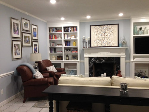
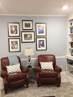
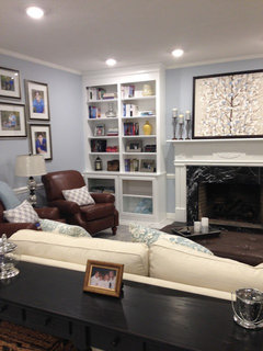
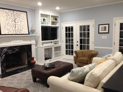
I put some photos on this bare wall yesterday but now feel it is kind of busy. Maybe just because of bookcases? When I look at it without view of bookcases, it looks ok. Any suggestions appreciated!

Comments (49)

  • 12 years ago
    They look like wonderful family photos so they should go somewhere in your home. To my taste, I agree that it looks a little busy. I have two suggestions - 1) replace them with a mirror or 2) reorganize the little things on the shelves. Maybe some more books and less little things and leave the pictures. Take everything off the shelves and replace them a few at a time and see when it starts to look "busy." The room is absolutely beautiful.
  • PRO
    12 years ago
    I personally think that the photos look great! But I would remove some items from the bookcases though! Beautiful room....love your color choices.... :)
  • PRO
    12 years ago
    You are correct. The focal point is the fireplace and these are looming larger than that. In addition, every room needs a resting wall with no pictures.

    A mirror might work here…….or try nothing.

    Can you use the photos somewhere else?

    Bookcases: put the books across the bottom shelves. Leave a few shelves empty. Spray paint all your vases the same color, so that they look collected.
    .
    …..almost there!
  • 12 years ago
    Just a thought- is there a rule not to put family photos in "formal" living room? Was going to place a piece of art above this sofa but could move photos to this wall and replace with a mirror only in that room. Note- ottoman is getting reupholstered in the fabric on top.
  • PRO
    12 years ago
    Hi,

    Cannot see an ottoman. Nor can I see fabric "on top". Did you mean to post a photo?

    I don't believe in design "rules", but there are guidelines. For the most part, guests do not like staring at your personal pictures. My opinion is that family photos are best left to areas where you spend most of your time….an office, bedroom, etc.

    I realize others may have differing views.

    Your room is very calm an peaceful. I would not add extra art to that wall, since it competes with the fireplace.

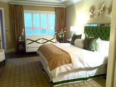
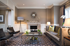
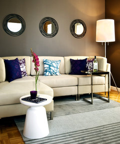
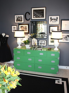
    Inspiration:

    I would recommend something like 2 or 3 large silver platters or starbursts
    houzz=
    Dallas project · More Info
    [houzz=
    North Toronto Living Room/Dining Room · More Info
    [houzz=
    Queens · More Info
    ]
  • 12 years ago
    I like your room a lot! Your photos are all portraits, aren't they? I think if you mixed them a little maybe with letters or a mirror or a couple of smaller frames, they would look less "busy". You've done a wonderful job so far though!
    Green and Gray Home Office · More Info
  • 12 years ago
    Bookcases too busy and I'd do fewer large pics.
  • 12 years ago
    Yes, was trying to attach photo but will not let me for some reason. Love the mirrors above sofa in your suggestion cdrdesign!
  • 12 years ago
    last modified: 12 years ago
    If you want to try styling the bookcases by the "rules" it is usually 1/3 books (standing, lying or propping/lifting other items,) 1/3 decor items (large ones or threes grouped,) 1/3 open space. I personally think it looks better when visually weightier items such as large books or encyclopedic volumes are on the bottom as an anchor. If they go up top with lighter visual items below, your eye gets the impression that there is no balance and that the upper weighty part may come down and crush the lower lighter part. Standing back from the arrangement and squinting your eyes can often reveal where the light/heavy arrangement is/is not working. As for the rest of the room, I agree with those who feel that family photos are not really for public exhibition. I do make the exception if you have a large framed matted professional photo of the entire family. That can even be nice above the mantel, but with all the squares in your space, I'd prefer a starburst mirror over yours. Is your TV mounted on a swivel base or wall swing-arm? That might make it easier to adjust for viewing, even when furniture is arranged differently. Your sofa on the wall would look good with the art now over the mantel. The loungers would go in the sofa's place. Have you considered adding a pair of swivel accent chairs? They'd be nice opposite the sofa or could flank the FP in warm weather.
  • PRO
    12 years ago
    Very nice colors. The too much is up to you stuff less stuff. It is what makes you happy.
  • 12 years ago
    If you like a more neutral and calming look, you can always try wrapping your books in white or kraft paper and/or reprinting the photos in black and white. I also think your room is stunning!!

    Good luck~
  • 12 years ago
    Totally didn't think of that! Thanks!
  • 12 years ago
    I think the room is beautiful, well done!
  • 12 years ago
    Beautiful room, but yes, to my eye it's getting a little busy. I'd move those family photos to an office, bedroom or hallway and take about a third to half the stuff off the shelves. If you choose to decorate the wall where the photos are, maybe a single item or just a pair would be nice since the shelves provide such a look of "multiples". The art over the fireplace looks just great next to the shelves for that reason.
  • 12 years ago
    I think this looks great but maybe you think it is too busy because there are to many boring colors. Add more pizzaz and make sure the room is not messy(kids clothes, open books ect.) and your room looks fine!
  • PRO
    12 years ago
    A quick fix would be to reorganize the bookshelf as suggested by other readers. My suggestion would be to create a "book of walls," put the vases on the table behind the sofa, organizing all the glass pieces in one place to give it a nice color variation and use the bookshelf just for books. Put enough books to fill up the space and make it look like a "wallpapered" wall. As far as the family photos, I'd move one to a different part of the wall and rearrange five of them or even down to four. Looks good, love the color combinations.
  • PRO
    12 years ago
    last modified: 12 years ago
    -- A beautiful room!
    Regarding the portraits, 2 things to try.

    Hang them in a very simple orientation so that the images become the focus, not how cleverly they are grouped.

    Have them printed in black/white. This will elevate them to "fine art". Color photos belong in less formal settings. This will also work better with your palette. Existing frames and matts are good with new b/w prints. Can you see that b/w prints will coordinate better with the artwork over your mantle, the marble fireplace surround,with the black tv screen, white sofa and dark woods?

    The bookcase should be either filled to capacity or left "hungry" with perhaps one object from a carefully curated collection on each shelf. If you decide to use books, choose the color of the spines and covers carefully, from your palette. Sets if books work wonderfully. Find some bookends that are interesting. You can buy boxes of used books on the internet and specify colors - some include free shipping. Google "books by the yard" for purchasing boxes of used books, then Google "Arranging bookshelves" for tons of ideas. Thrift shops, flea markets are a rich source of used books too. Place a beautiful book cover facing forward, maybe on a stand? Don"t get too tricky though. You can enter "clutter- land" quickly doing that! A great small set of books would work on your console table too - pull a few books out of the bookcase and out into the room. Group with a piece of sculpture, for example.
  • 12 years ago
    I love the photo's The bookcase's have to much on them visually. Also try moving the sofa to that wall and chairs facing the fireplace. I love your wall color and your painting. I think maybe the darker chair and the bookcase may be throwing your eye off. Making it look crowded. I love your room. Just a little to busy on the book shelves.
  • 12 years ago
    Bookcase too busy, too many colors that draw your eye away from the focal point the fireplace. Glass bottles on the left of the firplace allows the eye to move across it and not fixate to it. Just edit. The family pictures are a bit distracting but I think it is the way the center ones are hung, with the step up of the center pictures. It is a family room so I guess it is acceptable to have your family pictures in there. With those pictures, the dark brown chairs and the busy book case it appears very busy , heavy and unbalanced on that side of the room compared to the rest of the room.
  • 12 years ago
    Books by the yard? By color?
    Say it isn't so
    Snif
  • PRO
    12 years ago
    If you can take a closer photo of the bookshelves, I can give you a step-by-step of what to put where. It may not be perfect, but we can tweak it. I am sure others will chime in.

    Do you have any more vases?
  • PRO
  • 12 years ago
    I think your room is beautiful. I like the splashes of colour on the shelves -- yellows, blues and reds. I would love to sit there.
  • 12 years ago
    The strange thing about the room is everything is top heavy -- the pictures are weighted to the top of the room. The book shelves are weighted to the top of the shelves and the fireplace itself it also drawing the eye up to the ceiling. I would try to rework the bookcase a bit and move the pictures across the space instead of stacking everything the same width and heft as the book case and the fire place.
  • 12 years ago
    Cdrdesign, I will post a close up when I get home this afternoon. I have one on my phone but it is not letting me upload for some reason. I rearranged a little last night and it looks a little better. Will post that as well. Thanks!
  • PRO
    12 years ago
    Oh great. Can't wait to see!
  • 12 years ago
    I think it looks great! Keep it.
  • 12 years ago
    I would remove the photos from this lovely room and put them in a more family-friendly room.
  • PRO
    12 years ago
    sbak24, your question about family photos is one of those issues that people feel very strongly about, pro or con. In my experience cultural background plays into it. The designer instructing an extended course I took was of Middle Eastern extraction and stated in no uncertain terms that personal photos and books are to be displayed only in personal spaces. I disagree, but respect the clients' wishes on this. To me, a home should reflect how you live, what you love, and if that includes family members (I hope!) and books (you bet), then include them in your overall scheme. I do suggest paying attention to what the photos and books communicate about your private life and how you want visitors to understand your world. Try not to be obviously showing off or hiding, and pick items that give you pleasure when your eye falls upon them, or invites a conversation.
  • 12 years ago
    cdrdesign like your suggestion to spray paint all you vases the same color to look like a collection. An inexpensive fix.
  • PRO
    12 years ago
    Right…unless some of them are valuable pieces. There are some easy and great spray paints out there…metallic look, leather look, etc.
    [houzz=
    Cary Bernstein Architect Choy 1 Residence · More Info
    ]
  • 12 years ago
    last modified: 12 years ago
    cdrdesign, Just did some today with metalics and got a mercury glass effect.
  • 12 years ago
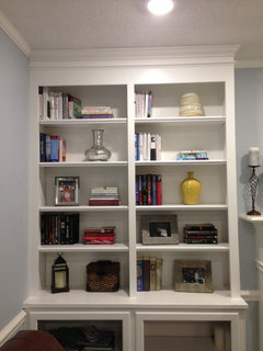
    Cdrdesign- finally home. Moved the books somewhat. On the bottom, I do have some glass coming which has a soft white design, so you won't be able to see what's inside. Thanks for all of your help!
  • PRO
    12 years ago
    Okay…..sort of a translucent glass on the bottom that will hide what is in there?

    Shelves:

    I think the shelves are much better. Here is an idea that might be an easy solution for you.

    -make the top left, middle right (where yellow vase is) and bottom left (where lantern and box is) the "vase" shelves. Other shelves will be empty or have books. The lantern and little box are just confusing things and I don't' see them belonging. Largest books on bottom.

    -if you want the photos on the shelves, group them on one shelf.

    Photo group on wall:

    Nice looking family! If you want to keep the photos there, I would recommend a long single row. If the boy/boy and girl/girl are the same person, maybe you could just hang one of each of them?

    Good progress!
  • 12 years ago
    Thank you! Will try your suggestions. And no, it is 4 different children lol!
  • PRO
    12 years ago
    Well, they are thoughtful kids. They were kind enough to wear blue in anticipation of your future living room paint color.

    Seriously, four across is worth a try. It will look much more contemporary that wayl Maybe the dog photos some where else?
  • 12 years ago
    I have nothing constructive to add as you are already better at decorating than I am, but your room layout looks similar to mine, and I would love to see a photo of the space across from the two chairs! I'm always looking for ideas for my room :-)
  • 12 years ago
    Emily B: thanks- definitely but off more than I could chew with my project. Still 2 rooms to go!
  • 12 years ago
    I see another yellow vase to the right of the fireplace. I'd definitely put that one with the other yellow one as a pair.
  • 12 years ago
    I disagree with those telling you to remove the family pictures to another room. I think that they look quite lovely over the sofa.
  • 12 years ago
    last modified: 12 years ago
    What is......bothering.......me about the photo arrangement is having it look like it is all centered around the lamp. While I realize the ones in the middle were probably put up higher so the lamp would not hide them, when I see that wall straight on, it just makes the lamp look too important. I do, though, love the pics in this room and how you have them framed and matted. Any way to lower those middle two to just be centered with the outer ones and forget about the lamp for a bit?
  • PRO
    12 years ago
    You are getting there!! Better to get it right.

    Abbyjean makes a good point about the lamp. I would just remove the lamp. I don't think you have to have one there. Or you could place a table on either side of the chairs with low lamps on each side. Additionally, you could add a couple of low, squatty lamps on the console table behind the couch. I am seeing only one lamp in the entire room. Is that right?

    fireplace: the art and surroundings are not linked. I would hang the art. Then, you can try moving the candles and the jar, so that they flank the art. That might help. So, the candles should sort of overlap the art. The jar should as well. Whatever the blue thing is on the mantle, it is sort of getting lost. Can you fill the jar with more of the silver balls?
  • 12 years ago
    Thanks for the picture! I think you have a beautiful room. What is the paint color?
  • 12 years ago
    Other than the lamp between the chairs I don't see any lamps elsewhere is the room which is needed. Ceiling lighting is general lighting but need ambient and task to complete any room. Not very cosy sitting under ceiling pot lights.
  • 12 years ago
    I know we're getting very picky now, but I like where CDR is going with the firplace and abbyjean with the family photos. I'd also hang the fireplace art, centered in height so there is a few inches of wall space above and below it. Then as CDR said, I'd scooch the jar and candles in to overlap the art a bit. I'd remove the blue object.
    If you plan to keep the family photos in the room (I must agree they are framed very nicely for the spot), I'd leave the outer four as they are, move the larger center one centered between the top two height wise so the top will be a bit lower then the two on each side. Then place the smaller center one centered below that (the same vertical distance that is between them right now). I know it's often a rule of thumb to have the larger item on bottom, but that's frequently not followed and looks great. In this case, I think it will look best to have the smaller item on the bottom. I'd definitely leave the lamp!
  • 12 years ago
    Any updates?