

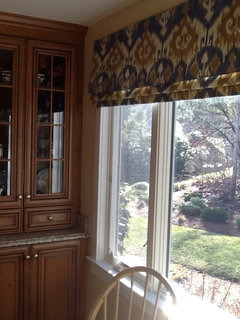
Kitchen Paint color suggestions
12 years ago
Featured Answer
Sort by:Oldest
Comments (16)
 12 years ago
Related Professionals
Vineland Interior Designers & Decorators · Frisco Interior Designers & Decorators · Gary Interior Designers & Decorators · Lima Interior Designers & Decorators · Monroe Interior Designers & Decorators · Albuquerque Interior Designers & Decorators · Evanston Interior Designers & Decorators · Chambersburg Architects & Building Designers · Plattsburgh Architects & Building Designers · Sioux Falls Architects & Building Designers · Shreveport Kitchen & Bathroom Designers · Kansas City Kitchen & Bathroom Designers · Waterloo Kitchen & Bathroom Designers · Bend Kitchen & Bathroom Designers · Jackson Kitchen & Bathroom Designers 12 years ago
 12 years ago
 12 years agolast modified: 12 years ago
- 12 years ago
- 12 years ago
 12 years ago
- 12 years ago
 12 years ago
 12 years ago
- 12 years ago
- 12 years ago
 12 years ago
 12 years ago
- 12 years ago

Related Stories
LIFEInviting Kids Into the Kitchen: Suggestions for Nurturing Cooks
Imagine a day when your child whips up dinner instead of complaining about it. You can make it happen with this wisdom
Full Story
HOUZZ TOURSHouzz Tour: Nature Suggests a Toronto Home’s Palette
Birch forests and rocks inspire the colors and materials of a Canadian designer’s townhouse space
Full Story
LANDSCAPE DESIGN6 Suggestions for Harmonious Hardscaping
Help a sidewalk, driveway or path flow with your garden design, for a cohesive and pleasing look
Full Story
GREEN BUILDINGEfficient Architecture Suggests a New Future for Design
Homes that pay attention to efficient construction, square footage and finishes are paving the way for fresh aesthetic potential
Full Story
MOST POPULAR8 Great Kitchen Cabinet Color Palettes
Make your kitchen uniquely yours with painted cabinetry. Here's how (and what) to paint them
Full Story
COLORCrazy for Color? Your Kitchen Cabinets Want In
Make over your kitchen in spectacular fashion with just colorful cabinet paint? Now there's a bright idea
Full Story
MOST POPULARFrom the Pros: How to Paint Kitchen Cabinets
Want a major new look for your kitchen or bathroom cabinets on a DIY budget? Don't pick up a paintbrush until you read this
Full Story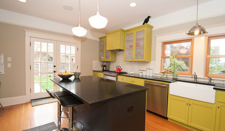
KITCHEN DESIGNKitchen of the Week: What a Difference Paint Can Make
A bold move gives a generic Portland kitchen personality without a major overhaul
Full Story
COLOR12 Tried-and-True Paint Colors for Your Walls
Discover one pro designer's time-tested favorite paint colors for kitchens, baths, bedrooms and more
Full Story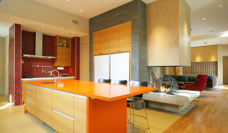
KITCHEN DESIGNPalatable Palettes: 8 Great Kitchen Color Schemes
Warm and appetizing or cool and relaxing? These 8 paint palettes can help you choose the best colors for your kitchen
Full Story




Maggie K