

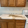
Kitchen backsplash
12 years ago
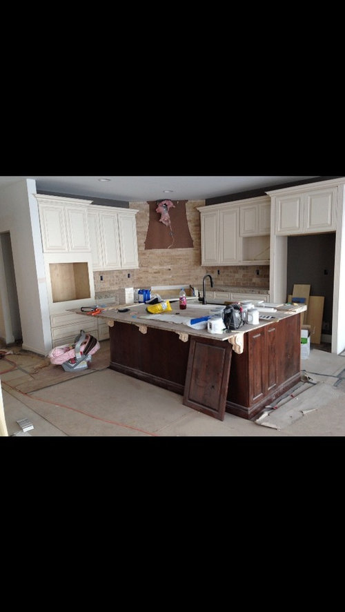

As is

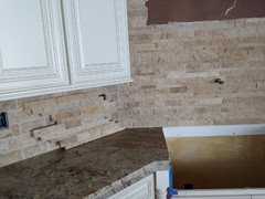
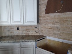
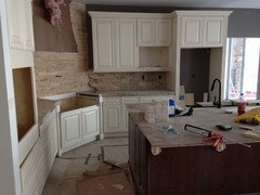
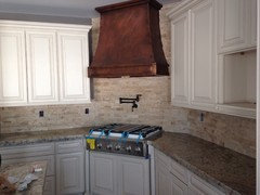
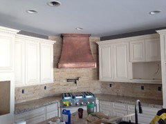
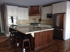
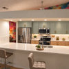
Remove subway tile and do whole kitchen in stacked stone.
Featured Answer
Sort by:Oldest
Comments (25)
Related Professionals
Winston-Salem Design-Build Firms · Tulsa Design-Build Firms · Killeen Design-Build Firms · Lufkin Design-Build Firms · San Antonio Design-Build Firms · Bemidji Design-Build Firms · Longview General Contractors · Sugar Land General Contractors · Texarkana General Contractors · Moline General Contractors · Quincy Flooring Contractors · Saint Joseph Flooring Contractors · Aiken Flooring Contractors · Lynchburg Flooring Contractors · Augusta Flooring Contractors 12 years ago
- 12 years ago
 12 years ago
- 12 years ago
- 12 years ago
 PRO12 years ago
 PRO12 years ago
 PRO12 years ago
 PRO12 years ago
- 12 years ago
 PRO12 years ago
 12 years ago
- 12 years ago
- 12 years ago
- 12 years ago
- PRO12 years ago
- 12 years ago
- 12 years ago
- 12 years ago


Related Stories
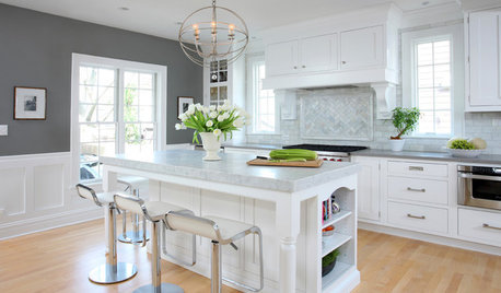
KITCHEN DESIGNHow to Add a Kitchen Backsplash
Great project: Install glass, tile or another decorative material for a gorgeous and protective backsplash
Full Story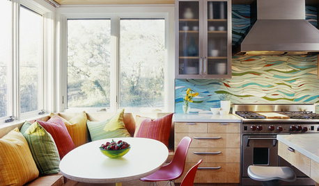
KITCHEN DESIGNKitchen of the Week: Exquisite Artistic Backsplash
Rippling colored glass forms an imaginative wall, while a clever layout embraces practicality in this stunning Texas kitchen
Full Story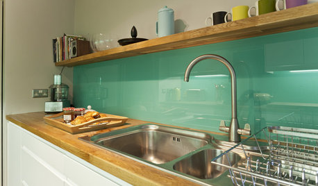
KITCHEN DESIGNHow to Pick a Kitchen Backsplash That Wows
Design your ideal backsplash with help from these Houzz guides and inspiring ideas for every kitchen style
Full Story
KITCHEN BACKSPLASHES10 Top Backsplashes to Pair With Concrete Counters
Simplify your decision making with these ideas for materials that work well with concrete
Full Story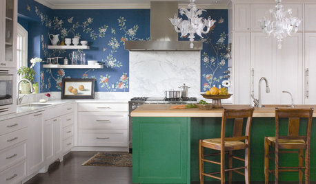
KITCHEN DESIGNTry a Shorter Kitchen Backsplash for Budget-Friendly Style
Shave costs on a kitchen remodel with a pared-down backsplash in one of these great materials
Full Story
MATERIALSKitchen Ideas: How to Choose the Perfect Backsplash
Backsplashes not only protect your walls, they also add color, pattern and texture. Find out which material is right for you
Full Story
KITCHEN DESIGNCountertop and Backsplash: Making the Perfect Match
Zero in on a kitchen combo you'll love with these strategies and great countertop-backsplash mixes for inspiration
Full Story
KITCHEN DESIGNHouzz Quiz: Which Kitchen Backsplash Material Is Right for You?
With so many options available, see if we can help you narrow down the selection
Full Story
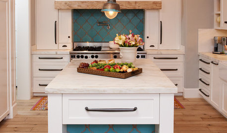
KITCHEN DESIGN10 Gorgeous Backsplash Alternatives to Subway Tile
Artistic installations, back-painted glass and pivoting windows prove there are backsplash possibilities beyond the platform
Full Story


Elizabeth Julian