Software
Houzz Logo Print
gtcontractors

What home do you like best?

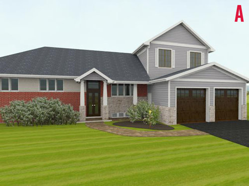
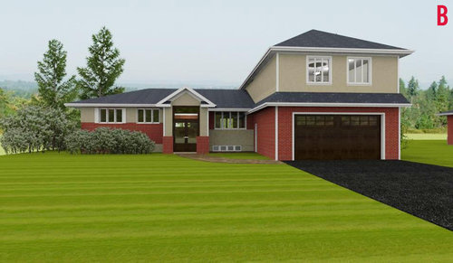
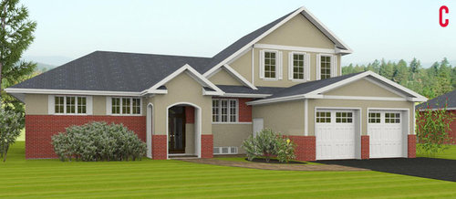
Between these 3D renderings of the same house, which one would you go for: A, B or C? and why?

Comments (51)

  • 12 years ago
    C.
    Greater Toronto Contractors thanked armygirl1987
  • PRO
    12 years ago
    last modified: 12 years ago
    C, but you need to edit some of the applied brick trim and the multi colors.

    Honestly? The house looks way too “new” and has no integrity.

    Vinyl shutters which do not fit; those garage doors could be upgraded. I would suggest some better landscaping.
    Greater Toronto Contractors thanked JudyG Designs
  • 12 years ago
    C
    Greater Toronto Contractors thanked Rachel H
  • 12 years ago
    C - looks great
    Greater Toronto Contractors thanked goodie04
  • PRO
    12 years ago
    C if you change the style of the archway.
    Greater Toronto Contractors thanked Megan Summer Studios
  • 12 years ago
    last modified: 12 years ago
    Gee, is there a house behind this garage???

    None. There are far are better ways of handling an attached garage.
    Greater Toronto Contractors thanked Architectrunnerguy
  • 12 years ago
    C.....A is ALL garage!
    Greater Toronto Contractors thanked cindytibs
  • PRO
    Greater Toronto Contractors thanked Pepe Calderin Design- Modern Interior Design
  • 12 years ago
    C. I like the continuity of the materials.
    Greater Toronto Contractors thanked User
  • 12 years ago
    I don't like the garage either....
    Greater Toronto Contractors thanked kadodi
  • 12 years ago
    C. Garage does not stand out as much.
    Greater Toronto Contractors thanked Traci Phillips
  • PRO
    12 years ago
    Definitely "B" but with black trim, gutters and front door pillars.
    Greater Toronto Contractors thanked Traditional Log Homes Ltd
  • 12 years ago
    C. It looks more in style. B is all garage a FROG. A is okay.
    Greater Toronto Contractors thanked grobby
  • 12 years ago
    Not sure on any, C is best but looks really angry. A has nice elements but it looks like two different houses joined together. B does look like a frog, lol!
    Greater Toronto Contractors thanked jessegee
  • PRO
    12 years ago
    last modified: 12 years ago
    C. It's the only one with a garage/upper level that looks like it's part of the house. However, the 1/2 roof line on the upper level looks odd. I would also lower the brick on the house to match the height of the brick on the garage. Also -- remove the brick that's surrounding the window at bottom/center. The roof line is unbalanced and the brick is uneven.

    Christi, on behalf of Thos. Baker
    Greater Toronto Contractors thanked Thos. Baker
  • 12 years ago
    C.
    Greater Toronto Contractors thanked pcmom1
  • 12 years ago
    C
    Greater Toronto Contractors thanked Ann
  • 12 years ago
    C blends the second story over the garage better into the design.
    Greater Toronto Contractors thanked Stacey at Dohiy.com
  • 12 years ago
    Hope my screen is showing these correctly. If so...

    ~A - Would like it better if the brick was replaced with the stone. The paint to the left of the front door seems like it should be the same as the gray on the siding to the right..or is it? There's too much going on with both the red brick and stone. They don't seem to have anything to do with each other. The stone looks better with the gray siding and roof. Also don't like the brown garage and front door with gray siding and roof.

    ~B - No.

    ~C - Like the design better, along with the paint and roof color. The all-red brick is distracting with them to me.
    Greater Toronto Contractors thanked chloebud
  • 12 years ago
    C.
    Greater Toronto Contractors thanked Ginger Kelly
  • 12 years ago
    C if I had to pick one, but it kind of looks like a house with an identity crisis in all three.
    Greater Toronto Contractors thanked Eliza Jane Darling
  • PRO
    12 years ago
    B, because of the "double-wide" (for lack of better words) garage door which makes parking wide vehicle,s like minivans and full-size SUVs, easier. At the same time it reminds me of a robot's face: two eyes and a large mouth. Then it'll look like it's eating or spitting out the cars. I have an imagination.
    Greater Toronto Contractors thanked ChromaCurve
  • 12 years ago
    C
    Greater Toronto Contractors thanked Snaggy
  • PRO
    12 years ago
    D....
    Greater Toronto Contractors thanked Umid Karimov
  • 12 years ago
    A with garage from C.
    Greater Toronto Contractors thanked Tracey Conwell
  • 12 years ago
    A with garage from C. Might need to alter shutters to either have em everywhere or not at all. But don't use tapered column. Might be able to use a square beam column. A is more graceful entrance with more natural light. And the other covered ones are so tired and routine.
    Greater Toronto Contractors thanked Tracey Conwell
  • 12 years ago
    Oh come on people!

    Do you all really think "better landscaping", "change style of archway", "black trim", "lower the brick on the house", "replace brick with stone", "altering shutters", "square beam column", etc. are really going to help this trainwreck?

    That kinda like the Texans saying "Gee, if we can get just one more guy down to the Alamo I think we're gonna be OK!".
    Greater Toronto Contractors thanked Architectrunnerguy
  • 12 years ago
    last modified: 12 years ago
    I prefer C. The look is more balanced than the other options.
    Greater Toronto Contractors thanked Kastellyg G
  • 12 years ago
    Just to throw it out there - C with a hint of A? The white garage doors kind of remind me of 1950's gloves. Are the shutters a bit like that final accessory you should actually take off??
    Greater Toronto Contractors thanked kt20
  • 12 years ago
    C looks much more balanced to me.
    A looks like two different houses pushed together and there's too much brick on the left.
    B looks too bulky on the right, the garage door is too dark and the little roof around the garage looks strange,
    Btw I do realise that there are very nice looking houses where there's a mix of materials or where one side is larger than the other, but to work it needs to be balanced, I'm not sure exactly what the art to achieving that is, but of these three examples it's C that looks balanced to me.
    Greater Toronto Contractors thanked macyjean
  • 12 years ago
    C ... with the stone from A
    Greater Toronto Contractors thanked indianpatti
  • 12 years ago
    C. It feels different, less industrial.
    Greater Toronto Contractors thanked housedresser2013
  • 12 years ago
    C
    Greater Toronto Contractors thanked jakartaray
  • 12 years ago
    I also vote for C, which best blends what I suspect will be (or looks like) an addition.
    Greater Toronto Contractors thanked ceeemdee
  • PRO
    Greater Toronto Contractors thanked Staged for Perfection
  • 12 years ago
    C....it is the most fluid design
    Greater Toronto Contractors thanked Timmys Girl
  • 12 years ago
    I love C. What a stunner of curb appeal!
    Greater Toronto Contractors thanked smfmom
  • 12 years ago
    C, but.
    One big garage door not two little ones.
    Lose the multipane windows and the weird dimension shutters.
    Lose the arching and heavy columns on the front entry; square and lighter posts and done in the trim colors.
    On the upper right chunk there's a false roofline/gable line there in white, Lose that.
    Just below that false line, there's brick with windows then siding, reverse to the windows being in wood and the brick below like the rest of the house.

    A looks like someone already added on twice and I don't want something that's that heavily remodeled. And the upper right bit is out of scale, it looks too small.
    B I don't like living space over the garage... especially if there's piping in that garage ceiling.
    Greater Toronto Contractors thanked User
  • 11 years ago
    C had the most amount of shell with great color combinations.
  • 11 years ago
    Maybe C but I'm not a big fan or all red brick and "in your face" garages.
  • 11 years ago
    C
  • 11 years ago
    C.... its the only one that doesn't look like an addition, I would you raise the entry way arch, and brick the whole wall (the one where the brick is surrounding the windows), so you don't have so many little patches of brick... I love brick, but maybe a little softer, to my eye?.
  • 11 years ago
    None. All three look like a ranch that has been added on to. I do not like the red brick on any of them. Like the stone from A. Like that the "addition" is more tied into the "original" house in C, but is still not quite right. Like the more substantial portico and garage trim in C.
  • 11 years ago
    None of these are my style, but C seems to incorporate the roof line the best.
  • PRO
    11 years ago
    C
  • 11 years ago
    C. Just seems more cohesive...the other two look like an "addition" was added above the garage, no very balanced. But is C is balanced well and has a nice feel to it.
  • 11 years ago
    C appears more substantial and the kerb appeal more pleasing to the eye.
  • 11 years ago
    C
  • 11 years ago
    C
Sponsored
Haus Studio
Average rating: 4.8 out of 5 stars28 Reviews
Franklin County's Preferred Custom Cabinetry & Design Studio