
Search results for "'the profession" in Home Design Ideas
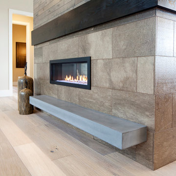
 Sound Concrete Countertops
This particular piece is a raised hearth at the entry to the home. It is another massive, seamless piece for the 2013 NW Idea House by Zetterberg Custom Homes. Photo Patrick Hagerty
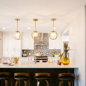
 TVL Creative Ltd.
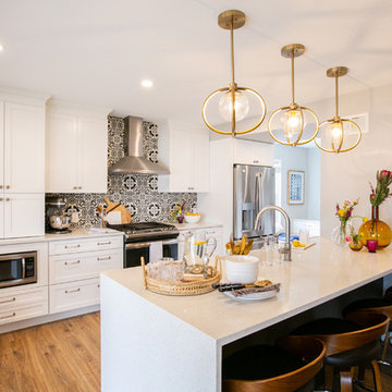
Cramped kitchen be gone! That was the project motto and top priority. The goal was to transform the current layout from multiple smaller spaces into a connected whole that would activate the main level for our clients, a young family of four.
The biggest obstacle was the wall dividing the kitchen and the dining room. Removing this wall was central to opening up and integrating the main living spaces, but the existing ductwork that ran right through the center of the wall posed a design challenge, er design opportunity. The resulting design solution features a central pantry that captures the ductwork and provides valuable storage- especially when compared to the original kitchen's 18" wide pantry cabinet. The pantry also anchors the kitchen island and serves as a visual separation of space between the kitchen and homework area.
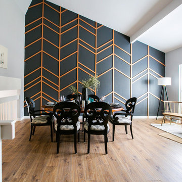
Through our design development process, we learned the formal living room was of no service to their lifestyle and therefore space they rarely spent time in. With that in mind, we proposed to eliminate the unused living room and make it the new dining room. Relocating the dining room to this space inherently felt right given the soaring ceiling and ample room for holiday dinners and celebrations. The new dining room was spacious enough for us to incorporate a conversational seating area in the warm, south-facing window alcove.
Now what to do with the old dining room?! To answer that question we took inspiration from our clients' shared profession in education and developed a craft area/homework station for both of their boys. The semi-custom cabinetry of the desk area carries over to the adjacent wall and forms window bench base with storage that we topped with butcher block for a touch of warmth. While the boys are young, the bench drawers are the perfect place for a stash of toys close to the kitchen.
The kitchen begins just beyond the window seat with their refrigerator enclosure. Opposite the refrigerator is the new pantry with twenty linear feet of shelving and space for brooms and a stick vacuum. Extending from the backside of the pantry the kitchen island design incorporates counter seating on the family room side and a cabinetry configuration on the kitchen side with drawer storage, a trashcan center, farmhouse sink, and dishwasher.
We took careful time in design and execution to align the range and sink because while it might seem like a small detail, it plays an important role in supporting the symmetrical configuration of the back wall of the kitchen. The rear wall design utilizes an appliance garage mirrors the visual impact of the refrigerator enclosure and helps keep the now open kitchen tidy. Between the appliance garage and refrigerator enclosure is the cooking zone with 30" of cabinetry and work surface on either side of the range, a chimney style vent hood, and a bold graphic tile backsplash.
The backsplash is just one of many personal touches we added to the space to reflect our client's modern eclectic style and love of color. Swooping lines of the mid-mod style barstools compliment the pendants and backsplash pattern. A pop of vibrant green on the frame of the pantry door adds a fresh wash of color to an otherwise neutral space. The big show stopper is the custom charcoal gray and copper chevron wall installation in the dining room. This was an idea our clients softly suggested, and we excitedly embraced the opportunity. It is also a kickass solution to the head-scratching design dilemma of how to fill a large and lofty wall.
We are so grateful to bring this design to life for our clients and now dear friends.
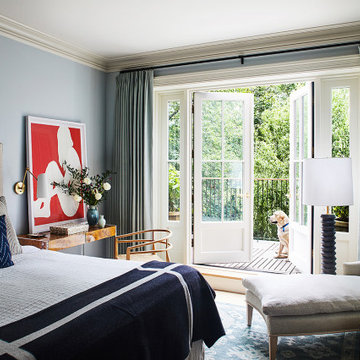
 The Brooklyn Studio
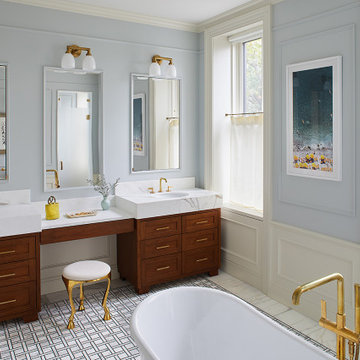
This Cobble Hill Brownstone for a family of five is a fun and captivating design, the perfect blend of the wife’s love of English country style and the husband’s preference for modern. The young power couple, her the co-founder of Maisonette and him an investor, have three children and a dog, requiring that all the surfaces, finishes and, materials used throughout the home are both beautiful and durable to make every room a carefree space the whole family can enjoy.
The primary design challenge for this project was creating both distinct places for the family to live their day to day lives and also a whole floor dedicated to formal entertainment. The clients entertain large dinners on a monthly basis as part of their profession. We solved this by adding an extension on the Garden and Parlor levels. This allowed the Garden level to function as the daily family operations center and the Parlor level to be party central. The kitchen on the garden level is large enough to dine in and accommodate a large catering crew.
On the parlor level, we created a large double parlor in the front of the house; this space is dedicated to cocktail hour and after-dinner drinks. The rear of the parlor is a spacious formal dining room that can seat up to 14 guests. The middle "library" space contains a bar and facilitates access to both the front and rear rooms; in this way, it can double as a staging area for the parties.
The remaining three floors are sleeping quarters for the family and frequent out of town guests. Designing a row house for private and public functions programmatically returns the building to a configuration in line with its original design.
This project was published in Architectural Digest.
Photography by Sam Frost
Find the right local pro for your project
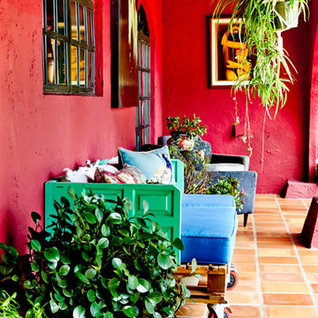
 Rikki Snyder
Photo: Rikki Snyder © 2015 Houzz
This is an example of an eclectic porch design in New York.
This is an example of an eclectic porch design in New York.
 TVL Creative Ltd.
Cramped kitchen be gone! That was the project motto and top priority. The goal was to transform the current layout from multiple smaller spaces into a connected whole that would activate the main level for our clients, a young family of four.
The biggest obstacle was the wall dividing the kitchen and the dining room. Removing this wall was central to opening up and integrating the main living spaces, but the existing ductwork that ran right through the center of the wall posed a design challenge, er design opportunity. The resulting design solution features a central pantry that captures the ductwork and provides valuable storage- especially when compared to the original kitchen's 18" wide pantry cabinet. The pantry also anchors the kitchen island and serves as a visual separation of space between the kitchen and homework area.
Through our design development process, we learned the formal living room was of no service to their lifestyle and therefore space they rarely spent time in. With that in mind, we proposed to eliminate the unused living room and make it the new dining room. Relocating the dining room to this space inherently felt right given the soaring ceiling and ample room for holiday dinners and celebrations. The new dining room was spacious enough for us to incorporate a conversational seating area in the warm, south-facing window alcove.
Now what to do with the old dining room?! To answer that question we took inspiration from our clients' shared profession in education and developed a craft area/homework station for both of their boys. The semi-custom cabinetry of the desk area carries over to the adjacent wall and forms window bench base with storage that we topped with butcher block for a touch of warmth. While the boys are young, the bench drawers are the perfect place for a stash of toys close to the kitchen.
The kitchen begins just beyond the window seat with their refrigerator enclosure. Opposite the refrigerator is the new pantry with twenty linear feet of shelving and space for brooms and a stick vacuum. Extending from the backside of the pantry the kitchen island design incorporates counter seating on the family room side and a cabinetry configuration on the kitchen side with drawer storage, a trashcan center, farmhouse sink, and dishwasher.
We took careful time in design and execution to align the range and sink because while it might seem like a small detail, it plays an important role in supporting the symmetrical configuration of the back wall of the kitchen. The rear wall design utilizes an appliance garage mirrors the visual impact of the refrigerator enclosure and helps keep the now open kitchen tidy. Between the appliance garage and refrigerator enclosure is the cooking zone with 30" of cabinetry and work surface on either side of the range, a chimney style vent hood, and a bold graphic tile backsplash.
The backsplash is just one of many personal touches we added to the space to reflect our client's modern eclectic style and love of color. Swooping lines of the mid-mod style barstools compliment the pendants and backsplash pattern. A pop of vibrant green on the frame of the pantry door adds a fresh wash of color to an otherwise neutral space. The big show stopper is the custom charcoal gray and copper chevron wall installation in the dining room. This was an idea our clients softly suggested, and we excitedly embraced the opportunity. It is also a kickass solution to the head-scratching design dilemma of how to fill a large and lofty wall.
We are so grateful to bring this design to life for our clients and now dear friends.
 TVL Creative Ltd.
Cramped kitchen be gone! That was the project motto and top priority. The goal was to transform the current layout from multiple smaller spaces into a connected whole that would activate the main level for our clients, a young family of four.
The biggest obstacle was the wall dividing the kitchen and the dining room. Removing this wall was central to opening up and integrating the main living spaces, but the existing ductwork that ran right through the center of the wall posed a design challenge, er design opportunity. The resulting design solution features a central pantry that captures the ductwork and provides valuable storage- especially when compared to the original kitchen's 18" wide pantry cabinet. The pantry also anchors the kitchen island and serves as a visual separation of space between the kitchen and homework area.
Through our design development process, we learned the formal living room was of no service to their lifestyle and therefore space they rarely spent time in. With that in mind, we proposed to eliminate the unused living room and make it the new dining room. Relocating the dining room to this space inherently felt right given the soaring ceiling and ample room for holiday dinners and celebrations. The new dining room was spacious enough for us to incorporate a conversational seating area in the warm, south-facing window alcove.
Now what to do with the old dining room?! To answer that question we took inspiration from our clients' shared profession in education and developed a craft area/homework station for both of their boys. The semi-custom cabinetry of the desk area carries over to the adjacent wall and forms window bench base with storage that we topped with butcher block for a touch of warmth. While the boys are young, the bench drawers are the perfect place for a stash of toys close to the kitchen.
The kitchen begins just beyond the window seat with their refrigerator enclosure. Opposite the refrigerator is the new pantry with twenty linear feet of shelving and space for brooms and a stick vacuum. Extending from the backside of the pantry the kitchen island design incorporates counter seating on the family room side and a cabinetry configuration on the kitchen side with drawer storage, a trashcan center, farmhouse sink, and dishwasher.
We took careful time in design and execution to align the range and sink because while it might seem like a small detail, it plays an important role in supporting the symmetrical configuration of the back wall of the kitchen. The rear wall design utilizes an appliance garage mirrors the visual impact of the refrigerator enclosure and helps keep the now open kitchen tidy. Between the appliance garage and refrigerator enclosure is the cooking zone with 30" of cabinetry and work surface on either side of the range, a chimney style vent hood, and a bold graphic tile backsplash.
The backsplash is just one of many personal touches we added to the space to reflect our client's modern eclectic style and love of color. Swooping lines of the mid-mod style barstools compliment the pendants and backsplash pattern. A pop of vibrant green on the frame of the pantry door adds a fresh wash of color to an otherwise neutral space. The big show stopper is the custom charcoal gray and copper chevron wall installation in the dining room. This was an idea our clients softly suggested, and we excitedly embraced the opportunity. It is also a kickass solution to the head-scratching design dilemma of how to fill a large and lofty wall.
We are so grateful to bring this design to life for our clients and now dear friends.
 The Brooklyn Studio
This Cobble Hill Brownstone for a family of five is a fun and captivating design, the perfect blend of the wife’s love of English country style and the husband’s preference for modern. The young power couple, her the co-founder of Maisonette and him an investor, have three children and a dog, requiring that all the surfaces, finishes and, materials used throughout the home are both beautiful and durable to make every room a carefree space the whole family can enjoy.
The primary design challenge for this project was creating both distinct places for the family to live their day to day lives and also a whole floor dedicated to formal entertainment. The clients entertain large dinners on a monthly basis as part of their profession. We solved this by adding an extension on the Garden and Parlor levels. This allowed the Garden level to function as the daily family operations center and the Parlor level to be party central. The kitchen on the garden level is large enough to dine in and accommodate a large catering crew.
On the parlor level, we created a large double parlor in the front of the house; this space is dedicated to cocktail hour and after-dinner drinks. The rear of the parlor is a spacious formal dining room that can seat up to 14 guests. The middle "library" space contains a bar and facilitates access to both the front and rear rooms; in this way, it can double as a staging area for the parties.
The remaining three floors are sleeping quarters for the family and frequent out of town guests. Designing a row house for private and public functions programmatically returns the building to a configuration in line with its original design.
This project was published in Architectural Digest.
Photography by Sam Frost
 Staging That Sells
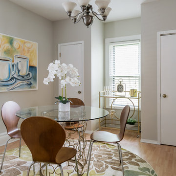
Example of a small trendy light wood floor great room design in St Louis with gray walls and no fireplace

 Fidelity General Contractors Inc.
Transitional porcelain tile kitchen photo in Los Angeles with a farmhouse sink, shaker cabinets, white cabinets, granite countertops, green backsplash, stone tile backsplash, stainless steel appliances and an island
 Marvista Design + Build
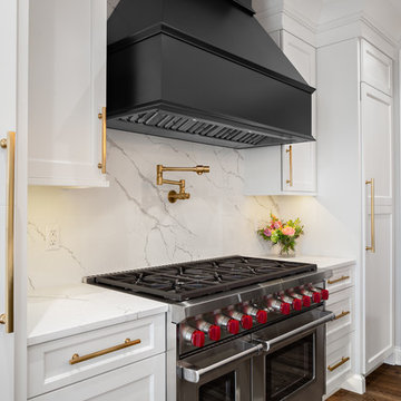
Keep the chef in the family happy with this profession 48" gas range with double ovens by Wolf.
Inspiration for a large transitional u-shaped medium tone wood floor and brown floor kitchen remodel in Other with an undermount sink, flat-panel cabinets, black cabinets, quartz countertops, white backsplash, stone slab backsplash, stainless steel appliances, an island and white countertops
Inspiration for a large transitional u-shaped medium tone wood floor and brown floor kitchen remodel in Other with an undermount sink, flat-panel cabinets, black cabinets, quartz countertops, white backsplash, stone slab backsplash, stainless steel appliances, an island and white countertops
 Cabinet Gallery
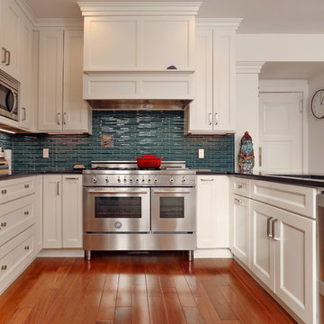
Transitional Style white painted cabinetry with Mod-style accents. Professional and built-In appliances.
Eat-in kitchen - mid-sized transitional u-shaped laminate floor and brown floor eat-in kitchen idea in Boston with an undermount sink, flat-panel cabinets, white cabinets, quartz countertops, blue backsplash, mosaic tile backsplash, stainless steel appliances and a peninsula
Eat-in kitchen - mid-sized transitional u-shaped laminate floor and brown floor eat-in kitchen idea in Boston with an undermount sink, flat-panel cabinets, white cabinets, quartz countertops, blue backsplash, mosaic tile backsplash, stainless steel appliances and a peninsula
 Cabinet Gallery
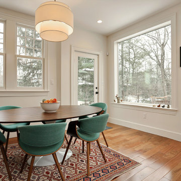
Transitional Style white painted cabinetry with Mod-style accents. Professional and built-In appliances.
Eat-in kitchen - mid-sized transitional u-shaped laminate floor and brown floor eat-in kitchen idea in Boston with an undermount sink, flat-panel cabinets, white cabinets, quartz countertops, blue backsplash, mosaic tile backsplash, stainless steel appliances and a peninsula
Eat-in kitchen - mid-sized transitional u-shaped laminate floor and brown floor eat-in kitchen idea in Boston with an undermount sink, flat-panel cabinets, white cabinets, quartz countertops, blue backsplash, mosaic tile backsplash, stainless steel appliances and a peninsula
 Hearthstone Inc
Richard Herman is in the hospitality business and owns several upscale hotels in Florida and in other states as well as cattle ranches in both Florida and Missouri. Their farm in Ocala is by farm their most unique. The property serves as a 4-H demonstration project for the purpose of children’s education. They have been working with the Academy Prep of St. Pete which is dedicated to inner-city youths that are selected on the basis of need and achievement. Wife Diane spends her time on the farm raising Gypsy Vanners, a diminutive draft horse named after the job they did in Eastern Europe, pulling the wagons (vans) for gypsies that wandered across the continent. On the Ocala farm, there are several mules with a unique profession.
Richard had visited the Hearthstone display at a Log & Timber Home Shows at the Orlando Convention Center many years ago. He was impressed that Hearthstone had stayed in touch with him over the years by mailings, invitations to shows, and periodic phone calls. When the time came to start serious consideration of the design of barn, Hearthstone responded promptly and professionally to Richard and Diane’s requests for information and a review of their ideas for their barn, which would serve as the centerpiece for their new farm.
They wanted a multipurpose facility that could accommodate an educational environment and a large hall suitable for the fundraising events for his charities. Richard wanted a barn that reflected the look and feel of barns built at the dawn of the 20th century. Besides the rustic chicken houses and vegetable gardens, they have completely renovated a 1020’s era farmhouse to be as historically correct as possible and serves as the entry to the farm.
“They very careful to feel us out, get comfortable with our capabilities, and be convinced that we could perform as promised,” said Project Manager John Ricketson of Hearthstone.
Design Process
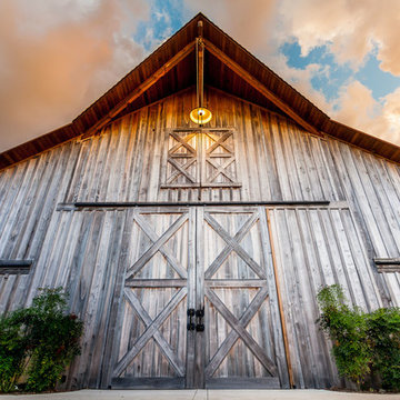
There were some initial drawings that gave us a start on the basic shape and size of the barn. From there, it was a process of narrowing down the uses of each area and the spans that could be achieved. The barn was going to have the traditional “board & batten” exterior siding and a metal roof. There is a cantilevered ‘hay hood” on the north gable end above the large sliding barn doors that open into the foyer and horse stalls. The wings house a combination of areas, beginning with the large restrooms to accommodate crowds for events. Other parts of the wings have garage areas for the farm vehicles, feed room, tack room, wash rack, storage, offices, and smaller restrooms.
Keeping with the look and feel of the turn of the century, Hearthstone developed a process for giving the timbers a surface texture that mimicked the circular cuts of timbers that had just come out of an old sawmill. This was easier said than done. Randy Giles guided his millwright (Wolfgang) in designing a machine that would do this effectively.
The barn was delivered in October of 2014 and was erected over the course of two weeks, thanks to a hardworking crew (Eric Foster) and near-perfect weather. After the Hearthstone crew completed the erection and roof dry-in, it was time for the local carpenters to step up and install some light conventional framing on the gable ends before applying the roof fascia and exterior board & batten siding. Next came the big sliding barn doors, plumbing, electrical, heating, and cooling. Large rustic fixtures were hung from the great hall roof timbers.
Exterior
The board & batten siding was cypress and allowed to turn color naturally as rain hit it and the sun started working on it with UV rays. This method causes a much grayer look closer to the ground and less so where the roof overhang provides protection. The North end has some large limestone boulders and planters arranged around the pad with tall pampas grass. The planters provide casual seating before events and during outside receptions. The entire area was sodded with lush St. Augustine grass and split rail fences were added to enclose the barn area. The corrugated metal roof was a special order material that immediately rusted after being exposed to moisture. The layer of rust protects the metal from the elements.
Interior
The board & batten theme was carried throughout most of the interior with the timbers left natural to show off the circular saw texture. All of the tongue & groove decking was shipped in advance to allow the local painter to pre-stain it with a dark brown transparent stain that is a beautiful background to the light color Eastern White Pine timbers.
“Everything was unique in this project” said Project Manager John Ricketson. “The setting on a small demonstration farm close to Ocala, the multipurpose design, the circular saw texture on the timbers.”
The Hermans are very proud of their farm’s outcome. Richard sent a note to Randy Giles, owner of Hearthstone: “The Barn is fantastic, not a single problem, period. Next month, we have Jo Dee Messina coming in to help with a fundraiser for a local center for abused kids. Folks love the farm, ...... but that barn gets all of the attention. I would encourage you to use me as a reference for your sales team, feel free to extend my cell phone to any prospective purchasers.”
 Greey Pickett
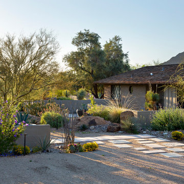
The renovation of this Mid-Century Ranch features the reintroduction of native plant species highlighted with steel planters, steppingstones, a ramada and small fountain.
Landscape Architect: Greey|Pickett
Architect: Clint Miller Architect
General Contractor: Sonora Sunset Construction
Landscape Contractor: West Point Landscaping
Photography: Steve Thompson
 Lauren Shadid Architecture + Interiors
photos by Holly Lepere
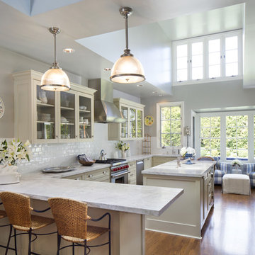
Example of a large classic u-shaped medium tone wood floor enclosed kitchen design in Los Angeles with an undermount sink, shaker cabinets, white cabinets, marble countertops, white backsplash, subway tile backsplash, stainless steel appliances and an island
Example of a large classic u-shaped medium tone wood floor enclosed kitchen design in Los Angeles with an undermount sink, shaker cabinets, white cabinets, marble countertops, white backsplash, subway tile backsplash, stainless steel appliances and an island
 Treefrog Design
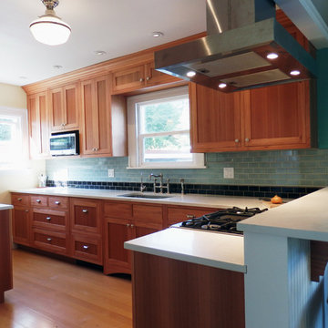
I have been working as a kitchen and bath designer in the Pacific Northwest for 13 years. I love engaging with new clients, ascertaining their needs through various interviews and meetings and then collaborating as we build their finished concept together. The variety of design styles, room layouts and function changes so much between one person and the next that no two finished products are remotely the same. This fluidity allows for endless possibilities for exploration in my field. It keeps the job interesting and has always given me a particular sense of reward and accomplishment as we near completion. The greatest personal recompense in this chosen profession is being able to walk with a client through this process and come out the other side with that client feeling elated with the end result.
 Design Concepts/Interiors, LLC
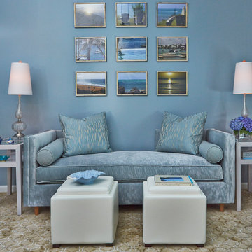
This yoga retreat was designed to be an escape for our client to practice yoga and to receive in home massages. We kept a theme of soothing blues throughout the space. A collection of the client's treasured photographs from travel sit atop this charming velvet-covered recamier from Kravet. Two small Kravet Alder Side Tables and two glass candlestick lamps flank either side. Two small storage ottomans sit in front, allowing for flexibility in the space and ease of movement when needing to be cleared for yoga or setting up the massage table.
Photo by Anastassios Mentis


 TVL Creative Ltd.
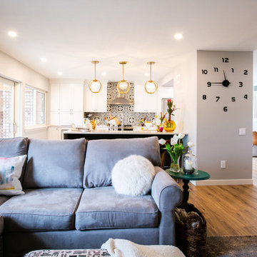
Cramped kitchen be gone! That was the project motto and top priority. The goal was to transform the current layout from multiple smaller spaces into a connected whole that would activate the main level for our clients, a young family of four.
The biggest obstacle was the wall dividing the kitchen and the dining room. Removing this wall was central to opening up and integrating the main living spaces, but the existing ductwork that ran right through the center of the wall posed a design challenge, er design opportunity. The resulting design solution features a central pantry that captures the ductwork and provides valuable storage- especially when compared to the original kitchen's 18" wide pantry cabinet. The pantry also anchors the kitchen island and serves as a visual separation of space between the kitchen and homework area.
Through our design development process, we learned the formal living room was of no service to their lifestyle and therefore space they rarely spent time in. With that in mind, we proposed to eliminate the unused living room and make it the new dining room. Relocating the dining room to this space inherently felt right given the soaring ceiling and ample room for holiday dinners and celebrations. The new dining room was spacious enough for us to incorporate a conversational seating area in the warm, south-facing window alcove.
Now what to do with the old dining room?! To answer that question we took inspiration from our clients' shared profession in education and developed a craft area/homework station for both of their boys. The semi-custom cabinetry of the desk area carries over to the adjacent wall and forms window bench base with storage that we topped with butcher block for a touch of warmth. While the boys are young, the bench drawers are the perfect place for a stash of toys close to the kitchen.
The kitchen begins just beyond the window seat with their refrigerator enclosure. Opposite the refrigerator is the new pantry with twenty linear feet of shelving and space for brooms and a stick vacuum. Extending from the backside of the pantry the kitchen island design incorporates counter seating on the family room side and a cabinetry configuration on the kitchen side with drawer storage, a trashcan center, farmhouse sink, and dishwasher.
We took careful time in design and execution to align the range and sink because while it might seem like a small detail, it plays an important role in supporting the symmetrical configuration of the back wall of the kitchen. The rear wall design utilizes an appliance garage mirrors the visual impact of the refrigerator enclosure and helps keep the now open kitchen tidy. Between the appliance garage and refrigerator enclosure is the cooking zone with 30" of cabinetry and work surface on either side of the range, a chimney style vent hood, and a bold graphic tile backsplash.
The backsplash is just one of many personal touches we added to the space to reflect our client's modern eclectic style and love of color. Swooping lines of the mid-mod style barstools compliment the pendants and backsplash pattern. A pop of vibrant green on the frame of the pantry door adds a fresh wash of color to an otherwise neutral space. The big show stopper is the custom charcoal gray and copper chevron wall installation in the dining room. This was an idea our clients softly suggested, and we excitedly embraced the opportunity. It is also a kickass solution to the head-scratching design dilemma of how to fill a large and lofty wall.
We are so grateful to bring this design to life for our clients and now dear friends.
4