
Search results for "Year previous ibizan" in Home Design Ideas
 Interiors by Natasha
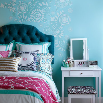
I was hired by the parents of a soon-to-be teenage girl turning 13 years-old. They wanted to remodel her bedroom from a young girls room to a teenage room. This project was a joy and a dream to work on! I got the opportunity to channel my inner child. I wanted to design a space that she would love to sleep in, entertain, hangout, do homework, and lounge in.
The first step was to interview her so that she would feel like she was a part of the process and the decision making. I asked her what was her favorite color, what was her favorite print, her favorite hobbies, if there was anything in her room she wanted to keep, and her style.
The second step was to go shopping with her and once that process started she was thrilled. One of the challenges for me was making sure I was able to give her everything she wanted. The other challenge was incorporating her favorite pattern-- zebra print. I decided to bring it into the room in small accent pieces where it was previously the dominant pattern throughout her room. The color palette went from light pink to her favorite color teal with pops of fuchsia. I wanted to make the ceiling a part of the design so I painted it a deep teal and added a beautiful teal glass and crystal chandelier to highlight it. Her room became a private oasis away from her parents where she could escape to. In the end we gave her everything she wanted.
Photography by Haigwood Studios
 Interiors by Natasha
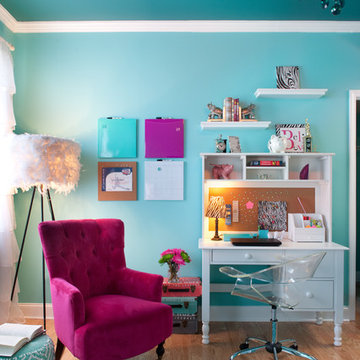
I was hired by the parents of a soon-to-be teenage girl turning 13 years-old. They wanted to remodel her bedroom from a young girls room to a teenage room. This project was a joy and a dream to work on! I got the opportunity to channel my inner child. I wanted to design a space that she would love to sleep in, entertain, hangout, do homework, and lounge in.
The first step was to interview her so that she would feel like she was a part of the process and the decision making. I asked her what was her favorite color, what was her favorite print, her favorite hobbies, if there was anything in her room she wanted to keep, and her style.
The second step was to go shopping with her and once that process started she was thrilled. One of the challenges for me was making sure I was able to give her everything she wanted. The other challenge was incorporating her favorite pattern-- zebra print. I decided to bring it into the room in small accent pieces where it was previously the dominant pattern throughout her room. The color palette went from light pink to her favorite color teal with pops of fuchsia. I wanted to make the ceiling a part of the design so I painted it a deep teal and added a beautiful teal glass and crystal chandelier to highlight it. Her room became a private oasis away from her parents where she could escape to. In the end we gave her everything she wanted.
Photography by Haigwood Studios
 Guy Ayers, Architect
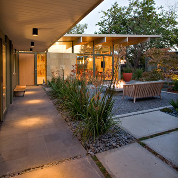
Reverse Shed Eichler
This project is part tear-down, part remodel. The original L-shaped plan allowed the living/ dining/ kitchen wing to be completely re-built while retaining the shell of the bedroom wing virtually intact. The rebuilt entertainment wing was enlarged 50% and covered with a low-slope reverse-shed roof sloping from eleven to thirteen feet. The shed roof floats on a continuous glass clerestory with eight foot transom. Cantilevered steel frames support wood roof beams with eaves of up to ten feet. An interior glass clerestory separates the kitchen and livingroom for sound control. A wall-to-wall skylight illuminates the north wall of the kitchen/family room. New additions at the back of the house add several “sliding” wall planes, where interior walls continue past full-height windows to the exterior, complimenting the typical Eichler indoor-outdoor ceiling and floor planes. The existing bedroom wing has been re-configured on the interior, changing three small bedrooms into two larger ones, and adding a guest suite in part of the original garage. A previous den addition provided the perfect spot for a large master ensuite bath and walk-in closet. Natural materials predominate, with fir ceilings, limestone veneer fireplace walls, anigre veneer cabinets, fir sliding windows and interior doors, bamboo floors, and concrete patios and walks. Landscape design by Bernard Trainor: www.bernardtrainor.com (see “Concrete Jungle” in April 2014 edition of Dwell magazine). Microsoft Media Center installation of the Year, 2008: www.cybermanor.com/ultimate_install.html (automated shades, radiant heating system, and lights, as well as security & sound).
Find the right local pro for your project
 MANDARINA STUDIO interior design
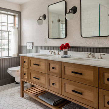
Summary of Scope: gut renovation/reconfiguration of kitchen, coffee bar, mudroom, powder room, 2 kids baths, guest bath, master bath and dressing room, kids study and playroom, study/office, laundry room, restoration of windows, adding wallpapers and window treatments
Background/description: The house was built in 1908, my clients are only the 3rd owners of the house. The prior owner lived there from 1940s until she died at age of 98! The old home had loads of character and charm but was in pretty bad condition and desperately needed updates. The clients purchased the home a few years ago and did some work before they moved in (roof, HVAC, electrical) but decided to live in the house for a 6 months or so before embarking on the next renovation phase. I had worked with the clients previously on the wife's office space and a few projects in a previous home including the nursery design for their first child so they reached out when they were ready to start thinking about the interior renovations. The goal was to respect and enhance the historic architecture of the home but make the spaces more functional for this couple with two small kids. Clients were open to color and some more bold/unexpected design choices. The design style is updated traditional with some eclectic elements. An early design decision was to incorporate a dark colored french range which would be the focal point of the kitchen and to do dark high gloss lacquered cabinets in the adjacent coffee bar, and we ultimately went with dark green.
 Dura Supreme Cabinetry
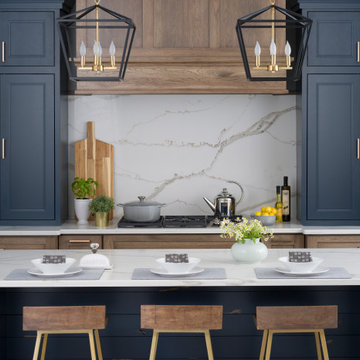
This modern farmhouse kitchen features a beautiful combination of Navy Blue painted and gray stained Hickory cabinets that’s sure to be an eye-catcher. The elegant “Morel” stain blends and harmonizes the natural Hickory wood grain while emphasizing the grain with a subtle gray tone that beautifully coordinated with the cool, deep blue paint.
The “Gale Force” SW 7605 blue paint from Sherwin-Williams is a stunning deep blue paint color that is sophisticated, fun, and creative. It’s a stunning statement-making color that’s sure to be a classic for years to come and represents the latest in color trends. It’s no surprise this beautiful navy blue has been a part of Dura Supreme’s Curated Color Collection for several years, making the top 6 colors for 2017 through 2020.
Beyond the beautiful exterior, there is so much well-thought-out storage and function behind each and every cabinet door. The two beautiful blue countertop towers that frame the modern wood hood and cooktop are two intricately designed larder cabinets built to meet the homeowner’s exact needs.
The larder cabinet on the left is designed as a beverage center with apothecary drawers designed for housing beverage stir sticks, sugar packets, creamers, and other misc. coffee and home bar supplies. A wine glass rack and shelves provides optimal storage for a full collection of glassware while a power supply in the back helps power coffee & espresso (machines, blenders, grinders and other small appliances that could be used for daily beverage creations. The roll-out shelf makes it easier to fill clean and operate each appliance while also making it easy to put away. Pocket doors tuck out of the way and into the cabinet so you can easily leave open for your household or guests to access, but easily shut the cabinet doors and conceal when you’re ready to tidy up.
Beneath the beverage center larder is a drawer designed with 2 layers of multi-tasking storage for utensils and additional beverage supplies storage with space for tea packets, and a full drawer of K-Cup storage. The cabinet below uses powered roll-out shelves to create the perfect breakfast center with power for a toaster and divided storage to organize all the daily fixings and pantry items the household needs for their morning routine.
On the right, the second larder is the ultimate hub and center for the homeowner’s baking tasks. A wide roll-out shelf helps store heavy small appliances like a KitchenAid Mixer while making them easy to use, clean, and put away. Shelves and a set of apothecary drawers help house an assortment of baking tools, ingredients, mixing bowls and cookbooks. Beneath the counter a drawer and a set of roll-out shelves in various heights provides more easy access storage for pantry items, misc. baking accessories, rolling pins, mixing bowls, and more.
The kitchen island provides a large worktop, seating for 3-4 guests, and even more storage! The back of the island includes an appliance lift cabinet used for a sewing machine for the homeowner’s beloved hobby, a deep drawer built for organizing a full collection of dishware, a waste recycling bin, and more!
All and all this kitchen is as functional as it is beautiful!
Request a FREE Dura Supreme Brochure Packet:
http://www.durasupreme.com/request-brochure
 TKS Design Group
Download our free ebook, Creating the Ideal Kitchen. DOWNLOAD NOW
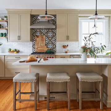
The homeowners came to us looking to update the kitchen in their historic 1897 home. The home had gone through an extensive renovation several years earlier that added a master bedroom suite and updates to the front façade. The kitchen however was not part of that update and a prior 1990’s update had left much to be desired. The client is an avid cook, and it was just not very functional for the family.
The original kitchen was very choppy and included a large eat in area that took up more than its fair share of the space. On the wish list was a place where the family could comfortably congregate, that was easy and to cook in, that feels lived in and in check with the rest of the home’s décor. They also wanted a space that was not cluttered and dark – a happy, light and airy room. A small powder room off the space also needed some attention so we set out to include that in the remodel as well.
See that arch in the neighboring dining room? The homeowner really wanted to make the opening to the dining room an arch to match, so we incorporated that into the design.
Another unfortunate eyesore was the state of the ceiling and soffits. Turns out it was just a series of shortcuts from the prior renovation, and we were surprised and delighted that we were easily able to flatten out almost the entire ceiling with a couple of little reworks.
Other changes we made were to add new windows that were appropriate to the new design, which included moving the sink window over slightly to give the work zone more breathing room. We also adjusted the height of the windows in what was previously the eat-in area that were too low for a countertop to work. We tried to keep an old island in the plan since it was a well-loved vintage find, but the tradeoff for the function of the new island was not worth it in the end. We hope the old found a new home, perhaps as a potting table.
Designed by: Susan Klimala, CKD, CBD
Photography by: Michael Kaskel
For more information on kitchen and bath design ideas go to: www.kitchenstudio-ge.com



 Adrienne DeRosa
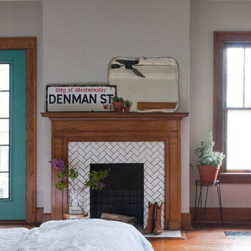
While renovating the master bedroom last year, the Mohrmans replaced the fireplace surround with white ceramic tile. Placed in a herringbone pattern, the tile and dark grout work together to lend a period feel to the room.
As with many renovations, there were some surprises along the way. "From what we could tell the mantle had never been removed", Chelsea explains. "We removed the mantle and found bits and pieces of photos, ticket stubs, coins, etc that had fallen back there over the years. Some of the items were dated back to the 1930’s." Being the eighth owners of the home, it was hard to tell whether there was something there from every previous owner, "... but we gathered it all, placed it in a tin, added our own piece, and placed it back inside the mantle as a time capsule for future owners to find in decades to come."

 Advance Design Studio, Ltd.
Jennifer and Dan have lived in their Deer Park Illinois home for 15 years, slowly making minor fixes like painting and decorating; but they had a new plan for their kitchen the entire time. An awkwardly placed garage door, and an island cooktop with a terrible downdraft made a full-scale kitchen remodel an absolute must. Jennifer had many ideas in mind and wanted to work with a company that could provide high-end work, while partnering with a designer that would tailor the kitchen to her ideas.
She was intrigued by the phrase “Common Sense Remodeling” in Advance Design’s feature she discovered while perusing an issue of the community’s Quintessential Barrington Magazine. Doing further research on the company’s website, as she looked through project profiles and read about Advance Design’s “Common Sense Remodeling” philosophy, she promptly scheduled an appointment to see if the people and ideas she read about were truly who they said they were. The more she read, the more she knew that the “Common Sense” approach to remodeling they described was exactly the type of company she was looking for.
The partnership was sealed after an initial consultation with Owner Todd Jurs and Project Designer Michelle Lecinski. They displayed a combination of friendliness, professionalism and respect that was unmatched by any of the other companies Jennifer talked to. She knew that with Advance Design, she would be able to retain the vision that she had in mind with high-quality craftsmanship.
“I reached out to Advance Design because of the ‘Common Sense Remodeling’ tagline,” Jennifer said. “That’s what lingered for me”. “Advance Design was the most respectful- of the house and of my design ideas, and the most professional of the handful of companies that looked at my project”.
Soon after the meeting Jennifer began working with Michelle on the project design. They quickly developed chemistry. Jennifer loved how Michelle researched and located every detail that Jennifer wanted for the kitchen. Between the two of them, every concept and idea was worked through and perfected. “Jennifer had definite ideas about what she wanted the new kitchen to look like, she just didn’t know how to bring it all together. We worked together really well to make her ideas into the practical reality necessary for a well-functioning kitchen, with the look and feel that she had envisioned”, says Michelle.
“Michelle was wonderful in using the CAD system she would show me new drawings every time we changed the layout while working through the design,” Jennifer said. “She was a really wonderful partner in execution, she made sure everything happened quickly and easily.”
The finished design drew out elements of Jennifer’s style and personality. The pair call the look “sophisticated farmhouse” to describe the kitchen renovation to family and friends. The result was a beautifully crafted, authentic-feeling space that satisfied Jennifer’s dreams 15 years in the making. The whole project consisted of a kitchen remodel, mudroom upgrade with powder room, and garage entry relocation. “The projects I personally like the best, are the ones that put the client’s dreams on display,” Project Designer Michelle said. “And this is one of those projects.”
The main focal point of the kitchen is custom zinc and brass ventilation hood with a vintage sheen, which was hand made to order by a small company in Indiana named Vogler Metalworking. “It’s like sculpture, a true work of art”, says Jennifer. Your eye is immediately drawn towards this elegant yet practical hood that eliminated the home’s downdraft problem and added a striking conversation piece at the same time. The carpenters had to use special gloves when transporting and installing it, so they didn’t smudge it with fingerprints. The beautiful hood centers proudly over the stunning black enamel and brass LaCornue Range. “I had a friend who had a LaCornue range and after learning how easy it was to cook perfect meals, I was convinced I wanted to have one”, says Jennifer. This unique, breathtaking combination anchors the entire kitchen and is apparent immediately as you walk into the great room the surrounds the space.
DuraSupreme Crestwood cabinets with a Kendall Panel add function and sophistication. A custom gray paint color paired with a storm blue was developed so that the new kitchen looked like it belonged to the existing space. Unlacquered brass faucets and hardware were important to Jennifer because she wanted the living finishes to age over time. Remarkable brass diamond mesh cabinet door inserts imported from the UK continue to add this one-of-a-kind kitchen renovation; giving it a “you won’t see this everywhere” quality. The use of old railcar flooring for the coffee bar countertop and reclaimed oak for the open shelving gives an authenticity to the space uncommon in kitchens today.
Jennifer and Michelle fell in love with the Limestone Grey Stone while they were investigating unique island countertop ideas. They liked the fact that the limestone as a living finish will age and change over time. Calcutta Miel Quartz countertops made for an excellent pairing around the perimeter, as it’s durable and perfect for cooking preparations. A textured white subway tile backsplash that runs to the ceiling keeps your eye moving towards the open shelving, and to the main focal point of the stunning range hood combination.
“The kitchen functions beautifully, and it’s gorgeous,” beams Jennifer as she gestures with both hands while smiling ear to ear. “The most important thing was I wanted a kitchen that had a wonderful flow, cooked beautiful meals and was a great gathering place for family and friends, and this space does that perfectly! Beauty wise, it turned out exactly how I had envisioned. I felt the function part was the hardest part, and that was nailed”!
Relocating the garage entry to the new mudroom was a huge priority and has finally separated the family’s arriving home functions from their kitchen. Now coats and shoes and bags have their own area for dropping once members arrive home. Matching gray DuraSupreme cabinetry helped create gorgeous, purposeful lockers for the family. A reclaimed vintage sink and custom wall paper were added to the tiny powder room to beautify the once previously only functional space. Advance Design was even able to create a custom space for their dog to sleep while the family is away.
“It was unbelievable that a project of this size was completed in such a short time, and I think that’s because of the large amount of planning and preparation that went into it,” Jennifer marveled, “When we started, we were ready, and everything was prepared”.
When it came to execution, Project Manager Justin Davis and his crew were quick, accessible, and organized. Projects like this kitchen are typically completed in as little as 8-10 weeks. Jennifer’s kitchen however despite the relocation of some challenging HVAC in a soffit and moving of an exterior door was completed remarkably fast in part because the team was working with an existing tile floor that ran throughout the first floor that the client really loved.
“You get to know these people really well because they’re living in your house while you’re living in your house. They were so fast and really good, it didn’t take as long as even planned” reported Jennifer. “I would text Justin and he always responded almost immediately. I got to know all the guys who were working in our house and they were all wonderful people”.
Details in a customized kitchen like this one require skill and care from the people who install it. “All the guys on the job were skilled at what the did. I wanted small details like little feet to look like furniture, that is where their carpentry skill came in to make these all perfect”, said Jennifer. “The tile guys were wonderful. They even let me determine how I wanted the texture with the grout to appear for a salt and pepper look; now that is a very skilled trade person making it custom”.
In Jennifer’s interview, she continued to reference Advance Design’s “Common Sense Remodeling”, so I took a minute to ask her exactly what that phrase meant to her and how it played out in her experience with her project and the Advance Design team. Here is what she said: “I was intrigued about Common Sense Remodeling and in my head that there would be clear costs and prices, great communication between the design team, the execution team and me”, said Jennifer. They did deliver on that, it was so clear about the cost breakdown, what I could expect from everyone who came to my house, and everything that we had ordered. That to me is the Common Sense”!
It’s great to see a client take literally our assertion that a well-planned remodeling project is simply “Common Sense”! She anticipated each step of the way would be clear, concise, and predictable, all the while protecting the outcome due to the careful upfront planning. “Advance Design delivered on their ‘Common Sense Remodeling’ promise,” Jennifer said. “From the design team, to the execution team - everything was straight forward like I imagined. The project turned out exactly how I envisioned, I enjoyed this process and absolutely would recommend Advance Design Studio to anyone.”
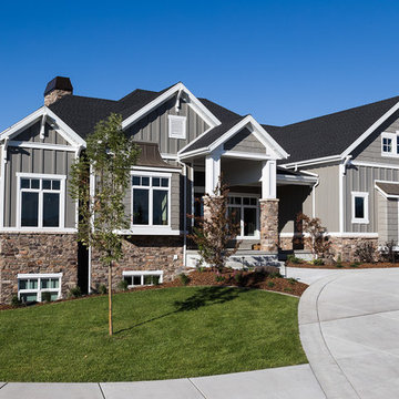
 Sierra Homes Construction
Imagine This Photography
Inspiration for a large craftsman gray one-story wood exterior home remodel in Salt Lake City
Inspiration for a large craftsman gray one-story wood exterior home remodel in Salt Lake City
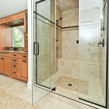
 SEED Homes
Inspiration for a timeless beige tile alcove shower remodel in DC Metro with raised-panel cabinets and medium tone wood cabinets
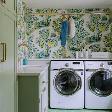 MANDARINA STUDIO interior design
Summary of Scope: gut renovation/reconfiguration of kitchen, coffee bar, mudroom, powder room, 2 kids baths, guest bath, master bath and dressing room, kids study and playroom, study/office, laundry room, restoration of windows, adding wallpapers and window treatments
Background/description: The house was built in 1908, my clients are only the 3rd owners of the house. The prior owner lived there from 1940s until she died at age of 98! The old home had loads of character and charm but was in pretty bad condition and desperately needed updates. The clients purchased the home a few years ago and did some work before they moved in (roof, HVAC, electrical) but decided to live in the house for a 6 months or so before embarking on the next renovation phase. I had worked with the clients previously on the wife's office space and a few projects in a previous home including the nursery design for their first child so they reached out when they were ready to start thinking about the interior renovations. The goal was to respect and enhance the historic architecture of the home but make the spaces more functional for this couple with two small kids. Clients were open to color and some more bold/unexpected design choices. The design style is updated traditional with some eclectic elements. An early design decision was to incorporate a dark colored french range which would be the focal point of the kitchen and to do dark high gloss lacquered cabinets in the adjacent coffee bar, and we ultimately went with dark green.
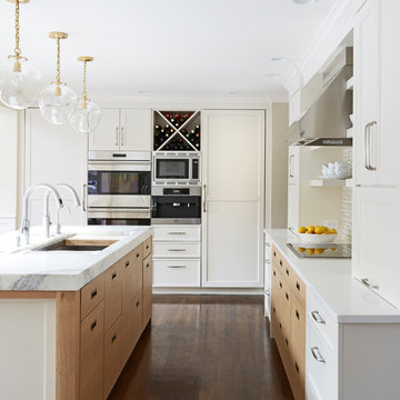 TKS Design Group
Free ebook, Creating the Ideal Kitchen. DOWNLOAD NOW
This large open concept kitchen and dining space was created by removing a load bearing wall between the old kitchen and a porch area. The new porch was insulated and incorporated into the overall space. The kitchen remodel was part of a whole house remodel so new quarter sawn oak flooring, a vaulted ceiling, windows and skylights were added.
A large calcutta marble topped island takes center stage. It houses a 5’ galley workstation - a sink that provides a convenient spot for prepping, serving, entertaining and clean up. A 36” induction cooktop is located directly across from the island for easy access. Two appliance garages on either side of the cooktop house small appliances that are used on a daily basis.
Honeycomb tile by Ann Sacks and open shelving along the cooktop wall add an interesting focal point to the room. Antique mirrored glass faces the storage unit housing dry goods and a beverage center. “I chose details for the space that had a bit of a mid-century vibe that would work well with what was originally a 1950s ranch. Along the way a previous owner added a 2nd floor making it more of a Cape Cod style home, a few eclectic details felt appropriate”, adds Klimala.
The wall opposite the cooktop houses a full size fridge, freezer, double oven, coffee machine and microwave. “There is a lot of functionality going on along that wall”, adds Klimala. A small pull out countertop below the coffee machine provides a spot for hot items coming out of the ovens.
The rooms creamy cabinetry is accented by quartersawn white oak at the island and wrapped ceiling beam. The golden tones are repeated in the antique brass light fixtures.
“This is the second kitchen I’ve had the opportunity to design for myself. My taste has gotten a little less traditional over the years, and although I’m still a traditionalist at heart, I had some fun with this kitchen and took some chances. The kitchen is super functional, easy to keep clean and has lots of storage to tuck things away when I’m done using them. The casual dining room is fabulous and is proving to be a great spot to linger after dinner. We love it!”
Designed by: Susan Klimala, CKD, CBD
For more information on kitchen and bath design ideas go to: www.kitchenstudio-ge.com

Sponsored
Columbus, OH

Wannemacher Interiors
Customized Award-Winning Interior Design Solutions in Franklin Cnty OH
 VanderHorn Architects
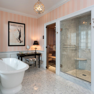
The main space features a soaking tub and vanity, while the sauna, shower and toilet rooms are arranged along one side of the room.
Gus Cantavero Photography
 Living Stone Design + Build
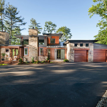
A stunning rustic modern exterior blends organic materials and sleek design in this energy-efficient mountain retreat, showcasing sustainable construction and luxurious craftsmanship.

 ZeroEnergy Design
This LEED Platinum certified house reflects the homeowner's desire for an exceptionally healthy and comfortable living environment, within a traditional neighborhood.
INFILL SITE. The family, who moved from another area of Wellesley, sought out this property to be within walking distance of the high school and downtown area. An existing structure on the tight lot was removed to make way for the new home. 84% of the construction waste, from both the previous structure and the new home, was diverted from a landfill. ZED designed to preserve the existing mature trees on the perimeter of the property to minimize site impacts, and to maintain the character of the neighborhood as well as privacy on the site.
EXTERIOR EXPRESSION. The street facade of the home relates to the local New England vernacular. The rear uses contemporary language, a nod to the family’s Californian roots, to incorporate a roof deck, solar panels, outdoor living space, and the backyard swimming pool. ZED’s careful planning avoided to the need to face the garage doors towards the street, a common syndrome of a narrow lot.
THOUGHTFUL SPACE. Homes with dual entries can often result in duplicate and unused spaces. In this home, the everyday and formal entry areas are one and the same; the front and garage doors share the entry program of coat closets, mudroom storage with bench for removing your shoes, and a laundry room with generous closets for the children's sporting equipment. The entry area leads directly to the living space, encompassing the kitchen, dining and sitting area areas in an L-shaped open plan arrangement. The kitchen is placed at the south-west corner of the space to allow for a strong connection to the dining, sitting and outdoor living spaces. A fire pit on the deck satisfies the family’s desire for an open flame while a sealed gas fireplace is used indoors - ZED’s preference after omitting gas burning appliances completely from an airtight home. A small study, with a window seat, is conveniently located just off of the living space. A first floor guest bedroom includes an accessible bathroom for aging visitors and can be used as a master suite to accommodate aging in place.
HEALTHY LIVING. The client requested a home that was easy to clean and would provide a respite from seasonal allergies and common contaminants that are found in many indoor spaces. ZED selected easy to clean solid surface flooring throughout, provided ample space for cleaning supplies on each floor, and designed a mechanical system with ventilation that provides a constant supply of fresh outdoor air. ZED selected durable materials, finishes, cabinetry, and casework with low or no volatile organic compounds (VOCs) and no added urea formaldehyde.
YEAR-ROUND COMFORT. The home is super insulated and air-tight, paired with high performance triple-paned windows, to ensure it is draft-free throughout the winter (even when in front of the large windows and doors). ZED designed a right-sized heating and cooling system to pair with the thermally improved building enclosure to ensure year-round comfort. The glazing on the home maximizes passive solar gains, and facilitates cross ventilation and daylighting.
ENERGY EFFICIENT. As one of the most energy efficient houses built to date in Wellesley, the home highlights a practical solution for Massachusetts. First, the building enclosure reduces the largest energy requirement for typical houses (heating). Super-insulation, exceptional air sealing, a thermally broken wall assembly, triple pane windows, and passive solar gain combine for a sizable heating load reduction. Second, within the house only efficient systems consume energy. These include an air source heat pump for heating & cooling, a heat pump hot water heater, LED lighting, energy recovery ventilation, and high efficiency appliances. Lastly, photovoltaics provide renewable energy help offset energy consumption. The result is an 89% reduction in energy use compared to a similar brand new home built to code requirements.
RESILIENT. The home will fare well in extreme weather events. During a winter power outage, heat loss will be very slow due to the super-insulated and airtight envelope– taking multiple days to drop to 60 degrees even with no heat source. An engineered drainage system, paired with careful the detailing of the foundation, will help to keep the finished basement dry. A generator will provide full operation of the all-electric house during a power outage.
OVERALL. The home is a reflection of the family goals and an expression of their values, beautifully enabling health, comfort, safety, resilience, and utility, all while respecting the planet.
ZED - Architect & Mechanical Designer
Bevilacqua Builders Inc - Contractor
Creative Land & Water Engineering - Civil Engineering
Barbara Peterson Landscape - Landscape Design
Nest & Company - Interior Furnishings
Eric Roth Photography - Photography
 Hudson & Miller Home
David Tsai, Wirken Photography
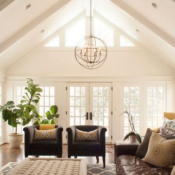
Large elegant dark wood floor family room photo in Kansas City with white walls
Large elegant dark wood floor family room photo in Kansas City with white walls

 Studio Dearborn
INTERNATIONAL AWARD WINNER. 2018 NKBA Design Competition Best Overall Kitchen. 2018 TIDA International USA Kitchen of the Year. 2018 Best Traditional Kitchen - Westchester Home Magazine design awards.
The designer's own kitchen was gutted and renovated in 2017, with a focus on classic materials and thoughtful storage. The 1920s craftsman home has been in the family since 1940, and every effort was made to keep finishes and details true to the original construction. For sources, please see the website at www.studiodearborn.com. Photography, Adam Kane Macchia and Timothy Lenz
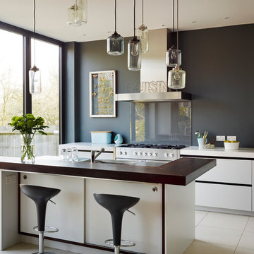
 Roundhouse
Roundhouse Urbo bespoke matt lacquer kitchen
Eat-in kitchen - large contemporary eat-in kitchen idea in London with an undermount sink, flat-panel cabinets, white cabinets and an island
Eat-in kitchen - large contemporary eat-in kitchen idea in London with an undermount sink, flat-panel cabinets, white cabinets and an island
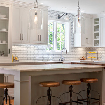
 Pennville Custom Cabinetry
Karen Swanson, owner of New England Design Works in Manchester, MA keeps designing award winning Pennville Custom Cabinetry kitchens. You may remember that earlier this year, Karen won both the regional Sub-Zero Design Contest and the National Kitchen & Bath Association's medium kitchen of the year.
nedesignworks@gmail.com
978.500.1096.
1