
Search results for "Actual goal" in Home Design Ideas
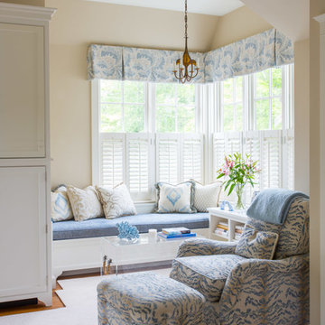
 OLSON LEWIS + Architects
Published in the NORTHSHORE HOME MAGAZINE Fall 2015 issue, this home was dubbed 'Manchester Marvel'.
Before its renovation, the home consisted of a street front cottage built in the 1820’s, with a wing added onto the back at a later point. The home owners required a family friendly space to accommodate a large extended family, but they also wished to retain the original character of the home.
The design solution was to turn the rectangular footprint into an L shape. The kitchen and the formal entertaining rooms run along the vertical wing of the home. Within the central hub of the home is a large family room that opens to the kitchen and the back of the patio. Located in the horizontal plane are the solarium, mudroom and garage.
Client Quote
"He (John Olson of OLSON LEWIS + Architects) did an amazing job. He asked us about our goals and actually walked through our former house with us to see what we did and did not like about it. He also worked really hard to give us the same level of detail we had in our last home."
“Manchester Marvel” clients.
Photo Credits:
Eric Roth
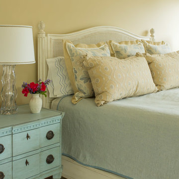 OLSON LEWIS + Architects
Published in the NORTHSHORE HOME MAGAZINE Fall 2015 issue, this home was dubbed 'Manchester Marvel'.
Before its renovation, the home consisted of a street front cottage built in the 1820’s, with a wing added onto the back at a later point. The home owners required a family friendly space to accommodate a large extended family, but they also wished to retain the original character of the home.
The design solution was to turn the rectangular footprint into an L shape. The kitchen and the formal entertaining rooms run along the vertical wing of the home. Within the central hub of the home is a large family room that opens to the kitchen and the back of the patio. Located in the horizontal plane are the solarium, mudroom and garage.
Client Quote
"He (John Olson of OLSON LEWIS + Architects) did an amazing job. He asked us about our goals and actually walked through our former house with us to see what we did and did not like about it. He also worked really hard to give us the same level of detail we had in our last home."
“Manchester Marvel” clients.
Photo Credits:
Eric Roth

 J.THOM Residential Design & Cabinetry
This clients Bedroom was actually too large and didn't have enough closet space which is not uncommon for a premium spec home by a National Builder / Developer. Our goal was to create an Owner's Bedroom Suite that felt more intimate and cozy as opposed to vast open space. In addition, more wardrobe space was a 'must have'.
We took the over-sized bedroom with cathedral ceiling and created smaller ancillary spaces like a sitting nook, walk-in wardrobe and shoe & accessory closet. We flattened out the cathedral ceiling to create a contemporary tray ceiling with ambient light.
By re-scaling the room, we added more storage and functional spaces that created a sense of purpose, intimacy and coziness. The result was a welcoming bedroom that is scaled appropriately for the Owner's furniture and art collection.
Find the right local pro for your project
 Siegler Design Services + INTERIORS
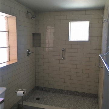
This home in a popular neighborhood close to Arizona State University dates probably to just before "mid-century and now has all NEW Fixtures and Finishes. The room was gutted and a new bathroom created. The goal of the project was to have a bathroom for this 1940's cottage that looked like it could be original but, was clean and fresh and healthy. Actually the windows and millwork and door openings are all original. The fixtures and finishes selected were to be in character with the decade in which the home was built which means the look is more World War II era and cottage / bungalow in ambiance. All this was softly and gently dramatized with the use and design of the 2 tone tile in creamy white and soft gray tiles throughout.
 White Crane Construction
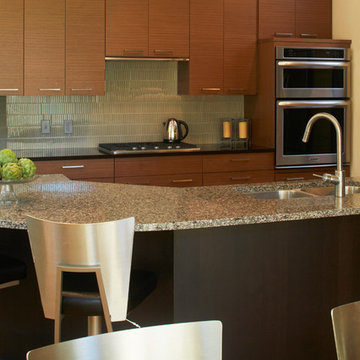
Cohesively updating and modernizing this home built in the 1990s were the goal in this remodel. Several elements throughout the house like the traditional golden oak original stair railing in the main entry were too colonial for the homeowner as their taste was trending more modern. The golden oak used on trim, fireplace mantle, and baseboards trapped this home in a time warp. The original Kitchen had cabinetry with a traditional door style, painted cabinets, and laminate countertops which also caused it to look dated. The clients expressed a desire to integrate more modern elements into their home in a cost effective way without having to rip everything down to the studs. Our design/build team proposed and executed many elegant cost effective design solutions that involved changing paint, cabinetry, finishes, and fixtures to achieve the desired modern feeling throughout the home.
The Kitchen was completely remodeled. The traditional cabinetry was replaced by new frameless Décor cabinets with slab doors and drawers in a beautiful exotic walnut veneer with horizontal graining and soft closing hardware. To enhance the existing structure functionally the built in desk space in the Kitchen was removed and replaced by pantry cabinetry creating improved storage and flow in the new kitchen. The new large Cherry island, also by Décor, was finished in a dark charcoal stain and topped with a solid surface Cambria quartz countertop in Kingston which features a modern mix of black, white and olive tones. For the perimeter countertops Cambria Oakhampton was selected for its complimentary sleek dark chocolate color. Innovative use of materials was demonstrated by cutting linear strips of a pre-sheeted horizontal grey glass mosaic tile, staggering it, and running it vertically instead of horizontally on the backsplash. White Kitchen appliances were traded out for a more contemporary stainless steel.
Photography: Jill Greer
 Degnan Design-Build-Remodel
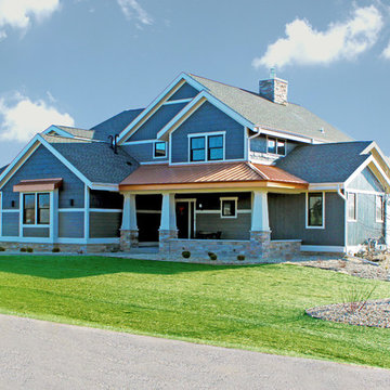
For this custom built home, we had the privilege of working alongside our client, an architect, who had a vision of his dream home that we were to bring to life. Designed to comfortably house two adults and eight children, this home was designed to perfection. Our goal was to pull those design ideas from the head of our client, put them on to paper, and make them a reality. Creating a set of plans that met not only our client's design ideas, but the neighborhood developers as well, took extensive teamwork and negotiations.
 TRA studio Architecture PLLC
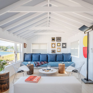
This Atlantic holiday cottage is located in the unique landscape of the creek at Towd Point, in Southampton, one of only 28 Federal Ecological Preserves in the US. Caterina and Bob, a design couple who owns the architecture firm TRA studio in the city, chose the property because of their historic ties to the area and the extraordinary setting and its precise location within it: it is the only house whose site is at the bend of the Towd Point peninsula, right where the views of the protected creek are at the widest and where a little beach naturally occurred.
Although the views are open and vast, the property is minimal, way too small to even consider a small pool or spa: the pristine creek is the house water feature, the recreation expansion of the diminutive back yard. We often joke that at TRA we can make small spaces feel big, which is, exactly what we did.
As often happened with TRA’s renovation projects, as well as with the most recent art pieces by Robert Traboscia, one of the Studio’s founders, the house is an “object trouve’’, originally a modest fishing outpost, that went through many alterations, to finally find a refreshed life as a modern cottage for a New York family. A vintage busted kayak, repurposed as a planter, completes the process.
The cottage is actually a collection of objects: the original Bayman’s cottage now houses two bedrooms, the adjoining deck soon afterwards was enclosed to make space for the kitchen/dining volume and a newer living room addition was later built to complete the compound.’
The compactness of the volumes contributes to the environmental quality of the house, whose
simple natural materials have been carefully restored and insulated, while the simplicity of the volumes, which has been respectfully retained, talks about a nostalgia for the past Long Island seaside retreats. The single level recognizable gabled roof silhouette sits comfortably on the private beach, the greyed cedar deck acting as a platform to connect with the landscape.
The informal weathered materials and the reductive color palette weave effortlessly from the exterior to the interior, creating a serene environment, echoing the coastal landscape, which emphasizes the line where the water meets the sky, the natural beach, tall breezy grasses and the multitude of happy birds who call the creek home.
The restoration process started with the modest goal of cleaning up the walls and replace the worn uneven floor, it soon turned into a forensic research for the original elements, uncovering the historic foam-green siding gabled façade that is now the backdrop of the dining pavilion. The renovation respected the history of the place: everything changed and everything stayed the same.
In an area known for vast, affluent, estates, the house is often the place where friends and family gather: the size of the house, the largeness of the creek, the wild life coexisting in harmony with the visitors, the availability of a swim in the bay or kayak adventure, are all interesting and inviting. We often observed that people do not want to leave our interiors, we love the little house because is a place that you never need to leave, this is definitely a house where there is always something to do. In the Hamptons, the question is often “what you are looking at”, usually the pool or landscaped nature, here it is easy to respond: our private beach and protected nature.
The landscaping simply aims at enhancing the existing: three sculptural and weathered trees were given new life, the natural arch of the Creek, further outlined by the bulkhead, is amplified and repeated, similarly to rock stratifications, to connect to the house and define the different modes of the landscape: native grasses, private beach, gravel lawn, fence and finally Towd Point Road. Towd Point Little Beach is a habitat meant to be shared with birds and animals.
 OLSON LEWIS + Architects
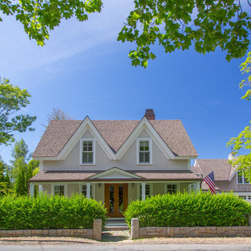
Published in the NORTHSHORE HOME MAGAZINE Fall 2015 issue, this home was dubbed 'Manchester Marvel'.
Before its renovation, the home consisted of a street front cottage built in the 1820’s, with a wing added onto the back at a later point. The home owners required a family friendly space to accommodate a large extended family, but they also wished to retain the original character of the home.
The design solution was to turn the rectangular footprint into an L shape. The kitchen and the formal entertaining rooms run along the vertical wing of the home. Within the central hub of the home is a large family room that opens to the kitchen and the back of the patio. Located in the horizontal plane are the solarium, mudroom and garage.
Client Quote
"He (John Olson of OLSON LEWIS + Architects) did an amazing job. He asked us about our goals and actually walked through our former house with us to see what we did and did not like about it. He also worked really hard to give us the same level of detail we had in our last home."
“Manchester Marvel” clients.
Photo Credits:
Eric Roth
 J.THOM Residential Design & Cabinetry
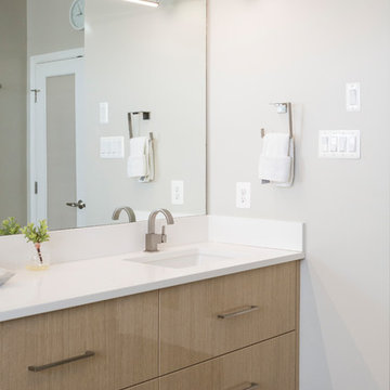
This clients Bedroom was actually too large and didn't have enough closet space which is not uncommon for a premium spec home by a National Builder / Developer. Our goal was to create an Owner's Bedroom Suite that felt more intimate and cozy as opposed to vast open space. In addition, more wardrobe space was a 'must have'.
We took the over-sized bedroom with cathedral ceiling and created smaller ancillary spaces like a sitting nook, walk-in wardrobe and shoe & accessory closet. We flattened out the cathedral ceiling to create a contemporary tray ceiling with ambient light.
By re-scaling the room, we added more storage and functional spaces that created a sense of purpose, intimacy and coziness. The result was a welcoming bedroom that is scaled appropriately for the Owner's furniture and art collection.
 Rhodes Architecture + Light
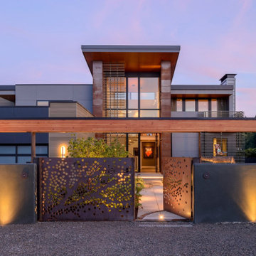
A transformation inspired by the owner’s love of modern architecture, art and color (and the adjacent sand, rock, water, and the northwest landscape), the Indianola House sought to bring the soul of a home to a colorless muted box. The original house was a drab 1990’s-era box with no personality or presence sited on a beautiful secluded bay, facing water and island views, northwest of the City of Seattle. The existing mono-colored stucco-clad exterior and pyramidal glass-block openings had led the neighborhood to dub the structure, unflatteringly, “The Miami Vice House”.
Rhodes Architecture’s Residential Architects careful use of natural light, rich, collaged finishes and ability to open the house to gardens, beach, and outdoor gathering was critical to the design. The house soon became “The Gallery”.
The original home’s grey stucco exterior made the house seem both large and featureless; the introduction of no-maintenance exterior materials that collage and complement each other was a goal of the homeowner and the Seattle Architects who teamed up for this residential design. The bloated scale of the house cried out for the establishment and definition of the parts of the structure, a breaking down of the home’s form and its apparent bland size.
Living, sleeping, and bathing areas that started as staid spaces were in need of opening to the natural environment with additions of large doors, folding glass walls and useable balconies were crucial to each space having a dialogue with the outdoors.
The owner’s extensive art collection was highlighted and became the focus of interior places, well-lit naturally and through a new lighting system. Energy use and sustainable systems were a key component of the design which used high-efficacy lighting, better cladding on a rain-screen system, high-efficiency doors and windows, new insulation and weather barriers, and which added a photovoltaic-generated electrical system. The contemporary design sought to integrate all of these systems, materials, and finishes into a seamless whole that lent interest and drama to a residence which was previously lusterless.
How radically this house was transformed is evident in the exteriors, gardens and the natural spaces the house now opens to, as well as the gallery-like interiors. This home is a stunning testament to what is possible “before-and-after” when remade by Rhodes Architecture + Light.
The clients are an older couple with long professional and political careers, a love of art and a clear desire to connect with the Northwest environment and enliven their daily lives with spaces full of color and natural light.
Rhodes Architecture + Light was hired in 2019 to add new exteriors and interiors, natural light, larger openings to beach and bay, seismic and foundation upgrades to the home, and to infuse life into the house through the re-use of existing space and varied materials, color, textures, and lighting. The only actual change to the exterior “shell” of the house was the introduction of a low “gull-wing” roof with wood soffits above the central atrium space, to add drama and bring natural light into the entry gallery space. Interior spaces, including bedrooms and bathrooms, were re-planned and opened to each other, to greater natural light, to roof decks, and to the incredible views and sea-side environment.
The Builder, Fairbank Construction Company of Bainbridge Island, Washington, met the challenge of the design, first completely deconstructing the finishes inside and out, then precisely interlocking new claddings, windows and doors, cabinetry, finishes and a new gull-wing central roof in a beautiful transformation. The construction was total, thorough, and very detailed, resulting a house that, far from seeming a “remodeling”, is far more present and fitting to the owner’s lives and the natural environment than the house we started with.
 LU Design Build
Designer
Jennifer Chapman
Photographer
Karen Palmer
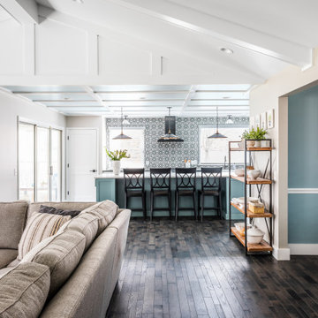
The kitchen in this 34 year old home was in desperate need of an update! It was closed off from the rest of the first floor and all of the fixtures and finishes were original to the house. Our first goal was to open up the kitchen to the great room by removing the wall separating the two. The client also wanted to make some big design statements by getting creative with the ceilings and choosing bold colors and patterns.
We were really inspired by the coastal cottage style when designing the ceiling and making finish selections. This kitchen is all about that tile! We instantly fell in love with it. It was the perfect match to the turquoise island and the quartz countertops. The ceiling in the kitchen is 8' which means we couldn't do an actual coffered ceiling so we created the illusion of a coffered ceiling by creating a grid out of flat stock and doing bead board in between. We painted the beadboard a really soft robin's egg blue, much like the ceilings on a traditional southern porch.
In the family room, we added six beams coming off the center beam and painted everything white. We filled in what would usually be dead wall space on the peak walls with a board and batten treatment. We created a small butler style pantry by making the dining room slightly smaller and creating a pass through between the kitchen and dining room with cabinetry. Overall, the space feels larger and way more exciting!
 Rhodes Architecture + Light
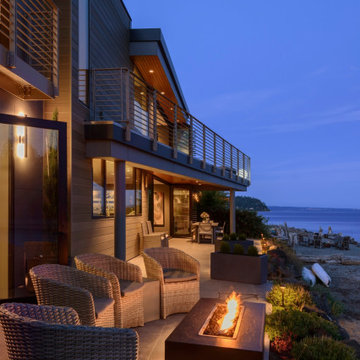
A transformation inspired by the owner’s love of modern architecture, art and color (and the adjacent sand, rock, water, and the northwest landscape), the Indianola House sought to bring the soul of a home to a colorless muted box. The original house was a drab 1990’s-era box with no personality or presence sited on a beautiful secluded bay, facing water and island views, northwest of the City of Seattle. The existing mono-colored stucco-clad exterior and pyramidal glass-block openings had led the neighborhood to dub the structure, unflatteringly, “The Miami Vice House”.
Rhodes Architecture’s Residential Architects careful use of natural light, rich, collaged finishes and ability to open the house to gardens, beach, and outdoor gathering was critical to the design. The house soon became “The Gallery”.
The original home’s grey stucco exterior made the house seem both large and featureless; the introduction of no-maintenance exterior materials that collage and complement each other was a goal of the homeowner and the Seattle Architects who teamed up for this residential design. The bloated scale of the house cried out for the establishment and definition of the parts of the structure, a breaking down of the home’s form and its apparent bland size.
Living, sleeping, and bathing areas that started as staid spaces were in need of opening to the natural environment with additions of large doors, folding glass walls and useable balconies were crucial to each space having a dialogue with the outdoors.
The owner’s extensive art collection was highlighted and became the focus of interior places, well-lit naturally and through a new lighting system. Energy use and sustainable systems were a key component of the design which used high-efficacy lighting, better cladding on a rain-screen system, high-efficiency doors and windows, new insulation and weather barriers, and which added a photovoltaic-generated electrical system. The contemporary design sought to integrate all of these systems, materials, and finishes into a seamless whole that lent interest and drama to a residence which was previously lusterless.
How radically this house was transformed is evident in the exteriors, gardens and the natural spaces the house now opens to, as well as the gallery-like interiors. This home is a stunning testament to what is possible “before-and-after” when remade by Rhodes Architecture + Light.
The clients are an older couple with long professional and political careers, a love of art and a clear desire to connect with the Northwest environment and enliven their daily lives with spaces full of color and natural light.
Rhodes Architecture + Light was hired in 2019 to add new exteriors and interiors, natural light, larger openings to beach and bay, seismic and foundation upgrades to the home, and to infuse life into the house through the re-use of existing space and varied materials, color, textures, and lighting. The only actual change to the exterior “shell” of the house was the introduction of a low “gull-wing” roof with wood soffits above the central atrium space, to add drama and bring natural light into the entry gallery space. Interior spaces, including bedrooms and bathrooms, were re-planned and opened to each other, to greater natural light, to roof decks, and to the incredible views and sea-side environment.
The Builder, Fairbank Construction Company of Bainbridge Island, Washington, met the challenge of the design, first completely deconstructing the finishes inside and out, then precisely interlocking new claddings, windows and doors, cabinetry, finishes and a new gull-wing central roof in a beautiful transformation. The construction was total, thorough, and very detailed, resulting a house that, far from seeming a “remodeling”, is far more present and fitting to the owner’s lives and the natural environment than the house we started with.
 AG Millworks
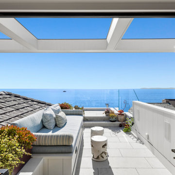
Consider this ingenious architectural feature: the half wall leading to the window cleverly covers the roofline, while the window itself offers a stunning view of the coastline. It even makes the deck appear wider than it actually is, creating a win-win situation. The beauty of a bi-fold door lies in its ability to provide expansive views without the need for pocketing, enhancing the resort-like lifestyle that permeates the entire home design. Cohesive style motifs are essential in any upscale design, and the goal for this project was to seamlessly bring the outside in.
 Paul Krause, LLC
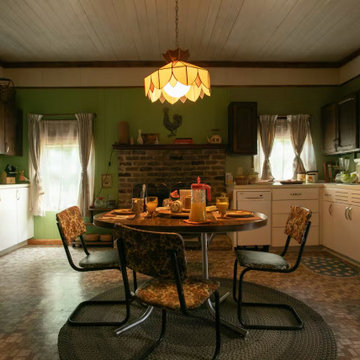
Cabinetry Design, fabrication and installation for Arrived Stranger Things Byer's House. Goal was to replicate the Set Kitchen used for filming . . . which was different than the actual house (used for exterior/outside filming only.
 Chateau Chic Designs
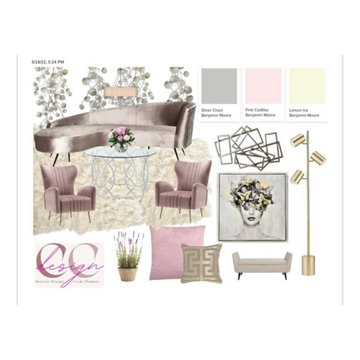
Mood boards can serve many purposes, starting with organizing the inspiration around a project. They can be a valuable resource throughout the design project, to help keep the style and aesthetic consistent and on track with a client’s goals and expectations.
Mood boards are also an excellent way to refine a project’s style before diving into the actual design process. They’re a much lower investment than mock ups and prototypes in terms of resources and time and can convey a lot about the look and feel of the final design.
 Leigh Designs
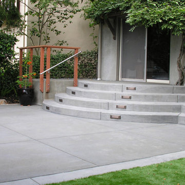
AFTER-
This was a very shady and enclosed backyard. The goal was to create lounge and dining areas, as well as a play area for the kids. Creating curved stairs provided a graceful aesthetic solution and practical access to any direction. The clients were amazed at how much more usable space the actually had. Artificial turf proved the best solution for soccer cleats, low water, and maintenance.
 Paul Krause, LLC
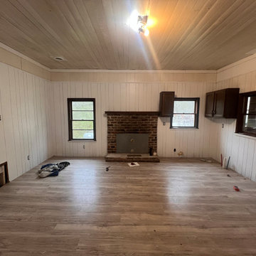
Cabinetry Design, fabrication and installation for Arrived Stranger Things Byer's House. Goal was to replicate the Set Kitchen used for filming . . . which was different than the actual house (used for exterior/outside filming only.
 Advance Design Studio, Ltd.
Curtis and Peggy had been thinking of a kitchen remodel for quite some time, but they knew their house would have a unique set of challenges. Their older Victorian house was built in 1891. The kitchen cabinetry was original, and they wanted to keep the authenticity of their period home while adding modern comforts that would improve their quality of life.
A friend recommended Advance Design Studio for their exceptional experience and quality of work. After meeting with designer Michelle Lecinski at Advance Design, they were confident they could partner with Advance to accomplish the unique kitchen renovation they’d been talking about for years. “We wanted to do the kitchen for a long, long time,” Curtis said. “(We asked ourselves) what are we actually going to do? How are we going to do this? And who are we going to find to do exactly what we want?”
The goal for the project was to keep the home renovation and new kitchen feeling authentic to the time in which it was built. They desperately wanted the modern comforts that come with a larger refrigerator and the dishwasher that they never had! The old home was also a bit drafty so adding a fireplace, wall insulation and new windows became a priority. They very much wanted to create a comfortable hearth room adjacent to the kitchen, complete with old world brick.
The original cabinetry had to go to make way for beautiful new kitchen cabinetry that appears as if it was a hundred years old, but with all the benefits of cutting-edge storage, self-closing drawers, and a brand-new look. “We just wanted to keep it old looking, but with some modern updates,” Peggy said.
Dura Supreme Highland Cabinets with a Heritage Old World Painted Finish replaced the original 1891 cabinets. The hand-applied careful rubbed-off detailing makes these exquisite cabinets look as if they came from a far-gone era. Despite the small size of the kitchen, Peggy, Curtis and Michelle utilized every inch with custom cabinet sizes to increase storage capacity. The custom cabinets allowed for the addition of a 24” Fisher Paykel dishwasher with a concealing Dura Supreme door panel. Michelle was also able to work into the new design a larger 30” Fisher Paykel French refrigerator. “We made every ¼ inch count in this small space,” designer Michelle said. “Having the ability to custom size the cabinetry was the only way to achieve this.”
“The kitchen essentially was designed around the Heartland Vintage range and oven,” says Michelle. A classic appliance that combines nostalgic beauty and craftsmanship for modern cooking, with nickel plated trim and elegantly shaped handles and legs; the not to miss range is a striking focal point of the entire room and an engaging conversation piece.
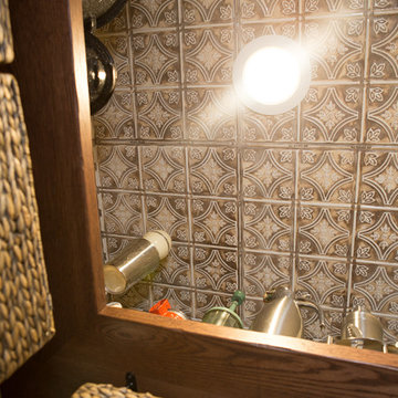
Granite countertops in Kodiak Satin with subtle veining kept with the old-world style. The delicate porcelain La Vie Crackle Sonoma tile kitchen backsplash compliments the home’s style perfectly. A handcrafted passthrough designed to show off Peggy’s fine china was custom built by project carpenters Justin Davis and Jeff Dallain to physically and visually open the space. Additional storage was created in the custom panty room with Latte Edinburg cabinets, hand-made weathered wood shelving with authentic black iron brackets, and an intricate tin copper ceiling.
Peggy and Curtis loved the idea of adding a Vermont stove to make the hearth-room not only functional, but a truly beckoning place to be. A stunning Bordeaux red Vermont Castings Stove with crisp black ventilation was chosen and combined with the authentic reclaimed Chicago brick wall. Advance’s talented carpenters custom-built elegant weathered shelves to house family memorabilia, installed carefully chosen barn sconces, and made the hearth room an inviting place to relax with a cup of coffee and a good book.
“Peggy and Curtis’ project was so much fun to work on. Creating a space that looks and feels like it always belonged in this beautiful old Victorian home is a designer’s dream. To see the delight in their faces when they saw the design details coming together truly made it worth the time and effort that went into making the very compact kitchen space work”, said Michelle. “The result is an amazing custom kitchen, packed with functionality in every inch, nook and cranny!” exclaims Michelle.
The renovation didn’t end with the kitchen. New Pella windows were added to help lessen the drafts. The removal of the original windows and trim necessitated the re-creation of hand-made corbels and trim details no longer available today. The talented carpenter team came to the rescue, crafting new pieces and masterfully finishing them as if they were always there. New custom gutters were formed and installed with a front entry rework necessary to accommodate the changes.
The whole house functions better, but it still feels like the original 1891 home. “From start to finish it’s just a much better space than we used to have,” Peggy said. “Jeff and Justin were amazing.” Curtis added; “We were lucky to find Advance Design, because they really came through for us. I loved that they had everything in house, anything you needed to have done, they could do it”.
 Architect
Why Mattress Thickness Is One of the Most Misunderstood Specs
When most people shop for a memory foam mattress, they focus on firmness, materials, and brand. Thickness tends to be an afterthought — or worse, treated as a proxy for quality. The assumption goes: thicker equals better. That assumption is wrong in a meaningful number of cases, and getting it wrong means waking up with exactly the kind of stiffness, pressure pain, or lower back ache you bought a new mattress to avoid.
The right thickness for a memory foam mattress is not a single number. It is a combination of your body weight, your sleep position, and any specific health conditions you are managing. A 14-inch mattress that provides ideal support for a 250-pound side sleeper may cause a 115-pound stomach sleeper to experience spinal misalignment all night. A 10-inch mattress that works perfectly for a back sleeper of average build offers inadequate pressure relief for a heavier side sleeper whose hips need to sink further into the comfort layer before the support base engages.
This guide maps thickness to the factors that actually determine whether a mattress works for your body. It covers the science of mattress layers, the three primary variables (weight, position, condition), and a complete decision table so you can find your ideal thickness without guesswork.
Understanding Mattress Thickness: Layers, Not Just Height
A memory foam mattress’s total thickness is the sum of its individual layers, and those layers serve entirely different functions. Two mattresses that are both 12 inches thick may feel radically different because their comfort layer depths and support core thicknesses are distributed differently.
The Two Parts That Matter
Every memory foam mattress has two functional zones: the comfort layer at the top and the support core at the bottom. The comfort layer — which in quality mattresses consists of gel-infused viscoelastic foam, transition foam, and a cooling cover — is the zone that contours to your body, relieves pressure, and cushions the joints. The support core — high-density foam or pocketed springs in a hybrid — is the zone that keeps the spine aligned and prevents the entire body from sinking into the mattress.
The key relationship is this: the comfort layer must be deep enough for your body’s heaviest pressure points to sink in fully before the firmer support core pushes back. If it is too shallow, those pressure points press against a firm surface and cause localised pain. If the support core is too thin, the whole mattress sags under body weight and the spine loses alignment regardless of how comfortable the top feels.
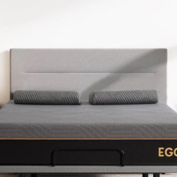
Here is how EGOHOME’s Black series layers map to these functions:
Layer
Material
Function
EGOHOME Technology
Cover (0.5–1")
Fabric + cooling tech
Temperature regulation, hygiene
Anti-heat™ Graphene Cooling Cover
Comfort layer (2–6")
Gel foam, AeroFusion™
Pressure relief, contouring
Copper Gel AeroFusion™ Foam
Transition layer (1–2")
Mid-density foam
Prevents sinkage past comfort zone
BraceSleeper™ Support Foam (upper)
Support core (6–12")
High-density foam or coils
Spinal alignment, edge support
BraceSleeper™ Support Foam (core)
Thickness alone does not tell you how a mattress will perform. A 14-inch mattress with a 2-inch comfort layer and a 12-inch support core will feel firm and supportive. A 14-inch mattress with a 6-inch comfort layer and an 8-inch support core will feel plush and contouring. Always check the comfort layer depth, not just the total inches.
Memory Foam Mattress Thickness Ranges: What Each Category Delivers
Here is a complete breakdown of what to expect from each thickness range and who each suits best:
Thickness
Profile
Best Use Case
Body Weight
Best Sleep Position
6–8"
Low profile
Children, bunk beds, guest rooms, adjustable bases
Under 130 lbs
Kids, lightweight, occasional use
8–10"
Standard-thin
Stomach sleepers, lightweight adults, budget setups
Under 130 lbs
Stomach, lightweight back sleepers
10–12"
Standard
Most adults, back sleepers, back pain relief
130–230 lbs
Back, stomach, combo sleepers
12–14"
High-profile
Side sleepers, plus-size, pressure relief
130–230 lbs+
Side sleepers, hip/shoulder pain
14"+
Premium
Plus-size sleepers, heavy duos, luxury setups
230 lbs+
Plus-size, side sleepers, chronic pain
6–8 Inches: Low-Profile (Specific Use Cases Only)
Low-profile mattresses in the 6 to 8 inch range are designed for specific applications rather than general adult use. They work well on bunk beds and trundle beds where height clearance is limited, for children’s beds where a lower sleep surface is safer, on adjustable bases where the mattress needs to flex significantly, and for lightweight individuals under 130 pounds who need minimal depth to reach the support core. For a standard adult of average build, a mattress under 8 inches is unlikely to provide adequate comfort layer depth for sustained pressure relief.
8–10 Inches: Standard-Thin (Stomach Sleepers and Lightweight Adults)
The 8 to 10 inch range is the practical starting point for most adult use. At this thickness, there is enough comfort layer to provide basic pressure relief without the excessive depth that allows heavier body sections to sink past the support zone. Stomach sleepers in particular benefit from this range: when sleeping face down, the goal is to keep the hips from sinking lower than the shoulders and chest, which would create a downward bow in the lumbar spine. A thinner mattress with a firmer feel prevents this hyperextension more reliably than a thicker, softer model. EGOHOME offers 8-inch memory foam options suited to this profile.
10–12 Inches: Standard (The Sweet Spot for Most Adults)
The 10 to 12 inch range is the most broadly appropriate thickness for adults of standard build. At this depth, a quality memory foam mattress contains enough comfort layer material to contour genuinely around the hips and shoulders without allowing the body to bottom out into the support core. It also contains enough support core depth to maintain spinal alignment under continuous body weight across seven or eight hours. Back sleepers of standard weight (130 to 230 pounds) typically find this range the most supportive, as the lumbar region receives adequate underlying resistance without the excessive softness that taller mattresses can develop under consistent pressure.
12–14 Inches: High-Profile (Side Sleepers and Plus-Size Sleepers)
The 12 to 14 inch range addresses two specific needs: side sleepers who require a deep enough comfort layer to allow the shoulder and hip to sink in while the waist remains supported, and heavier individuals whose body weight requires more foam depth before reaching full support core engagement. For a side sleeper of standard or higher body weight, a comfort layer of less than 4 to 6 inches is often not deep enough for the shoulder to sink fully into an aligned position. The result is an upward lateral bow in the thoracic spine that causes shoulder and upper back pain upon waking. The EGOHOME Black 14-inch Pro and Hybrid models are built specifically for this thickness range.
14 Inches and Above: Premium and Plus-Size
Mattresses at 14 inches or more are appropriate for plus-size sleepers over 230 pounds and for couples where one partner is significantly heavier. At higher body weights, a greater depth of both comfort material and support foam is required because the heavier load compresses the foam more aggressively. A support core that adequately resists a 160-pound sleeper may allow excessive sinkage under a 280-pound sleeper, causing the hips to drop past the point of lumbar support. EGOHOME’s Black 14-inch Firm model includes a 12-inch BraceSleeper™ Support Foam core specifically designed to resist this deep compression under higher body weights.
Thickness by Body Weight: The Primary Determining Factor
Body weight is the single most important variable in thickness selection because it directly determines how far the body sinks into the foam. The same mattress will feel completely different to a 120-pound sleeper versus a 240-pound sleeper, because the heavier person compresses the foam significantly more deeply.
Lightweight Sleepers (Under 130 lbs)
Lightweight sleepers do not need and often cannot benefit from thick mattresses. Because they exert less pressure on the foam, they may not compress a 14-inch mattress deeply enough to feel the support core at all, resulting in a floating sensation with insufficient underlying resistance. For lightweight sleepers, 8 to 10 inches provides adequate comfort layer depth for full pressure relief. The EGOHOME Black 10-inch Classic (medium feel) is the appropriate starting point for this weight category.
Standard-Weight Sleepers (130–230 lbs)
Standard-weight adults represent the broadest population of mattress buyers, and the 10 to 12 inch range was designed specifically for this group. At this weight range, the body compresses the comfort layer meaningfully enough for the foam to contour around pressure points, while the support core remains thick enough to prevent excessive sinkage. The EGOHOME Black 12-inch and the Black 10-inch ranges both address this category, with the 12-inch models being more appropriate for side sleepers who need the extra comfort layer depth.
Plus-Size Sleepers (Over 230 lbs)
Heavier sleepers require 12 to 14 inches at minimum to prevent bottoming out — the point at which body weight compresses through the comfort layer entirely and the sleeper feels the firm support core directly. Bottoming out eliminates pressure relief completely and can significantly worsen joint pain and lower back stiffness. EGOHOME recommends a suggested maximum of 300 pounds per person across their mattress range, and the 14-inch Hybrid and 14-inch Firm models are engineered with the deeper support cores required to handle higher body weights without performance degradation over time.
Thickness by Sleep Position: Matching Depth to Alignment Needs
Side Sleepers: 12 Inches or More
Side sleeping places the body’s heaviest pressure points — the shoulder and hip — in direct contact with the mattress. These points need to sink into the comfort layer deeply enough that the spine remains horizontal from head to toe. If the comfort layer is too thin or too firm, the shoulder cannot descend fully into the mattress, and the spine develops an upward lateral curve between the shoulder and the head. This causes the neck, shoulder, and upper back tension that many side sleepers report upon waking.
Side sleepers of standard weight need at least 12 inches, with a soft to medium-soft comfort layer. EGOHOME’s Black 12-inch Pro (soft feel, 7.5 out of 10 cooling score) is specifically recommended for side sleepers managing back, shoulder, or joint pain. The Black 14-inch Pro (medium-soft, 8 out of 10 cooling) adds additional comfort layer depth for those who need greater pressure relief.
Back Sleepers: 10–12 Inches
Back sleeping is the most spinal-alignment-friendly position because the body’s weight is distributed relatively evenly across the mattress. The primary challenge for back sleepers is lumbar support: the natural inward curve of the lower back creates a gap between the lumbar spine and the mattress surface that must be filled by the foam contouring upward into it. A mattress that is too soft allows the pelvis to sink excessively, flattening this curve and creating lower back compression. A mattress that is too firm cannot conform into the lumbar curve at all.
For back sleepers, 10 to 12 inches with a medium or medium-firm feel provides the optimal combination. EGOHOME’s Black 12-inch Hybrid (medium-firm, 6.5 out of 10 cooling) is specifically noted as ideal for back sleepers, combining pocketed spring zoned support with gel foam contouring for precise lumbar engagement.
Stomach Sleepers: 8–10 Inches
Stomach sleepers face the opposite alignment challenge from side sleepers. Rather than needing the mattress to yield deeply at the joints, they need the mattress to maintain a flat, firm surface that prevents the hips from sinking below the chest. If the hips drop lower than the upper body, the lumbar spine hyperextends into an arched position that compresses the posterior vertebral joints and causes significant lower back pain.
Stomach sleepers need a thinner mattress with a firmer feel. The EGOHOME Black 14-inch Firm is specifically recommended for stomach sleepers and heavier sleepers who need maximum surface resistance. Its 12-inch BraceSleeper™ Support Foam core provides the deep, unyielding base that prevents hip sinkage without requiring a thin mattress that compromises comfort.
Best Thickness for Back Pain: The Medium-Firm 10–12 Inch Principle
For people managing chronic lower back pain, herniated discs, sciatica, or general spinal stiffness, mattress thickness interacts with back health in a specific way that differs from general sleep comfort recommendations.
The key principle for back pain is controlled contouring. You need enough foam depth to relieve pressure at the hips and shoulders, but not so much depth that the foam develops a sag under the heavier sections of the body over time. Excessive thickness combined with a soft comfort layer is one of the most common causes of mattress-induced back pain — the sleeper sinks into a gentle hammock shape that feels comfortable initially but compresses the lumbar discs continuously throughout the night.
10–12 Inches: The Optimal Back Pain Range
A medium-firm mattress of 10 to 12 inches addresses both needs simultaneously. It provides adequate foam depth for genuine pressure relief at the hips and shoulders without the risk of comfort layer collapse that taller, softer mattresses can develop. The support core at this thickness is deep enough to maintain consistent lumbar support from the first night through years of regular use.
For side sleepers with lower back pain, the recommendation extends to 12 inches with a soft feel to ensure the hip can sink into full alignment. For back sleepers with lower back pain, 10 to 12 inches with a medium-firm feel is the target. For stomach sleepers with lower back pain, a firmer feel at any thickness is more important than depth — preventing hip sinkage is the priority.
⚠️ Mattresses over 14 inches with very soft comfort layers are a common hidden cause of lower back pain. The deep softness feels luxurious initially but allows the lumbar region to sag into misalignment through the night. If you sleep on a thick, very soft mattress and wake with lower back stiffness, the mattress — not your position — may be the cause.
Complete Thickness Decision Table: Your Position × Your Weight
Use this table to find your recommended thickness and the matching EGOHOME model:
Sleep Position
Body Weight
Ideal Thickness
EGOHOME Recommendation
Side sleeper
Under 130 lbs
12"
EGOHOME Black 12” Pro (soft, 7.5/10 cool)
Side sleeper
130–230 lbs
12–14"
EGOHOME Black 14” Pro (medium-soft, 8/10 cool)
Side sleeper
Over 230 lbs
14"
EGOHOME Black 14” Hybrid (medium-firm, 8.5/10 cool)
Back sleeper
Under 130 lbs
10"
EGOHOME Black 10” Classic (medium, 6/10 cool)
Back sleeper
130–230 lbs
10–12"
EGOHOME Black 12” Hybrid (medium-firm, 6.5/10 cool)
Back sleeper
Over 230 lbs
12–14"
EGOHOME Black 14” Hybrid (medium-firm, 8.5/10 cool)
Stomach sleeper
Under 130 lbs
8–10"
EGOHOME 8" Memory Foam (firm, standard support)
Stomach sleeper
130–230 lbs
10–12"
EGOHOME Black 10” Hybrid (medium-firm, 6.5/10 cool)
Stomach sleeper
Over 230 lbs
12–14"
EGOHOME Black 14” Firm (firm, 7/10 cool)
Combination
Any weight
10–14"
EGOHOME Black 14” Pro or 14” Hybrid
? If you are between two categories — for example, a 220-pound back sleeper with occasional side sleeping — choose the model suited to your heavier variable. A 12” hybrid model handles the heavier weight and still adapts to position changes. When in doubt, go medium-firm over soft.
EGOHOME Memory Foam Mattresses by Thickness
EGOHOME’s range spans 6 to 14 inches across memory foam and hybrid constructions, with every model carrying CertiPUR-US® and OEKO-TEX® Standard 100 certification, a 10-year warranty, a 100-night home trial, and free shipping and returns across the contiguous U.S.
For 8–10 Inch Needs
The EGOHOME 8-inch memory foam and Black 10-inch Classic and Hybrid models cover the lightweight and stomach sleeper range. The 10-inch Classic offers a medium feel suited to back and side sleepers under 130 pounds. The 10-inch Hybrid adds pocketed spring support for better lumbar engagement and airflow.
For 10–12 Inch Needs
The EGOHOME Black 12-inch range — Classic, Pro, and Hybrid — is the most widely applicable thickness tier. The 12-inch Classic (soft, cool 6/10) suits side sleepers and those with joint pain. The 12-inch Hybrid (medium-firm, cool 6.5/10) is specifically recommended for back sleepers and standard-weight adults across positions. The 12-inch Pro (soft, cool 7.5/10) is the top choice for side sleepers dealing with shoulder or hip pain.
For 12–14 Inch Needs
The EGOHOME Black 14-inch series is the flagship range. The 14-inch Pro (medium-soft, cool 8/10) is designed for side sleepers and pressure-relief-first buyers. The 14-inch Hybrid (medium-firm, cool 8.5/10) handles all sleep positions and is the strongest all-rounder in the range. The 14-inch Firm is built for stomach sleepers and heavier individuals, with a 12-inch BraceSleeper™ Support Foam core that resists sinkage under higher body weights.
Frequently Asked Questions
Is a thicker memory foam mattress always better?
No. Thickness should match your body weight and sleep position, not simply be maximised. A 14-inch mattress with a very soft comfort layer can cause back pain in lightweight sleepers or stomach sleepers by allowing excessive sinkage. A well-calibrated 10-inch mattress will consistently outperform an oversized 14-inch model for the wrong body type.
What thickness of memory foam is good for back pain?
A medium-firm mattress of 10 to 12 inches is the most widely recommended range for lower back pain. It provides enough foam depth for genuine pressure relief without the risk of comfort layer collapse that causes lumbar sagging. Side sleepers with back pain may benefit from 12 inches with a softer feel to ensure hip and shoulder alignment.
What is the minimum thickness for a memory foam mattress for adults?
For most adults, 8 inches is the practical minimum for sustained comfort. Below 8 inches, there is often insufficient comfort layer depth for pressure relief across a full night of sleep. The exception is stomach sleepers who may intentionally choose 8 inches for a firmer surface that prevents hip sinkage.
Does mattress thickness affect how long it lasts?
Yes, indirectly. A mattress that is too thin for the body weight it supports will experience faster comfort layer compression and develop sags and pressure indentations earlier than one appropriately sized for that load. Choosing the correct thickness for your weight extends the usable lifespan of the mattress. EGOHOME mattresses are expected to last 6 to 8 years with proper care, with regular rotation every 3 to 6 months recommended.
Can I use a thick mattress on an adjustable base?
Memory foam mattresses up to 14 inches are generally compatible with adjustable bases, though the mattress should be flexible enough to bend at the head and foot sections without cracking or deforming. EGOHOME mattresses are confirmed compatible with adjustable bases. For very thick or firm mattresses, check the specific flex requirements of your adjustable base before purchasing.
Final Thoughts
The best thickness for a memory foam mattress is not the thickest you can find or the most expensive number on the specification sheet. It is the thickness that aligns precisely with your body weight, your sleep position, and any specific conditions you are managing — then pairs that depth with a comfort layer and support core calibrated to work
 Bhupinder Singh
Elevate Your Bathing Experience with Kohler Shower Accessories
Showerheads and Rain Showers
BRAQ brings you “Kohler's Shower accessories designed” to turn your bathroom into a spa-like retreat. From rainfall showerheads to body jets, the options are endless.
Features of Kohler Shower Accessories:
Multiple spray settings
Thermostatic temperature control
Easy-clean nozzles
Chrome, matte black, and gold finishes
Whether it’s a luxury suite or a compact space, BRAQ helps you configure your Shower accessories for the ultimate relaxation.
Hand Showers and Slide Bars
Adjustable and ergonomic, Kohler’s hand showers with slide bars are ideal for family use. They are:
Easy to install
Water-efficient
Sleek in design
Complementary to various décor themes
Why BRAQ by BRCeramics Is the Best Tile Shop and Tiles Showroom
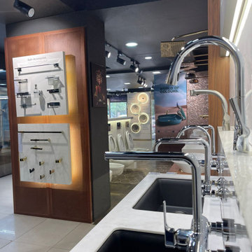
BRAQ isn’t just a destination for bath fittings. As a “premium Tile Store”, we house an expansive collection of floor tiles, wall tiles, and designer tiles that perfectly complement Kohler’s bathware. Our displays help you visualize the full setup – from Toilet Sets and Vanities to Tiles and Faucets – all in one place.
Benefits of visiting our Tile Shop:
One-stop-shop for complete bathroom solutions
Expert assistance on product combinations
Interactive displays with real-life mockups
Access to exclusive Kohler designs
Tiles and Bathroom Aesthetics – Harmonizing Space
BRAQ goes beyond being a Tiles Showroom. We believe in curating spaces that are both functional and artistic. Our tile collection is chosen to match Kohler’s elite fittings in color, design, and texture.
Tiles available at BRAQ include:
Matte and glossy ceramic tiles
Large-format vitrified tiles
Anti-skid bathroom floor tiles
Decorative wall cladding
By visiting our “Tile Store”, you can see how Kohler fittings blend seamlessly with our tile solutions for a completely styled bathroom.
Client Experience at BRAQ BRCeramics
At BRAQ, we prioritize customer satisfaction and experience. Our trained staff takes the time to understand your needs, preferences, and design goals.
Our Process:
Consultation and product education
On-site demo and layout planning
Finalization of fittings and tiles
Delivery and installation coordination
Post-installation service support
We ensure that you leave with not just products but with complete peace of mind.
Sustainability and Innovation
Kohler is globally recognized for sustainable practices. All Kohler bath fittings available at BRAQ are engineered for:
Reduced water consumption
Long lifecycle
Minimal maintenance
Recyclable packaging
Choose “eco-friendly Toilet Sets” and Water Sense-certified Faucets without compromising on style or performance.
Project Applications – From Homes to Hotels
BRAQ supplies Kohler fittings and tiles for:
Residential apartments
Bungalows and villas
Boutique hotels
Corporate offices
Hospitality spaces
Our Tile Showroom features actual-size mockups, allowing builders and architects to make confident choices for large-scale projects.
Visit BRAQ Today – The Best Tiles Shop in Delhi NCR
Looking for the “best bath fittings” and “designer tiles in Delhi NCR”? BRAQ by BRCeramics is your ultimate destination. From premium Kohler Toilet Sets to eye-catching Vessel Wash Basins and Mirrors, we offer the full spectrum of products under one roof.
Find us easily by searching "Tile Shop near me" or "Tiles showroom Delhi NCR" and explore why BRAQ is the most trusted name in the business.
Frequently Asked Questions (FAQs)
Q1: Are Kohler bath fittings at BRAQ covered under warranty?
Yes, all Kohler products sold at BRAQ come with official manufacturer warranties and service support.
Q2: Can I see full bathroom setups at the Tiles Showroom?
Absolutely. BRAQ features real-size mockups that showcase Kohler Toilet Sets, Vanities, Faucets, and Tiles in functional layouts.
Q3: Do you offer home delivery and installation?
Yes, we offer both delivery and installation support across Delhi NCR.
Q4: What makes Kohler Faucets better than others?
Kohler Faucets are known for superior build quality, water efficiency, and design innovation.
Q5: Can I consult with a designer at BRAQ?
Yes, we offer in-store and virtual consultation with our design experts to help you plan your bathroom.
Visit BRAQ by BRCeramics Today
Explore the best of Kohler bath fittings—from “Toilet Sets” to Shower accessories—and transform your bathroom into a luxury space. BRAQ’s Tile Shop and Tiles Showroom in Delhi NCR is ready to welcome you with expert guidance, premium products, and an unparalleled experience.
Come visit BRAQ BRCeramics — Your “Luxury Bathroom Destination in Delhi NCR”.
Contact us for personalized consultations or to schedule a showroom tour!
Let me know if you'd like this content in a downloadable format or want to include images or product links.
Visiting our website and Showroom : - https://brceramics.com/braq | https://g.co/kgs/zmGNejy
#Besttoiletforbathroomindelhi | #Tileshowroominrajourigarden | #Tilesshopindelhi | #Tilesshopinrajagarden | #bestvanitiesforbathroomsindelhi | #bestwashbasinforbathroomindelhi | #bestmirrorforbathroomindelhi | #Bestwashbasinsforbathroomindelhi | #Bestvesselswashbasinindelhi | #Bestfaucetforbathroomsindelhi | #Bestparallelbathroomindelhi | #Bestvivetallbasinfaucetforbathroomindelhi | #Bestbathtubforbathroomindelhi | #Bestbathfillersforbathroomindelhi | #Bestshowerforbathroomindelhi | #bestshowerheadforbathroomindelhi |
22