
Search results for "Adding clutter" in Home Design Ideas
 CO Interiors
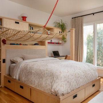
Designed to inspire imagination, movement, and independence, this custom boys’ bedroom transforms everyday functionality into an adventurous and highly personalized retreat. Every inch of the room was thoughtfully designed to maximize play, storage, and comfort while maintaining a clean and cohesive aesthetic that can evolve with the child over time.
The custom built-in bed structure acts as the centerpiece of the room, combining sleeping, climbing, lounging, and storage into one integrated design. Inspired by the feeling of a treehouse or indoor fort, the elevated rope hammock introduces a playful architectural feature that encourages creativity, reading, and imaginative play while adding visual excitement overhead.
Integrated climbing bars and bold red accent details bring energy and personality to the otherwise warm and natural material palette. Custom birch millwork throughout the room provides extensive built-in storage for books, toys, and collectibles while helping the space remain organized and functional for daily life.
Deep storage drawers were seamlessly incorporated below the bed platform to maximize usable space without adding visual clutter. A built-in desk and shelving area near the window creates a dedicated zone for homework, reading, and creative projects while still allowing natural light and views to remain a central feature within the room.
The overall design balances fun and sophistication by pairing playful elements with clean lines, warm wood tones, layered textures, and thoughtfully integrated functionality — creating a bedroom that feels adventurous, calming, and built to grow alongside its young owner.
 Ellie K Design
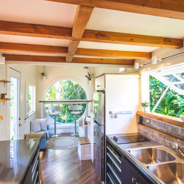
This coastal, contemporary Tiny Home features a warm yet industrial style kitchen with stainless steel counters and husky tool drawers with black cabinets. the silver metal counters are complimented by grey subway tiling as a backsplash against the warmth of the locally sourced curly mango wood windowsill ledge. I mango wood windowsill also acts as a pass-through window to an outdoor bar and seating area on the deck. Entertaining guests right from the kitchen essentially makes this a wet-bar. LED track lighting adds the right amount of accent lighting and brightness to the area. The window is actually a french door that is mirrored on the opposite side of the kitchen. This kitchen has 7-foot long stainless steel counters on either end. There are stainless steel outlet covers to match the industrial look. There are stained exposed beams adding a cozy and stylish feeling to the room. To the back end of the kitchen is a frosted glass pocket door leading to the bathroom. All shelving is made of Hawaiian locally sourced curly mango wood. A stainless steel fridge matches the rest of the style and is built-in to the staircase of this tiny home. Dish drying racks are hung on the wall to conserve space and reduce clutter.
The centerpiece and focal point to this tiny home living room is the grand circular-shaped window which is actually two half-moon windows jointed together where the mango woof bar-top is placed. This acts as a work and dining space. Hanging plants elevate the eye and draw it upward to the high ceilings. Colors are kept clean and bright to expand the space. The love-seat folds out into a sleeper and the ottoman/bench lifts to offer more storage. The round rug mirrors the window adding consistency. This tropical modern coastal Tiny Home is built on a trailer and is 8x24x14 feet. The blue exterior paint color is called cabana blue. The large circular window is quite the statement focal point for this how adding a ton of curb appeal. The round window is actually two round half-moon windows stuck together to form a circle. There is an indoor bar between the two windows to make the space more interactive and useful- important in a tiny home. There is also another interactive pass-through bar window on the deck leading to the kitchen making it essentially a wet bar. This window is mirrored with a second on the other side of the kitchen and the are actually repurposed french doors turned sideways. Even the front door is glass allowing for the maximum amount of light to brighten up this tiny home and make it feel spacious and open. This tiny home features a unique architectural design with curved ceiling beams and roofing, high vaulted ceilings, a tiled in shower with a skylight that points out over the tongue of the trailer saving space in the bathroom, and of course, the large bump-out circle window and awning window that provides dining spaces.

Find the right local pro for your project

 Tanya Capaldo Designs
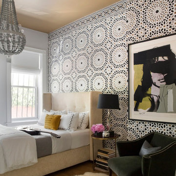
Andy Warhol's Mick Jagger, Spun wire chandelier, green mohair antique chair, Schumacher wallpaper.
Photography by Eric Roth
Example of a large transitional dark wood floor bedroom design in Boston with multicolored walls
Example of a large transitional dark wood floor bedroom design in Boston with multicolored walls
 Ellie Lillstrom Photography
Photo: A Darling Felicity Photography © 2015 Houzz
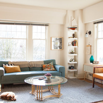
Living room - mid-sized eclectic enclosed medium tone wood floor living room idea in Seattle with white walls
Living room - mid-sized eclectic enclosed medium tone wood floor living room idea in Seattle with white walls
 TKS Design Group
Download our free ebook, Creating the Ideal Kitchen. DOWNLOAD NOW
Lakefront property in the northwest suburbs of Chicago is hard to come by, so when we were hired by this young family with exactly that, we were immediately inspired by not just the unusually large footprint of this 1950’s colonial revival but also the lovely views of the manmade lake it was sited on. The large 5-bedroom home was solidly stuck in the 1980’s, but we saw tons of potential. We started out by updating the existing staircase with a fresh coat of paint and adding new herringbone slate to the entry hall.
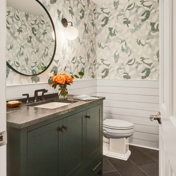
The powder room off the entryway also got a refresh - new flooring, new cabinets and fixtures. We ran the new slate right through into this space for some consistency. A fun wallpaper and shiplap trim add a welcoming feel and set the tone for the home.
Next, we tackled the kitchen. Located away from the rest of the first floor, the kitchen felt a little isolated, so we immediately began planning for how to better connect it to the rest of the first floor. We landed on removing the wall between the kitchen and dining room and designed a modified galley style space with separate cooking and clean up zones. The cooking zone consists of the refrigerator, prep sink and cooktop, along with a nice long run of prep space at the island. The cleanup side of the kitchen consists of the main sink and dishwasher. Both areas are situated so that the user can view the lake during prep work and cleanup!
One of the home’s main puzzles was how to incorporate the mudroom and area in front of the patio doors at the back of the house. We already had a breakfast table area, so the space by the patio doors was a bit of a no man’s land. We decided to separate the kitchen proper from what became the new mudroom with a large set of barn doors. That way you can quickly hide any mudroom messes but have easy access to the light coming in through the patio doors as well as the outdoor grilling station. We also love the impact the barn doors add to the overall space.
The homeowners’ first words to us were “it’s time to ditch the brown,” so we did! We chose a lovely blue pallet that reflects the home’s location on the lake which is also vibrant yet easy on the eye. Countertops are white quartz, and the natural oak floor works well with the other honey accents. The breakfast table was given a refresh with new chairs, chandelier and window treatments that frame the gorgeous views of the lake out the back.
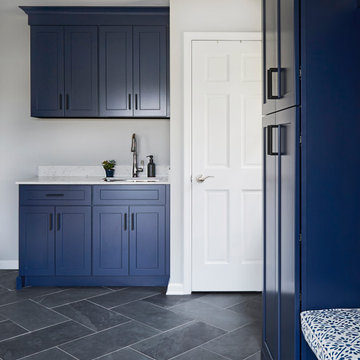
We coordinated the slate mudroom flooring with that used in the home’s main entrance for a consistent feel. The storage area consists of open and closed storage to allow for some clutter control as needed.
Next on our “to do” list was revamping the dated brown bar area in the neighboring dining room. We eliminated the clutter by adding some closed cabinets and did some easy updates to help the space feel more current. One snag we ran into here was the discovery of a beam above the existing open shelving that had to be modified with a smaller structural beam to allow for our new design to work. This was an unexpected surprise, but in the end we think it was well worth it!
We kept the colors here a bit more muted to blend with the homeowner’s existing furnishings. Open shelving and polished nickel hardware add some simple detail to the new entertainment zone which also looks out onto the lake!
Next we tackled the upstairs starting with the homeowner’s son’s bath. The bath originally had both a tub shower and a separate shower, so we decided to swap out the shower for a new laundry area. This freed up some space downstairs in what used to be the mudroom/laundry room and is much more convenient for daily laundry needs.
We continued the blue palette here with navy cabinetry and the navy tile in the shower. Porcelain floor tile and chrome fixtures keep maintenance to a minimum while matte black mirrors and lighting add some depth the design. A low maintenance runner adds some warmth underfoot and ties the whole space together.
We added a pocket door to the bathroom to minimize interference with the door swings. The left door of the laundry closet is on a 180 degree hinge to allow for easy full access to the machines. Next we tackled the master bath which is an en suite arrangement. The original was typical of the 1980’s with the vanity outside of the bathroom, situated near the master closet. And the brown theme continued here with multiple shades of brown.
Our first move was to segment off the bath and the closet from the master bedroom. We created a short hall from the bedroom to the bathroom with his and hers walk-in closets on the left and right as well as a separate toilet closet outside of the main bathroom for privacy and flexibility.
The original bathroom had a giant soaking tub with steps (dangerous!) as well as a small shower that did not work well for our homeowner who is 6’3”. With other bathtubs in the home, they decided to eliminate the tub and create an oversized shower which takes up the space where the old tub was located. The double vanity is on the opposite wall and a bench is located under the window for morning conversations and a place to set a couple of towels.
The pallet in here is light and airy with a mix of blond wood, creamy porcelain and marble tile, and brass accents. A simple roman shade adds some texture and it’s top-down mechanism allows for light and privacy.
This large whole house remodel gave our homeowners not only the ability to maximize the potential of their home but also created a lovely new frame from which to view their fabulous lake views.
Designed by: Susan Klimala, CKD, CBD
Photography by: Michael Kaskel
For more information on kitchen and bath design ideas go to: www.kitchenstudio-ge.com

Sponsored
Columbus, OH

Structural Remodeling
Franklin County's Heavy Timber Specialists | Best of Houzz 2020!
 TKS Design Group
Download our free ebook, Creating the Ideal Kitchen. DOWNLOAD NOW
Lakefront property in the northwest suburbs of Chicago is hard to come by, so when we were hired by this young family with exactly that, we were immediately inspired by not just the unusually large footprint of this 1950’s colonial revival but also the lovely views of the manmade lake it was sited on. The large 5-bedroom home was solidly stuck in the 1980’s, but we saw tons of potential. We started out by updating the existing staircase with a fresh coat of paint and adding new herringbone slate to the entry hall.
The powder room off the entryway also got a refresh - new flooring, new cabinets and fixtures. We ran the new slate right through into this space for some consistency. A fun wallpaper and shiplap trim add a welcoming feel and set the tone for the home.
Next, we tackled the kitchen. Located away from the rest of the first floor, the kitchen felt a little isolated, so we immediately began planning for how to better connect it to the rest of the first floor. We landed on removing the wall between the kitchen and dining room and designed a modified galley style space with separate cooking and clean up zones. The cooking zone consists of the refrigerator, prep sink and cooktop, along with a nice long run of prep space at the island. The cleanup side of the kitchen consists of the main sink and dishwasher. Both areas are situated so that the user can view the lake during prep work and cleanup!
One of the home’s main puzzles was how to incorporate the mudroom and area in front of the patio doors at the back of the house. We already had a breakfast table area, so the space by the patio doors was a bit of a no man’s land. We decided to separate the kitchen proper from what became the new mudroom with a large set of barn doors. That way you can quickly hide any mudroom messes but have easy access to the light coming in through the patio doors as well as the outdoor grilling station. We also love the impact the barn doors add to the overall space.
The homeowners’ first words to us were “it’s time to ditch the brown,” so we did! We chose a lovely blue pallet that reflects the home’s location on the lake which is also vibrant yet easy on the eye. Countertops are white quartz, and the natural oak floor works well with the other honey accents. The breakfast table was given a refresh with new chairs, chandelier and window treatments that frame the gorgeous views of the lake out the back.
We coordinated the slate mudroom flooring with that used in the home’s main entrance for a consistent feel. The storage area consists of open and closed storage to allow for some clutter control as needed.
Next on our “to do” list was revamping the dated brown bar area in the neighboring dining room. We eliminated the clutter by adding some closed cabinets and did some easy updates to help the space feel more current. One snag we ran into here was the discovery of a beam above the existing open shelving that had to be modified with a smaller structural beam to allow for our new design to work. This was an unexpected surprise, but in the end we think it was well worth it!
We kept the colors here a bit more muted to blend with the homeowner’s existing furnishings. Open shelving and polished nickel hardware add some simple detail to the new entertainment zone which also looks out onto the lake!
Next we tackled the upstairs starting with the homeowner’s son’s bath. The bath originally had both a tub shower and a separate shower, so we decided to swap out the shower for a new laundry area. This freed up some space downstairs in what used to be the mudroom/laundry room and is much more convenient for daily laundry needs.
We continued the blue palette here with navy cabinetry and the navy tile in the shower. Porcelain floor tile and chrome fixtures keep maintenance to a minimum while matte black mirrors and lighting add some depth the design. A low maintenance runner adds some warmth underfoot and ties the whole space together.
We added a pocket door to the bathroom to minimize interference with the door swings. The left door of the laundry closet is on a 180 degree hinge to allow for easy full access to the machines. Next we tackled the master bath which is an en suite arrangement. The original was typical of the 1980’s with the vanity outside of the bathroom, situated near the master closet. And the brown theme continued here with multiple shades of brown.
Our first move was to segment off the bath and the closet from the master bedroom. We created a short hall from the bedroom to the bathroom with his and hers walk-in closets on the left and right as well as a separate toilet closet outside of the main bathroom for privacy and flexibility.
The original bathroom had a giant soaking tub with steps (dangerous!) as well as a small shower that did not work well for our homeowner who is 6’3”. With other bathtubs in the home, they decided to eliminate the tub and create an oversized shower which takes up the space where the old tub was located. The double vanity is on the opposite wall and a bench is located under the window for morning conversations and a place to set a couple of towels.
The pallet in here is light and airy with a mix of blond wood, creamy porcelain and marble tile, and brass accents. A simple roman shade adds some texture and it’s top-down mechanism allows for light and privacy.
This large whole house remodel gave our homeowners not only the ability to maximize the potential of their home but also created a lovely new frame from which to view their fabulous lake views.
Designed by: Susan Klimala, CKD, CBD
Photography by: Michael Kaskel
For more information on kitchen and bath design ideas go to: www.kitchenstudio-ge.com
 TKS Design Group
Download our free ebook, Creating the Ideal Kitchen. DOWNLOAD NOW
Lakefront property in the northwest suburbs of Chicago is hard to come by, so when we were hired by this young family with exactly that, we were immediately inspired by not just the unusually large footprint of this 1950’s colonial revival but also the lovely views of the manmade lake it was sited on. The large 5-bedroom home was solidly stuck in the 1980’s, but we saw tons of potential. We started out by updating the existing staircase with a fresh coat of paint and adding new herringbone slate to the entry hall.
The powder room off the entryway also got a refresh - new flooring, new cabinets and fixtures. We ran the new slate right through into this space for some consistency. A fun wallpaper and shiplap trim add a welcoming feel and set the tone for the home.
Next, we tackled the kitchen. Located away from the rest of the first floor, the kitchen felt a little isolated, so we immediately began planning for how to better connect it to the rest of the first floor. We landed on removing the wall between the kitchen and dining room and designed a modified galley style space with separate cooking and clean up zones. The cooking zone consists of the refrigerator, prep sink and cooktop, along with a nice long run of prep space at the island. The cleanup side of the kitchen consists of the main sink and dishwasher. Both areas are situated so that the user can view the lake during prep work and cleanup!
One of the home’s main puzzles was how to incorporate the mudroom and area in front of the patio doors at the back of the house. We already had a breakfast table area, so the space by the patio doors was a bit of a no man’s land. We decided to separate the kitchen proper from what became the new mudroom with a large set of barn doors. That way you can quickly hide any mudroom messes but have easy access to the light coming in through the patio doors as well as the outdoor grilling station. We also love the impact the barn doors add to the overall space.
The homeowners’ first words to us were “it’s time to ditch the brown,” so we did! We chose a lovely blue pallet that reflects the home’s location on the lake which is also vibrant yet easy on the eye. Countertops are white quartz, and the natural oak floor works well with the other honey accents. The breakfast table was given a refresh with new chairs, chandelier and window treatments that frame the gorgeous views of the lake out the back.
We coordinated the slate mudroom flooring with that used in the home’s main entrance for a consistent feel. The storage area consists of open and closed storage to allow for some clutter control as needed.
Next on our “to do” list was revamping the dated brown bar area in the neighboring dining room. We eliminated the clutter by adding some closed cabinets and did some easy updates to help the space feel more current. One snag we ran into here was the discovery of a beam above the existing open shelving that had to be modified with a smaller structural beam to allow for our new design to work. This was an unexpected surprise, but in the end we think it was well worth it!
We kept the colors here a bit more muted to blend with the homeowner’s existing furnishings. Open shelving and polished nickel hardware add some simple detail to the new entertainment zone which also looks out onto the lake!
Next we tackled the upstairs starting with the homeowner’s son’s bath. The bath originally had both a tub shower and a separate shower, so we decided to swap out the shower for a new laundry area. This freed up some space downstairs in what used to be the mudroom/laundry room and is much more convenient for daily laundry needs.
We continued the blue palette here with navy cabinetry and the navy tile in the shower. Porcelain floor tile and chrome fixtures keep maintenance to a minimum while matte black mirrors and lighting add some depth the design. A low maintenance runner adds some warmth underfoot and ties the whole space together.
We added a pocket door to the bathroom to minimize interference with the door swings. The left door of the laundry closet is on a 180 degree hinge to allow for easy full access to the machines. Next we tackled the master bath which is an en suite arrangement. The original was typical of the 1980’s with the vanity outside of the bathroom, situated near the master closet. And the brown theme continued here with multiple shades of brown.
Our first move was to segment off the bath and the closet from the master bedroom. We created a short hall from the bedroom to the bathroom with his and hers walk-in closets on the left and right as well as a separate toilet closet outside of the main bathroom for privacy and flexibility.
The original bathroom had a giant soaking tub with steps (dangerous!) as well as a small shower that did not work well for our homeowner who is 6’3”. With other bathtubs in the home, they decided to eliminate the tub and create an oversized shower which takes up the space where the old tub was located. The double vanity is on the opposite wall and a bench is located under the window for morning conversations and a place to set a couple of towels.
The pallet in here is light and airy with a mix of blond wood, creamy porcelain and marble tile, and brass accents. A simple roman shade adds some texture and it’s top-down mechanism allows for light and privacy.
This large whole house remodel gave our homeowners not only the ability to maximize the potential of their home but also created a lovely new frame from which to view their fabulous lake views.
Designed by: Susan Klimala, CKD, CBD
Photography by: Michael Kaskel
For more information on kitchen and bath design ideas go to: www.kitchenstudio-ge.com
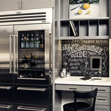
 Jules Art of Living
Cherie Cordellos Commercial Photography
Small elegant built-in desk study room photo in San Francisco with gray walls
Small elegant built-in desk study room photo in San Francisco with gray walls
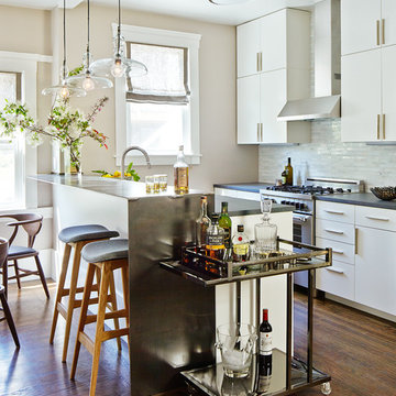
 Karin Payson architecture + design
Brad Knipstein
Open concept kitchen - small contemporary galley dark wood floor open concept kitchen idea in San Francisco with flat-panel cabinets, white cabinets, quartzite countertops, white backsplash, stone tile backsplash, stainless steel appliances and a peninsula
Open concept kitchen - small contemporary galley dark wood floor open concept kitchen idea in San Francisco with flat-panel cabinets, white cabinets, quartzite countertops, white backsplash, stone tile backsplash, stainless steel appliances and a peninsula
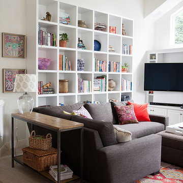
 Maggie Stephens Interiors
A huge custom bookshelf and custom sectionals are large enough to hold their own in a large, double height space.
Jon + Moch Photography
Example of a mid-sized eclectic open concept carpeted living room design in Other with white walls, a standard fireplace, a stone fireplace and a wall-mounted tv
Example of a mid-sized eclectic open concept carpeted living room design in Other with white walls, a standard fireplace, a stone fireplace and a wall-mounted tv
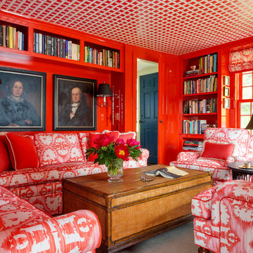
 Ramsay Gourd Home
Greg Premru
Example of a small eclectic enclosed family room library design in Burlington with red walls
Example of a small eclectic enclosed family room library design in Burlington with red walls

Sponsored
Columbus, OH

Hope Restoration & General Contracting
Columbus Design-Build, Kitchen & Bath Remodeling, Historic Renovations
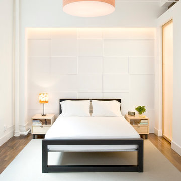
 Darci Hether
Open concept, loft living makes this one bedroom with home office feel spacious, bright and airy. With strategically placed and well thought out built-ins and a wall hung media cabinet, everything has its place while being visual pleasing.
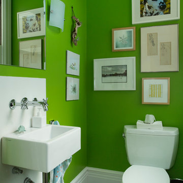
 Margot Hartford Photography
Photo: Margot Hartford © 2015 Houzz
Inspiration for a contemporary powder room remodel in San Francisco
Inspiration for a contemporary powder room remodel in San Francisco
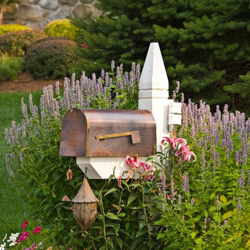
 Cording Landscape Design
Giant Hyssop and lilies surround this copper mailbox.
Alan & Linda Detrick Photography
Inspiration for a mid-sized traditional full sun front yard driveway in New York for summer.
Inspiration for a mid-sized traditional full sun front yard driveway in New York for summer.
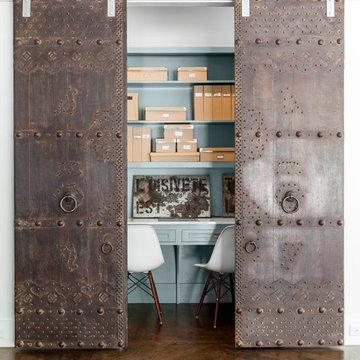
 Robert Elliott Custom Homes
Nathan Schroder Photography
BK Design Studio
Robert Elliott Custom Homes
Inspiration for a contemporary built-in desk dark wood floor home office remodel in Dallas with blue walls
Inspiration for a contemporary built-in desk dark wood floor home office remodel in Dallas with blue walls

Sponsored
Columbus, OH
Hope Restoration & General Contracting
Columbus Design-Build, Kitchen & Bath Remodeling, Historic Renovations
 TVL Creative Ltd.
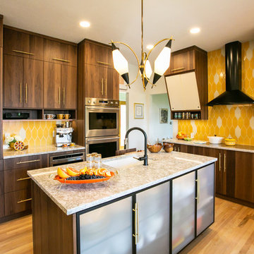
When a client tells us they’re a mid-century collector and long for a kitchen design unlike any other we are only too happy to oblige. This kitchen is saturated in mid-century charm and its custom features make it difficult to pin-point our favorite aspect!
Cabinetry
We had the pleasure of partnering with one of our favorite Denver cabinet shops to make our walnut dreams come true! We were able to include a multitude of custom features in this kitchen including frosted glass doors in the island, open cubbies, a hidden cutting board, and great interior cabinet storage. But what really catapults these kitchen cabinets to the next level is the eye-popping angled wall cabinets with sliding doors, a true throwback to the magic of the mid-century kitchen. Streamline brushed brass cabinetry pulls provided the perfect lux accent against the handsome walnut finish of the slab cabinetry doors.
Tile
Amidst all the warm clean lines of this mid-century kitchen we wanted to add a splash of color and pattern, and a funky backsplash tile did the trick! We utilized a handmade yellow picket tile with a high variation to give us a bit of depth; and incorporated randomly placed white accent tiles for added interest and to compliment the white sliding doors of the angled cabinets, helping to bring all the materials together.
Counter
We utilized a quartz along the counter tops that merged lighter tones with the warm tones of the cabinetry. The custom integrated drain board (in a starburst pattern of course) means they won’t have to clutter their island with a large drying rack. As an added bonus, the cooktop is recessed into the counter, to create an installation flush with the counter surface.
Stair Rail
Not wanting to miss an opportunity to add a touch of geometric fun to this home, we designed a custom steel handrail. The zig-zag design plays well with the angles of the picket tiles and the black finish ties in beautifully with the black metal accents in the kitchen.
Lighting
We removed the original florescent light box from this kitchen and replaced it with clean recessed lights with accents of recessed undercabinet lighting and a terrifically vintage fixture over the island that pulls together the black and brushed brass metal finishes throughout the space.
This kitchen has transformed into a strikingly unique space creating the perfect home for our client’s mid-century treasures.
 Powell Construction
These homeowners came to us wanting to upgrade the curb appeal of their home and improve the layout of the interior. They hoped for an entry that would welcome guests to their home both inside and out, while also creating more defined and purposeful space within the home. The main goals of the project were to add a covered wrap around porch, add more windows for natural light, create a formal entry that housed the client’s baby grand piano, and add a home office for the clients to work from home.
With a dated exterior and facade that lacked dimension, there was little charm to be had. The front door was hidden from visitors and a lack of windows made the exterior unoriginal. We approached the exterior design pulling inspiration from the farmhouse style, southern porches, and craftsman style homes. Eventually we landed on a design that added numerous windows to the front façade, reminiscent of a farmhouse, and turned a Dutch hipped roof into an extended gable roof, creating a large front porch and adding curb appeal interest. By relocating the entry door to the front of the house and adding a gable accent over this new door, it created a focal point for guests and passersby. In addition to those design elements, we incorporated some exterior shutters rated for our northwest climate that echoed the southern style homes our client loved. A greige paint color (Benjamin Moore Cape May Cobblestone) accented with a white trim (Benjamin Moore Swiss Coffee) and a black front door, shutters, and window box (Sherwin Williams Black Magic) all work together to create a charming and welcoming façade.
On the interior we removed a half wall and coat closet that separated the original cramped entryway from the front room. The front room was a multipurpose space that didn’t have a designated use for the family, it became a catch-all space that was easily cluttered. Through the design process we came up with a plan to split the spaces into 2 rooms, a large open semi-formal entryway and a home office. The semi-formal entryway was intentionally designed to house the homeowner’s baby grand piano – a real showstopper. The flow created by this entryway is welcoming and ushers you into a beautifully curated home.
A new office now sits right off the entryway with beautiful French doors, built-in cabinetry, and an abundance of natural light – everything that one dreams of for their home office. The home office looks out to the front porch and front yard as well as the pastural side yard where the children frequently play. The office is an ideal location for a moment of inspiration, reflection, and focus. A warm white paint (Benjamin Moore Swiss Coffee) combined with the newly installed light oak luxury vinyl plank flooring runs throughout the home, creating continuity and a neutral canvas. Traditional and schoolhouse style statement light fixtures coordinate with the black door hardware for an added level of contrast.
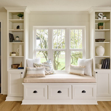
There is one more improvement that made a big difference to this family. In the family room, we added a built-in window seat. This created a cozy nook that is used by all for reading and extra seating. This relatively small improvement had a big impact on how the family uses and enjoys the space.
 Corynne Pless
Photo: Corynne Pless © 2013 Houzz
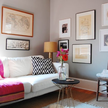
Eclectic family room photo in New York with gray walls
Eclectic family room photo in New York with gray walls
4