
Search results for "Additional costs" in Home Design Ideas

 Revealing Redesign
This farmhouse, with it's original foundation dating back to 1778, had a lot of charm--but with its bad carpeting, dark paint colors, and confusing layout, it was hard to see at first just how welcoming, charming, and cozy it could be.
The first focus of our renovation was creating a master bedroom suite--since there wasn't one, and one was needed for the modern family that was living here day-in and day-out.
To do this, a collection of small rooms (some of them previously without heat or electrical outlets) were combined to create a gorgeous, serene space in the eaves of the oldest part of the house, complete with master bath containing a double vanity, and spacious shower. Even though these rooms are new, it is hard to see that they weren't original to the farmhouse from day one.
In the rest of the house we removed walls that were added in the 1970's that made spaces seem smaller and more choppy, added a second upstairs bathroom for the family's two children, reconfigured the kitchen using existing cabinets to cut costs ( & making sure to keep the old sink with all of its character & charm) and create a more workable layout with dedicated eating area.
Also added was an outdoor living space with a deck sheltered by a pergola--a spot that the family spends tons of time enjoying during the warmer months.
A family room addition had been added to the house by the previous owner in the 80's, so to make this space feel less like it was tacked on, we installed historically accurate new windows to tie it in visually with the original house, and replaced carpeting with hardwood floors to make a more seamless transition from the historic to the new.
To complete the project, we refinished the original hardwoods throughout the rest of the house, and brightened the outlook of the whole home with a fresh, bright, updated color scheme.
Photos by Laura Kicey

 Outwater Industries Inc
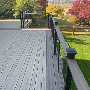
Ideally suited for use on balconies, porches and decking, Outwater has augmented its offering of contractor's grade balusters, baluster rails, newel and porch posts with the introduction of new motifs to accommodate a range of decorative applications.
Comprising lightweight, durable, high-density polyurethane and non-corrosive structural materials, Outwater's Balustrade System is easy to install using traditional woodworking tools and is internally fortified with large diameter, high strength steel or PVC pipes (varies by model) for enhanced structural integrity as well as to meet stringent building codes.
Furthermore, unlike wood balusters, which require fastidious maintenance in order to avoid possible rotting or splitting, consequently diminishing their strength, Outwater's Balustrade System comes factory primed and is impervious to adverse weather conditions, ensuring its uncompromising dimensional stability and steadfast, enduring safety.
Also, in contrast to cement balustrading, which is unwieldy and necessitates laborious installation by masons, not to mention, being highly susceptible to breaking, crumbling and cracking, Outwater's Balustrade System weighs just a portion of cement balustrading, thus significantly reducing its comparative shipping cost.
Offered in approximate heights from 28-in. to 40-in. with 5-in. to 12-in. rail widths, installations can be further customized with the addition of corner and center newel posts, a variety of post tops, accent moldings and ball ornaments.
Product Features:
• Offered with numerous complementary Balusters, Baluster Rails, Newel and Porch Posts from which to choose
• Easy to install without the need of a mason
• Internally fortified with large diameter, high strength steel or PVC pipes for enhanced structural integrity to meet stringent building codes
• Comes factory primed and is impervious to adverse weather conditions
• Weighs just a portion of cement balustrading, thus significantly reducing its comparative shipping cost
• Offered in approximate heights from 28-in. to 40-in. with 5-in. to 12-in. rail widths
• Complementary accessories allow for further customization as desired
Contact:
Architectural Products by Outwater
Sales & Product Information (USA & Canada):
1-800-631-8375 / 1-201-498-8750
Fax (USA & Canada): 1-800-888-3315 / 1-201-498-8751
Sales & Product Information (Outside of the USA & Canada):
1-201-498-8750
Fax (Outside of the USA & Canada): 1-201-498-8751
Email: info@outwaterplastics.com
Web: www.outwater.com
Visit us!
East Coast:
24 River Road
Bogota, NJ 07603
1-201-498-8750
West Coast:
4720 West Van Buren
Phoenix, AZ 85043
1-602-447-0936
About Architectural Products by Outwater:
It really is easy to shop with us!
Relied upon by more than 1,000,000 builders, renovators, architects designers, woodworkers, cabinet and furniture manufacturers, OEM's and retail consumers since 1972, Architectural Products by Outwater is an international manufacturer and distributor of more than 65,000 innovative and traditional Decorative Building Products that you possibly never knew existed or for which you simply could not find a reliable source. This is where Outwater truly shines!
“Now you can design, buy, build and dream like the Pros…”
Outwater’s products are, to say the least, very competitively priced and include interior and exterior architectural mouldings and millwork; columns and capitals; LED lighting and lighting accessories; balustrading; faux stone panels; faux wood beams; genuine stone tiles; decorative wood carvings; wrought iron components; stamped steel and polymer ceiling panels and backsplashes; wainscoting; wall coverings; fireplace surrounds and mantels; plastic "glass" block; period and contemporary hardware; home organization systems; kitchen and bath accessories; kitchen and bath cabinetry; bath vanities; furniture & cabinet components; knobs & pulls; casters; laminates; brass tubing & fittings; surfacing materials… and so much more!
In addition, with warehouse and distribution facilities in New Jersey and Arizona totaling over 300,000 square feet, Outwater facilitates purchases with reduced lead times and shipping costs, enabling us to fulfill and ship over 98% of our orders from stock within one to two business days!
At a time when many companies appear to have rapidly transitioned away from personalized customer service, having replaced their knowledgeable and immensely valuable human sales representatives with inanimate online marketing channels, which can be helpful to you if you were to know exactly what you might need and were not to encounter difficulties in placing your order, here at Outwater, we still believe that human interaction with a live, well versed, non-commissioned sales representative will undoubtedly better serve your needs in the long run. Even though you can always shop with us at www.outwater.com, you can also always deal directly with our extremely well versed and friendly sales and customer service representatives for their unparalleled support and assistance, most of whom have worked at Outwater for more than 15 years.
Whether you have been one of our loyal customers over the years or this is your first time in doing business with us, we would like to thank you for your expressed interest in our company and the products that we carry.
Please feel free to contact us with any questions at 1-800-631-8375 or visit us online at www.outwater.com
We look forward to serving you in the near future.

 Stone Action
This kitchen was fabricated by The Beveled Edge! Check out their work: http://bevelededge.net/
To see variations of calacatta marble, simply search "calacatta" on our site of over 6,000 stone options: http://www.stoneaction.com
Understanding Marble:
Marble is a porous, high-maintenance surface.
Be prepared to see some scratches. Marble is a softer stone. However, marble is still so beautiful with the scratches! If you’ve ever gone to Italy, you can see the beautiful marble on floors and many restaurants. It’s a classic lasting look. Even with scratches.
If you don't mind the extra work, they are a beautiful addition. Marble has a multifaceted ability to work with so many different design styles. If you're a homeowner looking for a wipe-and-go countertop, though, you'll probably want to skip this one.
It's cost-effective, depending on the type of marble you buy. Carrara marble (a grayer version with softer veins from Carrara, Italy) is one of the least expensive natural countertop materials on the market, mainly because it's readily available. Calacatta marble, which offers a whiter surface and more dramatic veining, and the price tag goes up.
Marble is heat-resistant — which is great — but you still need to be careful. Marble is heat resistant. Despite its ability to withstand high temps, you never want to place a piping hot pot on for risk of discoloring or burning the surface. We recommend always using a pot holder anyways.
We don’t want to dissuade you from using marble. In fact, I personally have a marble island in my kitchen. Stone Action solely wants you to be informed so that you’re choosing the right material for your project.
We hope you personally come check out our marble or other stone selection!
See more marble or other types of Stone Action’s stone selection:
http://www.stoneaction.com
Find the right local pro for your project

 Zola European Windows
McKeesport Downtown Housing, formerly a YMCA, is an 84-unit SRO for people at risk of homelessness. The old brick and terracotta building was important historically for McKeesport. The decision to design the project to Passive House criteria actually went a long way to making the pro-forma work. This project was the first large scale retrofit to be designed to meet Passive House Standards in the US. Another major concern of the project team was to maintain the historic charm of the building.
Space was at a premium and a reorganization of space allowed for making larger resident rooms. Through a community process with various stakeholders, amenities were identified and added to the project, including a community room, a bike storage area, exterior smoking balconies, single-user rest rooms, a bed bug room for non-toxic treatment of bed bugs, and communal kitchens to provide healthy options for food. The renovation includes new additional lighting, air-conditioning, make-up air and ventilation systems, an elevator, and cooking facilities. A cold-weather shelter, 60-day emergency housing, bridge housing, and section 8 apartment rentals make up the housing programs within the shelter. Thoughtful Balance designed the interiors, and selected the furniture for durability and resistance to bed bugs.
The project team worked closely with Zola Windows to specify a unique uPVC window that not only offers passive house performance levels at an affordable cost, but also harmonizes with the building’s historic aesthetic. Zola’s American Heritage SDH (simulated double hung) from the popular, budget-friendly Thermo uPVC line was specified for the project. The windows implemented in this project feature a lower tilt & turn window and a fixed upper for maximum airtightness and thermal performance. The implementation of these windows helped the project team achieve a very significant energy consumption reduction of at least 75%.
Photographer: Alexander Denmarsh

 Spazio LA
The renovated kitchen features Casavitabella Alhambra marengo floor tiles, Caesarstone Empira white countertops, Emser Craft II White subway backsplash and Top Knobs brush satin nickel cabinet pulls - all available at Spazio LA Tile Gallery.


 TVL Creative Ltd.
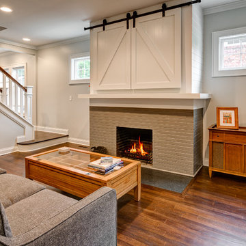
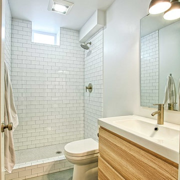
This remodel took a dated and cramped bathroom and transformed it into a classy oasis for our Lowry clients. The clients had a limited budget and wanted to leave the space as in-place as possible. However, the large drop in tub ate valuable floor space and a half wall between the shower and tub had become a holding place for random items without a home. The thick frame on the shower glass made the shower feel extremely small, and the dated lighting and fixtures further depressed the space. We proposed a traditional and elegant design that consider the client's budgetary and spatial constraints. We removed the existing drop-in tub and replaced it with a lovely free-standing soaker. The length of this tub is short, but the depth is exaggerated, making it an ideal replacement in this tiny footprint. The shower glass was swapped for framless glass that boldly expands space. We tore out the existing carpet and installed gorgeous wood-look tile that adds depth and warmth to the room. The clients opted to keep their existing vanity to save cost, so a new top was added to bring the aesthetic up to the level of the new additions. The wall paint was taken from a buttery yellow to a soft gray-green, accented by a darker version of this same color on the siding barn door and toilet room door. New vanity lights, faucets, and storage shelves were installed to help our clients organize and keep things off the counter tops. Finally, new custom up-down window shades were curated for the bathroom to add to the final touch. This space is a simple scope with a dramatic transformation that introduces a timeless look for years to come.
Sponsored
Columbus, OH

Hope Restoration & General Contracting
Columbus Design-Build, Kitchen & Bath Remodeling, Historic Renovations

 John R. Schroeder, AIA
Photography by: Caryn B. Davis
This project included a two-story addition with a kitchen/dining area on the first floor and bedroom/bathroom on the second floor. The house is located on a gently sloping site surrounded by woods and meadows. The kitchen features grey lower cabinetry and white upper cabinetry with a subtle, rounded board and batten backsplash. The dining area features a large picture window flanked by double hungs that look out over the meadow. The upstairs bathroom shares a tub/shower with another bathroom in Jack-n-Jill fashion. Phase II will include first and second floor renovations and an expansive rear deck and stone terrace.
John R. Schroeder, AIA is a professional design firm specializing in architecture, interiors, and planning. We have over 30 years experience with projects of all types, sizes, and levels of complexity. Because we love what we do, we approach our work with enthusiasm and dedication. We are committed to the highest level of design and service on each and every project. We engage our clients in positive and rewarding collaborations. We strive to exceed expectations through our attention to detail, our understanding of the “big picture”, and our ability to effectively manage a team of design professionals, industry representatives, and building contractors. We carefully analyze budgets and project objectives to assist clients with wise fund allocation.
We continually monitor and research advances in technology, materials, and construction methods, both sustainable and otherwise, to provide a responsible, well-suited, and cost effective product. Our design solutions are highly functional using both innovative and traditional approaches. Our aesthetic style is flexible and open, blending cues from client desires, building function, site context, and material properties, making each project unique, personalized, and enduring.
 StoneUnlimited Kitchen and Bath Remodeling
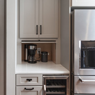
Choosing to abandon uniformity in your kitchen can be a great choice if you're looking to opt out of a monochrome aesthetic. Two-toned kitchen cabinets add visual interest and contrast while drawing focus to different features within the space. Designs utilizing two-toned cabinets have become very popular in recent years and it's not a trend that will be fading out any time soon.
Our clients opted for a combination of Earl Grey and Macchiato Classic cabinetry in their two-toned kitchen. The large island with its second faucet, sink, microwave drawer and lower storage is the focal point of the room and a great work surface for food prep and entertaining. A vertical pull out PowerDock was installed into the top of the island for plugging in kitchen tools, phones and laptops. Dolomite Marble subway tile and Brunello quartz countertops brighten up the kitchen and balance out the tone of the cabinets creating a light and airy feel. The addition of contrasting touches such as the Honey Bronze, Flat Black hardware and Champaign Bronze faucets, accessories the room beautifully. The subdued and sophisticated style of this two-toned kitchen is exquisite and shows the various ways that two-tone cabinets can be versatile and appealing.
Some of the other areas that were remodeled in this home included the complete overhaul of the existing stair well, a guest bath and laundry area.
The guest bath has beautiful vanity cabinets in Celest finish, Monochrome Lotus Deco tile and very reflective Midnight Dots in the shower floor and niche. The combination of all three give a striking white, blue and black design that will inspire and show that you can use pattern and texture in small spaces. A twenty four inch wall mounted shower seat can be lifted and secured when in use and tucked away to allow access out of the shower. A pocket door from the guest bathroom provides a second access point to the hallway with the laundry that has also been revamped with the same style and finish of cabinetry.
 TVL Creative Ltd.
This remodel took a dated and cramped bathroom and transformed it into a classy oasis for our Lowry clients. The clients had a limited budget and wanted to leave the space as in-place as possible. However, the large drop in tub ate valuable floor space and a half wall between the shower and tub had become a holding place for random items without a home. The thick frame on the shower glass made the shower feel extremely small, and the dated lighting and fixtures further depressed the space. We proposed a traditional and elegant design that consider the client's budgetary and spatial constraints. We removed the existing drop-in tub and replaced it with a lovely free-standing soaker. The length of this tub is short, but the depth is exaggerated, making it an ideal replacement in this tiny footprint. The shower glass was swapped for framless glass that boldly expands space. We tore out the existing carpet and installed gorgeous wood-look tile that adds depth and warmth to the room. The clients opted to keep their existing vanity to save cost, so a new top was added to bring the aesthetic up to the level of the new additions. The wall paint was taken from a buttery yellow to a soft gray-green, accented by a darker version of this same color on the siding barn door and toilet room door. New vanity lights, faucets, and storage shelves were installed to help our clients organize and keep things off the counter tops. Finally, new custom up-down window shades were curated for the bathroom to add to the final touch. This space is a simple scope with a dramatic transformation that introduces a timeless look for years to come.

 Saikley Architects
This house was a very small mid-century bungalow with previous additions that resulted in a large but chaotic layout. The owners wanted to convert the house to a super-efficient, and charming Craftsman-style, 6 bedroom home for their large family and work at home.
We achieved the space needs by moving a few walls for a more efficient, organized layout, setting up spaces for overlapping uses, and making a small upstairs addition. Every bit of square footage was optimized to meet the goals of the project without making the house huge or adding unnecessary cost.
Much thought was given to the entry sequence near the front door. A large flow-through mudroom with storage for each family member, and adjacent laundry, make it easy for children to be taught to keep their things organized and to contribute to household chores. A mail station and central home admin area at the mudroom help keep clutter down at other areas and minimize home management tasks. A garage door near the kitchen gives quick access to bulk items.
The existing house had too much view to the street from the living room through large corner windows, and too little entry transition, to the extent that the family did not feel comfortable using the living room much without shades drawn. We raised the window sills and brought the new windows in from the corner of the house, allowing plenty of light while protecting privacy and a sense of enclosure in the living room. We enlarged the front porch to create a more graceful transition from the public to private space. We located the front door so that the circulation from entry into the house would allow for furnishing the living room with a sitting circle that is not intruded upon by people walking through the room.
Sight lines through the living spaces were an important consideration in the design. The owners wanted discreet spaces for living room, kitchen, dining and family room, but also wanted the living spaces to feel connected and to be able to easily watch their children. Being able to see the children playing in the yard while getting things done inside the house was also important. While largely working with the existing structure, we opened walls and rearranged the use of spaces to make a series of connected living spaces with long views through them.
The character of the remodeled house is a contemporary Craftsman with classic materials and cool, consistent colors. A few arches echo through the house to frame spaces and soften the feeling of the rooms.
Photography: Kurt Manley
https://saikleyarchitects.com/portfolio/bungalow-expansion/

 Board & Vellum
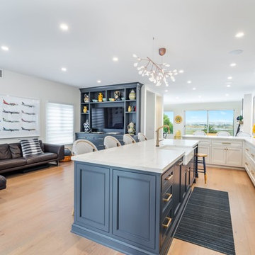
The owners of this beautiful home in Montlake desperately needed more space for their growing family. We gave them the breathing room they craved by putting an addition on the back of the house that extended the square footage across all three floors (basement, main floor and second floor). This allowed for a more spacious kitchen that opens to the backyard and offers plenty of natural light. We refreshed the existing cabinets with new paint and added more storage with built-in cabinets and a casual dining area with integrated bench seating. We also reconfigured the entire second floor to allow ample space for an airy master suite, plus two more bedrooms and a shared bathroom. In the basement, we lowered the floor to increase the ceiling height, and transformed it into a comfortable space for entertaining friends or relaxing with the family. The remodeled basement now includes a family media room with plenty of built-ins, a wet bar, a guest bedroom, and a bathroom.
Sponsored
Columbus, OH

Structural Remodeling
Franklin County's Heavy Timber Specialists | Best of Houzz 2020!
 Byggmeister Inc
Photo by Mike Casey
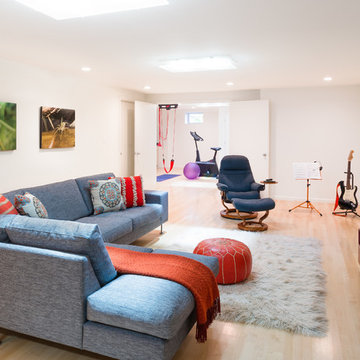
The owners of this 1960s ranch house loved their house but it wasn't configured to meet their needs. The house had only two small bedrooms for the family of four, and there was no casual living space for parents and kids to hang out separately. Neither we nor the clients wanted to increase the home's energy usage. It was a tall order: could we increase the home's size without increasing its energy footprint?
ADDING FUNCTIONALITY
We built two small additions, one at the front of the home and one off the side adjacent to the two existing bedrooms. These new spaces provided an additional bedroom on the main level as well as a new stair down to the basement. At basement level, the additions yielded a guest room, a full bathroom and a laundry area. The existing basement, which is now easily accessible from the main floor, was refinished as a casual family room.
The architect designed the new spaces to be spare and bright, replicating the mid-century aesthetic. Every detail—from the open stair, to the light maple floors, to the detailing of the bathroom vanity—echoes the vintage and character of the original home.
INTEGRATING ENERGY AND DESIGN
The key to meeting this challenge was a rigorous and integrated planning process with early-stage energy modeling accompanying design. As the architect (Anita Rogers) worked out the space plan, the energy consultant (Mike Duclos) analyzed how various scenarios could be combined with envelope and mechanical packages to not only hold the line on energy use but improve performance. We anticipate the plan we settled on will save 25% annually over pre-project energy use.
 TVL Creative Ltd.
This remodel took a dated and cramped bathroom and transformed it into a classy oasis for our Lowry clients. The clients had a limited budget and wanted to leave the space as in-place as possible. However, the large drop in tub ate valuable floor space and a half wall between the shower and tub had become a holding place for random items without a home. The thick frame on the shower glass made the shower feel extremely small, and the dated lighting and fixtures further depressed the space. We proposed a traditional and elegant design that consider the client's budgetary and spatial constraints. We removed the existing drop-in tub and replaced it with a lovely free-standing soaker. The length of this tub is short, but the depth is exaggerated, making it an ideal replacement in this tiny footprint. The shower glass was swapped for framless glass that boldly expands space. We tore out the existing carpet and installed gorgeous wood-look tile that adds depth and warmth to the room. The clients opted to keep their existing vanity to save cost, so a new top was added to bring the aesthetic up to the level of the new additions. The wall paint was taken from a buttery yellow to a soft gray-green, accented by a darker version of this same color on the siding barn door and toilet room door. New vanity lights, faucets, and storage shelves were installed to help our clients organize and keep things off the counter tops. Finally, new custom up-down window shades were curated for the bathroom to add to the final touch. This space is a simple scope with a dramatic transformation that introduces a timeless look for years to come.
 TVL Creative Ltd.
This remodel took a dated and cramped bathroom and transformed it into a classy oasis for our Lowry clients. The clients had a limited budget and wanted to leave the space as in-place as possible. However, the large drop in tub ate valuable floor space and a half wall between the shower and tub had become a holding place for random items without a home. The thick frame on the shower glass made the shower feel extremely small, and the dated lighting and fixtures further depressed the space. We proposed a traditional and elegant design that consider the client's budgetary and spatial constraints. We removed the existing drop-in tub and replaced it with a lovely free-standing soaker. The length of this tub is short, but the depth is exaggerated, making it an ideal replacement in this tiny footprint. The shower glass was swapped for framless glass that boldly expands space. We tore out the existing carpet and installed gorgeous wood-look tile that adds depth and warmth to the room. The clients opted to keep their existing vanity to save cost, so a new top was added to bring the aesthetic up to the level of the new additions. The wall paint was taken from a buttery yellow to a soft gray-green, accented by a darker version of this same color on the siding barn door and toilet room door. New vanity lights, faucets, and storage shelves were installed to help our clients organize and keep things off the counter tops. Finally, new custom up-down window shades were curated for the bathroom to add to the final touch. This space is a simple scope with a dramatic transformation that introduces a timeless look for years to come.
 Stone Action
Absolute Stone Design fabricated this kitchen and provided us this photo! http://www.absolutestonedesign.com
This kitchen has Invisible Gray marble with a polished finish.
Understanding Marble:
Marble is a porous, high-maintenance surface.
Be prepared to see some scratches. Marble is a softer stone. However, marble is still so beautiful with the scratches! If you’ve ever gone to Italy, you can see the beautiful marble on floors and many restaurants. It’s a classic lasting look. Even with scratches.
If you don't mind the extra work, they are a beautiful addition. Marble has a multifaceted ability to work with so many different design styles. If you're a homeowner looking for a wipe-and-go countertop, though, you'll probably want to skip this one.
It's cost-effective, depending on the type of marble you buy. Carrara marble (a grayer version with softer veins from Carrara, Italy) is one of the least expensive natural countertop materials on the market, mainly because it's readily available. Calacatta marble, which offers a whiter surface and more dramatic veining, and the price tag goes up.
Marble is heat-resistant — which is great — but you still need to be careful. Marble is heat resistant. Despite its ability to withstand high temps, you never want to place a piping hot pot on for risk of discoloring or burning the surface. We recommend always using a pot holder anyways.
We don’t want to dissuade you from using marble. In fact, I personally have a marble island in my kitchen. Stone Action solely wants you to be informed so that you’re choosing the right material for your project.
We hope you personally come check out our marble or other stone selection!
See more marble or other types of Stone Action’s stone selection:
http://www.stoneaction.com
Sponsored
Columbus, OH
Hope Restoration & General Contracting
Columbus Design-Build, Kitchen & Bath Remodeling, Historic Renovations
 StoneUnlimited Kitchen and Bath Remodeling
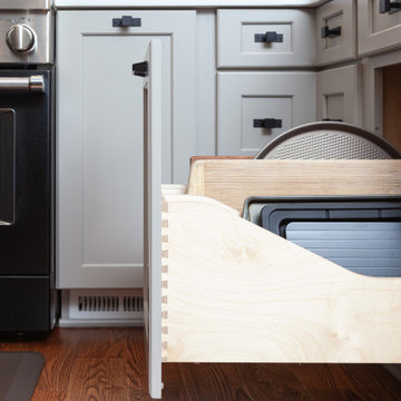
Choosing to abandon uniformity in your kitchen can be a great choice if you're looking to opt out of a monochrome aesthetic. Two-toned kitchen cabinets add visual interest and contrast while drawing focus to different features within the space. Designs utilizing two-toned cabinets have become very popular in recent years and it's not a trend that will be fading out any time soon.
Our clients opted for a combination of Earl Grey and Macchiato Classic cabinetry in their two-toned kitchen. The large island with its second faucet, sink, microwave drawer and lower storage is the focal point of the room and a great work surface for food prep and entertaining. A vertical pull out PowerDock was installed into the top of the island for plugging in kitchen tools, phones and laptops. Dolomite Marble subway tile and Brunello quartz countertops brighten up the kitchen and balance out the tone of the cabinets creating a light and airy feel. The addition of contrasting touches such as the Honey Bronze, Flat Black hardware and Champaign Bronze faucets, accessories the room beautifully. The subdued and sophisticated style of this two-toned kitchen is exquisite and shows the various ways that two-tone cabinets can be versatile and appealing.
Some of the other areas that were remodeled in this home included the complete overhaul of the existing stair well, a guest bath and laundry area.
The guest bath has beautiful vanity cabinets in Celest finish, Monochrome Lotus Deco tile and very reflective Midnight Dots in the shower floor and niche. The combination of all three give a striking white, blue and black design that will inspire and show that you can use pattern and texture in small spaces. A twenty four inch wall mounted shower seat can be lifted and secured when in use and tucked away to allow access out of the shower. A pocket door from the guest bathroom provides a second access point to the hallway with the laundry that has also been revamped with the same style and finish of cabinetry.
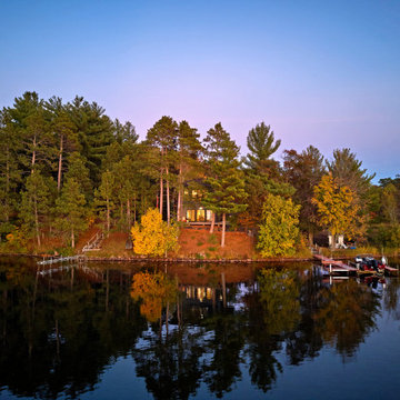
 CHRISTOPHER STROM ARCHITECTS
Sommerhus is a private retreat for two empty-nesters. The clients purchased the previous cabin after falling in love with its location on a private, lakefront peninsula. However, this beautiful site was a challenging site to build on, due to its position sandwiched between the lake and protected wet land. The clients disliked the old cabin because it could only be used in the summer months, due to its lack of both insulation and heat. In addition, it was too small for their needs. They wanted to build a new, larger retreat, but were met with yet another constraint: the new cabin would be limited to the previous cabin’s small footprint. Thus, they decided to approach an architect to design their dream cabin.
As the clients described, “We visited Denmark for a family wedding in 2015, and while biking near Gilleleje, a fishing village on the Baltic Sea, we fell in love with the aesthetic of ‘Sommerhus’: dark exteriors, clean, simple lines, and lots of windows.” We set out to design a cabin that fit this aesthetic while also meeting the site’s constraints.
The clients were committed to keeping all existing trees on their site. In addition, zoning codes required the new retreat to stay within the previous cabin's small footprint. Thus, to maximize the square footage of the cabin without removing trees or expanding the footprint, the new structure had to grow vertically. At the same time, the clients wanted to be good neighbors. To them, this meant that their cabin should disappear into the woods, especially when viewed from the lake. To accomplish both these requests, the architect selected a dark exterior metal façade that would visually retreat into the trees. The metal siding is a modern, low-maintenance, and cost-effective solution, especially when compared to traditional wood siding. Warm wood on the soffits of the large roof overhang contrast with the metal siding. Sommerhus's resulting exterior is just as the clients’ requested: boldly modern yet respectful of the serene surroundings.
The homeowners desired a beach-house-inspired interior, full of light and warmth, in contrast to the dark exterior. As the homeowner explained, “I wanted it to feel like a porch inside.” To achieve this, the living room has two walls of sliding glass doors that connect to the wrap-around porch. This creates a beautiful, indoor-outdoor living space. The crisp and bright kitchen also connects to the porch with the window that opens to an outdoor counter - perfect for passing food and drinks to those lounging on the porch. The kitchen is open to the rest of the first-floor entertaining space, and brings a playful, beach-house feel to the cabin.
After the completion of the project, the homeowners remarked, “Working with Christopher and Eric [of CSA] was a wonderful experience. We absolutely love our home, and each season on the lake is more special than the last.”
 Revealing Redesign
This farmhouse, with it's original foundation dating back to 1778, had a lot of charm--but with its bad carpeting, dark paint colors, and confusing layout, it was hard to see at first just how welcoming, charming, and cozy it could be.
The first focus of our renovation was creating a master bedroom suite--since there wasn't one, and one was needed for the modern family that was living here day-in and day-out.
To do this, a collection of small rooms (some of them previously without heat or electrical outlets) were combined to create a gorgeous, serene space in the eaves of the oldest part of the house, complete with master bath containing a double vanity, and spacious shower. Even though these rooms are new, it is hard to see that they weren't original to the farmhouse from day one.
In the rest of the house we removed walls that were added in the 1970's that made spaces seem smaller and more choppy, added a second upstairs bathroom for the family's two children, reconfigured the kitchen using existing cabinets to cut costs ( & making sure to keep the old sink with all of its character & charm) and create a more workable layout with dedicated eating area.
Also added was an outdoor living space with a deck sheltered by a pergola--a spot that the family spends tons of time enjoying during the warmer months.
A family room addition had been added to the house by the previous owner in the 80's, so to make this space feel less like it was tacked on, we installed historically accurate new windows to tie it in visually with the original house, and replaced carpeting with hardwood floors to make a more seamless transition from the historic to the new.
To complete the project, we refinished the original hardwoods throughout the rest of the house, and brightened the outlook of the whole home with a fresh, bright, updated color scheme.
Photos by Laura Kicey
186