
Search results for "Additional functionalities" in Home Design Ideas

 VPC Builders, LLC
Shed - mid-sized farmhouse two-story and detached gray shed idea in Charlotte with a shingle roof

 Chr DAUER Architects
A typical post-1906 Noe Valley house is simultaneously restored, expanded and redesigned to keep what works and rethink what doesn’t. The front façade, is scraped and painted a crisp monochrome white—it worked. The new asymmetrical gabled rear addition takes the place of a windowless dead end box that didn’t. A “Great kitchen”, open yet formally defined living and dining rooms, a generous master suite, and kid’s rooms with nooks and crannies, all make for a newly designed house that straddles old and new.
Structural Engineer: Gregory Paul Wallace SE
General Contractor: Cardea Building Co.
Interior Design: Ken Fulk
Photographer: Open Homes Photography
 Two Hands Interiors
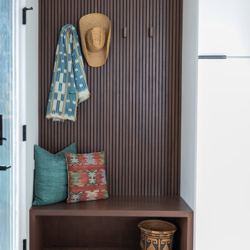
A custom walnut slat wall feature elevates this mudroom wall while providing easily accessible hooks.
Small trendy light wood floor, brown floor and wood wall mudroom photo in Chicago with white walls
Small trendy light wood floor, brown floor and wood wall mudroom photo in Chicago with white walls
Find the right local pro for your project


 Advance Design Studio, Ltd.
This 1930's Barrington Hills farmhouse was in need of some TLC when it was purchased by this southern family of five who planned to make it their new home. The renovation taken on by Advance Design Studio's designer Scott Christensen and master carpenter Justin Davis included a custom porch, custom built in cabinetry in the living room and children's bedrooms, 2 children's on-suite baths, a guest powder room, a fabulous new master bath with custom closet and makeup area, a new upstairs laundry room, a workout basement, a mud room, new flooring and custom wainscot stairs with planked walls and ceilings throughout the home.
The home's original mechanicals were in dire need of updating, so HVAC, plumbing and electrical were all replaced with newer materials and equipment. A dramatic change to the exterior took place with the addition of a quaint standing seam metal roofed farmhouse porch perfect for sipping lemonade on a lazy hot summer day.
In addition to the changes to the home, a guest house on the property underwent a major transformation as well. Newly outfitted with updated gas and electric, a new stacking washer/dryer space was created along with an updated bath complete with a glass enclosed shower, something the bath did not previously have. A beautiful kitchenette with ample cabinetry space, refrigeration and a sink was transformed as well to provide all the comforts of home for guests visiting at the classic cottage retreat.
The biggest design challenge was to keep in line with the charm the old home possessed, all the while giving the family all the convenience and efficiency of modern functioning amenities. One of the most interesting uses of material was the porcelain "wood-looking" tile used in all the baths and most of the home's common areas. All the efficiency of porcelain tile, with the nostalgic look and feel of worn and weathered hardwood floors. The home’s casual entry has an 8" rustic antique barn wood look porcelain tile in a rich brown to create a warm and welcoming first impression.
Painted distressed cabinetry in muted shades of gray/green was used in the powder room to bring out the rustic feel of the space which was accentuated with wood planked walls and ceilings. Fresh white painted shaker cabinetry was used throughout the rest of the rooms, accentuated by bright chrome fixtures and muted pastel tones to create a calm and relaxing feeling throughout the home.
Custom cabinetry was designed and built by Advance Design specifically for a large 70” TV in the living room, for each of the children’s bedroom’s built in storage, custom closets, and book shelves, and for a mudroom fit with custom niches for each family member by name.
The ample master bath was fitted with double vanity areas in white. A generous shower with a bench features classic white subway tiles and light blue/green glass accents, as well as a large free standing soaking tub nestled under a window with double sconces to dim while relaxing in a luxurious bath. A custom classic white bookcase for plush towels greets you as you enter the sanctuary bath.

 Smith & Ragsdale Interior Design
While this new home had an architecturally striking exterior, the home’s interior fell short in terms of true functionality and overall style. The most critical element in this renovation was the kitchen and dining area, which needed careful attention to bring it to the level that suited the home and the homeowners.
As a graduate of Culinary Institute of America, our client wanted a kitchen that “feels like a restaurant, with the warmth of a home kitchen,” where guests can gather over great food, great wine, and truly feel comfortable in the open concept home. Although it follows a typical chef’s galley layout, the unique design solutions and unusual materials set it apart from the typical kitchen design.
Polished countertops, laminated and stainless cabinets fronts, and professional appliances are complemented by the introduction of wood, glass, and blackened metal – materials introduced in the overall design of the house. Unique features include a wall clad in walnut for dangling heavy pots and utensils; a floating, sculptural walnut countertop piece housing an herb garden; an open pantry that serves as a coffee bar and wine station; and a hanging chalkboard that hides a water heater closet and features different coffee offerings available to guests.
The dining area addition, enclosed by windows, continues to vivify the organic elements and brings in ample natural light, enhancing the darker finishes and creating additional warmth.
Photos by Ira Montgomery





 Rosen Kelly Conway Architecture & Design
Home office - traditional built-in desk dark wood floor and brown floor home office idea in New York with gray walls

 AIBD - American Institute of Building Design
The outdoor living area utilizes bold radial lines to offer a sense of unobstructed openness along the panoramic riverside views. Special consideration was given to the design and engineering of the outdoor space to allow a massive 60-foot span between columns, resulting in an unparalleled view. Playful geometric shapes speak to an easy livability that belie the bold and glamorous design. The second floor deck provides seamless access from the guest bedrooms, office and exercise rooms. The use of glass railing and zero-edge doors carefully preserve the view.
A Grand ARDA for Outdoor Living Design goes to
RG Designs and K2 Design Group
Designers: Richard Guzman with Jenny Provost
From: Bonita Springs, Florida

 Change Your Bathroom©
The detailed plans for this bathroom can be purchased here: https://www.changeyourbathroom.com/shop/simple-yet-elegant-bathroom-plans/ Small bathroom with Carrara marble hex tile on floor, ceramic subway tile on shower walls, marble counter top, marble bench seat, marble trimming out window, water resistant marine shutters in shower, towel rack with capital picture frame, frameless glass panel with hinges. Atlanta Bathroom
 FineLine Kitchens, Inc.
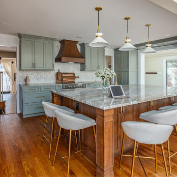
Hi everyone, I'm Sarah and Ogun we are here with fine line kitchens. So we are a couple working together. I do the interior design and remodeling of the space material selection meeting with the clients. And I handled operations outside, you know meaning all the construction work that is taking place the inside. The houses that we work in. I handle all the aspects of the construction, so today's project is very special. We're in Vienna and the client had a very big family. It's a family of seven that lives here. So we had a few aspects that we needed to keep in mind while designing this one. Having everybody be able to sit on the island. So we wanted plenty of seating all the way around. We didn't want anybody standing or anything like that. So what we did is we maximize the space. The center island is the biggest part of the kitchen. We use a natural stone to kind of give it a beautiful texture versus quartz. It's kind of standard white or kind of fabricated, so I wanted something very natural. We did this because I took my inspiration from the outside, so the inspiration if you look at the view right in front of me is there are so many greens there's a lot of brass accents and I wanted to bring this. Into this kitchen while designing it for my clients. She is very warm very. She wanted a very homey, comfy kind of look for the kitchen. So that's what we did today. As you can see, the cabinets are sage green, very light, so I still think it's a neutral, but it's a lighter color that again brings the outside in and we combine that with the oak right behind me so it's a slightly warm oak. It's not very dark. It's not very light. It's a medium brown and the same color went on the island. To kind of tie these two in and the backsplash, my favorite part is where you can see a little bit of design. It is, in my opinion still classic, but includes a pattern so the outside part is as we said in the beginning, is handled by my husband. I'd like him to speak a little bit about that. Thanks, Sarah, I want to talk to you guys a little bit about the construction part of this project. Originally this kitchen was located mostly in this area. They had their stove there sing. It was more of a peninsula layout in Sarah's and the customer vision they wanted. They wanted to get rid of the peninsula and they want to be able to have a huge island that can at least sit seven people because they're familiar with seven. So we wanted to make sure that we can achieve this design and bring it to life so that they can be happy with this layout. Some of the challenges we had, the house, the home being, you know, old home. There were a lot of you know the older electrical and plumbing that had to be replaced. We had to relocate the stove from here to this area. Over here we had put a nice foot fan that we had to relocate all the ductwork and the plumbing. Was being on the peninsula area. We had to relocate it to the center islands. So we achieved all this and kind of like bring it to bring in this kitchen up to date it looks beautiful. That's true, so yes, the old layout did not function for my clients because everything was kind of gathered on one side of the kitchen. So there was like a peninsula right there. So the end of this island kind of continued straight. And that was just the L shape. Kind of where everything was and there used to be another big table here, so they were using only kind of half of the space. So like I said at the beginning, our vision was to kind of feed everybody at the island, create some symmetry. 'cause I love that. So as you can see behind me, this is kind of the focal point symmetrical. Everything is kind of even we wanted to also panel the fridge here so it mimics the pantry and another size. So when you're looking at it, it is bringing again that symmetry back again. I hope you enjoyed this kitchen and this video and I'll see you soon. So how do you think this project turned out? It's nice. I like the color. I think it turned out nice. It's kind of like a little bit different color than what we always do. So I realize. Are you giving me a little bit of credit here that I did something different? Are you proud? I'm so proud of you. Other than that I like it. That they have kind of like a two sink. So if this was our kitchen, if we ever like you can have your own. I can have mine if we ever get into a fight then this can be like my own kitchen. Why are we gonna bring in a fight right now? So I'm cooking anyway. You're grilling most of the time, So what are you even talking about? My kitchen? That's my kitchen. You can just take the small sink. That's fine. It's always good to have your own space right there, so anyways. Thank you guys for watching. We hope to see you soon and if you have any questions please click the link below. It'll lead you to our website, house, YouTube and all of the social media is so nice to have you guys. We'll see you soon. Thanks bye bye-bye.



 The Refined Group
Werner Segarra
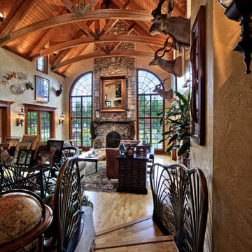
Example of a tuscan medium tone wood floor dining room design in Phoenix with multicolored walls
Example of a tuscan medium tone wood floor dining room design in Phoenix with multicolored walls

 TKS Design Group
Download our free ebook, Creating the Ideal Kitchen. DOWNLOAD NOW
For many, extra time at home during COVID left them wanting more from their homes. Whether you realized the shortcomings of your space or simply wanted to combat boredom, a well-designed and functional home was no longer a want, it became a need. Tina found herself wanting more from her Old Irving Park home and reached out to The Kitchen Studio about adding function to her kitchen to make the most of the available real estate.
At the end of the day, there is nothing better than returning home to a bright and happy space you love. And this kitchen wasn’t that for Tina. Dark and dated, with a palette from the past and features that didn’t make the most of the available square footage, this remodel required vision and a fresh approach to the space. Lead designer, Stephanie Cole’s main design goal was better flow, while adding greater functionality with organized storage, accessible open shelving, and an overall sense of cohesion with the adjoining family room.
The original kitchen featured a large pizza oven, which was rarely used, yet its footprint limited storage space. The nearby pantry had become a catch-all, lacking the organization needed in the home. The initial plan was to keep the pizza oven, but eventually Tina realized she preferred the design possibilities that came from removing this cumbersome feature, with the goal of adding function throughout the upgraded and elevated space. Eliminating the pantry added square footage and length to the kitchen for greater function and more storage. This redesigned space reflects how she lives and uses her home, as well as her love for entertaining.
The kitchen features a classic, clean, and timeless palette. White cabinetry, with brass and bronze finishes, contrasts with rich wood flooring, and lets the large, deep blue island in Woodland’s custom color Harbor – a neutral, yet statement color – draw your eye.
The kitchen was the main priority. In addition to updating and elevating this space, Tina wanted to maximize what her home had to offer. From moving the location of the patio door and eliminating a window to removing an existing closet in the mudroom and the cluttered pantry, the kitchen footprint grew. Once the floorplan was set, it was time to bring cohesion to her home, creating connection between the kitchen and surrounding spaces.
The color palette carries into the mudroom, where we added beautiful new cabinetry, practical bench seating, and accessible hooks, perfect for guests and everyday living. The nearby bar continues the aesthetic, with stunning Carrara marble subway tile, hints of brass and bronze, and a design that further captures the vibe of the kitchen.
Every home has its unique design challenges. But with a fresh perspective and a bit of creativity, there is always a way to give the client exactly what they want [and need]. In this particular kitchen, the existing soffits and high slanted ceilings added a layer of complexity to the lighting layout and upper perimeter cabinets.
While a space needs to look good, it also needs to function well. This meant making the most of the height of the room and accounting for the varied ceiling features, while also giving Tina everything she wanted and more. Pendants and task lighting paired with an abundance of natural light amplify the bright aesthetic. The cabinetry layout and design compliments the soffits with subtle profile details that bring everything together. The tile selections add visual interest, drawing the eye to the focal area above the range. Glass-doored cabinets further customize the space and give the illusion of even more height within the room.
While her family may be grown and out of the house, Tina was focused on adding function without sacrificing a stunning aesthetic and dreamy finishes that make the kitchen the gathering place of any home. It was time to love her kitchen again, and if you’re wondering what she loves most, it’s the niche with glass door cabinetry and open shelving for display paired with the marble mosaic backsplash over the range and complimenting hood. Each of these features is a stunning point of interest within the kitchen – both brag-worthy additions to a perimeter layout that previously felt limited and lacking.
Whether your remodel is the result of special needs in your home or simply the excitement of focusing your energy on creating a fun new aesthetic, we are here for it. We love a good challenge because there is always a way to make a space better – adding function and beauty simultaneously.


 JRP Design & Remodel
Our client came to us with a desire to take an overgrown, neglected space and transform it into a clean contemporary backyard for the family to enjoy. Having had less than stellar experiences with other contractors, they wanted to find a trustworthy company; One that would complement their style and provide excellent communication. They saw a JRP banner at their son's baseball game at Westlake High School and decided to call. After meeting with the team, they knew JRP was the firm they needed to give their backyard a complete overhaul.
With a focus on sleek, clean lines, this contemporary backyard is captivating. The outdoor family room is a perfect blend of beauty, form, and function. JRP reworked the courtyard and dining area to create a space for the family to enjoy together. An outdoor pergola houses a media center and lounge. Restoration Hardware low profile furniture provides comfortable seating while maintaining a polished look. The adjacent barbecue is perfect for crafting up family dinners to enjoy amidst a Southern California sunset.
Before renovating, the landscaping was an unkempt mess that felt overwhelming. Synthetic grass and concrete decking was installed to give the backyard a fresh feel while offering easy maintenance. Gorgeous hardscaping takes the outdoor area to a whole new level. The resurfaced free-form pool joins to a lounge area that's perfect for soaking up the sun while watching the kids swim. Hedges and outdoor shrubs now maintain a clean, uniformed look.
A tucked-away area taken over by plants provided an opportunity to create an intimate outdoor dining space. JRP added wooden containers to accommodate touches of greenery that weren't overwhelming. Bold patterned statement flooring contrasts beautifully against a neutral palette. Additionally, our team incorporated a fireplace for a feel of coziness.
Once an overlooked space, the clients and their children are now eager to spend time outdoors together. This clean contemporary backyard renovation transformed what the client called "an overgrown jungle" into a space that allows for functional outdoor living and serene luxury.
Photographer: Andrew - OpenHouse VC
Sponsored
Columbus, OH

Structural Remodeling
Franklin County's Heavy Timber Specialists | Best of Houzz 2020!

 Visbeen Architects
This cozy lake cottage skillfully incorporates a number of features that would normally be restricted to a larger home design. A glance of the exterior reveals a simple story and a half gable running the length of the home, enveloping the majority of the interior spaces. To the rear, a pair of gables with copper roofing flanks a covered dining area that connects to a screened porch. Inside, a linear foyer reveals a generous staircase with cascading landing. Further back, a centrally placed kitchen is connected to all of the other main level entertaining spaces through expansive cased openings. A private study serves as the perfect buffer between the homes master suite and living room. Despite its small footprint, the master suite manages to incorporate several closets, built-ins, and adjacent master bath complete with a soaker tub flanked by separate enclosures for shower and water closet. Upstairs, a generous double vanity bathroom is shared by a bunkroom, exercise space, and private bedroom. The bunkroom is configured to provide sleeping accommodations for up to 4 people. The rear facing exercise has great views of the rear yard through a set of windows that overlook the copper roof of the screened porch below.
Builder: DeVries & Onderlinde Builders
Interior Designer: Vision Interiors by Visbeen
Photographer: Ashley Avila Photography

 The Tiny Project
Alek Lisefski / tiny-project.com
Trendy kitchen photo in San Francisco with a drop-in sink, flat-panel cabinets and stainless steel appliances
Trendy kitchen photo in San Francisco with a drop-in sink, flat-panel cabinets and stainless steel appliances

 Mari Kushino Design
Classic Shaker Kitchen In A Small Space.
Design by Mari Kushino Design,
Cabinets by South Shore Cabinetry,
Photography by Tony Colangelo Photography.
20