
Search results for "Address challenges" in Home Design Ideas
 LifeStyle Saint Veronica Brooks ASID Design
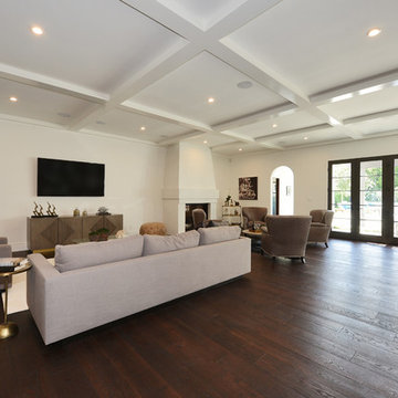
Hancock Homes Realty - The challenge of addressing this really grand space was to separate the spaces to give transition. I attacked this remodel by designing the ceiling plan. lighting, creating intimacy and purpose in each space and through colors in furnishings. I created the curved ceiling design to mimic that of a family crest. - Hancock Homes Realty - Home sold for $10 Million in Historic Hancock Park
 Drury Design
The Setup:
After purchasing this home, the homeowners faced a unique opportunity to reimagine their kitchen and nearby spaces. Water damage from a burst pipe had left much of the home’s interior in need of repair, and while the existing kitchen was functional and in relatively good shape, it didn’t align with the family’s vision for their new home. The layout included a peninsula that wasn’t ideal, and there were some druthers with the nearby pantry.
Since the space needed to be rebuilt anyway, the homeowners saw this as a chance to create a kitchen that was both highly functional for their four young children and timeless in its design. The project also included a refresh of the adjacent message center and dining room — spaces that play key roles in the family’s daily life. The goal was to create a cohesive flow between these areas, balancing modern functionality with the craftsman-inspired character of the rest of the home.
Design Objectives:
- Replace the outdated peninsula with a large island to maximize counter space and create new seating options.
- Open up the space visually by removing soffits and rethinking the cabinetry layout.
Incorporate concealed refrigeration and freezer units to provide significant storage for the family while maintaining a streamlined aesthetic.
- Integrate black cabinetry into the design without making the space feel harsh or heavy.
- Ensure the lighting plan balances functional task lighting with ambient accent lighting.
- Avoid visual clutter in the cabinetry design while still giving a nod to the craftsman aesthetic.
- Incorporate a slab backsplash as a key design feature.
Design Challenges:
- The outdated peninsula left dead space in the kitchen and lacked sufficient seating for the family.
- The cooktop wall was cramped, with small cabinets flanking the hood, limited storage, and soffits that made the space feel closed-in.
- The family needed significant refrigeration space (two refrigerators and a freezer) but wanted to avoid a cluttered look with visible stainless steel appliances.
- Adding black cabinetry risked making the space feel too dark or heavy.
- The original lighting plan was insufficient, particularly over the dining table where a decorative fixture proved too dim.
- The family wanted shaker-style drawer fronts to match the home’s arts-and-crafts design but worried that too much shaker cabinetry might look overly busy.
- Prioritizing a slab backsplash in the wish list priority planning.
The Renewed Space
Design Solutions:
- A functional island: The peninsula was replaced with a large island that provides continuous countertop space for prepping and serving. The island also features seating for four people, creating a central hub for informal meals and activities.
- Streamlined cooktop wall: The soffits were removed, and the upper cabinets on the cooktop wall were eliminated to create a more open, streamlined design. A custom oversized hood became the focal point of the wall, with the blower unit offset inside it to align with the cooktop while maintaining exterior visual symmetry.
- Concealed refrigeration: Two column refrigerators and one freezer were integrated into the cabinetry, concealing them behind wood paneling that blends seamlessly with the overall design.
- Warm black cabinetry: The black cabinetry was crafted from hickory with a visible grain, softening its appearance and adding warmth. The grain detail gives the cabinetry a rich, textured look that avoids feeling stark or overpowering.
- Additional lighting: In the dining area, recessed can lights were added during an additional installation phase to supplement the gorgeous decorative fixture’s dim output. The new lighting plan creates a layered effect, combining functional task lighting with softer ambient lighting.
- Simplified cabinetry details: Slab drawer fronts were used on the upper drawers, while five-piece shaker fronts (with slightly less prominent rail and stile pieces) were reserved for the middle and lower drawers. This approach simplified the overall look while maintaining the craftsman-inspired aesthetic.
- Slab backsplash priority: The slab backsplash was prioritized by making thoughtful adjustments elsewhere, like opting not to extend cabinetry to the ceiling, which also helped visually prioritize the gorgeous slab backsplash. This decision also enhanced the kitchen’s furniture-like feel, aligning with the home’s craftsman character.
- This kitchen perfectly balances practicality with timeless style. By addressing the family’s functional needs — ample seating, smart storage, and effective lighting — while incorporating thoughtful design elements like warm black cabinetry and a striking slab backsplash, Alicia created a space that works beautifully for a busy household. The result is a cohesive, inviting kitchen that honors the home’s craftsman roots and will serve the family well for years to come.
 RHEINZINK
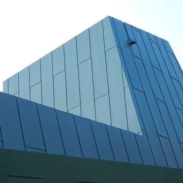
Inspired by noted American architect Norman Jaffe, the strikingly contemporary Sagaponack Residence on Long Island is highlighted by distinctively unique angles both inside and out. Jaffe was widely recognized for his contemporary residential style and use of natural materials and passive solar forms of design for his many South Long Island beach houses.
The 2,700 sq. ft. private residence is located one-half mile from the Atlantic coast and sited in an area that was originally characterized by long vistas over farm fields to the ocean beyond. Now, the area is thickly built up with weekend homes. The project was meant to address this change by creating a place that focuses on the immediate landscape and provides a garden environment for the owner.
A collaborative arrangement between two architectural firms brought the project to life. Andrew Reyniak, principal at ARAPC, New York, was architect of record; Mark Anthony C. Verzosa, principal at +macv, Sag Harbor, NY, was design consultant and general contractor.
“We knew we wanted to use zinc from the beginning,” Verzosa said. “We wanted a material that had a life.” Approximately 5,500 sq. ft. of prePATINA blue-grey RHEINZINK was specified to provide the life and the look that the design team sought. RHEINZINK Vertical Angled Standing Seam Panels and Flat Lock Tiles clad the exterior along with rough-sawn, locally-sourced white cedar. RHEINZINK Double Lock Standing Seam Panels were used on the roof.
“The RHEINZINK is obviously a very versatile material,” according to Verzosa. “The color blends very well into the environment and the sky in particular. And we like the way it patinas and self-heals.”
The unique design of the house incorporates unusual angles on both the exterior and interior. “There’s not a lot of 90 degree or horizontal plumb walls,” Verzosa said. “The dramatic geometry of the building created complicated detailing on the project.”
Fabrication and installation of the RHEINZINK panels was done by Metropan Systems, Inc., Bayside, NY. The company specializes in zinc façade and roofing projects, according to John Gushue, president. “We’ve done more than 60 zinc projects since 2001 and the majority have been RHEINZINK,” Gushue said. “If I could do zinc every day, I would.”
The unusual geometry of the Sagaponack Residence made for a challenging installation. “There was nothing cookie cutter about this job,” according to Gushue. “We began meeting with the architect about a year before actually starting the work in order to incorporate the very best detailing. Every fastener is hidden and there’s no caulk on the façade. Many of the RHEINZINK panels were fabricated on-site in order to bend around corners. And the flashing details had to be meticulous.”
The design of the project presents a modern, artistic look in every aspect. “Of all the zinc projects we’ve done, this is my favorite,” Gushue said. “It was a great job to be on. And properly maintained, it could last for 150 years.”
Find the right local pro for your project
 Castle Building & Remodeling
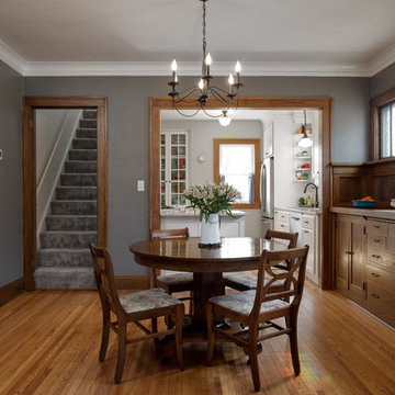
This 1929 Tudor kitchen and porch in St. Paul’s Macalester-Groveland neighborhood was ready for a remodel. The existing back porch was falling off the home and the kitchen was a challenge for the family.
A new kitchen was designed that opened up to the dining room, to create more light and sense of space.
A small back addition was completed to extend the mudroom space and storage. Castle designed and constructed a new open back porch with Azek composite decking, new railing, and stunning arch detail on the roof to coordinate with the home’s existing sweeping lines.
Inside the kitchen, Crystal cabinetry, Silestone quartz countertops, Blanco composite sink, Kohler faucet, new appliances from Warners’ Stellian, chevron tile backsplash from Ceramic Tileworks, and new hardwoods, laced in to match the existing, fully update the space.
One of our favorite details is the glass-doored pantry for the homeowners to showcase their Fiestaware!
Tour this project in person, September 28 – 29, during the 2019 Castle Home Tour!
 Braen Supply
Building a Dream Backyard
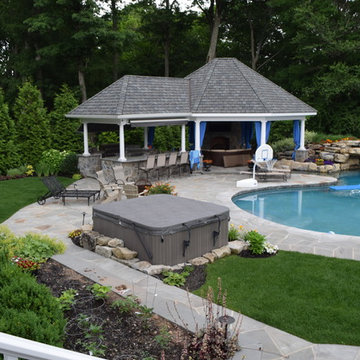
When this homeowner started the design process of a new backyard, Braen Supply was immediately there to supply all the stone materials. The home was part of a new development, so the challenge was to make the home stand out while still addressing specific areas of the existing backyard, such as the steep grade.
Working With the Experts
Taking the steep grade into consideration, moss rock boulders were selected to create stairs down to the lower area of the backyard where the fire pit sits. The grade of the backyard also allowed for the infinity pool, full color bluestone pattern was selected as the veneer for the back wall of the infinity pool.
Braen Supply chose Tennessee gray and bluestone to create a seamless transition from the front of the house to the back of the house. Although they are two different stones, they work nicely together to complete the overall design and tone of the home. It all came together and made the perfect backyard.
Materials Used:
Belgium Blocks
Full Color Bluestone Pattern
Bluestone Caps
Tennessee Gray Irregular
Moss Rock Boulders
Full Color Bluestone Irregular
Kearney Stone Steps
Granite Mosaic Veneer
Completed Areas:
Front Walkway & Porch
Driveway Edging
Backyard Walkways
Pool Patio & Coping
Pool Water Features
Fireplace Hearth & Mantal
Wading Pool
Raised Hot Tub
 Kallweit Graham Architecture
Construction: Kingdom Builders
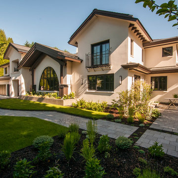
It's all about you! Your dreams, your site, your budget…. that's our inspiration! It is all about creating a home that is a true reflection of you and your unique lifestyle. Every project has it's challenges, but underneath the real-life concerns of budget and bylaws lie opportunities to delight. At Kallweit Graham Architecture, it is these opportunities that we seek to discover for each and every project.
The key to good design is not an unlimited budget, nor following trends. Rather, it takes the limitations of a project and, through thoughtful design, brings out its uniqueness, and enhances the property and it's value.
Building new or renovating an existing home is exciting! We also understand that it can be an emotional undertaking and sometimes overwhelming. For over two decades we have helped hundreds of clients "find their way" through the building maze. We are careful listeners, helping people to identify and prioritize their needs. If you have questions like what is possible? what will it look like? and how much will it cost? our trademarked RenoReport can help… see our website for details www.kga.ca.
We welcome your enquiries, which can be addressed to Karen or Ross
Karen@kga.ca ext:4
Ross@kga.ca ext: 2
604.921.8044
 Deck and Patio Company "Outdoor Living Experts"
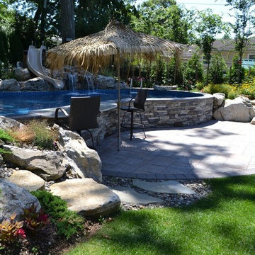
This pool was designed one one side with an exposed wall in order to address the problems of the sloping terrain. Deck and Patio veneered the wall in Cambridge Ledgestone. The patio is made of Cambridge Pavers. www.deckandpatio.com


 Four Elements Construction
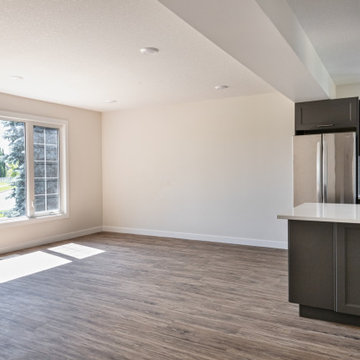
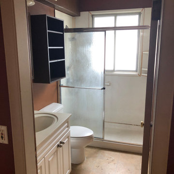
This was the another opportunity to work with one of our favorite clients on one of her projects. This time she wanted to completely revamp a recently purchased make-shift revenue property and convert it to a legal three-suiter maximizing rental income in a prime rental area close to NAIT. The mid-fifties semi-bungalow was in quite poor condition, so it was a challenging opportunity to address the various structural deficiencies while keeping the project at a reasonable budget. We gutted and opened up all three floors, removed a poorly constructed rear addition, and created three comfortable suites on the three separate floors. Compare the before and after pictures - a complete transformation!
 Michael Nash Design, Build & Homes
This growing family of six was struggling with a dysfunctional kitchen design. The center island had been installed at an odd angle that limited accessibility and traffic flow. Additionally, storage space was limited by poor cabinet design. Finally, doorways in and out of the kitchen were narrow and poorly located, especially for children dashing in and out.
Other design challenges included how to better use a 10’ x 12’ room for children’s jackets and toys and how to add a professional-quality gas range in a neighborhood were natural gas wasn’t available. The new design would address all of these issues.
DESIGN SOLUTIONS
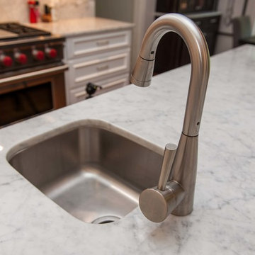
The new kitchen design revolves around a more proportional island. Carefully placed in the center of the new space with seating for four, it includes a prep sink, a second dishwasher and a beverage center.
The distressed ebony-stained island and hutch provides a brilliant contrast between the white color cabinetry. White Carrera marble countertops and backsplash top both island and perimeter cabinets.
Tall, double stacked cabinetry lines two walls to maximize storage space. Across the room there was an unused wall that now contains a 36” tower fridge and freezer, both covered with matching panels, and a tall cabinet that contains a microwave, steam unit and warming drawer.
A propane tank was buried in the back yard to provide gas to a new 60” professional range and cooktop. A custom-made wood mantel hood blends perfectly with the cabinet style.
The old laundry room was reconfigured to have lots of locker space for all kids and added cabinetry for storage. A double entry door separated the new mudroom from the rest of the back hall. In the back hall the back windows were replaced with a set of French door and added decking to create a direct access to deck and backyard.
The end result is an open floor plan, high-end appliances, great traffic flow and pleasing colors. The homeowner calls it the “kitchen of her dreams.”
 Four Elements Construction
This was the another opportunity to work with one of our favorite clients on one of her projects. This time she wanted to completely revamp a recently purchased make-shift revenue property and convert it to a legal three-suiter maximizing rental income in a prime rental area close to NAIT. The mid-fifties semi-bungalow was in quite poor condition, so it was a challenging opportunity to address the various structural deficiencies while keeping the project at a reasonable budget. We gutted and opened up all three floors, removed a poorly constructed rear addition, and created three comfortable suites on the three separate floors. Compare the before and after pictures - a complete transformation!
 CairnsCraft Design & Remodel
Rustic-Modern Finnish Kitchen
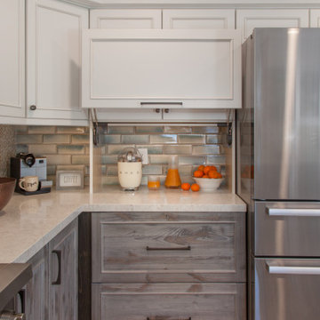
Our client was inclined to transform this kitchen into a functional, Finnish inspired space. Finnish interior design can simply be described in 3 words: simplicity, innovation, and functionalism. Finnish design addresses the tough climate, unique nature, and limited sunlight, which inspired designers to create solutions, that would meet the everyday life challenges. The combination of the knotty, blue-gray alder base cabinets combined with the clean white wall cabinets reveal mixing these rustic Finnish touches with the modern. The leaded glass on the upper cabinetry was selected so our client can display their personal collection from Finland.
Mixing black modern hardware and fixtures with the handmade, light, and bright backsplash tile make this kitchen a timeless show stopper.
This project was done in collaboration with Susan O'Brian from EcoLux Interiors.
 Kallweit Graham Architecture
Construction: Kingdom Builders
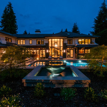
It's all about you! Your dreams, your site, your budget…. that's our inspiration! It is all about creating a home that is a true reflection of you and your unique lifestyle. Every project has it's challenges, but underneath the real-life concerns of budget and bylaws lie opportunities to delight. At Kallweit Graham Architecture, it is these opportunities that we seek to discover for each and every project.
The key to good design is not an unlimited budget, nor following trends. Rather, it takes the limitations of a project and, through thoughtful design, brings out its uniqueness, and enhances the property and it's value.
Building new or renovating an existing home is exciting! We also understand that it can be an emotional undertaking and sometimes overwhelming. For over two decades we have helped hundreds of clients "find their way" through the building maze. We are careful listeners, helping people to identify and prioritize their needs. If you have questions like what is possible? what will it look like? and how much will it cost? our trademarked RenoReport can help… see our website for details www.kga.ca.
We welcome your enquiries, which can be addressed to Karen or Ross
Karen@kga.ca ext:4
Ross@kga.ca ext: 2
604.921.8044
 BMR BelMax Remodeling
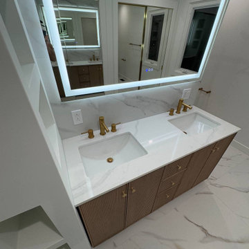
Master Bathroom Remodeling in Ambler, PA – A Complete Transformation by BMR Belmax Remodeling
At BMR Belmax Remodeling, we specialize in creating beautiful, functional, and luxurious bathroom spaces tailored to our clients’ needs. One of our most recent projects involved a master bathroom remodeling in Ambler, PA, where we completely reimagined the layout to maximize space, improve functionality, and enhance aesthetics. The result was a modern, spacious, and inviting master bathroom that perfectly suited the homeowner’s vision.
The Challenge: An Outdated and Divided Bathroom
The original master bathroom in Ambler, PA was divided into two separate rooms. One area housed a vanity and closet, while the other contained the shower and toilet. While functional, this layout felt cramped, disjointed, and inefficient. The homeowners wanted to merge these two spaces into a single, cohesive master bathroom that felt larger, more open, and more luxurious.
They envisioned a modern walk-in shower, enhanced storage, better lighting, and high-end finishes, all while improving the flow and accessibility of the space. Our team at BMR Belmax Remodeling worked closely with them to develop a design that addressed their needs and transformed their bathroom into a modern retreat.
The Transformation: A Unified & Modern Master Bathroom
Our approach to this bathroom renovation in Ambler, PA focused on space optimization, luxury finishes, and functionality. We combined the two separate rooms into one expansive master bathroom, making the space feel more open and elegant.
1. Layout Reconfiguration & Wall Removal
We removed the dividing wall between the shower and vanity area to open up the space and create a more seamless layout.
A new wall was built to expand the shower area, allowing for a larger and more comfortable walk-in shower.
The closet and vanity space were integrated into the main bathroom layout, eliminating the need for a separate entryway and making the space more efficient and accessible.
2. Walk-In Shower with Premium Features
A stunning walk-in shower with sleek glass doors was installed to give the bathroom a modern and luxurious look.
We used large-format tiles on the shower walls and flooring, creating a cohesive, stylish, and low-maintenance surface.
A built-in recessed niche with a custom tile shelf was added for practical storage while maintaining a clean and sophisticated design.
3. Vanity & Storage Enhancements
The old vanity was replaced with a sleek, modern vanity that provided ample storage and counter space.
We incorporated custom-built shelves on the left side of the vanity, offering additional storage without cluttering the design.
A lighted mirror was installed above the vanity, combining style and practicality while enhancing the overall lighting in the space.
4. Elegant Fixtures & Finishes
To add a touch of luxury, we installed gold-finished fixtures, including the showerhead, faucets, and cabinet handles, giving the bathroom a high-end, elegant feel.
A modern one-piece toilet was installed to complement the clean and minimalist design.
The bathroom’s neutral color palette and textured finishes created a calm and inviting atmosphere.
5. Enhanced Ventilation & Lighting
A new exhaust fan was installed to improve air circulation and moisture control, ensuring a comfortable and mold-free environment.
Additional task lighting and ambient lighting were carefully placed to make the bathroom bright, warm, and inviting.
The Result: A Stunning, Spacious, and Functional Master Bathroom
The completed master bathroom remodeling in Ambler, PA is now a spacious, modern retreat that perfectly blends style and functionality. By unifying the previously divided rooms, we created a flowing and open space that feels larger and more inviting. The walk-in shower, gold fixtures, and custom vanity elevate the aesthetics, while the recessed niche, built-in shelves, and enhanced lighting provide practicality and comfort.
The homeowner was thrilled with the transformation, noting how much brighter, more functional, and elegant the space now feels. They particularly loved how the layout reconfiguration made the space more open and efficient, as well as the luxurious finishes that added a high-end touch.
 Sosna Inc
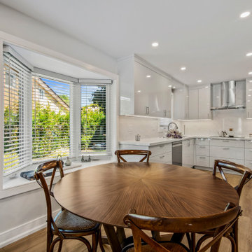
This renovation project focused on transforming a retired couple’s home into a space that reflects their current stage of life—comfortable, elegant, and functional. With their children grown and moved out, the couple wanted a home that adapted to their needs while addressing years of wear and outdated design. Having had previous negative experiences with contractors, they were hesitant but committed to renovating instead of moving. By building trust through clear communication and a shared vision, the team was able to bring their dream to life.
The renovation started with the kitchen, where a partial wall removal opened up the space, creating a seamless flow between the kitchen and living areas. Custom cabinetry with integrated storage solutions, durable contemporary flooring, and refreshed ceilings replaced outdated finishes, while new lighting fixtures and a strategically placed skylight brightened the entire main floor. A built-in entry closet and refinished staircase with sleek metal railings added modern touches without expanding the home’s footprint.
In the master ensuite, luxury and function took center stage. The space was expanded to include a full-sized soaking tub, a double vanity with ample storage, and marble tiles for a spa-like retreat. The addition of a home office in the master suite provided a private, comfortable space for hobbies and personal tasks, while an updated closet system brought improved organization. The fully renovated basement, featuring a walk-in shower and custom laundry room furniture, ensured the home could comfortably accommodate visiting family and friends.
The project was not without challenges, including integrating a seamless transition between existing structures and a new addition, as well as ensuring the design respected the couple’s cultural tastes. Through teamwork, regular progress updates, and attention to detail, these hurdles were overcome with success. A new patio door now connects the home’s interior to the outdoor space, transforming the backyard into a natural extension of the living area.
The result is a stunning transformation—an elegant, modern, and functional home that supports the couple’s evolving lifestyle. This renovation serves as a testament to how thoughtful design and collaboration can create a space that is both beautiful and practical, allowing homeowners to enjoy a new chapter of life with comfort and ease.
 Irene Designs
Home Remodeling Project Overview
This extensive home remodeling project transformed a dated and inefficient layout into a functional, open, and aesthetically cohesive living space. The original layout had several challenges:
• A kitchen with limited storage, no cabinets on the window side, a sink facing the wall, and a range crammed into the corner. The pantry closet was too deep and impractical.
• A living room that couldn’t accommodate furniture without interfering with traffic flow.
• A front foyer with wasted space.
• A claustrophobic hallway toilet room without a sink, located near the laundry room.
The Remodeling Concept
The scope of this project extended well beyond the kitchen. We proposed several layout options to address issues in all adjacent spaces, ultimately implementing a plan that:
• Removed two walls and moved doorways.
• Replaced the kitchen window.
• Converted the hallway toilet room into a storage space.
• Installed pocket doors to separate the laundry hallway from the living room.
Kitchen Transformation
• Open Concept: By removing the wall between the kitchen and dining room, the two spaces became a seamless open area.
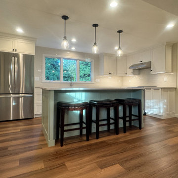
• New Layout: Cabinets were relocated to the window side for more storage and natural light. A central island with storage and seating was added, and a coffee bar was installed in the dining room.
• Updated Pantry: The deep pantry closet was converted into a pullout pantry with a cabinet front for better accessibility.
• Design Details: Off-white kitchen cabinets pair beautifully with a light green island. Warm white quartz counters and an artisan tile backsplash complete the look.
Dining Room
• Expanded Space: Most of the wall separating the dining room and foyer was removed, creating a more spacious area while still accommodating all furniture thanks to careful measurements.
Living Room Improvements
• Optimized Layout: Moving doorways and installing pocket doors allowed for better furniture placement, including a sofa that doesn’t interfere with traffic flow.
• Fireplace Upgrade: The brick fireplace was updated with a three-dimensional staggered stone veneer in a color matching the kitchen cabinets, creating a cohesive look. A TV was installed above the fireplace at a comfortable viewing angle.
Additional Updates
• New Flooring: All remodeled rooms now feature updated flooring.
• Ceilings: Popcorn ceilings were replaced with smooth, flat finishes, complemented by recessed lighting.
• Walls: Fresh paint throughout the space, with an accent wall in the living room matching the light green of the kitchen island.
• Lighting: Stylish sconces were added for a touch of elegance.
The Result
The homeowners are thrilled with the transformation, marveling at how their once cramped and inefficient home now feels spacious, functional, and beautifully cohesive. They can’t believe their house could ever look like this!
 The Design Studio of Wendy Harper
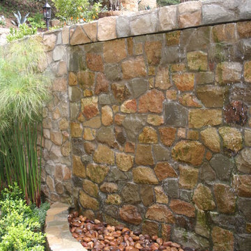
Do to this sites location ocean front and adjacent to a creek, many spacial challenges needed to be addressed. This is the wall separating the pool area from the driveway. Integrating grass into the driveway paving and adding lush planters and pottery, made this driveway space feel like a transition space between the kitchen patio and the pool area. A weeping wall adds the sound of babbling water and a pleasant element to this 'driveway' space.
Photo: Wendy Harper
 Jacobson Construction
From Attic to Awesome
Many of the classic Tudor homes in Minneapolis are defined as 1 ½ stories. The ½ story is actually an attic; a space just below the roof and with a rough floor often used for storage and little more. The owners were looking to turn their attic into about 900 sq. ft. of functional living/bedroom space with a big bath, perfect for hosting overnight guests.
This was a challenging project, considering the plan called for raising the roof and adding two large shed dormers. A structural engineer was consulted, and the appropriate construction measures were taken to address the support necessary from below, passing the required stringent building codes.
The remodeling project took about four months and began with reframing many of the roof support elements and adding closed cell spray foam insulation throughout to make the space warm and watertight during cold Minnesota winters, as well as cool in the summer.
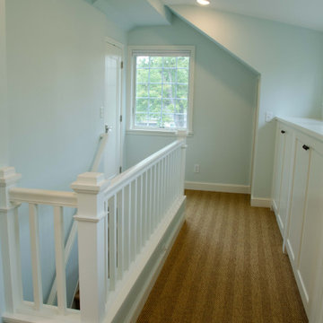
You enter the room using a stairway enclosed with a white railing that offers a feeling of openness while providing a high degree of safety. A short hallway leading to the living area features white cabinets with shaker style flat panel doors – a design element repeated in the bath. Four pairs of South facing windows above the cabinets let in lots of South sunlight all year long.
The 130 sq. ft. bath features soaking tub and open shower room with floor-to-ceiling 2-inch porcelain tiling. The custom heated floor and one wall is constructed using beautiful natural stone. The shower room floor is also the shower’s drain, giving this room an open feeling while providing the ultimate functionality. The other half of the bath consists of a toilet and pedestal sink flanked by two white shaker style cabinets with Granite countertops. A big skylight over the tub and another north facing window brightens this room and highlights the tiling with a shade of green that’s pleasing to the eye.
The rest of the remodeling project is simply a large open living/bedroom space. Perhaps the most interesting feature of the room is the way the roof ties into the ceiling at many angles – a necessity because of the way the home was originally constructed. The before and after photos show how the construction method included the maximum amount of interior space, leaving the room without the “cramped” feeling too often associated with this kind of remodeling project.
Another big feature of this space can be found in the use of skylights. A total of six skylights – in addition to eight South-facing windows – make this area warm and bright during the many months of winter when sunlight in Minnesota comes at a premium.
The main living area offers several flexible design options, with space that can be used with bedroom and/or living room furniture with cozy areas for reading and entertainment. Recessed lighting on dimmers throughout the space balances daylight with room light for just the right atmosphere.
The space is now ready for decorating with original artwork and furnishings. How would you furnish this space?
 Decorating Den Interiors-Barbara Tabak
The client’s goal for this makeover was to create a clean style with a contemporary vibe in her cold empty bedroom. The client’s main focus for the design was to block the morning sun that woke her up long before she wanted to begin her day.
Problem(s) addressed:
The room was void of furnishings, bedding and accessories. The décor consisted of a mattress, box spring, jewelry chest and an old comforter, and therefore had no inspirational piece from which to begin the design. We were literally starting from scratch. As for the morning sun dilemma, I was excited to come up with a better solution to the sun challenge than her temporary solution of stacking towels in the arch window.
Solution provided:
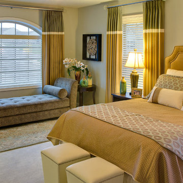
Furnishings were the first priority. Rich espresso-stained contemporary dresser, gentleman’s chest and nightstands began the design. Next, a leopard print upholstered chaise was selected to sit in front of the double arched window providing a place to read, work on a laptop, and listen to music or just lounge. Two faux leather ottomans were selected to perch at the end of the bed.
Custom bedding and color scheme was next on the list. The client had requested a restful color palette, which fell into place when we found the perfect heather-gray, gold and cream hued bed ensemble. With the bedding selected, a coordinating wall paint and gold velvet fabric was chosen for the upholstered headboard.
To solve the clients early morning wake up call, traversing draperies that are installed above the window arch were designed to shut out the morning sun. The inverted French pleat draperies, with their color block design, enhance the room’s clean contemporary style. Brushed silver hardware with cracked crystal finials coordinated the furniture hardware and added a touch of sophistication.
Finally, a combination of elegant lighting, mixed media art, an area rug and accessories finish the room’s contemporary design.
 Design Set Match
This remodel addressed issues including peeling vinyl flooring, outdated fixtures, and safety hazards due to deferred maintenance.
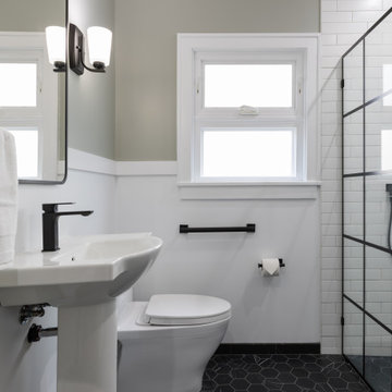
Challenges included: sourcing budget-sensitive materials with a high-end feel; slip-resistant hexagon floor tiles; a new pedestal sink; a water-saving toilet; and a larger medicine cabinet, while correcting code violations.
Universal Design created an open floor plan, low-maintenance finishes, zero-threshold entries into the bathroom and shower, in addition to highly-contrasting materials, grab bars with blocking, accessible towel bars for user convenience, and dimmable lighting with anti-glare trim.
We combined modern materials for a noir style and universal functionality for our aging-in-place clients and their forever home.
 Architectural Resource LLC
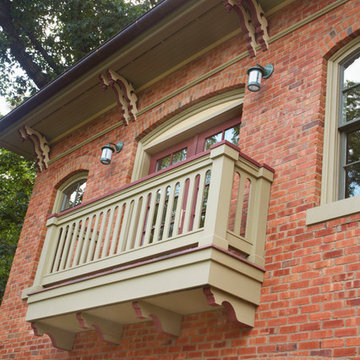
Our Clients, the proud owners of a landmark 1860’s era Italianate home, desired to greatly improve their daily ingress and egress experience. With a growing young family, the lack of a proper entry area and attached garage was something they wanted to address. They also needed a guest suite to accommodate frequent out-of-town guests and visitors. But in the homeowner’s own words, “He didn’t want to be known as the guy who ‘screwed up’ this beautiful old home”. Our design challenge was to provide the needed space of a significant addition, but do so in a manner that would respect the historic home. Our design solution lay in providing a “hyphen”: a multi-functional daily entry breezeway connector linking the main house with a new garage and in-law suite above.
46