
Search results for "Address challenges" in Home Design Ideas
 Modulor
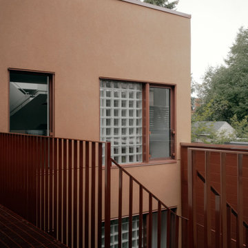
Located in the heart of Montreal, Binôme is an architectural urban densification project built by Modulor. Composed of two distinct buildings connected by an inner courtyard, this new five-unit development stands out through its unique layout, architecture, and exceptional attention to detail. The construction required rigorous planning and precise technical execution, particularly due to major excavation work and underpinning of adjacent buildings. Such interventions in a dense urban environment demand specialized expertise and tight project management at every phase of the build.
Conceived as an income-generating property, the clients benefited from our strategic support to ensure the profitability, efficiency, and optimization of their investment. Modulor worked closely with the team at Appareil Architecture to bring to life a project of high architectural integrity.
Binôme’s architecture draws inspiration from the area's industrial past: clean volumes, red brick, generous openings reminiscent of former workshops, and elegant brick colonnades form a refined and cohesive ensemble. The central courtyard, designed as a luminous and welcoming shared space, becomes the vibrant heart of the project. A colorful metal staircase, crafted by Atomic Soudure, connects both buildings and adds a distinctive, curated touch.
As a finalist for the 2025 Ordre des architectes du Québec Awards of Excellence, Binôme stands as a model of successful urban revitalization. It illustrates how thoughtful, well-executed construction can elevate Montreal’s built environment while addressing today’s densification challenges.
 Elegance Kitchen & Bath
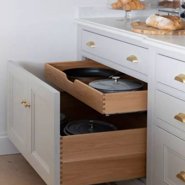
White Kitchen Cabinets: Timeless Elegance for Modern Homes
White kitchen cabinets are more than just a design choice; they're a testament to timeless elegance and adaptability in the heart of any home. As homeowners continue to seek spaces that feel airy, clean, and spacious, white cabinets have emerged as a top choice for both modern and traditional kitchens alike.
Why Choose White Kitchen Cabinets?
Versatility: The neutral hue of white allows these cabinets to blend seamlessly with any color palette or kitchen design. Whether you're aiming for a sleek modern look or a cozy cottage vibe, white cabinets can be the perfect canvas to achieve your desired aesthetic.
Brightness and Space: White reflects light beautifully, making your kitchen appear larger and more open. It's especially beneficial for smaller spaces, where creating an illusion of a more expansive area is crucial.
Timeless Appeal: While trends come and go, white has an enduring appeal. It exudes a sense of cleanliness and simplicity, making it a long-lasting choice for homeowners.
Resale Value: If you ever consider selling your home, white kitchen cabinets can boost your property's appeal to potential buyers, ensuring that your kitchen remains stylish and up-to-date.
Pairing with Other Elements
The adaptability of white kitchen cabinets means you can play with various colors and textures. Whether it's a vibrant backsplash, granite countertops, or wooden flooring, the neutrality of white ensures that everything comes together harmoniously.
Maintenance and Durability
A common misconception is that white cabinets can be challenging to maintain. However, with today's advancements in paint and finishes, white kitchen cabinets are resistant to stains and easy to clean. Furthermore, any marks or stains are quickly spotted, ensuring that you can address them promptly, keeping your cabinets in pristine condition.
Conclusion
White kitchen cabinets are not just a fleeting trend. Their unmatched versatility, the spacious feel they bring to any kitchen, and their timeless beauty make them an excellent choice for homeowners. Whether you're renovating your kitchen or designing a new one, consider the elegance and adaptability that white cabinets can bring to your space. With proper care and the right design elements, your white kitchen can be a showstopper for years to come.
 Design Set Match
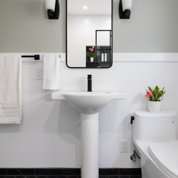
This remodel addressed issues including peeling vinyl flooring, outdated fixtures, and safety hazards due to deferred maintenance.
Challenges included: sourcing budget-sensitive materials with a high-end feel; slip-resistant hexagon floor tiles; a new pedestal sink; a water-saving toilet; and a larger medicine cabinet, while correcting code violations.
Universal Design created an open floor plan, low-maintenance finishes, zero-threshold entries into the bathroom and shower, in addition to highly-contrasting materials, grab bars with blocking, accessible towel bars for user convenience, and dimmable lighting with anti-glare trim.
We combined modern materials for a noir style and universal functionality for our aging-in-place clients and their forever home.
Find the right local pro for your project
 Sara Mosele
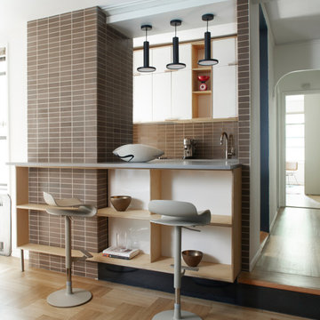
When Sara Mosele Interiors, an innovative architecture/interior design studio in New York, was tasked with transforming a client’s new one-bedroom apartment in the Chelsea section of New York into his dream home, she jumped at the chance to merge her “design with a human touch” philosophy with her Italian sensibility. The client, a young Italian, was a first-time buyer who wanted to transition from his eclectic rental look to a sophisticated, sustainable aesthetic that was both warm and contemporary. Sara mobilized her team to create a functional yet stylish environment that will remain timeless.
Sara knew the apartment had good bones in an old building with character. The apartment needed minimal upgrades. The footprint was functional, the wooden floors were in good condition. and the kitchen and bathroom required no major chamges. Sara and team were able to plunge into the design, using color, shape and texture to make a new statement, The walls became a neutral canvas in each room. The living room, for example, was painted a soft gray against which an abstract painting with bright red and blue colors became the inspiration for the selection of a bright blue chair and ottoman in boucle, blue pillows on an off-white modular sofa, and complementary red and blue rugs.
The goal was to work with high-end modern Italian brands --- Flexform, Vitra, Molteni &C, among them ---selected in sizes that match the proportions of the rooms. A challenge throughout was the need for more lighting which was addressed creatively with an abstract chandelier in the living room and a similar modern look over a sleek metal table in the dining room where rust-colored chairs edge the metal table. Three modern light fixtures also are placed over the sink in the kitchen
The bedroom also juxtaposes a brown headboard and a whimsical taupe side table by Vitra with sections that rotate, creating contrast against a creamy beige bedspread and wall color. A custom-made wardrobe serves as a focal piece and valuable storage space.
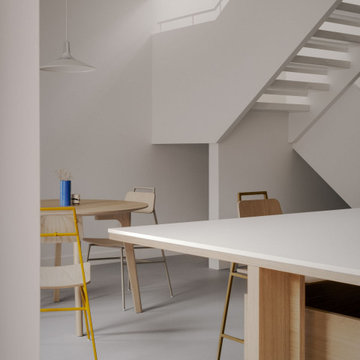 Modulor
Located in the heart of Montreal, Binôme is an architectural urban densification project built by Modulor. Composed of two distinct buildings connected by an inner courtyard, this new five-unit development stands out through its unique layout, architecture, and exceptional attention to detail. The construction required rigorous planning and precise technical execution, particularly due to major excavation work and underpinning of adjacent buildings. Such interventions in a dense urban environment demand specialized expertise and tight project management at every phase of the build.
Conceived as an income-generating property, the clients benefited from our strategic support to ensure the profitability, efficiency, and optimization of their investment. Modulor worked closely with the team at Appareil Architecture to bring to life a project of high architectural integrity.
Binôme’s architecture draws inspiration from the area's industrial past: clean volumes, red brick, generous openings reminiscent of former workshops, and elegant brick colonnades form a refined and cohesive ensemble. The central courtyard, designed as a luminous and welcoming shared space, becomes the vibrant heart of the project. A colorful metal staircase, crafted by Atomic Soudure, connects both buildings and adds a distinctive, curated touch.
As a finalist for the 2025 Ordre des architectes du Québec Awards of Excellence, Binôme stands as a model of successful urban revitalization. It illustrates how thoughtful, well-executed construction can elevate Montreal’s built environment while addressing today’s densification challenges.
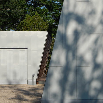
 RHEINZINK
Inspired by noted American architect Norman Jaffe, the strikingly contemporary Sagaponack Residence on Long Island is highlighted by distinctively unique angles both inside and out. Jaffe was widely recognized for his contemporary residential style and use of natural materials and passive solar forms of design for his many South Long Island beach houses.
The 2,700 sq. ft. private residence is located one-half mile from the Atlantic coast and sited in an area that was originally characterized by long vistas over farm fields to the ocean beyond. Now, the area is thickly built up with weekend homes. The project was meant to address this change by creating a place that focuses on the immediate landscape and provides a garden environment for the owner.
A collaborative arrangement between two architectural firms brought the project to life. Andrew Reyniak, principal at ARAPC, New York, was architect of record; Mark Anthony C. Verzosa, principal at +macv, Sag Harbor, NY, was design consultant and general contractor.
“We knew we wanted to use zinc from the beginning,” Verzosa said. “We wanted a material that had a life.” Approximately 5,500 sq. ft. of prePATINA blue-grey RHEINZINK was specified to provide the life and the look that the design team sought. RHEINZINK Vertical Angled Standing Seam Panels and Flat Lock Tiles clad the exterior along with rough-sawn, locally-sourced white cedar. RHEINZINK Double Lock Standing Seam Panels were used on the roof.
“The RHEINZINK is obviously a very versatile material,” according to Verzosa. “The color blends very well into the environment and the sky in particular. And we like the way it patinas and self-heals.”
The unique design of the house incorporates unusual angles on both the exterior and interior. “There’s not a lot of 90 degree or horizontal plumb walls,” Verzosa said. “The dramatic geometry of the building created complicated detailing on the project.”
Fabrication and installation of the RHEINZINK panels was done by Metropan Systems, Inc., Bayside, NY. The company specializes in zinc façade and roofing projects, according to John Gushue, president. “We’ve done more than 60 zinc projects since 2001 and the majority have been RHEINZINK,” Gushue said. “If I could do zinc every day, I would.”
The unusual geometry of the Sagaponack Residence made for a challenging installation. “There was nothing cookie cutter about this job,” according to Gushue. “We began meeting with the architect about a year before actually starting the work in order to incorporate the very best detailing. Every fastener is hidden and there’s no caulk on the façade. Many of the RHEINZINK panels were fabricated on-site in order to bend around corners. And the flashing details had to be meticulous.”
The design of the project presents a modern, artistic look in every aspect. “Of all the zinc projects we’ve done, this is my favorite,” Gushue said. “It was a great job to be on. And properly maintained, it could last for 150 years.”
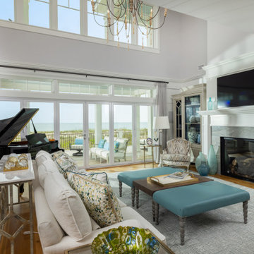
 Goggans Architecture & Interiors
When the Owners approached Goggans Architecture about renovation of a 90’s era oceanfront house, it was clear there would be a lot more to the renovation than mere updates and remedying deferred maintenance. One of the most significant issues was how to integrate an outdoor pool given the pool had to be within the building envelope, and the house was already abutting the setback on its ocean side. A second significant challenge was how to provide a roof top deck over a pitched roof house with an attic, that was functional and attractive. Finally, creating better access from the parking area to the kitchen was a priority.
Goggans Architecture addressed the placement of a pool by creating a walled courtyard at the front, or landward side, of the house. The pool was placed on one side of the entry walkway, while its composition was balanced by a parterre garden on the other side of the walkway. The roof top deck was resolved by adding a new staircase and passageway through former attic space. By using a motorized roof hatch, the Owners could ascend to the roof deck which perched just below the roof ridge, hidden from view from the street. Relocating an underneath stair from one side of the house to a point that was closer to the kitchen resolved the access issue.
These strategic moves created other opportunities, such as expansion of the master bathroom to a portion of the front porch, while allowing an exterior stair from the bath directly to the pool. Other enhancements included placement of a large folding door in the Great room, renovation and expansion of the kitchen and exterior decks, reorganization, and replacement of the fenestration, updating all baths and interior and exterior finishes.
The extensive renovation reflects the holistic approach of Goggans Architecture, marrying landscape architecture, architecture, and interiors.


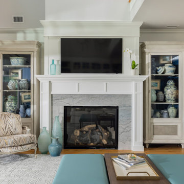 Goggans Architecture & Interiors
When the Owners approached Goggans Architecture about renovation of a 90’s era oceanfront house, it was clear there would be a lot more to the renovation than mere updates and remedying deferred maintenance. One of the most significant issues was how to integrate an outdoor pool given the pool had to be within the building envelope, and the house was already abutting the setback on its ocean side. A second significant challenge was how to provide a roof top deck over a pitched roof house with an attic, that was functional and attractive. Finally, creating better access from the parking area to the kitchen was a priority.
Goggans Architecture addressed the placement of a pool by creating a walled courtyard at the front, or landward side, of the house. The pool was placed on one side of the entry walkway, while its composition was balanced by a parterre garden on the other side of the walkway. The roof top deck was resolved by adding a new staircase and passageway through former attic space. By using a motorized roof hatch, the Owners could ascend to the roof deck which perched just below the roof ridge, hidden from view from the street. Relocating an underneath stair from one side of the house to a point that was closer to the kitchen resolved the access issue.
These strategic moves created other opportunities, such as expansion of the master bathroom to a portion of the front porch, while allowing an exterior stair from the bath directly to the pool. Other enhancements included placement of a large folding door in the Great room, renovation and expansion of the kitchen and exterior decks, reorganization, and replacement of the fenestration, updating all baths and interior and exterior finishes.
The extensive renovation reflects the holistic approach of Goggans Architecture, marrying landscape architecture, architecture, and interiors.
 Michael Nash Design, Build & Homes
This growing family of six was struggling with a dysfunctional kitchen design. The center island had been installed at an odd angle that limited accessibility and traffic flow. Additionally, storage space was limited by poor cabinet design. Finally, doorways in and out of the kitchen were narrow and poorly located, especially for children dashing in and out.
Other design challenges included how to better use a 10’ x 12’ room for children’s jackets and toys and how to add a professional-quality gas range in a neighborhood were natural gas wasn’t available. The new design would address all of these issues.
DESIGN SOLUTIONS
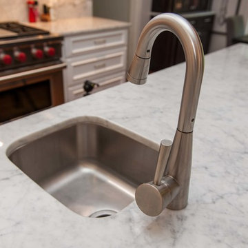
The new kitchen design revolves around a more proportional island. Carefully placed in the center of the new space with seating for four, it includes a prep sink, a second dishwasher and a beverage center.
The distressed ebony-stained island and hutch provides a brilliant contrast between the white color cabinetry. White Carrera marble countertops and backsplash top both island and perimeter cabinets.
Tall, double stacked cabinetry lines two walls to maximize storage space. Across the room there was an unused wall that now contains a 36” tower fridge and freezer, both covered with matching panels, and a tall cabinet that contains a microwave, steam unit and warming drawer.
A propane tank was buried in the back yard to provide gas to a new 60” professional range and cooktop. A custom-made wood mantel hood blends perfectly with the cabinet style.
The old laundry room was reconfigured to have lots of locker space for all kids and added cabinetry for storage. A double entry door separated the new mudroom from the rest of the back hall. In the back hall the back windows were replaced with a set of French door and added decking to create a direct access to deck and backyard.
The end result is an open floor plan, high-end appliances, great traffic flow and pleasing colors. The homeowner calls it the “kitchen of her dreams.”
 RHEINZINK
Inspired by noted American architect Norman Jaffe, the strikingly contemporary Sagaponack Residence on Long Island is highlighted by distinctively unique angles both inside and out. Jaffe was widely recognized for his contemporary residential style and use of natural materials and passive solar forms of design for his many South Long Island beach houses.
The 2,700 sq. ft. private residence is located one-half mile from the Atlantic coast and sited in an area that was originally characterized by long vistas over farm fields to the ocean beyond. Now, the area is thickly built up with weekend homes. The project was meant to address this change by creating a place that focuses on the immediate landscape and provides a garden environment for the owner.
A collaborative arrangement between two architectural firms brought the project to life. Andrew Reyniak, principal at ARAPC, New York, was architect of record; Mark Anthony C. Verzosa, principal at +macv, Sag Harbor, NY, was design consultant and general contractor.
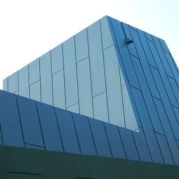
“We knew we wanted to use zinc from the beginning,” Verzosa said. “We wanted a material that had a life.” Approximately 5,500 sq. ft. of prePATINA blue-grey RHEINZINK was specified to provide the life and the look that the design team sought. RHEINZINK Vertical Angled Standing Seam Panels and Flat Lock Tiles clad the exterior along with rough-sawn, locally-sourced white cedar. RHEINZINK Double Lock Standing Seam Panels were used on the roof.
“The RHEINZINK is obviously a very versatile material,” according to Verzosa. “The color blends very well into the environment and the sky in particular. And we like the way it patinas and self-heals.”
The unique design of the house incorporates unusual angles on both the exterior and interior. “There’s not a lot of 90 degree or horizontal plumb walls,” Verzosa said. “The dramatic geometry of the building created complicated detailing on the project.”
Fabrication and installation of the RHEINZINK panels was done by Metropan Systems, Inc., Bayside, NY. The company specializes in zinc façade and roofing projects, according to John Gushue, president. “We’ve done more than 60 zinc projects since 2001 and the majority have been RHEINZINK,” Gushue said. “If I could do zinc every day, I would.”
The unusual geometry of the Sagaponack Residence made for a challenging installation. “There was nothing cookie cutter about this job,” according to Gushue. “We began meeting with the architect about a year before actually starting the work in order to incorporate the very best detailing. Every fastener is hidden and there’s no caulk on the façade. Many of the RHEINZINK panels were fabricated on-site in order to bend around corners. And the flashing details had to be meticulous.”
The design of the project presents a modern, artistic look in every aspect. “Of all the zinc projects we’ve done, this is my favorite,” Gushue said. “It was a great job to be on. And properly maintained, it could last for 150 years.”
 Four Elements Construction
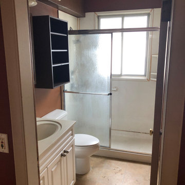
This was the another opportunity to work with one of our favorite clients on one of her projects. This time she wanted to completely revamp a recently purchased make-shift revenue property and convert it to a legal three-suiter maximizing rental income in a prime rental area close to NAIT. The mid-fifties semi-bungalow was in quite poor condition, so it was a challenging opportunity to address the various structural deficiencies while keeping the project at a reasonable budget. We gutted and opened up all three floors, removed a poorly constructed rear addition, and created three comfortable suites on the three separate floors. Compare the before and after pictures - a complete transformation!
 Four Elements Construction
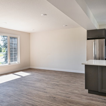
This was the another opportunity to work with one of our favorite clients on one of her projects. This time she wanted to completely revamp a recently purchased make-shift revenue property and convert it to a legal three-suiter maximizing rental income in a prime rental area close to NAIT. The mid-fifties semi-bungalow was in quite poor condition, so it was a challenging opportunity to address the various structural deficiencies while keeping the project at a reasonable budget. We gutted and opened up all three floors, removed a poorly constructed rear addition, and created three comfortable suites on the three separate floors. Compare the before and after pictures - a complete transformation!
 BMR BelMax Remodeling
Master Bathroom Remodeling in Ambler, PA – A Complete Transformation by BMR Belmax Remodeling
At BMR Belmax Remodeling, we specialize in creating beautiful, functional, and luxurious bathroom spaces tailored to our clients’ needs. One of our most recent projects involved a master bathroom remodeling in Ambler, PA, where we completely reimagined the layout to maximize space, improve functionality, and enhance aesthetics. The result was a modern, spacious, and inviting master bathroom that perfectly suited the homeowner’s vision.
The Challenge: An Outdated and Divided Bathroom
The original master bathroom in Ambler, PA was divided into two separate rooms. One area housed a vanity and closet, while the other contained the shower and toilet. While functional, this layout felt cramped, disjointed, and inefficient. The homeowners wanted to merge these two spaces into a single, cohesive master bathroom that felt larger, more open, and more luxurious.
They envisioned a modern walk-in shower, enhanced storage, better lighting, and high-end finishes, all while improving the flow and accessibility of the space. Our team at BMR Belmax Remodeling worked closely with them to develop a design that addressed their needs and transformed their bathroom into a modern retreat.
The Transformation: A Unified & Modern Master Bathroom
Our approach to this bathroom renovation in Ambler, PA focused on space optimization, luxury finishes, and functionality. We combined the two separate rooms into one expansive master bathroom, making the space feel more open and elegant.
1. Layout Reconfiguration & Wall Removal
We removed the dividing wall between the shower and vanity area to open up the space and create a more seamless layout.
A new wall was built to expand the shower area, allowing for a larger and more comfortable walk-in shower.
The closet and vanity space were integrated into the main bathroom layout, eliminating the need for a separate entryway and making the space more efficient and accessible.
2. Walk-In Shower with Premium Features
A stunning walk-in shower with sleek glass doors was installed to give the bathroom a modern and luxurious look.
We used large-format tiles on the shower walls and flooring, creating a cohesive, stylish, and low-maintenance surface.
A built-in recessed niche with a custom tile shelf was added for practical storage while maintaining a clean and sophisticated design.
3. Vanity & Storage Enhancements
The old vanity was replaced with a sleek, modern vanity that provided ample storage and counter space.
We incorporated custom-built shelves on the left side of the vanity, offering additional storage without cluttering the design.
A lighted mirror was installed above the vanity, combining style and practicality while enhancing the overall lighting in the space.
4. Elegant Fixtures & Finishes
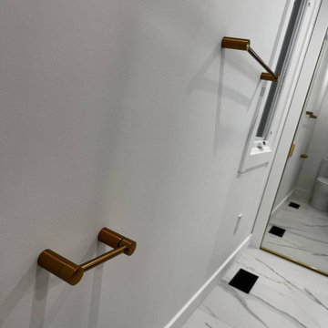
To add a touch of luxury, we installed gold-finished fixtures, including the showerhead, faucets, and cabinet handles, giving the bathroom a high-end, elegant feel.
A modern one-piece toilet was installed to complement the clean and minimalist design.
The bathroom’s neutral color palette and textured finishes created a calm and inviting atmosphere.
5. Enhanced Ventilation & Lighting
A new exhaust fan was installed to improve air circulation and moisture control, ensuring a comfortable and mold-free environment.
Additional task lighting and ambient lighting were carefully placed to make the bathroom bright, warm, and inviting.
The Result: A Stunning, Spacious, and Functional Master Bathroom
The completed master bathroom remodeling in Ambler, PA is now a spacious, modern retreat that perfectly blends style and functionality. By unifying the previously divided rooms, we created a flowing and open space that feels larger and more inviting. The walk-in shower, gold fixtures, and custom vanity elevate the aesthetics, while the recessed niche, built-in shelves, and enhanced lighting provide practicality and comfort.
The homeowner was thrilled with the transformation, noting how much brighter, more functional, and elegant the space now feels. They particularly loved how the layout reconfiguration made the space more open and efficient, as well as the luxurious finishes that added a high-end touch.
 Advanced Home Improvement, Inc.
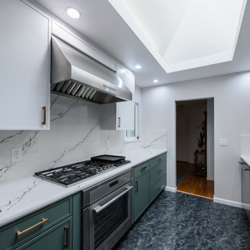
The design challenge was to maximize storage in a small galley kitchen where existing clutter overflowed into the dining room. The goal was to create a seamless and functional solution without sacrificing the space’s flow or aesthetic. To address this, we opened up a wall adjacent to the kitchen and dining room, creating room for two built-in pantries flush with the wall. These added pantries provided much-needed storage while maintaining a clean, integrated look.
 Kallweit Graham Architecture
Construction: Kingdom Builders
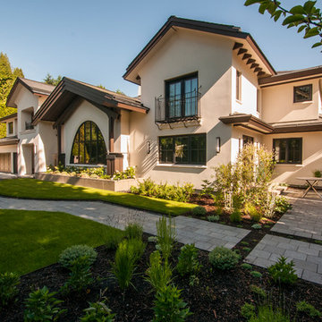
It's all about you! Your dreams, your site, your budget…. that's our inspiration! It is all about creating a home that is a true reflection of you and your unique lifestyle. Every project has it's challenges, but underneath the real-life concerns of budget and bylaws lie opportunities to delight. At Kallweit Graham Architecture, it is these opportunities that we seek to discover for each and every project.
The key to good design is not an unlimited budget, nor following trends. Rather, it takes the limitations of a project and, through thoughtful design, brings out its uniqueness, and enhances the property and it's value.
Building new or renovating an existing home is exciting! We also understand that it can be an emotional undertaking and sometimes overwhelming. For over two decades we have helped hundreds of clients "find their way" through the building maze. We are careful listeners, helping people to identify and prioritize their needs. If you have questions like what is possible? what will it look like? and how much will it cost? our trademarked RenoReport can help… see our website for details www.kga.ca.
We welcome your enquiries, which can be addressed to Karen or Ross
Karen@kga.ca ext:4
Ross@kga.ca ext: 2
604.921.8044
 Castle Building & Remodeling
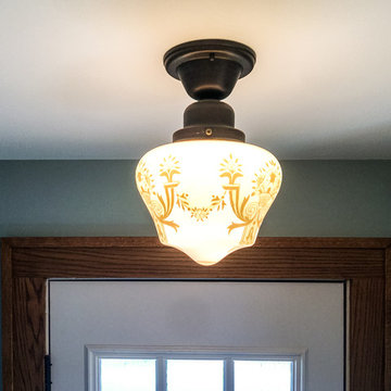
This 1929 Tudor kitchen and porch in St. Paul’s Macalester-Groveland neighborhood was ready for a remodel. The existing back porch was falling off the home and the kitchen was a challenge for the family.
A new kitchen was designed that opened up to the dining room, to create more light and sense of space.
A small back addition was completed to extend the mudroom space and storage. Castle designed and constructed a new open back porch with Azek composite decking, new railing, and stunning arch detail on the roof to coordinate with the home’s existing sweeping lines.
Inside the kitchen, Crystal cabinetry, Silestone quartz countertops, Blanco composite sink, Kohler faucet, new appliances from Warners’ Stellian, chevron tile backsplash from Ceramic Tileworks, and new hardwoods, laced in to match the existing, fully update the space.
One of our favorite details is the glass-doored pantry for the homeowners to showcase their Fiestaware!
Tour this project in person, September 28 – 29, during the 2019 Castle Home Tour!
 B Street Design
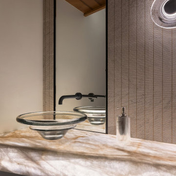
This home prized itself on unique architecture, with sharp angles and interesting geometric shapes incorporated throughout the design. We wanted to intermix this style in a softer fashion, while also maintaining functionality in the kitchen and bathrooms that were to be remodeled. The refreshed spaces now exude a highly contemporary allure, featuring integrated hardware, rich wood tones, and intriguing asymmetrical cabinetry, all anchored by a captivating silver roots marble.
In the bathrooms, integrated slab sinks took the spotlight, while the powder room countertop radiated a subtle glow. To address previous storage challenges, a full-height cabinet was introduced in the hall bath, optimizing space. Additional storage solutions were seamlessly integrated into the primary closet, adjacent to the primary bath. Despite the dark wood cabinetry, strategic lighting choices and lighter finishes were employed to enhance the perceived spaciousness of the rooms.
 RHEINZINK
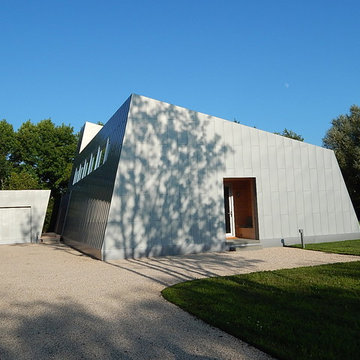
Inspired by noted American architect Norman Jaffe, the strikingly contemporary Sagaponack Residence on Long Island is highlighted by distinctively unique angles both inside and out. Jaffe was widely recognized for his contemporary residential style and use of natural materials and passive solar forms of design for his many South Long Island beach houses.
The 2,700 sq. ft. private residence is located one-half mile from the Atlantic coast and sited in an area that was originally characterized by long vistas over farm fields to the ocean beyond. Now, the area is thickly built up with weekend homes. The project was meant to address this change by creating a place that focuses on the immediate landscape and provides a garden environment for the owner.
A collaborative arrangement between two architectural firms brought the project to life. Andrew Reyniak, principal at ARAPC, New York, was architect of record; Mark Anthony C. Verzosa, principal at +macv, Sag Harbor, NY, was design consultant and general contractor.
“We knew we wanted to use zinc from the beginning,” Verzosa said. “We wanted a material that had a life.” Approximately 5,500 sq. ft. of prePATINA blue-grey RHEINZINK was specified to provide the life and the look that the design team sought. RHEINZINK Vertical Angled Standing Seam Panels and Flat Lock Tiles clad the exterior along with rough-sawn, locally-sourced white cedar. RHEINZINK Double Lock Standing Seam Panels were used on the roof.
“The RHEINZINK is obviously a very versatile material,” according to Verzosa. “The color blends very well into the environment and the sky in particular. And we like the way it patinas and self-heals.”
The unique design of the house incorporates unusual angles on both the exterior and interior. “There’s not a lot of 90 degree or horizontal plumb walls,” Verzosa said. “The dramatic geometry of the building created complicated detailing on the project.”
Fabrication and installation of the RHEINZINK panels was done by Metropan Systems, Inc., Bayside, NY. The company specializes in zinc façade and roofing projects, according to John Gushue, president. “We’ve done more than 60 zinc projects since 2001 and the majority have been RHEINZINK,” Gushue said. “If I could do zinc every day, I would.”
The unusual geometry of the Sagaponack Residence made for a challenging installation. “There was nothing cookie cutter about this job,” according to Gushue. “We began meeting with the architect about a year before actually starting the work in order to incorporate the very best detailing. Every fastener is hidden and there’s no caulk on the façade. Many of the RHEINZINK panels were fabricated on-site in order to bend around corners. And the flashing details had to be meticulous.”
The design of the project presents a modern, artistic look in every aspect. “Of all the zinc projects we’ve done, this is my favorite,” Gushue said. “It was a great job to be on. And properly maintained, it could last for 150 years.”
 Landis Architects | Builders
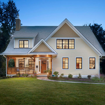
This older couple wanted to create a forever home where they could age in place and welcome family and friends. They purchased a small house on a large lot – a rare find close to downtown Bethesda. We worked with them to reclaim and donate as much as possible from the existing house prior to demolition.
The overall house design and location provide features that address four main requests from the client:
• Aging-in-Place Features
• Understated Design
• Maximizing Garden/Landscape Area
• Optimal Orientation for Solar Panels
The couple’s goal is to live in the house as long as possible, so they wanted wheelchair access to all major parts of the house. Starting with the exterior, they wanted a level, walk-in front door, and a walk-in garage/basement entry. With a lot that had a 6-foot grade change, it was a construction and aesthetic challenge to make it resemble a natural grade.
We added soil at the front to raise the entry but did not want it to look like the house was rising from the ground. We also avoided using mechanical drainage. The yard is flatter at the back, the water drains down and away from the house. We also created a maintenance-free exterior with fiber cement siding and composite decking.
 Drury Design
The Setup:
After purchasing this home, the homeowners faced a unique opportunity to reimagine their kitchen and nearby spaces. Water damage from a burst pipe had left much of the home’s interior in need of repair, and while the existing kitchen was functional and in relatively good shape, it didn’t align with the family’s vision for their new home. The layout included a peninsula that wasn’t ideal, and there were some druthers with the nearby pantry.
Since the space needed to be rebuilt anyway, the homeowners saw this as a chance to create a kitchen that was both highly functional for their four young children and timeless in its design. The project also included a refresh of the adjacent message center and dining room — spaces that play key roles in the family’s daily life. The goal was to create a cohesive flow between these areas, balancing modern functionality with the craftsman-inspired character of the rest of the home.
Design Objectives:
- Replace the outdated peninsula with a large island to maximize counter space and create new seating options.
- Open up the space visually by removing soffits and rethinking the cabinetry layout.
Incorporate concealed refrigeration and freezer units to provide significant storage for the family while maintaining a streamlined aesthetic.
- Integrate black cabinetry into the design without making the space feel harsh or heavy.
- Ensure the lighting plan balances functional task lighting with ambient accent lighting.
- Avoid visual clutter in the cabinetry design while still giving a nod to the craftsman aesthetic.
- Incorporate a slab backsplash as a key design feature.
Design Challenges:
- The outdated peninsula left dead space in the kitchen and lacked sufficient seating for the family.
- The cooktop wall was cramped, with small cabinets flanking the hood, limited storage, and soffits that made the space feel closed-in.
- The family needed significant refrigeration space (two refrigerators and a freezer) but wanted to avoid a cluttered look with visible stainless steel appliances.
- Adding black cabinetry risked making the space feel too dark or heavy.
- The original lighting plan was insufficient, particularly over the dining table where a decorative fixture proved too dim.
- The family wanted shaker-style drawer fronts to match the home’s arts-and-crafts design but worried that too much shaker cabinetry might look overly busy.
- Prioritizing a slab backsplash in the wish list priority planning.
The Renewed Space
Design Solutions:
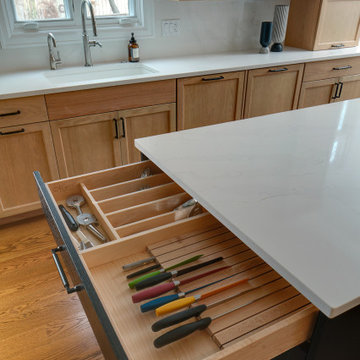
- A functional island: The peninsula was replaced with a large island that provides continuous countertop space for prepping and serving. The island also features seating for four people, creating a central hub for informal meals and activities.
- Streamlined cooktop wall: The soffits were removed, and the upper cabinets on the cooktop wall were eliminated to create a more open, streamlined design. A custom oversized hood became the focal point of the wall, with the blower unit offset inside it to align with the cooktop while maintaining exterior visual symmetry.
- Concealed refrigeration: Two column refrigerators and one freezer were integrated into the cabinetry, concealing them behind wood paneling that blends seamlessly with the overall design.
- Warm black cabinetry: The black cabinetry was crafted from hickory with a visible grain, softening its appearance and adding warmth. The grain detail gives the cabinetry a rich, textured look that avoids feeling stark or overpowering.
- Additional lighting: In the dining area, recessed can lights were added during an additional installation phase to supplement the gorgeous decorative fixture’s dim output. The new lighting plan creates a layered effect, combining functional task lighting with softer ambient lighting.
- Simplified cabinetry details: Slab drawer fronts were used on the upper drawers, while five-piece shaker fronts (with slightly less prominent rail and stile pieces) were reserved for the middle and lower drawers. This approach simplified the overall look while maintaining the craftsman-inspired aesthetic.
- Slab backsplash priority: The slab backsplash was prioritized by making thoughtful adjustments elsewhere, like opting not to extend cabinetry to the ceiling, which also helped visually prioritize the gorgeous slab backsplash. This decision also enhanced the kitchen’s furniture-like feel, aligning with the home’s craftsman character.
- This kitchen perfectly balances practicality with timeless style. By addressing the family’s functional needs — ample seating, smart storage, and effective lighting — while incorporating thoughtful design elements like warm black cabinetry and a striking slab backsplash, Alicia created a space that works beautifully for a busy household. The result is a cohesive, inviting kitchen that honors the home’s craftsman roots and will serve the family well for years to come.
66