
Search results for "Address challenges" in Home Design Ideas
 Crystal Kitchen + Bath
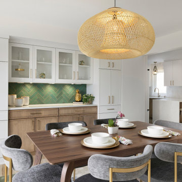
The Plymouth clients faced a dilemma with a non-functioning dishwasher, ovens, and cooktop, an awkward layout, and dated arches straight from the ’80s. Despite the challenges, their love for the school district, neighborhood, and home prevailed.
We undertook a transformative journey, turning their first floor into an entertainer’s haven with a stunning kitchen, a chic dining room, an enchanting powder bath, and a practical mudroom.
Breaking down barriers, we removed the wall between the kitchen and living room, widening entrances to the dining room. Faux beams and a window in the family room were eliminated, and the old Chicago fireplace brick received a sleek black makeover crowned with a live edge mantel. A pop of terracotta paint and floating shelves in the new record player niche set the stage for nostalgic LPs.
Considering the family’s love for baking and grilling, we prioritized ample storage. Pull-out spice racks, a charging drawer, built-in knife block, trash & recycle pull-out, built-in tray dividers, corner storage, large drawers, and roll-out shelves now keep everything organized and easily accessible.
Embracing a Scandifornian design style, favored by the clients, infused the space with color and natural materials. A woven grass light fixture in the dining room, light wood-look luxury vinyl floors, and a vibrant green herringbone tile backsplash all contributed to the refreshing aesthetic. Throughout the home, terracotta and green hues with accents of black added depth and interest, while the redesigned layout now bathes the entire space in natural light.
In addressing practical needs, we removed an exterior door from the mudroom to create a closet and a built-in bench with hooks. The main entry and powder bath now share playful floral wallpaper, complemented by a walnut vanity and gold fixtures in the powder room, offering a sophisticated touch amidst vibrant botanicals.
 Klopf Architecture
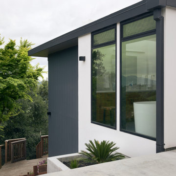
Set in a quiet neighborhood and framed by mature trees, this residence presented a unique opportunity: to thoughtfully evolve a custom mid-century modern home into a space that supports the everyday rhythms of a growing family. With a deep respect for the home’s original architecture, Klopf Architecture reimagined the house to better meet the needs of its owners—introducing functional improvements while preserving the spirit and character of its mid-century roots.
The clients approached Klopf Architecture with a clear vision: refresh their home while seamlessly integrating new programmatic elements. Key goals included clarifying and enhancing the entry sequence; connecting the detached garage to the main house with a practical yet architecturally intentional intervention; adding functional spaces such as a mudroom and laundry room; expanding and remodeling the primary suite’s bathroom and closet; and creating a more engaging outdoor space that capitalized on the site’s impressive views, featuring a fire pit and outdoor kitchen.
As a couple with distinct yet complementary perspectives—one focused on modern functionality and technology, and the other dedicated to preserving the home’s architectural integrity—their collaboration with Klopf Architecture resulted in a solution that harmonized both ideals. Their shared commitment to improving the livability of their home led to a design dialogue rooted in balance. This dynamic partnership shaped the direction of the renovation, ensuring that every decision honored the spirit of the original home while aligning with the practical needs of their growing family.
Designing within the constraints of the sloped site posed one of the project’s central challenges. The detached garage sat at a higher elevation than the main house, requiring a solution that ensured architectural and geometric compatibility between the two structures. Rather than create a purely utilitarian link, Klopf Architecture introduced an intentional connection that contributes to the overall architectural language. A notable pinch point in the plan—where differing geometries converged—was treated as a hinge point, turning a potentially awkward juncture into an architectural feature. This area now functions as both a transition and a moment of design interest that unifies the overall plan.
The design also addressed the underutilized outdoor area, which was located in a shadowed portion of the site with geometrical limitations. A new connection to the rear deck was created in this same area, making the outdoor space more useful and inviting. Klopf Architecture introduced carefully positioned openings and spatial improvements that forged a strong visual and functional connection between indoor and outdoor spaces. The outdoor area now reads as a deliberate extension of the home, embracing natural light and emphasizing the dramatic views.
Working through multiple design iterations, Klopf Architecture crafted a solution that preserved the architectural language of the original home while supporting the functional needs of modern life. The garage-to-house connection became more than a passage—it evolved into an architectural moment of transition. A new mudroom and laundry space enhanced convenience without compromising the clean lines of the design. The primary suite was expanded to create a private, serene retreat. The reimagined backyard, complete with fire pit and kitchen, now plays a vital role in the family’s daily routine and social life.
Outcomes and Lasting Impact
The result is a home that balances heritage with contemporary design, technical precision with design sensibility. The redesign not only met the clients’ initial goals but also exceeded expectations in its ability to seamlessly blend past and present, function and beauty, making the outdoor kitchen a favorite gathering place.
Beyond aesthetics, the renovation has significantly improved daily life for the family. The newly integrated garage connection has streamlined routines, providing a seamless transition between arriving home, storing belongings, and entering the main living spaces. The expanded primary suite offers a retreat-like atmosphere, creating a private space to unwind at the end of the day. The redesigned outdoor areas have also become an extension of their lifestyle—whether it's casual family dinners around the fire pit, entertaining friends in the outdoor kitchen, or simply enjoying the view from the reimagined backyard.
Through a thoughtful and strategic approach, the house has been successfully evolved into a home that remains true to its mid-century modern roots while enhancing livability, functionality, and the overall quality of life for the modern-day owners.
Klopf Architecture Team: Geoffrey Campen, Fernanda Bernardes
Architectural Interior Design: Klopf Architecture
Structural Engineer: Base Design Inc.
Contractor: Golden Snail Builders
Photography: Mariko Reed
Year Completed:2022
 User
UserThe client purchased a mature, small, NAPA Valley vineyard to be their home and for personal enjoyment.
Once they began converting their new "hobby" grapes into wine, they soon realized they needed a place to "age" their labors and a place to then enjoy them. They decided to design such a place within the confines of their home where they could entertain family and friends.
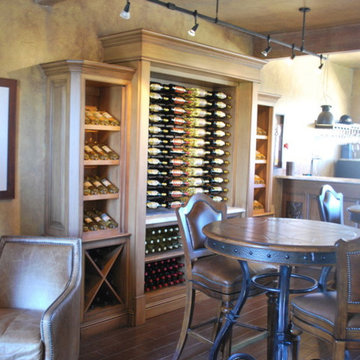
The structure was modified to allow storage of more than 200 individual bottles, cases, and magnum size bottles. A cask room was added as was a well-appointed tasting room. The storage area is separated from the tasting and social area by a tempered glass doors and windows. The space to be converted was a challenge. No surface was plumb or level, therefore, the remodel involved interior walls, new floors and ceilings.
Until these issues were addressed, the beautiful cabinet work, and a complete temperature and humidity control system to store, maintain, and enjoy the wine could not be started. The floors had to be floated out and chases with faux finishes provided for HVAC and electrical. Lighting in the tasting room is provided by a series of recessed and puck lights.
The bar/counter area is highlighted by a custom, Tiffany style chandelier. Enough space was left in front of the bar to accommodate two serving tables for food and snacks, with plenty of room to move about the space. Discreetly hidden behind the bar is a large capacity cooler that can chill several bottles at once.
The bar is capped with eight lineal feet of Calcutta Gold Marble and sports a brass foot rail. The bar has grape panels between Acanthus Corbels and the bottle storage cabinet areas are a unique blend of Acanthus overlays under precisely cut and mitered grape design crown molding over and around a cleverly designed bottle storage system.
Traffic flow is achieved through the multiple points of entry through any of three pairs of 6' custom double doors which, when weather permitting, can remain open while entertaining. The host and hostess can attend food and beverage service from behind and around the bar through a separate doorway.
The temperature controlled cask storage area is large enough for the clients' current needs, and can accommodate a larger number of casks should the need arise.
The floor and walls of the cask room are designed for easy maintenance.. Both rooms are delightfully decorated with earthen tone faux finishes on walls, ceilings and floors reminiscent of a nonspecific European wine making region.
This effect is extended to the soffits in the tasting room. A unique wine racking system is easily stored, providing even greater ability to maintain and move about the storage area.
Find the right local pro for your project
 Irene Designs
Home Remodeling Project Overview
This extensive home remodeling project transformed a dated and inefficient layout into a functional, open, and aesthetically cohesive living space. The original layout had several challenges:
• A kitchen with limited storage, no cabinets on the window side, a sink facing the wall, and a range crammed into the corner. The pantry closet was too deep and impractical.
• A living room that couldn’t accommodate furniture without interfering with traffic flow.
• A front foyer with wasted space.
• A claustrophobic hallway toilet room without a sink, located near the laundry room.
The Remodeling Concept
The scope of this project extended well beyond the kitchen. We proposed several layout options to address issues in all adjacent spaces, ultimately implementing a plan that:
• Removed two walls and moved doorways.
• Replaced the kitchen window.
• Converted the hallway toilet room into a storage space.
• Installed pocket doors to separate the laundry hallway from the living room.
Kitchen Transformation
• Open Concept: By removing the wall between the kitchen and dining room, the two spaces became a seamless open area.
• New Layout: Cabinets were relocated to the window side for more storage and natural light. A central island with storage and seating was added, and a coffee bar was installed in the dining room.
• Updated Pantry: The deep pantry closet was converted into a pullout pantry with a cabinet front for better accessibility.
• Design Details: Off-white kitchen cabinets pair beautifully with a light green island. Warm white quartz counters and an artisan tile backsplash complete the look.
Dining Room
• Expanded Space: Most of the wall separating the dining room and foyer was removed, creating a more spacious area while still accommodating all furniture thanks to careful measurements.
Living Room Improvements
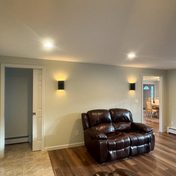
• Optimized Layout: Moving doorways and installing pocket doors allowed for better furniture placement, including a sofa that doesn’t interfere with traffic flow.
• Fireplace Upgrade: The brick fireplace was updated with a three-dimensional staggered stone veneer in a color matching the kitchen cabinets, creating a cohesive look. A TV was installed above the fireplace at a comfortable viewing angle.
Additional Updates
• New Flooring: All remodeled rooms now feature updated flooring.
• Ceilings: Popcorn ceilings were replaced with smooth, flat finishes, complemented by recessed lighting.
• Walls: Fresh paint throughout the space, with an accent wall in the living room matching the light green of the kitchen island.
• Lighting: Stylish sconces were added for a touch of elegance.
The Result
The homeowners are thrilled with the transformation, marveling at how their once cramped and inefficient home now feels spacious, functional, and beautifully cohesive. They can’t believe their house could ever look like this!
 Level Studio
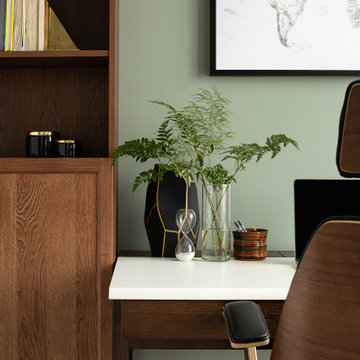
This modern townhome in Vaughan received some mid-century modern flair and some really fun wallpaper.
The large open concept living room was challenging in terms of creating a successful layout and we addressed it by bringing a large sectional closer to the center of the room rather than anchoring it against walls. Plenty of circulation space for a sideboard with a beautiful vinyl player, a collection of tall architectural prints and an eight foot tall floor lamp bring the eye up a double story living space.
Fun wallpaper creates a long feature wall in the living and dining area with a geometric pattern that brings some movement to the room and is also mirrored in the kitchen backsplash and sideboard veneer.
We designed a bedroom with the perfect shade of blue that will age nicely with our client’s young son along with a calming study perfect for getting some work done.
 Four Elements Construction
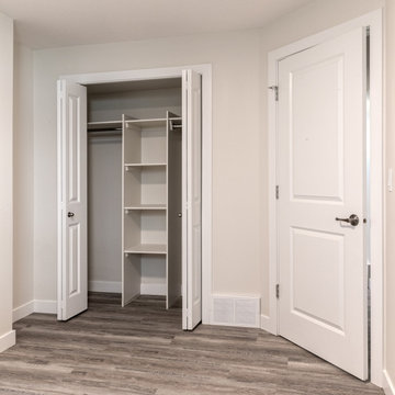
This was the another opportunity to work with one of our favorite clients on one of her projects. This time she wanted to completely revamp a recently purchased make-shift revenue property and convert it to a legal three-suiter maximizing rental income in a prime rental area close to NAIT. The mid-fifties semi-bungalow was in quite poor condition, so it was a challenging opportunity to address the various structural deficiencies while keeping the project at a reasonable budget. We gutted and opened up all three floors, removed a poorly constructed rear addition, and created three comfortable suites on the three separate floors. Compare the before and after pictures - a complete transformation!
 LifeStyle Saint Veronica Brooks ASID Design
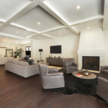
The challenge of addressing this really grand space was to separate the spaces to give transition. I attacked this remodel by designing the ceiling plan. lighting, creating intimacy and purpose in each space and through colors in furnishings. I created the curved ceiling design to mimic that of a family crest. - Hancock Homes Realty - Home sold for $10 Million in Historic Hancock Park


 Advance Design Studio, Ltd.
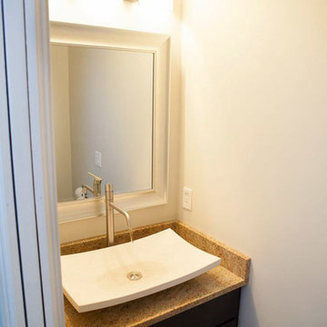
This clean cut kitchen stemmed from the design challenge to place a contemporary kitchen in a traditional Tudor style house in the Northwest Suburbs of Chicago. Our client was a self-described city person living in the country - who wanted an urban contemporary feeling incorporated into her home. She says she waited many years to find the right design team who understood her vision!
Not wanting to ignore the beautiful 50 year old oaks outside her window, Advance Design transformed her traditional kitchen into an urban kitchen utopia with the use of texture and earthy finishes keeping with the feel of the existing home. Dura Supreme Bria frameless cabinets with a soft pillowed door works to incorporate a woodsy feel in shades of grey textured foil appropriately called “Twig”. Aluminum framed opaque glass doors are hinged with a lift up Aventos hinge for a contemporary twist and a super-functional opening. Brushed nickel hardware in various sizes keeps with the clean line feel.
To keep the design organic and “fit it in” with the rest of the house, we covered the floor with a natural looking travertine porcelain laid on a 45 degree angle simulating a more traditional feel in a neutral tone of silvery-brown. The backsplash is clean and crisp with large Carrera marble tiles in a brick pattern, and a splash of energy from a vertical marble and glass mosaic accent. We then finished off the look with clean Cambria Torquay countertops portraying minimal patterning to keep the work surfaces feeling uncluttered and open.
Other areas of the home were addressed to “blend” the style in with lightly distressed grey tone hardwood floors and a “matching” renovated powder room displaying contemporary features to compliment the nearby kitchen’s style.
Photo Credits- Joe Nowak
 Jacobson Construction
From Attic to Awesome
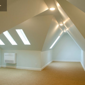
Many of the classic Tudor homes in Minneapolis are defined as 1 ½ stories. The ½ story is actually an attic; a space just below the roof and with a rough floor often used for storage and little more. The owners were looking to turn their attic into about 900 sq. ft. of functional living/bedroom space with a big bath, perfect for hosting overnight guests.
This was a challenging project, considering the plan called for raising the roof and adding two large shed dormers. A structural engineer was consulted, and the appropriate construction measures were taken to address the support necessary from below, passing the required stringent building codes.
The remodeling project took about four months and began with reframing many of the roof support elements and adding closed cell spray foam insulation throughout to make the space warm and watertight during cold Minnesota winters, as well as cool in the summer.
You enter the room using a stairway enclosed with a white railing that offers a feeling of openness while providing a high degree of safety. A short hallway leading to the living area features white cabinets with shaker style flat panel doors – a design element repeated in the bath. Four pairs of South facing windows above the cabinets let in lots of South sunlight all year long.
The 130 sq. ft. bath features soaking tub and open shower room with floor-to-ceiling 2-inch porcelain tiling. The custom heated floor and one wall is constructed using beautiful natural stone. The shower room floor is also the shower’s drain, giving this room an open feeling while providing the ultimate functionality. The other half of the bath consists of a toilet and pedestal sink flanked by two white shaker style cabinets with Granite countertops. A big skylight over the tub and another north facing window brightens this room and highlights the tiling with a shade of green that’s pleasing to the eye.
The rest of the remodeling project is simply a large open living/bedroom space. Perhaps the most interesting feature of the room is the way the roof ties into the ceiling at many angles – a necessity because of the way the home was originally constructed. The before and after photos show how the construction method included the maximum amount of interior space, leaving the room without the “cramped” feeling too often associated with this kind of remodeling project.
Another big feature of this space can be found in the use of skylights. A total of six skylights – in addition to eight South-facing windows – make this area warm and bright during the many months of winter when sunlight in Minnesota comes at a premium.
The main living area offers several flexible design options, with space that can be used with bedroom and/or living room furniture with cozy areas for reading and entertainment. Recessed lighting on dimmers throughout the space balances daylight with room light for just the right atmosphere.
The space is now ready for decorating with original artwork and furnishings. How would you furnish this space?
 Castle Building & Remodeling
This 1929 Tudor kitchen and porch in St. Paul’s Macalester-Groveland neighborhood was ready for a remodel. The existing back porch was falling off the home and the kitchen was a challenge for the family.
A new kitchen was designed that opened up to the dining room, to create more light and sense of space.
A small back addition was completed to extend the mudroom space and storage. Castle designed and constructed a new open back porch with Azek composite decking, new railing, and stunning arch detail on the roof to coordinate with the home’s existing sweeping lines.
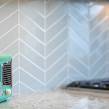
Inside the kitchen, Crystal cabinetry, Silestone quartz countertops, Blanco composite sink, Kohler faucet, new appliances from Warners’ Stellian, chevron tile backsplash from Ceramic Tileworks, and new hardwoods, laced in to match the existing, fully update the space.
One of our favorite details is the glass-doored pantry for the homeowners to showcase their Fiestaware!
Tour this project in person, September 28 – 29, during the 2019 Castle Home Tour!
 Clawson Architects, LLC
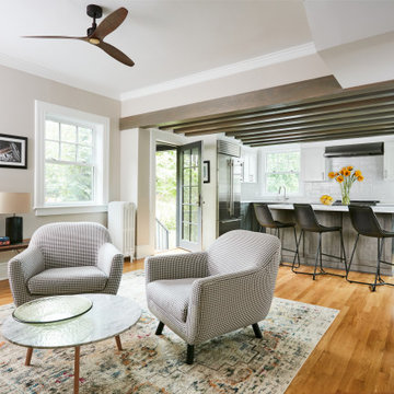
A real chef lives here! The hounds tooth upholstery on the chairs is a nod to the traditional chef's trousers! This home presented many challenges. the original kitchen was cut off from the home and was difficult to access with step up and steps down into the space. The cooking areas is the former mudroom, powder room and breakfast room all separated from each other and the kitchen. the hang out space was the location of the original kitchen. The exposed beams with beadboard ceiling in between was created to address the difference in floor and ceiling levels in the home.
 Closet Solutions
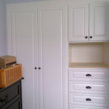
The challenge on this project is very common in the beach areas of LA--how to maximize storage when you have very little closet space. To address this issue and also provide an attractive accent to the home, we worked with the client to design and build custom cabinets into the space of her prior reach-in closet. We utilized clean, white raised panel cabinetry with plenty of drawers, as well as hanging space and shelves behind the cabinet doors. This complemented the traditional decor of the home.
 BMR BelMax Remodeling
Master Bathroom Remodeling in Ambler, PA – A Complete Transformation by BMR Belmax Remodeling
At BMR Belmax Remodeling, we specialize in creating beautiful, functional, and luxurious bathroom spaces tailored to our clients’ needs. One of our most recent projects involved a master bathroom remodeling in Ambler, PA, where we completely reimagined the layout to maximize space, improve functionality, and enhance aesthetics. The result was a modern, spacious, and inviting master bathroom that perfectly suited the homeowner’s vision.
The Challenge: An Outdated and Divided Bathroom
The original master bathroom in Ambler, PA was divided into two separate rooms. One area housed a vanity and closet, while the other contained the shower and toilet. While functional, this layout felt cramped, disjointed, and inefficient. The homeowners wanted to merge these two spaces into a single, cohesive master bathroom that felt larger, more open, and more luxurious.
They envisioned a modern walk-in shower, enhanced storage, better lighting, and high-end finishes, all while improving the flow and accessibility of the space. Our team at BMR Belmax Remodeling worked closely with them to develop a design that addressed their needs and transformed their bathroom into a modern retreat.
The Transformation: A Unified & Modern Master Bathroom
Our approach to this bathroom renovation in Ambler, PA focused on space optimization, luxury finishes, and functionality. We combined the two separate rooms into one expansive master bathroom, making the space feel more open and elegant.
1. Layout Reconfiguration & Wall Removal
We removed the dividing wall between the shower and vanity area to open up the space and create a more seamless layout.
A new wall was built to expand the shower area, allowing for a larger and more comfortable walk-in shower.
The closet and vanity space were integrated into the main bathroom layout, eliminating the need for a separate entryway and making the space more efficient and accessible.
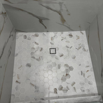
2. Walk-In Shower with Premium Features
A stunning walk-in shower with sleek glass doors was installed to give the bathroom a modern and luxurious look.
We used large-format tiles on the shower walls and flooring, creating a cohesive, stylish, and low-maintenance surface.
A built-in recessed niche with a custom tile shelf was added for practical storage while maintaining a clean and sophisticated design.
3. Vanity & Storage Enhancements
The old vanity was replaced with a sleek, modern vanity that provided ample storage and counter space.
We incorporated custom-built shelves on the left side of the vanity, offering additional storage without cluttering the design.
A lighted mirror was installed above the vanity, combining style and practicality while enhancing the overall lighting in the space.
4. Elegant Fixtures & Finishes
To add a touch of luxury, we installed gold-finished fixtures, including the showerhead, faucets, and cabinet handles, giving the bathroom a high-end, elegant feel.
A modern one-piece toilet was installed to complement the clean and minimalist design.
The bathroom’s neutral color palette and textured finishes created a calm and inviting atmosphere.
5. Enhanced Ventilation & Lighting
A new exhaust fan was installed to improve air circulation and moisture control, ensuring a comfortable and mold-free environment.
Additional task lighting and ambient lighting were carefully placed to make the bathroom bright, warm, and inviting.
The Result: A Stunning, Spacious, and Functional Master Bathroom
The completed master bathroom remodeling in Ambler, PA is now a spacious, modern retreat that perfectly blends style and functionality. By unifying the previously divided rooms, we created a flowing and open space that feels larger and more inviting. The walk-in shower, gold fixtures, and custom vanity elevate the aesthetics, while the recessed niche, built-in shelves, and enhanced lighting provide practicality and comfort.
The homeowner was thrilled with the transformation, noting how much brighter, more functional, and elegant the space now feels. They particularly loved how the layout reconfiguration made the space more open and efficient, as well as the luxurious finishes that added a high-end touch.
 SHELLEY RODNER DESIGN / DDI
DESIGN CHALLENGES ADDRESSED:
To anyone who may be reading this project overview, I do hope you'll have the opportunity to
have a look at the 'before' photo of this space. It's quite a transformation!
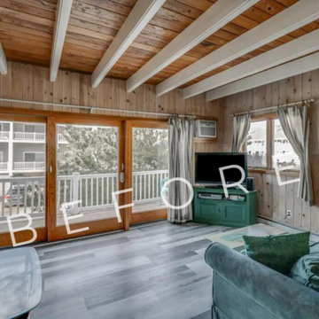
Our homeowners purchased their condo at the beach several years ago. As shown in the 'before'
photo, at the time, their family room was a dark and dated space with unsightly paneled walls,
heavy faux ceiling beams and odds and ends for furniture. Everything felt cramped and cluttered
throughout the condo, especially their family room. The client's vision was for an airy and
relaxed coastal vibe for their 'place at the beach'.
DESIGN SOLUTIONS PROVIDED:
The entire condo was taken down to stud. The faux beams were edited out and the ceiling raised.
The heavy out-dated paneling was removed and replaced with fresh clean walls that were painted
in a calming creamy sand tone throughout the entire condo.
The existing dark and gloomy furniture was replaced with stylish updated pieces. Great thought
was given to the size, scale and textiles used. The sofa and loveseat, done in a softly textured
herring boned pattern, was the perfect choice. It's cremey toned easy care fabric created a 'pet
friendly' environment for the clients. The homeowners have two dogs and a cat who love a visit
to the beach as much as their 'humans'.
Worn out window treatments were replaced with fresh custom draperies in a playful botanical
print featuring tones of kiwi, leaf green and cerulean blue. A special 'solar friendly' lining was
used to tame the harmful rays of direct sun.
A variety of special curated accents were added to the room. The richly textured rug, round
coffee table with an organic feel, comfy pillows and a few special art pieces all helped to
complete this space.
The overall effect of the renovation was quite dramatic and the clients were thrilled with the
results. This family room went from being dark and dated to light and airy and is now a space
that is inviting and relaxing which perfectly suits the homeowner's coastal lifestyle.
RETAIL PROJECT PRICE: $ 9,000.00
Retail price is defined as the total sale you submitted on your sales repor
 D. A. Dunlevy
Elevated curb appeal with family-friendly function.
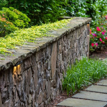
Varying elevations and an unexpected structural challenge required a strategic plan for this charming Bethesda home. The clients wanted an outdoor space for family and friends that had room for play, lounging, and grilling—all while keeping a high curb appeal. Once all structural needs were addressed, our team installed an exposed aggregate driveway with a brick border and banding. The stunning outdoor kitchen was custom-built for the grill and smoker station, topped with a granite counter. A custom lattice planted with climbing hydrangea serves as a beautiful privacy screen for the kitchen windows. A lush, serene feel was created using low-maintenance plantings like crepe myrtle trees, creeping Jenny, heavenly bamboo, roses, and ferns. Stepping stones dotted with mazus plants meander through, and the entire effect is one of a woodland paradise that’s always been there. It’s the perfect place to relax with friends and family, and the home has been made even lovelier with these additions.
 Drury Design
The Setup:
After purchasing this home, the homeowners faced a unique opportunity to reimagine their kitchen and nearby spaces. Water damage from a burst pipe had left much of the home’s interior in need of repair, and while the existing kitchen was functional and in relatively good shape, it didn’t align with the family’s vision for their new home. The layout included a peninsula that wasn’t ideal, and there were some druthers with the nearby pantry.
Since the space needed to be rebuilt anyway, the homeowners saw this as a chance to create a kitchen that was both highly functional for their four young children and timeless in its design. The project also included a refresh of the adjacent message center and dining room — spaces that play key roles in the family’s daily life. The goal was to create a cohesive flow between these areas, balancing modern functionality with the craftsman-inspired character of the rest of the home.
Design Objectives:
- Replace the outdated peninsula with a large island to maximize counter space and create new seating options.
- Open up the space visually by removing soffits and rethinking the cabinetry layout.
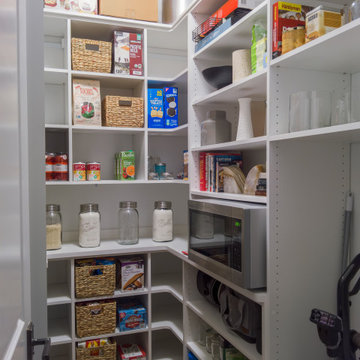
Incorporate concealed refrigeration and freezer units to provide significant storage for the family while maintaining a streamlined aesthetic.
- Integrate black cabinetry into the design without making the space feel harsh or heavy.
- Ensure the lighting plan balances functional task lighting with ambient accent lighting.
- Avoid visual clutter in the cabinetry design while still giving a nod to the craftsman aesthetic.
- Incorporate a slab backsplash as a key design feature.
Design Challenges:
- The outdated peninsula left dead space in the kitchen and lacked sufficient seating for the family.
- The cooktop wall was cramped, with small cabinets flanking the hood, limited storage, and soffits that made the space feel closed-in.
- The family needed significant refrigeration space (two refrigerators and a freezer) but wanted to avoid a cluttered look with visible stainless steel appliances.
- Adding black cabinetry risked making the space feel too dark or heavy.
- The original lighting plan was insufficient, particularly over the dining table where a decorative fixture proved too dim.
- The family wanted shaker-style drawer fronts to match the home’s arts-and-crafts design but worried that too much shaker cabinetry might look overly busy.
- Prioritizing a slab backsplash in the wish list priority planning.
The Renewed Space
Design Solutions:
- A functional island: The peninsula was replaced with a large island that provides continuous countertop space for prepping and serving. The island also features seating for four people, creating a central hub for informal meals and activities.
- Streamlined cooktop wall: The soffits were removed, and the upper cabinets on the cooktop wall were eliminated to create a more open, streamlined design. A custom oversized hood became the focal point of the wall, with the blower unit offset inside it to align with the cooktop while maintaining exterior visual symmetry.
- Concealed refrigeration: Two column refrigerators and one freezer were integrated into the cabinetry, concealing them behind wood paneling that blends seamlessly with the overall design.
- Warm black cabinetry: The black cabinetry was crafted from hickory with a visible grain, softening its appearance and adding warmth. The grain detail gives the cabinetry a rich, textured look that avoids feeling stark or overpowering.
- Additional lighting: In the dining area, recessed can lights were added during an additional installation phase to supplement the gorgeous decorative fixture’s dim output. The new lighting plan creates a layered effect, combining functional task lighting with softer ambient lighting.
- Simplified cabinetry details: Slab drawer fronts were used on the upper drawers, while five-piece shaker fronts (with slightly less prominent rail and stile pieces) were reserved for the middle and lower drawers. This approach simplified the overall look while maintaining the craftsman-inspired aesthetic.
- Slab backsplash priority: The slab backsplash was prioritized by making thoughtful adjustments elsewhere, like opting not to extend cabinetry to the ceiling, which also helped visually prioritize the gorgeous slab backsplash. This decision also enhanced the kitchen’s furniture-like feel, aligning with the home’s craftsman character.
- This kitchen perfectly balances practicality with timeless style. By addressing the family’s functional needs — ample seating, smart storage, and effective lighting — while incorporating thoughtful design elements like warm black cabinetry and a striking slab backsplash, Alicia created a space that works beautifully for a busy household. The result is a cohesive, inviting kitchen that honors the home’s craftsman roots and will serve the family well for years to come.
 Elite Kitchen & Bath/Express Contracting
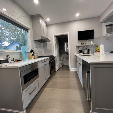
A family of five needed a kitchen that would accommodate three growing children. Better Storage organization was key in the redesign. The couple wanted to convert their galley kitchen into a larger space without compromising their dining area. They wanted a learning and gathering place for their children. They longed for a cozy but spacious kitchen to nurture their close-knit family. Their home is small so it was a challenge to create a kitchen that would address all of their needs
The client wanted high quality, durable cabinetry with luxury finishes. We designed and installed high quality RUTT Cabinetry, all maple wood, American made cabinetry that will be durable and beautiful for so many years to come. The cabinetry color they chose was a soft gray. The finish is silky smooth.
Since they love the marble look, we recommended 48”x48” porcelain wall tiles and a quartz countertop. This material achieves the look they want, is durable and is easy to keep clean.
We installed a beautiful white oak wood floor stained in a custom grayish color that added charm to their older home. A vertical floor to ceiling, very stylish, aluminum hot Water radiator which gave them welcome heat. A bronze light fixture with clean lines added elegance and glowing light.
 Advance Design Studio, Ltd.
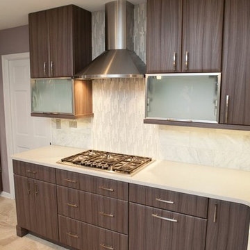
This clean cut kitchen stemmed from the design challenge to place a contemporary kitchen in a traditional Tudor style house in the Northwest Suburbs of Chicago. Our client was a self-described city person living in the country - who wanted an urban contemporary feeling incorporated into her home. She says she waited many years to find the right design team who understood her vision!
Not wanting to ignore the beautiful 50 year old oaks outside her window, Advance Design transformed her traditional kitchen into an urban kitchen utopia with the use of texture and earthy finishes keeping with the feel of the existing home. Dura Supreme Bria frameless cabinets with a soft pillowed door works to incorporate a woodsy feel in shades of grey textured foil appropriately called “Twig”. Aluminum framed opaque glass doors are hinged with a lift up Aventos hinge for a contemporary twist and a super-functional opening. Brushed nickel hardware in various sizes keeps with the clean line feel.
To keep the design organic and “fit it in” with the rest of the house, we covered the floor with a natural looking travertine porcelain laid on a 45 degree angle simulating a more traditional feel in a neutral tone of silvery-brown. The backsplash is clean and crisp with large Carrera marble tiles in a brick pattern, and a splash of energy from a vertical marble and glass mosaic accent. We then finished off the look with clean Cambria Torquay countertops portraying minimal patterning to keep the work surfaces feeling uncluttered and open.
Other areas of the home were addressed to “blend” the style in with lightly distressed grey tone hardwood floors and a “matching” renovated powder room displaying contemporary features to compliment the nearby kitchen’s style.
Photo Credits- Joe Nowak
 BMR BelMax Remodeling
Master Bathroom Remodeling in Ambler, PA – A Complete Transformation by BMR Belmax Remodeling
At BMR Belmax Remodeling, we specialize in creating beautiful, functional, and luxurious bathroom spaces tailored to our clients’ needs. One of our most recent projects involved a master bathroom remodeling in Ambler, PA, where we completely reimagined the layout to maximize space, improve functionality, and enhance aesthetics. The result was a modern, spacious, and inviting master bathroom that perfectly suited the homeowner’s vision.
The Challenge: An Outdated and Divided Bathroom
The original master bathroom in Ambler, PA was divided into two separate rooms. One area housed a vanity and closet, while the other contained the shower and toilet. While functional, this layout felt cramped, disjointed, and inefficient. The homeowners wanted to merge these two spaces into a single, cohesive master bathroom that felt larger, more open, and more luxurious.
They envisioned a modern walk-in shower, enhanced storage, better lighting, and high-end finishes, all while improving the flow and accessibility of the space. Our team at BMR Belmax Remodeling worked closely with them to develop a design that addressed their needs and transformed their bathroom into a modern retreat.
The Transformation: A Unified & Modern Master Bathroom
Our approach to this bathroom renovation in Ambler, PA focused on space optimization, luxury finishes, and functionality. We combined the two separate rooms into one expansive master bathroom, making the space feel more open and elegant.
1. Layout Reconfiguration & Wall Removal
We removed the dividing wall between the shower and vanity area to open up the space and create a more seamless layout.
A new wall was built to expand the shower area, allowing for a larger and more comfortable walk-in shower.
The closet and vanity space were integrated into the main bathroom layout, eliminating the need for a separate entryway and making the space more efficient and accessible.
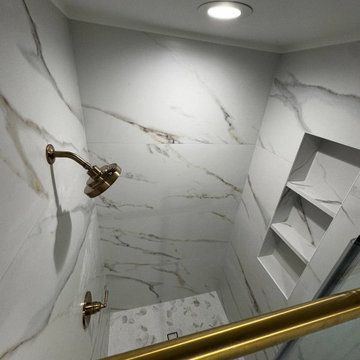
2. Walk-In Shower with Premium Features
A stunning walk-in shower with sleek glass doors was installed to give the bathroom a modern and luxurious look.
We used large-format tiles on the shower walls and flooring, creating a cohesive, stylish, and low-maintenance surface.
A built-in recessed niche with a custom tile shelf was added for practical storage while maintaining a clean and sophisticated design.
3. Vanity & Storage Enhancements
The old vanity was replaced with a sleek, modern vanity that provided ample storage and counter space.
We incorporated custom-built shelves on the left side of the vanity, offering additional storage without cluttering the design.
A lighted mirror was installed above the vanity, combining style and practicality while enhancing the overall lighting in the space.
4. Elegant Fixtures & Finishes
To add a touch of luxury, we installed gold-finished fixtures, including the showerhead, faucets, and cabinet handles, giving the bathroom a high-end, elegant feel.
A modern one-piece toilet was installed to complement the clean and minimalist design.
The bathroom’s neutral color palette and textured finishes created a calm and inviting atmosphere.
5. Enhanced Ventilation & Lighting
A new exhaust fan was installed to improve air circulation and moisture control, ensuring a comfortable and mold-free environment.
Additional task lighting and ambient lighting were carefully placed to make the bathroom bright, warm, and inviting.
The Result: A Stunning, Spacious, and Functional Master Bathroom
The completed master bathroom remodeling in Ambler, PA is now a spacious, modern retreat that perfectly blends style and functionality. By unifying the previously divided rooms, we created a flowing and open space that feels larger and more inviting. The walk-in shower, gold fixtures, and custom vanity elevate the aesthetics, while the recessed niche, built-in shelves, and enhanced lighting provide practicality and comfort.
The homeowner was thrilled with the transformation, noting how much brighter, more functional, and elegant the space now feels. They particularly loved how the layout reconfiguration made the space more open and efficient, as well as the luxurious finishes that added a high-end touch.
70