
Search results for "Adequately" in Home Design Ideas
 Gramophone
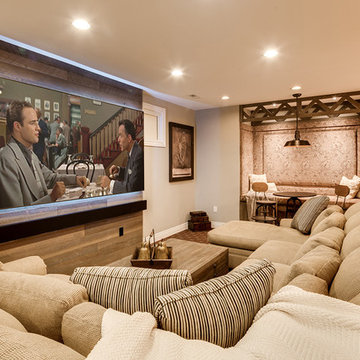
The client had a finished basement space that was not functioning for the entire family. He spent a lot of time in his gym, which was not large enough to accommodate all his equipment and did not offer adequate space for aerobic activities. To appeal to the client's entertaining habits, a bar, gaming area, and proper theater screen needed to be added. There were some ceiling and lolly column restraints that would play a significant role in the layout of our new design, but the Gramophone Team was able to create a space in which every detail appeared to be there from the beginning. Rustic wood columns and rafters, weathered brick, and an exposed metal support beam all add to this design effect becoming real.
Maryland Photography Inc.
 Kimberlee Marie Interiors
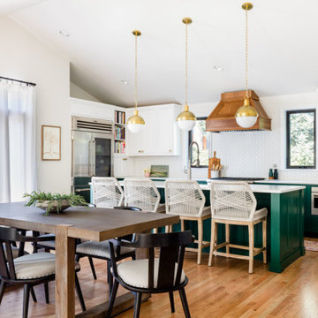
Set in the charming neighborhood of Wedgwood, this Cape Cod-style home needed a major update to satisfy our client's lifestyle needs. The living room, dining room, and kitchen were all separated, making it hard for our clients to carry out day-to-day life with small kids or adequately entertain. Our client also loved to cook for her family, so having a large open concept kitchen where she could cook, keep tabs on the kids, and entertain simultaneously was very important. To accommodate those needs, we bumped out the back and side of the house and eliminated all the walls in the home's communal areas. Adding on to the back of the house also created space in the basement where they could add a separate entrance and mudroom.
We wanted to make sure to blend the character of this home with the client's love for color, modern flare, and updated finishes. So we decided to keep the original fireplace and give it a fresh look with tile, add new hardwood in a lighter stain to match the existing and bring in pops of color through the kitchen cabinets and furnishings. New windows, siding, and a fresh coat of paint were added to give this home the curbside appeal it deserved.
In the second phase of this remodel, we transformed the basement bathroom and storage room into a primary suite. With the addition of baby number three, our clients wanted to create a retreat they could call their own. Bringing in soft, muted tones made their bedroom feel calm and collected, a relaxing place to land after a busy day. With our client’s love of patterned tile, we decided to go a little bolder in the bathroom with the flooring and vanity wall. Adding the marble in the shower and on the countertop helped balance the bold tile choices and keep both spaces feeling cohesive.
 Kimberlee Marie Interiors
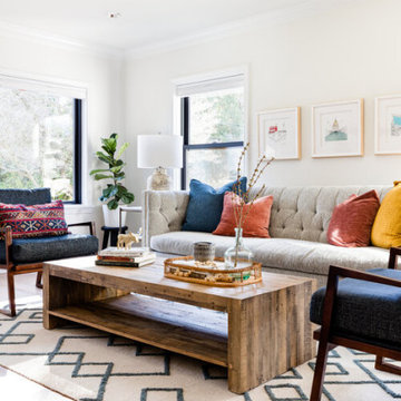
Set in the charming neighborhood of Wedgwood, this Cape Cod-style home needed a major update to satisfy our client's lifestyle needs. The living room, dining room, and kitchen were all separated, making it hard for our clients to carry out day-to-day life with small kids or adequately entertain. Our client also loved to cook for her family, so having a large open concept kitchen where she could cook, keep tabs on the kids, and entertain simultaneously was very important. To accommodate those needs, we bumped out the back and side of the house and eliminated all the walls in the home's communal areas. Adding on to the back of the house also created space in the basement where they could add a separate entrance and mudroom.
We wanted to make sure to blend the character of this home with the client's love for color, modern flare, and updated finishes. So we decided to keep the original fireplace and give it a fresh look with tile, add new hardwood in a lighter stain to match the existing and bring in pops of color through the kitchen cabinets and furnishings. New windows, siding, and a fresh coat of paint were added to give this home the curbside appeal it deserved.
In the second phase of this remodel, we transformed the basement bathroom and storage room into a primary suite. With the addition of baby number three, our clients wanted to create a retreat they could call their own. Bringing in soft, muted tones made their bedroom feel calm and collected, a relaxing place to land after a busy day. With our client’s love of patterned tile, we decided to go a little bolder in the bathroom with the flooring and vanity wall. Adding the marble in the shower and on the countertop helped balance the bold tile choices and keep both spaces feeling cohesive.
Find the right local pro for your project
 Crystal Kitchen + Bath
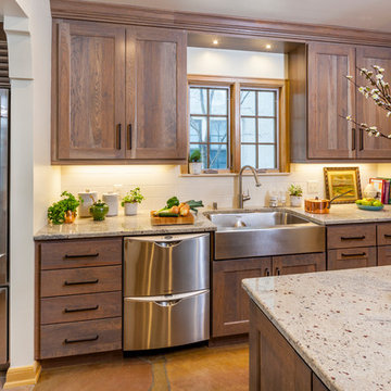
The kitchen in this beautiful 1934 home had been renovated, but lacked flow and adequate storage and for the family of five. The Viking range was trapped in an alcove, with little counter space on the sides. By relocating the wall oven, the range wall is a functional area featuring two niches, an accessory rail and dramatic tile. The new grey-stained Crystal cabinets in hickory and cherry complement the existing Colorado stone floors. Careful selection of materials and placement blends existing and new, while respecting the vintage of the home.
 Balboa Design Group
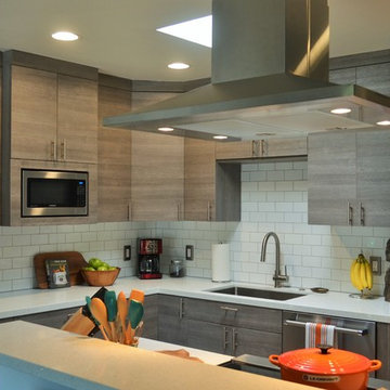
Our client's original kitchen lacked adequate storage and counter space. To create a more open flow from the living room to the kitchen, we decided to remove some walls and cabinets over the island, replacing with a ceiling-mount vent hood. We also incorporated an L-shaped counter along the north facing wall to maximize counter space and increase the amount of storage. The combination of custom gray distressed wood cabinetry and sparkling white quartzite countertops create a stunning atmosphere in this previously lackluster kitchen.
 Cabinet-S-Top
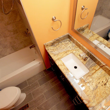
We updated this master bath with Medallion Potter’s Mill cabinets in Maple wood with Ginger Snap stain with Amerock satin nickel pull and a Moen kingsley faucet. In the shower, Daltile 10x14 Perla Grigo tile on the wall with Bliss Mosiac Fusion Clay with recessed 12x12 niche and Daltile 7x20 Gribgo gray tile on the floor and an Aker one-piece gelcoated fiberglass tub.
 Kadello & Larsen Architectural Designs
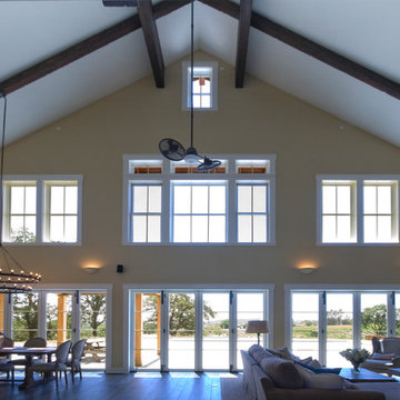
Large farmhouse open concept dark wood floor living room photo in San Francisco with beige walls, a standard fireplace and a stone fireplace
 Renovisions
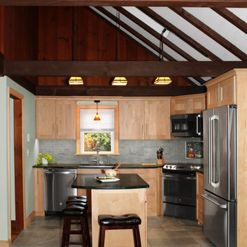
This kitchen had not been renovated since the salt box colonial house was built in the 1960’s. The new owner felt it was time for a complete refresh with some traditional details and adding in the owner’s contemporary tastes.
At initial observation, we determined the house had good bones; including high ceilings and abundant natural light from a double-hung window and three skylights overhead recently installed by our client. Mixing the homeowners desires required the skillful eyes of Cathy and Ed from Renovisions. The original kitchen had dark stained, worn cabinets, in-adequate lighting and a non-functional coat closet off the kitchen space. In order to achieve a true transitional look, Renovisions incorporated classic details with subtle, simple and cleaner line touches. For example, the backsplash mix of honed and polished 2” x 3” stone-look subway tile is outlined in brushed stainless steel strips creating an edgy feel, especially at the niche above the range. Removing the existing wall that shared the coat closet opened up the kitchen to allow adding an island for seating and entertaining guests.
We chose natural maple, shaker style flat panel cabinetry with longer stainless steel pulls instead of knobs, keeping in line with the clients desire for a sleeker design. This kitchen had to be gutted to accommodate the new layout featuring an island with pull-out trash and recycling and deeper drawers for utensils. Spatial constraints were top of mind and incorporating a convection microwave above the slide-in range made the most sense. Our client was thrilled with the ability to bake, broil and microwave from GE’s advantium oven – how convenient! A custom pull-out cabinet was built for his extensive array of spices and oils. The sink base cabinet provides plenty of area for the large rectangular stainless steel sink, single-lever multi-sprayer faucet and matching filtered water dispenser faucet. The natural, yet sleek green soapstone countertop with distinct white veining created a dynamic visual and principal focal point for the now open space.
While oak wood flooring existed in the entire first floor, as an added element of color and interest we installed multi-color slate-look porcelain tiles in the kitchen area. We also installed a fully programmable floor heating system for those chilly New England days. Overall, out client was thrilled with his Mission Transition.
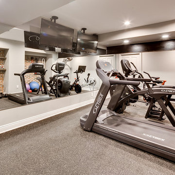 Gramophone
The client had a finished basement space that was not functioning for the entire family. He spent a lot of time in his gym, which was not large enough to accommodate all his equipment and did not offer adequate space for aerobic activities. To appeal to the client's entertaining habits, a bar, gaming area, and proper theater screen needed to be added. There were some ceiling and lolly column restraints that would play a significant role in the layout of our new design, but the Gramophone Team was able to create a space in which every detail appeared to be there from the beginning. Rustic wood columns and rafters, weathered brick, and an exposed metal support beam all add to this design effect becoming real.
Maryland Photography Inc.
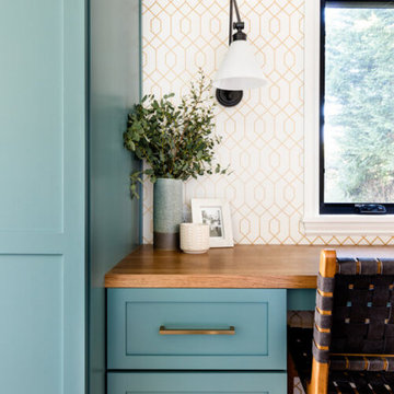 Kimberlee Marie Interiors
Set in the charming neighborhood of Wedgwood, this Cape Cod-style home needed a major update to satisfy our client's lifestyle needs. The living room, dining room, and kitchen were all separated, making it hard for our clients to carry out day-to-day life with small kids or adequately entertain. Our client also loved to cook for her family, so having a large open concept kitchen where she could cook, keep tabs on the kids, and entertain simultaneously was very important. To accommodate those needs, we bumped out the back and side of the house and eliminated all the walls in the home's communal areas. Adding on to the back of the house also created space in the basement where they could add a separate entrance and mudroom.
We wanted to make sure to blend the character of this home with the client's love for color, modern flare, and updated finishes. So we decided to keep the original fireplace and give it a fresh look with tile, add new hardwood in a lighter stain to match the existing and bring in pops of color through the kitchen cabinets and furnishings. New windows, siding, and a fresh coat of paint were added to give this home the curbside appeal it deserved.
In the second phase of this remodel, we transformed the basement bathroom and storage room into a primary suite. With the addition of baby number three, our clients wanted to create a retreat they could call their own. Bringing in soft, muted tones made their bedroom feel calm and collected, a relaxing place to land after a busy day. With our client’s love of patterned tile, we decided to go a little bolder in the bathroom with the flooring and vanity wall. Adding the marble in the shower and on the countertop helped balance the bold tile choices and keep both spaces feeling cohesive.
 Gilmans Kitchens and Baths
A Gilmans Kitchens and Baths Install Only Project!
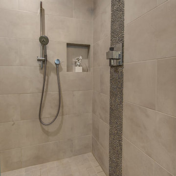
A little bit more drama was implemented in the master bathroom. Shades of taupe and grey were used, while sparkly countertops, tile, cabinet knobs and pendant lights added simple glamour.
A banjo countertop using Cambria's Whitney was used for extra contertop surface and a linen cabinet was added for adequate storage.
Learn more about the Gilmans Install Only Process!
http://www.gkandb.com/services/design-build/
DESIGNER: JANIS MANACSA
PHOTOGRAPHY: TREVE JOHNSON
CABINETS: KITCHEN CRAFT CABINETRY
COUNTERTOP: CAMBRIA WHITNEY
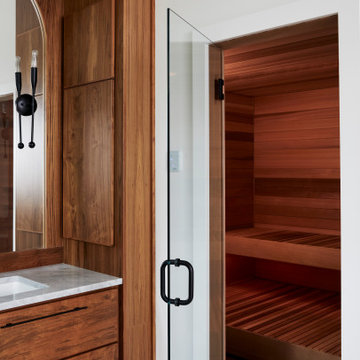

 Creative Furniture Galleries
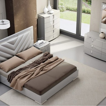
Featuring a gorgeously upholstered headboard framed around a elegant grey high gloss with chrome accents for a sophisticated finish. The casegoods not only provide adequate spacing for storage, but also feature soft close drawers.
Features:
Upholstered Headboard
Grey High Gloss finish
Chrome Accents
Soft closing tracks case goods
Dimensions:
Queen Bed: W 71.5" x D 82.5" x H 50.5"
King Bed: W 87.5" x D 82.5" x H 50.5"
Nightstand: W 24.5" x D 17.5" x H 21"
Dresser: W 66" x D 20" x H 30"
Mirror: W 35.6" x D 1" x H 43.5"
Chest: W 39.5" x D 19.5" x H 47"
 Vetter Architects
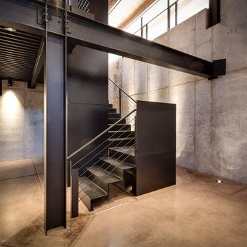
A minimal insertion into a densely wooded landscape, the Collector’s Pavilion provides the owners with an 8,000 sf private fitness space and vintage automobile gallery. On a gently sloping site in amongst a grove of trees, the pavilion slides into the topography - mimicking and contrasting the surrounding landscape with a folded roof plane that hovers over a board formed concrete base.
The clients’ requirement for a nearby room to display a growing car collection as well as provide a remote area for personal fitness carries with it a series of challenges related to privacy and security. The pavilion nestles into the wooded site - finding a home in a small clearing - and merges with the sloping landscape. The building has dual personalities, serving as a private and secure bunker from the exterior, while transforming into a warm and inviting space on the interior. The use of indirect light and the need to obscure direct views from the public right away provides the client with adequate day light for day-to-day use while ensuring that strict privacy is maintained. This shifting personality is also dramatically affected by the seasons - contrasting and merging with the surrounding environment depending on the time of year.
The Collector’s Pavilion employs meticulous detailing of its concrete to steel to wood connections, exploring the grounded nature of poured concrete in conjunction with a delicate wood roof system that floats above a grid of steel. Above all, the Pavilion harmonizes with it’s natural surroundings through it’s materiality, formal language, and siting.
Overview
Chenequa, WI
Size
8,000 sf
Completion Date
May 2013
Services
Architecture, Landscape Architecture, Interior Design
 Renovations by Garman LLC
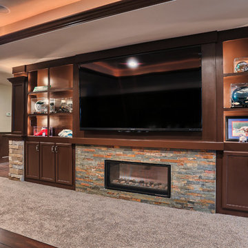
The client required displays for their sports memorabilia collection. We designed built-in shelving with LED lighting around the media room for displaying signed helmets and footballs. We were conscious to include adequate wall space in the design for hanging framed jerseys and showcasing these items.
 Mosaic Collective, LLC.
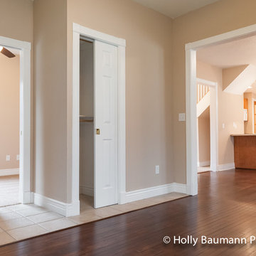
New paint, new lighting, refinished original hardwood floors to replace bad carpet. The dark stain on the hardwood hides flaws from previous less-than-adequate finish jobs. Holly Baumann Photography
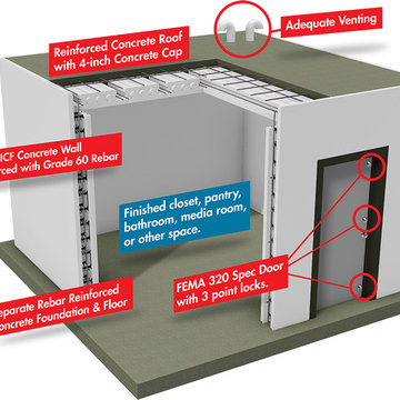
 BuildBlock Insulating Concrete Forms (ICFs)
BuildBlock saferooms
Closet - closet idea in Oklahoma City
Closet - closet idea in Oklahoma City
 Tradition Outdoor Living
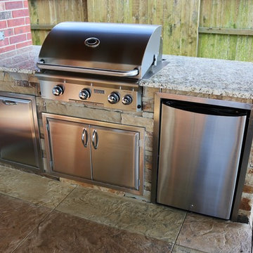
This project included a Patio Cover Addition, Outdoor Kitchen, Gas-Burning Fireplace, and Stamped Concrete walking surface with a custom pattern. The attention is immediately drawn to the Ledgestone fire place with a rustic cedar mantel. The Ledgestone flows continuously throughout the space, found on the base of the patio columns and outdoor kitchen. The kitchen sparkles with Stainless Steel appliances, containing storage compartments, refrigerator, and grill. Topped with Venetian Gold Granite, this cooking space provides ample counter space that is easily maintained. The overall appeal of this Outdoor Living area remains beautifully traditional, with cedar-trimmed columns and beams. Also, though it has custom features, this addition is built to look original to the home with matching paint, shingles, gutters, and framing materials. The elaborate, pre-stained Tongue and Groove ceiling is quite an attractive feature to this patio cover, and the recessed lighting illuminates the evening. The fans provide adequate air-flow and the sound system keeps the patio atmosphere in tune.
 La Vie Modern Furniture
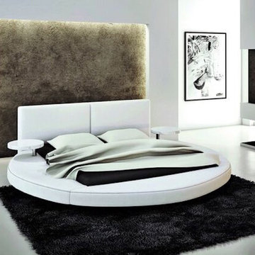
Product Code: 383S, Showcasing a futuristic design, the 383B modern round leather bed exudes expediency and usability. Each side of the bed has built-in round nightstands with stainless steel leg, white lacquer finish, The round platform in tufting leather, where the bed frame sits, can be used for other purposes like a table for your laptop, etc. Adequate back support is achieved from the expansive headboard. frame is round, mattress size is available for double, queen and king size. other colors are available!
 Glow Lighting
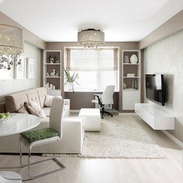
How To Use Small Chandeliers According to Apartment Therapy:
“You can add these to your "words to live by" list: never underestimate the power of good lighting. A beautifully decorated room can end up feeling like a cave and that chair you just had recovered in gorgeous flax colored linen can look sickly green if you lack adequate lighting. It's even more complicated in a small space. Creating the balance between too much and too little light, plus finding fixtures that won't overwhelm a petite space can take some trial and error.”
Since the vast majority of condos and new and renovated homes are now open concept designs. Your lighting design for open concept floor plans should coordinate either in frame type, metal finish color and crystal style. The look should be cohesive but doesn’t have to be “matchy- matchy”...
**Continue reading by clicking the link above!**
23