
Search results for "Adjacent dimension" in Home Design Ideas
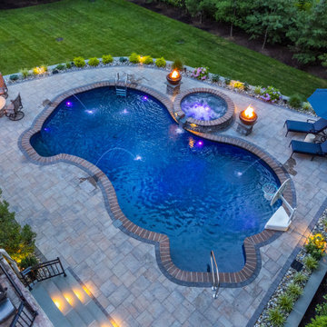
 The Pool Boss
 transformed this Caldwell, NJ property into an outdoor living space full of amenities. The home and surrounding grounds represent a true blend of rustic and elegant, so it is only fitting that the homeowner chose “The Harmony” pool. Perfectly suited to the home itself, it also expresses a beautiful synergy of classic and modern pool elements.
External steps descend into this stunning free-form pool which was also fitted with deck jets and a swim-out in the deep end! Perhaps the most exciting water feature is the adjacent fieldstone hot tub which contains a “spillover” waterfall into the pool. A vibrant fire bowl sits on either side.
The surrounding paving stone patio provides style + generous space for poolside lounging. On the opposite end, a handsome fieldstone fire pit provides a cozy gathering space for the colder months. A thin border of shrubs & river stones creates dimension and separates the water space from the green space.
Overlooking this oasis is a handsome deck spanning the width of the house. Look up and you’ll admire a rich wood-planked ceiling. Look down and you’ll see a patterned paving stone floor set in a complementary Ashlar pattern. The Pool Boss truly created a space that incorporated the design elements of this lovely house, making it a natural extension of the property as well as an enviable place for entertaining!
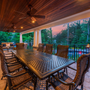 The Pool Boss
 transformed this Caldwell, NJ property into an outdoor living space full of amenities. The home and surrounding grounds represent a true blend of rustic and elegant, so it is only fitting that the homeowner chose “The Harmony” pool. Perfectly suited to the home itself, it also expresses a beautiful synergy of classic and modern pool elements.
External steps descend into this stunning free-form pool which was also fitted with deck jets and a swim-out in the deep end! Perhaps the most exciting water feature is the adjacent fieldstone hot tub which contains a “spillover” waterfall into the pool. A vibrant fire bowl sits on either side.
The surrounding paving stone patio provides style + generous space for poolside lounging. On the opposite end, a handsome fieldstone fire pit provides a cozy gathering space for the colder months. A thin border of shrubs & river stones creates dimension and separates the water space from the green space.
Overlooking this oasis is a handsome deck spanning the width of the house. Look up and you’ll admire a rich wood-planked ceiling. Look down and you’ll see a patterned paving stone floor set in a complementary Ashlar pattern. The Pool Boss truly created a space that incorporated the design elements of this lovely house, making it a natural extension of the property as well as an enviable place for entertaining!
 Design with Frank
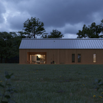
The Two-Bedroom Family compact home is the perfect solution for households of two with children. It features a main bedroom that can be used by either your kids or guests, while an adjacent room would work well as their own private space! The layout has everything for hours of outdoor playtime. Multiple decks and porches provide ample space to store all toys and stuff, while the covered living room offers cozy shelter from bad weather or sunbathing when you want some peace to make breakfast later on!
Features:
• Area: 1300 sqft
• Dimension: 64’ L X 25’ W X 20' H
• Living room: 18' -6" L X 15’-10" W
• Dining room: 12' L X 15’-10" W
• Bedroom 01: 15' L X 12' W
• Bedroom 02: 12'-5" L X 10’-10" W
• Windows: 4 Large glass sliding doors
• Deck: 1 Coved decks
• Bathroom: Includes a bathtub
• Kitchen: Eat-in Kitchen with Pantry room
• Accommodates 4 to 6 people
• Laundry: Large Laundry room
• Heating: Mini-split/ radiant floor heat/ Air sourced heat pump
• Foundation: Stem wall
Find the right local pro for your project

 User
Alder was designed for a piece of property with a lot of street presence considering its front dimension is 135’-5”. With a total depth of 41’-8”, the residence has a total under roof square footage of 4,665 and an air conditioned area of 3,579 square feet. A flex room with private bath is attached behind the garage which is detached from the main residence but connected by the roof. The master suite is located on the first floor and has private lounge area adjacent to the pool and pool deck. The kitchen, breakfast area, dining room, foyer, and great room feature large, floor to ceiling, stacking glass doors which open fully to allow seamless interaction between the interior and exterior spaces of the home. Two additional bedrooms and two bathrooms complete the second floor with access the second floor balcony overlooking the pool and pool deck below.
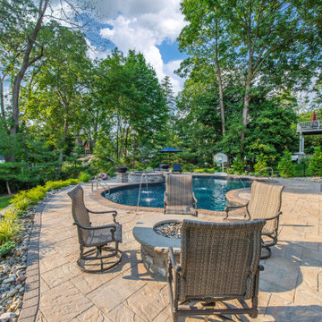 The Pool Boss
 transformed this Caldwell, NJ property into an outdoor living space full of amenities. The home and surrounding grounds represent a true blend of rustic and elegant, so it is only fitting that the homeowner chose “The Harmony” pool. Perfectly suited to the home itself, it also expresses a beautiful synergy of classic and modern pool elements.
External steps descend into this stunning free-form pool which was also fitted with deck jets and a swim-out in the deep end! Perhaps the most exciting water feature is the adjacent fieldstone hot tub which contains a “spillover” waterfall into the pool. A vibrant fire bowl sits on either side.
The surrounding paving stone patio provides style + generous space for poolside lounging. On the opposite end, a handsome fieldstone fire pit provides a cozy gathering space for the colder months. A thin border of shrubs & river stones creates dimension and separates the water space from the green space.
Overlooking this oasis is a handsome deck spanning the width of the house. Look up and you’ll admire a rich wood-planked ceiling. Look down and you’ll see a patterned paving stone floor set in a complementary Ashlar pattern. The Pool Boss truly created a space that incorporated the design elements of this lovely house, making it a natural extension of the property as well as an enviable place for entertaining!
 Alair Homes Hickory
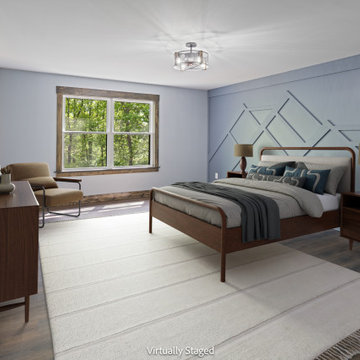
The primary bedroom blends modern simplicity with rustic mountain character, creating a peaceful retreat designed for comfort and relaxation. Soft blue-gray walls paired with rich wood flooring and stained trim bring warmth and contrast to the space while maintaining a calm, airy atmosphere. Natural light pours through the oversized window, framing wooded views and enhancing the connection to the surrounding landscape.
A custom feature wall inspired by mountain silhouettes adds a unique architectural detail and serves as a striking focal point within the room. The monochromatic design introduces texture and dimension while reinforcing the home’s nature-inspired aesthetic. Clean lines, neutral finishes, and understated lighting contribute to the room’s modern yet inviting feel.
The spacious layout offers flexibility for furnishings while maintaining an open and uncluttered appearance. Adjacent access to the primary bath creates a functional private suite, thoughtfully designed to balance style, comfort, and everyday livability.
 Twelve Stones Designs, LLC
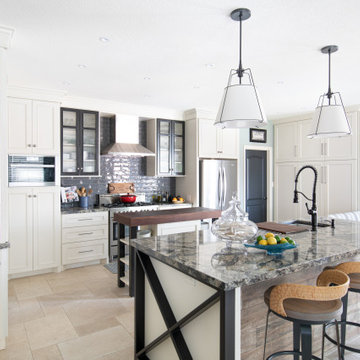
The owners of this kitchen had spent the money to upgrade the finishes in their kitchen upon building the home 12 years ago, but after living in the space for several years they realized how nonfunctional the layout really was. The (then) two preschool aged children had grown into busy, hungry teenagers with many friends who also liked to hang out at the house. So the family needed a more functional kitchen with better traffic flow, space for daily activities revolving around the kitchen at different times of day, and a kitchen that could accommodate cooking for and serving large groups. Furthermore, the dark, traditional finishes no longer reflected the homeowners’ style. They requested a brighter, more relaxed, coastal style that reflected their love of the seaside cities they like to visit.
Originally, the kitchen was U-shaped with a narrow island in the middle. The island created narrow aisles that bottle-necked at the dishwasher, refrigerator, and cooktop areas. There was a pass-through from the foyer into the kitchen, but the owners never liked that the pass-through was also located so close to the powder room. The awkward proximity was unappealing and made guests feel uncomfortable.
The kitchen’s storage was made up of lots of narrow cabinets, apothecary drawers, clipped corner units, and very few drawers. It lacked useful storage for the larger items the family used on a daily basis. And the kitchen’s only pantry was small closet that had only builder-grade, narrow shelving with no illumination to be able to see the contents inside.
Overall, the kitchen’s lighting plan was poorly executed. Only six recessed cans illuminated the entire kitchen and nook areas. The under cabinet lighting was not evenly distributed either. In fact, the builder had mis-placed the under cabinet lighting around the decorative pilasters which made for choppy, dark cubbies. Further, the builder didn’t include any lighting over the sink or the bar area, which meant whoever was doing the dishes was always in their own shadow. That, coupled with the steep overhang of the game room above made the bar area feel like a dim, cavernous space that wasn’t inviting or task oriented. The kitchen looked out into the main living space, but the raised bar and a narrow wall (which held the only large cabinet in the kitchen) created more of a barrier than a relationship to the living room or breakfast nook. In fact, one couldn’t even see the breakfast nook from the cooktop or sink areas due to its orientation. The raised bar top was too narrow to comfortably sit to either dine at or chat from due to the lack of knee space. The the homeowners confided that the kitchen felt more like a dark, dirty prison than place where the family, or their guests, wanted to gather and commune.
The clients' needs and desires were:
➢ to create a kitchen that would be a space the family loved to be in; to relate to the adjacent spaces all around, and to have better flow for entertaining large groups
➢ to remove the walls between the breakfast nook and living area and to be able to utilize the natural light from the windows in both those areas
➢ to incorporate a functional chopping block for prepping fresh food for home cooked meals, an island with a large sink and drain board, 2 pull out trash cans, and seating for at least the 2 teens to eat or do homework
➢ to design a kitchen and breakfast nook with an airy, coastal, relaxed vibe that blended with the rest of the house's coastal theme
➢ to integrate a layered lighting plan which would include ample general illumination, specific task lighting, decorative lighting, and lots of illuminated storage
➢ to design a kitchen with not only more storage for all the husband’s kitchen gadgets and collection of oils and spices, but smart storage, including a coffee/breakfast bar and a place to store and conceal the toaster oven and microwave
➢ to find a way to utilize the large open space between the kitchen, pantry area, and breakfast nook
Twelve Stones Designs achieved the owner's goals by:
➢ removing the walls between the kitchen and living room to allow the natural light to filter in from the adjacent rooms and to create a connection between the kitchen, nook, and living spaces for a sense of unity and communion
➢ removing the existing pantry and designing 3 large pantry style cabinets with LED tape lights and rollout drawers to house lots of kitchen appliances, gadgets, and tons of groceries. We also took the cabinets all the way up to the 9’ ceiling for additional storage for seasonal items and bulk storage.
➢ designing 2 islands - 1 with a gorgeous black walnut chopping block that houses a drawer for chopping and carving knives and a custom double pull out trash unit for point of use utilization - and 1 that houses the dishwasher, a large Blanco Gourmet sink with integrated drain board, woven baskets for fresh root vegetables and kitchen towels, plenty of drawer storage for kitchen items, and bar seating for up to 4 diners.
➢ closing off the space between the kitchen and the powder room to create a beautiful new private alcove for the powder room as well as adding some decorative storage. This also gave us space to include more tall storage near the new range for precision placement of the husband’s extensive oil and spice collection as well as a location for a combo-steam oven the wife wanted for baking and cooking healthy meals.
The project is enhanced functionally by:
➢ incorporated USB and standard receptacles for the kids’ laptops and phone charging in the large island
➢ designing the small island to include additional open shelving for items used on a daily basis such as a variety of bowls, plates, and colanders. This set up also works well for the husband who prefers to “plate” his dinners in restaurant-style fashion before presenting them to the table.
➢ the integration of specific storage units, such as double stacked cutlery drawers, a custom spice pull-out, a Kuerig coffee and tea pod drawer, and custom double stacked utensil drawers
➢ moving the refrigerator to the old oven location - this eliminated the bottle neck as well as created a better relationship to the eating table. It also utilizes the floor space between the pantry, nook, and kitchen
➢ creating a banquet style breakfast nook - this banquette seating not only doubles the amount of seating for large gatherings but it better utilizes the odd space between the kitchen and the previous nook area. It also helps to create a distinct pathway from the mudroom room through the pantry area, kitchen, nook, and living room.
➢ the coffee/breakfast bar area which includes the perfect location for the concealed microwave and toaster oven, convenient storage for the coffee pods and tea accoutrements. Roll-out drawers below also house the smoothie maker, hot water kettle, and a plethora of smoothie-making ingredients such as protein powders, smoothie additives, etc. Furthermore, the drawers below the Keurig house measuring utensil, cutlery, baking supplies and tupperware storage.
➢ incorporating lots of wide drawers and pullouts to accommodate large cookware.
➢ utilizing as much vertical space as possible by building storage to the ceiling which accommodates the family’s abundant amount of serving platters, baking sheets, bakeware, casserole dishes, and additional cutting boards.
The project is enhanced aesthetically by:
➢ new 5-piece Versailles pattern porcelain tile that now seamlessly joins the entire down stairs area together creating a bright, cohesiveness feeling instead of choppy separated spaces - it also adds a coastal feeling
➢ designing a cabinet to conceal the microwave and toaster oven
➢ the coastal influenced light fixtures over the nook table and island
➢ the sandy colors of the Langdon Cambria countertops. The swirling pattern and sparkling quartz pieces remind the homeowner of black-and-tan sandy beaches
➢ the striped banquet seating whose creamy white background and blue-green stripes were the inspiration for the cabinet and wall colors.
➢ All the interior doors were painted black to coordinate with the blacks and grays in the backsplash tile and countertop. This also adds a hint of tailored formality to an otherwise casual space.
➢ the use of WAC's Oculux small aperture LED units for the overhead lighting complimented with Diode LED strips for task lighting under the cabinets and inside the pantry and glass wall cabinets. All of the lighting applications are on separate dimmer switches.
Innovative uses of materials or construction methods by Realty Restoration LLC:
➢ Each 1-1/2” x 3” block of reclaimed end-grain black walnut that makes up the center island chopping block was hand milled and built in the shop. It was designed to look substantial and proportional to the surrounding elements, executed by creating the 4 inch tall top with a solid wood chamfered edge band.
➢ The metal doors on either side of the vent hood were also custom designed for this project and built in the Realty Restoration LLC shop. They are made 1x2, 11-gauge mild steel with ribbed glass. Weighing 60 lbs a piece, heavy duty cabinet hinges were added to support the weight of the door and keep them from sagging.
➢ Under-cabinet receptacles were added along the range wall in order to have a clean, uninterrupted backsplash.
Design obstacles to overcome:
➢ Because we were removing the demising walls between the kitchen and living room, we had to find a way to plumb and vent the new island. We did this by tunneling through the slab (the slab had post tension cables which prevented us from just trenching) to run a new wet vent through a nearby structural wall. We pulled the existing hot and cold lines between upper floor joists and ran them down the structural wall as well and up through a conduit in the tunnel.
➢ Since we were converting from wall overs to a gas range it allowed us to utilize the 220 feed for the wall ovens to provide a new sub panel for all the new kitchen circuits
➢ Due to framing deficiencies inherited from the original build there was a 1-1/2” differential in the floor-to-ceiling height over a 20 foot span; by utilizing the process of cutting and furring coupled with the crown moulding details on the cabinet elevations we were able to mask the problem and provide seamless transitions between the cabinet components.
Evidence of superior craftsmanship:
➢ uniquely designed, one-of-a-kind metal “X” end panels on the large island. The end panels were custom made in the Realty Restoration LLC shop and fitted to the exact dimensions of the island. The welding seams are completely indistinguishable - the posts look like they are cut from a single sheet of metal
➢ square metal posts on the small island were also custom made and designed to compliment and carry through the metal element s throughout the kitchen
➢ the beautiful, oversized end panels on the pantry cabinets which give the breakfast nook a tailored look
➢ integrating a large format 5 piece Versailles tile pattern to seamlessly flow from the existing spaces into the new kitchen space
➢ By constructing a custom cabinet that jogged around a corner we could not remodel (housing the entry way coat closet) we were able to camouflage the adjacent wall offset within the upper and lower cabinets. By designing around the existing jog in the structural walls we accomplished a few things: we were able to find the space to house, and hide, the microwave and toaster oven yet still have a clean cohesive appearance from the kitchen side. Additionally, the owners were able to keep their much needed coat closet and we didn’t have to increase the budget with unnecessary structural work.


 Giulietti Schouten Weber Architects
Sally Painter
Example of a trendy master blue tile and subway tile porcelain tile and gray floor freestanding bathtub design in Portland with open cabinets, gray cabinets, white walls, an integrated sink, concrete countertops and gray countertops
Example of a trendy master blue tile and subway tile porcelain tile and gray floor freestanding bathtub design in Portland with open cabinets, gray cabinets, white walls, an integrated sink, concrete countertops and gray countertops

 B Smart Builders
Photos by Norman & Young, Design selections by Stacy Buky with WestFort Home
Powder room - country powder room idea in Dallas
Powder room - country powder room idea in Dallas
 Bilotta Kitchen & Home
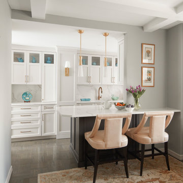
Bilotta Senior Designer, Thomas Vecchio, and Patrick J. Hamilton of Patrick James Hamilton Designs, partnered on this Manhattan upper east side kitchen renovation. This nondescript ‘60’s co-op and galley kitchen were reimagined into a pre-war era gem by adding architectural details: paneling, coffers, and moldings. Widening the opening created an open vista. Upper panes of glass on the Bilotta Collection wall cabinets echo the apartment’s transoms and unite the two sections that are interrupted by the paneled structural column. To compensate for the shorter wall, storage is optimized with plentiful pullouts, dividers, and specialized organizers. The “dead end” under the window was eliminated by continuing cabinetry and countertop materials around the room.
Countertop wall cabinets create a hutch in full view of the dining room. With dark gray paint, corner posts and furniture base molding, the peninsula reads like an island and bridges the two areas. Quartz countertops sport “lightning bolt” veins for pattern. Sophisticated on-
trend brushed brass was employed on the cabinet pulls and knobs, faucet, sconces, and pendants. A gamechanger was extending the footprint of the kitchen into the hallway with two tall cabinets. One is allocated for cleaning supplies, bulk items, recycling, and the vacuum. The other conceals a built-in wine rack; glassware and bar items; a docking drawer for charging devices; and a Penda-flex rack for files. An absolutely stunning metamorphosis.
Written by Paulette Gambacorta adapted for Houzz.
Bilotta Designer: Tom Vecchio
Interior Designer: Patrick J. Hamilton of Patrick James Hamilton Designs
Photographer: John Bessler

 Randy Angell Designs
This project is proof that the challenges posed by limited space and accessibility can always be overcome in order to deliver stunning results. The space itself was rather small and also very close to the neighboring residence. Not only was the neighboring wall imposing, it was also of a completely different design style.
The goal here was to create a layering effect with numerous features of varying heights. Not only would this add depth and dimension to the overall design, but it would cause the viewer to shift their focus from the encroaching wall to the beauty of the pool space.
Instead of trying to maximize the water area by squaring off the pool, I decided to instead maximize the visual interest by gracefully rounding off the back wall of the pool. This was accomplished by implementing a raised stucco wall, and also a shorter, matching curved wall, featuring a "Sheer Descent" waterfall.
Inside the taller, deep-plum stucco wall, I created three vertical windows which are all highlighted by LED uplighting. To give depth, dimension and some natural beauty, I implemented a simple bed of Horse Tail Reeds behind the short wall, and chose to place Banana Trees behind the taller wall.
The main seating area is just outside the home's master suite, and is separated by a "Leuder" limestone fire pit. Aside from being a striking design feature, the floating stepper pads accomplish a number of things; they serve triple-duty as a walkway, a seating area adjacent to the fire pit, and also as a poolside rest for beverages.
After discovering that the narrow courtyard acted as a sort of wind tunnel between the two houses, we opted to install tempered glass in order to better control the behavior of the flames. This solved the problem while remaining visually pleasing to the client as well.
You'll notice in some of the leading photos for this project that I had originally intended to implement stepper pads on both sides of the pool closest to the house. And despite a thorough understanding of what would be necessary on an engineering and structural-design basis, we were eventually forced to turn this into a solid deck due to unrelenting city-required setbacks. However the client remained very understanding due to encountering a number of similar issues in their home-build process.
In the end, they were delivered an outstanding pool design that had come to fruition only after coming up with numerous solutions to a number of challenges that only a unique space like this could provide.
 Randy Angell Designs
This project is proof that the challenges posed by limited space and accessibility can always be overcome in order to deliver stunning results. The space itself was rather small and also very close to the neighboring residence. Not only was the neighboring wall imposing, it was also of a completely different design style.
The goal here was to create a layering effect with numerous features of varying heights. Not only would this add depth and dimension to the overall design, but it would cause the viewer to shift their focus from the encroaching wall to the beauty of the pool space.
Instead of trying to maximize the water area by squaring off the pool, I decided to instead maximize the visual interest by gracefully rounding off the back wall of the pool. This was accomplished by implementing a raised stucco wall, and also a shorter, matching curved wall, featuring a "Sheer Descent" waterfall.
Inside the taller, deep-plum stucco wall, I created three vertical windows which are all highlighted by LED uplighting. To give depth, dimension and some natural beauty, I implemented a simple bed of Horse Tail Reeds behind the short wall, and chose to place Banana Trees behind the taller wall.
The main seating area is just outside the home's master suite, and is separated by a "Leuder" limestone fire pit. Aside from being a striking design feature, the floating stepper pads accomplish a number of things; they serve triple-duty as a walkway, a seating area adjacent to the fire pit, and also as a poolside rest for beverages.
After discovering that the narrow courtyard acted as a sort of wind tunnel between the two houses, we opted to install tempered glass in order to better control the behavior of the flames. This solved the problem while remaining visually pleasing to the client as well.
You'll notice in some of the leading photos for this project that I had originally intended to implement stepper pads on both sides of the pool closest to the house. And despite a thorough understanding of what would be necessary on an engineering and structural-design basis, we were eventually forced to turn this into a solid deck due to unrelenting city-required setbacks. However the client remained very understanding due to encountering a number of similar issues in their home-build process.
In the end, they were delivered an outstanding pool design that had come to fruition only after coming up with numerous solutions to a number of challenges that only a unique space like this could provide.
Sponsored
Columbus, OH

Hope Restoration & General Contracting
Columbus Design-Build, Kitchen & Bath Remodeling, Historic Renovations

 My House Design|Build|Team
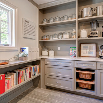
In this white kitchen renovation, we removed the old wooden shaker-style kitchen cabinetry and replaced them with all new white and grey cabinets, and white marble counter tops. Expertly hidden behind some of these cabinets is the family’s new walk-in pantry.
The original space had a small, awkward-shaped kitchen island that was so small it was barely functional or convenient for more than one person to sit at. We gave the homeowners a much larger kitchen island, with a beveled edge, that now has more than enough space for eating, socializing, or doing work. With a large overhang counter top on one side, there is now room for several backless bar stools tucked under the island. You’ll also notice glitters of gold inside the two over-sized lighting fixtures suspended over the island.
We created the homeowners a small wok kitchen just off of their new white kitchen renovation. In the main kitchen, we added a ceramic flat cook top and subtle white exhaust hood with an elegant rose-gold trim. Behind it, a white/grey mosaic back splash acts as a wall accent to provide some dimension to the otherwise solid white space. Surrounding the range hood are two large wall cabinets with clear doors to provide extra storage without adding bulk to the newly opened room.
The adjacent dining room was also updated to include a long, contemporary dining table with comfortable seating for eight (ten if you want to get cozy). We replaced the low-hanging run-of-the-mill chandelier with a higher, more modern style made of gold and glass. Behind it all is a new dark grey accent wall with a paneled design to add dimension and depth to the new brighter room.
 Bilotta Kitchen & Home
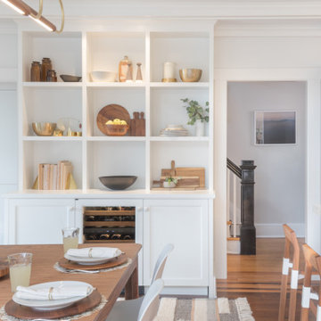
Lustrous walnut flooring literally lays the groundwork for this suburban renovation. Rutt Regency Cabinetry with Flat-panel doors give center stage to the starring features. Perimeter (Rutt Regency) cabinetry is a soft white, while a repetition of rich walnut dresses the island cabinets, the refrigerator framing as well as the stools and adjacent dining table with chairs. That contrast creates a point-counterpoint dialogue with the floors. Though the top trim is deceivingly simple, it’s actually a triple stack of moldings. Countertops are a mix of Caesarstone quartz on the perimeter and marble on the center island. Vertically-stacked subway tiles in assorted whites and off-whites add subtle shading and dimension. Viking’s white finish graces the refrigerator and range, while the dishwasher and wine cooler sport cabinetry panels. Conveniently located opposite the refrigerator, a stainless microwave drawer was placed in the island.
A delightful surprise designed by the architect is hidden behind the island: handcrafted panels and a storage cabinet faced in varied-width slats of walnut that speak to the attention to detail in this room.
Warm brass was chosen for pulls, faucet, and pendants. The brass strap on the white vent hood is punctuated by a single oversized pyramid-shaped rivet; another small detail that speaks volumes.
This project was designed by Architect Eva Bouhassira in collaboration with Tom Vecchio of Bilotta Kitchens. Photography by Tim Lee. Written by Paulette Gambacorta adapted for Houzz.
 Bilotta Kitchen & Home
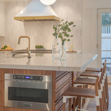
Lustrous walnut flooring literally lays the groundwork for this suburban renovation. Rutt Regency Cabinetry with Flat-panel doors give center stage to the starring features. Perimeter (Rutt Regency) cabinetry is a soft white, while a repetition of rich walnut dresses the island cabinets, the refrigerator framing as well as the stools and adjacent dining table with chairs. That contrast creates a point-counterpoint dialogue with the floors. Though the top trim is deceivingly simple, it’s actually a triple stack of moldings. Countertops are a mix of Caesarstone quartz on the perimeter and marble on the center island. Vertically-stacked subway tiles in assorted whites and off-whites add subtle shading and dimension. Viking’s white finish graces the refrigerator and range, while the dishwasher and wine cooler sport cabinetry panels. Conveniently located opposite the refrigerator, a stainless microwave drawer was placed in the island.
A delightful surprise designed by the architect is hidden behind the island: handcrafted panels and a storage cabinet faced in varied-width slats of walnut that speak to the attention to detail in this room.
Warm brass was chosen for pulls, faucet, and pendants. The brass strap on the white vent hood is punctuated by a single oversized pyramid-shaped rivet; another small detail that speaks volumes.
This project was designed by Architect Eva Bouhassira in collaboration with Tom Vecchio of Bilotta Kitchens. Photography by Tim Lee. Written by Paulette Gambacorta adapted for Houzz.

 CairnsCraft Design & Remodel
Our client requested a design that reflected their need to renovate their dated bathroom into a transitional floor plan that would provide accessibility and function. The new shower design consists of a pony wall with a glass enclosure that has beautiful details of brushed nickel square glass clamps.
The interior shower fittings entail geometric lines that lend a contemporary finish. A curbless shower and linear drain added an extra dimension of accessibility to the plan. In addition, a balance bar above the accessory niche was affixed to the wall for extra stability.
The shower area also includes a folding teak wood bench seat that also adds to the comfort of the bathroom as well as to the accessibility factors. Improved lighting was created with LED Damp-location rated recessed lighting. LED sconces were also used to flank the Robern medicine cabinet which created realistic and flattering light. Designer: Marie Cairns
Contractor: Charles Cairns
Photographer: Michael Andrew
Sponsored
Columbus, OH
Hope Restoration & General Contracting
Columbus Design-Build, Kitchen & Bath Remodeling, Historic Renovations
 My House Design|Build|Team
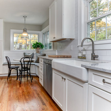
In this white kitchen renovation, we removed the old wooden shaker-style kitchen cabinetry and replaced them with all new white and grey cabinets, and white marble counter tops. Expertly hidden behind some of these cabinets is the family’s new walk-in pantry.
The original space had a small, awkward-shaped kitchen island that was so small it was barely functional or convenient for more than one person to sit at. We gave the homeowners a much larger kitchen island, with a beveled edge, that now has more than enough space for eating, socializing, or doing work. With a large overhang counter top on one side, there is now room for several backless bar stools tucked under the island. You’ll also notice glitters of gold inside the two over-sized lighting fixtures suspended over the island.
We created the homeowners a small wok kitchen just off of their new white kitchen renovation. In the main kitchen, we added a ceramic flat cook top and subtle white exhaust hood with an elegant rose-gold trim. Behind it, a white/grey mosaic back splash acts as a wall accent to provide some dimension to the otherwise solid white space. Surrounding the range hood are two large wall cabinets with clear doors to provide extra storage without adding bulk to the newly opened room.
The adjacent dining room was also updated to include a long, contemporary dining table with comfortable seating for eight (ten if you want to get cozy). We replaced the low-hanging run-of-the-mill chandelier with a higher, more modern style made of gold and glass. Behind it all is a new dark grey accent wall with a paneled design to add dimension and depth to the new brighter room.

 The Kitchen Company
Transitional black and white kitchen remodel designed by Gail Bolling
Woodbridge, Connecticut To get more detailed information copy and paste this link into your browser. https://thekitchencompany.com/blog/featured-kitchen-everyday-chefs-delight,
Photographer, Dennis Carbo

17