
Search results for "Aesthetically pleasing" in Home Design Ideas

 Studio Dearborn
This spacious kitchen in Westchester County is flooded with light from huge windows on 3 sides of the kitchen plus two skylights in the vaulted ceiling. The dated kitchen was gutted and reconfigured to accommodate this large kitchen with crisp white cabinets and walls. Ship lap paneling on both walls and ceiling lends a casual-modern charm while stainless steel toe kicks, walnut accents and Pietra Cardosa limestone bring both cool and warm tones to this clean aesthetic. Kitchen design and custom cabinetry, built ins, walnut countertops and paneling by Studio Dearborn. Architect Frank Marsella. Interior design finishes by Tami Wassong Interior Design. Pietra cardosa limestone countertops and backsplash by Marble America. Appliances by Subzero; range hood insert by Best. Cabinetry color: Benjamin Moore Super White. Hardware by Top Knobs. Photography Adam Macchia.


 Cuppett Kilpatrick Architecture + Interior Design
Ryann Ford
Example of a country two-story mixed siding exterior home design in Austin with a metal roof
Example of a country two-story mixed siding exterior home design in Austin with a metal roof
Find the right local pro for your project


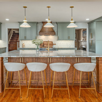
 FineLine Kitchens, Inc.
Hi everyone, I'm Sarah and Ogun we are here with fine line kitchens. So we are a couple working together. I do the interior design and remodeling of the space material selection meeting with the clients. And I handled operations outside, you know meaning all the construction work that is taking place the inside. The houses that we work in. I handle all the aspects of the construction, so today's project is very special. We're in Vienna and the client had a very big family. It's a family of seven that lives here. So we had a few aspects that we needed to keep in mind while designing this one. Having everybody be able to sit on the island. So we wanted plenty of seating all the way around. We didn't want anybody standing or anything like that. So what we did is we maximize the space. The center island is the biggest part of the kitchen. We use a natural stone to kind of give it a beautiful texture versus quartz. It's kind of standard white or kind of fabricated, so I wanted something very natural. We did this because I took my inspiration from the outside, so the inspiration if you look at the view right in front of me is there are so many greens there's a lot of brass accents and I wanted to bring this. Into this kitchen while designing it for my clients. She is very warm very. She wanted a very homey, comfy kind of look for the kitchen. So that's what we did today. As you can see, the cabinets are sage green, very light, so I still think it's a neutral, but it's a lighter color that again brings the outside in and we combine that with the oak right behind me so it's a slightly warm oak. It's not very dark. It's not very light. It's a medium brown and the same color went on the island. To kind of tie these two in and the backsplash, my favorite part is where you can see a little bit of design. It is, in my opinion still classic, but includes a pattern so the outside part is as we said in the beginning, is handled by my husband. I'd like him to speak a little bit about that. Thanks, Sarah, I want to talk to you guys a little bit about the construction part of this project. Originally this kitchen was located mostly in this area. They had their stove there sing. It was more of a peninsula layout in Sarah's and the customer vision they wanted. They wanted to get rid of the peninsula and they want to be able to have a huge island that can at least sit seven people because they're familiar with seven. So we wanted to make sure that we can achieve this design and bring it to life so that they can be happy with this layout. Some of the challenges we had, the house, the home being, you know, old home. There were a lot of you know the older electrical and plumbing that had to be replaced. We had to relocate the stove from here to this area. Over here we had put a nice foot fan that we had to relocate all the ductwork and the plumbing. Was being on the peninsula area. We had to relocate it to the center islands. So we achieved all this and kind of like bring it to bring in this kitchen up to date it looks beautiful. That's true, so yes, the old layout did not function for my clients because everything was kind of gathered on one side of the kitchen. So there was like a peninsula right there. So the end of this island kind of continued straight. And that was just the L shape. Kind of where everything was and there used to be another big table here, so they were using only kind of half of the space. So like I said at the beginning, our vision was to kind of feed everybody at the island, create some symmetry. 'cause I love that. So as you can see behind me, this is kind of the focal point symmetrical. Everything is kind of even we wanted to also panel the fridge here so it mimics the pantry and another size. So when you're looking at it, it is bringing again that symmetry back again. I hope you enjoyed this kitchen and this video and I'll see you soon. So how do you think this project turned out? It's nice. I like the color. I think it turned out nice. It's kind of like a little bit different color than what we always do. So I realize. Are you giving me a little bit of credit here that I did something different? Are you proud? I'm so proud of you. Other than that I like it. That they have kind of like a two sink. So if this was our kitchen, if we ever like you can have your own. I can have mine if we ever get into a fight then this can be like my own kitchen. Why are we gonna bring in a fight right now? So I'm cooking anyway. You're grilling most of the time, So what are you even talking about? My kitchen? That's my kitchen. You can just take the small sink. That's fine. It's always good to have your own space right there, so anyways. Thank you guys for watching. We hope to see you soon and if you have any questions please click the link below. It'll lead you to our website, house, YouTube and all of the social media is so nice to have you guys. We'll see you soon. Thanks bye bye-bye.

 Art of Kitchens Pty Ltd
Our client wanted a unique, modern space that would pay tribute to the industrial history of the original factory building, yet remain an inviting space for entertaining, socialising and cooking.
This project focused on designing an aesthetically pleasing, functional kitchen that complemented the industrial style of the building. The kitchen space needed to be impressive in its own right, without taking away from the main features of the open-plan living area.
Every facet of the kitchen, from the smallest tile to the largest appliance was carefully considered. A combination of creative design and flawless joinery made it possible to use diverse materials such as stainless steel, reclaimed timbers, marble and reflective surfaces alongside integrated state-of-the-art appliances created an urbane, inner-city space suitable for large-scale entertaining or relaxing.

 Design Platform
David Lauer
Inspiration for a mid-sized contemporary master white tile and marble tile porcelain tile and white floor freestanding bathtub remodel in Denver with white walls
Inspiration for a mid-sized contemporary master white tile and marble tile porcelain tile and white floor freestanding bathtub remodel in Denver with white walls


 Ryan Street Architects
Ryann Ford
Inspiration for a mediterranean dark wood floor vestibule remodel in Austin with white walls and a glass front door
Inspiration for a mediterranean dark wood floor vestibule remodel in Austin with white walls and a glass front door

 Décor Aid
New Yorkers are always on the prowl for innovative ways to make the most of the space they have. An upper east side couple, challenged with a slightly narrow L shaped apartment sought out Decor Aid’s help to make the most of their Manhattan condo. Paired with one of our senior designer, Kimberly P., we learned that the clients wanted a space that looked beautiful, comfortable and also packed with functionality for everyday living.
“Immediately upon seeing the space, I knew that we needed to create a narrative that allowed the design to control how you moved through the space,” reports Kimberly, senior interior designer.
After surveying each room and learning a bit more about their personal style, we started with the living room remodel. It was clear that the couple wanted to infuse mid-century modern into the design plan. Sourcing the Room & Board Jasper Sofa with its narrow arms and tapered legs, it offered the mid-century look, with the modern comfort the clients are used to. Velvet accent pillows from West Elm and Crate & Barrel add pops of colors but also a subtle touch of luxury, while framed pictures from the couple’s honeymoon personalize the space.
Moving to the dining room next, Kimberly decided to add a blue accent wall to emphasize the Horchow two piece Percussion framed art that was to be the focal point of the dining area. The Seno sideboard from Article perfectly accentuated the mid-century style the clients loved while providing much-needed storage space. The palette used throughout both rooms were very New York style, grays, blues, beiges, and whites, to add depth, Kimberly sourced decorative pieces in a mixture of different metals.
“The artwork above their bureau in the bedroom is photographs that her father took,”
Moving into the bedroom renovation, our designer made sure to continue to stick to the client’s style preference while once again creating a personalized, warm and comforting space by including the photographs taken by the client’s father. The Avery bed added texture and complimented the other colors in the room, while a hidden drawer at the foot pulls out for attached storage, which thrilled the clients. A deco-inspired Faceted mirror from West Elm was a perfect addition to the bedroom due to the illusion of space it provides. The result was a bedroom that was full of mid-century design, personality, and area so they can freely move around.
The project resulted in the form of a layered mid-century modern design with touches of luxury but a space that can not only be lived in but serves as an extension of the people who live there. Our designer was able to take a very narrowly shaped Manhattan apartment and revamp it into a spacious home that is great for sophisticated entertaining or comfortably lazy nights in.

 Pamela Sandler Architect
Inspiration for a mid-sized transitional built-in desk light wood floor study room remodel in Boston with white walls

Emily Andrews
Example of a farmhouse open concept living room design with white walls, a standard fireplace and a plaster fireplace
Example of a farmhouse open concept living room design with white walls, a standard fireplace and a plaster fireplace


 Georgia Zikas Design
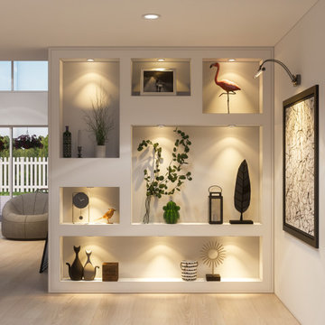
Open plan, spacious living. Honoring 1920’s architecture with a collected look.
Example of a transitional master gray tile and marble tile marble floor, gray floor and double-sink walk-in shower design with shaker cabinets, gray cabinets, gray walls, marble countertops, a hinged shower door, gray countertops, an undermount sink and a freestanding vanity
Example of a transitional master gray tile and marble tile marble floor, gray floor and double-sink walk-in shower design with shaker cabinets, gray cabinets, gray walls, marble countertops, a hinged shower door, gray countertops, an undermount sink and a freestanding vanity

 Building Arts Sustainable Architecture
The kitchen spills out onto the deck and the sliding glass door that was added in the master suite opens up into an exposed structure screen porch. Over all the exterior space extends the traffic flow of the interior and makes the home feel larger without adding actual square footage.
Troy Thies Photography

 Heritage Construction Companies, LLC.
Open concept kitchen - huge contemporary galley porcelain tile and black floor open concept kitchen idea in Minneapolis with flat-panel cabinets, white cabinets, white appliances, an island, a single-bowl sink, quartz countertops, white backsplash and white countertops

 KES Studio
Interiors by SFA Design
Photography by Meghan Beierle-O'Brien
Example of a large classic women's brown floor and dark wood floor dressing room design in Los Angeles with open cabinets and white cabinets
Example of a large classic women's brown floor and dark wood floor dressing room design in Los Angeles with open cabinets and white cabinets

 O’Hara Interiors
Martha O'Hara Interiors, Interior Design & Photo Styling | City Homes, Builder | Troy Thies, Photography
Please Note: All “related,” “similar,” and “sponsored” products tagged or listed by Houzz are not actual products pictured. They have not been approved by Martha O’Hara Interiors nor any of the professionals credited. For information about our work, please contact design@oharainteriors.com.



 Linden L.A.N.D. Group
Rebecca Lindenmeyr
Design ideas for a huge farmhouse full sun backyard formal garden in Burlington.
Design ideas for a huge farmhouse full sun backyard formal garden in Burlington.

 Constructionologists
Inspiration for a mid-sized contemporary master white tile and porcelain tile white floor and porcelain tile freestanding bathtub remodel in Dallas with flat-panel cabinets, dark wood cabinets, white walls, an undermount sink, a hinged shower door, a one-piece toilet and quartz countertops
3