
Search results for "Align key" in Home Design Ideas
 Airehart Construction, Inc.
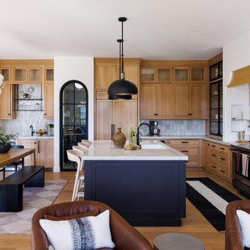
Inspiration for a transitional l-shaped medium tone wood floor and brown floor kitchen remodel with an undermount sink, shaker cabinets, medium tone wood cabinets, gray backsplash, stainless steel appliances, two islands and white countertops
 Alair Homes Charlotte
Jim Scmid
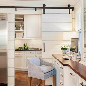
Example of a classic medium tone wood floor kitchen design in Charlotte with stainless steel appliances and white walls
Example of a classic medium tone wood floor kitchen design in Charlotte with stainless steel appliances and white walls

Find the right local pro for your project
 SV Design
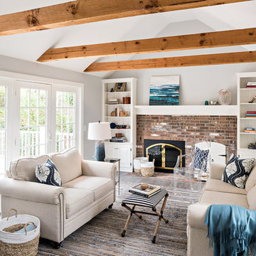
The layout of this colonial-style house lacked the open, coastal feel the homeowners wanted for their summer retreat. Siemasko + Verbridge worked with the homeowners to understand their goals and priorities: gourmet kitchen; open first floor with casual, connected lounging and entertaining spaces; an out-of-the-way area for laundry and a powder room; a home office; and overall, give the home a lighter and more “airy” feel. SV’s design team reprogrammed the first floor to successfully achieve these goals.
SV relocated the kitchen to what had been an underutilized family room and moved the dining room to the location of the existing kitchen. This shift allowed for better alignment with the existing living spaces and improved flow through the rooms. The existing powder room and laundry closet, which opened directly into the dining room, were moved and are now tucked in a lower traffic area that connects the garage entrance to the kitchen. A new entry closet and home office were incorporated into the front of the house to define a well-proportioned entry space with a view of the new kitchen.
By making use of the existing cathedral ceilings, adding windows in key locations, removing very few walls, and introducing a lighter color palette with contemporary materials, this summer cottage now exudes the light and airiness this home was meant to have.
© Dan Cutrona Photography
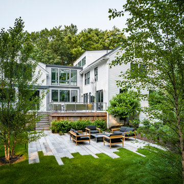

 Susan Serra
Earl Kendall
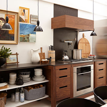
Kitchen - mid-sized scandinavian kitchen idea in New York with flat-panel cabinets, medium tone wood cabinets, quartz countertops, black backsplash, stone slab backsplash, stainless steel appliances, white walls and an island
Kitchen - mid-sized scandinavian kitchen idea in New York with flat-panel cabinets, medium tone wood cabinets, quartz countertops, black backsplash, stone slab backsplash, stainless steel appliances, white walls and an island
 Living with Lolo
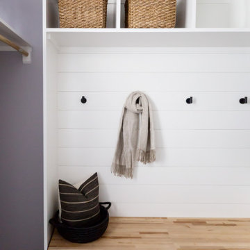
Entry in Ridgerunner Drive | Room Type:
Whole Home Remodel |
Project Name:
Ridgerunner |
Key Feature:
A full-home transformation that converted the property from a dated Tuscan style into a modern farmhouse design with a more contemporary edge.
Challenge:
The home’s original Tuscan style felt dated and did not align with the homeowners’ desired aesthetic. The challenge was to modernize the entire space while creating a design that remained practical and comfortable for a young family with a child.
Solution:
The home underwent a complete remodel that replaced the heavy Tuscan finishes with a lighter, more modern farmhouse palette. Updated materials, finishes, and design details created a fresh, contemporary look while maintaining a family-friendly environment.
Timeline:
Completed in 2019.
 Metropolis Drafting and Construction Inc
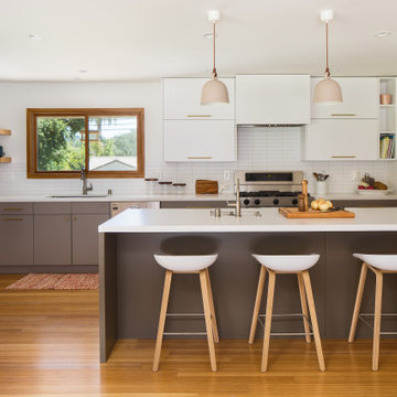
Complete overhaul of the common area in this wonderful Arcadia home.
The living room, dining room and kitchen were redone.
The direction was to obtain a contemporary look but to preserve the warmth of a ranch home.
The perfect combination of modern colors such as grays and whites blend and work perfectly together with the abundant amount of wood tones in this design.
The open kitchen is separated from the dining area with a large 10' peninsula with a waterfall finish detail.
Notice the 3 different cabinet colors, the white of the upper cabinets, the Ash gray for the base cabinets and the magnificent olive of the peninsula are proof that you don't have to be afraid of using more than 1 color in your kitchen cabinets.
The kitchen layout includes a secondary sink and a secondary dishwasher! For the busy life style of a modern family.
The fireplace was completely redone with classic materials but in a contemporary layout.
Notice the porcelain slab material on the hearth of the fireplace, the subway tile layout is a modern aligned pattern and the comfortable sitting nook on the side facing the large windows so you can enjoy a good book with a bright view.
The bamboo flooring is continues throughout the house for a combining effect, tying together all the different spaces of the house.
All the finish details and hardware are honed gold finish, gold tones compliment the wooden materials perfectly.
 Woodland Builders
This remodeling project in Scituate, MA began with a unique challenge: the original architectural plans didn’t fully align with the family’s vision for their forever home. Woodland Builders stepped in to redesign the layout, creating a more compact and cost-effective plan that perfectly suited the family’s lifestyle and long-term needs.
The homeowners, who loved their neighborhood and planned to stay for the next 30 years, sought additional space, a functional kitchen, and a new bathroom. To achieve these goals, they moved into temporary housing, enabling Woodland to work efficiently and meet their aggressive timeline.
The remodel encompassed several key areas of the home, each thoughtfully reimagined to enhance functionality, style, and comfort.

 Potter Construction Inc
The leaded glass windows, a key feature throughout the main floor and entry door, were preserved as a focal point in the design. We crafted cabinetry to align with the window, ensuring that the beautiful leaded glass remains a standout element of the space
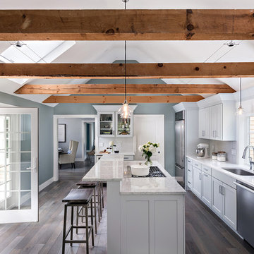 SV Design
The layout of this colonial-style house lacked the open, coastal feel the homeowners wanted for their summer retreat. Siemasko + Verbridge worked with the homeowners to understand their goals and priorities: gourmet kitchen; open first floor with casual, connected lounging and entertaining spaces; an out-of-the-way area for laundry and a powder room; a home office; and overall, give the home a lighter and more “airy” feel. SV’s design team reprogrammed the first floor to successfully achieve these goals.
SV relocated the kitchen to what had been an underutilized family room and moved the dining room to the location of the existing kitchen. This shift allowed for better alignment with the existing living spaces and improved flow through the rooms. The existing powder room and laundry closet, which opened directly into the dining room, were moved and are now tucked in a lower traffic area that connects the garage entrance to the kitchen. A new entry closet and home office were incorporated into the front of the house to define a well-proportioned entry space with a view of the new kitchen.
By making use of the existing cathedral ceilings, adding windows in key locations, removing very few walls, and introducing a lighter color palette with contemporary materials, this summer cottage now exudes the light and airiness this home was meant to have.
© Dan Cutrona Photography
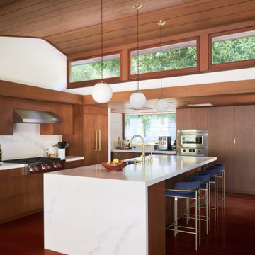
 Klopf Architecture
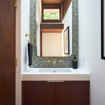
Nestled in the hills of Orinda, California, this 1951 residence is one of only seven extant homes, now known as “The Magnificent Seven”, designed by architect Olof Dahlstrand, a protégé of Frank Lloyd Wright. With its low-slung rooflines, natural materials, and deep integration with the sloping landscape, the home is a pristine example of mid-century modern design inspired by Wright’s organic principles. Over the years, prior homeowners have emphasized preservation, ensuring that the house remained relatively untouched. Each owner has respected the original architecture and stayed true to Dahlstrand’s intent. When a family of five—two college-aged sons and a middle school-aged daughter—acquired the property, they were captivated by its history, legacy of care, and architectural significance. While they appreciated Dahlstrand’s original vision, they also recognized the need to adapt the home for contemporary living while preserving its design integrity.
The remodel was conceived as a thoughtful response to the past—an effort to bring the house into the 21st century without compromising its soul. The primary mandate was to maintain architectural continuity while improving the functionality, comfort, and livability for a modern family. The design team—architects and contractor alike—worked with a shared reverence for the original architecture, allowing that mindset to guide even the most technical or pragmatic decisions.
A key objective was to increase natural light in the kitchen—a departure from Wrightian principles of enclosed, intimate cooking spaces—while maintaining the home’s architectural language. The kitchen was reconfigured to foster a stronger connection to adjacent living spaces while retaining the underlying concept of spatial separation. One of the most transformative architectural changes was the removal of a ridge beam that was originally planned to remain visible through the kitchen. During construction, the team collaborated on a better solution: a wide-flanged steel beam concealed within the roof envelope. This subtle move preserved the clean lines and ceiling continuity, a modern update carried out with utmost respect for the existing framework.
The home’s original powder room, previously accessible only through the kitchen, was relocated for better flow and privacy. A new powder room was carved out of former kitchen cabinetry—a narrow, interior space that could have felt dark and enclosed. To avoid this, the design extended the line of original transom windows into the new powder room and added a skylight above the vanity. The result is a bright and airy space that feels consistent with the rest of the home. Other updates included the installation of new solid-core interior doors with veneers carefully matched to the original mahogany, enhancing the continuity of the interiors. Even smaller decisions, such as placing the door knobs at 42 inches high, mirrored the original proportions. Every choice reflected a shared belief between the architect, contractor, and client: that new work should serve the integrity of the old.
The home’s extensive interior redwood millwork and paneling was meticulously restored. Where new materials were introduced—such as the replacement redwood soffit paneling—the contractor took pains to find finish nails that matched the original, rather than using modern equivalents. This level of craftsmanship and collaboration defined the project. It extended even to the detailing of a blind door to the new powder room, which had to disappear into the existing redwood board-and-batten wall. It was a team effort: the owner found a suitable handle, the architects devised the custom in-swing mechanism, and the contractor executed it so the door aligned precisely with the battens. Throughout, the homeowners were deeply engaged in the design process. One, a meticulous design enthusiast, focused on aesthetic integrity and historic detail. The other brought a practical and function-driven perspective, ensuring that new fixtures and materials would be durable and require minimal maintenance.
While the home’s location posed no major site challenges, sustainability was a key concern. The team upgraded the roof insulation, installed solar panels with battery storage, and added ductless mini-split cooling systems. Lighting was another area where modern technology was woven into a historic framework: new square LED fixtures echo the original custom perimeter soffit lights, maintaining the design language while offering advanced performance.
A planned expansion of a bedroom into suite with a bathroom had to be shelved due to budget constraints and the high cost of below-grade foundation work. Still, the team focused their efforts on making the most of the existing footprint, resolving constraints through design ingenuity rather than adding square footage. This renovation represents a collaborative achievement in preserving and evolving a historically significant home. Every decision was shaped by a shared ethos among clients, architects, and contractor: to maintain the home’s architectural soul while updating it for contemporary life. The result is a timeless modernist residence that continues Olof Dahlstrand’s legacy, remaining grounded in nature, craftsmanship, and human-scale design.
Klopf Architecture Team: John Klopf, AIA, Klara Kevane, Fernanda Bernardes
Interior Architectural Design: Klopf Architecture
Structural Engineer: Daniel Bastiao
Contractor: Don Larwood, Larwood Construction
Photography: Mariko Reed
Year Completed: 2022
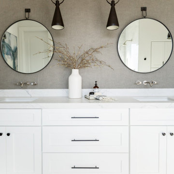 Living with Lolo
Bathroom in Ridgerunner Drive | Room Type:
Whole Home Remodel |
Project Name:
Ridgerunner |
Key Feature:
A full-home transformation that converted the property from a dated Tuscan style into a modern farmhouse design with a more contemporary edge.
Challenge:
The home’s original Tuscan style felt dated and did not align with the homeowners’ desired aesthetic. The challenge was to modernize the entire space while creating a design that remained practical and comfortable for a young family with a child.
Solution:
The home underwent a complete remodel that replaced the heavy Tuscan finishes with a lighter, more modern farmhouse palette. Updated materials, finishes, and design details created a fresh, contemporary look while maintaining a family-friendly environment.
Timeline:
Completed in 2019.
 Ogawa Fisher Architects
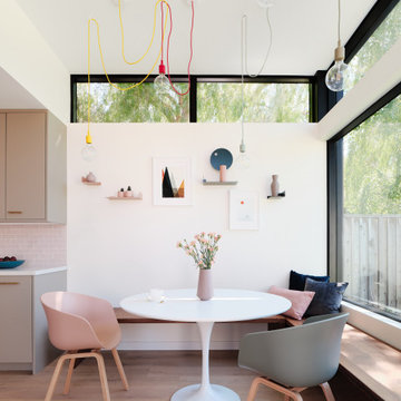
Dining nook
Example of a minimalist light wood floor and beige floor dining room design in San Francisco with white walls
Example of a minimalist light wood floor and beige floor dining room design in San Francisco with white walls
 Bilotta Kitchen & Home
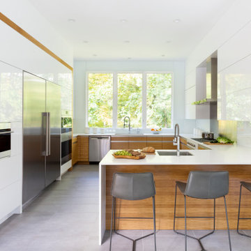
A convergence of sleek contemporary style and organic elements culminate in this elevated esthetic. High gloss white contrasts with sustainable bamboo veneers, run horizontally, and stained a warm matte caramel color. The showpiece is the 3” bamboo framing around the tall units, engineered in strips that perfectly align with the breaks in the surrounding cabinetry. So as not to clutter the clean lines of the flat panel doors, the white cabinets open with touch latches, most of which have lift-up mechanisms. Base cabinets have integrated channel hardware in stainless steel, echoing the appliances. Storage abounds, with such conveniences as tray partitions, corner swing-out lazy susans, and assorted dividers and inserts for the profusion of large drawers.
Pure white quartz countertops terminate in a waterfall end at the peninsula, where there’s room for three comfortable stools under the overhang. A unique feature is the execution of the cooktop: it’s set flush into the countertop, with a fascia of quartz below it; the cooktop’s knobs are set into that fascia. To assure a clean look throughout, the quartz is continued onto the backsplashes, punctuated by a sheet of stainless steel behind the rangetop and hood. Serenity and style in a hardworking space.
This project was designed in collaboration with Taylor Viazzo Architects.
Photography by Jason Taylor, R.A., AIA.
Written by Paulette Gambacorta, adapted for Houzz
Bilotta Designer: Danielle Florie
Architect: Taylor Viazzo Architects
Photographer: Jason Taylor, R.A., AIA

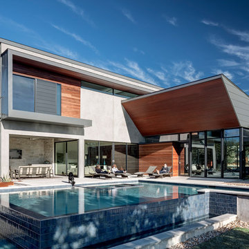
 Matt Fajkus Architecture
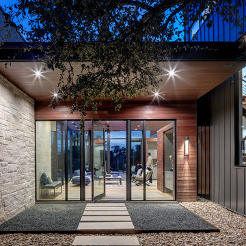
The Control/Shift House is perched on the high side of the site which takes advantage of the view to the southeast. A gradual descending path navigates the change in terrain from the street to the entry of the house. A series of low retaining walls/planter beds gather and release the earth upon the descent resulting in a fairly flat level for the house to sit on the top one third of the site. The entry axis is aligned with the celebrated stair volume and then re-centers on the actual entry axis once you approach the forecourt of the house.
The initial desire was for an “H” scheme house with common entertaining spaces bridging the gap between the more private spaces. After an investigation considering the site, program, and view, a key move was made: unfold the east wing of the “H” scheme to open all rooms to the southeast view resulting in a “T” scheme. The new derivation allows for both a swim pool which is on axis with the entry and main gathering space and a lap pool which occurs on the cross axis extending along the lengthy edge of the master suite, providing direct access for morning exercise and a view of the water throughout the day.
The Control/Shift House was derived from a clever way of following the “rules.” Strict HOA guidelines required very specific exterior massing restrictions which limits the lengths of unbroken elevations and promotes varying sizes of masses. The solution most often used in this neighborhood is one of addition - an aggregation of masses and program randomly attached to the inner core of the house which often results in a parasitic plan. The approach taken with the Control/Shift House was to push and pull program/massing to delineate and define the layout of the house. Massing is intentional and reiterated by the careful selection of materiality that tracks through the house. Voids and relief in the plan are a natural result of this method and allow for light and air to circulate throughout every space of the house, even into the most inner core.
Photography: Charles Davis Smith
 Matt Fajkus Architecture
The Control/Shift House is perched on the high side of the site which takes advantage of the view to the southeast. A gradual descending path navigates the change in terrain from the street to the entry of the house. A series of low retaining walls/planter beds gather and release the earth upon the descent resulting in a fairly flat level for the house to sit on the top one third of the site. The entry axis is aligned with the celebrated stair volume and then re-centers on the actual entry axis once you approach the forecourt of the house.
The initial desire was for an “H” scheme house with common entertaining spaces bridging the gap between the more private spaces. After an investigation considering the site, program, and view, a key move was made: unfold the east wing of the “H” scheme to open all rooms to the southeast view resulting in a “T” scheme. The new derivation allows for both a swim pool which is on axis with the entry and main gathering space and a lap pool which occurs on the cross axis extending along the lengthy edge of the master suite, providing direct access for morning exercise and a view of the water throughout the day.
The Control/Shift House was derived from a clever way of following the “rules.” Strict HOA guidelines required very specific exterior massing restrictions which limits the lengths of unbroken elevations and promotes varying sizes of masses. The solution most often used in this neighborhood is one of addition - an aggregation of masses and program randomly attached to the inner core of the house which often results in a parasitic plan. The approach taken with the Control/Shift House was to push and pull program/massing to delineate and define the layout of the house. Massing is intentional and reiterated by the careful selection of materiality that tracks through the house. Voids and relief in the plan are a natural result of this method and allow for light and air to circulate throughout every space of the house, even into the most inner core.
Photography: Charles Davis Smith
 Klopf Architecture
Nestled in the hills of Orinda, California, this 1951 residence is one of only seven extant homes, now known as “The Magnificent Seven”, designed by architect Olof Dahlstrand, a protégé of Frank Lloyd Wright. With its low-slung rooflines, natural materials, and deep integration with the sloping landscape, the home is a pristine example of mid-century modern design inspired by Wright’s organic principles. Over the years, prior homeowners have emphasized preservation, ensuring that the house remained relatively untouched. Each owner has respected the original architecture and stayed true to Dahlstrand’s intent. When a family of five—two college-aged sons and a middle school-aged daughter—acquired the property, they were captivated by its history, legacy of care, and architectural significance. While they appreciated Dahlstrand’s original vision, they also recognized the need to adapt the home for contemporary living while preserving its design integrity.
The remodel was conceived as a thoughtful response to the past—an effort to bring the house into the 21st century without compromising its soul. The primary mandate was to maintain architectural continuity while improving the functionality, comfort, and livability for a modern family. The design team—architects and contractor alike—worked with a shared reverence for the original architecture, allowing that mindset to guide even the most technical or pragmatic decisions.
A key objective was to increase natural light in the kitchen—a departure from Wrightian principles of enclosed, intimate cooking spaces—while maintaining the home’s architectural language. The kitchen was reconfigured to foster a stronger connection to adjacent living spaces while retaining the underlying concept of spatial separation. One of the most transformative architectural changes was the removal of a ridge beam that was originally planned to remain visible through the kitchen. During construction, the team collaborated on a better solution: a wide-flanged steel beam concealed within the roof envelope. This subtle move preserved the clean lines and ceiling continuity, a modern update carried out with utmost respect for the existing framework.
The home’s original powder room, previously accessible only through the kitchen, was relocated for better flow and privacy. A new powder room was carved out of former kitchen cabinetry—a narrow, interior space that could have felt dark and enclosed. To avoid this, the design extended the line of original transom windows into the new powder room and added a skylight above the vanity. The result is a bright and airy space that feels consistent with the rest of the home. Other updates included the installation of new solid-core interior doors with veneers carefully matched to the original mahogany, enhancing the continuity of the interiors. Even smaller decisions, such as placing the door knobs at 42 inches high, mirrored the original proportions. Every choice reflected a shared belief between the architect, contractor, and client: that new work should serve the integrity of the old.
The home’s extensive interior redwood millwork and paneling was meticulously restored. Where new materials were introduced—such as the replacement redwood soffit paneling—the contractor took pains to find finish nails that matched the original, rather than using modern equivalents. This level of craftsmanship and collaboration defined the project. It extended even to the detailing of a blind door to the new powder room, which had to disappear into the existing redwood board-and-batten wall. It was a team effort: the owner found a suitable handle, the architects devised the custom in-swing mechanism, and the contractor executed it so the door aligned precisely with the battens. Throughout, the homeowners were deeply engaged in the design process. One, a meticulous design enthusiast, focused on aesthetic integrity and historic detail. The other brought a practical and function-driven perspective, ensuring that new fixtures and materials would be durable and require minimal maintenance.
While the home’s location posed no major site challenges, sustainability was a key concern. The team upgraded the roof insulation, installed solar panels with battery storage, and added ductless mini-split cooling systems. Lighting was another area where modern technology was woven into a historic framework: new square LED fixtures echo the original custom perimeter soffit lights, maintaining the design language while offering advanced performance.
A planned expansion of a bedroom into suite with a bathroom had to be shelved due to budget constraints and the high cost of below-grade foundation work. Still, the team focused their efforts on making the most of the existing footprint, resolving constraints through design ingenuity rather than adding square footage. This renovation represents a collaborative achievement in preserving and evolving a historically significant home. Every decision was shaped by a shared ethos among clients, architects, and contractor: to maintain the home’s architectural soul while updating it for contemporary life. The result is a timeless modernist residence that continues Olof Dahlstrand’s legacy, remaining grounded in nature, craftsmanship, and human-scale design.
Klopf Architecture Team: John Klopf, AIA, Klara Kevane, Fernanda Bernardes
Interior Architectural Design: Klopf Architecture
Structural Engineer: Daniel Bastiao
Contractor: Don Larwood, Larwood Construction
Photography: Mariko Reed
Year Completed: 2022
 CIA_Studio
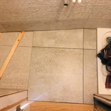
Here you can find a photo at the starting point of the bathroom refurbishment on a detached house in Sheen Lane, London.
You will see in the following photos that there is special attention to detail, to have a coordinated and balanced space, as well as comfortable for family use.
P02.Initial design key, where the shower tray, the toilet pipe, sink conections and the entrance door, and the tiles mark the guidelines to the inegrated desing.
2