
Search results for "All natural elements" in Home Design Ideas
 Medallion Cabinetry
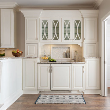
"The homeowners wanted a kitchen that reflected their personalities and cooking styles. Sophisticated but still elegant." designer Rodney Lee of York, PA.
After designing a successful home office space remodel, our same client came back to us to discuss plans and possibilities for their kitchen renovation. After a few discussions with the client, we decided the overall design concept for their kitchen would be “Sophisticated Elegance.” The homeowners wanted a kitchen that reflected their personalities and their cooking styles. Sophisticated but still elegant. The space had to be extremely functional and the color scheme had to have a certain warmth that matched the rest of their home.
The Medallion line has a wide range of architectural elements that helped us achieve that “Sophisticated Elegance”; curved/arched range hood, openings, valances, and corbels and trim. The “Sophistication” lies purely in the detail, the fixtures, the angles in the peninsula, and the changes in height and depth.
We wanted the color scheme to be as warm as possible as it would be in a bright, elegant space. We considered two colors and ended up choosing Divinity over the White Icing. The grey tones in the marble backsplash tile kept the colors modern but warm. We used natural stone versus the more aggregated quartz to maintain the use of natural product and unpredictable patterns and natural elements. We also used a dark rich stain on walnut wood as a good break from all the bright painted finishes. Oak and walnut reflect the “heart” of Pennsylvania and was a great way to maintain the use of natural elements.
The kitchen was divided into individual areas, each one focused on a particular need and/or function. My biggest challenge was transitioning the peninsula into the wet bar/hutch area while maintaining proper separation from the kitchen cabinetry and still tying it into the rest of the space.
A wealth of storage solutions.
•Desk Area. The client wanted a functional work area so we created a furniture look with ogee edging in the walnut, provincial toe space detail in solid walnut, and open display storage at top. The desk has plenty of storage.
•Main Kitchen. We were able to open up this space by creating smart transitions and separations using custom Medallion products that cater to the clients’ lifestyle. Each piece is functional while staying true to the sophisticated elegance design throughout the home.
◦Main Cabinetry: Medallion Gold Wellington Maple Divinity Classic Paint
◦48" uppers around range area; glass eclipse mullion-arched hood design
◦Mixer lift base left of range; drawer warmer with custom panel
•The main work station, or power spot, can hold up to five work stations comfortably. The cook can work within the confines of the peninsula design and access everything needed to prepare complete meals in 1-2 steps. Every cabinet has deluxe roll-out trays and/or drawers, making this kitchen fully accessible. The client wanted to be able to display and stage different pieces and concepts during holidays and gatherings. We chose to go with the more modern Mission arch above the wall oven and fridge, which complimented many of the hard angles and distinct lines used in the kitchen space.
My favorite part of this kitchen remodel came about just by listening to our client talk about how much they adored their daughter’s artwork. After numerous conversations, we landed on installing an artwork wall that was designed as a conversation piece and provides the ability to install different works of art.
 TKS Design Group
Free ebook, Creating the Ideal Kitchen. DOWNLOAD NOW
One of my favorite things to work on is older homes with a bit of history because I find it an interesting challenge to marry the historical architectural features of a home with modern design elements that work well for my client’s current lifestyle.
This home was particularly fun because it was the second kitchen we had done for this family and was quite a departure from the style of the first kitchen.
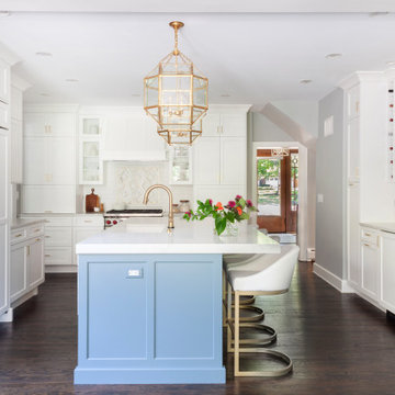
The before shot of the kitchen shows a view from the family room. See the dropped ceiling? We were curious, was this just part of the design or was the dropped ceiling there to hide mechanicals? Well we soon found out that it was mostly decorative (yay!), and with the exception of a little bit of work to some plumbing from an upstairs bathroom and rerouting of the ventilation system within the original floor joists, we were in the clear, phew! The shot of the completed kitchen from roughly the same vantage point shows how much taller the ceilings are. It makes a huge difference in the feel of the space. Dark and gloomy turned fresh and light!
Another serious consideration was what do we do with the skinny transom window above the refrigerator. After much back and forth, we decided to eliminate it and do some open shelving instead. This ended up being one of the nicest areas in the room. I am calling it the “fun zone” because it houses all the barware, wine cubbies and a bar fridge — the perfect little buffet spot for entertaining. It is flanked on either side by pull out pantries that I’m sure will get a ton of use. Since the neighboring room has literally three walls of almost full height windows, the kitchen gets plenty of light.
The gold shelving brackets, large pendant fixtures over the island and the tile mural behind the range all pay subtle homage to the home’s prairie style architecture and bring a bit of sparkle to the room.
Even though the room is quite large, the work triangle is very tight with the large Subzero fridge, sink and range all nearby for easy maneuvering during meal prep. There is seating for four at the island, and work aisles are generous.
Designed by: Susan Klimala, CKD, CBD
Photography by: LOMA Studios
For more information on kitchen and bath design ideas go to: www.kitchenstudio-ge.com
 MSI
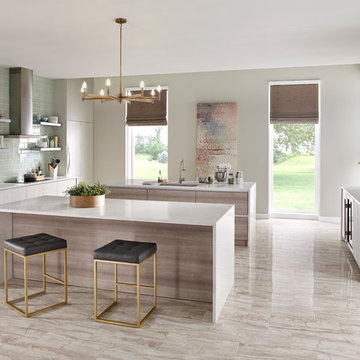
MSIOnce upon a time, you’d never see high glamour looks, mod colorways, and life-long durability in the same sentence. Q™ Premium Natural Quartz changed all that. The industry’s most innovative quartz countertop brand, Q’s low maintenance, stain-resistant, and nearly indestructible collection features over 55 sleek and sophisticated styles – all backed by MSI’s best-in-class supply chain, lifetime residential warranty, and competitive pricing. What’s not to love?
Find the right local pro for your project
 Thomas Roszak Architecture, LLC
Photo credit: Scott McDonald @ Hedrich Blessing
7RR-Ecohome:
The design objective was to build a house for a couple recently married who both had kids from previous marriages. How to bridge two families together?
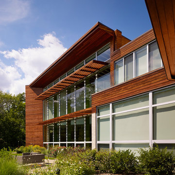
The design looks forward in terms of how people live today. The home is an experiment in transparency and solid form; removing borders and edges from outside to inside the house, and to really depict “flowing and endless space”. The house floor plan is derived by pushing and pulling the house’s form to maximize the backyard and minimize the public front yard while welcoming the sun in key rooms by rotating the house 45-degrees to true north. The angular form of the house is a result of the family’s program, the zoning rules, the lot’s attributes, and the sun’s path. We wanted to construct a house that is smart and efficient in terms of construction and energy, both in terms of the building and the user. We could tell a story of how the house is built in terms of the constructability, structure and enclosure, with a nod to Japanese wood construction in the method in which the siding is installed and the exposed interior beams are placed in the double height space. We engineered the house to be smart which not only looks modern but acts modern; every aspect of user control is simplified to a digital touch button, whether lights, shades, blinds, HVAC, communication, audio, video, or security. We developed a planning module based on a 6-foot square room size and a 6-foot wide connector called an interstitial space for hallways, bathrooms, stairs and mechanical, which keeps the rooms pure and uncluttered. The house is 6,200 SF of livable space, plus garage and basement gallery for a total of 9,200 SF. A large formal foyer celebrates the entry and opens up to the living, dining, kitchen and family rooms all focused on the rear garden. The east side of the second floor is the Master wing and a center bridge connects it to the kid’s wing on the west. Second floor terraces and sunscreens provide views and shade in this suburban setting. The playful mathematical grid of the house in the x, y and z axis also extends into the layout of the trees and hard-scapes, all centered on a suburban one-acre lot.
Many green attributes were designed into the home; Ipe wood sunscreens and window shades block out unwanted solar gain in summer, but allow winter sun in. Patio door and operable windows provide ample opportunity for natural ventilation throughout the open floor plan. Minimal windows on east and west sides to reduce heat loss in winter and unwanted gains in summer. Open floor plan and large window expanse reduces lighting demands and maximizes available daylight. Skylights provide natural light to the basement rooms. Durable, low-maintenance exterior materials include stone, ipe wood siding and decking, and concrete roof pavers. Design is based on a 2' planning grid to minimize construction waste. Basement foundation walls and slab are highly insulated. FSC-certified walnut wood flooring was used. Light colored concrete roof pavers to reduce cooling loads by as much as 15%. 2x6 framing allows for more insulation and energy savings. Super efficient windows have low-E argon gas filled units, and thermally insulated aluminum frames. Permeable brick and stone pavers reduce the site’s storm-water runoff. Countertops use recycled composite materials. Energy-Star rated furnaces and smart thermostats are located throughout the house to minimize duct runs and avoid energy loss. Energy-Star rated boiler that heats up both radiant floors and domestic hot water. Low-flow toilets and plumbing fixtures are used to conserve water usage. No VOC finish options and direct venting fireplaces maintain a high interior air quality. Smart home system controls lighting, HVAC, and shades to better manage energy use. Plumbing runs through interior walls reducing possibilities of heat loss and freezing problems. A large food pantry was placed next to kitchen to reduce trips to the grocery store. Home office reduces need for automobile transit and associated CO2 footprint. Plan allows for aging in place, with guest suite than can become the master suite, with no need to move as family members mature.
 Drury Design
THE SETUP
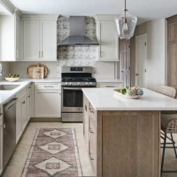
Client Background: Our clients, a couple who have transitioned into the empty nest phase, have cherished their home for over three decades without undergoing any significant renovations. With a newfound desire to adapt their living space to better suit their current lifestyle, they’ve embarked on a journey to reimagine their kitchen — the heart of their home. Their aspiration is to cultivate a serene, neutral-toned sanctuary on the first floor that seamlessly merges with their family room, ensuring a harmonious and inviting environment.
Design Inspiration: The renovation is inspired by the couple’s penchant for soft, calming neutrals, using their cherished family room and the kitchen’s existing tile flooring as the cornerstone for the color scheme. This approach aims to foster a sense of warmth and tranquility throughout.
Design Objectives:
Harmonize the kitchen with the family room by adopting a soothing, neutral color scheme, ensuring a seamless flow across the first floor.
Enhance kitchen functionality with thoughtfully designed cabinetry, providing a designated place for every item and maximizing storage efficiency.
Cultivate an inviting and comfortable atmosphere that reflects the homeowners’ desire for a calm and relaxing space.
Design Challenges:
The homeowners wish to retain the existing kitchen tile flooring and integrate it into a refreshed, modern design.
Accommodating a dining area spacious enough for family visits without compromising the kitchen’s open feel or functional layout.
Despite liking the current placement of plumbing and appliances, the homeowners aspire for a more open floor plan to facilitate better movement and interaction.
The need to amplify natural light in the kitchen, especially around the sink area, where existing lighting is insufficient.
Preserving the half-wall between the kitchen and family room, a feature the homeowners want to keep, while ensuring it complements the new design.
THE RENEWED SPACE
Design Solutions:
By choosing a neutral color palette that complements the existing tile, the design unifies the kitchen with the adjacent spaces. The tile’s grout was cleaned and restored, enhancing the floor’s appearance and integrating it seamlessly with the new kitchen aesthetic.
The inclusion of a larger island with seating for two, alongside maintaining a substantial dining table, was achieved by optimizing the spatial layout. This allowed for a sociable yet functional kitchen, accommodating large family gatherings without feeling crowded.
Minor adjustments to the kitchen’s layout maintained the preferred locations for plumbing and appliances while introducing an ‘open’ design concept. Strategic modifications, such as angling the pantry wall, improved the flow and accessibility within the space.
Replacing the garden window with a broader, standard window significantly increased natural light, transforming the sink area into a bright, welcoming space with enhanced views of the outdoors.
The decision to keep the half-wall was ingeniously leveraged to define the dining area while maintaining an open connection to the family room. This feature not only serves as a visual separator but also ties the two spaces together through the shared color scheme and design elements.
The homeowners are thrilled with their newly remodeled kitchen, which has become a hub of warmth and hospitality. Hosting a wedding shower and a birthday party, they have shared their renewed space with friends and family, who have been equally enamored. This remodel has not only met their functional and aesthetic desires but has also enriched their home with a fresh sense of serenity and joy.
The upstairs part of the home is shaping up nicely. Here’s their newly remodeled primary bathroom.
 Klopf Architecture
The Roger Lee designed house from 1962 was purchased by the current homeowners in almost original condition, as the previous owners elected to defer most maintenance projects over the years. The clients were able to see beyond the dated materials and finishes, single-paned glass and uninsulated walls and they approached Klopf Architecture to help them expand and update the entire home, one the family could settle into and enjoy for years to come. It was important that the new designs were aligned with Lee's original intent not only because of the client's appreciation for mid-century modern architecture, but also because the house was deemed historical. The Stanford Real Estate Office requires a stringent design review which safeguards the integrity of the community, which Klopf Architecture was happy to oblige going into their updated designs.
As with many original mid-century modern homes, the house was scaled to the 1960s lifestyle where rooms were smaller and openings to views were limited and tightly framed. The original conditions defined the direction the family of four would take in updating the house and making it comfortable for their modern lifestyle. Klopf designed a full gut remodel and major addition to bring the house into the 21st century and provide the living area needed for the client's family. The newly expanded house added just about 1,100 sf to create an airy, comfortable and family friendly house, taking full advantage of the beautiful southwestern views that extend out to the hills beyond. The enclosed garage created an additional 240 sf of covered space for long-term storage.
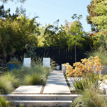
A cracked swimming pool created an eyesore taking up a majority of the backyard landscape, so it was one of the first elements to go during the transformation. Working with Outer Space Landscape Architects, the family asked for a mix of relaxing outdoor patio spaces that eventually blend into the native landscaping, extending their views outward toward the natural greenery of the trees beyond their property. Filling in the old pool was a smart way to expand the living spaces outward. The orientation of the house was designed to enjoy the views, but the original architecture provided the first homeowners with mere glimpses of the landscape outside.
Klopf was able to broaden those views, continuing and extending on the original architecture to take full advantage of the unobstructed natural views across the rear facade of the house. Small horizontal openings in the primary bedroom and office were replaced with much taller windows that now follow the angled roof line upward, extending across almost all of the facade. We worked with Western Windows, whose designs included an oblique-shaped, operable casement that allowed our design to rise with the slope. A new corner office added to the primary suite, offers a bright and functional work-from-home solution that looks out at the distant views and added natural light from the expanded window configuration that now wraps around the corner.
The existing lower level was designed by Lee as a utilitarian space, serving as a wet pool room with a drain in the center of the floor, bathroom, laundry and storage areas. Without the need for a pool room, Klopf was able to convert the area into a much more comfortable and functional living space with a new family room and guest suite. The new spaces enjoy easy access to a new outdoor patio through floor to ceiling, full-width glass sliders.
Continuing along the rear facade, a previously exposed deck extending from the living room and hallway provided access to the backyard through a single set of stairs leading toward the side of the house which made sense when the pool was in place. The new deck was re-envisioned as an extension of the main living room and now serves as a second outdoor living room. A new slatted pergola above provides the homeowners welcome relief from the hot afternoon sun. A second set of stairs now creates a better connection to the redesigned lower level. Klopf was able to reconfigure the spaces, extending the living room outward toward the views, where the family now claims it as the heart of the home, spending a large majority of their time outdoors.
Back inside, the original wood-burning Malm fireplace was beautifully restored and a gas burner installed to comply with California's strict air standards. It now rests in front of a wall of Heath accent tiles where a dated red brick wall used to stand. A new taller window brings more light and views into the refreshed interior living room. The original glass doors opposite the fireplace were replaced by larger sliders that when fully opened, create a seamless transition to the new outdoor living area so the two spaces feel like one connected space. The original utilitarian kitchen was needlessly tucked into the far back corner and closed-off, out of sight from the living room, so the clients asked Klopf to open it up and expand the kitchen forward so it felt more connected. Today the much larger kitchen is connected to the living area where a short wall with a cutout offers a visual glimpse into the kitchen and a handy pass-through counter for serving guests. A new breakfast nook was also added to create another spot where the family can gather for casual meals. Just outside, a new built-in outdoor grill and prep area extends the kitchen outside and connects to a new outdoor dining spot nestled amongst the trees, taking advantage of the views out back.
Klopf was able to expand the other two bedrooms, add a new laundry room and half-bath and convert the carport to an enclosed garage to add more storage areas which was lost when the pool house was converted to the family and guest room.
To maintain a historical connection to the original designs, the exterior siding was repeated on all exterior walls, a full-height stained glass window at the front entryway restored, and an interior slatted screen element repeated outside at the exterior entry courtyard and over the new outdoor living room to create a shade trellis. The new house stands proudly and shines against it's new landscaping features, while respecting and expanding on the original intent of Roger Lee's designs epitomizing the comforts of indoor-outdoor living in Northern California.
Completion year: 2020
Klopf Architecture project team: John Klopf, Klara Kevane, Noel Andrade
Contractor: ORB Construction, Brendan O'Reilly
Structural engineer: Sezen and Moon
Landscape architect: Outer space
Furnishings and decoration: Urbanism Designs
Photographer: Mariko Reed
 Rande Leaman Interior Design
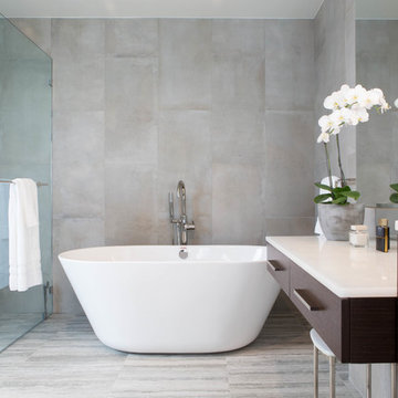
Clean lines and natural elements are the focus in this master bathroom. The free-standing tub takes center stage next to the open shower, separated by a glass wall. On the right is one of two vanities, with a make-up area adjacent. Across the room is the other vanity. The countertops are constructed of a compressed white glass counter slab. The natural look to the stone floors and walls are all porcelain, so upkeep is easy.
Sponsored
Columbus, OH

Wannemacher Interiors
Customized Award-Winning Interior Design Solutions in Franklin Cnty OH
 InHance
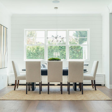
Ground Up - New Construction Design. From all details on the exterior, including doors, windows, siding, lighting, the house numbers, and mailbox; to all interior finishes including tile, stone, paints, cabinet design, and much more. We added fun color elements using paint and tile to modernise the farmhouse feel of this family home. The home also features beautiful wood and gold/brass elements to contrast matte black finishes and bring in earth elements.
 Signature Designs Kitchen | Bath | Interiors
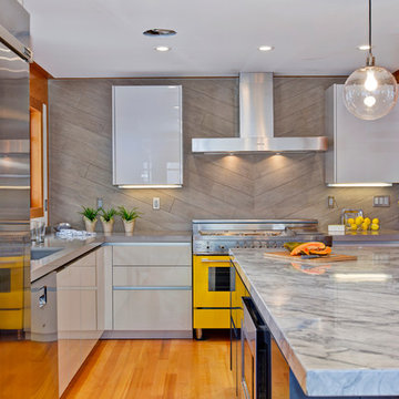
Winner of "HOME OF THE YEAR 2016" San Diego Home and Garden Lifestyles Magazine featuring this great contemporary kitchen remodel in An Irving Gill renovation near Balboa Park stays true to its historic essence.
More about the project.
This young couple has a creative back ground, one being an actor and the other being a teacher who inspires others. They now enjoy a new historical home with amazing touches of modern styling and comforts. The home was designed by renowned architect Irving Gill in 1905 and is on the historical register but it only applies to the exterior of the home. The brick pillar is an original feature from the home's turn-of-the-century stove. The window casings were built to replicate the original Douglas Fir windows as seen on Gill's original plans, and all the molding was redone in his signature flush style as well. The central feature in this kitchen is the Yellow Italian Bertazzoni Range with a single herringbone tiled back splash. The cabinetry is a light gray paired perfectly with a dark "graphite" gray island, and industrial vents at the toe kick enhance the overall look.
Builder Jon Walsh / Kim Grant Architect
Kitchen Design Bonnie Bagley Catlin
Handle free Cabinetry
Signature Designs Kitchen Bath
Cabinetry: Modern Cabinetry
Floors: Existing Fir Wood Floors
Backsplash: Porcelain Tile
Countertops: Quartz
 Armstrong Builders LLC
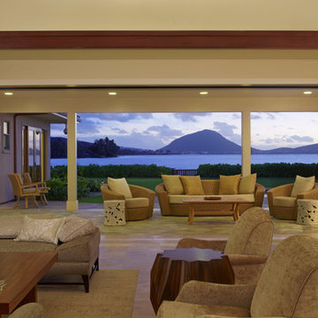
Natural African sliding mahogany doors lead out to a spacious, pool-front lanai and magnificent ocean views. These features were designed to simplify indoor-outdoor living. The theme of simple and natural elements continues outdoors with an organically shaped pool and spa with travertine stone flooring.
 Simply Home Decorating
This beautiful North Vancouver home belongs to a nature-loving and health-conscious couple, Emma and Vince (names changed), their two young children, and their dog, Jasper. When they contacted us about renovating and furnishing their kitchen and family room, we walked in and saw a world of potential waiting to be uncovered.
Before: Larkhall Crescent Home:
Like many original North Vancouver homes, the interior was definitely dated. We encountered late ‘80s finishes in powder pink and teal green, old carpet, and a kitchen that wasn’t maximized to suit this family’s modern-day lifestyle. However, the size of the rooms offered us a ton of space with which to get creative.
Knowing our clients’ love of cooking, need for work spaces (Emma and Vince both work remotely), and growing family, we developed a design concept that would increase usable space, optimize storage, and create intimacy in this large area. As for the style, we were inspired by their European roots, inventing a new and modern take on “Belgian Farmhouse” style. Now, the home is truly one-of-a-kind.
After: Warm & Cozy Family Room:
Fresh, bright, and comfortable, this living area has been transformed! We started with the fireplace as a focal point, selecting aged brick tiles for added texture and a crisp wood mantle. The taupe-coloured sectional infuses the room with visual warmth and serves the added purpose of separating the family room from the kitchen.
Emma and Vince were also keen on using non-toxic materials in their home, and we were happy to oblige. To meet their needs, we sourced natural wood elements and sought out Canadian-made products - that adhere to high health standards - whenever possible.
Look closer at the elements of this space, and you will find this stunning, honeycomb-patterned rug in earthy gold, beige, and charcoal tones. It’s plush to the touch and full of visual texture that brings this room’s colour palette together. We sourced these two-tone chairs with caning, petrified wood side table, black sconces, and botanical prints in greyscale from local artist, Heather Johnston.
We topped off the space with this dark wood and rattan console that offers storage facing the kitchen and presents an opportunity to display cherished items. The result is a cozy lounging space brimming with comfort and functionality. It’s perfect for enjoying quality family time, or Emma can simply slide the coffee table away to make room for her morning yoga practice.
Now, let’s turn around and give some attention to the kitchen. Do you remember what the original kitchen looked like? If not, scroll back up, because the transformation is shocking…
Moody & Welcoming Kitchen for Healthy Living:
This kitchen looks very different from how it started, right? Though we didn’t touch any walls, the kitchen has almost doubled in usable space! We created a long, extended island with storage, an outlet for small appliances, and seating for comfortable prep, after-school snacking, or mingling among friends.
On the other side of the island, the family has even more storage and an integrated dishwasher within easy reach of the sink, perfect for quick clean-up. From this angle, you can also see the expansive custom Shaker cabinetry in white and the integrated double ovens. These facilitate their cooking experience and gave us the opportunity to add an additional surprise…
A coffee garage station and more hidden storage! Keeping these items located along the perimeter allows them to be accessed by the family or their guests without someone getting under the cook’s feet. These are the little details that make everyday life easier and more enjoyable.
Moving deeper into the kitchen, the seamless induction cooktop topped with a freestanding concealed hood fan commands attention in a soft yet prominent way. The natural wood accent mirrors the fireplace mantle, and the choice of off-black wood-grain cabinets not only continues our black-and-white colour palette but adds a sense of depth and contrast. The corner sink is located to the right and perfectly positioned with a view of their thriving backyard.
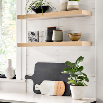
To invite more of this family’s character into the space, we mixed metals for interest — matte black, dark pewter, and warm brass — and created open shelves in white oak for their plants and decor. You can also glimpse the tumbled edge of the backsplash tile, which echoes the rustic brick of the fireplace. It adds that farmhouse charm while still feeling timeless and sophisticated.
Last but not least, we designed this dining banquette in the bay window (with integrated bench storage, of course), where the family can share a meal together, the kids can do homework, or Emma and Vince can work and enjoy a change of scenery from their offices. Like the other spaces in the home, it was designed to be beautiful, multi-functional, and long-lasting.
Praise from Our Clients:
It is clear that we love this home, but what did our clients have to say?
“Lori is a visionary and masters execution to the finest detail all at the same time. When she first met us to know more about who we are and how we live, she could right away envision how we could use the space in our kitchen and living room…The results exceeded our expectations.
Lori and her team were also a delight to work with — coordination with all the trades, fast problem-solving, regular updates, professional and friendly attitude of her entire team — made it the dream team. Thank you SHD for making our space so beautiful!”
In turn, we are so grateful for this family’s trust, their open communication, and for being wonderful people with whom to work. (So, thank you!)
 CRE Construction
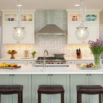
Classic White Cabinetry was the foundation of design for a Kitchen that is both beautiful and functional. Wolf and Sub-Zero appliances make it a cook's dream. All the important elements of storage, seating and space planning are perfect for everyday family living as well as entertaining.
Landmark Photography
 KS Designs LLC
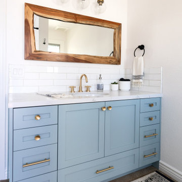
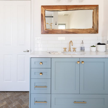
This guest bath has a light and airy feel with an organic element and pop of color. The custom vanity is in a midtown jade aqua-green PPG paint Holy Glen. It provides ample storage while giving contrast to the white and brass elements. A playful use of mixed metal finishes gives the bathroom an up-dated look. The 3 light sconce is gold and black with glass globes that tie the gold cross handle plumbing fixtures and matte black hardware and bathroom accessories together. The quartz countertop has gold veining that adds additional warmth to the space. The acacia wood framed mirror with a natural interior edge gives the bathroom an organic warm feel that carries into the curb-less shower through the use of warn toned river rock. White subway tile in an offset pattern is used on all three walls in the shower and carried over to the vanity backsplash. The shower has a tall niche with quartz shelves providing lots of space for storing shower necessities. The river rock from the shower floor is carried to the back of the niche to add visual interest to the white subway shower wall as well as a black Schluter edge detail. The shower has a frameless glass rolling shower door with matte black hardware to give the this smaller bathroom an open feel and allow the natural light in. There is a gold handheld shower fixture with a cross handle detail that looks amazing against the white subway tile wall. The white Sherwin Williams Snowbound walls are the perfect backdrop to showcase the design elements of the bathroom.
Photography by LifeCreated.

Sponsored
Columbus, OH
Wannemacher Interiors
Customized Award-Winning Interior Design Solutions in Franklin Cnty OH
 Rudloff Custom Builders
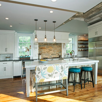
This kitchen has many interesting elements that set it apart.
The sense of openness is created by the raised ceiling and multiple ceiling levels, lighting and light colored cabinets.
A custom hood over the stone back splash creates a wonderful focal point with it's traditional style architectural mill work complimenting the islands use of reclaimed wood (as seen on the ceiling as well) transitional tapered legs, and the use of Carrara marble on the island top.
This kitchen was featured in a Houzz Kitchen of the Week article!
Photography by Alicia's Art, LLC
RUDLOFF Custom Builders, is a residential construction company that connects with clients early in the design phase to ensure every detail of your project is captured just as you imagined. RUDLOFF Custom Builders will create the project of your dreams that is executed by on-site project managers and skilled craftsman, while creating lifetime client relationships that are build on trust and integrity.
We are a full service, certified remodeling company that covers all of the Philadelphia suburban area including West Chester, Gladwynne, Malvern, Wayne, Haverford and more.
As a 6 time Best of Houzz winner, we look forward to working with you on your next project.
 Advance Design Studio, Ltd.
Mike and Michelle of Lake Barrington knew they needed extra space. Their home was becoming too crowded for their family with blossoming teenagers, so a basement renovation offered the perfect solution for more space for the kids and more room to entertain for the adults.
“Our project consisted of expanding our laundry room, putting in a first floor wet bar so we had adult space upstairs, while also renovating our basement for a family-friendly and teen-functional area as well,” Michelle says.
They found Advance Design Studio through a neighbor who gave a glowing recommendation, giving Michelle and Mike the confidence they needed to move forward with a major home renovation. They felt like they knew Advance Design before they even worked together. When they met with the owner Todd Jurs and designer Nicole Ryan, Mike and Michelle knew they were getting a trustworthy, dependable team that could create the project they had been dreaming about for 7 years.
Having virtually no natural light to work with, one of the biggest design challenges was creating a basement that did not feel dark and depressing. The Advance team got to work creating architectural archways and custom detailed dry-stack stone columns artfully designed into the space, adding a dramatic element that made the space feel less like a basement or more like a relaxing family room. Color 3D renderings were created to portray what the space would look like so Mike and Michelle could visualize the space in advance.
Detailed trim and crown moldings grace the built in buffet and wet bar making for an amazingly functional space that lacks nothing in style and visual interest. Cherry wood cabinetry by Dura Supreme is featured in the space with a “Cocoa Brown” finish and includes beautiful mirrored glass doors embellished with unique elliptical mullion details. A built-in microwave, dishwasher and mini fridge add practicality to the ample entertainment mecca. An under mounted sink finishes the space joined with a intricate mosaic tile backsplash and “Ventisca Polished” quartz countertops.
The basement is absolutely perfect for hosting friends and family with expertly designed key areas such as a game space for the kids, a movie area for the family, an ample workout room with luxurious full bath, and even built in wine storage. The family absolutely loves the new basement living space, and has already enjoyed numerous family movie nights and sleep-overs with friends.
While custom cabinets made by Dura Supreme were used to create unique spaces that lived up to Mike and Michelle’s expectations., heated flooring under the 16”x16” “Mongolian Spring” tile was installed giving all tiled areas of the basement a much cozier feel, eliminating that cold hard surface most of us hate in our basements!
The new basement must-have requirement list included a new bath space, which was incorporated adjacent to the work out room. The sleek shower door and cabinets in the new bathroom make guests and family feel like they are in an elegant hotel. The new guest bath features 4”x36” “Silver Screen” honed marble tile in a brick pattern on the shower walls and 2”x2” “Chenille” limestone tile in a hexagon mosaic pattern on the shower floor.
“I came in with very specific requirements for our three project areas,” Michelle says. “There was not one time that I felt like I was asking for something that was not going to turn out how I anticipated.”
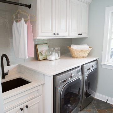
Tying in multiple rooms during a renovation if you have can do it makes a lot of sense and saves money in the long run. A fully functional laundry room as well was a must on this family’s wish list. Michelle wanted to add space to the existing cramped and awkward laundry room, and Mike wanted to make sure they could still park a car in the garage. Reconfiguring interior walls required borrowing unused space cleverly from the garage in order to enlarge the laundry room space.
Drawers under the stairs added beautiful hidden storage created almost magically out of dead space. White painted Dura Supreme cabinets bring additional light into the small space; while the 16”x16” cleft slate tile flooring provides excellent contrast and the naturally earthy feel Michelle wanted. Quartz countertops with a 3”x12” “Debut Dew” subway tile backsplash add elegance to the now upliftingly bright laundry room.
The extra space makes doing laundry much more pleasurable and the added storage is a great for all those little things like winter hats and gloves, umbrellas and the like. “The Advance Design project team was phenomenal to work with,” Michelle says. “They came in, shared the plans with us and walked us through the expectations. We always knew what was coming next.”
Converting an existing closet space, the wet bar upstairs was challenging because they wanted a functional area that didn’t look or feel like cabinets just sticking out of a closet. So the Advance team transformed this ordinary closet space into a stunning wet bar that architecturally appears as if it’s always been there. Traditional, elegant hand carved custom molding matching the adjacent fireplace ties the new entertainment bar area in nicely with the existing family room and kitchen area.
Featuring a built in wine refrigerator, Dura Supreme cabinetry in deep cherry wood elegantly displays wine bottles and etched glass mullion doors that fill with soft light in the evening hours. Cambria “Windermere” quartz countertops with a sophisticated hammered copper sink and a glimmering backsplash round out the stunning wet bar. Hosting parties and family functions has become much more enjoyable now that they have a dedicated beverage serving area large enough to include hors devours.
All three projects were designed and constructed together at the same time, making for a cohesive project that was administered smoothly and easily both for the design team and for the family. Disruption to the home was minimal as each phase was completed in each project conclusively, and design and meeting time for the homeowner was efficient and organized making for an enjoyable process.
“Advance Design was great to work with,” Michelle says. “I would highly recommend them to anyone considering a home improvement project. They took the time at the beginning to understand our needs, our budget, and our vision for our home. The field team was great, attentive, on time, cleaned up each day and made the overall experience very positive. We couldn't be happier with the finished product.”
With the help of our talented, award winning design team you can create the basement, laundry room, or any other home renovation that you have been dreaming of. With our “Common Sense Remodeling” approach, the process of renovating you home has never been easier. Contact us today at 847-836-2600 or schedule an appointment to talk with us about that kitchen remodeling project.
Joe Nowak
 KS Designs LLC
This guest bath has a light and airy feel with an organic element and pop of color. The custom vanity is in a midtown jade aqua-green PPG paint Holy Glen. It provides ample storage while giving contrast to the white and brass elements. A playful use of mixed metal finishes gives the bathroom an up-dated look. The 3 light sconce is gold and black with glass globes that tie the gold cross handle plumbing fixtures and matte black hardware and bathroom accessories together. The quartz countertop has gold veining that adds additional warmth to the space. The acacia wood framed mirror with a natural interior edge gives the bathroom an organic warm feel that carries into the curb-less shower through the use of warn toned river rock. White subway tile in an offset pattern is used on all three walls in the shower and carried over to the vanity backsplash. The shower has a tall niche with quartz shelves providing lots of space for storing shower necessities. The river rock from the shower floor is carried to the back of the niche to add visual interest to the white subway shower wall as well as a black Schluter edge detail. The shower has a frameless glass rolling shower door with matte black hardware to give the this smaller bathroom an open feel and allow the natural light in. There is a gold handheld shower fixture with a cross handle detail that looks amazing against the white subway tile wall. The white Sherwin Williams Snowbound walls are the perfect backdrop to showcase the design elements of the bathroom.
Photography by LifeCreated.
 The Anderson Studio of Architecture & Design
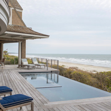
Housed atop a sand dune overlooking a crescent shaped beach, this updated innovative shingle style home replaced an existing vacation home our clients purchased a number of years ago. Significantly upgrading what was previously there, the single characteristic they wanted to maintain was a curved glass element that made the home distinctly identifiable from the beach. The height of the dune is unique for the area and well above flood plane which permits living space on all three levels of the home. Choreographed to fit within the natural landscape, guests entering the home from the front porch are immediately greeted with stunning views of the ocean. Delicate wood paneling and textural details are illuminated by abundant natural light flooding the home. East and West facing stairs are greeted with a wash of sunlight in the morning and evening, illuminating paths to breakfast and returning to rest. Photo by Brennan Wesley
Sponsored
Columbus, OH
Free consultation for landscape design!

Peabody Landscape Group
Columbus' Reliable Landscape Design & Contracting
 KS Designs LLC
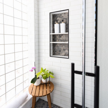
This guest bath has a light and airy feel with an organic element and pop of color. The custom vanity is in a midtown jade aqua-green PPG paint Holy Glen. It provides ample storage while giving contrast to the white and brass elements. A playful use of mixed metal finishes gives the bathroom an up-dated look. The 3 light sconce is gold and black with glass globes that tie the gold cross handle plumbing fixtures and matte black hardware and bathroom accessories together. The quartz countertop has gold veining that adds additional warmth to the space. The acacia wood framed mirror with a natural interior edge gives the bathroom an organic warm feel that carries into the curb-less shower through the use of warn toned river rock. White subway tile in an offset pattern is used on all three walls in the shower and carried over to the vanity backsplash. The shower has a tall niche with quartz shelves providing lots of space for storing shower necessities. The river rock from the shower floor is carried to the back of the niche to add visual interest to the white subway shower wall as well as a black Schluter edge detail. The shower has a frameless glass rolling shower door with matte black hardware to give the this smaller bathroom an open feel and allow the natural light in. There is a gold handheld shower fixture with a cross handle detail that looks amazing against the white subway tile wall. The white Sherwin Williams Snowbound walls are the perfect backdrop to showcase the design elements of the bathroom.
Photography by LifeCreated.
 Klopf Architecture
Klopf Architecture and Jesse Ososki Art remodeled an existing Eichler atrium home into a brighter, more open, and more functional version of its original self.
The goals were to preserve the Eichler look and feel without the need to strictly adhere to it. The scope of work included re-configuring the master bedroom/bath, the kitchen, and the hall bath/laundry area, as well as updating interior finishes throughout to be more sophisticated.
The owners are detail-oriented and were very involved in the design process, down to the selection of lighting controls and stainless steel faceplates.Their design aesthetic leans toward the Scandinavian — light and bright, with simple straight lines and pure geometric shapes.
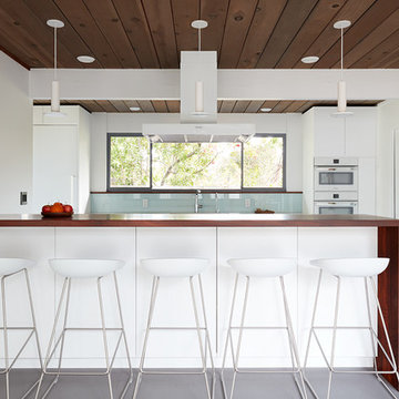
The finish flooring is large porcelain tile (24” x 24”) in a neutral grey tone, providing a uniform backdrop against which other materials can stand out. The same tile continues into the shower floor (with a different finish texture for slip-resistance) and up the shower/tub walls (in a smaller size). Heath Classic Field ceramic tile in Modern Blue was used sparingly, to add color at the hall bath vanity backsplash and at the shampoo niches in both bathrooms. Back-painted soda glass in pale blue to match the Heath tile was used at the kitchen backsplash. This same accent color was also used at the front entry atrium door. Kitchen cabinetry, countertops, appliances, and light fixtures are all white, making the kitchen feel more airy and light. Countertops are Caesarstone Blizzard.
The owners chose to keep some of the original Eichler elements: the concrete masonry fireplace; the stained tongue-and-groove redwood ceiling decking; and the luan wall paneling. The luan paneling was lightly sanded, cleaned, and re-stained. The owners also kept an added element that was installed by a previous owner: sliding shoji panels at all bedroom windows and sliding glass doors, for both privacy and sun control. Grooves were cut into the new tile flooring for the shoji panels to slide in, creating a more integrated look. Walnut was used to add warmth and contrast at the kitchen bar top and niche, the bathroom vanities, and the window sill/ledge under the kitchen window.
This Burlingame Eichler Remodel is a 2,121 sf, 4 bedroom/2 bath home located in the heart of Silicon Valley.
Klopf Architecture Project Team: John Klopf, Klara Kevane and Yegvenia Torres Zavala
Contractor: Jesse Ososki Art
Structural Engineer: Emmanuel Pun
Photography ©2018 Mariko Reed
Location: Burlingame, CA
Year completed: 2017
 User
UserSight & Sound
This clean modern south Oakville Ontario remodel proves you don’t need to move
to a condo to completely update your surroundings.
These Oakville empty nesters with an active social life aren't interested in “fuddy-duddy” decor.
On the contrary, they are interested in the latest design trends, as well as the most current audio/visual components.
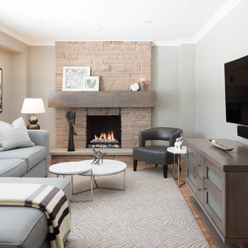
The original stone fireplace was updated with a custom designed mantle and a new gas insert. The updated warm grey
colour palette balances the natural stone making it an inviting focal point. The interior design included reconfiguring the room layout. Originally a smaller TV was located in-between the window and the fireplace and the sofa was where the current cabinet is now.
Our new layout opens up the room taking full advantage of it’s size. The sumptuous sectional allows for relaxed tete a tete
evenings as well as seating for larger groups. The additional leather occasional chair completes the conversation circle too. We naturally selected fabrics that are family friendly to ensure the grandchildren and adults can all be at ease. The flexibility of the 3
piece coffee table is both practical and adds an element of modern artistry. Grounding the room is a carpet graphic grey animal
skin custom sized into an area rug. Components as well as miscellaneous items are easily stored in the customised wood cabinet.
Stephani Buchman Photography
16