
Search results for "Allow" in Home Design Ideas
 Clark Design Build, LLC
This home is located on a one acre parcel of land near the banks of the Milwaukee River in the older established subdivision of Sleepy Hollow Estates in Mequon, Wisconsin. The inspiration for this Glen Cove Residence was to bring the desired by many, contemporary and modern lifestyle of a down town loft and establish it in a neighborhood in the suburbs amongst traditional style homes.
Sleepy Hollow Estates like many older established neighborhoods throughout the North shore and Westside communities of Milwaukee had great local architects such as John Randall McDonald and Russell Barr Williamson, who built contemporary master pieces amongst very traditional style homes. This created diversity in the style of homes in these neighborhoods which for the people living in them and the people just passing by, an experience of harmony and cultural lifestyle.
Unfortunately today, many new neighborhood developments lack harmony and cultural lifestyle and don’t allow for homes such as this Glen Cove Residence to be built. And for that matter many of the homes built by John Randall McDonald and Russell Barr Williamson back in the 1950’s. When driving through these new developments, one would experience beautiful traditional style homes, but all the homes tend to look the same. There is no diversity in the styles of homes thus these neighborhoods lack the harmony and a cultural life style for the people who live there or what people are looking for when buying a home that reflects their lifestyle. This Glen Cove Residence is an example that a contemporary home which offers a modern lifestyle that many desires can be established amongst traditional homes while blending in with the neighborhood.
Don’t be fooled by the flat roof of this home, building technology has come a long way since Frank Lloyd Wright! The roof system on this home is more energy efficient than most roof systems builders are putting on traditional homes today and it doesn’t leak! This Glen Cove Residence was built using all traditional building materials that you would see in homes being built in new developments today. There is a misconception out there that modern homes are expensive to build. That is not true! This Glen Cove Residence was built for roughly $130 per square foot which is the same price one would pay for a similar builder’s model traditional style home with the same upgrades.
This Glen Cove Residence consists of three bedrooms and three and one half baths. All bedrooms are located on second floor with laundry, guest bath and a master suite. Located between the first and second floors off of the landing is an office/den space. The first floor is open concept with the kitchen, dining and living areas located at the rear of the home with expansive windows allowing a great connection to back yard area and outdoors. On the back of the home is a covered deck area allowing for outdoor entertaining without the worry of the elements. The first floor also offers a powder room, mudroom and walk-in pantry off the kitchen area. From the mudroom there is access to an attached four car tandem garage. From the first floor to the finished basement is an open stair allowing the basement area to feel as part of the house and not just a basement? The basement consists of a main living area, game area with wet bar, exercise room, kids play room with 14’ ceilings, full bathroom and mechanical room with storage closets throughout.
 TKS Design Group
Download our free ebook, Creating the Ideal Kitchen. DOWNLOAD NOW
Lakefront property in the northwest suburbs of Chicago is hard to come by, so when we were hired by this young family with exactly that, we were immediately inspired by not just the unusually large footprint of this 1950’s colonial revival but also the lovely views of the manmade lake it was sited on. The large 5-bedroom home was solidly stuck in the 1980’s, but we saw tons of potential. We started out by updating the existing staircase with a fresh coat of paint and adding new herringbone slate to the entry hall.
The powder room off the entryway also got a refresh - new flooring, new cabinets and fixtures. We ran the new slate right through into this space for some consistency. A fun wallpaper and shiplap trim add a welcoming feel and set the tone for the home.
Next, we tackled the kitchen. Located away from the rest of the first floor, the kitchen felt a little isolated, so we immediately began planning for how to better connect it to the rest of the first floor. We landed on removing the wall between the kitchen and dining room and designed a modified galley style space with separate cooking and clean up zones. The cooking zone consists of the refrigerator, prep sink and cooktop, along with a nice long run of prep space at the island. The cleanup side of the kitchen consists of the main sink and dishwasher. Both areas are situated so that the user can view the lake during prep work and cleanup!
One of the home’s main puzzles was how to incorporate the mudroom and area in front of the patio doors at the back of the house. We already had a breakfast table area, so the space by the patio doors was a bit of a no man’s land. We decided to separate the kitchen proper from what became the new mudroom with a large set of barn doors. That way you can quickly hide any mudroom messes but have easy access to the light coming in through the patio doors as well as the outdoor grilling station. We also love the impact the barn doors add to the overall space.
The homeowners’ first words to us were “it’s time to ditch the brown,” so we did! We chose a lovely blue pallet that reflects the home’s location on the lake which is also vibrant yet easy on the eye. Countertops are white quartz, and the natural oak floor works well with the other honey accents. The breakfast table was given a refresh with new chairs, chandelier and window treatments that frame the gorgeous views of the lake out the back.
We coordinated the slate mudroom flooring with that used in the home’s main entrance for a consistent feel. The storage area consists of open and closed storage to allow for some clutter control as needed.
Next on our “to do” list was revamping the dated brown bar area in the neighboring dining room. We eliminated the clutter by adding some closed cabinets and did some easy updates to help the space feel more current. One snag we ran into here was the discovery of a beam above the existing open shelving that had to be modified with a smaller structural beam to allow for our new design to work. This was an unexpected surprise, but in the end we think it was well worth it!
We kept the colors here a bit more muted to blend with the homeowner’s existing furnishings. Open shelving and polished nickel hardware add some simple detail to the new entertainment zone which also looks out onto the lake!
Next we tackled the upstairs starting with the homeowner’s son’s bath. The bath originally had both a tub shower and a separate shower, so we decided to swap out the shower for a new laundry area. This freed up some space downstairs in what used to be the mudroom/laundry room and is much more convenient for daily laundry needs.
We continued the blue palette here with navy cabinetry and the navy tile in the shower. Porcelain floor tile and chrome fixtures keep maintenance to a minimum while matte black mirrors and lighting add some depth the design. A low maintenance runner adds some warmth underfoot and ties the whole space together.
We added a pocket door to the bathroom to minimize interference with the door swings. The left door of the laundry closet is on a 180 degree hinge to allow for easy full access to the machines. Next we tackled the master bath which is an en suite arrangement. The original was typical of the 1980’s with the vanity outside of the bathroom, situated near the master closet. And the brown theme continued here with multiple shades of brown.
Our first move was to segment off the bath and the closet from the master bedroom. We created a short hall from the bedroom to the bathroom with his and hers walk-in closets on the left and right as well as a separate toilet closet outside of the main bathroom for privacy and flexibility.
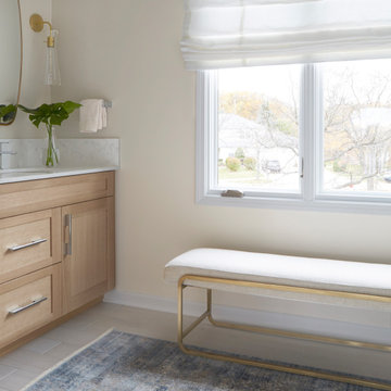
The original bathroom had a giant soaking tub with steps (dangerous!) as well as a small shower that did not work well for our homeowner who is 6’3”. With other bathtubs in the home, they decided to eliminate the tub and create an oversized shower which takes up the space where the old tub was located. The double vanity is on the opposite wall and a bench is located under the window for morning conversations and a place to set a couple of towels.
The pallet in here is light and airy with a mix of blond wood, creamy porcelain and marble tile, and brass accents. A simple roman shade adds some texture and it’s top-down mechanism allows for light and privacy.
This large whole house remodel gave our homeowners not only the ability to maximize the potential of their home but also created a lovely new frame from which to view their fabulous lake views.
Designed by: Susan Klimala, CKD, CBD
Photography by: Michael Kaskel
For more information on kitchen and bath design ideas go to: www.kitchenstudio-ge.com
 Design Perspective Interior Design, LLC
I was hired by my previous employer, Corvallis Custom Kitchens and Baths to assist these homeowners with all of the materials, fixtures and finish choices to complete this master bathroom remodel.
Brian Egan, owner and designer at CCKB in Sept 2017, since retired), designed this aging-in-place, accessible shower (previously a shower and separate soaker tub) for the clients who reside in an over 55 community here in Corvallis.
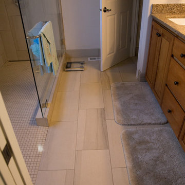
Large format 12x24 unpolished Crossville Kosmos Moonstruck tile was chosen for the bathroom floor and the shower walls to minimize grout lines. For the shower floor/pan small 1x1 DalTile Keystones Marble color tile was used to aid in making the floor feel extra slip resistant as the Keystones tiles do not have grittier feeling surface than porcelain tile.
For safety and a non-industrial look, Moen Align chrome designer grab bars were installed in the shower and toilet room. The handshower and rainshower head system by Grohe beautifully combines the 2 systems in one unit called Retrofit 160. To allow the homeowners to turn the shower on and warm up without them having to step in the direct spray of the shower head, the controls were placed under the window near the shower entry. This would also allow a helper to assist anyone using the shower in the future should the need arise.
A linear drain was installed to pull water away from the zero threshold shower entry. Installing a linear shower drain allows for a no threshold shower which can allow for the shower to be accessible with a walker or roll-in with a wheelchair as the shower was designed almost 40" wide.
The homeowners were thrilled with the transformation of their bathroom. The design and material choices fit their tastes and needs perfectly. Now they can continue to age in place and not worry about how they would be able to bathe if something were to decrease their mobility.
Photos by: H. Needham
Find the right local pro for your project
 Thomas Roszak Architecture, LLC
Photo credit: Scott McDonald @ Hedrich Blessing
7RR-Ecohome:
The design objective was to build a house for a couple recently married who both had kids from previous marriages. How to bridge two families together?
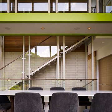
The design looks forward in terms of how people live today. The home is an experiment in transparency and solid form; removing borders and edges from outside to inside the house, and to really depict “flowing and endless space”. The house floor plan is derived by pushing and pulling the house’s form to maximize the backyard and minimize the public front yard while welcoming the sun in key rooms by rotating the house 45-degrees to true north. The angular form of the house is a result of the family’s program, the zoning rules, the lot’s attributes, and the sun’s path. We wanted to construct a house that is smart and efficient in terms of construction and energy, both in terms of the building and the user. We could tell a story of how the house is built in terms of the constructability, structure and enclosure, with a nod to Japanese wood construction in the method in which the siding is installed and the exposed interior beams are placed in the double height space. We engineered the house to be smart which not only looks modern but acts modern; every aspect of user control is simplified to a digital touch button, whether lights, shades, blinds, HVAC, communication, audio, video, or security. We developed a planning module based on a 6-foot square room size and a 6-foot wide connector called an interstitial space for hallways, bathrooms, stairs and mechanical, which keeps the rooms pure and uncluttered. The house is 6,200 SF of livable space, plus garage and basement gallery for a total of 9,200 SF. A large formal foyer celebrates the entry and opens up to the living, dining, kitchen and family rooms all focused on the rear garden. The east side of the second floor is the Master wing and a center bridge connects it to the kid’s wing on the west. Second floor terraces and sunscreens provide views and shade in this suburban setting. The playful mathematical grid of the house in the x, y and z axis also extends into the layout of the trees and hard-scapes, all centered on a suburban one-acre lot.
Many green attributes were designed into the home; Ipe wood sunscreens and window shades block out unwanted solar gain in summer, but allow winter sun in. Patio door and operable windows provide ample opportunity for natural ventilation throughout the open floor plan. Minimal windows on east and west sides to reduce heat loss in winter and unwanted gains in summer. Open floor plan and large window expanse reduces lighting demands and maximizes available daylight. Skylights provide natural light to the basement rooms. Durable, low-maintenance exterior materials include stone, ipe wood siding and decking, and concrete roof pavers. Design is based on a 2' planning grid to minimize construction waste. Basement foundation walls and slab are highly insulated. FSC-certified walnut wood flooring was used. Light colored concrete roof pavers to reduce cooling loads by as much as 15%. 2x6 framing allows for more insulation and energy savings. Super efficient windows have low-E argon gas filled units, and thermally insulated aluminum frames. Permeable brick and stone pavers reduce the site’s storm-water runoff. Countertops use recycled composite materials. Energy-Star rated furnaces and smart thermostats are located throughout the house to minimize duct runs and avoid energy loss. Energy-Star rated boiler that heats up both radiant floors and domestic hot water. Low-flow toilets and plumbing fixtures are used to conserve water usage. No VOC finish options and direct venting fireplaces maintain a high interior air quality. Smart home system controls lighting, HVAC, and shades to better manage energy use. Plumbing runs through interior walls reducing possibilities of heat loss and freezing problems. A large food pantry was placed next to kitchen to reduce trips to the grocery store. Home office reduces need for automobile transit and associated CO2 footprint. Plan allows for aging in place, with guest suite than can become the master suite, with no need to move as family members mature.
 Equilibrium Interior Design Inc
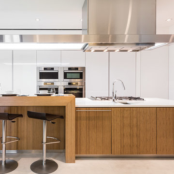
The sleek design allows you to move around the kitchen without protruding catching handles. The doors and drawers incorporate state of the art technology allowing for simple tap or push on the surface for the cabinetry to open. This is especially useful when your hands have food on them when you’re cooking as you are able to use your knee or thigh to activate doors to open. Even refrigerator and freezer have a fully integrated hidden custom pull handle that looks like a vertical reveal – this allows for good grip to pull the heavy doors with suction, and the white acrylic panels are very easy to keep clean.
Positions of two sinks on the island were specifically placed in the locations to facilitate the steps in food preparation - having them both on a single working surface makes it easier to work between them without dropping food or dripping water on the floors while preparing for cooking. Island incorporates a tall counter to sit at for a quick bite or just to stand around with you friends as you are preparing a meal. . This island truly is the heart of the kitchen and the heart of this home.
Photography: Craig Denis
 TKS Design Group
Free ebook, Creating the Ideal Kitchen. DOWNLOAD NOW
This project started out as a kitchen remodel but ended up as so much more. As the original plan started to take shape, some water damage provided the impetus to remodel a small upstairs hall bath. Once this bath was complete, the homeowners enjoyed the result so much that they decided to set aside the kitchen and complete a large master bath remodel. Once that was completed, we started planning for the kitchen!
The original kitchen was just large enough to accommodate an island and a separate pantry but felt a little cramped, especially during the weekends when the couple likes to entertain. The primary goal was to maintain the functionality of the current space, but to add some breathing room as well as to provide a view to the homeowner’s side yard and substantial Hosta garden.
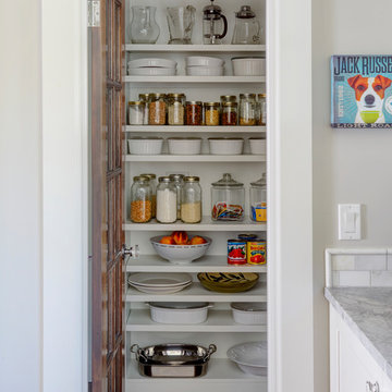
The solution was to bump out the space about 10 feet which provided ample room for large pro appliances, a large island for gathering and an upgraded pantry space. It was important to the homeowners to create a space that felt like it belonged in their historic 1866 home. Details such as matching new trim to the existing large custom profiles in the original home and re-purposing an existing door to be used for the new pantry, provided these touches. A large window at the main sink provides that view into the yard and a beautiful focal point for the room.
A mix of painted wood and stained cabinetry gives the new kitchen a sense of belonging in the older home, as do the Super White quartzite that has the look of marble, subway tile backsplash, polished nickel lanterns and glass and mirrored doors. The large pantry, filled with custom shelving built to the homeowner’s specifications, stainless steel appliances and the two Galley Workstations – sinks that do double duty as prep space – ensure that not only does the kitchen look great, but also functions in a personalized manner that works perfectly for the occupants.
Doing the bump out also allowed the opportunity for a small mudroom and powder room right off the kitchen as well as re-arranging some openings to allow for better traffic flow throughout the entire first floor. The result is a comfortable up-to-date home that feels both steeped in history yet allows for today’s style of living.
Designed by: Susan Klimala, CKD, CBD
Photography by: Michael Alan Kaskel
For more information on kitchen and bath design ideas go to: www.kitchenstudio-ge.com
 Cabinets & Designs
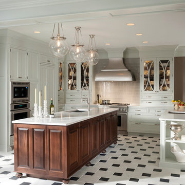
This white kitchen features white cabinets by Wood-Mode, a stainless steel vent hood along with stainless steel appliances, globe pendant lighting and recessed lighting. This white kitchen is tied together with a dark wooden island, which becomes the focal point of the kitchen. The glass cabinet fronts allow guests and family to easily find their way around the kitchen.
 A Direct Cabinet Distributor Corp
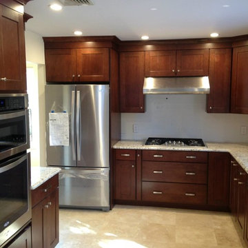
This New Hyde Park, NY customer came to us looking to not for not only a new updated kitchen, but a more functional kitchen. When our designer first walked into their existing kitchen, he noticed the microwave on the counter, soffits, and the large outdated double oven taking up a huge amount of usable space. Which all contributed to how small and closed off the room felt. These problems he knew he could fix with a new updated layout.
He designed the new kitchen with a new door way in the area the old double oven used to be. This made the room compatible with today's trends- open kitchen design with an airy flow. He suggested for the customer to purchase a micro/oven combo appliance, allowing them to free their counter tops up of that big bulky appliance. This also allowed the customers to choose a sleek new hood for over their cook top. Removal of the suffits allowed us to design with taller wall cabinets topped off with a beautiful cove crown.
Renovation done by: HOMEREDI
 Amanda Lantz Interiors
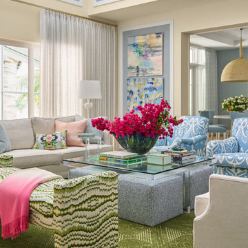
This custom green rug anchors the living area, paving the way for the great room’s bright palette. The swivel chairs covered in a sky-blue Ikat fabric allow a connection to the kitchen with just a twist, while an acrylic cocktail table stores four upholstered benches on casters. Custom drapery allow for a soft glow of natural light.
 Melton Design Build
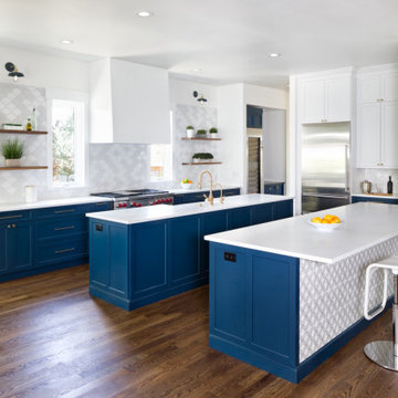
The kitchen remodel includes a cool white backsplash in the kitchen. This detail beautifully compliments the cool tones throughout the rest of the kitchen's tiles and kitchen cabinets. The highlight and most significant feature of this kitchen remodel has not one, but two kitchen islands. This allows for more working space, and more room to makes hosting more enjoyable. The brass detailing on the cabinets and kitchen sink is rich and warm, giving the perfect detail to this regal kitchen. We love a kitchen that can accommodate a wine fridge and mini-fridge for the family who loves to entertain and enjoys hosting. This kitchen includes open shelving while allowing for plenty of storage.
Photo by Mark Quentin / StudioQphoto.com
 MFI Limited
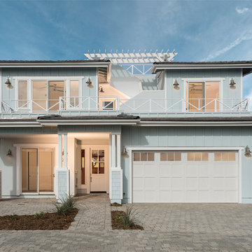
Coastal blue two-story house exterior idea in San Luis Obispo with a hip roof and a tile roof

 Noelle Johnson Landscape Consulting
Wilting tropical hibiscus leaves.
This is an example of a landscaping in Other.
This is an example of a landscaping in Other.
 ZeroEnergy Design
This renovated brick rowhome in Boston’s South End offers a modern aesthetic within a historic structure, creative use of space, exceptional thermal comfort, a reduced carbon footprint, and a passive stream of income.
DESIGN PRIORITIES. The goals for the project were clear - design the primary unit to accommodate the family’s modern lifestyle, rework the layout to create a desirable rental unit, improve thermal comfort and introduce a modern aesthetic. We designed the street-level entry as a shared entrance for both the primary and rental unit. The family uses it as their everyday entrance - we planned for bike storage and an open mudroom with bench and shoe storage to facilitate the change from shoes to slippers or bare feet as they enter their home. On the main level, we expanded the kitchen into the dining room to create an eat-in space with generous counter space and storage, as well as a comfortable connection to the living space. The second floor serves as master suite for the couple - a bedroom with a walk-in-closet and ensuite bathroom, and an adjacent study, with refinished original pumpkin pine floors. The upper floor, aside from a guest bedroom, is the child's domain with interconnected spaces for sleeping, work and play. In the play space, which can be separated from the work space with new translucent sliding doors, we incorporated recreational features inspired by adventurous and competitive television shows, at their son’s request.
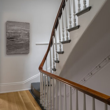
MODERN MEETS TRADITIONAL. We left the historic front facade of the building largely unchanged - the security bars were removed from the windows and the single pane windows were replaced with higher performing historic replicas. We designed the interior and rear facade with a vision of warm modernism, weaving in the notable period features. Each element was either restored or reinterpreted to blend with the modern aesthetic. The detailed ceiling in the living space, for example, has a new matte monochromatic finish, and the wood stairs are covered in a dark grey floor paint, whereas the mahogany doors were simply refinished. New wide plank wood flooring with a neutral finish, floor-to-ceiling casework, and bold splashes of color in wall paint and tile, and oversized high-performance windows (on the rear facade) round out the modern aesthetic.
RENTAL INCOME. The existing rowhome was zoned for a 2-family dwelling but included an undesirable, single-floor studio apartment at the garden level with low ceiling heights and questionable emergency egress. In order to increase the quality and quantity of space in the rental unit, we reimagined it as a two-floor, 1 or 2 bedroom, 2 bathroom apartment with a modern aesthetic, increased ceiling height on the lowest level and provided an in-unit washer/dryer. The apartment was listed with Jackie O'Connor Real Estate and rented immediately, providing the owners with a source of passive income.
ENCLOSURE WITH BENEFITS. The homeowners sought a minimal carbon footprint, enabled by their urban location and lifestyle decisions, paired with the benefits of a high-performance home. The extent of the renovation allowed us to implement a deep energy retrofit (DER) to address air tightness, insulation, and high-performance windows. The historic front facade is insulated from the interior, while the rear facade is insulated on the exterior. Together with these building enclosure improvements, we designed an HVAC system comprised of continuous fresh air ventilation, and an efficient, all-electric heating and cooling system to decouple the house from natural gas. This strategy provides optimal thermal comfort and indoor air quality, improved acoustic isolation from street noise and neighbors, as well as a further reduced carbon footprint. We also took measures to prepare the roof for future solar panels, for when the South End neighborhood’s aging electrical infrastructure is upgraded to allow them.
URBAN LIVING. The desirable neighborhood location allows the both the homeowners and tenant to walk, bike, and use public transportation to access the city, while each charging their respective plug-in electric cars behind the building to travel greater distances.
OVERALL. The understated rowhouse is now ready for another century of urban living, offering the owners comfort and convenience as they live life as an expression of their values.
Eric Roth Photo
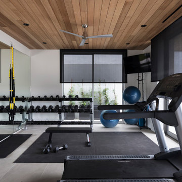
 Eyoh Design
Louisa, San Clemente Coastal Modern Architecture
The brief for this modern coastal home was to create a place where the clients and their children and their families could gather to enjoy all the beauty of living in Southern California. Maximizing the lot was key to unlocking the potential of this property so the decision was made to excavate the entire property to allow natural light and ventilation to circulate through the lower level of the home.
A courtyard with a green wall and olive tree act as the lung for the building as the coastal breeze brings fresh air in and circulates out the old through the courtyard.
The concept for the home was to be living on a deck, so the large expanse of glass doors fold away to allow a seamless connection between the indoor and outdoors and feeling of being out on the deck is felt on the interior. A huge cantilevered beam in the roof allows for corner to completely disappear as the home looks to a beautiful ocean view and Dana Point harbor in the distance. All of the spaces throughout the home have a connection to the outdoors and this creates a light, bright and healthy environment.
Passive design principles were employed to ensure the building is as energy efficient as possible. Solar panels keep the building off the grid and and deep overhangs help in reducing the solar heat gains of the building. Ultimately this home has become a place that the families can all enjoy together as the grand kids create those memories of spending time at the beach.
Images and Video by Aandid Media.
 Vetter Architects
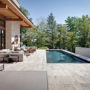
The owners requested a Private Resort that catered to their love for entertaining friends and family, a place where 2 people would feel just as comfortable as 42. Located on the western edge of a Wisconsin lake, the site provides a range of natural ecosystems from forest to prairie to water, allowing the building to have a more complex relationship with the lake - not merely creating large unencumbered views in that direction. The gently sloping site to the lake is atypical in many ways to most lakeside lots - as its main trajectory is not directly to the lake views - allowing for focus to be pushed in other directions such as a courtyard and into a nearby forest.
The biggest challenge was accommodating the large scale gathering spaces, while not overwhelming the natural setting with a single massive structure. Our solution was found in breaking down the scale of the project into digestible pieces and organizing them in a Camp-like collection of elements:
- Main Lodge: Providing the proper entry to the Camp and a Mess Hall
- Bunk House: A communal sleeping area and social space.
- Party Barn: An entertainment facility that opens directly on to a swimming pool & outdoor room.
- Guest Cottages: A series of smaller guest quarters.
- Private Quarters: The owners private space that directly links to the Main Lodge.
These elements are joined by a series green roof connectors, that merge with the landscape and allow the out buildings to retain their own identity. This Camp feel was further magnified through the materiality - specifically the use of Doug Fir, creating a modern Northwoods setting that is warm and inviting. The use of local limestone and poured concrete walls ground the buildings to the sloping site and serve as a cradle for the wood volumes that rest gently on them. The connections between these materials provided an opportunity to add a delicate reading to the spaces and re-enforce the camp aesthetic.
The oscillation between large communal spaces and private, intimate zones is explored on the interior and in the outdoor rooms. From the large courtyard to the private balcony - accommodating a variety of opportunities to engage the landscape was at the heart of the concept.
Overview
Chenequa, WI
Size
Total Finished Area: 9,543 sf
Completion Date
May 2013
Services
Architecture, Landscape Architecture, Interior Design
 Splash Pools & Construction
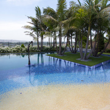
A quick look through the glass front door of this home allows you to see through the house to the paradise that awaits. Toll Brothers desired for this luxurious zero edge, beach entry pool to include a cabana with a spa capable of being closed-off entirely. Expert design and installation left them completely enamored with their outdoor space.
The cabana was constructed at pool level, with a zero edge completely around it, requiring the footings to actually be built into the pool. It showcases a large water feature, as well as glass walls that can completely close, providing privacy for the spa. We worked alongside the contractor for the cabana while constructing the pool so that we could properly install the elements for both portions of the project.
The beach entry has several colors of mosaic tile, installed by hand to create a gradient of color, as though walking from sand to deeper water. The entire front portion of the pool is a beach entry, allowing guests to walk straight from the outdoor patio into the pool. The back of the pool is a negative edge, creating an expansive, ocean-like feel to the space.
The landscape was designed to coordinate perfectly with the pool, featuring a large grassy peninsula that jets into the water. Multi-trunk King Palms were craned over the house and delicately placed into the middle of this oasis. They are surrounded by artificial turf ensuring easy maintenance and a clean line along the zero edge.
This luxurious, resort-style pool and spa allows ample space for lounging on the beach, relaxing in the spa and swimming in the colorful lagoon. The owners could not be happier with their beach-themed paradise.
Toll Brothers the Enclave at Yorba Linda
 Form Collective
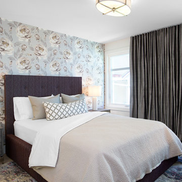
Mid-sized transitional master light wood floor and beige floor bedroom photo in Vancouver with multicolored walls
 Astro Design Inc.
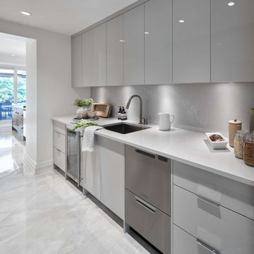
This kitchen was designed with the intent of hosting large family gatherings, upwards of twenty people at a time. Locating the kitchen adjacent to the informal eating area, the family room and the patio, was the ideal choice for entertaining. The implementation of a large double island, in an unexpected “L” shape, allowed for a ton of extra space without consequently feeling like an industrial environment.
The choice to panel the expansive fridge and freezer allowed the mirrored stainless-steel display cabinets to really become a focal point in the space. These cabinets worked perfectly to house the client’s large stemware collection. Repeating the mirrored finish on the other side of the room, with a refined hood fan exudes glamour. Lastly, the sophisticated hardware and sculptural light fixtures elevate this kitchen to the contemporary, yet traditional, formal style found throughout the rest of the home.
 HR DESIGN DEPT
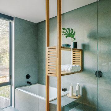
The Watonga residence was commissioned by a woman with a big heart for animal fostering. She wanted a house that felt private from the street but visually and physically connected to the backyard. The house needed to consider the typology and scale of the existing neighborhood, and it needed durable materials to accommodate little paws. Finally, it had to support an environmentally conscientious life. The house was intentionally placed on the short end of an irregularly shaped lot, allowing the living spaces to open up to a large native landscape and adjacent lot containing a significant tree grove. This siting allowed for a passive orientation where window walls face north and exposure to the south and west is minimal.
The interior is light-filled, capturing expansive landscape views of an established oak grove to the North and bayou views to the East. A carefully choreographed entry vestibule and screen shield create interior privacy from the street. A two-story volume fills the center of the home with warm, southern light. A palette of tile, Texas stone, and concrete are used for budget friendly durability. The house is derived from a simple diagram with utilitarian functions placed in the stone box and living in a minimal gabled roof that supports solar panel orientation and rainwater collection.
At its core, this home is designed for family, foster dogs, well-curated music, and Aggie game days.
 Plain & Posh
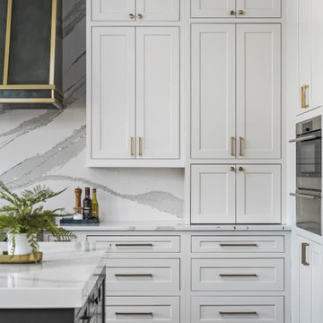
This stunning home is a combination of the best of traditional styling with clean and modern design, creating a look that will be as fresh tomorrow as it is today. Traditional white painted cabinetry in the kitchen, combined with the slab backsplash, a simpler door style and crown moldings with straight lines add a sleek, non-fussy style. An architectural hood with polished brass accents and stainless steel appliances dress up this painted kitchen for upscale, contemporary appeal. The kitchen islands offers a notable color contrast with their rich, dark, gray finish.
The stunning bar area is the entertaining hub of the home. The second bar allows the homeowners an area for their guests to hang out and keeps them out of the main work zone.
The family room used to be shut off from the kitchen. Opening up the wall between the two rooms allows for the function of modern living. The room was full of built ins that were removed to give the clean esthetic the homeowners wanted. It was a joy to redesign the fireplace to give it the contemporary feel they longed for.
Their used to be a large angled wall in the kitchen (the wall the double oven and refrigerator are on) by straightening that out, the homeowners gained better function in the kitchen as well as allowing for the first floor laundry to now double as a much needed mudroom room as well.
80