
Search results for "Also developed" in Home Design Ideas
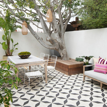
 Meridith Baer Home
Staged for Michael McCraine, Compass
Photos by Cater Photography
Eclectic patio photo in Los Angeles
Eclectic patio photo in Los Angeles
 Jay Sifford
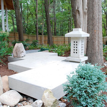
We needed a bridge to cross the dry creek bed, so I designed a version of a Japanese yatsuhashi, or zig zag, bridge. It is clad in concrete backer board. I wanted to simulate a granite mountain plateau with a boulder peak. The client purchased the concrete lantern which perfectly complements the entrance to this woodland garden.
Photo by Jay Sifford
 Hoi Ning Wong
Photo: Hoi Ning Wong © 2014 Houzz
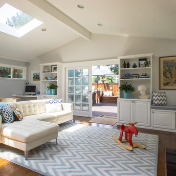
Example of a transitional formal and open concept medium tone wood floor living room design in San Francisco with white walls, a standard fireplace and a wall-mounted tv
Example of a transitional formal and open concept medium tone wood floor living room design in San Francisco with white walls, a standard fireplace and a wall-mounted tv
Find the right local pro for your project

 Drewett Works
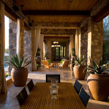
This Ranch Hacienda hillside estate boasts well over 13,000 square feet under roof. A loggia serves as the backbone for the design. Each space, both interior and exterior, has a direct response to the linear expression of outdoor space.
The exterior materials and detailing are rustic and simple in nature. The mass and scale create drama and correspond to the vast desert skyline and adjacent majestic McDowell mountain views.
Features of the house include a motor court with dual garages, a separate guest quarters, and a walk-in cooler.
Silverleaf is known for its embodiment of traditional architectural styles, and this house expresses the essence of a hacienda with its communal courtyard spaces and quiet luxury.
This was the first project of many designed by Architect C.P. Drewett for construction in Silverleaf, located in north Scottsdale.
Project Details:
Architecture | C.P. Drewett, AIA, DrewettWorks, Scottsdale, AZ
Builder | Sonora West Development, Scottsdale, AZ
Photography | Dino Tonn, Scottsdale, AZ
 Haven Design and Construction
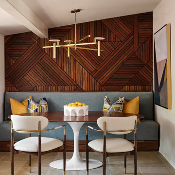
One functional challenge was that the home did not have a pantry. MCM closets were historically smaller than the walk-in closets and pantries of today. So, we printed out the home’s floorplan and began sketching ideas. The breakfast area was quite large, and it backed up to the primary bath on one side and it also adjoined the main hallway. We decided to reconfigure the large breakfast area by making part of it into a new walk-in pantry. This gave us the extra space we needed to create a new main hallway, enough space for a spacious walk-in pantry, and finally, we had enough space remaining in the breakfast area to add a cozy built-in walnut dining bench. Above the new dining bench, we designed and incorporated a geometric walnut accent wall to add warmth and texture.
 Windscapes Landscaping
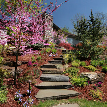
Inspiration for a mid-sized traditional full sun backyard stone landscaping in Grand Rapids.

 Drewett Works
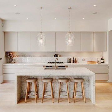
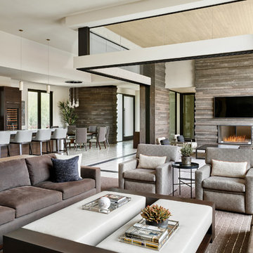
This photo: Interior designer Claire Ownby, who crafted furniture for the great room's living area, took her cues for the palette from the architecture. The sofa's Roma fabric mimics the Cantera Negra stone columns, chairs sport a Pindler granite hue, and the Innovations Rodeo faux leather on the coffee table resembles the floor tiles. Nearby, Shakuff's Tube chandelier hangs over a dining table surrounded by chairs in a charcoal Pindler fabric.
Positioned near the base of iconic Camelback Mountain, “Outside In” is a modernist home celebrating the love of outdoor living Arizonans crave. The design inspiration was honoring early territorial architecture while applying modernist design principles.
Dressed with undulating negra cantera stone, the massing elements of “Outside In” bring an artistic stature to the project’s design hierarchy. This home boasts a first (never seen before feature) — a re-entrant pocketing door which unveils virtually the entire home’s living space to the exterior pool and view terrace.
A timeless chocolate and white palette makes this home both elegant and refined. Oriented south, the spectacular interior natural light illuminates what promises to become another timeless piece of architecture for the Paradise Valley landscape.
Project Details | Outside In
Architect: CP Drewett, AIA, NCARB, Drewett Works
Builder: Bedbrock Developers
Interior Designer: Ownby Design
Photographer: Werner Segarra
Publications:
Luxe Interiors & Design, Jan/Feb 2018, "Outside In: Optimized for Entertaining, a Paradise Valley Home Connects with its Desert Surrounds"
Awards:
Gold Nugget Awards - 2018
Award of Merit – Best Indoor/Outdoor Lifestyle for a Home – Custom
The Nationals - 2017
Silver Award -- Best Architectural Design of a One of a Kind Home - Custom or Spec
http://www.drewettworks.com/outside-in/

 Milgard Windows & Doors
The Kiguchi family moved into their Austin, Texas home in 1994. Built in the 1980’s as part of a neighborhood development, they happily raised their family here but longed for something more contemporary. Once they became empty nesters, they decided it was time for a major remodel. After spending many years visiting Austin AIA Home Tours that highlight contemporary residential architecture, they had a lot of ideas and in 2013 were ready to interview architects and get their renovation underway.
The project turned into a major remodel due to an unstable foundation. Architects Ben Arbib and Ed Hughey, of Arbib Hughey Design were hired to solve the structural issue and look for inspiration in the bones of the house, which sat on top of a hillside and was surrounded by great views.
Unfortunately, with the old floor plan, the beautiful views were hidden by small windows that were poorly placed. In order to bring more natural light into the house the window sizes and configurations had to be addressed, all while keeping in mind the homeowners desire for a modern look and feel.
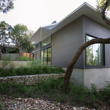
To achieve a more contemporary and sophisticated front of house, a new entry was designed that included removing a two-story bay window and porch. The entrance of the home also became more integrated with the landscape creating a template for new foliage to be planted. Older exterior materials were updated to incorporate a more muted palette of colors with a metal roof, dark grey siding in the back and white stucco in the front. Deep eaves were added over many of the new large windows for clean lines and sun protection.
“Inside it was about opening up the floor plan, expanding the views throughout the house, and updating the material palette to get a modern look that was also warm and inviting,” said Ben from Arbib Hughey Design. “Prior to the remodel, the house had the typical separation of rooms. We removed the walls between them and changed all of the windows to Milgard Thermally Improved Aluminum to connect the inside with the outside. No matter where you are you get nice views and natural light.”
The architects wanted to create some drama, which they accomplished with the window placement and opening up the interior floor plan to an open concept approach. Cabinetry was used to help delineate intimate spaces. To add warmth to an all-white living room, white-washed oak wood floors were installed and pine planks were used around the fireplace. The large windows served as artwork bringing the color of nature into the space.
An octagon shaped, elevated dining room, (named “the turret”), had a big impact on the design of the house. They architects rounded the corners and added larger window openings overlooking a new sunken garden. The great room was also softened by rounding out the corners and that circular theme continued throughout the house, being picked up in skylight wells and kitchen cabinetry. A staircase leading to a catwalk was added and the result was a two-story window wall that flooded the home with natural light.
When asked why Milgard® Thermally Improved Aluminum windows were selected, the architectural team listed many reasons:
1) Aesthetics: “We liked the slim profiles and narrow sightlines. The window frames never get in the way of the view and that was important to us. They also have a very contemporary look that went well with our design.”
2) Options: “We liked that we could get large sliding doors that matched the windows, giving us a very cohesive look and feel throughout the project.”
3) Cost Effective: “Milgard windows are affordable. You get a good product at a good price.”
4) Custom Sizes: “Milgard windows are customizable, which allowed us to get the right window for each location.”
Ready to take on your own traditional to modern home remodeling project? Arbib Hughey Design advises, “Work with a good architect. That means picking a team that is creative, communicative, listens well and is responsive. We think it’s important for an architect to listen to their clients and give them something they want, not something the architect thinks they should have. At the same time you want an architect who is willing and able to think outside the box and offer up design options that you may not have considered. Design is about a lot of back and forth, trying out ideas, getting feedback and trying again.”
The home was completely transformed into a unique, contemporary house perfectly integrated with its site. Internally the home has a natural flow for the occupants and externally it is integrated with the surroundings taking advantage of great natural light. As a side note, it was highly praised as part of the Austin AIA homes tour.
 Earth Design, Inc.
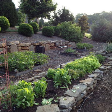
The owners of this vegetable garden purchased the undeveloped lot adjacent to their home and developed the sloping area into a collection of raised beds. - Photo by Kevin Bost
 Thomas Roszak Architecture, LLC
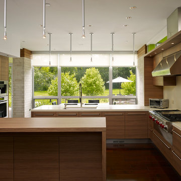
Photo credit: Scott McDonald @ Hedrich Blessing
7RR-Ecohome:
The design objective was to build a house for a couple recently married who both had kids from previous marriages. How to bridge two families together?
The design looks forward in terms of how people live today. The home is an experiment in transparency and solid form; removing borders and edges from outside to inside the house, and to really depict “flowing and endless space”. The house floor plan is derived by pushing and pulling the house’s form to maximize the backyard and minimize the public front yard while welcoming the sun in key rooms by rotating the house 45-degrees to true north. The angular form of the house is a result of the family’s program, the zoning rules, the lot’s attributes, and the sun’s path. We wanted to construct a house that is smart and efficient in terms of construction and energy, both in terms of the building and the user. We could tell a story of how the house is built in terms of the constructability, structure and enclosure, with a nod to Japanese wood construction in the method in which the siding is installed and the exposed interior beams are placed in the double height space. We engineered the house to be smart which not only looks modern but acts modern; every aspect of user control is simplified to a digital touch button, whether lights, shades, blinds, HVAC, communication, audio, video, or security. We developed a planning module based on a 6-foot square room size and a 6-foot wide connector called an interstitial space for hallways, bathrooms, stairs and mechanical, which keeps the rooms pure and uncluttered. The house is 6,200 SF of livable space, plus garage and basement gallery for a total of 9,200 SF. A large formal foyer celebrates the entry and opens up to the living, dining, kitchen and family rooms all focused on the rear garden. The east side of the second floor is the Master wing and a center bridge connects it to the kid’s wing on the west. Second floor terraces and sunscreens provide views and shade in this suburban setting. The playful mathematical grid of the house in the x, y and z axis also extends into the layout of the trees and hard-scapes, all centered on a suburban one-acre lot.
Many green attributes were designed into the home; Ipe wood sunscreens and window shades block out unwanted solar gain in summer, but allow winter sun in. Patio door and operable windows provide ample opportunity for natural ventilation throughout the open floor plan. Minimal windows on east and west sides to reduce heat loss in winter and unwanted gains in summer. Open floor plan and large window expanse reduces lighting demands and maximizes available daylight. Skylights provide natural light to the basement rooms. Durable, low-maintenance exterior materials include stone, ipe wood siding and decking, and concrete roof pavers. Design is based on a 2' planning grid to minimize construction waste. Basement foundation walls and slab are highly insulated. FSC-certified walnut wood flooring was used. Light colored concrete roof pavers to reduce cooling loads by as much as 15%. 2x6 framing allows for more insulation and energy savings. Super efficient windows have low-E argon gas filled units, and thermally insulated aluminum frames. Permeable brick and stone pavers reduce the site’s storm-water runoff. Countertops use recycled composite materials. Energy-Star rated furnaces and smart thermostats are located throughout the house to minimize duct runs and avoid energy loss. Energy-Star rated boiler that heats up both radiant floors and domestic hot water. Low-flow toilets and plumbing fixtures are used to conserve water usage. No VOC finish options and direct venting fireplaces maintain a high interior air quality. Smart home system controls lighting, HVAC, and shades to better manage energy use. Plumbing runs through interior walls reducing possibilities of heat loss and freezing problems. A large food pantry was placed next to kitchen to reduce trips to the grocery store. Home office reduces need for automobile transit and associated CO2 footprint. Plan allows for aging in place, with guest suite than can become the master suite, with no need to move as family members mature.
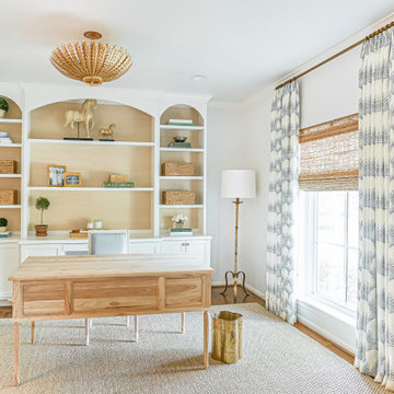
Study room - mid-sized transitional freestanding desk medium tone wood floor and brown floor study room idea in Houston with white walls
Sponsored
Columbus, OH
We Design, Build and Renovate

CHC & Family Developments
Industry Leading General Contractors in Franklin County, Ohio
 Tile X Design
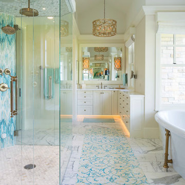
Project: Minnetonka Residence
Builder: Robert Craig Homes
Designer: Stephanie McKenna
Installer: Miller Tile
Products: TXD Stone & Glass Imports
Elegant master blue tile, multicolored tile and white tile marble floor bathroom photo in Minneapolis with white cabinets and beige walls
Elegant master blue tile, multicolored tile and white tile marble floor bathroom photo in Minneapolis with white cabinets and beige walls
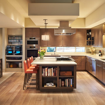
 Bristal Design
Benjamin Benschneider- Seattle, WA
Vuecrest house, Bellevue, Washington. Image license: Bristal Design Group and Design Guild Homes© Copyright 2015 Benjamin Benschneider All Rights Reserved. Usage may be arranged by contacting Benjamin Benschneider Photography. Email: bbenschneider@comcast.net or phone: 206-789-5973
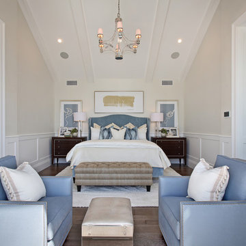
 Brandon Architects, Inc.
JERI KOEGEL
Beach style guest medium tone wood floor bedroom photo in Orange County with white walls
Beach style guest medium tone wood floor bedroom photo in Orange County with white walls
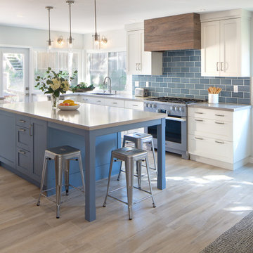
 Audry Cordero, NKBA at Design Studio West
This beautiful kitchen is perfect for friends and family to gather around, cook meals together, or to simply enjoy an afternoon of baking with the kids. The large central island has plenty of storage including a mixer lift, a microwave drawer, and trash/recycle bins. Easy maintenance and kid friendly with plenty of storage were on top of our list.
Cabinets: Sollera Cabinets, Custom Colors
Sponsored
Columbus, OH

Hope Restoration & General Contracting
Columbus Design-Build, Kitchen & Bath Remodeling, Historic Renovations
 USI Design & Remodeling
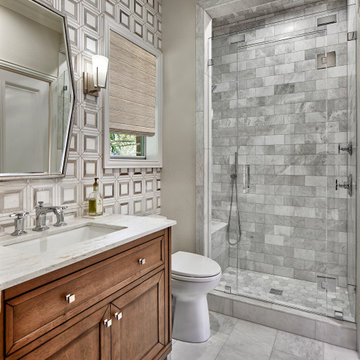
Design and construction by USI.
Elements of multi-room renovation include:
-Curated design theme
-Managing flow
-Appliance re-assignments
-Plumbing relocations
-Tub to shower conversions
 Mia Rao Design
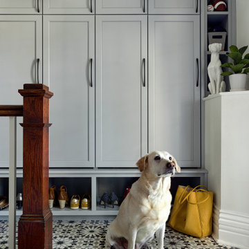
Built-in lockers for coat and shoe storage is perfect for this family of five. Patterned concrete tiles will perform well and add some fun to this mudroom.
 Simply Home Decorating
This beautiful North Vancouver home belongs to a nature-loving and health-conscious couple, Emma and Vince (names changed), their two young children, and their dog, Jasper. When they contacted us about renovating and furnishing their kitchen and family room, we walked in and saw a world of potential waiting to be uncovered.
Before: Larkhall Crescent Home:
Like many original North Vancouver homes, the interior was definitely dated. We encountered late ‘80s finishes in powder pink and teal green, old carpet, and a kitchen that wasn’t maximized to suit this family’s modern-day lifestyle. However, the size of the rooms offered us a ton of space with which to get creative.
Knowing our clients’ love of cooking, need for work spaces (Emma and Vince both work remotely), and growing family, we developed a design concept that would increase usable space, optimize storage, and create intimacy in this large area. As for the style, we were inspired by their European roots, inventing a new and modern take on “Belgian Farmhouse” style. Now, the home is truly one-of-a-kind.
After: Warm & Cozy Family Room:
Fresh, bright, and comfortable, this living area has been transformed! We started with the fireplace as a focal point, selecting aged brick tiles for added texture and a crisp wood mantle. The taupe-coloured sectional infuses the room with visual warmth and serves the added purpose of separating the family room from the kitchen.
Emma and Vince were also keen on using non-toxic materials in their home, and we were happy to oblige. To meet their needs, we sourced natural wood elements and sought out Canadian-made products - that adhere to high health standards - whenever possible.
Look closer at the elements of this space, and you will find this stunning, honeycomb-patterned rug in earthy gold, beige, and charcoal tones. It’s plush to the touch and full of visual texture that brings this room’s colour palette together. We sourced these two-tone chairs with caning, petrified wood side table, black sconces, and botanical prints in greyscale from local artist, Heather Johnston.
We topped off the space with this dark wood and rattan console that offers storage facing the kitchen and presents an opportunity to display cherished items. The result is a cozy lounging space brimming with comfort and functionality. It’s perfect for enjoying quality family time, or Emma can simply slide the coffee table away to make room for her morning yoga practice.
Now, let’s turn around and give some attention to the kitchen. Do you remember what the original kitchen looked like? If not, scroll back up, because the transformation is shocking…
Moody & Welcoming Kitchen for Healthy Living:
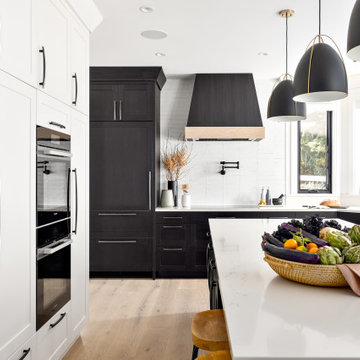
This kitchen looks very different from how it started, right? Though we didn’t touch any walls, the kitchen has almost doubled in usable space! We created a long, extended island with storage, an outlet for small appliances, and seating for comfortable prep, after-school snacking, or mingling among friends.
On the other side of the island, the family has even more storage and an integrated dishwasher within easy reach of the sink, perfect for quick clean-up. From this angle, you can also see the expansive custom Shaker cabinetry in white and the integrated double ovens. These facilitate their cooking experience and gave us the opportunity to add an additional surprise…
A coffee garage station and more hidden storage! Keeping these items located along the perimeter allows them to be accessed by the family or their guests without someone getting under the cook’s feet. These are the little details that make everyday life easier and more enjoyable.
Moving deeper into the kitchen, the seamless induction cooktop topped with a freestanding concealed hood fan commands attention in a soft yet prominent way. The natural wood accent mirrors the fireplace mantle, and the choice of off-black wood-grain cabinets not only continues our black-and-white colour palette but adds a sense of depth and contrast. The corner sink is located to the right and perfectly positioned with a view of their thriving backyard.
To invite more of this family’s character into the space, we mixed metals for interest — matte black, dark pewter, and warm brass — and created open shelves in white oak for their plants and decor. You can also glimpse the tumbled edge of the backsplash tile, which echoes the rustic brick of the fireplace. It adds that farmhouse charm while still feeling timeless and sophisticated.
Last but not least, we designed this dining banquette in the bay window (with integrated bench storage, of course), where the family can share a meal together, the kids can do homework, or Emma and Vince can work and enjoy a change of scenery from their offices. Like the other spaces in the home, it was designed to be beautiful, multi-functional, and long-lasting.
Praise from Our Clients:
It is clear that we love this home, but what did our clients have to say?
“Lori is a visionary and masters execution to the finest detail all at the same time. When she first met us to know more about who we are and how we live, she could right away envision how we could use the space in our kitchen and living room…The results exceeded our expectations.
Lori and her team were also a delight to work with — coordination with all the trades, fast problem-solving, regular updates, professional and friendly attitude of her entire team — made it the dream team. Thank you SHD for making our space so beautiful!”
In turn, we are so grateful for this family’s trust, their open communication, and for being wonderful people with whom to work. (So, thank you!)
49