
Search results for "Appropriately" in Home Design Ideas
 Cathie Hong Interiors
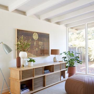
This 1956 John Calder Mackay home had been poorly renovated in years past. We kept the 1400 sqft footprint of the home, but re-oriented and re-imagined the bland white kitchen to a midcentury olive green kitchen that opened up the sight lines to the wall of glass facing the rear yard. We chose materials that felt authentic and appropriate for the house: handmade glazed ceramics, bricks inspired by the California coast, natural white oaks heavy in grain, and honed marbles in complementary hues to the earth tones we peppered throughout the hard and soft finishes. This project was featured in the Wall Street Journal in April 2022.
 Dig Your Garden Landscape Design
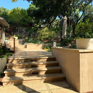
APLD 2021 Silver Award Winning Landscape Design. An expansive back yard landscape with several mature oak trees and a stunning Golden Locust tree has been transformed into a welcoming outdoor retreat. The renovations include a wraparound deck, an expansive travertine natural stone patio, stairways and pathways along with concrete retaining walls and column accents with dramatic planters. The pathways meander throughout the landscape... some with travertine stepping stones and gravel and those below the majestic oaks left natural with fallen leaves. Raised vegetable beds and fruit trees occupy some of the sunniest areas of the landscape. A variety of low-water and low-maintenance plants for both sunny and shady areas include several succulents, grasses, CA natives and other site-appropriate Mediterranean plants complimented by a variety of boulders. Dramatic white pots provide architectural accents, filled with succulents and citrus trees. Design, Photos, Drawings © Eileen Kelly, Dig Your Garden Landscape Design
 Dibello Architects, PLLC
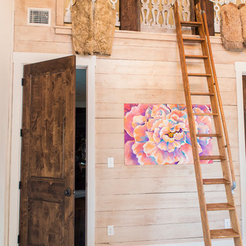
The 3,400 SF, 3 – bedroom, 3 ½ bath main house feels larger than it is because we pulled the kids’ bedroom wing and master suite wing out from the public spaces and connected all three with a TV Den.
Convenient ranch house features include a porte cochere at the side entrance to the mud room, a utility/sewing room near the kitchen, and covered porches that wrap two sides of the pool terrace.
We designed a separate icehouse to showcase the owner’s unique collection of Texas memorabilia. The building includes a guest suite and a comfortable porch overlooking the pool.
The main house and icehouse utilize reclaimed wood siding, brick, stone, tie, tin, and timbers alongside appropriate new materials to add a feeling of age.
Find the right local pro for your project
 InsideWright
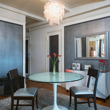
The room was dark brown, which was fine for a while ... but for an entranceway and a room without windows, dark was not an appropriate long term choice. There was a feng shui request in this re-decorating project, earth tones were not welcome in this area of the home, black, white, metal and water were preferable colors/elements. The walls are 2 layers of metallic paint, the undercoat is a silver, the top coat is a gunmetal mixed with the silver to create an uneven tone. A wide wallpaper paste brush was used to create a vertical linear pattern. The Larson Juhl gold leaf framed mirror is covered in adhesive car vinyl. The Ikea unit is enveloped in an adhesive mural, printed by muralsyourway.com, the artist is David Bromstad. The chair seats were recovered in a silver vinyl fabric. The rug is from overstock.com. The capiz chandelier is from West Elm. The table base is an Ikea take on the Eero Saarinen tulip table. In the "before" room, there were glass tables cluttered with everyday items and "to do" piles of paper. The goal was to have storage in this room to hide the clutter. There was not an outlet on the wall where the Ikea unit sits, and there was not a budget to have the prewar wall fitted with electricity, so an extension cord crosses the room under a grey cord concealer.
 Black + Vernooy Architects
Designed by Black + Vernooy, built by Schatz Homes
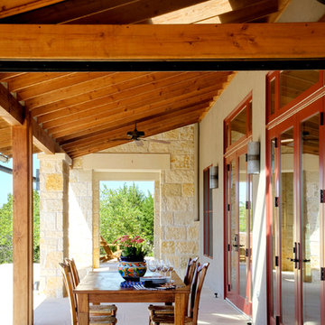
Designed to accommodate the clients' desire for a house that "sits beautifully and confidently" on its dramatic ridge-top site, the Mirador Residence takes full advantage of the site's natural terracing and sweeping Hill Country views by providing seamless transitions to its generous outdoor living spaces. The plan expresses the owner’s casual lifestyle and need for a variety of spaces strongly connected to the outdoors. Central Texas materials, such as native limestone and aromatic cedar, are chosen for their regional appropriateness and are deployed and detailed in ways designed to further integrate the house with its natural surroundings. The house comprises approximately 5900 square feet of living space wrapped around a hillside courtyard, and was completed in 2005.
 Garden Stories
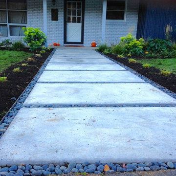
Poured concrete pavers set in smooth Mexican beach pebbles. This north-facing front yard features appropriate naturalistic planting.
Photo of a mid-sized mid-century modern drought-tolerant and partial sun front yard concrete paver landscaping in Portland.
Photo of a mid-sized mid-century modern drought-tolerant and partial sun front yard concrete paver landscaping in Portland.
 Ingrid Ramsay Designs
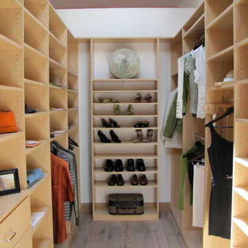
Spacious M.Closet with Melamine Maple-look closet system, fully adjustable;
photo: Roberta Hall
Walk-in closet - mid-sized contemporary gender-neutral light wood floor walk-in closet idea in San Francisco with flat-panel cabinets
Walk-in closet - mid-sized contemporary gender-neutral light wood floor walk-in closet idea in San Francisco with flat-panel cabinets
 Fenton W. Varney - Master Builders
Entry
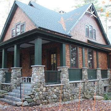
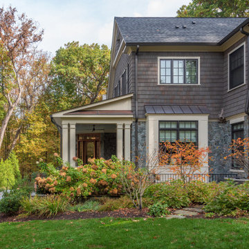
Large craftsman brown two-story wood exterior home idea in Manchester
Large craftsman brown two-story wood exterior home idea in Manchester

 Magic Landscaping, Inc.
Magic Landscaping, Inc- New Jersey Landscape Designer & Contractor.
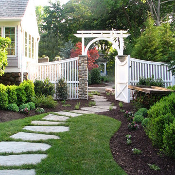
This is an example of a traditional landscaping in New York.
This is an example of a traditional landscaping in New York.
 Amanda Martocchio Architecture
Michael Moran/OTTO photography.
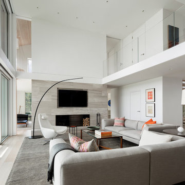
The objective of this award-winning gut renovation was to create a spatially dynamic, light-filled, and energy-efficient home with a strong connection to Long Island Sound. The design strategy is straightforward: a gabled roof covers a central “spine” corridor that terminates with cathedral ceilinged spaces at both ends. The relocated approach and entry deposit visitors into the front hall with its curvilinear, cantilevered stair. A two-story, windowed family gathering space lies ahead – a straight shot to the water beyond.
The design challenge was to utilize the existing house footprint and structure, while raising the top of foundation walls to exceed new flood regulations, reconfiguring the spatial organization, and using innovative materials to produce a tight thermal envelope and contemporary yet contextually appropriate facades.
 Pearl Remodeling
Korbin - Santa Monica room addition
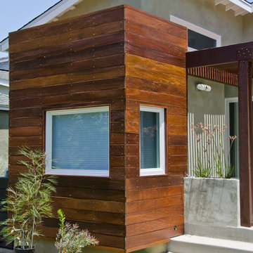
Mid-sized trendy backyard concrete patio photo in Los Angeles with a pergola
Mid-sized trendy backyard concrete patio photo in Los Angeles with a pergola
 Andrea Wojciak Interiors
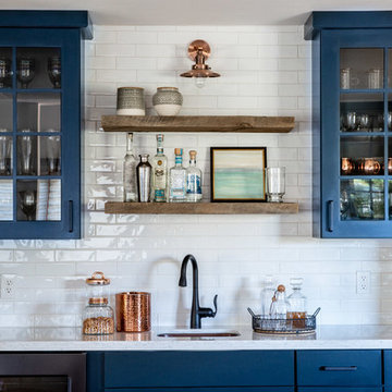
Example of a mid-sized transitional single-wall medium tone wood floor and brown floor wet bar design in Phoenix with an undermount sink, shaker cabinets, blue cabinets, quartz countertops, white backsplash, subway tile backsplash and white countertops
 Kathleen Jennison
An Arts & Crafts Bungalow is one of my favorite styles of homes. We have quite a few of them in our Stockton Mid-Town area. And when C&L called us to help them remodel their 1923 American Bungalow, I was beyond thrilled.
As per usual, when we get a new inquiry, we quickly Google the project location while we are talking to you on the phone. My excitement escalated when I saw the Google Earth Image of the sweet Sage Green bungalow in Mid-Town Stockton. "Yes, we would be interested in working with you," I said trying to keep my cool.
But what made it even better was meeting C&L and touring their home, because they are the nicest young couple, eager to make their home period perfect. Unfortunately, it had been slightly molested by some bad house-flippers, and we needed to bring the bathroom back to it "roots."
We knew we had to banish the hideous brown tile and cheap vanity quickly. But C&L complained about the condensation problems and the constant fight with mold. This immediately told me that improper remodeling had occurred and we needed to remedy that right away.
The Before: Frustrations with a Botched Remodel
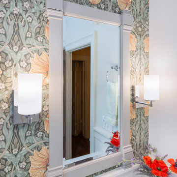
The bathroom needed to be brought back to period appropriate design with all the functionality of a modern bathroom. We thought of things like marble countertop, white mosaic floor tiles, white subway tile, board and batten molding, and of course a fabulous wallpaper.
This small (and only) bathroom on a tight budget required a little bit of design sleuthing to figure out how we could get the proper look and feel. Our goal was to determine where to splurge and where to economize and how to complete the remodel as quickly as possible because C&L would have to move out while construction was going on.
The Process: Hard Work to Remedy Design and Function
During our initial design study, (which included 2 hours in the owners’ home), we noticed framed images of William Morris Arts and Crafts textile patterns and knew this would be our design inspiration. We presented C&L with three options and they quickly selected the Pimpernel Design Concept.
We had originally selected the Black and Olive colors with a black vanity, mirror, and black and white floor tile. C&L liked it but weren’t quite sure about the black, We went back to the drawing board and decided the William & Co Pimpernel Wallpaper in Bayleaf and Manilla color with a softer gray painted vanity and mirror and white floor tile was more to their liking.
After the Design Concept was approved, we went to work securing the building permit, procuring all the elements, and scheduling our trusted tradesmen to perform the work.
We did uncover some shoddy work by the flippers such as live electrical wires hidden behind the wall, plumbing venting cut-off and buried in the walls (hence the constant dampness), the tub barely balancing on two fence boards across the floor joist, and no insulation on the exterior wall.
All of the previous blunders were fixed and the bathroom put back to its previous glory. We could feel the house thanking us for making it pretty again.
The After Reveal: Cohesive Design Decisions
We selected a simple white subway tile for the tub/shower. This is always classic and in keeping with the style of the house.
We selected a pre-fab vanity and mirror, but they look rich with the quartz countertop. There is much more storage in this small vanity than you would think.
The Transformation: A Period Perfect Refresh
We began the remodel just as the pandemic reared and stay-in-place orders went into effect. As C&L were already moved out and living with relatives, we got the go-ahead from city officials to get the work done (after all, how can you shelter in place without a bathroom?).
All our tradesmen were scheduled to work so that only one crew was on the job site at a time. We stayed on the original schedule with only a one week delay.
The end result is the sweetest little bathroom I've ever seen (and I can't wait to start work on C&L's kitchen next).
Thank you for joining me in this project transformation. I hope this inspired you to think about being creative with your design projects, determining what works best in keeping with the architecture of your space, and carefully assessing how you can have the best life in your home.
 User
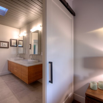
UserMid-sized mid-century modern master beige tile and porcelain tile ceramic tile drop-in bathtub photo in San Francisco with a vessel sink, furniture-like cabinets, light wood cabinets, quartz countertops and white walls
 R. B. Schwarz, Inc.
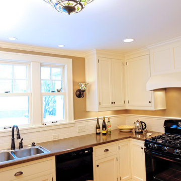
What was once a tiny, galley kitchen is now a bright airy kitchen with room for an extra large refrigerator, two full-size pantry cabinets, table and more. Photo Credit: Marc Golub
 Drewett Works
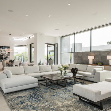
Above and Beyond is the third residence in a four-home collection in Paradise Valley, Arizona. Originally the site of the abandoned Kachina Elementary School, the infill community, appropriately named Kachina Estates, embraces the remarkable views of Camelback Mountain.
Nestled into an acre sized pie shaped cul-de-sac lot, the lot geometry and front facing view orientation created a remarkable privacy challenge and influenced the forward facing facade and massing. An iconic, stone-clad massing wall element rests within an oversized south-facing fenestration, creating separation and privacy while affording views “above and beyond.”
Above and Beyond has Mid-Century DNA married with a larger sense of mass and scale. The pool pavilion bridges from the main residence to a guest casita which visually completes the need for protection and privacy from street and solar exposure.
The pie-shaped lot which tapered to the south created a challenge to harvest south light. This was one of the largest spatial organization influencers for the design. The design undulates to embrace south sun and organically creates remarkable outdoor living spaces.
This modernist home has a palate of granite and limestone wall cladding, plaster, and a painted metal fascia. The wall cladding seamlessly enters and exits the architecture affording interior and exterior continuity.
Kachina Estates was named an Award of Merit winner at the 2019 Gold Nugget Awards in the category of Best Residential Detached Collection of the Year. The annual awards ceremony was held at the Pacific Coast Builders Conference in San Francisco, CA in May 2019.
Project Details: Above and Beyond
Architecture: Drewett Works
Developer/Builder: Bedbrock Developers
Interior Design: Est Est
Land Planner/Civil Engineer: CVL Consultants
Photography: Dino Tonn and Steven Thompson
Awards:
Gold Nugget Award of Merit - Kachina Estates - Residential Detached Collection of the Year
 Oak Mountain Custom Woodwork
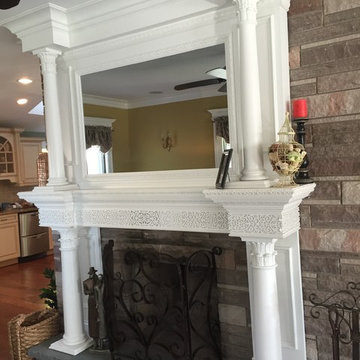
this client owns a Victorian Home in Essex county NJ and asked me to design a fireplace surround that was appropriate for the space and hid the television. The mirror you see in the photo is actually a 2-way mirror and if you look closely at the center section of the mantle, the remote speaker for the TV is built in. The fretwork pattern adds a lovely detail and the super columns (column on top of column) fit perfectly in the design scheme.
 Melinda Mandell Interior Design
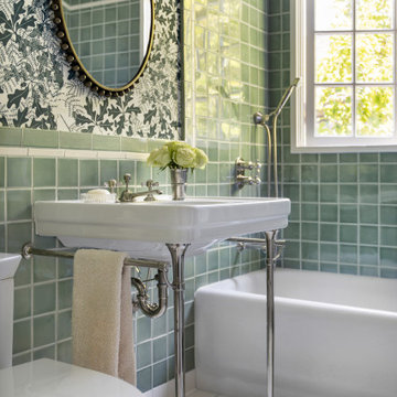
This bathroom features handmade ceramic wall tile and hexagonal floor tile, a console sink with decorative metal legs and polished nickel plumbing throughout. The leaf print wallpaper is hand printed in the UK.

90