
Search results for "Avoiding closing" in Home Design Ideas

 Thinkterior LLC
Oasis in the Desert
You can find a whole lot of fun ready for the kids in this fun contemporary play-yard in the dessert.
Theme:
The overall theme of the play-yard is a blend of creative and active outdoor play that blends with the contemporary styling of this beautiful home.
Focus:
The overall focus for the design of this amazing play-yard was to provide this family with an outdoor space that would foster an active and creative playtime for their children of various ages. The visual focus of this space is the 15-foot tree placed in the middle of the turf yard. This fantastic structure beacons the children to climb the mini stumps and enjoy the slide or swing happily from the branches all the while creating a touch of whimsical nature not typically found in the desert.
Surrounding the tree the play-yard offers an array of activities for these lucky children from the chalkboard walls to create amazing pictures to the custom ball wall to practice their skills, the custom myWall system provides endless options for the kids and parents to keep the space exciting and new. Rock holds easily clip into the wall offering ever changing climbing routes, custom water toys and games can also be adapted to the wall to fit the fun of the day.
Storage:
The myWall system offers various storage options including shelving, closed cases or hanging baskets all of which can be moved to alternate locations on the wall as the homeowners want to customize the play-yard.
Growth:
The myWall system is built to grow with the users whether it is with changing taste, updating design or growing children, all the accessories can be moved or replaced while leaving the main frame in place. The materials used throughout the space were chosen for their durability and ability to withstand the harsh conditions for many years. The tree also includes 3 levels of swings offering children of varied ages the chance to swing from the branches.
Safety:
Safety is of critical concern with any play-yard and a space in the harsh conditions of the desert presented specific concerns which were addressed with light colored materials to reflect the sun and reduce heat buildup and stainless steel hardware was used to avoid rusting. The myWall accessories all use a locking mechanism which allows for easy adjustments but also securely locks the pieces into place once set. The flooring in the treehouse was also textured to eliminate skidding.
 Drury Design
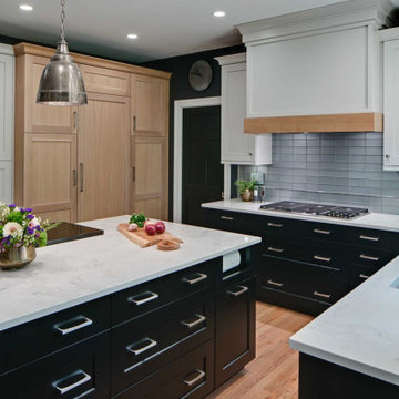
The original intent of this project was to replace the island, hood, countertops, and a few appliances. A primary bath remodel was the main priority. But once the couple realized certain features would enhance the functionality of the kitchen – not to mention completely change the aesthetic – they put the master bath on hold and decided to remodel the entire kitchen first.
Design objectives:
-Omit separate table, plan for a larger island that would seat 7 people
-Simple, clean lines – no rounded corners or weird angles
-Nothing trendy – use modern classic details
-Uncluttered countertops
-Better pantry storage for food & small appliances
-Integrated major appliances
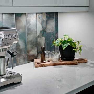
-Coffee bar
-Avoid “1 color on perimeter with second color on island”
-Integrate a harmonious variety of finishes
-Integrate black & handmade metals
Design challenges:
-Island shape to fit within confines of existing half wall between kitchen & family room & bay window/door to backyard
-Narrow kitchen with major walkway
-Planning for 7 seats at the island
-Keep guest social area away from the cook’s zone
-Place appliances according to use
-Point-of-use storage for an avid cook within a relatively small space
-Integrate colors without looking too busy
THE NEW KITCHEN
-While the island is mostly rectangular, the seating area utilizes the bay extension without interfering with the exterior door
-All seating is placed on the outside perimeter of the island, giving the cook dedicated prep space
-The L-shaped seating area & adjacent coffee bar encourage guests to gather on the outside edge of the kitchen where they can still interact with the cook
-Island prep space includes 5 feet of versatile drawer storage, double waste basket and an open paper towel dispenser
-One pantry designated for food; the other for small appliances & bulk storage; creates visual armoire look
-Microwave drawer in island faces refrigerator for easy access & less interference with cook’s zone
-Appliance garages avoid clutter on the countertops
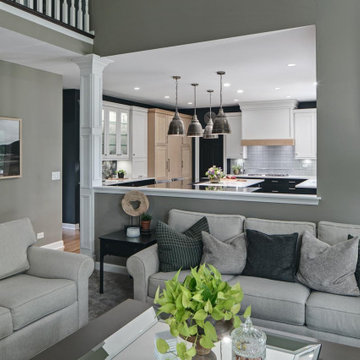
-Off-white upper cabinets make the kitchen look larger while the black bases offer contrast without closing in the space
Once the client committed to remodeling her entire kitchen, she had a good idea of the direction she wanted the space to take. Even so, there were many details that remained open to explore & contemplate. The end result is modern, clean and ultimately transitional – a creative vision anchored in functionality and artistry!
A powder room remodel was added to the project that beautifully compliments the kitchen aesthetic. The entire staircase, all trim & doors were painted in the same tones as the kitchen, transforming the entire first floor into a cohesive & welcoming space. It was a great collaborative partnership!
 Drury Design
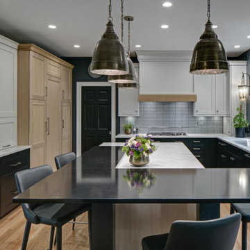
The original intent of this project was to replace the island, hood, countertops, and a few appliances. A primary bath remodel was the main priority. But once the couple realized certain features would enhance the functionality of the kitchen – not to mention completely change the aesthetic – they put the master bath on hold and decided to remodel the entire kitchen first.
Design objectives:
-Omit separate table, plan for a larger island that would seat 7 people
-Simple, clean lines – no rounded corners or weird angles
-Nothing trendy – use modern classic details
-Uncluttered countertops
-Better pantry storage for food & small appliances
-Integrated major appliances
-Coffee bar
-Avoid “1 color on perimeter with second color on island”
-Integrate a harmonious variety of finishes
-Integrate black & handmade metals
Design challenges:
-Island shape to fit within confines of existing half wall between kitchen & family room & bay window/door to backyard
-Narrow kitchen with major walkway
-Planning for 7 seats at the island
-Keep guest social area away from the cook’s zone
-Place appliances according to use
-Point-of-use storage for an avid cook within a relatively small space
-Integrate colors without looking too busy
THE NEW KITCHEN
-While the island is mostly rectangular, the seating area utilizes the bay extension without interfering with the exterior door
-All seating is placed on the outside perimeter of the island, giving the cook dedicated prep space
-The L-shaped seating area & adjacent coffee bar encourage guests to gather on the outside edge of the kitchen where they can still interact with the cook
-Island prep space includes 5 feet of versatile drawer storage, double waste basket and an open paper towel dispenser
-One pantry designated for food; the other for small appliances & bulk storage; creates visual armoire look
-Microwave drawer in island faces refrigerator for easy access & less interference with cook’s zone
-Appliance garages avoid clutter on the countertops
-Off-white upper cabinets make the kitchen look larger while the black bases offer contrast without closing in the space
Once the client committed to remodeling her entire kitchen, she had a good idea of the direction she wanted the space to take. Even so, there were many details that remained open to explore & contemplate. The end result is modern, clean and ultimately transitional – a creative vision anchored in functionality and artistry!
A powder room remodel was added to the project that beautifully compliments the kitchen aesthetic. The entire staircase, all trim & doors were painted in the same tones as the kitchen, transforming the entire first floor into a cohesive & welcoming space. It was a great collaborative partnership!
Find the right local pro for your project

 Braitman Design Studio
A custom glass countertop with an integral glass sink acts as the room’s dramatic centerpiece. In part, it stands out due to its large size – measuring 88” in length, with the custom sink measuring 28” x 15” x 6” deep. We used standard ¾” thick float glass, which we sandblasted in order to bring out the green tint. Finally, we raised the glass ½” above the vanity using chrome standoffs.
In order to avoid countertop clutter, we mounted soap and cup holders on the wall, and provided extra storage in the custom 6-drawer, 57” wide vanity below, as well as in the 52” high, 8” deep cabinet seen above the toilet. The lines and size of the vanity reflect modern design trends, as does the selection of large drawer pulls. In addition to their modern look, the pulls allow for effortless opening and closing.

 TVL Creative Ltd.
Our clients had just recently closed on their new house in Stapleton and were excited to transform it into their perfect forever home. They wanted to remodel the entire first floor to create a more open floor plan and develop a smoother flow through the house that better fit the needs of their family. The original layout consisted of several small rooms that just weren’t very functional, so we decided to remove the walls that were breaking up the space and restructure the first floor to create a wonderfully open feel.
After removing the existing walls, we rearranged their spaces to give them an office at the front of the house, a large living room, and a large dining room that connects seamlessly with the kitchen. We also wanted to center the foyer in the home and allow more light to travel through the first floor, so we replaced their existing doors with beautiful custom sliding doors to the back yard and a gorgeous walnut door with side lights to greet guests at the front of their home.
Living Room
Our clients wanted a living room that could accommodate an inviting sectional, a baby grand piano, and plenty of space for family game nights. So, we transformed what had been a small office and sitting room into a large open living room with custom wood columns. We wanted to avoid making the home feel too vast and monumental, so we designed custom beams and columns to define spaces and to make the house feel like a home. Aesthetically we wanted their home to be soft and inviting, so we utilized a neutral color palette with occasional accents of muted blues and greens.
Dining Room
Our clients were also looking for a large dining room that was open to the rest of the home and perfect for big family gatherings. So, we removed what had been a small family room and eat-in dining area to create a spacious dining room with a fireplace and bar. We added custom cabinetry to the bar area with open shelving for displaying and designed a custom surround for their fireplace that ties in with the wood work we designed for their living room. We brought in the tones and materiality from the kitchen to unite the spaces and added a mixed metal light fixture to bring the space together
Kitchen
We wanted the kitchen to be a real show stopper and carry through the calm muted tones we were utilizing throughout their home. We reoriented the kitchen to allow for a big beautiful custom island and to give us the opportunity for a focal wall with cooktop and range hood. Their custom island was perfectly complimented with a dramatic quartz counter top and oversized pendants making it the real center of their home. Since they enter the kitchen first when coming from their detached garage, we included a small mud-room area right by the back door to catch everyone’s coats and shoes as they come in. We also created a new walk-in pantry with plenty of open storage and a fun chalkboard door for writing notes, recipes, and grocery lists.
Office
We transformed the original dining room into a handsome office at the front of the house. We designed custom walnut built-ins to house all of their books, and added glass french doors to give them a bit of privacy without making the space too closed off. We painted the room a deep muted blue to create a glimpse of rich color through the french doors
Powder Room
The powder room is a wonderful play on textures. We used a neutral palette with contrasting tones to create dramatic moments in this little space with accents of brushed gold.
Master Bathroom
The existing master bathroom had an awkward layout and outdated finishes, so we redesigned the space to create a clean layout with a dream worthy shower. We continued to use neutral tones that tie in with the rest of the home, but had fun playing with tile textures and patterns to create an eye-catching vanity. The wood-look tile planks along the floor provide a soft backdrop for their new free-standing bathtub and contrast beautifully with the deep ash finish on the cabinetry.

 Cameo Homes Inc.
Park City Showcase of Homes 2013 by Utah Home Builder, Cameo Homes Inc., in Tuhaye, Park City, Utah. www.cameohomesinc.com
Inspiration for a rustic living room remodel in Salt Lake City
Inspiration for a rustic living room remodel in Salt Lake City
 Drury Design
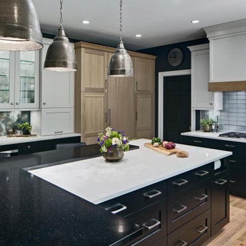
The original intent of this project was to replace the island, hood, countertops, and a few appliances. A primary bath remodel was the main priority. But once the couple realized certain features would enhance the functionality of the kitchen – not to mention completely change the aesthetic – they put the master bath on hold and decided to remodel the entire kitchen first.
Design objectives:
-Omit separate table, plan for a larger island that would seat 7 people
-Simple, clean lines – no rounded corners or weird angles
-Nothing trendy – use modern classic details
-Uncluttered countertops
-Better pantry storage for food & small appliances
-Integrated major appliances
-Coffee bar
-Avoid “1 color on perimeter with second color on island”
-Integrate a harmonious variety of finishes
-Integrate black & handmade metals
Design challenges:
-Island shape to fit within confines of existing half wall between kitchen & family room & bay window/door to backyard
-Narrow kitchen with major walkway
-Planning for 7 seats at the island
-Keep guest social area away from the cook’s zone
-Place appliances according to use
-Point-of-use storage for an avid cook within a relatively small space
-Integrate colors without looking too busy
THE NEW KITCHEN
-While the island is mostly rectangular, the seating area utilizes the bay extension without interfering with the exterior door
-All seating is placed on the outside perimeter of the island, giving the cook dedicated prep space
-The L-shaped seating area & adjacent coffee bar encourage guests to gather on the outside edge of the kitchen where they can still interact with the cook
-Island prep space includes 5 feet of versatile drawer storage, double waste basket and an open paper towel dispenser
-One pantry designated for food; the other for small appliances & bulk storage; creates visual armoire look
-Microwave drawer in island faces refrigerator for easy access & less interference with cook’s zone
-Appliance garages avoid clutter on the countertops
-Off-white upper cabinets make the kitchen look larger while the black bases offer contrast without closing in the space
Once the client committed to remodeling her entire kitchen, she had a good idea of the direction she wanted the space to take. Even so, there were many details that remained open to explore & contemplate. The end result is modern, clean and ultimately transitional – a creative vision anchored in functionality and artistry!
A powder room remodel was added to the project that beautifully compliments the kitchen aesthetic. The entire staircase, all trim & doors were painted in the same tones as the kitchen, transforming the entire first floor into a cohesive & welcoming space. It was a great collaborative partnership!
Sponsored
Columbus, OH

Snider & Metcalf Interior Design, LTD
Leading Interior Designers in Columbus, Ohio & Ponte Vedra, Florida

 Ashton Renovations
The original ensuite bathroom in this condominium required renovations to replace problematic Kitec plumbing. The layout in the space remained the same, but improvements were made to address certain design challenges with lighting, automation, and space. The aim was to create a modern bathroom design with textured wood features, and the feel of metallic black accents.
A number of prominent changes were made to improve the use of space. The original entry, a left-handed door swinging into the bathroom, was replaced. It interfered with the vanity clear floor space. It also made the use of the bathroom difficult when two users were present. It was changed to a soft closing pocket door. To avoid losing space it was installed by creating a wall cavity on the outside of the bathroom. This door also included frosted glass panels to allow natural light into the space. Double sliding glass shower doors were also installed to address access issues to the shower valve.
Storage improvements included the installation of dual inset medicine cabinets, and pull out drawers within the wall hung vanity. The depth of the medicine cabinets were extended outwards, and this nice detail was finished with a textured wood finish. The addition of the wall hung vanity also created the feeling of more space beneath the units and allowed for under cabinet lighting.
Lighting and automation improvements included the addition of HUE LED lighting. This was done by installing two shower pot lights, a 6” main potlight, and under cabinet lighting. These are all controlled by the Philips Hue App that programs routines, scenes, and other settings.
Some of the other highlights of this modern bathroom include dark grout, which contrasts nicely with the elongated white tile, a thermostatic shower system, herringbone textured porcelain floor tile, and a Schluter Kerdi waterproofing shower system. This bathroom is made most unique though with the choice of wallpaper, which can be described as modern luxury, a graphic take on agate stone patterns with metallic embellishments.
 Drury Design
The original intent of this project was to replace the island, hood, countertops, and a few appliances. A primary bath remodel was the main priority. But once the couple realized certain features would enhance the functionality of the kitchen – not to mention completely change the aesthetic – they put the master bath on hold and decided to remodel the entire kitchen first.
Design objectives:
-Omit separate table, plan for a larger island that would seat 7 people
-Simple, clean lines – no rounded corners or weird angles
-Nothing trendy – use modern classic details
-Uncluttered countertops
-Better pantry storage for food & small appliances
-Integrated major appliances
-Coffee bar
-Avoid “1 color on perimeter with second color on island”
-Integrate a harmonious variety of finishes
-Integrate black & handmade metals
Design challenges:
-Island shape to fit within confines of existing half wall between kitchen & family room & bay window/door to backyard
-Narrow kitchen with major walkway
-Planning for 7 seats at the island
-Keep guest social area away from the cook’s zone
-Place appliances according to use
-Point-of-use storage for an avid cook within a relatively small space
-Integrate colors without looking too busy
THE NEW KITCHEN
-While the island is mostly rectangular, the seating area utilizes the bay extension without interfering with the exterior door
-All seating is placed on the outside perimeter of the island, giving the cook dedicated prep space
-The L-shaped seating area & adjacent coffee bar encourage guests to gather on the outside edge of the kitchen where they can still interact with the cook
-Island prep space includes 5 feet of versatile drawer storage, double waste basket and an open paper towel dispenser
-One pantry designated for food; the other for small appliances & bulk storage; creates visual armoire look
-Microwave drawer in island faces refrigerator for easy access & less interference with cook’s zone
-Appliance garages avoid clutter on the countertops
-Off-white upper cabinets make the kitchen look larger while the black bases offer contrast without closing in the space
Once the client committed to remodeling her entire kitchen, she had a good idea of the direction she wanted the space to take. Even so, there were many details that remained open to explore & contemplate. The end result is modern, clean and ultimately transitional – a creative vision anchored in functionality and artistry!
A powder room remodel was added to the project that beautifully compliments the kitchen aesthetic. The entire staircase, all trim & doors were painted in the same tones as the kitchen, transforming the entire first floor into a cohesive & welcoming space. It was a great collaborative partnership!
 Drury Design
The original intent of this project was to replace the island, hood, countertops, and a few appliances. A primary bath remodel was the main priority. But once the couple realized certain features would enhance the functionality of the kitchen – not to mention completely change the aesthetic – they put the master bath on hold and decided to remodel the entire kitchen first.
Design objectives:
-Omit separate table, plan for a larger island that would seat 7 people
-Simple, clean lines – no rounded corners or weird angles
-Nothing trendy – use modern classic details
-Uncluttered countertops
-Better pantry storage for food & small appliances
-Integrated major appliances
-Coffee bar
-Avoid “1 color on perimeter with second color on island”
-Integrate a harmonious variety of finishes
-Integrate black & handmade metals
Design challenges:
-Island shape to fit within confines of existing half wall between kitchen & family room & bay window/door to backyard
-Narrow kitchen with major walkway
-Planning for 7 seats at the island
-Keep guest social area away from the cook’s zone
-Place appliances according to use
-Point-of-use storage for an avid cook within a relatively small space
-Integrate colors without looking too busy
THE NEW KITCHEN
-While the island is mostly rectangular, the seating area utilizes the bay extension without interfering with the exterior door
-All seating is placed on the outside perimeter of the island, giving the cook dedicated prep space
-The L-shaped seating area & adjacent coffee bar encourage guests to gather on the outside edge of the kitchen where they can still interact with the cook
-Island prep space includes 5 feet of versatile drawer storage, double waste basket and an open paper towel dispenser
-One pantry designated for food; the other for small appliances & bulk storage; creates visual armoire look
-Microwave drawer in island faces refrigerator for easy access & less interference with cook’s zone
-Appliance garages avoid clutter on the countertops
-Off-white upper cabinets make the kitchen look larger while the black bases offer contrast without closing in the space
Once the client committed to remodeling her entire kitchen, she had a good idea of the direction she wanted the space to take. Even so, there were many details that remained open to explore & contemplate. The end result is modern, clean and ultimately transitional – a creative vision anchored in functionality and artistry!
A powder room remodel was added to the project that beautifully compliments the kitchen aesthetic. The entire staircase, all trim & doors were painted in the same tones as the kitchen, transforming the entire first floor into a cohesive & welcoming space. It was a great collaborative partnership!
 Drury Design
The original intent of this project was to replace the island, hood, countertops, and a few appliances. A primary bath remodel was the main priority. But once the couple realized certain features would enhance the functionality of the kitchen – not to mention completely change the aesthetic – they put the master bath on hold and decided to remodel the entire kitchen first.
Design objectives:
-Omit separate table, plan for a larger island that would seat 7 people
-Simple, clean lines – no rounded corners or weird angles
-Nothing trendy – use modern classic details
-Uncluttered countertops
-Better pantry storage for food & small appliances
-Integrated major appliances
-Coffee bar
-Avoid “1 color on perimeter with second color on island”
-Integrate a harmonious variety of finishes
-Integrate black & handmade metals
Design challenges:
-Island shape to fit within confines of existing half wall between kitchen & family room & bay window/door to backyard
-Narrow kitchen with major walkway
-Planning for 7 seats at the island
-Keep guest social area away from the cook’s zone
-Place appliances according to use
-Point-of-use storage for an avid cook within a relatively small space
-Integrate colors without looking too busy
THE NEW KITCHEN
-While the island is mostly rectangular, the seating area utilizes the bay extension without interfering with the exterior door
-All seating is placed on the outside perimeter of the island, giving the cook dedicated prep space
-The L-shaped seating area & adjacent coffee bar encourage guests to gather on the outside edge of the kitchen where they can still interact with the cook
-Island prep space includes 5 feet of versatile drawer storage, double waste basket and an open paper towel dispenser
-One pantry designated for food; the other for small appliances & bulk storage; creates visual armoire look
-Microwave drawer in island faces refrigerator for easy access & less interference with cook’s zone
-Appliance garages avoid clutter on the countertops
-Off-white upper cabinets make the kitchen look larger while the black bases offer contrast without closing in the space
Once the client committed to remodeling her entire kitchen, she had a good idea of the direction she wanted the space to take. Even so, there were many details that remained open to explore & contemplate. The end result is modern, clean and ultimately transitional – a creative vision anchored in functionality and artistry!
A powder room remodel was added to the project that beautifully compliments the kitchen aesthetic. The entire staircase, all trim & doors were painted in the same tones as the kitchen, transforming the entire first floor into a cohesive & welcoming space. It was a great collaborative partnership!

 Adaptiv DC
You can find a whole lot of fun ready for the kids in this fun contemporary play-yard. Theme: The overall theme of the play-yard is a blend of creative and active outdoor play that blends with the contemporary styling of this beautiful home. Focus: The overall focus for the design of this amazing play-yard was to provide this family with an outdoor space that would foster an active and creative playtime for their children of various ages. The visual focus of this space is the 15-foot tree placed in the middle of the turf yard. This fantastic structure beacons the children to climb the mini stumps and enjoy the slide or swing happily from the branches all the while creating a touch of whimsical nature. Surrounding the tree the play-yard offers an array of activities for these lucky children from the chalkboard walls to create amazing pictures to the custom ball wall to practice their skills, the custom myWall system provides endless options for the kids and parents to keep the space exciting and new. Rock holds easily clip into the wall offering ever changing climbing routes, custom water toys and games can also be adapted to the wall to fit the fun of the day. Storage: The myWall system offers various storage options including shelving, closed cases or hanging baskets all of which can be moved to alternate locations on the wall as the homeowners want to customize the play-yard. Growth: The myWall system is built to grow with the users whether it is with changing taste, updating design or growing children, all the accessories can be moved or replaced while leaving the main frame in place. The materials used throughout the space were chosen for their durability and ability to withstand the harsh conditions for many years. The tree also includes 3 levels of swings offering children of varied ages the chance to swing from the branches. Safety: Safety is of critical concern with any play-yard and a space in the harsh hot summers presented specific concerns which were addressed with light colored materials to reflect the sun and reduce heat buildup and stainless steel hardware was used to avoid rusting. The myWall accessories all use a locking mechanism which allows for easy adjustments but also securely locks the pieces into place once set. The flooring in the treehouse was also textured to eliminate skidding.
 Drury Design
The original intent of this project was to replace the island, hood, countertops, and a few appliances. A primary bath remodel was the main priority. But once the couple realized certain features would enhance the functionality of the kitchen – not to mention completely change the aesthetic – they put the master bath on hold and decided to remodel the entire kitchen first.
Design objectives:
-Omit separate table, plan for a larger island that would seat 7 people
-Simple, clean lines – no rounded corners or weird angles
-Nothing trendy – use modern classic details
-Uncluttered countertops
-Better pantry storage for food & small appliances
-Integrated major appliances
-Coffee bar
-Avoid “1 color on perimeter with second color on island”
-Integrate a harmonious variety of finishes
-Integrate black & handmade metals
Design challenges:
-Island shape to fit within confines of existing half wall between kitchen & family room & bay window/door to backyard
-Narrow kitchen with major walkway
-Planning for 7 seats at the island
-Keep guest social area away from the cook’s zone
-Place appliances according to use
-Point-of-use storage for an avid cook within a relatively small space
-Integrate colors without looking too busy
THE NEW KITCHEN
-While the island is mostly rectangular, the seating area utilizes the bay extension without interfering with the exterior door
-All seating is placed on the outside perimeter of the island, giving the cook dedicated prep space
-The L-shaped seating area & adjacent coffee bar encourage guests to gather on the outside edge of the kitchen where they can still interact with the cook
-Island prep space includes 5 feet of versatile drawer storage, double waste basket and an open paper towel dispenser
-One pantry designated for food; the other for small appliances & bulk storage; creates visual armoire look
-Microwave drawer in island faces refrigerator for easy access & less interference with cook’s zone
-Appliance garages avoid clutter on the countertops
-Off-white upper cabinets make the kitchen look larger while the black bases offer contrast without closing in the space
Once the client committed to remodeling her entire kitchen, she had a good idea of the direction she wanted the space to take. Even so, there were many details that remained open to explore & contemplate. The end result is modern, clean and ultimately transitional – a creative vision anchored in functionality and artistry!
A powder room remodel was added to the project that beautifully compliments the kitchen aesthetic. The entire staircase, all trim & doors were painted in the same tones as the kitchen, transforming the entire first floor into a cohesive & welcoming space. It was a great collaborative partnership!

 Ashton Renovations
The original ensuite bathroom in this condominium required renovations to replace problematic Kitec plumbing. The layout in the space remained the same, but improvements were made to address certain design challenges with lighting, automation, and space. The aim was to create a modern bathroom design with textured wood features, and the feel of metallic black accents.
A number of prominent changes were made to improve the use of space. The original entry, a left-handed door swinging into the bathroom, was replaced. It interfered with the vanity clear floor space. It also made the use of the bathroom difficult when two users were present. It was changed to a soft closing pocket door. To avoid losing space it was installed by creating a wall cavity on the outside of the bathroom. This door also included frosted glass panels to allow natural light into the space. Double sliding glass shower doors were also installed to address access issues to the shower valve.
Storage improvements included the installation of dual inset medicine cabinets, and pull out drawers within the wall hung vanity. The depth of the medicine cabinets were extended outwards, and this nice detail was finished with a textured wood finish. The addition of the wall hung vanity also created the feeling of more space beneath the units and allowed for under cabinet lighting.
Lighting and automation improvements included the addition of HUE LED lighting. This was done by installing two shower pot lights, a 6” main potlight, and under cabinet lighting. These are all controlled by the Philips Hue App that programs routines, scenes, and other settings.
Some of the other highlights of this modern bathroom include dark grout, which contrasts nicely with the elongated white tile, a thermostatic shower system, herringbone textured porcelain floor tile, and a Schluter Kerdi waterproofing shower system. This bathroom is made most unique though with the choice of wallpaper, which can be described as modern luxury, a graphic take on agate stone patterns with metallic embellishments.

 A Direct Cabinet Distributor Corp
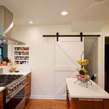
This New Hyde Park, NY customer came to us looking to not for not only a new updated kitchen, but a more functional kitchen. When our designer first walked into their existing kitchen, he noticed the microwave on the counter, soffits, and the large outdated double oven taking up a huge amount of usable space. Which all contributed to how small and closed off the room felt. These problems he knew he could fix with a new updated layout.
He designed the new kitchen with a new door way in the area the old double oven used to be. This made the room compatible with today's trends- open kitchen design with an airy flow. He suggested for the customer to purchase a micro/oven combo appliance, allowing them to free their counter tops up of that big bulky appliance. This also allowed the customers to choose a sleek new hood for over their cook top. Removal of the suffits allowed us to design with taller wall cabinets topped off with a beautiful cove crown.
Renovation done by: HOMEREDI

 TVL Creative Ltd.
Our clients had just recently closed on their new house in Stapleton and were excited to transform it into their perfect forever home. They wanted to remodel the entire first floor to create a more open floor plan and develop a smoother flow through the house that better fit the needs of their family. The original layout consisted of several small rooms that just weren’t very functional, so we decided to remove the walls that were breaking up the space and restructure the first floor to create a wonderfully open feel.
After removing the existing walls, we rearranged their spaces to give them an office at the front of the house, a large living room, and a large dining room that connects seamlessly with the kitchen. We also wanted to center the foyer in the home and allow more light to travel through the first floor, so we replaced their existing doors with beautiful custom sliding doors to the back yard and a gorgeous walnut door with side lights to greet guests at the front of their home.
Living Room
Our clients wanted a living room that could accommodate an inviting sectional, a baby grand piano, and plenty of space for family game nights. So, we transformed what had been a small office and sitting room into a large open living room with custom wood columns. We wanted to avoid making the home feel too vast and monumental, so we designed custom beams and columns to define spaces and to make the house feel like a home. Aesthetically we wanted their home to be soft and inviting, so we utilized a neutral color palette with occasional accents of muted blues and greens.
Dining Room
Our clients were also looking for a large dining room that was open to the rest of the home and perfect for big family gatherings. So, we removed what had been a small family room and eat-in dining area to create a spacious dining room with a fireplace and bar. We added custom cabinetry to the bar area with open shelving for displaying and designed a custom surround for their fireplace that ties in with the wood work we designed for their living room. We brought in the tones and materiality from the kitchen to unite the spaces and added a mixed metal light fixture to bring the space together
Kitchen
We wanted the kitchen to be a real show stopper and carry through the calm muted tones we were utilizing throughout their home. We reoriented the kitchen to allow for a big beautiful custom island and to give us the opportunity for a focal wall with cooktop and range hood. Their custom island was perfectly complimented with a dramatic quartz counter top and oversized pendants making it the real center of their home. Since they enter the kitchen first when coming from their detached garage, we included a small mud-room area right by the back door to catch everyone’s coats and shoes as they come in. We also created a new walk-in pantry with plenty of open storage and a fun chalkboard door for writing notes, recipes, and grocery lists.
Office
We transformed the original dining room into a handsome office at the front of the house. We designed custom walnut built-ins to house all of their books, and added glass french doors to give them a bit of privacy without making the space too closed off. We painted the room a deep muted blue to create a glimpse of rich color through the french doors
Powder Room
The powder room is a wonderful play on textures. We used a neutral palette with contrasting tones to create dramatic moments in this little space with accents of brushed gold.
Master Bathroom
The existing master bathroom had an awkward layout and outdated finishes, so we redesigned the space to create a clean layout with a dream worthy shower. We continued to use neutral tones that tie in with the rest of the home, but had fun playing with tile textures and patterns to create an eye-catching vanity. The wood-look tile planks along the floor provide a soft backdrop for their new free-standing bathtub and contrast beautifully with the deep ash finish on the cabinetry.
Sponsored
Plain City, OH

Kuhns Contracting, Inc.
Central Ohio's Trusted Home Remodeler Specializing in Kitchens & Baths

 Jessy Krol Designs LLC
The family room of this home was redesigned to reflect the airy French look the client loved so much. In order to avoid the mess and disturbance of demolishing the old brick mantle, Jess design a painted wood paneling facade to mask the old, and create a place for the tv. The bookcases that flank it have wonderful details such as french brass hardware, reticulated brass doors, with interiors sheathed in real linen. The desk area works as a lovely computer/work station with concealed file cabinets, and the bookcases are home to the clients lovely collectables. The existing cocktail table was lacquered white (previously was dark wood) and the sofa was made custom in cotton velvet from Duralee with 100% down fill for that "sinking in" feeling the client wanted. The simple drapery panels required a lot of yardage, so instead of using real silk, Jess found an amazing synthetic taffeta at Duralee that is so close to looking like silk, you have to touch it to know! (this saved thousands of $$ ) There was a large closet opposite the window wall that was opened up and transformed into a bar with custom barstools, and an antiqued mirror ceiling to illuminate the space. The pillow fabrics are from Nancy Corzine, the glass chandelier is William Crowder, the mantle sconces and opaline lamp are antiques, and the acrylic side table purchased through Lewis Mittman in NYC.

 BathGems
Give your bathroom a Tuscan-style feel with our 36" Cobre Bath Vanity. Its beautifully dark Mahogany finished cabinet features a double-door cabinet with gorgeous woodworking that is subtle, yet elegant. The door knobs finish off the cabinet with a bright appeel that matches the copper countertop. You'll love the floral print on the bottom of the sink, giving the Cobre vanity an all-around sunny look. Use with a non-overflow drain system.
Dimensions
Vanity
36"W x 23.5"D x 36"H
Mirror
20"W x 1.5"D x 39"H
Premier Collection
Vanities that are marked as Premier Collection are the best vanities in the industry where no expense has been spared. These are the best vanities money can buy made from small quantities of handpicked solid hard woods that are hand finished to perfection. To be considered part of the Premium Collection the vanity must get A+++ grades in: Wood used, Interior Construction, Counter Top, and Finish. Wood Used:
Premier Collections uses Kiln dried wood in small batches to insure proper drying to prevent cracking and warping. All wood is cared for in great detail to prevent cracking and warping so that your vanity looks as good as they day it arrived for many years. Vanity Tops:
Premier Collections vanities that have stone tops use a thicker stone, up to 3cm (1cm more than industry average), providing a more luxurious look. All of the vanities with stone tops are sealed to prevent watermarks and minor stains. Construction:
Premium Collection vanities use hard wood box framed construction that provides strength and durability for decades. All vanities have working drawers with able storage made with slide ball bearing drawers and or soft close mounts. Center drawers are boxed and fitted around plumbing for additional storage. Finish:
Premium Collection vanities are all hand stained, hand painted, using up to a 15 layer sealing and finishing process to avoid future fading, cracking, or peeling.
Vanities that are marked as Premier Collection are the best vanities in the industry where no expense has been spared. These are the best vanities money can buy made from small quantities of handpicked solid hard woods that are hand finished to perfection. To be considered part of the Premium Collection the vanity must get A+++ grades in: Wood used, Interior Construction, Counter Top, and Finish. Wood Used:
Premier Collections uses Kiln dried wood in small batches to insure proper drying to prevent cracking and warping. All wood is cared for in great detail to prevent cracking and warping so that your vanity looks as good as they day it arrived for many years. Vanity Tops:
Premier Collections vanities that have stone tops use a thicker stone, up to 3cm (1cm more than industry average), providing a more luxurious look. All of the vanities with stone tops are sealed to prevent watermarks and minor stains. Construction:
Premium Collection vanities use hard wood box framed construction that provides strength and durability for decades. All vanities have working drawers with able storage made with slide ball bearing drawers and or soft close mounts. Center drawers are boxed and fitted around plumbing for additional storage. Finish:
Premium Collection vanities are all hand stained, hand painted, using up to a 15 layer sealing and finishing process to avoid future fading, cracking, or peeling.
 Ashton Renovations
The original ensuite bathroom in this condominium required renovations to replace problematic Kitec plumbing. The layout in the space remained the same, but improvements were made to address certain design challenges with lighting, automation, and space. The aim was to create a modern bathroom design with textured wood features, and the feel of metallic black accents.
A number of prominent changes were made to improve the use of space. The original entry, a left-handed door swinging into the bathroom, was replaced. It interfered with the vanity clear floor space. It also made the use of the bathroom difficult when two users were present. It was changed to a soft closing pocket door. To avoid losing space it was installed by creating a wall cavity on the outside of the bathroom. This door also included frosted glass panels to allow natural light into the space. Double sliding glass shower doors were also installed to address access issues to the shower valve.
Storage improvements included the installation of dual inset medicine cabinets, and pull out drawers within the wall hung vanity. The depth of the medicine cabinets were extended outwards, and this nice detail was finished with a textured wood finish. The addition of the wall hung vanity also created the feeling of more space beneath the units and allowed for under cabinet lighting.
Lighting and automation improvements included the addition of HUE LED lighting. This was done by installing two shower pot lights, a 6” main potlight, and under cabinet lighting. These are all controlled by the Philips Hue App that programs routines, scenes, and other settings.
Some of the other highlights of this modern bathroom include dark grout, which contrasts nicely with the elongated white tile, a thermostatic shower system, herringbone textured porcelain floor tile, and a Schluter Kerdi waterproofing shower system. This bathroom is made most unique though with the choice of wallpaper, which can be described as modern luxury, a graphic take on agate stone patterns with metallic embellishments.
43