
Search results for "Backing play" in Home Design Ideas
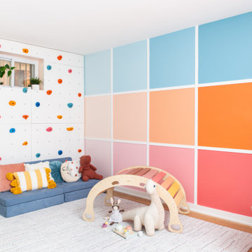
 grOH! Playrooms
Kids' room - mid-sized contemporary gender-neutral medium tone wood floor and brown floor kids' room idea in DC Metro with multicolored walls
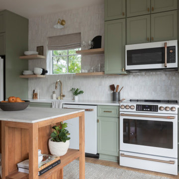
 Corio Design House
Transitional galley light wood floor and beige floor kitchen photo in San Francisco with an undermount sink, shaker cabinets, green cabinets, white backsplash, white appliances, an island and white countertops

Find the right local pro for your project

 Brooks + Scarpa Architects
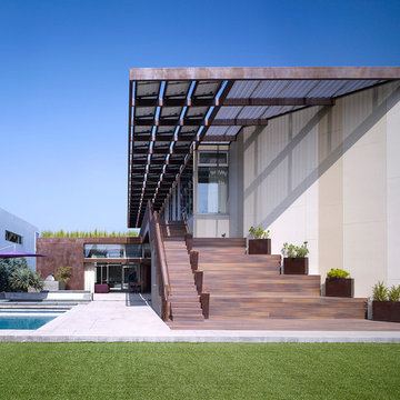
The Yin-Yang House is a net-zero energy single-family home in a quiet Venice, CA neighborhood. The design objective was to create a space for a large and growing family with several children, which would create a calm, relaxed and organized environment that emphasizes public family space. The home also serves as a place to entertain, and a welcoming space for teenagers as they seek social space with friends.
The home is organized around a series of courtyards and other outdoor spaces that integrate with the interior of the house. Facing the street the house appears to be solid. However, behind the steel entry door is a courtyard, which reveals the indoor-outdoor nature of the house behind the solid exterior. From the entry courtyard, the entire space to the rear garden wall can be seen; the first clue of the home’s spatial connection between inside and out. These spaces are designed for entertainment, and the 40 foot sliding glass door to the living room enhances the harmonic relationship of the main room, allowing the owners to host many guests without the feeling of being overburdened.
The tensions of the house’s exterior are subtly underscored by a 12-inch steel band that hews close to, but sometimes rises above or falls below the floor line of the second floor – a continuous loop moving inside and out like a pen that is never lifted from the page, but reinforces the intent to spatially weave together the indoors with the outside as a single space.
Scale manipulation also plays a formal role in the design of the structure. From the rear, the house appears to be a single-story volume. The large master bedroom window and the outdoor steps are scaled to support this illusion. It is only when the steps are animated with people that one realizes the true scale of the house is two stories.
The kitchen is the heart of the house, with an open working area that allows the owner, an accomplished chef, to converse with friends while cooking. Bedrooms are intentionally designed to be very small and simple; allowing for larger public spaces, emphasizing the family over individual domains. The breakfast room looks across an outdoor courtyard to the guest room/kids playroom, establishing a visual connection while defining the separation of uses. The children can play outdoors while under adult supervision from the dining area or the office, or do homework in the office while adults occupy the adjacent outdoor or indoor space.
Many of the materials used, including the bamboo interior, composite stone and tile countertops and bathroom finishes are recycled, and reinforce the environmental DNA of the house, which also has a green roof. Blown-in cellulose insulation, radiant heating and a host of other sustainable features aids in the performance of the building’s heating and cooling.
The active systems in the home include a 12 KW solar photovoltaic panel system, the largest such residential system available on the market. The solar panels also provide shade from the sun, preventing the house from becoming overheated. The owners have been in the home for over nine months and have yet to receive a power bill.
 TVL Creative Ltd.
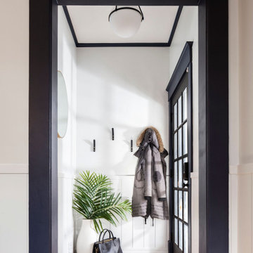
This 1910 West Highlands home was so compartmentalized that you couldn't help to notice you were constantly entering a new room every 8-10 feet. There was also a 500 SF addition put on the back of the home to accommodate a living room, 3/4 bath, laundry room and back foyer - 350 SF of that was for the living room. Needless to say, the house needed to be gutted and replanned.
Kitchen+Dining+Laundry-Like most of these early 1900's homes, the kitchen was not the heartbeat of the home like they are today. This kitchen was tucked away in the back and smaller than any other social rooms in the house. We knocked out the walls of the dining room to expand and created an open floor plan suitable for any type of gathering. As a nod to the history of the home, we used butcherblock for all the countertops and shelving which was accented by tones of brass, dusty blues and light-warm greys. This room had no storage before so creating ample storage and a variety of storage types was a critical ask for the client. One of my favorite details is the blue crown that draws from one end of the space to the other, accenting a ceiling that was otherwise forgotten.
Primary Bath-This did not exist prior to the remodel and the client wanted a more neutral space with strong visual details. We split the walls in half with a datum line that transitions from penny gap molding to the tile in the shower. To provide some more visual drama, we did a chevron tile arrangement on the floor, gridded the shower enclosure for some deep contrast an array of brass and quartz to elevate the finishes.
Powder Bath-This is always a fun place to let your vision get out of the box a bit. All the elements were familiar to the space but modernized and more playful. The floor has a wood look tile in a herringbone arrangement, a navy vanity, gold fixtures that are all servants to the star of the room - the blue and white deco wall tile behind the vanity.
Full Bath-This was a quirky little bathroom that you'd always keep the door closed when guests are over. Now we have brought the blue tones into the space and accented it with bronze fixtures and a playful southwestern floor tile.
Living Room & Office-This room was too big for its own good and now serves multiple purposes. We condensed the space to provide a living area for the whole family plus other guests and left enough room to explain the space with floor cushions. The office was a bonus to the project as it provided privacy to a room that otherwise had none before.
 La Lune Collection
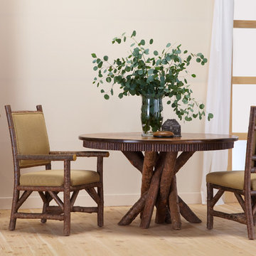
Rustic Dining Table #3091, Rustic Side Chair #1288, Rustic Arm Chair #1290, Rustic Hutch #2042 by La Lune Collection.
Since 1978, La Lune Collection has produced simply the finest rustic furniture for commercial and residential installations, presenting over 600 designs of seating, cabinets, tables, beds, and accessories.
Sponsored
Delaware, OH

Buckeye Basements, Inc.
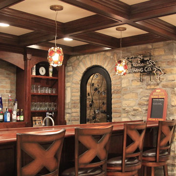
Central Ohio's Basement Finishing ExpertsBest Of Houzz '13-'21
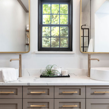 TVL Creative Ltd.
This 1910 West Highlands home was so compartmentalized that you couldn't help to notice you were constantly entering a new room every 8-10 feet. There was also a 500 SF addition put on the back of the home to accommodate a living room, 3/4 bath, laundry room and back foyer - 350 SF of that was for the living room. Needless to say, the house needed to be gutted and replanned.
Kitchen+Dining+Laundry-Like most of these early 1900's homes, the kitchen was not the heartbeat of the home like they are today. This kitchen was tucked away in the back and smaller than any other social rooms in the house. We knocked out the walls of the dining room to expand and created an open floor plan suitable for any type of gathering. As a nod to the history of the home, we used butcherblock for all the countertops and shelving which was accented by tones of brass, dusty blues and light-warm greys. This room had no storage before so creating ample storage and a variety of storage types was a critical ask for the client. One of my favorite details is the blue crown that draws from one end of the space to the other, accenting a ceiling that was otherwise forgotten.
Primary Bath-This did not exist prior to the remodel and the client wanted a more neutral space with strong visual details. We split the walls in half with a datum line that transitions from penny gap molding to the tile in the shower. To provide some more visual drama, we did a chevron tile arrangement on the floor, gridded the shower enclosure for some deep contrast an array of brass and quartz to elevate the finishes.
Powder Bath-This is always a fun place to let your vision get out of the box a bit. All the elements were familiar to the space but modernized and more playful. The floor has a wood look tile in a herringbone arrangement, a navy vanity, gold fixtures that are all servants to the star of the room - the blue and white deco wall tile behind the vanity.
Full Bath-This was a quirky little bathroom that you'd always keep the door closed when guests are over. Now we have brought the blue tones into the space and accented it with bronze fixtures and a playful southwestern floor tile.
Living Room & Office-This room was too big for its own good and now serves multiple purposes. We condensed the space to provide a living area for the whole family plus other guests and left enough room to explain the space with floor cushions. The office was a bonus to the project as it provided privacy to a room that otherwise had none before.
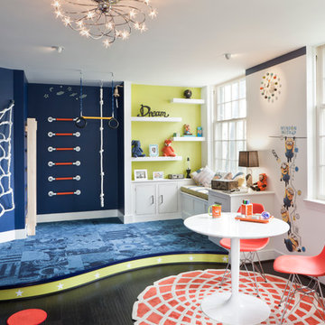
 DC Design House
Playroom design: Katherine Vernot-Jonas, Katherine Vernot-Jonas Designs
Photo: Angie Seckinger
Trendy kids' room photo in DC Metro
Trendy kids' room photo in DC Metro
 Interiors by Popov
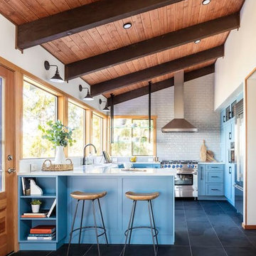
When we drove out to Mukilteo for our initial consultation, we immediately fell in love with this house. With its tall ceilings, eclectic mix of wood, glass and steel, and gorgeous view of the Puget Sound, we quickly nicknamed this project "The Mukilteo Gem". Our client, a cook and baker, did not like her existing kitchen. The main points of issue were short runs of available counter tops, lack of storage and shortage of light. So, we were called in to implement some big, bold ideas into a small footprint kitchen with big potential. We completely changed the layout of the room by creating a tall, built-in storage wall and a continuous u-shape counter top. Early in the project, we took inventory of every item our clients wanted to store in the kitchen and ensured that every spoon, gadget, or bowl would have a dedicated "home" in their new kitchen. The finishes were meticulously selected to ensure continuity throughout the house. We also played with the color scheme to achieve a bold yet natural feel.This kitchen is a prime example of how color can be used to both make a statement and project peace and balance simultaneously. While busy at work on our client's kitchen improvement, we also updated the entry and gave the homeowner a modern laundry room with triple the storage space they originally had.
End result: ecstatic clients and a very happy design team. That's what we call a big success!
John Granen.

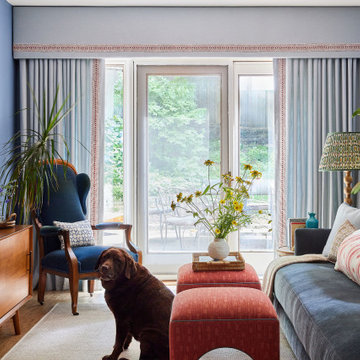
 Rachel Gedymin Design
Transitional medium tone wood floor and brown floor living room photo in New York with blue walls and a wall-mounted tv
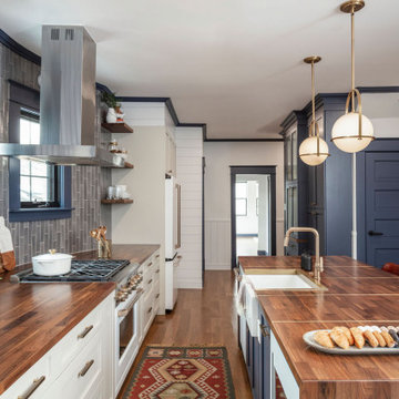 TVL Creative Ltd.
This 1910 West Highlands home was so compartmentalized that you couldn't help to notice you were constantly entering a new room every 8-10 feet. There was also a 500 SF addition put on the back of the home to accommodate a living room, 3/4 bath, laundry room and back foyer - 350 SF of that was for the living room. Needless to say, the house needed to be gutted and replanned.
Kitchen+Dining+Laundry-Like most of these early 1900's homes, the kitchen was not the heartbeat of the home like they are today. This kitchen was tucked away in the back and smaller than any other social rooms in the house. We knocked out the walls of the dining room to expand and created an open floor plan suitable for any type of gathering. As a nod to the history of the home, we used butcherblock for all the countertops and shelving which was accented by tones of brass, dusty blues and light-warm greys. This room had no storage before so creating ample storage and a variety of storage types was a critical ask for the client. One of my favorite details is the blue crown that draws from one end of the space to the other, accenting a ceiling that was otherwise forgotten.
Primary Bath-This did not exist prior to the remodel and the client wanted a more neutral space with strong visual details. We split the walls in half with a datum line that transitions from penny gap molding to the tile in the shower. To provide some more visual drama, we did a chevron tile arrangement on the floor, gridded the shower enclosure for some deep contrast an array of brass and quartz to elevate the finishes.
Powder Bath-This is always a fun place to let your vision get out of the box a bit. All the elements were familiar to the space but modernized and more playful. The floor has a wood look tile in a herringbone arrangement, a navy vanity, gold fixtures that are all servants to the star of the room - the blue and white deco wall tile behind the vanity.
Full Bath-This was a quirky little bathroom that you'd always keep the door closed when guests are over. Now we have brought the blue tones into the space and accented it with bronze fixtures and a playful southwestern floor tile.
Living Room & Office-This room was too big for its own good and now serves multiple purposes. We condensed the space to provide a living area for the whole family plus other guests and left enough room to explain the space with floor cushions. The office was a bonus to the project as it provided privacy to a room that otherwise had none before.

 Living with Lolo
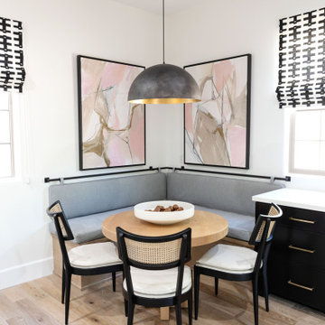
Dining Room in Trailside View | Refined Transitional Home in Scottsdale, AZ |
Room Type: Whole Home Remodel and Furnishings |
Project Name: Trailside View Residence |
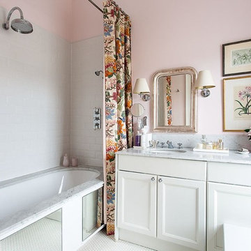
Key Feature: A full home remodel and furnishings project anchored by white oak cabinetry and countertops, where the clients gave Living with Lolo real creative freedom to play with bold fabrics, wallpapers, and drapery that most homeowners would talk themselves out of.
Challenge: Transitional design can play it safe by default, neutral palette, inoffensive finishes, nothing that makes you catch your breath. The remodel needed a strong foundation that felt refined and timeless, but the clients wanted more than that. They wanted a home with personality, and the challenge was channeling that creative openness into something cohesive rather than chaotic.
Solution: Living with Lolo used white oak cabinetry and countertops to ground the remodel in warmth and quiet sophistication, then let the soft goods carry the personality. Bold fabric choices, expressive wallpapers, and thoughtful drapery gave each room its own moment without losing the thread that connected the whole home. Because the remodel and furnishings were managed together under one roof, the bolder design choices landed the way they were intended to rather than feeling like afterthoughts layered onto a finished renovation.
Materials: White oak cabinetry, white oak countertops, curated wallpapers, bold upholstery fabrics, custom drapery, and layered accessories sourced through Living with Lolo's trade relationships.
Budget: $250,000 to $550,000 |
Timeline: Approximately 5 to 9 months from design through completion.

 Alison Kandler Interior Design
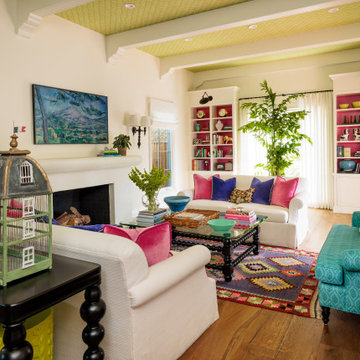
Example of a large eclectic formal ceramic tile, green floor and wallpaper ceiling living room design in Los Angeles with a standard fireplace and a wall-mounted tv
 DesignbyRuchi
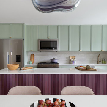
The existing galley kitchen was opened up fully, the hardest part, to create a fully open concept living for this family who loves to cook and entertain. The custom kitchen island has a beautiful fluted detail on the back which makes for great view from the great room. The backsplash is a travertine tile in a large format and almost feels like a slab.
Sponsored
Fredericksburg, OH

High Point Cabinets
Columbus' Experienced Custom Cabinet Builder | 4x Best of Houzz Winner
 Garden Structures & More
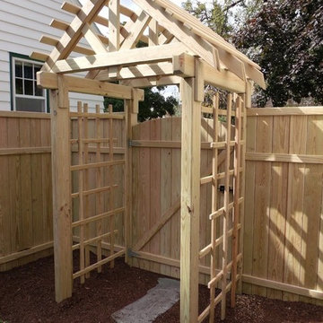
I will just be quiet while you observe.
Photo of a large contemporary partial sun backyard gravel landscaping in Minneapolis for summer.
Photo of a large contemporary partial sun backyard gravel landscaping in Minneapolis for summer.
 Cross Custom Homes
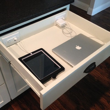
Drawer in kitchen for electronics and charger storage
Example of a small cottage home design design in Dallas
Example of a small cottage home design design in Dallas
 ZeroEnergy Design
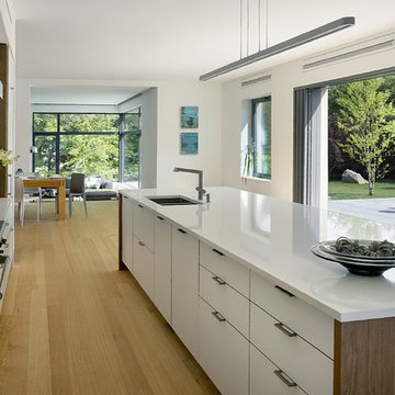
ZeroEnergy Design (ZED) created this modern home for a progressive family in the desirable community of Lexington.
Thoughtful Land Connection. The residence is carefully sited on the infill lot so as to create privacy from the road and neighbors, while cultivating a side yard that captures the southern sun. The terraced grade rises to meet the house, allowing for it to maintain a structured connection with the ground while also sitting above the high water table. The elevated outdoor living space maintains a strong connection with the indoor living space, while the stepped edge ties it back to the true ground plane. Siting and outdoor connections were completed by ZED in collaboration with landscape designer Soren Deniord Design Studio.
Exterior Finishes and Solar. The exterior finish materials include a palette of shiplapped wood siding, through-colored fiber cement panels and stucco. A rooftop parapet hides the solar panels above, while a gutter and site drainage system directs rainwater into an irrigation cistern and dry wells that recharge the groundwater.
Cooking, Dining, Living. Inside, the kitchen, fabricated by Henrybuilt, is located between the indoor and outdoor dining areas. The expansive south-facing sliding door opens to seamlessly connect the spaces, using a retractable awning to provide shade during the summer while still admitting the warming winter sun. The indoor living space continues from the dining areas across to the sunken living area, with a view that returns again to the outside through the corner wall of glass.
Accessible Guest Suite. The design of the first level guest suite provides for both aging in place and guests who regularly visit for extended stays. The patio off the north side of the house affords guests their own private outdoor space, and privacy from the neighbor. Similarly, the second level master suite opens to an outdoor private roof deck.
Light and Access. The wide open interior stair with a glass panel rail leads from the top level down to the well insulated basement. The design of the basement, used as an away/play space, addresses the need for both natural light and easy access. In addition to the open stairwell, light is admitted to the north side of the area with a high performance, Passive House (PHI) certified skylight, covering a six by sixteen foot area. On the south side, a unique roof hatch set flush with the deck opens to reveal a glass door at the base of the stairwell which provides additional light and access from the deck above down to the play space.
Energy. Energy consumption is reduced by the high performance building envelope, high efficiency mechanical systems, and then offset with renewable energy. All windows and doors are made of high performance triple paned glass with thermally broken aluminum frames. The exterior wall assembly employs dense pack cellulose in the stud cavity, a continuous air barrier, and four inches exterior rigid foam insulation. The 10kW rooftop solar electric system provides clean energy production. The final air leakage testing yielded 0.6 ACH 50 - an extremely air tight house, a testament to the well-designed details, progress testing and quality construction. When compared to a new house built to code requirements, this home consumes only 19% of the energy.
Architecture & Energy Consulting: ZeroEnergy Design
Landscape Design: Soren Deniord Design
Paintings: Bernd Haussmann Studio
Photos: Eric Roth Photography
31