
Search results for "Belongs" in Home Design Ideas

 User
For this vacation home, a complete gut job was needed in order to fit the lifestyle and needs of this young family of four and their guests. The narrow floor plan created unique challenges, but we maximized its full potential. The result was a warm but modern design with plenty of storage and seating.
One of the biggest challenges was making sure everyone had a place to sit in the kitchen. The space between the kitchen and staircase was limiting, but with sleek modern chairs that tuck away, we were able to allow for traffic patterns and seat all of the children.
To accommodate any vacation extras, an extra wide space near the kitchen and bathroom was transformed into additional shelving. We installed floor-to-ceiling cabinets that offer plenty of space for everyone’s belongings.
A clean design was a must, so we opted for a more modern look. We used Benjamin Moore's "Simply White" as the foundation, putting it on the walls and cabinets, and coordinating the countertops and backsplash. To make the home more welcoming, we used natural wood on the island and floating shelves. The wood was coordinated with the floor, creating a cohesive interior.
Project designed by Star Valley, Wyoming interior design firm Tawna Allred Interiors. They also serve Alpine, Auburn, Bedford, Etna, Freedom, Freedom, Grover, Thayne, Turnerville, Swan Valley, and Jackson Hole, Wyoming
 Blondie's Treehouse Inc
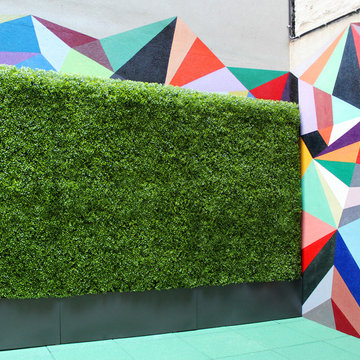
Referencing this square footage as an internal courtyard might be a stretch. A more accurate description would perhaps be the awesome things that New Yorkers can do with the tiny spaces we have.
The parameters of the project lend to its description. This Tribeca residential building’s shared amenity space and gym on the lower level opens up onto a 350 square foot space of brick walls and concrete pavers. The south wall of this space is made up by the terraces belonging to the residential units above and while the setting allows for minimal ambient light, each balcony looks down onto the shared space below.
In order to provide visual interest from the gym and the overhead views, Blondie’s designers Sara Baerwald and Eva Vessio utilized Jay Scott’s rectangle containers lining the north wall as well as surrounding the utilities in the southwest corner. They then created 8 foot faux boxwood hedge on the north wall and the appropriate height to conceal the utilities. From below the hedge creates the feeling of a courtyard and from above it softens the view of the once barren space. Adding color and functionality, the concrete pavers were replaced with rubber tiles in a bright aqua. To play off of this color and add a unique level of visual impact, artist Chris Pearson designed and painted a multi-color prism mural. Primarily on the east wall and then stretching over the hedges to the south, the depth and dimension that this mural provides for the space is incredible. It is a testament to the successful solutions we conjure when thinking outside the box and allowing for unique site specific resolutions.

 Jarrett Design
Every so often, or perhaps more often than not, we walk into a home and feel that the kitchen belongs in a different location. Our Walnut and White kitchen had that feeling. Like many homes built in the 80’s, the kitchen was closed off. While it was centrally located between the dining room and family room, the small galley kitchen with an awkward pass-through to the family room did not function for this couple who enjoys spending their evenings cooking together.
Removing all of the walls, providing clear site lines from one end of the house to the other, gave these homeowners a space that worked for them and their family. The kitchen moved into the family room space, and the family room moved into the dining room space while the dining area is now nestled between the two.
The homeowner’s style of warm contemporary led us to a slab door and drawer in a soft white paint with accents of natural walnut. The built-in refrigerator and coordinating built in pantry cabinet anchor the wall with their walnut surround while counter wall cabinets hide all of the small appliances, allowing the quartz counters and quartzite backsplash to shine.
Jacqueline Powell Photography
Find the right local pro for your project
 Blondie's Treehouse Inc
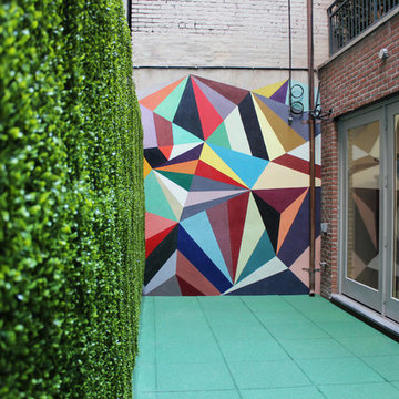
Referencing this square footage as an internal courtyard might be a stretch. A more accurate description would perhaps be the awesome things that New Yorkers can do with the tiny spaces we have.
The parameters of the project lend to its description. This Tribeca residential building’s shared amenity space and gym on the lower level opens up onto a 350 square foot space of brick walls and concrete pavers. The south wall of this space is made up by the terraces belonging to the residential units above and while the setting allows for minimal ambient light, each balcony looks down onto the shared space below.
In order to provide visual interest from the gym and the overhead views, Blondie’s designers Sara Baerwald and Eva Vessio utilized Jay Scott’s rectangle containers lining the north wall as well as surrounding the utilities in the southwest corner. They then created 8 foot faux boxwood hedge on the north wall and the appropriate height to conceal the utilities. From below the hedge creates the feeling of a courtyard and from above it softens the view of the once barren space. Adding color and functionality, the concrete pavers were replaced with rubber tiles in a bright aqua. To play off of this color and add a unique level of visual impact, artist Chris Pearson designed and painted a multi-color prism mural. Primarily on the east wall and then stretching over the hedges to the south, the depth and dimension that this mural provides for the space is incredible. It is a testament to the successful solutions we conjure when thinking outside the box and allowing for unique site specific resolutions.
 Jarrett Design
Every so often, or perhaps more often than not, we walk into a home and feel that the kitchen belongs in a different location. Our Walnut and White kitchen had that feeling. Like many homes built in the 80’s, the kitchen was closed off. While it was centrally located between the dining room and family room, the small galley kitchen with an awkward pass-through to the family room did not function for this couple who enjoys spending their evenings cooking together.
Removing all of the walls, providing clear site lines from one end of the house to the other, gave these homeowners a space that worked for them and their family. The kitchen moved into the family room space, and the family room moved into the dining room space while the dining area is now nestled between the two.
The homeowner’s style of warm contemporary led us to a slab door and drawer in a soft white paint with accents of natural walnut. The built-in refrigerator and coordinating built in pantry cabinet anchor the wall with their walnut surround while counter wall cabinets hide all of the small appliances, allowing the quartz counters and quartzite backsplash to shine.
Jacqueline Powell Photography

 TVL Creative Ltd.
Our wonderful Baker clients were ready to remodel the kitchen in their c.1900 home shortly after moving in. They were looking to undo the 90s remodel that existed, and make the kitchen feel like it belonged in their historic home. We were able to design a balance that incorporated the vintage charm of their home and the modern pops that really give the kitchen its personality. We started by removing the mirrored wall that had separated their kitchen from the breakfast area. This allowed us the opportunity to open up their space dramatically and create a cohesive design that brings the two rooms together. To further our goal of making their kitchen appear more open we removed the wall cabinets along their exterior wall and replaced them with open shelves. We then incorporated a pantry cabinet into their refrigerator wall to balance out their storage needs. This new layout also provided us with the space to include a peninsula with counter seating so that guests can keep the cook company. We struck a fun balance of materials starting with the black & white hexagon tile on the floor to give us a pop of pattern. We then layered on simple grey shaker cabinets and used a butcher block counter top to add warmth to their kitchen. We kept the backsplash clean by utilizing an elongated white subway tile, and painted the walls a rich blue to add a touch of sophistication to the space.
 Blondie's Treehouse Inc
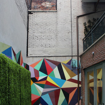
Referencing this square footage as an internal courtyard might be a stretch. A more accurate description would perhaps be the awesome things that New Yorkers can do with the tiny spaces we have.
The parameters of the project lend to its description. This Tribeca residential building’s shared amenity space and gym on the lower level opens up onto a 350 square foot space of brick walls and concrete pavers. The south wall of this space is made up by the terraces belonging to the residential units above and while the setting allows for minimal ambient light, each balcony looks down onto the shared space below.
In order to provide visual interest from the gym and the overhead views, Blondie’s designers Sara Baerwald and Eva Vessio utilized Jay Scott’s rectangle containers lining the north wall as well as surrounding the utilities in the southwest corner. They then created 8 foot faux boxwood hedge on the north wall and the appropriate height to conceal the utilities. From below the hedge creates the feeling of a courtyard and from above it softens the view of the once barren space. Adding color and functionality, the concrete pavers were replaced with rubber tiles in a bright aqua. To play off of this color and add a unique level of visual impact, artist Chris Pearson designed and painted a multi-color prism mural. Primarily on the east wall and then stretching over the hedges to the south, the depth and dimension that this mural provides for the space is incredible. It is a testament to the successful solutions we conjure when thinking outside the box and allowing for unique site specific resolutions.

 MIG Furniture Design, Inc.
SPECIAL ORDER 8-14 WEEKS
Made in Italy by Gruppo Spar Holding
Modern Italian Wall Unit SP-Composition Y33. This modern modular wall, consisting of individual pieces, is a great design solution for those, who are full of creativity and desire to reveal their individuality and arrange the living room by themselves. The individual units allow to organize only those areas you want in the way you need it and prefer, which is impossible to do with the joint wall unit compositions. The entertainment center provides an abundance of storage space, both hidden and exposed, to aid with organization of all your belongings.
The Wall Unit Composition Y33 is shown in the next colors/finishes:
Structure - White and Anthracite Gloss lacquer;
Front - White and Anthracite Gloss lacquer;
Glass - Mirrored glass.
PLEASE NOTE: The Exential is a modular wall unit line offering a wide variety of units in different sizes. You can order this wall unit either as a complete composition, as shown in the main picture, or build your own composition according to your own dimensions and preferences. Please contact our office about details on the customization of this wall unit.
MATERIAL/CONSTRUCTION:
Structure: Made with particle board of wood, covered with E1 melamine finishes or high gloss / matt lacquered
Glass: 4 mm glass
Drawers: Made with panels of wood particles in E1-coated finish PVC beech. Metal runners with fine race to fall
The starting price is for the Wall Unit Composition Y33 as shown in the main picture.
Dimensions:
Shown Wall Unit Composition: W130" x D22.8" x H78"
 Jarrett Design
Every so often, or perhaps more often than not, we walk into a home and feel that the kitchen belongs in a different location. Our Walnut and White kitchen had that feeling. Like many homes built in the 80’s, the kitchen was closed off. While it was centrally located between the dining room and family room, the small galley kitchen with an awkward pass-through to the family room did not function for this couple who enjoys spending their evenings cooking together.
Removing all of the walls, providing clear site lines from one end of the house to the other, gave these homeowners a space that worked for them and their family. The kitchen moved into the family room space, and the family room moved into the dining room space while the dining area is now nestled between the two.
The homeowner’s style of warm contemporary led us to a slab door and drawer in a soft white paint with accents of natural walnut. The built-in refrigerator and coordinating built in pantry cabinet anchor the wall with their walnut surround while counter wall cabinets hide all of the small appliances, allowing the quartz counters and quartzite backsplash to shine.
Jacqueline Powell Photography

 DM Design Solutions
DM Designs - Chicago
Design Objective: Convert a studio on the 87th floor of the John Hancock Building into a sophisticated, playful, elegant Mad Men-esque Mens Club / Pied a Terre. This was a complete gut renovation.
Our inspiration was the vintage orange tweed sofa the client had purchased for the space. We wanted classy, not kitschy, so designing the "bones" of the condo in timeless and elegant materials was essential. To ground the space and make a dramatic first impression, we selected reclaimed hardwood flooring from a 1800 French Chateau and laid it on the timeless and classic herringbone pattern. From there, we added seagrass wallpaper, custom wood paneled walls, vintage gun and decorative mirrors from the 1970's for the kitchen backsplash and added classic furnishings such as the Platner dining table and black tulip chairs. The coolest feature by far was the custom bookshelf/hidden door we designed to create a library foyer that masked the entry to the bathroom. Inside the bathroom, we converted a vintage, mid century modern bar cabinet into a vanity complete with a honey onyx countertop that lights up from within when you enter the space. Completing the space overall is a framed, original Men's Club Charter that greets you upon entry and that belonged to the client's father.
 MIG Furniture Design, Inc.
SPECIAL ORDER 8-14 WEEKS
Made in Italy by Gruppo Spar Holding
Modern Italian Wall Unit SP-Composition Y30. This modern modular wall, consisting of individual pieces, is a great design solution for those, who are full of creativity and desire to reveal their individuality and arrange the living room by themselves. The individual units allow to organize only those areas you want in the way you need it and prefer, which is impossible to do with the joint wall unit compositions. The entertainment center provides an abundance of storage space, both hidden and exposed, to aid with organization of all your belongings. Large TV area allows to place a huge TV, turning the living room into a movie theater.
The Wall Unit Composition Y30 is shown in the next colors/finishes:
Structure - White, Cappuccino and Anthracite Gloss lacquers;
Front - White, Cappuccino and Anthracite Gloss lacquers.
PLEASE NOTE: The Exential is a modular wall unit line offering a wide variety of units in different sizes. You can order this wall unit either as a complete composition, as shown in the main picture, or build your own composition according to your own dimensions and preferences. Please contact our office about details on the customization of this wall unit.
MATERIAL/CONSTRUCTION:
Structure: Made with particle board of wood, covered with E1 melamine finishes or high gloss / matt lacquered
Glass: 4 mm glass
Drawers: Made with panels of wood particles in E1-coated finish PVC beech. Metal runners with fine race to fall
The starting price is for the Wall Unit Composition Y30 as shown in the main picture.
Dimensions:
Shown Wall Unit Composition: W141.7" x D22.8" x H78"
 Laure Nell Interiors
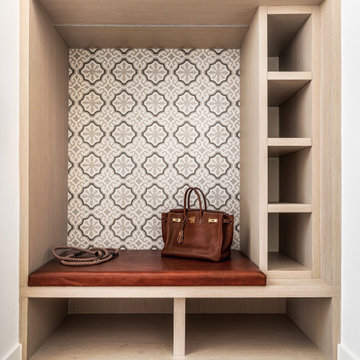
This 6,399-square-foot house in Boca Raton belongs to two surgeons who love to travel. And it needed a facelift in order to truly feel like a home that reflected their tastes, lifestyle and shared memories. So Laure Nell Interiors came on board to remodel and modernize their kitchen and dining room, create a dedicated office nook, and design an inviting mudroom clad in encaustic ceramic tile that greets the owners when they come home after a busy day at work.
The owners wanted a streamlined, European-inspired kitchen with Scandinavian, minimalist details where the stone-wrapped hood would be the hero. But it would also need to function for the wife who likes to bake often with their younger daughter. We created an integrated bar to house the owners’ beloved collection of Barollo wines from Italy, and custom shelving that displays their Murano glass pieces along with ceramics that were also brought back from Europe.
A creamy palette of white quartz with minimal veining provided a canvas for custom sandy-hued cabinetry—each door panel hand painted in a custom finish that preserves the natural variations of the wood. Taupe dining chairs harmonize with the color scheme, contrasted with pops of caramel from Demvel’s custom leather cabinet handles and leather seat in the mudroom, and barstools from Design Within Reach. Now the owners and their family can continue their Nordic adventures even when they’re still at home. Photography by Jack Cook
 User
For this vacation home, a complete gut job was needed in order to fit the lifestyle and needs of this young family of four and their guests. The narrow floor plan created unique challenges, but we maximized its full potential. The result was a warm but modern design with plenty of storage and seating.
One of the biggest challenges was making sure everyone had a place to sit in the kitchen. The space between the kitchen and staircase was limiting, but with sleek modern chairs that tuck away, we were able to allow for traffic patterns and seat all of the children.
To accommodate any vacation extras, an extra wide space near the kitchen and bathroom was transformed into additional shelving. We installed floor-to-ceiling cabinets that offer plenty of space for everyone’s belongings.
A clean design was a must, so we opted for a more modern look. We used Benjamin Moore's "Simply White" as the foundation, putting it on the walls and cabinets, and coordinating the countertops and backsplash. To make the home more welcoming, we used natural wood on the island and floating shelves. The wood was coordinated with the floor, creating a cohesive interior.
Project designed by Star Valley, Wyoming interior design firm Tawna Allred Interiors. They also serve Alpine, Auburn, Bedford, Etna, Freedom, Freedom, Grover, Thayne, Turnerville, Swan Valley, and Jackson Hole, Wyoming
 TVL Creative Ltd.
Our wonderful Baker clients were ready to remodel the kitchen in their c.1900 home shortly after moving in. They were looking to undo the 90s remodel that existed, and make the kitchen feel like it belonged in their historic home. We were able to design a balance that incorporated the vintage charm of their home and the modern pops that really give the kitchen its personality. We started by removing the mirrored wall that had separated their kitchen from the breakfast area. This allowed us the opportunity to open up their space dramatically and create a cohesive design that brings the two rooms together. To further our goal of making their kitchen appear more open we removed the wall cabinets along their exterior wall and replaced them with open shelves. We then incorporated a pantry cabinet into their refrigerator wall to balance out their storage needs. This new layout also provided us with the space to include a peninsula with counter seating so that guests can keep the cook company. We struck a fun balance of materials starting with the black & white hexagon tile on the floor to give us a pop of pattern. We then layered on simple grey shaker cabinets and used a butcher block counter top to add warmth to their kitchen. We kept the backsplash clean by utilizing an elongated white subway tile, and painted the walls a rich blue to add a touch of sophistication to the space.

 Simply Home Decorating
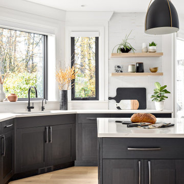
This beautiful North Vancouver home belongs to a nature-loving and health-conscious couple, Emma and Vince (names changed), their two young children, and their dog, Jasper. When they contacted us about renovating and furnishing their kitchen and family room, we walked in and saw a world of potential waiting to be uncovered.
Before: Larkhall Crescent Home:
Like many original North Vancouver homes, the interior was definitely dated. We encountered late ‘80s finishes in powder pink and teal green, old carpet, and a kitchen that wasn’t maximized to suit this family’s modern-day lifestyle. However, the size of the rooms offered us a ton of space with which to get creative.
Knowing our clients’ love of cooking, need for work spaces (Emma and Vince both work remotely), and growing family, we developed a design concept that would increase usable space, optimize storage, and create intimacy in this large area. As for the style, we were inspired by their European roots, inventing a new and modern take on “Belgian Farmhouse” style. Now, the home is truly one-of-a-kind.
After: Warm & Cozy Family Room:
Fresh, bright, and comfortable, this living area has been transformed! We started with the fireplace as a focal point, selecting aged brick tiles for added texture and a crisp wood mantle. The taupe-coloured sectional infuses the room with visual warmth and serves the added purpose of separating the family room from the kitchen.
Emma and Vince were also keen on using non-toxic materials in their home, and we were happy to oblige. To meet their needs, we sourced natural wood elements and sought out Canadian-made products - that adhere to high health standards - whenever possible.
Look closer at the elements of this space, and you will find this stunning, honeycomb-patterned rug in earthy gold, beige, and charcoal tones. It’s plush to the touch and full of visual texture that brings this room’s colour palette together. We sourced these two-tone chairs with caning, petrified wood side table, black sconces, and botanical prints in greyscale from local artist, Heather Johnston.
We topped off the space with this dark wood and rattan console that offers storage facing the kitchen and presents an opportunity to display cherished items. The result is a cozy lounging space brimming with comfort and functionality. It’s perfect for enjoying quality family time, or Emma can simply slide the coffee table away to make room for her morning yoga practice.
Now, let’s turn around and give some attention to the kitchen. Do you remember what the original kitchen looked like? If not, scroll back up, because the transformation is shocking…
Moody & Welcoming Kitchen for Healthy Living:
This kitchen looks very different from how it started, right? Though we didn’t touch any walls, the kitchen has almost doubled in usable space! We created a long, extended island with storage, an outlet for small appliances, and seating for comfortable prep, after-school snacking, or mingling among friends.
On the other side of the island, the family has even more storage and an integrated dishwasher within easy reach of the sink, perfect for quick clean-up. From this angle, you can also see the expansive custom Shaker cabinetry in white and the integrated double ovens. These facilitate their cooking experience and gave us the opportunity to add an additional surprise…
A coffee garage station and more hidden storage! Keeping these items located along the perimeter allows them to be accessed by the family or their guests without someone getting under the cook’s feet. These are the little details that make everyday life easier and more enjoyable.
Moving deeper into the kitchen, the seamless induction cooktop topped with a freestanding concealed hood fan commands attention in a soft yet prominent way. The natural wood accent mirrors the fireplace mantle, and the choice of off-black wood-grain cabinets not only continues our black-and-white colour palette but adds a sense of depth and contrast. The corner sink is located to the right and perfectly positioned with a view of their thriving backyard.
To invite more of this family’s character into the space, we mixed metals for interest — matte black, dark pewter, and warm brass — and created open shelves in white oak for their plants and decor. You can also glimpse the tumbled edge of the backsplash tile, which echoes the rustic brick of the fireplace. It adds that farmhouse charm while still feeling timeless and sophisticated.
Last but not least, we designed this dining banquette in the bay window (with integrated bench storage, of course), where the family can share a meal together, the kids can do homework, or Emma and Vince can work and enjoy a change of scenery from their offices. Like the other spaces in the home, it was designed to be beautiful, multi-functional, and long-lasting.
Praise from Our Clients:
It is clear that we love this home, but what did our clients have to say?
“Lori is a visionary and masters execution to the finest detail all at the same time. When she first met us to know more about who we are and how we live, she could right away envision how we could use the space in our kitchen and living room…The results exceeded our expectations.
Lori and her team were also a delight to work with — coordination with all the trades, fast problem-solving, regular updates, professional and friendly attitude of her entire team — made it the dream team. Thank you SHD for making our space so beautiful!”
In turn, we are so grateful for this family’s trust, their open communication, and for being wonderful people with whom to work. (So, thank you!)

 Stonebridge Mosaics
A beautiful design of Thassos and Mother of Pearl in a very unique shade of blue!
Minimalist bathroom photo in New York
Minimalist bathroom photo in New York
 DM Design Solutions
DM Designs - Chicago
Design Objective: Convert a studio on the 87th floor of the John Hancock Building into a sophisticated, playful, elegant Mad Men-esque Mens Club / Pied a Terre. This was a complete gut renovation.
Our inspiration was the vintage orange tweed sofa the client had purchased for the space. We wanted classy, not kitschy, so designing the "bones" of the condo in timeless and elegant materials was essential. To ground the space and make a dramatic first impression, we selected reclaimed hardwood flooring from a 1800 French Chateau and laid it on the timeless and classic herringbone pattern. From there, we added seagrass wallpaper, custom wood paneled walls, vintage gun and decorative mirrors from the 1970's for the kitchen backsplash and added classic furnishings such as the Platner dining table and black tulip chairs. The coolest feature by far was the custom bookshelf/hidden door we designed to create a library foyer that masked the entry to the bathroom. Inside the bathroom, we converted a vintage, mid century modern bar cabinet into a vanity complete with a honey onyx countertop that lights up from within when you enter the space. Completing the space overall is a framed, original Men's Club Charter that greets you upon entry and that belonged to the client's father.
 Studio VAE
Situated at the end of a cul-de-sac near the beautiful Mount Sutro Open Space Reserve, this 1907 Parnassus Heights home belongs to an active couple with a young daughter. They had dreams of transforming their home into a comforting refuge, equally equipped to whip up cocktails for guests, welcome them home after a good surf, or host their aging parents.
We touched just about every space in this home, including the kitchen, hallway, dining room, bedrooms, and bathrooms. In addition, we updated the basement hall that leads to the outside, transforming it into a more presentable entry for guests, and created an enclosed storage space. Given the age of the home and its location on a hillside, precise structural work was involved to renew the home’s integrity.
In the kitchen, which was originally dark and cramped, we made dramatic changes. We expanded the kitchen’s footprint, designing it to capture the expansive city views and create the indoor-outdoor living space they had always wanted. A large island with custom concrete countertops, a custom banquette, and beautiful red oak cabinets are just a few of the standout features in this soothing space.
The rest of this home’s spaces received equally thoughtful planning: floor-to-ceiling bedroom wardrobes with integrated lighting, custom built-in elements, carefully layered lighting for ambiance and drama, a steam shower in the primary bathroom, and the addition of skylights to bring in natural light. This home is now an inviting, purposeful space perfectly tailored to infusing joy and ease into their everyday lives.
 User
For this vacation home, a complete gut job was needed in order to fit the lifestyle and needs of this young family of four and their guests. The narrow floor plan created unique challenges, but we maximized its full potential. The result was a warm but modern design with plenty of storage and seating.
One of the biggest challenges was making sure everyone had a place to sit in the kitchen. The space between the kitchen and staircase was limiting, but with sleek modern chairs that tuck away, we were able to allow for traffic patterns and seat all of the children.
To accommodate any vacation extras, an extra wide space near the kitchen and bathroom was transformed into additional shelving. We installed floor-to-ceiling cabinets that offer plenty of space for everyone’s belongings.
A clean design was a must, so we opted for a more modern look. We used Benjamin Moore's "Simply White" as the foundation, putting it on the walls and cabinets, and coordinating the countertops and backsplash. To make the home more welcoming, we used natural wood on the island and floating shelves. The wood was coordinated with the floor, creating a cohesive interior.
Project designed by Star Valley, Wyoming interior design firm Tawna Allred Interiors. They also serve Alpine, Auburn, Bedford, Etna, Freedom, Freedom, Grover, Thayne, Turnerville, Swan Valley, and Jackson Hole, Wyoming
204