
Search results for "Belongs" in Home Design Ideas
 Archbuild Architects + Builders
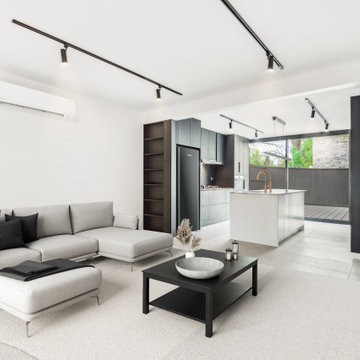
We are thrilled to present one of our recent major renovation projects, an exquisite transformation of an old townhouse/terrace house located in the scenic Sydney Northern Beaches. This project is a testament to our commitment to delivering excellence and luxurious details in every aspect of our architectural design and building services.
With a passion for preserving the historical charm of the old townhouse, while infusing it with modern elegance and sophistication, our team of skilled architects and builders worked vigorously to bring this vision to life. We understand the importance of maintaining the unique character of heritage buildings, and this project showcases our expertise in seamlessly blending the old with the new.
Our collaboration with Strata was instrumental in obtaining the necessary approvals and ensuring compliance with the strata bylaws. Additionally, we worked closely with the City of North Sydney Council to secure their approval for the renovation, ensuring that every aspect of the project adhered to the highest standards of quality and safety.
These photos belong to the house, before the renovation
The result is a stunning transformation that not only enhances the architectural beauty of the townhouse but also offers a luxurious and modern living space. Our meticulous attention to detail is evident in every element of the design, from the exquisite finishes to the carefully curated materials.
 Closet Factory
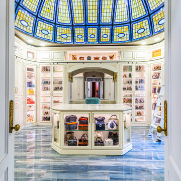
Welcome to the epitome of modern luxury and organization – your french baroque walk-in closet. This stylish haven is not just a storage space; it's a personalized boutique designed to elevate your wardrobe experience.
As you step into the room, the first thing you'll notice is the sleek design and ample natural light, accentuating the clean lines and neutral tones. The closet is thoughtfully organized, ensuring that every item has its designated place. The centerpiece of the room is a meticulously crafted island, adorned with a stylish countertop, providing a multifunctional space for folding clothes or laying out accessories.
On either side of the closet, custom-built shelves showcase your impressive shoe collection. Each pair has its own dedicated spot, allowing you to easily find and admire your favorite footwear. The shelves are not just practical; they're a display of artistry, designed to turn your shoes into a visual feast.
Ample storage solutions line the walls, offering designated sections for hanging clothes, folded items, and accessories. The closet's intelligent design maximizes space, ensuring that every inch is utilized efficiently. Integrated lighting adds a touch of glamour, spotlighting specific areas and creating an ambiance that turns dressing into an experience.
The french baroque walk-in closet isn't just a space to store your belongings; it's a sanctuary where you curate your style. It's a reflection of your taste, a blend of functionality and aesthetics that makes getting ready each day a joy. Welcome to a space where organization meets opulence, and where your wardrobe dreams come to life.
 Sosna Inc
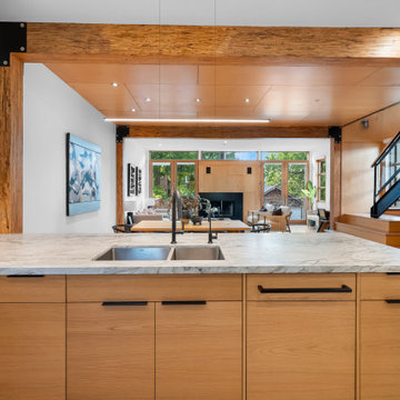
This Kitchen renovation was created for a busy family who wanted their home to better support the way they lived.
With two children, a dog, and demanding professional schedules, the Kitchen was the heart of their home. However, the existing space felt outdated, inefficient, and disconnected from their personal style. The heavy wood finishes and worn materials no longer reflected the look or functionality they wanted.
The goal was to create a Kitchen that felt fresh and elevated, while still looking like it had always belonged in the home.
The new design focused on improving functionality while carefully selecting materials that blended seamlessly with the existing finishes. White oak veneer Kitchen cabinetry brought warmth and timeless character, while a natural dolomite countertop became the centrepiece of the space.
Custom cabinetry was also added to the Mudroom, creating additional storage and helping the home function better for everyday life.
The Clients had a strong vision and a preference for natural materials rather than standard builder-grade finishes. Through thoughtful conversations and careful sourcing, we helped bring that vision to life while balancing design goals and budget considerations.
The finished Kitchen is warm, functional, and timeless. It is a space designed not only to look beautiful but to support busy mornings, family meals, and everyday moments.
Project Details:
? Kitchen Renovation
? White Oak Veneer Cabinetry
? Natural Dolomite Countertop
? Custom Mudroom Cabinetry
? Timeless, Functional Design
Sosna Home Renovations
7250 Keele Street, Unit 372
Vaughan, ON L4K 1Z8
website: www.sosna.ca
phone: 416-888-7366 extension 1
email: contact@sosna.ca
Find the right local pro for your project

 TVL Creative Ltd.
Our wonderful Baker clients were ready to remodel the kitchen in their c.1900 home shortly after moving in. They were looking to undo the 90s remodel that existed, and make the kitchen feel like it belonged in their historic home. We were able to design a balance that incorporated the vintage charm of their home and the modern pops that really give the kitchen its personality. We started by removing the mirrored wall that had separated their kitchen from the breakfast area. This allowed us the opportunity to open up their space dramatically and create a cohesive design that brings the two rooms together. To further our goal of making their kitchen appear more open we removed the wall cabinets along their exterior wall and replaced them with open shelves. We then incorporated a pantry cabinet into their refrigerator wall to balance out their storage needs. This new layout also provided us with the space to include a peninsula with counter seating so that guests can keep the cook company. We struck a fun balance of materials starting with the black & white hexagon tile on the floor to give us a pop of pattern. We then layered on simple grey shaker cabinets and used a butcher block counter top to add warmth to their kitchen. We kept the backsplash clean by utilizing an elongated white subway tile, and painted the walls a rich blue to add a touch of sophistication to the space.

 DM Design Solutions
DM Designs - Chicago
Design Objective: Convert a studio on the 87th floor of the John Hancock Building into a sophisticated, playful, elegant Mad Men-esque Mens Club / Pied a Terre. This was a complete gut renovation.
Our inspiration was the vintage orange tweed sofa the client had purchased for the space. We wanted classy, not kitschy, so designing the "bones" of the condo in timeless and elegant materials was essential. To ground the space and make a dramatic first impression, we selected reclaimed hardwood flooring from a 1800 French Chateau and laid it on the timeless and classic herringbone pattern. From there, we added seagrass wallpaper, custom wood paneled walls, vintage gun and decorative mirrors from the 1970's for the kitchen backsplash and added classic furnishings such as the Platner dining table and black tulip chairs. The coolest feature by far was the custom bookshelf/hidden door we designed to create a library foyer that masked the entry to the bathroom. Inside the bathroom, we converted a vintage, mid century modern bar cabinet into a vanity complete with a honey onyx countertop that lights up from within when you enter the space. Completing the space overall is a framed, original Men's Club Charter that greets you upon entry and that belonged to the client's father.
 Clark Hall Doors
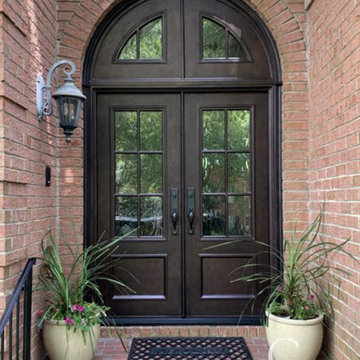
Featuring a custom-made transom, these traditional-inspired double iron doors showcase our Dark Bronze finish, insulated glass windows, and bespoke hardware to complement the home's exterior.

 Eco Cuisine Design
This splendid kitchen, belonging to the Guilbaut family in Pincourt, was completely updated through refacing. All of the doors, as well as the drawer faces, have been replaced by crystal-white shaker-style Model 3620 with the aim of brightening up the room and giving it a modern, structured appearance. The accent of a dark grey glossy island adds a certain industrial aspect, which is also reflected in the new suspended lamps, an excellent lighting choice made by the client! The two tones of the kitchen act as a backdrop for the magnificent Snowflakes granite countertop, predominantly pale grey and white with dark grey veins.
Cette splendide cuisine de la famille Guilbaut à Pincourt a été remise au goût du jour grâce au refacing. L’ensemble des portes ainsi que les façades des tiroirs ont été remplacées par le modèle 3620 de type shaker couleur blanc cristal, dans le but d’éclaircir la pièce et lui donner une allure moderne structurée. L’accent de l’îlot de couleur gris foncé satiné ajoute un certain côté industriel, qui se reflète également par le nouveau système d’éclairage suspendu; un très bon choix de luminaire par la cliente! Les deux tons de la cuisine agissent comme toile de fond pour mettre en valeur le magnifique comptoir de granite Snowflakes à dominance gris pâle et blanc, qui possède des courants veines de gris foncé.

 Artful Design Interiors
Sandler Photographic
Inspiration for a large contemporary loft-style light wood floor living room remodel in Phoenix with beige walls, a standard fireplace, a stone fireplace and a wall-mounted tv
Inspiration for a large contemporary loft-style light wood floor living room remodel in Phoenix with beige walls, a standard fireplace, a stone fireplace and a wall-mounted tv
 DM Design Solutions
DM Designs - Chicago
Design Objective: Convert a studio on the 87th floor of the John Hancock Building into a sophisticated, playful, elegant Mad Men-esque Mens Club / Pied a Terre. This was a complete gut renovation.
Our inspiration was the vintage orange tweed sofa the client had purchased for the space. We wanted classy, not kitschy, so designing the "bones" of the condo in timeless and elegant materials was essential. To ground the space and make a dramatic first impression, we selected reclaimed hardwood flooring from a 1800 French Chateau and laid it on the timeless and classic herringbone pattern. From there, we added seagrass wallpaper, custom wood paneled walls, vintage gun and decorative mirrors from the 1970's for the kitchen backsplash and added classic furnishings such as the Platner dining table and black tulip chairs. The coolest feature by far was the custom bookshelf/hidden door we designed to create a library foyer that masked the entry to the bathroom. Inside the bathroom, we converted a vintage, mid century modern bar cabinet into a vanity complete with a honey onyx countertop that lights up from within when you enter the space. Completing the space overall is a framed, original Men's Club Charter that greets you upon entry and that belonged to the client's father.

 User
For this vacation home, a complete gut job was needed in order to fit the lifestyle and needs of this young family of four and their guests. The narrow floor plan created unique challenges, but we maximized its full potential. The result was a warm but modern design with plenty of storage and seating.
One of the biggest challenges was making sure everyone had a place to sit in the kitchen. The space between the kitchen and staircase was limiting, but with sleek modern chairs that tuck away, we were able to allow for traffic patterns and seat all of the children.
To accommodate any vacation extras, an extra wide space near the kitchen and bathroom was transformed into additional shelving. We installed floor-to-ceiling cabinets that offer plenty of space for everyone’s belongings.
A clean design was a must, so we opted for a more modern look. We used Benjamin Moore's "Simply White" as the foundation, putting it on the walls and cabinets, and coordinating the countertops and backsplash. To make the home more welcoming, we used natural wood on the island and floating shelves. The wood was coordinated with the floor, creating a cohesive interior.
Project designed by Star Valley, Wyoming interior design firm Tawna Allred Interiors. They also serve Alpine, Auburn, Bedford, Etna, Freedom, Freedom, Grover, Thayne, Turnerville, Swan Valley, and Jackson Hole, Wyoming

 Jarrett Design
Every so often, or perhaps more often than not, we walk into a home and feel that the kitchen belongs in a different location. Our Walnut and White kitchen had that feeling. Like many homes built in the 80’s, the kitchen was closed off. While it was centrally located between the dining room and family room, the small galley kitchen with an awkward pass-through to the family room did not function for this couple who enjoys spending their evenings cooking together.
Removing all of the walls, providing clear site lines from one end of the house to the other, gave these homeowners a space that worked for them and their family. The kitchen moved into the family room space, and the family room moved into the dining room space while the dining area is now nestled between the two.
The homeowner’s style of warm contemporary led us to a slab door and drawer in a soft white paint with accents of natural walnut. The built-in refrigerator and coordinating built in pantry cabinet anchor the wall with their walnut surround while counter wall cabinets hide all of the small appliances, allowing the quartz counters and quartzite backsplash to shine.
Jacqueline Powell Photography
 User
For this vacation home, a complete gut job was needed in order to fit the lifestyle and needs of this young family of four and their guests. The narrow floor plan created unique challenges, but we maximized its full potential. The result was a warm but modern design with plenty of storage and seating.
One of the biggest challenges was making sure everyone had a place to sit in the kitchen. The space between the kitchen and staircase was limiting, but with sleek modern chairs that tuck away, we were able to allow for traffic patterns and seat all of the children.
To accommodate any vacation extras, an extra wide space near the kitchen and bathroom was transformed into additional shelving. We installed floor-to-ceiling cabinets that offer plenty of space for everyone’s belongings.
A clean design was a must, so we opted for a more modern look. We used Benjamin Moore's "Simply White" as the foundation, putting it on the walls and cabinets, and coordinating the countertops and backsplash. To make the home more welcoming, we used natural wood on the island and floating shelves. The wood was coordinated with the floor, creating a cohesive interior.
Project designed by Star Valley, Wyoming interior design firm Tawna Allred Interiors. They also serve Alpine, Auburn, Bedford, Etna, Freedom, Freedom, Grover, Thayne, Turnerville, Swan Valley, and Jackson Hole, Wyoming

 AI LIVING INC.
A unique and pretty texture highlight to living. A perfect combination of Calacatta high gloss polished tile and Handcrafted natural hard walnut.
Our Bella Powder room brings unique and gorgeous textures to your home. With handcrafted natural hard walnut wood it incorporates natural elements, essentially giving the room a relaxing feel. The Calacatta tiles create depth with a sleek and modern effect. The LED vanity mirror enhances the beauty of the wood and tiles. The push-open drawers create the ultimate minimalist design. This powder room perfectly ties in a rustic yet modern look. The Bella room is great for unwanted storage in your main washroom as well as any makeup or personal belongings. Our price for the Bella powder room package is only $4888.00 (plus applicable taxes).
Floor tile: Brown, 12 x 24 “, Calacatta high gloss polished
Wall tile: Brown, 24 x 48″, Big slab Calacatta high gloss
Wall Material: 1 x 9 “, Handcrafted natural hard walnut
Vanity cabinet: White, Both side stone waterfall counter top, push open drawer
Vanity top: Floating design
Sink: White, 18″
Faucets: Chrome, Glossy chrome finish
Mirror: 24 x 32″, UL certified LED panel with touch switch
Wall paint: Grey-Blue, Benjamin Moore
Toilet: White, American Standard with dual flush
Lighting: Energy green pots
Terms and conditions for powder rooms:
Price for the powder room package is for a maximum of 30 sq ft. Additional costs will apply for a larger room. Vanity wall tiles are within 4-5 feet. Tile back splash only behind mirror vanity. We will not change plumbing or redesign
 TVL Creative Ltd.
Our wonderful Baker clients were ready to remodel the kitchen in their c.1900 home shortly after moving in. They were looking to undo the 90s remodel that existed, and make the kitchen feel like it belonged in their historic home. We were able to design a balance that incorporated the vintage charm of their home and the modern pops that really give the kitchen its personality. We started by removing the mirrored wall that had separated their kitchen from the breakfast area. This allowed us the opportunity to open up their space dramatically and create a cohesive design that brings the two rooms together. To further our goal of making their kitchen appear more open we removed the wall cabinets along their exterior wall and replaced them with open shelves. We then incorporated a pantry cabinet into their refrigerator wall to balance out their storage needs. This new layout also provided us with the space to include a peninsula with counter seating so that guests can keep the cook company. We struck a fun balance of materials starting with the black & white hexagon tile on the floor to give us a pop of pattern. We then layered on simple grey shaker cabinets and used a butcher block counter top to add warmth to their kitchen. We kept the backsplash clean by utilizing an elongated white subway tile, and painted the walls a rich blue to add a touch of sophistication to the space.

 Olamar Interiors
This condo in Sterling, VA belongs to a couple about to enter into retirement. They own this home in Sterling, along with a weekend home in West Virginia, a vacation home on Emerald Isle in North Carolina and a vacation home in St. John. They want to use this home as their "home-base" during their retirement, when they need to be in the metro area for business or to see family. The condo is small and they felt it was too "choppy," it didn't have good flow and the rooms were too separated and confined. They wondered if it could have more of an open concept feel but were doubtful due to the size and layout of the home. The furnishings they owned from their previous home were very traditional and heavy. They wanted a much lighter, more open and more contemporary feel to this home. They wanted it to feel clean, light, airy and much bigger then it is.
The first thing we tackled was an unsightly, and very heavy stone veneered fireplace wall that separated the family room from the office space. It made both rooms look heavy and dark. We took down the stone and opened up parts of the wall so that the two spaces would flow into each other.
We added a view thru fireplace and gave the fireplace wall a faux marble finish to lighten it and make it much more contemporary. Glass shelves bounce light and keep the wall feeling light and streamlined. Custom built ins add hidden storage and make great use of space in these small rooms.
Our strategy was to open as much as possible and to lighten the space through the use of color, fabric and glass. New furnishings in lighter colors and soft textures help keep the feeling light and modernize the space. Sheer linen draperies soften the hard lines and add to the light, airy feel. Tinius Photography
 Olamar Interiors
This condo in Sterling, VA belongs to a couple about to enter into retirement. They own this home in Sterling, along with a weekend home in West Virginia, a vacation home on Emerald Isle in North Carolina and a vacation home in St. John. They want to use this home as their "home-base" during their retirement, when they need to be in the metro area for business or to see family. The condo is small and they felt it was too "choppy," it didn't have good flow and the rooms were too separated and confined. They wondered if it could have more of an open concept feel but were doubtful due to the size and layout of the home. The furnishings they owned from their previous home were very traditional and heavy. They wanted a much lighter, more open and more contemporary feel to this home. They wanted it to feel clean, light, airy and much bigger then it is.
The first thing we tackled was an unsightly, and very heavy stone veneered fireplace wall that separated the family room from the office space. It made both rooms look heavy and dark. We took down the stone and opened up parts of the wall so that the two spaces would flow into each other.
We added a view thru fireplace and gave the fireplace wall a faux marble finish to lighten it and make it much more contemporary. Glass shelves bounce light and keep the wall feeling light and streamlined. Custom built ins add hidden storage and make great use of space in these small rooms.
Our strategy was to open as much as possible and to lighten the space through the use of color, fabric and glass. New furnishings in lighter colors and soft textures help keep the feeling light and modernize the space. Sheer linen draperies soften the hard lines and add to the light, airy feel. Tinius Photography

 Kuno Architecture Inc.
Photographer: Johann Wall - www.johannwall.com
Custom Millwork: Watt Wrks - www.wattwrks.ca
Example of a small 1960s u-shaped linoleum floor and gray floor enclosed kitchen design in Vancouver with a double-bowl sink, flat-panel cabinets, medium tone wood cabinets, laminate countertops, white backsplash, ceramic backsplash, stainless steel appliances and no island
Example of a small 1960s u-shaped linoleum floor and gray floor enclosed kitchen design in Vancouver with a double-bowl sink, flat-panel cabinets, medium tone wood cabinets, laminate countertops, white backsplash, ceramic backsplash, stainless steel appliances and no island

 Regan Baker Design Inc.
Well-traveled. Relaxed. Timeless.
Our well-traveled clients were soon-to-be empty nesters when they approached us for help reimagining their Presidio Heights home. The expansive Spanish-Revival residence originally constructed in 1908 had been substantially renovated 8 year prior, but needed some adaptations to better suit the needs of a family with three college-bound teens. We evolved the space to be a bright, relaxed reflection of the family’s time together, revising the function and layout of the ground-floor rooms and filling them with casual, comfortable furnishings and artifacts collected abroad.
One of the key changes we made to the space plan was to eliminate the formal dining room and transform an area off the kitchen into a casual gathering spot for our clients and their children. The expandable table and coffee/wine bar means the room can handle large dinner parties and small study sessions with similar ease. The family room was relocated from a lower level to be more central part of the main floor, encouraging more quality family time, and freeing up space for a spacious home gym.
In the living room, lounge-worthy upholstery grounds the space, encouraging a relaxed and effortless West Coast vibe. Exposed wood beams recall the original Spanish-influence, but feel updated and fresh in a light wood stain. Throughout the entry and main floor, found artifacts punctate the softer textures — ceramics from New Mexico, religious sculpture from Asia and a quirky wall-mounted phone that belonged to our client’s grandmother.
 TVL Creative Ltd.
Our wonderful Baker clients were ready to remodel the kitchen in their c.1900 home shortly after moving in. They were looking to undo the 90s remodel that existed, and make the kitchen feel like it belonged in their historic home. We were able to design a balance that incorporated the vintage charm of their home and the modern pops that really give the kitchen its personality. We started by removing the mirrored wall that had separated their kitchen from the breakfast area. This allowed us the opportunity to open up their space dramatically and create a cohesive design that brings the two rooms together. To further our goal of making their kitchen appear more open we removed the wall cabinets along their exterior wall and replaced them with open shelves. We then incorporated a pantry cabinet into their refrigerator wall to balance out their storage needs. This new layout also provided us with the space to include a peninsula with counter seating so that guests can keep the cook company. We struck a fun balance of materials starting with the black & white hexagon tile on the floor to give us a pop of pattern. We then layered on simple grey shaker cabinets and used a butcher block counter top to add warmth to their kitchen. We kept the backsplash clean by utilizing an elongated white subway tile, and painted the walls a rich blue to add a touch of sophistication to the space.

 Valentini Kids Furniture Brooklyn NY
Modern Italian Floating Platform Bed Nightfly by Rossetto
Made in Italy
The Nightfly by Rossetto is a wooden italian floating platform bed with the upholstered headboard. The bed features an ultra modern design and is made of the top quality materials. Thanks to its shape and hidden legs there is an illusion of bed just floating in the air without even touching the floor. Designed and manufactured in Italy, this modern bed, as well as the bedroom casegoods, feature luxurious Gloss Black or White lacquered finish and crocodile pattern eco-leather inserts. The headboard of this floating bed is really unique, consisting of two parts creating an alluring asymmetry. The headboard can be ordered with optional Light, providing an astonishing look at night. The Nightfly furniture line also offers all the necessary optional bedroom case-goods: nightstands, dresser, mirror, dressing table, pouf and sliding door wardrobes to complement the design of your sleeping area and provide an essential storage space for your clothes and other belongings. This modern floating bed is available in two sizes: Queen and King.
The starting price is for the Nightfly Queen Size Bed. The headboard Light is not included in the price and can be purchased separately.
Dimensions:
Queen Size Bed: W118" x D85" x H37"
King Size Bed: W131" x D85" x H37"
Nightstand: W24" x D18" x H16"
Dresser: W49" x D20" x H31"
Mirror: W49" x D1" x H20"
Dressing Table: W47" x D22" x H29"
Pouf: W17" x D17" x H17"
2-Sliding-Door Wardrobe (Narrow): W80" x D27" x H93"
2-Sliding-Door Wardrobe (Wide): W95" x D27" x H93"
3-Sliding-Door Wardrobe: W119" x D27" x H93"
203