
Search results for "Better" in Home Design Ideas

 Designs for Living by Wendy, LLC
Kitchen - huge traditional medium tone wood floor and brown floor kitchen idea in Jacksonville with raised-panel cabinets, white cabinets, multicolored backsplash, stainless steel appliances, an island, limestone countertops, porcelain backsplash and beige countertops
 The Aldrich Group, LLC
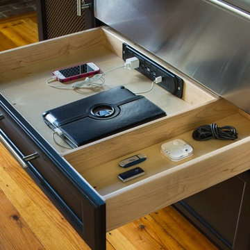
Convenient drawer for recharging electronics
Jeff Herr Photography
Home design - large cottage medium tone wood floor home design idea in Atlanta with a farmhouse sink, shaker cabinets, white cabinets, wood countertops, green backsplash, stainless steel appliances and an island
Home design - large cottage medium tone wood floor home design idea in Atlanta with a farmhouse sink, shaker cabinets, white cabinets, wood countertops, green backsplash, stainless steel appliances and an island

 Timber Trails Development Company
Home office - cottage freestanding desk dark wood floor and brown floor home office idea in Chicago with gray walls
Find the right local pro for your project

 Erin King Interiors
Beach style dark wood floor kitchen/dining room combo photo in Los Angeles with white walls

 Niche Interiors
Brad Knipstein Photography
Bedroom - contemporary dark wood floor and black floor bedroom idea in San Francisco with gray walls
Bedroom - contemporary dark wood floor and black floor bedroom idea in San Francisco with gray walls

 Ohana Home & Design
Large 1950s master blue tile and porcelain tile porcelain tile, gray floor and double-sink japanese bathtub photo in Minneapolis with flat-panel cabinets, dark wood cabinets, a two-piece toilet, white walls, an undermount sink, quartzite countertops, a hinged shower door, white countertops and a built-in vanity

 Lake Country Builders
Elegant living room photo in Minneapolis with a standard fireplace and a stone fireplace

Sponsored
Sunbury, OH

J.Holderby - Renovations
Franklin County's Leading General Contractors - 2X Best of Houzz!

 Patrick Schmitt, designer Inc.
Custom wet bar
Large transitional galley dark wood floor and brown floor seated home bar photo in Portland with open cabinets, blue cabinets and granite countertops
Large transitional galley dark wood floor and brown floor seated home bar photo in Portland with open cabinets, blue cabinets and granite countertops

 Kitchen Intuitions
Open walnut vanity with brass faucets and a large alcove shower.
Photos by Chris Veith
Example of a mid-sized transitional master white tile porcelain tile and black floor alcove shower design in New York with shaker cabinets, medium tone wood cabinets, a two-piece toilet, beige walls, an undermount sink, quartzite countertops, a hinged shower door and white countertops
Example of a mid-sized transitional master white tile porcelain tile and black floor alcove shower design in New York with shaker cabinets, medium tone wood cabinets, a two-piece toilet, beige walls, an undermount sink, quartzite countertops, a hinged shower door and white countertops

 User
UserJeff Herr
Mid-sized transitional master white tile and subway tile drop-in bathtub photo in Atlanta with an undermount sink, gray cabinets, marble countertops and gray walls
Mid-sized transitional master white tile and subway tile drop-in bathtub photo in Atlanta with an undermount sink, gray cabinets, marble countertops and gray walls

 Wright Building Company
www.wrightbuild.com
Example of a large classic mixed siding exterior home design in New York
Example of a large classic mixed siding exterior home design in New York

 Progress Lighting
Drees Homes featuring Nisse chandelier by Progress Lighting
Example of a transitional master dark wood floor and brown floor bedroom design with multicolored walls
Example of a transitional master dark wood floor and brown floor bedroom design with multicolored walls





 Westwind Woodworkers Inc.
Michael's Photography
Inspiration for a large modern u-shaped medium tone wood floor open concept kitchen remodel in Minneapolis with an undermount sink, flat-panel cabinets, gray cabinets, granite countertops, white backsplash, ceramic backsplash, stainless steel appliances and an island
Inspiration for a large modern u-shaped medium tone wood floor open concept kitchen remodel in Minneapolis with an undermount sink, flat-panel cabinets, gray cabinets, granite countertops, white backsplash, ceramic backsplash, stainless steel appliances and an island

 Neat Method San Diego
Inspiration for a contemporary women's medium tone wood floor walk-in closet remodel in San Diego with open cabinets, white cabinets and white walls

 Casabella Interiors
Example of a classic master dark wood floor bedroom design in Boston with beige walls, a standard fireplace and a brick fireplace

 TVL Creative Ltd.
Our clients had just recently closed on their new house in Stapleton and were excited to transform it into their perfect forever home. They wanted to remodel the entire first floor to create a more open floor plan and develop a smoother flow through the house that better fit the needs of their family. The original layout consisted of several small rooms that just weren’t very functional, so we decided to remove the walls that were breaking up the space and restructure the first floor to create a wonderfully open feel.
After removing the existing walls, we rearranged their spaces to give them an office at the front of the house, a large living room, and a large dining room that connects seamlessly with the kitchen. We also wanted to center the foyer in the home and allow more light to travel through the first floor, so we replaced their existing doors with beautiful custom sliding doors to the back yard and a gorgeous walnut door with side lights to greet guests at the front of their home.
Living Room
Our clients wanted a living room that could accommodate an inviting sectional, a baby grand piano, and plenty of space for family game nights. So, we transformed what had been a small office and sitting room into a large open living room with custom wood columns. We wanted to avoid making the home feel too vast and monumental, so we designed custom beams and columns to define spaces and to make the house feel like a home. Aesthetically we wanted their home to be soft and inviting, so we utilized a neutral color palette with occasional accents of muted blues and greens.
Dining Room
Our clients were also looking for a large dining room that was open to the rest of the home and perfect for big family gatherings. So, we removed what had been a small family room and eat-in dining area to create a spacious dining room with a fireplace and bar. We added custom cabinetry to the bar area with open shelving for displaying and designed a custom surround for their fireplace that ties in with the wood work we designed for their living room. We brought in the tones and materiality from the kitchen to unite the spaces and added a mixed metal light fixture to bring the space together
Kitchen
We wanted the kitchen to be a real show stopper and carry through the calm muted tones we were utilizing throughout their home. We reoriented the kitchen to allow for a big beautiful custom island and to give us the opportunity for a focal wall with cooktop and range hood. Their custom island was perfectly complimented with a dramatic quartz counter top and oversized pendants making it the real center of their home. Since they enter the kitchen first when coming from their detached garage, we included a small mud-room area right by the back door to catch everyone’s coats and shoes as they come in. We also created a new walk-in pantry with plenty of open storage and a fun chalkboard door for writing notes, recipes, and grocery lists.
Office
We transformed the original dining room into a handsome office at the front of the house. We designed custom walnut built-ins to house all of their books, and added glass french doors to give them a bit of privacy without making the space too closed off. We painted the room a deep muted blue to create a glimpse of rich color through the french doors
Powder Room
The powder room is a wonderful play on textures. We used a neutral palette with contrasting tones to create dramatic moments in this little space with accents of brushed gold.
Master Bathroom
The existing master bathroom had an awkward layout and outdated finishes, so we redesigned the space to create a clean layout with a dream worthy shower. We continued to use neutral tones that tie in with the rest of the home, but had fun playing with tile textures and patterns to create an eye-catching vanity. The wood-look tile planks along the floor provide a soft backdrop for their new free-standing bathtub and contrast beautifully with the deep ash finish on the cabinetry.
Sponsored
Sunbury, OH
J.Holderby - Renovations
Franklin County's Leading General Contractors - 2X Best of Houzz!

 CG&S Design-Build
Design by Joanna Hartman
Photography by Ryann Ford
Styling by Adam Fortner
This space features 3cm Bianco Carrera Marble, oak floors, Restoration Hardware for the cabinets, and a large West Elm white capiz shell pendant to top it off.

 Herrick Design Group
Inspiration for a 1950s light wood floor wet bar remodel in Minneapolis with an undermount sink, flat-panel cabinets, medium tone wood cabinets, white backsplash and white countertops

 Edmond Kitchen & Bath LLC
This creative transitional space was transformed from a very dated layout that did not function well for our homeowners - who enjoy cooking for both their family and friends. They found themselves cooking on a 30" by 36" tiny island in an area that had much more potential. A completely new floor plan was in order. An unnecessary hallway was removed to create additional space and a new traffic pattern. New doorways were created for access from the garage and to the laundry. Just a couple of highlights in this all Thermador appliance professional kitchen are the 10 ft island with two dishwashers (also note the heated tile area on the functional side of the island), double floor to ceiling pull-out pantries flanking the refrigerator, stylish soffited area at the range complete with burnished steel, niches and shelving for storage. Contemporary organic pendants add another unique texture to this beautiful, welcoming, one of a kind kitchen! Photos by David Cobb Photography.
20