
Search results for "Bonus start up" in Home Design Ideas
 KitchenLab Interiors
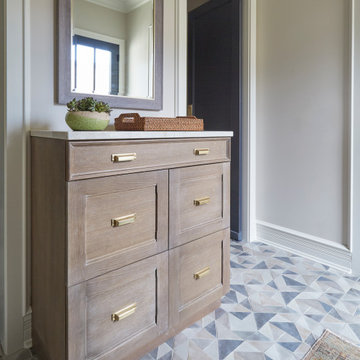
KitchenLab Interiors’ first, entirely new construction project in collaboration with GTH architects who designed the residence. KLI was responsible for all interior finishes, fixtures, furnishings, and design including the stairs, casework, interior doors, moldings and millwork. KLI also worked with the client on selecting the roof, exterior stucco and paint colors, stone, windows, and doors. The homeowners had purchased the existing home on a lakefront lot of the Valley Lo community in Glenview, thinking that it would be a gut renovation, but when they discovered a host of issues including mold, they decided to tear it down and start from scratch. The minute you look out the living room windows, you feel as though you're on a lakeside vacation in Wisconsin or Michigan. We wanted to help the homeowners achieve this feeling throughout the house - merging the causal vibe of a vacation home with the elegance desired for a primary residence. This project is unique and personal in many ways - Rebekah and the homeowner, Lorie, had grown up together in a small suburb of Columbus, Ohio. Lorie had been Rebekah's babysitter and was like an older sister growing up. They were both heavily influenced by the style of the late 70's and early 80's boho/hippy meets disco and 80's glam, and both credit their moms for an early interest in anything related to art, design, and style. One of the biggest challenges of doing a new construction project is that it takes so much longer to plan and execute and by the time tile and lighting is installed, you might be bored by the selections of feel like you've seen them everywhere already. “I really tried to pull myself, our team and the client away from the echo-chamber of Pinterest and Instagram. We fell in love with counter stools 3 years ago that I couldn't bring myself to pull the trigger on, thank god, because then they started showing up literally everywhere", Rebekah recalls. Lots of one of a kind vintage rugs and furnishings make the home feel less brand-spanking new. The best projects come from a team slightly outside their comfort zone. One of the funniest things Lorie says to Rebekah, "I gave you everything you wanted", which is pretty hilarious coming from a client to a designer.
 TKS Design Group
Download our free ebook, Creating the Ideal Kitchen. DOWNLOAD NOW
Lakefront property in the northwest suburbs of Chicago is hard to come by, so when we were hired by this young family with exactly that, we were immediately inspired by not just the unusually large footprint of this 1950’s colonial revival but also the lovely views of the manmade lake it was sited on. The large 5-bedroom home was solidly stuck in the 1980’s, but we saw tons of potential. We started out by updating the existing staircase with a fresh coat of paint and adding new herringbone slate to the entry hall.
The powder room off the entryway also got a refresh - new flooring, new cabinets and fixtures. We ran the new slate right through into this space for some consistency. A fun wallpaper and shiplap trim add a welcoming feel and set the tone for the home.
Next, we tackled the kitchen. Located away from the rest of the first floor, the kitchen felt a little isolated, so we immediately began planning for how to better connect it to the rest of the first floor. We landed on removing the wall between the kitchen and dining room and designed a modified galley style space with separate cooking and clean up zones. The cooking zone consists of the refrigerator, prep sink and cooktop, along with a nice long run of prep space at the island. The cleanup side of the kitchen consists of the main sink and dishwasher. Both areas are situated so that the user can view the lake during prep work and cleanup!
One of the home’s main puzzles was how to incorporate the mudroom and area in front of the patio doors at the back of the house. We already had a breakfast table area, so the space by the patio doors was a bit of a no man’s land. We decided to separate the kitchen proper from what became the new mudroom with a large set of barn doors. That way you can quickly hide any mudroom messes but have easy access to the light coming in through the patio doors as well as the outdoor grilling station. We also love the impact the barn doors add to the overall space.
The homeowners’ first words to us were “it’s time to ditch the brown,” so we did! We chose a lovely blue pallet that reflects the home’s location on the lake which is also vibrant yet easy on the eye. Countertops are white quartz, and the natural oak floor works well with the other honey accents. The breakfast table was given a refresh with new chairs, chandelier and window treatments that frame the gorgeous views of the lake out the back.
We coordinated the slate mudroom flooring with that used in the home’s main entrance for a consistent feel. The storage area consists of open and closed storage to allow for some clutter control as needed.
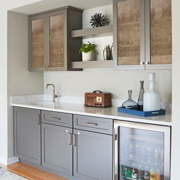
Next on our “to do” list was revamping the dated brown bar area in the neighboring dining room. We eliminated the clutter by adding some closed cabinets and did some easy updates to help the space feel more current. One snag we ran into here was the discovery of a beam above the existing open shelving that had to be modified with a smaller structural beam to allow for our new design to work. This was an unexpected surprise, but in the end we think it was well worth it!
We kept the colors here a bit more muted to blend with the homeowner’s existing furnishings. Open shelving and polished nickel hardware add some simple detail to the new entertainment zone which also looks out onto the lake!
Next we tackled the upstairs starting with the homeowner’s son’s bath. The bath originally had both a tub shower and a separate shower, so we decided to swap out the shower for a new laundry area. This freed up some space downstairs in what used to be the mudroom/laundry room and is much more convenient for daily laundry needs.
We continued the blue palette here with navy cabinetry and the navy tile in the shower. Porcelain floor tile and chrome fixtures keep maintenance to a minimum while matte black mirrors and lighting add some depth the design. A low maintenance runner adds some warmth underfoot and ties the whole space together.
We added a pocket door to the bathroom to minimize interference with the door swings. The left door of the laundry closet is on a 180 degree hinge to allow for easy full access to the machines. Next we tackled the master bath which is an en suite arrangement. The original was typical of the 1980’s with the vanity outside of the bathroom, situated near the master closet. And the brown theme continued here with multiple shades of brown.
Our first move was to segment off the bath and the closet from the master bedroom. We created a short hall from the bedroom to the bathroom with his and hers walk-in closets on the left and right as well as a separate toilet closet outside of the main bathroom for privacy and flexibility.
The original bathroom had a giant soaking tub with steps (dangerous!) as well as a small shower that did not work well for our homeowner who is 6’3”. With other bathtubs in the home, they decided to eliminate the tub and create an oversized shower which takes up the space where the old tub was located. The double vanity is on the opposite wall and a bench is located under the window for morning conversations and a place to set a couple of towels.
The pallet in here is light and airy with a mix of blond wood, creamy porcelain and marble tile, and brass accents. A simple roman shade adds some texture and it’s top-down mechanism allows for light and privacy.
This large whole house remodel gave our homeowners not only the ability to maximize the potential of their home but also created a lovely new frame from which to view their fabulous lake views.
Designed by: Susan Klimala, CKD, CBD
Photography by: Michael Kaskel
For more information on kitchen and bath design ideas go to: www.kitchenstudio-ge.com
 Klopf Architecture
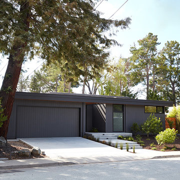
Klopf Architecture, Arterra Landscape Architects and Henry Calvert of Calvert Ventures Designed and built a new warm, modern, Eichler-inspired, open, indoor-outdoor home on a deeper-than-usual San Mateo Highlands property where an original Eichler house had burned to the ground.
The owners wanted multi-generational living and larger spaces than the original home offered, but all parties agreed that the house should respect the neighborhood and blend in stylistically with the other Eichlers. At first the Klopf team considered re-using what little was left of the original home and expanding on it. But after discussions with the owner and builder, all parties agreed that the last few remaining elements of the house were not practical to re-use, so Klopf Architecture designed a new home that pushes the Eichler approach in new directions.
One disadvantage of Eichler production homes is that the house designs were not optimized for each specific lot. A new custom home offered the team a chance to start over. In this case, a longer house that opens up sideways to the south fit the lot better than the original square-ish house that used to open to the rear (west). Accordingly, the Klopf team designed an L-shaped “bar” house with a large glass wall with large sliding glass doors that faces sideways instead of to the rear like a typical Eichler. This glass wall opens to a pool and landscaped yard designed by Arterra Landscape Architects.
Driving by the house, one might assume at first glance it is an Eichler because of the horizontality, the overhanging flat roof eaves, the dark gray vertical siding, and orange solid panel front door, but the house is designed for the 21st Century and is not meant to be a “Likeler.” You won't see any posts and beams in this home. Instead, the ceiling decking is a western red cedar that covers over all the beams. Like Eichlers, this cedar runs continuously from inside to out, enhancing the indoor / outdoor feeling of the house, but unlike Eichlers it conceals a cavity for lighting, wiring, and insulation. Ceilings are higher, rooms are larger and more open, the master bathroom is light-filled and more generous, with a separate tub and shower and a separate toilet compartment, and there is plenty of storage. The garage even easily fits two of today's vehicles with room to spare.
A massive 49-foot by 12-foot wall of glass and the continuity of materials from inside to outside enhance the inside-outside living concept, so the owners and their guests can flow freely from house to pool deck to BBQ to pool and back.
During construction in the rough framing stage, Klopf thought the front of the house appeared too tall even though the house had looked right in the design renderings (probably because the house is uphill from the street). So Klopf Architecture paid the framer to change the roofline from how we had designed it to be lower along the front, allowing the home to blend in better with the neighborhood. One project goal was for people driving up the street to pass the home without immediately noticing there is an "imposter" on this lot, and making that change was essential to achieve that goal.
This 2,606 square foot, 3 bedroom, 3 bathroom Eichler-inspired new house is located in San Mateo in the heart of the Silicon Valley.
Klopf Architecture Project Team: John Klopf, AIA, Klara Kevane
Landscape Architect: Arterra Landscape Architects
Contractor: Henry Calvert of Calvert Ventures
Photography ©2016 Mariko Reed
Location: San Mateo, CA
Year completed: 2016
Find the right local pro for your project
 TaylorPro Design and Remodeling, Inc.
"When we bought our house in Poway 11 years ago, we were so happy with our huge master bath and Jacuzzi tub. It was such a huge step-up from our prior home. But just like the rest of the house, the master bath was already almost 20 years old and getting out dated and in need of remodeling. We broke up our remodeling projects into every couple of years, doing what we could ourselves and hiring out for the rest. The master bath was the last project and much too big for us to do on our own. We got 3 quotes from 3 contractors listed on Angie’s list which all had good reviews. One was a major re modeler and the other two were smaller contractors. We ended up going with TaylorPro because he was right in the middle and had great reviews.
Kerry was very responsive getting us a timely estimate and had great suggestions for what we were looking for. From the start to finish it turned out to be a wonderful experience! To our delight, they were able to get started ahead of what we were told. Everything went almost as scheduled and we were informed constantly on where we were in the project. Kerry was very responsive to all our concerns or requests and we were never left wondering what the next step would be. His crew was wonderful, so polite and hard working. They were very professional, on time, considerate and knew exactly what they were doing.
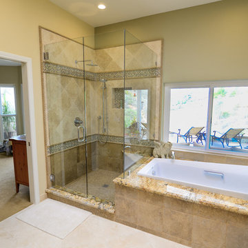
There were certain things we were really looking for in the remodel. First off, the bathroom was pretty large with a high ceiling. In the winter months, it was always really cold and hard to heat. To solve that we had TaylorPro install heated flooring beneath the travertine tiles. We also needed a custom vanity that would conceal hair appliances, most of our personal toiletries and have enough storage for everything else. The cabinetry was custom designed to exactly what we were looking for. Lastly, we wanted a classic, timeless look using tumbled travertine. After consulting with his designer we were able to select all the tile, accent tile and a beautiful frameless glass shower enclosure.
The finished project was beyond our highest expectations and we won’t hesitate to use Kerry and his crew for any future jobs or recommend him to family and friends."
~ Mark and Amy B, Clients
Frameless shower door, glass tile with rope border, dark and light travertine tiles on walls, travertine on floor, heated floor by NuHeat, tub and sinks by Kohler, shower/tub/vanity fixtures Hansgrohe, toilet Toto, custom cabinets by Thead Custom Cabinetry.
Photo by Kerry W. Taylor
 Kari P
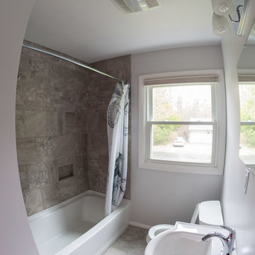
When I bought my house in May 2014, there was one thing I really didn’t like about it – the 1950s bathroom complete with pink tile and mismatched gaudy fixtures was absolutely hideous. I knew redoing the bathroom would be a big, expensive project, so I vowed to just live with it while I fixed up parts of the house that were easier to update, such as putting a fresh coat of paint on the walls and updating the curtains (which I still haven’t done, by the way). Well my first winter in the new house turned out to be a bad one, and in February 2015, I noticed water stains on the walls and ceiling of the second bedroom that only got worse and worse each day. The water damage quickly spread to other rooms, and when contractors came to the house to access and fix the damage, they discovered moisture behind the pink tiled walls of my bathroom. And so started the bathroom remodel.
Start to finish, this project took close to six months, due to going back and forth with insurance and difficulty finding a contractor I liked. I lived without a shower for at least four of those months, showering at the gym where I worked or in a pop-up tent in my backyard once it was warm enough out. My friend Eric and I demoed the bathroom and for the remodel, I picked out all of the design components and had a local contractor, Fred Haas do the work. I kept the original layout – as my bathroom was small to begin with and it was both impractical and expensive to start moving things around – but just about everything else about the bathroom is new, except for maybe the window and door. New tub, sink, and toilet, new tile floor and shower surround, new walls and ceiling, fresh paint, new fixtures and mirror, updated lighting, and a better ventilation system were all added.
Tub – Sterling Vikrell
Toilet – Kohler Wellworth® two-piece round-front dual-flush toilet
Sink – Kohler Veer™ 21" pedestal bathroom sink
Fixtures – Kohler Alteo® line
Tile floor and shower surround – American Olean Laurel Heights ceramic tile in Summit Gray
Lighting – I don't remember... will have to see if I can find it
Ventilation system – NuTone
Mirror – Ikea
Paint – Behr
Shower Curtain – eBay
Here are photos of my project from start to finish. As you can see, I probably still need a thing or two (a toilet paper holder, mini storage shelf, and some art wouldn’t hurt, nor would replacing the door or painting it white), but overall I’m really happy with how my new bathroom came out. I LOVE it, which is the exact opposite of how I felt about the original bathroom.
Photos © Kari Post
 Veneta Cucine Coral Gables
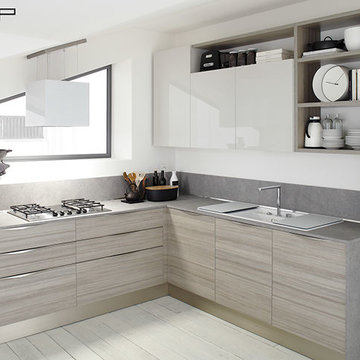
START TIME UP
Part of the Start Time kitchen family Start Time features a youthful feel of design with pure lines dressed in cool colors and wood finishes. These trends are in step with today's natural look and modern kitchen designs. Start Time is known for being the start of something new and innovative, something no one else has done, only try to follow. Modern design that works with any space.
 Atlanta Porch & Patio
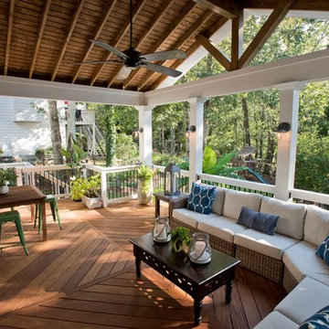
Our client wanted a rustic chic look for their covered porch. We gave the crown molding and trim a more formal look, but kept the floor and roof more rustic.
At Atlanta Porch & Patio we are dedicated to building beautiful custom porches, decks, and outdoor living spaces throughout the metro Atlanta area. Our mission is to turn our clients’ ideas, dreams, and visions into personalized, tangible outcomes. Clients of Atlanta Porch & Patio rest easy knowing each step of their project is performed to the highest standards of honesty, integrity, and dependability. Our team of builders and craftsmen are licensed, insured, and always up to date on trends, products, designs, and building codes. We are constantly educating ourselves in order to provide our clients the best services at the best prices.
We deliver the ultimate professional experience with every step of our projects. After setting up a consultation through our website or by calling the office, we will meet with you in your home to discuss all of your ideas and concerns. After our initial meeting and site consultation, we will compile a detailed design plan and quote complete with renderings and a full listing of the materials to be used. Upon your approval, we will then draw up the necessary paperwork and decide on a project start date. From demo to cleanup, we strive to deliver your ultimate relaxation destination on time and on budget.
Sponsored
Sunbury, OH

J.Holderby - Renovations
Franklin County's Leading General Contractors - 2X Best of Houzz!
 Abda Custom Window Fashions
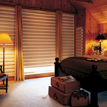
The pirouette shades also comes with a blackout option to provide the perfect sleeping experience. Layer with blackout draperies for the most sun blockage. Hunter Douglas Pirouette provides an elegant look with sophisticated functionality.
The Hunter Douglas Pirouette gives the look of a roman shade with the functionality of a silhouette sheer shade. The Pirouette’s fabric vanes open to a sheer fabric to provide a view through area and allowing light into the room. The sheer fabric provides protection from the harsh UV rays. The shade also closes completely for privacy. The Pirouette has the look of roman shades with the functionality of blinds. The Pirouette also comes in specialty shades that can fit many types of windows such as, arches or angles.
The structure of the Pirouette is clean and elegant because the lifting system for the vanes have the patented Invisi-Lift system. This system allows the floating vanes to operate without having the unsightly cords or tapes. The vanes of the Hunter Douglas Pirouette can be flattened or contoured for complete privacy or opened for wide view-through.
Protect your wood flooring, furniture or artwork from the damaging ultraviolet rays. The Pirouette Roman Shades block up to 81% of the harmful UV rays with vanes open and 99% with the vanes closed. There is a large selection of fabrics to choose from and two vane sizes.
The Pirouette can also be operated manually or by remote control. Hunter Douglas has an app that can control the Pirouette on your iPhone or iPad.
At Abda, we make the draperies, curtains, valances, cornices, pillow shams, accent throw pillows, duvet covers, comforters, coverlets and bed skirts…even custom fabric headboards in a variety of styles, sizes and shapes. We also make draperies, roman shades, valances or cornices to coordinate. If you have an existing piece of furniture, we also do upholstery. The possibilities are endless when you go custom. If you’re not sure where to start, no worries because we have design specialists that can help you create the home you’ve always dreamed of!
We’re known for our attention to detail, great quality and outstanding service. We not only work with Indiana clients but also across the nation.
HOW DO WE HAVE QUALITY PRODUCTS WITHOUT BREAKING THE BUDGET?
At Abda, we believe in providing quality products, great customer service without breaking the pocket book for our customers! We’ve been in business since 1998 and have learned a few things over the years. Customers want excellent, reliable products without spending more than necessary. We decided to not have a large flashy retail store and focus on referrals rather than traditional advertising. In doing so, we’re able to provide the same great quality products as our competitors at a better price. And the amazing thing is, we do all of this while putting our focus on excellent customer service for our clients. Don’t take our word for it, check out what some of our customers are saying about us. www.abdawindowfashions.com
LIVE OUT OF STATE OR TOO BUSY?
Talk with our professional design specialists and let them help you transform your home! It’s simple and easy. This is a great solution for persons who live out of state or are too busy for a traditional home consultation. We have a “virtual interior designer” that will work with you each step of the way. With our great reviews, solid company and company values- you know that your home is in great hands!
For more information, contact Talitha at 317-273-8343 or email: talitha@abdawindowfashions.com or check out our houzz.com store!
LIVE IN CENTRAL INDIANA?
For our local customers we offer, FREE In-home consultation or showroom appointment to meet your lifestyle and design needs. At Abda, we have the perfect blend of high-end and affordable solutions for every style and budget. Affordable doesn’t mean cheap! We pride ourselves on quality products with excellent service. We’re so confident of our products that we give our customers more than the manufacturers guarantee!
At Abda, you will find knowledgeable staff that will turn your visions into a reality. Stop in our showroom or schedule a Free In-home consultation today! We know you will be happy with the results but don’t take our word for it, check out what some of our customers say about us on Houzz and Angie’s List!
http://www.angieslist.com/companylist/us/in/indianapolis/abda-inc-custom-window-fashions-reviews-60394.htm?cid=ssabadge
WHY CHOOSE US?
We have been in business since November 1998 and started in the window covering business by cleaning & repairing blinds. This gave us a unique perspective from most window covering dealers. We have always considered how well products hold up and which manufacturers stand behind their products the best. We let our clients know the benefits of more expensive products and give honest feedback. We take pride in showing alternative products to fit all budgets. We also give our customers an additional 2 year warranty on top of the manufacturers guarantee!
Our great testimonials on Angie’s List, Houzz.com and referrals have helped our company grow without the need for “conventional” advertising. Abda means ‘servant’. At Abda, we approach every customer with a servant’s attitude. This philosophy has helped our customers feel confident in their purchases and well-taken care of. Our number one focus is customer service and we believe in putting the customer’s needs first. We offer our clients an additional 2 year warranty on top of the manufacturer’s warranty and want each and every client to be completely happy with their purchase. We’ve been awarded the prestigious 2014 Angie’s List Super Service Award, an honor bestowed annually on approximately 5 percent of all the businesses rated on the nation’s leading provider of consumer reviews. We’ve grown over the years and have added more team members to our company and we’re very excited at the direction our company is going.
Contact us today to get started on your project.
Abda, Inc
1159 Country Club Road
Indianapolis, In 46234
317-273-8343 (Ext. 103)
Other Common Names For Pirouette:
Roman Shades
Roman Blinds
Blinds
Pirouette Blinds
Vertical Blinds
Venetian Blinds
Shades
Fabric Shades
Hunter Douglas Blinds
Hunter Douglas Shades
Hunter Douglas Pirouette
Energy Efficient Blinds
Sun Protection Shades
Sun Protection Blinds
Child Safety Blinds
Child Safety Window Treatments
Indianapolis Blinds
Indianapolis Shades
Indianapolis Fabric Roman Shades
Custom Blinds
www.abdawindowfashions.com
 TOC design & construction inc.
DESIGNED BY TOC design
CONSTRUCTION BY TOC design & Construction inc.
PHOTOS BY : Tania Scardellato
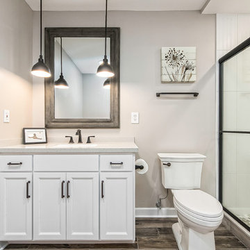
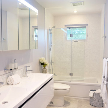
I was fortunate to have a young family approach me in desperate need to renovate there only 3 piece bathroom. This space was In dire need of a remodel, with old brown wall to wall tiles and a dated bulky yellow brown single sink vanity.
Storage was a must, lighting a necessity, and proper accessibility to the shower bath area.
We had a tight budget to respect, but a full gut of this bathroom was required. And a good thing too, once we started doing the demolition we noticed that mildew and rotting floors and walls had accumulated throughout the years. Doing it right the first time is no joke when dealing with water and electrical issues.
We discarded all reminisce of old and built from scratch, new walls, new plumbing, new electrical ,new insulation and a new window, a new fan that actually exhausted outside ( I say this laughing as you would be amazed at how many fans are installed but don’t exhaust outside, and you the client would never know unless you go inside the attic space.
Once all the hard stuff was done, the rest is just a matter of smart design. If you have a small bathroom here are some tips to guide you.
10 tips for making a small bathroom feel larger
Is your tiny bathroom cramping your functionality and style, leaving you longing for the enormous bathrooms gracing the pages of design magazines? Even if your bathroom is a fraction of the size, all it takes is some design savvy to make the most of the space you have. Consider these 10 smart tips that will help your bathroom look, feel and function like those larger contenders.
1-Get creative with corners
Space is at a premium in small bathrooms, so it's important to maximize every inch. Corners, for example, provide extra space for shelving, storage units and even hooks. Get creative and install unique design solutions that are not only functional, but also eye-catching. If you love the airiness of floating cabinets, add baskets or decorative boxes under for extra storage. If you are installing floating cabinets insure that they are installed securely to studs or plywood at wall.
2- Let solid colors shine
Busy patterns have a shrinking effect and make small bathrooms seem even smaller. Conversely, light natural hues make a space feel more open. If you're itching to get creative with design, experiment with textures but keep overpowering patterns to a minimum. Tone on tone is the best to achieve this.
3 - Maximize your bathtub
A bathtub takes up a significant portion of the room, but modern, compact options with curved basins, can make the tub feel larger when in use, all while conserving space.
4 - Select a smaller faucet
A faucet is jewelry for the bathroom. And just as accessories can overpower an outfit, a big bulky faucet isn't flattering in a small bath. Single-handle designs conserve counter space, while a wall-mount installation frees it up all together and can create quite the wow-factor, if the budget can accommodate the required changes to plumbing behind the wall.
5 - Make vanity storage simple
If you're in a storage war with your small bathroom, you're not alone in the battle. Toiletries and personal supplies without a place to call home only add clutter and chaos. Store smart with a space-saving vanity, the dual sink vanity shown here, looks quite simple, but in reality it has 4 sets of full extension drawers, and the vanity tower adds extra storage without overpowering the use of space.
6 - Show off the shower
Shower curtains may be pretty, but they interrupt the visual flow of a bathing space and make it feel significantly smaller. In bathrooms with small footprints, opt for a clear glass sliding shower door that doesn't require the clearance of one with a hinged design. Or as shown in this design and for fraction less expensive a half hinged panel installed on a fixed tempered glass panel. If you're embarking on a big remodel, create the illusion of more space by using same tile in the shower that's used throughout; instead of seeing them as two separate zones, the eye will read them as one.
7 - Discover the treasure of hidden storage
Work with a contractor, and you just might find some serious storage potential hidden behind your walls. Whether it's utilizing space between the studs for shallow shelving or a creating a small linen closet by annexing space from an adjacent room, even small additions can make a big difference.
8 - Focal Point
Tile is a beautiful, durable addition to any bathroom. For dainty spaces, consider installing tile at a diagonal to accentuate the focal point or as in this bathroom I used an oversized textured pattern to bring depth to the space at the window wall.
9 - Choose the right lights
Strategically install light to reflect and brighten a small bathroom to make it appear larger. Recessed lighting is an affordable solution for tiny rooms, offering ample light while taking up little space. Wall sconces alongside a mirror also reflect off the walls and make a room feel bright and airy. I always recommend going with LED lighting at 2800 to 3000K.
10 – Accessorize
This is your time to shine in your decorating skills, have fun with your towels, you can change the color scheme daily just by adding pops of color in your accessories, make sure to get items that serve a dual purpose, like baskets, boxes they can always be used as hampers, storing of towels and even a nice display for your guest.
 TKS Design Group
Download our free ebook, Creating the Ideal Kitchen. DOWNLOAD NOW
Lakefront property in the northwest suburbs of Chicago is hard to come by, so when we were hired by this young family with exactly that, we were immediately inspired by not just the unusually large footprint of this 1950’s colonial revival but also the lovely views of the manmade lake it was sited on. The large 5-bedroom home was solidly stuck in the 1980’s, but we saw tons of potential. We started out by updating the existing staircase with a fresh coat of paint and adding new herringbone slate to the entry hall.
The powder room off the entryway also got a refresh - new flooring, new cabinets and fixtures. We ran the new slate right through into this space for some consistency. A fun wallpaper and shiplap trim add a welcoming feel and set the tone for the home.
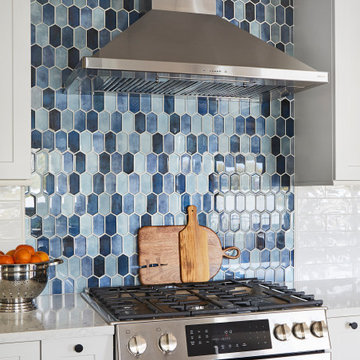
Next, we tackled the kitchen. Located away from the rest of the first floor, the kitchen felt a little isolated, so we immediately began planning for how to better connect it to the rest of the first floor. We landed on removing the wall between the kitchen and dining room and designed a modified galley style space with separate cooking and clean up zones. The cooking zone consists of the refrigerator, prep sink and cooktop, along with a nice long run of prep space at the island. The cleanup side of the kitchen consists of the main sink and dishwasher. Both areas are situated so that the user can view the lake during prep work and cleanup!
One of the home’s main puzzles was how to incorporate the mudroom and area in front of the patio doors at the back of the house. We already had a breakfast table area, so the space by the patio doors was a bit of a no man’s land. We decided to separate the kitchen proper from what became the new mudroom with a large set of barn doors. That way you can quickly hide any mudroom messes but have easy access to the light coming in through the patio doors as well as the outdoor grilling station. We also love the impact the barn doors add to the overall space.
The homeowners’ first words to us were “it’s time to ditch the brown,” so we did! We chose a lovely blue pallet that reflects the home’s location on the lake which is also vibrant yet easy on the eye. Countertops are white quartz, and the natural oak floor works well with the other honey accents. The breakfast table was given a refresh with new chairs, chandelier and window treatments that frame the gorgeous views of the lake out the back.
We coordinated the slate mudroom flooring with that used in the home’s main entrance for a consistent feel. The storage area consists of open and closed storage to allow for some clutter control as needed.
Next on our “to do” list was revamping the dated brown bar area in the neighboring dining room. We eliminated the clutter by adding some closed cabinets and did some easy updates to help the space feel more current. One snag we ran into here was the discovery of a beam above the existing open shelving that had to be modified with a smaller structural beam to allow for our new design to work. This was an unexpected surprise, but in the end we think it was well worth it!
We kept the colors here a bit more muted to blend with the homeowner’s existing furnishings. Open shelving and polished nickel hardware add some simple detail to the new entertainment zone which also looks out onto the lake!
Next we tackled the upstairs starting with the homeowner’s son’s bath. The bath originally had both a tub shower and a separate shower, so we decided to swap out the shower for a new laundry area. This freed up some space downstairs in what used to be the mudroom/laundry room and is much more convenient for daily laundry needs.
We continued the blue palette here with navy cabinetry and the navy tile in the shower. Porcelain floor tile and chrome fixtures keep maintenance to a minimum while matte black mirrors and lighting add some depth the design. A low maintenance runner adds some warmth underfoot and ties the whole space together.
We added a pocket door to the bathroom to minimize interference with the door swings. The left door of the laundry closet is on a 180 degree hinge to allow for easy full access to the machines. Next we tackled the master bath which is an en suite arrangement. The original was typical of the 1980’s with the vanity outside of the bathroom, situated near the master closet. And the brown theme continued here with multiple shades of brown.
Our first move was to segment off the bath and the closet from the master bedroom. We created a short hall from the bedroom to the bathroom with his and hers walk-in closets on the left and right as well as a separate toilet closet outside of the main bathroom for privacy and flexibility.
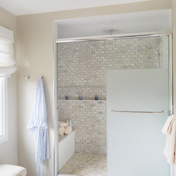
The original bathroom had a giant soaking tub with steps (dangerous!) as well as a small shower that did not work well for our homeowner who is 6’3”. With other bathtubs in the home, they decided to eliminate the tub and create an oversized shower which takes up the space where the old tub was located. The double vanity is on the opposite wall and a bench is located under the window for morning conversations and a place to set a couple of towels.
The pallet in here is light and airy with a mix of blond wood, creamy porcelain and marble tile, and brass accents. A simple roman shade adds some texture and it’s top-down mechanism allows for light and privacy.
This large whole house remodel gave our homeowners not only the ability to maximize the potential of their home but also created a lovely new frame from which to view their fabulous lake views.
Designed by: Susan Klimala, CKD, CBD
Photography by: Michael Kaskel
For more information on kitchen and bath design ideas go to: www.kitchenstudio-ge.com
 TKS Design Group
Download our free ebook, Creating the Ideal Kitchen. DOWNLOAD NOW
Lakefront property in the northwest suburbs of Chicago is hard to come by, so when we were hired by this young family with exactly that, we were immediately inspired by not just the unusually large footprint of this 1950’s colonial revival but also the lovely views of the manmade lake it was sited on. The large 5-bedroom home was solidly stuck in the 1980’s, but we saw tons of potential. We started out by updating the existing staircase with a fresh coat of paint and adding new herringbone slate to the entry hall.
The powder room off the entryway also got a refresh - new flooring, new cabinets and fixtures. We ran the new slate right through into this space for some consistency. A fun wallpaper and shiplap trim add a welcoming feel and set the tone for the home.
Next, we tackled the kitchen. Located away from the rest of the first floor, the kitchen felt a little isolated, so we immediately began planning for how to better connect it to the rest of the first floor. We landed on removing the wall between the kitchen and dining room and designed a modified galley style space with separate cooking and clean up zones. The cooking zone consists of the refrigerator, prep sink and cooktop, along with a nice long run of prep space at the island. The cleanup side of the kitchen consists of the main sink and dishwasher. Both areas are situated so that the user can view the lake during prep work and cleanup!
One of the home’s main puzzles was how to incorporate the mudroom and area in front of the patio doors at the back of the house. We already had a breakfast table area, so the space by the patio doors was a bit of a no man’s land. We decided to separate the kitchen proper from what became the new mudroom with a large set of barn doors. That way you can quickly hide any mudroom messes but have easy access to the light coming in through the patio doors as well as the outdoor grilling station. We also love the impact the barn doors add to the overall space.
The homeowners’ first words to us were “it’s time to ditch the brown,” so we did! We chose a lovely blue pallet that reflects the home’s location on the lake which is also vibrant yet easy on the eye. Countertops are white quartz, and the natural oak floor works well with the other honey accents. The breakfast table was given a refresh with new chairs, chandelier and window treatments that frame the gorgeous views of the lake out the back.
We coordinated the slate mudroom flooring with that used in the home’s main entrance for a consistent feel. The storage area consists of open and closed storage to allow for some clutter control as needed.
Next on our “to do” list was revamping the dated brown bar area in the neighboring dining room. We eliminated the clutter by adding some closed cabinets and did some easy updates to help the space feel more current. One snag we ran into here was the discovery of a beam above the existing open shelving that had to be modified with a smaller structural beam to allow for our new design to work. This was an unexpected surprise, but in the end we think it was well worth it!
We kept the colors here a bit more muted to blend with the homeowner’s existing furnishings. Open shelving and polished nickel hardware add some simple detail to the new entertainment zone which also looks out onto the lake!
Next we tackled the upstairs starting with the homeowner’s son’s bath. The bath originally had both a tub shower and a separate shower, so we decided to swap out the shower for a new laundry area. This freed up some space downstairs in what used to be the mudroom/laundry room and is much more convenient for daily laundry needs.
We continued the blue palette here with navy cabinetry and the navy tile in the shower. Porcelain floor tile and chrome fixtures keep maintenance to a minimum while matte black mirrors and lighting add some depth the design. A low maintenance runner adds some warmth underfoot and ties the whole space together.
We added a pocket door to the bathroom to minimize interference with the door swings. The left door of the laundry closet is on a 180 degree hinge to allow for easy full access to the machines. Next we tackled the master bath which is an en suite arrangement. The original was typical of the 1980’s with the vanity outside of the bathroom, situated near the master closet. And the brown theme continued here with multiple shades of brown.
Our first move was to segment off the bath and the closet from the master bedroom. We created a short hall from the bedroom to the bathroom with his and hers walk-in closets on the left and right as well as a separate toilet closet outside of the main bathroom for privacy and flexibility.
The original bathroom had a giant soaking tub with steps (dangerous!) as well as a small shower that did not work well for our homeowner who is 6’3”. With other bathtubs in the home, they decided to eliminate the tub and create an oversized shower which takes up the space where the old tub was located. The double vanity is on the opposite wall and a bench is located under the window for morning conversations and a place to set a couple of towels.
The pallet in here is light and airy with a mix of blond wood, creamy porcelain and marble tile, and brass accents. A simple roman shade adds some texture and it’s top-down mechanism allows for light and privacy.
This large whole house remodel gave our homeowners not only the ability to maximize the potential of their home but also created a lovely new frame from which to view their fabulous lake views.
Designed by: Susan Klimala, CKD, CBD
Photography by: Michael Kaskel
For more information on kitchen and bath design ideas go to: www.kitchenstudio-ge.com
 In Detail Interiors
Small coastal condo gets a new life!
This project started as a consultation that really focused on whether or not it was feasible to maximize functionality out of a tight kitchen area in a condo on the beach. The cabinetry was sort of dated but not terrible terrible.
Refresh or total gut of this small kitchen
The client wanted to give it a refresh worked but we had worked with her before…so she could not quite decide how far to go. Maybe just repaint the existing cabinets? She needed some furniture. She wanted a little more ambiance and pizazz. And she wanted the Cheryl magic.
Ok finally, decision made. Kitchen had to go@!
Decision made- a new kitchen to go with the new living!
After further review on site with her during the consult meeting, and pitching a few inquiries around for bids on cabinetry and countertops – she ultimately decided to gut and re-do the whole layout. And man-oh-man what a difference some well executed design makes!!
This layout was unique and truly optimized every inch we could muster from the kitchen. (Working around that spiral staircase and navigating the soffit that wrapped the entire kitchen and adjacent living room!!) Colors needed to be bold while still feeling fresh so we paired a deep aubergine and a sort of “matte” Caribbean blue which laid the groundwork for a stunning living area palette.
Tough layout to enlarge much
There were a lot of other “givens” in this space that made the execution of the design a highly strategized process. We knew we had to work around the large wall space that starts the kitchen because it had the laundry room hiding on the other side… the awkward nook with windows on all sides that was a small breakfast area before the remodel… oh, and did we mention that dang spiral staircase?! Multiple site visits to plot the cabinetry and countertop curve paid off all said and done, though!
Living space that work with the open floor plan kitchen
Designing the furnishings then became the fun part! With a smaller living space flanked by windows and sliders – but one that needed to balance the kitchen in substance – we had to break a few preferred design rules to make up the amount of seating desired.
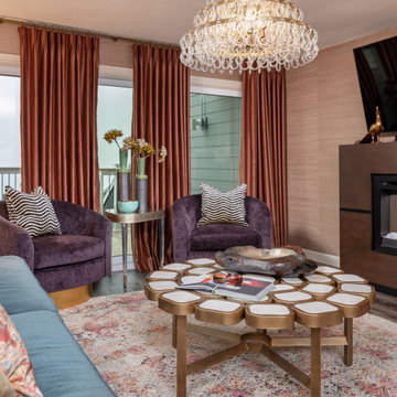
The deep grape-y purple barrel swivels were the perfect “transition” piece by the slider offering access to the views while being versatile enough to still afford safe use of the slider and passage outside. Adding some graphic punch with the droplet shaped, stone and brass cocktail table and bold multicolored rug we love the balance of these weightier aesthetic choices with the adjacent kitchen.
Signature pieces make all the difference
Carrying through little pops of that blue green between the counter stools (I die! Seriously! SO GORGEOUS) and the sofa (with those brass nails!) — these colors really created a sturdy but eclectic tonal feel that the client was just over the moon for. The art and grasscloth on the walls throughout developed the architecture of the space in an overall structure that was really lacking – it feels warm, inviting, comfortable – BEAUTIFUL – but not too priss and pomp.
Now if we could just keep the pup off the sofa!
 Décor Aid
Million Dollar Listing’s celebrity broker Ryan Serhant reached out to Decor Aid to stage a luxurious Brooklyn condo development. The only caveat was that our interior designers had 48 hours to come up with the design, concept, and source all the furniture. Always up for a challenge, we partnered with Mitchell Gold & Bob Williams to create this contemporary gem.
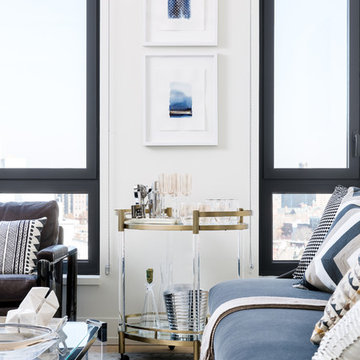
Staying true to their contemporary vision, our interior decorators sourced all pieces through MGBW. Starting in the living room, we placed the Gunner Sofa, a piece that offers clean-lined living. The thin arms and slanted profile emphasize the modern elegance of the home. Through the use of various contemporary patterns and textures we were able to avoid the one-dimensional ambiance, and instead, the apartment’s living room feels detailed and thought out, without making anyone who enters overcrowded with home decor.
The Melrose cocktail table was sourced for its sleek, stainless steel and glass design that contrasts with more substantial pieces in the space, while also complementing the contemporary style. The glass design gives the illusion that this table takes up less space, giving the living room design a light and airy feel all around. The living space transformed into something out of a decor catalog with just the right amount of personality, creating a room that follows through with our starting design, yet functional for everyday use.
After the living room area, we set our eyes on designing the master bedroom. Our interior decorators were immediately drawn to the Celina Floating Rail Bed, it’s opulent nailhead trim, and dramatic design brings fresh sophistication to the bedroom design, while also standing out as a timeless piece that can complement various trends or styles that might be added later on to the bedroom decoration. We sourced the Roland Table Lamp to add texture, with its elaborate ribbed design, that compliments the air of masculinity the Carmen Leather Ottoman add while contrasting with the light, sleeker pieces. This difference in weight left us with a bedroom decoration that lives up to the trending modern standards, yet a space that is timeless and stylish no matter the decor trends.
Once we finished and the project was completed, our senior designers took a step back and took in all of their hard labor. Decor Aid was able to make this newly built blank space and design it into a modern wonder small brooklyn apartment. The MGBW furnishings were all hand-picked to keep an even balance of complementing and contrasting contemporary pieces, which was one of our more critical apartment decorating ideas. The apartment home decor brings to life this modern concept in a way that isn’t overbearing and shows off their style making the space in every sense an accurate reflection of a chic contemporary style.

Sponsored
Sunbury, OH
J.Holderby - Renovations
Franklin County's Leading General Contractors - 2X Best of Houzz!
 Thyme & Place Design LLC
When my client had to move from her company office to work at home, she set up in the dining room. Despite her best efforts, this was not the long-term solution she was looking for. My client realized she needed a dedicated space not on the main floor of the home. On one hand, having your office space right next to the kitchen is handy. On the other hand, it made separating work and home life was not that easy.
The house was a ranch. In essence, the basement would run entire length of the home. As we came down the steps, we entered a time capsule. The house was built in the 1950’s. The walls were covered with original knotty pine paneling. There was a wood burning fireplace and considering this was a basement, high ceilings. In addition, there was everything her family could not store at their own homes. As we wound though the space, I though “wow this has potential”, Eventually, after walking through the laundry room we came to a small nicely lit room. This would be the office.
My client looked at me and asked what I thought. Undoubtedly, I said, this can be a great workspace, but do you really want to walk through this basement and laundry to get here? Without reservation, my client said where do we start?
Once the design was in place, we started the renovation. The knotty pine paneling had to go. Specifically, to add some insulation and control the dampness and humidity. The laundry room wall was relocated to create a hallway to the office.
At the far end of the room, we designated a workout zone. Weights, mats, exercise bike and television are at the ready for morning or afternoon workouts. The space can be concealed by a folding screen for party time. Doors to an old closet under the stairs were relocated to the workout area for hidden storage. Now we had nice wall for a beautiful console and mirror for storage and serving during parties.
In order to add architectural details, we covered the old ugly support columns with simple recessed millwork panels. This detail created a visual division between the bar area and the seating area in front of the fireplace. The old red brick on the fireplace surround was replaced with stack stone. A mantle was made from reclaimed wood. Additional reclaimed wood floating shelves left and right of the fireplace provides decorative display while maintaining a rustic element balancing the copper end table and leather swivel rocker.
We found an amazing rug which tied all of the colors together further defining the gathering space. Russet and burnt orange became the accent color unifying each space. With a bit of whimsy, a rather unusual light fixture which looks like roots from a tree growing through the ceiling is a conversation piece.
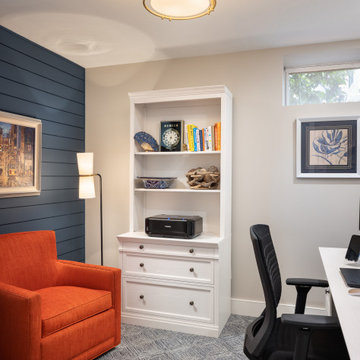
The office space is quite and removed from the main part of the basement. There is a desk large enough for multiple screens, a small bookcase holding office supplies and a comfortable chair for conference calls. Because working from home requires many online meetings, we added a shiplap wall painted in Hale Navy to contrast with the orange fabric on the chair. We finished the décor with a painting from my client’s father. This is the background online visitors will see.
The last and best part of the renovation is the beautiful bar. My client is an avid collector of wine. She already had the EuroCave refrigerator, so I incorporated it into the design. The cabinets are painted Temptation Grey from Benjamin Moore. The counter tops are my favorite hard working quartzite Brown Fantasy. The backsplash is a combination of rustic wood and old tin ceiling like porcelain tiles. Together with the textures of the reclaimed wood and hide poofs balanced against the smooth finish of the cabinets, we created a comfortable luxury for relaxing.
There is ample storage for bottles, cans, glasses, and anything else you can think of for a great party. In addition to the wine storage, we incorporated a beverage refrigerator, an ice maker, and a sink. Floating shelves with integrated lighting illuminate the back bar. The raised height of the front bar provides the perfect wine tasting and paring spot. I especially love the pendant lights which look like wine glasses.
Finally, I selected carpet for the stairs and office. It is perfect for noise reduction. Meanwhile for the overall flooring, I specifically selected a high-performance vinyl plank floor. We often use this product as it is perfect to install on a concrete floor. It is soft to walk on, easy to clean and does not reduce the overall height of the space.
 Abda Custom Window Fashions
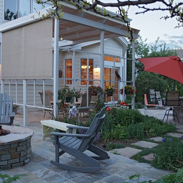
Screen shades are great on a pergola. This outdoor living space wasn't used to its full capacity due to the annoyance of the sun's rays. Now that the outdoor screen shades are installed, the owners can utilize this beautifully landscaped backyard. The outdoor shades come in a variety of fabrics and opacities and can withstand outdoor weather conditions.
The sun can be overwhelming at times with the brightness and high temperatures. Shades are also a great way to block harmful ultra-violet rays to protect your hardwood flooring, furniture and artwork from fading. There are different types of shades that were engineered to solve a specific dilemma.
We work with clients in the Central Indiana Area. Contact us today to get started on your project. 317-273-8343
 Barn Pros
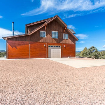
This off-grid mountain barn home located in the heart of the Rockies sits at 7,500 feet and has expansive, beautiful views of the foothills below. The model is a Barn Pros 36 ft. x 36 ft. Denali barn apartment with a partially enclosed shed roof on one side for outdoor seating and entertainment area. The deck off the back of the building is smaller than the standard 12 ft. x 12 ft. deck included in the Denali package. Roll-up garage doors like the one shown at the front of the home are an add-on option for nearly any Barn Pros kit.
Inside, the finish is decidedly rustic modern where sheetrock walls contrast handsomely with the exposed posts and beams throughout the space. The owners incorporated garage parking, laundry, kitchenette with wood-burning stove oven, bathroom, workout area and a pool table all on the first floor. The upper level houses the main living space where contemporary décor and finished are combined with natural wood flooring and those same exposed posts and beams. Lots of natural light fills the space from the 18 ft. vaulted ceilings, dormer windows and French doors off the living room. The owners added a partial loft for additional sleeping and a functional storage area.
 TKS Design Group
Download our free ebook, Creating the Ideal Kitchen. DOWNLOAD NOW
As with most projects, it all started with the kitchen layout. The home owners came to us wanting to upgrade their kitchen and overall aesthetic in their suburban home, with a combination of fresh paint, updated finishes, and improved flow for more ease when doing everyday activities.
A monochromatic, earth-toned palette left the kitchen feeling uninspired. It lacked the brightness they wanted from their space. An eat-in table underutilized the available square footage. The butler’s pantry was out of the way and hard to access, and the dining room felt detached from the kitchen.
Lead Designer, Stephanie Cole, saw an improved layout for the spaces that were no longer working for this family. By eliminating an existing wall between the kitchen and dining room, and relocating the bar area to the dining room, we opened up the kitchen, providing all the space we needed to create a dreamy and functional layout. A new perimeter configuration promoted circulation while also making space for a large and functional island loaded with seating – a must for any family. Because an island that isn’t big enough for everyone (and a few more) is a recipe for disaster. The light white cabinetry is fresh and contrasts with the deeper tones in the wood flooring, creating a modern aesthetic that is elevated, yet approachable for everyday living.
With better flow as the overarching goal, we made some structural changes too. To remove a bottleneck in the entryway, we angled one of the dining room walls to create more natural separation between rooms and facilitate ease of movement throughout the large space.
At The Kitchen Studio, we believe a well-designed kitchen uses every square inch to the fullest. By starting from scratch, it was possible to rethink the entire kitchen layout and design the space according to how it is used, because the kitchen shouldn’t make it harder to feed the family. A new location for the existing range, flanked by a new column refrigerator and freezer on each side, worked to anchor the space. The very large and very spacious island (a dream island if we do say so ourselves) now houses the primary sink and provides ample space for food prep and family gathering.
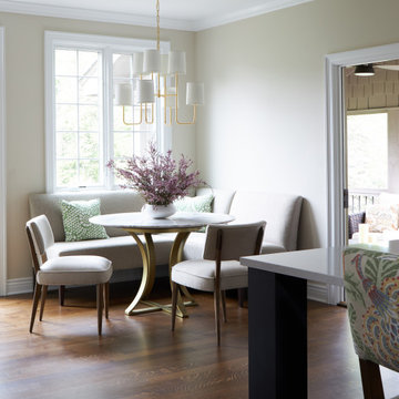
The new kitchen table and coordinating banquette seating provide a cozy nook for quick breakfasts before school or work, and evening homework sessions. Elegant gold details catch the natural light, elevating the aesthetic.
The dining room was transformed into one of this client’s favorite spaces and we couldn’t agree more. We saw an opportunity to give the dining room a more distinguished identity by closing off the entrance from the foyer. The relocated wet bar enhances the sophisticated vibe of this gathering space, complete with beautiful antique mirror tiles and open shelving encased by moody built-in cabinets.
Updated furnishings add warmth. A rich walnut table is paired with custom chairs in a muted coral fabric. The large, transitional chandelier grounds the room, pairing beautifully with the gold finishes prevalent in the faucet and cabinet hardware. Linen-inspired wallpaper and cream-toned window treatments add to the glamorous feel of this entertainment space.
There is no way around it. The laundry room was cramped. The large washer and dryer blocked access to the sink and left little room for the space to serve its other essential function – as a mudroom. Because we reworked the kitchen layout to create more space overall, we could rethink the mudroom too – an essential for any busy family. The first step was moving the washer and dryer to an existing area on the second floor, where most of the family’s laundry lives (no one wants to carry laundry up and down the stairs if they don’t have to anyway). This is a more functional solution and opened up the space for all the mudroom necessities – including the existing kitchen refrigerator, loads of built-in cubbies, and a bench.
It’s hard to not fall in love with every detail of a new space, especially when it serves your day-to-day life. But that doesn’t mean the clients didn’t have their favorite features they use on the daily. This remodel was focused largely on function with a new kitchen layout. And it’s the functional features that have the biggest impact. The large island provides much needed workspace in the kitchen and is a spot where everyone gathers together – it grounds the space and the family. And the custom counter stools are the icing on the cake. The nearby mudroom has everything their previous space was lacking – ample storage, space for everyone’s essentials, and the beloved cement floor tiles that are both durable and artistic.

Sponsored
Columbus, OH

Wannemacher Interiors
Customized Award-Winning Interior Design Solutions in Franklin Cnty OH
 Valentini Kids Furniture Brooklyn NY
Modern Wooden Top Dining Table Connection by Huppe
Made in Canada
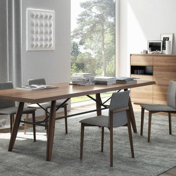
Connection by Huppe is a new luxury dining table from the Dining Furniture Up Line. The table is a real masterpiece created in Canada by real professionals from the hand-selected materials. Dining Table Connection features a real Scandinavian European design, that is remarkable by simple design, but astonishing uniqueness. The top of the dining table feature solid walnut or oak wood contour and is 2" thick. Up to your choice the tabletop can be ordered in one of the available wood stain finishes. The legs are made of 100% solid White Oak or Walnut and also finished up to your choice. The legs are supported with steel beams that carry not only a supporting function but also highlight the design, making the dining table a vivid spot in any interior. Connection wooden top dining table is available in three sizes: 84", 98" and 108", so you could find the right size for your modern home.
Connection Dining Table by Huppe is also available with Glass Top - Click here to View.
Features:
Designed by Up Huppe
2" thick and durable tabletop, featuring solid wood contour
Solid oak or walnut legs available in a variety of finishes
Rectangular tabletop shape
Base feature steel beams available in different matt lacquered colors
Available in three different sizes
*In the main picture the dining table is shown in Natural Walnut finish with Matt Black lacquered base beams.
The starting price is for the Connection Wooden Dining Table W84" in Smoked Oak Finish / Matt Black Lacquer.
Dimensions:
Dining Table: W84" x D40" x H30"
Dining Table: W98" x D40" x H30"
Dining Table: W108" x D40" x H30"
 Michelle Berwick Design
Design by: Michelle Berwick
Photos: Larry Arnal
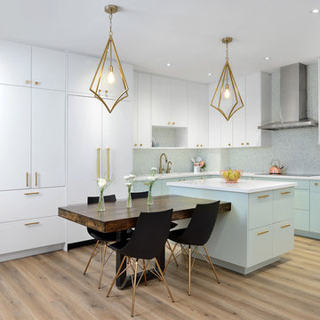
This kitchen has left me still smiling with how it came together. The color palette that started with our choice of tile ended up being our common thread and it could not have turned out better. Updating the kitchen with gorgeous cabinets, stunning backsplash, modern lighting, rose gold details and the perfect configuration has my social media blowing up! This is definitely one of my favorite kitchens, I hope they enjoy it for many years to come.
 Abda Custom Window Fashions
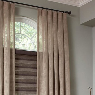
We love sheer linen draperies! These draperies are from our line of 'sheer linen' and have a one finger pinch pleat. We can make them lined or un-lined (shown in picture). They not only soften the space but also provide privacy and UV protection.
They are layered over our roman shades to provide privacy and style.
For clients out of the Indiana area, we now have a professionally trained interior designer! Our "virtual designer" can help you with your project and ship your custom items directly to you at a fraction of the cost without compromising on quality! Let our design specialists help you today!
**UPDATE** We also work with clients all over the country! Our virtual designers have experience as local and long distance design consultants. Our designers offer professional fabric and design recommendations, free estimates and have a great ability to communicate via email or phone to help conceptualize the project and see it through to the final stages. Fabric samples are mailed directly to you and we also provide easy installation guides.
We're very excited to announce that we were featured on HOUZZ! Click the link below to check out the article!
http://www.houzz.com/ideabooks/30722151/list/design-workshop-shutters-all-grown-up
Abda Window fashions of Indianapolis has custom curtains, drapes, valances, cornices, pillows and hardware in a variety of fabrics and finishes. Curtains and drapes are great alone or paired with a hard window treatment for the ultimate fashion statement. All of our curtains, drapes, valances, cornices and pillows are custom-made from our own workroom. We also make custom bedding and upholstery. We have a huge selection of fabrics that will match any style.
Our custom, affordable draperies, curtains and sheers are now available to anyone in the US. We make them in our own workroom and ship them anywhere in the US! Talk with our professional design specialists and let them help you transform your home! It’s simple and easy. This is a great solution for persons who live out of state or are too busy for a traditional home consultation. With our great reviews, solid company and company values- you know that you’re home is in great hands!
We also have ready-made curtains and bedding available too! And don’t forget our custom hardware! You can also check out our houzz.com store for great window fashion products, including our exclusive bendable rods!
To see our new line, contact Talitha at 317-273-8343 or email: talitha@abdawindowfashions.com or check out our houzz.com store!
For our local customers we offer, FREE In-home consultation or showroom appointment to meet your lifestyle and design needs. At Abda, we have the perfect blend of high-end and affordable solutions for every style and budget. Affordable doesn’t mean cheap! We pride ourselves on quality products with excellent service. We’re so confident of our products that we give our customers more than the manufacturers guarantee!
We give our customers an additional 2 year warranty on top of the manufacturers guarantee!
At Abda, you will find knowledgeable staff that will turn your visions into a reality. Stop in our showroom or schedule a Free In-home consultation today! We know you will be happy with the results but don’t take our word for it, check out what some of our customers say about us on Houzz and Angie’s List!
http://www.angieslist.com/companylist/us/in/indianapolis/abda-inc-custom-window-fashions-reviews-60394.htm?cid=ssabadge
Why Choose Us?
We have been in business since November 1998 and started in the window covering business by cleaning & repairing blinds. This gave us a unique perspective from most window covering dealers. We have always considered how well products hold up and which manufacturers stand behind their products the best. We let our clients know the benefits of more expensive products and give honest feedback. We take pride in showing alternative products to fit all budgets.
Our great testimonials on Angie’s List, Houzz.com and referrals have helped our company grow without the need for “conventional” advertising. Abda means ‘servant’. At Abda, we approach every customer with a servant’s attitude. This philosophy has helped our customers feel confident in their purchases and well-taken care of. Our number one focus is customer service and we believe in putting the customer’s needs first. We offer our clients an additional 2 year warranty on top of the manufacturer’s warranty and want each and every client to be completely happy with their purchase. We’ve been awarded the prestigious 2013 Angie’s List Super Service Award, an honor bestowed annually on approximately 5 percent of all the businesses rated on the nation’s leading provider of consumer reviews. We’ve grown over the years and have added more team members to our company and we’re very excited at the direction our company is going.
Check out our website for more information: www.abdawindowfashions.com
Below is a list of styles and types of curtains and draperies that we can help you with. No worries if you do not find what you’re looking for below! Since we have our own workroom, the sky is the limit. There’s no project too small or large! Our design specialists are great at helping you with window treatment ideas. Stop in our showroom or call today for a FREE in-home consultation. If you’re out of state, no problem! We’re now making our custom treatments and shipping them to you!
Call today (317-273-8343) for more information or email:
talitha@abdawindowfashions.com
Some of the styles and types:
Modern curtains & draperies,
Contemporary curtains & draperies,
Traditional curtains & draperies,
Transitional curtains & draperies,
Beach Style curtains & draperies,
Asian Style curtains & draperies,
Eclectic curtains & draperies,
Midcentury curtains & draperies,
Mediterranean curtains & draperies,
Farmhouse Style curtains & draperies
Kitchen curtains,
Living room curtains,
Dining room curtains,
Master Bedroom curtains,
Nursery curtains,
Children’s room curtains,
Guest bedroom curtains,
Areas that we serve for installation for curtains & draperies are listed below. (But we ship to anywhere in the US!) If you don’t see your city on the list, just give us a call and we will see what we can do.
Indianapolis curtains and draperies & surrounding areas,
Carmel curtains and draperies & surrounding areas,
Zionsville curtains and draperies & surrounding areas
Westfield curtains and draperies & surrounding areas,
Avon curtains and draperies & surrounding areas,
Greenwood curtains and draperies & surrounding areas,
Abda Window Fashions
1159 Country Club Road
Indianapolis, In 46234
14