
Search results for "Bonus start up" in Home Design Ideas
 Designtheory Inc.
Valerie Wilcox
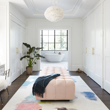
Dressing room - mid-sized transitional gender-neutral brown floor and dark wood floor dressing room idea in Toronto with shaker cabinets and white cabinets
Dressing room - mid-sized transitional gender-neutral brown floor and dark wood floor dressing room idea in Toronto with shaker cabinets and white cabinets
 LQ SHOP
photo credit: Sebastian Bach
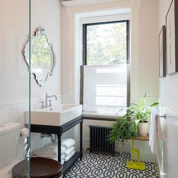
Bathroom - transitional 3/4 bathroom idea in New York with white walls
Bathroom - transitional 3/4 bathroom idea in New York with white walls
 Dallas Builders Association
We’re spending more time at home than ever — so shouldn't it be a space that you thrive in? When your home is designed the way you want it, you’ll enjoy a better mood, better relationships, and so much more.
At Urban Loop Studio, we guide you on the journey to your dream home — and have multiple 5-star reviews to prove it. Take the first step now, and schedule a complimentary consultation with us.
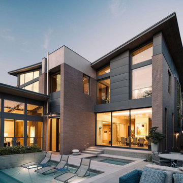
This week’s home of the week is seated in one of the most opulent neighborhoods in Dallas, TX. This gem is the epitome of luxury.
This 9,521 sqft home sits on a 16,334 sqft lot with 1,468 sqft of backyard amenities.
It includes a piano room to entertain guests, a luggage room to prepare for packing and unpacking for travels that includes an 8’ long countertop space to place suitcases and one of the largest closets in Texas, if not the largest closet. There is a separate kitchen for baking, where the best mini chocolate chip cookies are baked to one’s delight. This opulent home has ultra luxury kitchen cabinets from Poggen Pohl, and the most beautiful courtyard area with a pool and fountains.
Get jealous or inspired, either way, this home is an obsession. We partnered with DoBa in working on this project and many other experts to bring this home into a reality.
So what are you waiting for?
You can stop the monotony of searching aimlessly on the MLS and avoid bidding wars by getting what you want in the first place. You can realize your DREAM home in as little as 2 months, starting at $300/ sqft for new construction and $295/sqft for remodels.
You deserve a home that is designed as a reflection of your soul.
What’s stopping you?
A family home isn’t just rooms that the family members eat, sleep, and settle in: it’s where the children grow up, and where precious moments of true connection are born and turned into timeless memories, stories that warm the heart.
Our homes are a true reflection of who we are, and a house isn’t a home until it holds a piece of its resident’s desires’ in every corner of every room.
Your home. It’s where you rest, play, and make memories — and for many of us, it’s where we work. We’re spending more time at home than ever — so shouldn't it be a space that you and your loved ones thrive in?
I’m Poonam Patel, and I’m here to tell you that it absolutely can and should be. And when your home is designed the way you want it, you’ll enjoy a better mood, better relationships, and so much more.
At Urban Loop Studio, we guide you on the journey to your dream home. Our goal is simple: to get your home to bring out the best in you — and everyone under your roof.
We’ll assist with your remodel, new construction, or design project. And we have the 5-star reviews to prove that we’re the premium home design studio you’re looking for.
Your dream home is closer than you think. Take the first step now, and schedule a complimentary 15-minute consultation with us, or
Take the first step by Downloading your complimentary project onboarding Start-up kit at https://www.urbanloopstudio.com/dreamhomestartupkit
This Home of the Week is presented by the Dallas Builders Association. For information on the Association please visit www.dallasbuilders.com.
Find the right local pro for your project
 Haven Design and Construction
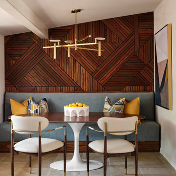
One functional challenge was that the home did not have a pantry. MCM closets were historically smaller than the walk-in closets and pantries of today. So, we printed out the home’s floorplan and began sketching ideas. The breakfast area was quite large, and it backed up to the primary bath on one side and it also adjoined the main hallway. We decided to reconfigure the large breakfast area by making part of it into a new walk-in pantry. This gave us the extra space we needed to create a new main hallway, enough space for a spacious walk-in pantry, and finally, we had enough space remaining in the breakfast area to add a cozy built-in walnut dining bench. Above the new dining bench, we designed and incorporated a geometric walnut accent wall to add warmth and texture.
 reStyled by Valerie
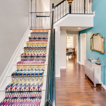
Light gray walls with a slate blue accent wall is punched up with this colorful patterned stair runner. Photo by Cinematic Homes
Example of a mid-sized transitional painted l-shaped staircase design in Columbus with painted risers
Example of a mid-sized transitional painted l-shaped staircase design in Columbus with painted risers
 McC | Architecture pllc
Photos: Scott Robert Larsen
Cabinetry: Sleepy Hollow Custom Kitchens
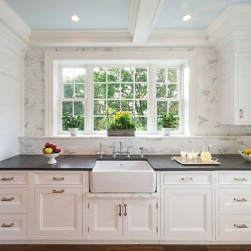
Example of a classic galley eat-in kitchen design in New York with a farmhouse sink, recessed-panel cabinets, white cabinets, quartz countertops, white backsplash, stone tile backsplash and stainless steel appliances
Example of a classic galley eat-in kitchen design in New York with a farmhouse sink, recessed-panel cabinets, white cabinets, quartz countertops, white backsplash, stone tile backsplash and stainless steel appliances
 Jordan Design Build Group
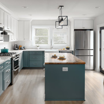
Our renovation of a 1930's bungalow focused on opening up the kitchen/dining/living areas to improve flow and connectivity between the spaces. The rustic reclaimed beams help delineate the spaces visually and add texture and warmth. The original white oak floors were refinished with a custom stain to evoke the wood’s natural raw state. We brought color into the space with the ‘blue spruce’ base cabinets and a custom reclaimed island top. The Calacatta gold quartz countertops, hexagon backsplash, and white upper cabinets keep the space feeling light and bright.

Sponsored
Sunbury, OH

J.Holderby - Renovations
Franklin County's Leading General Contractors - 2X Best of Houzz!
 Cantoni Irvine
Designed By: Richard Bustos Photos By: Jeri Koegel
Ron and Kathy Chaisson have lived in many homes throughout Orange County, including three homes on the Balboa Peninsula and one at Pelican Crest. But when the “kind of retired” couple, as they describe their current status, decided to finally build their ultimate dream house in the flower streets of Corona del Mar, they opted not to skimp on the amenities. “We wanted this house to have the features of a resort,” says Ron. “So we designed it to have a pool on the roof, five patios, a spa, a gym, water walls in the courtyard, fire-pits and steam showers.”
To bring that five-star level of luxury to their newly constructed home, the couple enlisted Orange County’s top talent, including our very own rock star design consultant Richard Bustos, who worked alongside interior designer Trish Steel and Patterson Custom Homes as well as Brandon Architects. Together the team created a 4,500 square-foot, five-bedroom, seven-and-a-half-bathroom contemporary house where R&R get top billing in almost every room. Two stories tall and with lots of open spaces, it manages to feel spacious despite its narrow location. And from its third floor patio, it boasts panoramic ocean views.
“Overall we wanted this to be contemporary, but we also wanted it to feel warm,” says Ron. Key to creating that look was Richard, who selected the primary pieces from our extensive portfolio of top-quality furnishings. Richard also focused on clean lines and neutral colors to achieve the couple’s modern aesthetic, while allowing both the home’s gorgeous views and Kathy’s art to take center stage.
As for that mahogany-lined elevator? “It’s a requirement,” states Ron. “With three levels, and lots of entertaining, we need that elevator for keeping the bar stocked up at the cabana, and for our big barbecue parties.” He adds, “my wife wears high heels a lot of the time, so riding the elevator instead of taking the stairs makes life that much better for her.”
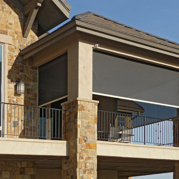
 Abda Custom Window Fashions
The sun can be overwhelming at times with the brightness and high temperatures. Shades are also a great way to block harmful ultra-violet rays to protect your hardwood flooring, furniture and artwork from fading. There are different types of shades that were engineered to solve a specific dilemma.
We work with clients in the Central Indiana Area. Contact us today to get started on your project. 317-273-8343
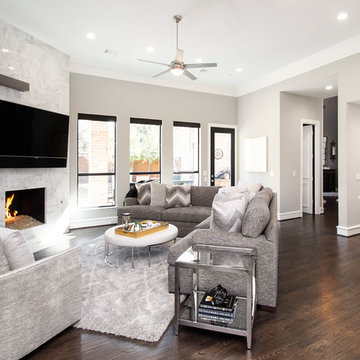
 Alair Homes Plano
Our clients came to us wanting to update and open up their kitchen, breakfast nook, wet bar, and den. They wanted a cleaner look without clutter but didn’t want to go with an all-white kitchen, fearing it’s too trendy. Their kitchen was not utilized well and was not aesthetically appealing; it was very ornate and dark. The cooktop was too far back in the kitchen towards the butler’s pantry, making it awkward when cooking, so they knew they wanted that moved. The rest was left up to our designer to overcome these obstacles and give them their dream kitchen.
We gutted the kitchen cabinets, including the built-in china cabinet and all finishes. The pony wall that once separated the kitchen from the den (and also housed the sink, dishwasher, and ice maker) was removed, and those appliances were relocated to the new large island, which had a ton of storage and a 15” overhang for bar seating. Beautiful aged brass Quebec 6-light pendants were hung above the island.
All cabinets were replaced and drawers were designed to maximize storage. The Eclipse “Greensboro” cabinetry was painted gray with satin brass Emtek Mod Hex “Urban Modern” pulls. A large banquet seating area was added where the stand-alone kitchen table once sat. The main wall was covered with 20x20 white Golwoo tile. The backsplash in the kitchen and the banquette accent tile was a contemporary coordinating Tempesta Neve polished Wheaton mosaic marble.
In the wet bar, they wanted to completely gut and replace everything! The overhang was useless and it was closed off with a large bar that they wanted to be opened up, so we leveled out the ceilings and filled in the original doorway into the bar in order for the flow into the kitchen and living room more natural. We gutted all cabinets, plumbing, appliances, light fixtures, and the pass-through pony wall. A beautiful backsplash was installed using Nova Hex Graphite ceramic mosaic 5x5 tile. A 15” overhang was added at the counter for bar seating.
In the den, they hated the brick fireplace and wanted a less rustic look. The original mantel was very bulky and dark, whereas they preferred a more rectangular firebox opening, if possible. We removed the fireplace and surrounding hearth, brick, and trim, as well as the built-in cabinets. The new fireplace was flush with the wall and surrounded with Tempesta Neve Polished Marble 8x20 installed in a Herringbone pattern. The TV was hung above the fireplace and floating shelves were added to the surrounding walls for photographs and artwork.
They wanted to completely gut and replace everything in the powder bath, so we started by adding blocking in the wall for the new floating cabinet and a white vessel sink. Black Boardwalk Charcoal Hex Porcelain mosaic 2x2 tile was used on the bathroom floor; coordinating with a contemporary “Cleopatra Silver Amalfi” black glass 2x4 mosaic wall tile. Two Schoolhouse Electric “Isaac” short arm brass sconces were added above the aged brass metal framed hexagon mirror. The countertops used in here, as well as the kitchen and bar, were Elements quartz “White Lightning.” We refinished all existing wood floors downstairs with hand scraped with the grain. Our clients absolutely love their new space with its ease of organization and functionality.
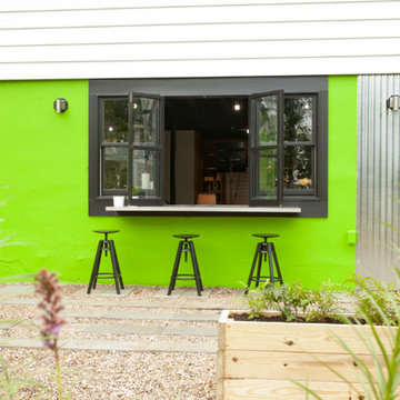
 The Cousins
The new backyard is perfect for entertaining large groups, hosting intimate dinners, or relaxing. Birdhouses and plants line the new space and a pergola shades a table for al fresco dining. A pass-through into the basement allows guests to pull a stool right up to the bar.
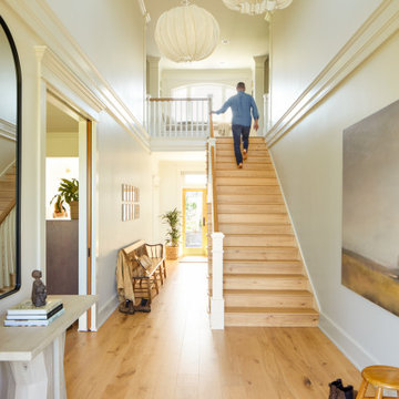
 Amy Troute Inspired Interior Design
This designer’s ideal is homeowners with a clear vision, set priorities, and values that align seamlessly with ours. These clients, an accomplished artist and the owner of a generational hops growing farm, were collaborative and trusting from the start. They conscientiously selected a team of Architect (Green Hammer), General Contractor (Cellar Ridge) and ATIID for furnishings and finishing touches. Each firm was able to meticulously manage their leg of the project, while collaborating wholistically with each other and the homeowners.
The family farmhouse, lovingly named “Westwood,” was showing the wear one expects after serving a growing family for decades. The owner’s dream was to revive, open up, and breathe modern life into each space, while respecting the home’s heritage.
One of our first collaborations was the light fixture that would grace the main two-story entry hall. HiiH Lights in Astoria, Oregon, was commissioned to bring “the function of light, the craft of paper, and the art of sculpture” to the home. Visiting the maker’s space – a massive barn on his coastal property – was such an inspiring adventure! Original work by the resident artist sets an ethereal tone in the space, and an antique bench handsomely blends the old with the new.
A wall that divided the home’s living room and kitchen was removed, and the breezy and bright gathering room was born. Light walls, warm wood tones, cozy upholstery, clean lines and heritage elements create a welcoming atmosphere and invite lounging and conversation. The sun-drenched nook is the home’s main indoor dining area, with an extension table and sculpted chairs that are just right for family gatherings or morning rituals with the Sunday paper. The kitchen is a chef’s dream with every modern amenity, but its casual attitude is “let’s make a mess and eat!”
The owner’s artwork graces the mantel over the new fireplace that was carved from a tree felled on the property, illustrating the thoughtful consideration of each element. The muted wool area rugs in the entryways and great room are hard-wearing for farm life, and the furniture’s classic lines, bold contrasting colors, deep seating and soft textures encourage cozy conversations or large group gatherings.
The library is undoubtedly our favorite space in this home. Tucked in “speakeasy style” behind a hidden (wallpapered!) door in the moody wet bar, and drenched in deep green, the room offers a quiet retreat that hugs you in an embrace of books and family photos. The cozy settee nestled between the bookcases sits opposite a custom pair of modern cognac leather wing chairs. The area rug continues the storied look without the antique price tag with a piece from Loloi’s “Heritage Collection.”
A little va-va-voom was requested for the powder bath and boy did we deliver! Custom wallpaper plays over original wainscotting and ceilings wrapped in more glorious green. The space evokes joy every time you open the door!
A primary suite that would “transport us to another world” and be “classic yet modern, peaceful, collected and uncluttered” was a tall order. Our new furniture layout takes full advantage of the view of wine country hills and the Willamette River, welcomes fireside lounging, and serves as a calm respite for the lovely owners.
Westwood Farmhouse truly was inspired by family, genuine love for home and graciousness for all who enter. Finishing the job was emotional for all involved because we were truly made to feel like part of the family.
Photography by George Barberis
 SAB Homes LLC
Low Gear Photography
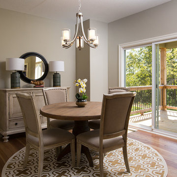
Kitchen/dining room combo - mid-sized traditional light wood floor kitchen/dining room combo idea in Kansas City with gray walls
Kitchen/dining room combo - mid-sized traditional light wood floor kitchen/dining room combo idea in Kansas City with gray walls


 HP Rovinelli Architects
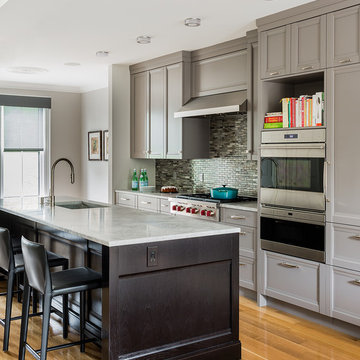
As part of the renovations of an entire townhouse in one of Boston's historic neighborhoods, we opened up one floor from end to end and placed the kitchen in the center, between the dining area and a sitting room.
Michael J. Lee Photography
 Tiffany Brooks, HGTV Host & Interior Designer
Inquire About Our Design Services
When we first started talking in the spring of 2015, I was impressed. She was witty, realistic, and understood that as much as she loves my shows on HGTV, design does not does not happen in 43 minutes! She told me about her space, and how she felt that her bedroom seemed “blah” to her. She had no retreat. Molly desperately longed for a place that she could spend time in, read in, play in and above all, relax in.
What we did:
Many people are terrified of hiring a designer. Rightfully so, they are investing a pretty penny in their homes. They want to make sure that everything, down to the last floral arrangement, is to their liking, because they will have to live it (and pay for it). Unfortunately, a client can unintentionally stifle a designer’s creativity through micro-management. This can produce lackluster results and ultimately cause more time (and money) to be spent on a project than is really necessary.
With Molly, that was never an issue. Before she even showed me the room in question, she said that I could have full creative license to do what I needed to do to her bedroom. SAY WHAAH!?
With Molly giving me complete creative freedom, I planned everything out and got down to business. The result: Bite-your-bottom-lip sexy. I don’t get jealous of too many of my clients’ spaces, but this one still takes my breath away every time I look at the pics!
The craziest part was that by adding more furniture, it actually made the space feel larger.
Molly and her husband Patrick loved the finished space, and promised me I will be back to finish the rest of the house!
Here’s the highlights of the rest of the project:
I came up with a space plan with three options.
Next, we reviewed mood boards and fabric schemes that would work for both Molly and her hubby Patrick.
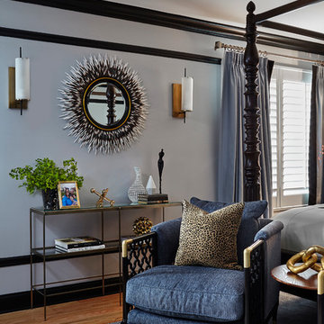
We started with the bed. My goal was to add edge to its otherwise traditional style.
We decided to spice things up by painting the trim work in the room black.
We built in layers of lighting with dimmers. In a bedroom everything should be on dimmers, right? Right.
We designed and customized bedding, chairs and window treatments.
Together with Molly, we selected the most perfect wallpaper. This geometric “grasscloth” adds so much depth and dimension that was just missing before.
What I love:
That light fixture. I mean it is really, really amazing in person.
The porcupine mirror. This thing came packaged like it was the hope diamond, and everyone was terrified to handle it. But it really became a highlight of the room.
 Urban Oasis Landscape Design
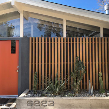
We began by removing the patchwork of “updates” that left a confusing pastiche. At the front of the house, we removed a late addition window and veneer stonework. Starting over now with a clean slate, we chose a color palette of rich charcoal and warm coral-orange. Over the new smooth stucco finish, we built two custom vertical screens with natural cedar to break up the expanse of the front walls and replaced the dated garage door with a stunning cedar door. New concrete planters hold an exotic collection of cactii at the entrance.
 TKS Design Group
Download our free ebook, Creating the Ideal Kitchen. DOWNLOAD NOW
Lakefront property in the northwest suburbs of Chicago is hard to come by, so when we were hired by this young family with exactly that, we were immediately inspired by not just the unusually large footprint of this 1950’s colonial revival but also the lovely views of the manmade lake it was sited on. The large 5-bedroom home was solidly stuck in the 1980’s, but we saw tons of potential. We started out by updating the existing staircase with a fresh coat of paint and adding new herringbone slate to the entry hall.
The powder room off the entryway also got a refresh - new flooring, new cabinets and fixtures. We ran the new slate right through into this space for some consistency. A fun wallpaper and shiplap trim add a welcoming feel and set the tone for the home.
Next, we tackled the kitchen. Located away from the rest of the first floor, the kitchen felt a little isolated, so we immediately began planning for how to better connect it to the rest of the first floor. We landed on removing the wall between the kitchen and dining room and designed a modified galley style space with separate cooking and clean up zones. The cooking zone consists of the refrigerator, prep sink and cooktop, along with a nice long run of prep space at the island. The cleanup side of the kitchen consists of the main sink and dishwasher. Both areas are situated so that the user can view the lake during prep work and cleanup!
One of the home’s main puzzles was how to incorporate the mudroom and area in front of the patio doors at the back of the house. We already had a breakfast table area, so the space by the patio doors was a bit of a no man’s land. We decided to separate the kitchen proper from what became the new mudroom with a large set of barn doors. That way you can quickly hide any mudroom messes but have easy access to the light coming in through the patio doors as well as the outdoor grilling station. We also love the impact the barn doors add to the overall space.
The homeowners’ first words to us were “it’s time to ditch the brown,” so we did! We chose a lovely blue pallet that reflects the home’s location on the lake which is also vibrant yet easy on the eye. Countertops are white quartz, and the natural oak floor works well with the other honey accents. The breakfast table was given a refresh with new chairs, chandelier and window treatments that frame the gorgeous views of the lake out the back.
We coordinated the slate mudroom flooring with that used in the home’s main entrance for a consistent feel. The storage area consists of open and closed storage to allow for some clutter control as needed.
Next on our “to do” list was revamping the dated brown bar area in the neighboring dining room. We eliminated the clutter by adding some closed cabinets and did some easy updates to help the space feel more current. One snag we ran into here was the discovery of a beam above the existing open shelving that had to be modified with a smaller structural beam to allow for our new design to work. This was an unexpected surprise, but in the end we think it was well worth it!
We kept the colors here a bit more muted to blend with the homeowner’s existing furnishings. Open shelving and polished nickel hardware add some simple detail to the new entertainment zone which also looks out onto the lake!
Next we tackled the upstairs starting with the homeowner’s son’s bath. The bath originally had both a tub shower and a separate shower, so we decided to swap out the shower for a new laundry area. This freed up some space downstairs in what used to be the mudroom/laundry room and is much more convenient for daily laundry needs.
We continued the blue palette here with navy cabinetry and the navy tile in the shower. Porcelain floor tile and chrome fixtures keep maintenance to a minimum while matte black mirrors and lighting add some depth the design. A low maintenance runner adds some warmth underfoot and ties the whole space together.
We added a pocket door to the bathroom to minimize interference with the door swings. The left door of the laundry closet is on a 180 degree hinge to allow for easy full access to the machines. Next we tackled the master bath which is an en suite arrangement. The original was typical of the 1980’s with the vanity outside of the bathroom, situated near the master closet. And the brown theme continued here with multiple shades of brown.
Our first move was to segment off the bath and the closet from the master bedroom. We created a short hall from the bedroom to the bathroom with his and hers walk-in closets on the left and right as well as a separate toilet closet outside of the main bathroom for privacy and flexibility.
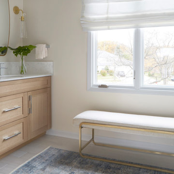
The original bathroom had a giant soaking tub with steps (dangerous!) as well as a small shower that did not work well for our homeowner who is 6’3”. With other bathtubs in the home, they decided to eliminate the tub and create an oversized shower which takes up the space where the old tub was located. The double vanity is on the opposite wall and a bench is located under the window for morning conversations and a place to set a couple of towels.
The pallet in here is light and airy with a mix of blond wood, creamy porcelain and marble tile, and brass accents. A simple roman shade adds some texture and it’s top-down mechanism allows for light and privacy.
This large whole house remodel gave our homeowners not only the ability to maximize the potential of their home but also created a lovely new frame from which to view their fabulous lake views.
Designed by: Susan Klimala, CKD, CBD
Photography by: Michael Kaskel
For more information on kitchen and bath design ideas go to: www.kitchenstudio-ge.com
Sponsored
Sunbury, OH
J.Holderby - Renovations
Franklin County's Leading General Contractors - 2X Best of Houzz!
 Alair Homes Plano
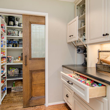
The heart of this house was boxed in with a divided kitchen, living and dining room. It also felt dated with faux finished paint and worn out tile counter tops. We successfully opened up the space and freshened every square inch. An all new layout with island, granite counter tops done in a leather finish and all new cabinetry were just the start. Ample pantry shelving, custom spice drawers, appliance garages, pull out racks and glass display cabinets make this kitchen an organizers dream! The pantry even got a unique flair with an antique door installed as a pocket door. This space has definitely gone from drab to eclectic cool! Design by Hatfield Builders & Remodelers | Photography by Versatile Imaging
 Abda Custom Window Fashions
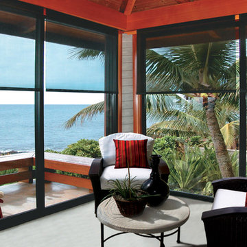
The sun can be overwhelming at times with the brightness and high temperatures. Shades are also a great way to block harmful ultra-violet rays to protect your hardwood flooring, furniture and artwork from fading. There are different types of shades that were engineered to solve a specific dilemma.
We work with clients in the Central Indiana Area. Contact us today to get started on your project. 317-273-8343
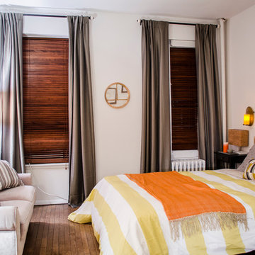
 Lauren Abrams Design
My client lived in a small studio apartment, and after working long days at his tech start-up, he needed a sanctuary in which to return and recharge. His only requests were that the space feel like a yoga studio and embody Zen.
45