
Search results for "Boosted problem solving" in Home Design Ideas
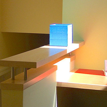

 Bullseye Wood Specialties, L.L.C
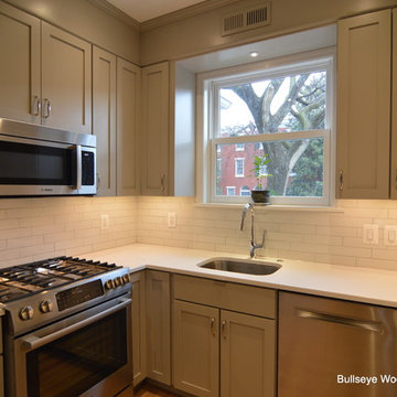
This compact DC kitchen was in dire need of space saving tricks and we used several. The kitchen features two tip-on toe kick drawers, sink tilt out, lazy susan, blind corner cabinet and custom vertical wood dividers over the frig. The original kitchen layout was L shaped because space did not allow for full depth base cabinets on the right wall. Problem solved -- we simply built cabinets that were 18" deep which still provide loads of storage as well as much needed counter top space.
 Che Bella Interiors Design + Remodeling
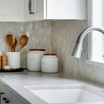
This kitchen renovation began with the clients questioning whether an addition was needed to meet their wishlist. By carefully rethinking the layout, the design team showed that everything could be accomplished within the existing footprint, maximizing function, storage, and flow while keeping the home’s balance intact. Small but strategic moves, like borrowing a touch of space from the laundry room and resizing a dining room window, opened the door to a larger island, improved circulation, and better placement for the range and sink.
The result is a kitchen that feels expansive and beautifully composed. Thoughtful adjustments to the structure created just enough breathing room for a layout that now supports daily life. A natural marble braided mosaic backsplash, soft and organic in texture, carries gracefully to the ceiling as a focal point, complemented by classic subway tile on adjacent wall. Every detail was executed with craftsmanship in mind, from the refined cabinetry to the layered finishes that give the space its timeless character.
Blending problem-solving with design, this kitchen delivers everything the homeowners envisioned, a bright, functional centerpiece that enhances both everyday living and special occasions alike.
Find the right local pro for your project
 ATA Architects Inc
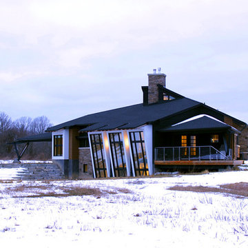
Function meets form in the Delta House, which incorporates innovative building solutions for our challenging rural Canadian climate. Perhaps more akin to aeronautics than architecture, biomimetic processes drove the problem-solving approach while seeking multiple functions for each component. A typical Canadian home grows up and out of the site, exposing more of the facade to the elements. Instead of building up, the focus here was to make better use of the lower level. A section of the house was dug out on the south side, making room for three main glazed boxes. The spaces and bedrooms of a typical second floor were transferred to the more protected basement, thus lowering the volume of conditioned air within the dwelling.
To minimize energy losses through the glazing, ATA centralized the windows on the south side of the building, while minimizing the glazing on other facades. The centralized windows became the “three sisters” allowing the winter sun into the main floor and lower level of the house. The aerodynamic delta shape of the building was tested in a wind tunnel and was designed to minimize energy loss due to contact with the turbulent winter wind. The sisters are tilted 10 degrees towards the sun, leveraging the properties of glass as a reflector, when the sun is at a high angle of incidence in the summer.
The house also contains an innovative thermal mass battery in the basement slab and a connected radiative masonry fireplace. Excess heat, gathered at the top of the tent-like roof is directed down and reheated through the chimney before being drawn into the basement slab for storage. Openings in the floor areas ensure the energy is equally distributed throughout the dwelling.
Read an article in the Globe and Mail about ATA’s Delta project here.
 Abigail Shea Interiors
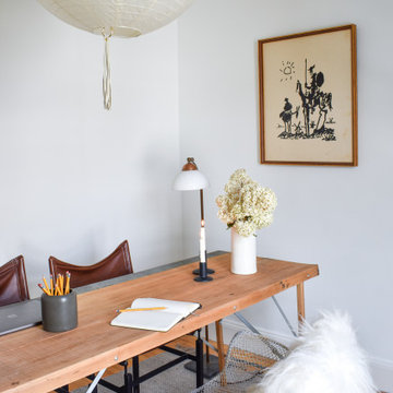
I had a blast working on this personal project. My partner, Alex, is working from home and I needed a space where I could be creative but also put in the hard work. We had 100sf, a budget of "as-cheap-as-possible," and tons of rental restrictions--but good design always starts with a little problem solving, right?
I infused the space with lots of neutral colors and tons of texture to keep it warm. I threw in my favorite vintage pieces, a big oversized paper lantern, and a bookshelf bar for some soul. & just like that, it's our favorite spot in town.

 Klopf Architecture
Malibu Glass Box House by Klopf Architecture
Following the devastating Woolsey Fire of 2018, the site in Malibu offered a unique opportunity to rebuild not just a home, but a new architectural composition that highlighted the property’s potential while navigating strict fire-rebuild codes in the area. Designed by Klopf Architecture, this project embraced a set of limitations and translated them into an architectural asset.
The city’s fire-rebuild process required the new structure to remain close to the original footprint, size and bulk, a constraint that ultimately clarified the architectural direction. Perched near the front of a long, narrow lot, the new home frames and overlooks a private, park-like rear expanse, an uncommon luxury especially in this part of Malibu .
Without a fixed program, the design process allowed for a different kind of creative focus allowing Klopf Architecture the opportunity to explore how a modernist home could best respond to this site. The team approached the project not with a list of requirements, but with a question: How might a modernist live here? What spatial qualities would inspire calm, connection, and a sense of wonder in this setting? The process became less about problem-solving and more about architectural storytelling—letting the site, the light, and the principles of modern design guide the form and flow of the home.
The response emerged in the form of a glass-box pavilion, an open, Mid-Century Modern inspired living, dining, and kitchen space that floats at the edge of the property’s natural descent. Connected to the more enclosed, private areas of the home by a glass-walled hallway, the living pavilion becomes a distinct centerpiece of the design. It opens on all four sides to the landscape with decks and patios on the flanks, an internal garden and water feature to the north, and a dramatic unguarded view of the expansive backyard and ocean horizon to the south.
Because of the mandated footprint, careful planning was required to ensure every space could still engage with light, landscape, or both. Strategic voids in the form of atriums and courtyards allow daylight to filter deep into the home’s core, while offering moments of surprise and retreat. These design gestures allow natural light to filter deep into the interior, creating a sense of brightness and openness throughout the day. At the same time, they expand the perceptual boundaries between inside and out, making the home feel more expansive while anchoring its connection to the surrounding landscape.
The siting of the house is what gives it its unique character. Rather than receding into the backyard like the neighboring homes, the house holds a slight prominence. From the central living pavilion, stepping down into the landscape feels more like entering a secluded park where a separate existing accessory structure, trail, and recreational areas await. The home’s modest street presence gives way to this unfolding drama of space, view, and nature.
Fire-resilient materials and assemblies are integrated seamlessly throughout including triple-pane glazing, under-slab and roof insulation, and locally sourced fire-rated cladding ensure the house not only meets Calfornia’s rigorous wildland-urban interface (WUI) standards, but feels effortlessly aligned with them. While technical decisions like fire-hardening and mechanical systems presented some construction challenges, particularly around the cantilevered glass box, the team found a functional compromise that preserved the integrity of the design.
Inside, a restrained palette and exposed post and beam design celebrate the ethos of mid-century modernism. A central circulation spine extends from the entry to the rear glass wall, offering a continuous visual link from street to ocean. Spaces such as the library and office, though more intimate in scale, are never cut off from nature as each opens to its own unique courtyard or garden view.
Though born out of a strict regulatory framework and developed without a specific client, the rebuild design unfolded with remarkable clarity. Grounded in site logic, refined by limitations and an emphasis on timeless spatial relationships – light, proportion, and a strong connection to nature, the resulting design feels both effortless and uplifting. The home lives lightly on the land, opens generously to its surroundings, and strikes a careful balance between privacy, openness, and calm. For Klopf Architecture, it stands as a compelling case study in how site, code, and circumstantial constraints can inspire enduring, modernist architecture. With years of experience reimagining mid-century modern design for how people live today, the firm took the project’s limitations as an opportunity. The result is a home shaped by open, flowing spaces, strong indoor-outdoor connections, and a calm, clear sense of structure. It’s a good reminder that even with strict constraints, there’s still room for architecture to breathe—and for modernism to keep moving forward.
Klopf Architecture project team: Geoff Campen, John Klopf, AIA, and Sherry Tan
Structural Engineer: ZFA
Contractor: Maison D’Artiste
Photography: ©2025 Mariko Reed
Year Completed: 2023
 Kitchen Inspiration Inc.
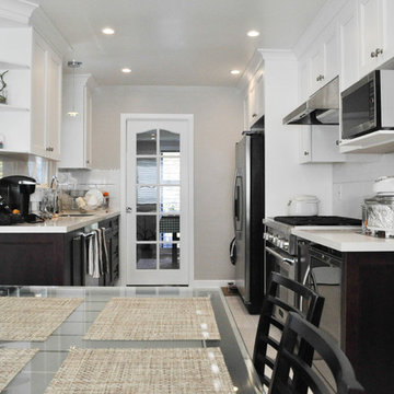
Project highlight – We are in the mission to improve the sage green galley kitchen in a cozy house in SF bay area.
Homeowners’ wish list for the new kitchen-
1. Improve lighting
2. More storage
3. More countertop space
4. Light maintenance countertop
5. Refrigerator door conflicts with wall.
6. Better flow
7. Add a mini Fridge
How did we transform the kitchen?
1. Added recessed light to ceiling & pendant light above the sink. Lighter color cabinet, back splash & countertop will bright up the space as well.
2. Adding a tall pantry with pull out shelves to the kitchen takes care the food storage. We also add 15 linear feet of base storage space under banquette seating.
3. Designating food storage in pantry clear out plenty of countertop space for food prep.
4. No more grout line on countertop. The engineer quartz countertop not only gives a beautiful touch to the kitchen but easy maintenance at the same time.
5. Common problem solved by adding a pantry between refrigerator & returning wall. Now the Ref door can be wide open with easy access to food.
6. The small peninsula in existing kitchen interrupts the flow and make kitchen feel smaller. It’s an item being removed.
7. Mini beverage fridge adds value to the kitchen for sure. Now, all drinks have a new home!
 Swatch Design Group
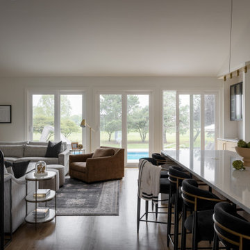
As a part of a larger transformation, the kitchen served as an anchor for rethinking how the home could feel and function. The goal was to create a space that felt truly integrated, flowed naturally within itself, and connected seamlessly to the outdoors. Storage was a top priority, with an emphasis on keeping countertops clean and the space feeling calm and open. Flow was equally important. What began as a layout optimized for entertaining evolved into a more intentional approach, where every sightline and transition was thoughtfully considered. The clients also needed the kitchen to work hard for their lifestyle, with a commercial-size refrigerator and freezer, generous prep space, and room to gather. The challenge was to bring purpose and polish to a space that didn’t quite feel like it belonged. The result is a kitchen that’s not only highly functional but finally feels like part of the home.
Project challenges:
- Maximizing storage was a primary challenge, especially with the inclusion of a commercial-sized fridge and freezer that occupied valuable cabinetry space.
- The need for clean, uninterrupted lines throughout the kitchen required thoughtful detailing, especially around cabinetry transitions and appliance integration.
- The oversized island design required two stone slabs and waterfall edges on both sides which posed both visual and logistical challenges.
- Incorporating electrical outlets into the island in a way that felt intentional and unobtrusive demanded creative problem-solving.
- The unique rooflines created strong visual angles that required a considered design approach to ensure the space felt cohesive rather than disjointed.
- Balancing symmetry and flow in a kitchen with structural constraints required precise layout planning to maintain a cohesive visual rhythm.
- Creating an intentional indoor/outdoor living flow, especially in the transitional space between the sliding doors to the backyard and the kitchen.
Project solutions:
- To balance the visual weight of the commercial-grade fridge and freezer, we flanked the range and hood with full-height pocket cabinetry, which created symmetry while reclaiming storage space. We also took a look into internal organization and carefully mapped out where every kitchen item would live. This allowed us to make informed decisions about drawer versus door configurations, and when to incorporate features like roll-out shelving to maximize accessibility and function.
- Linear light fixtures above the island were chosen for their low visual impact, allowing sightlines to remain clear and emphasizing the thoughtful spatial layout.
- The oversized island was carefully executed using two coordinated slabs, with a subtle brass inlay detail between them to turn a logistical challenge into a design feature.
- Pop-up electrical outlets were integrated into the island to keep surfaces clutter-free while maintaining easy access, which combined form and function seamlessly.
- With multiple focal points and a peaked vaulted ceiling, layout precision was key. The island, hood, and adjacent staircase were all perfectly centered on the vault, creating a sense of alignment across the open space.
- In the transitional area between kitchen and backyard, we added a wet bar that visually and functionally connects the indoor space with the outdoors. This addition provides extra storage and creates a dedicated entertainment spot for guests, enhancing the overall flow and usability of the home.
 Swatch Design Group
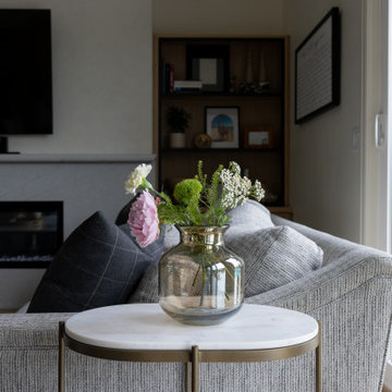
As a part of a larger transformation, the kitchen served as an anchor for rethinking how the home could feel and function. The goal was to create a space that felt truly integrated, flowed naturally within itself, and connected seamlessly to the outdoors. Storage was a top priority, with an emphasis on keeping countertops clean and the space feeling calm and open. Flow was equally important. What began as a layout optimized for entertaining evolved into a more intentional approach, where every sightline and transition was thoughtfully considered. The clients also needed the kitchen to work hard for their lifestyle, with a commercial-size refrigerator and freezer, generous prep space, and room to gather. The challenge was to bring purpose and polish to a space that didn’t quite feel like it belonged. The result is a kitchen that’s not only highly functional but finally feels like part of the home.
Project challenges:
- Maximizing storage was a primary challenge, especially with the inclusion of a commercial-sized fridge and freezer that occupied valuable cabinetry space.
- The need for clean, uninterrupted lines throughout the kitchen required thoughtful detailing, especially around cabinetry transitions and appliance integration.
- The oversized island design required two stone slabs and waterfall edges on both sides which posed both visual and logistical challenges.
- Incorporating electrical outlets into the island in a way that felt intentional and unobtrusive demanded creative problem-solving.
- The unique rooflines created strong visual angles that required a considered design approach to ensure the space felt cohesive rather than disjointed.
- Balancing symmetry and flow in a kitchen with structural constraints required precise layout planning to maintain a cohesive visual rhythm.
- Creating an intentional indoor/outdoor living flow, especially in the transitional space between the sliding doors to the backyard and the kitchen.
Project solutions:
- To balance the visual weight of the commercial-grade fridge and freezer, we flanked the range and hood with full-height pocket cabinetry, which created symmetry while reclaiming storage space. We also took a look into internal organization and carefully mapped out where every kitchen item would live. This allowed us to make informed decisions about drawer versus door configurations, and when to incorporate features like roll-out shelving to maximize accessibility and function.
- Linear light fixtures above the island were chosen for their low visual impact, allowing sightlines to remain clear and emphasizing the thoughtful spatial layout.
- The oversized island was carefully executed using two coordinated slabs, with a subtle brass inlay detail between them to turn a logistical challenge into a design feature.
- Pop-up electrical outlets were integrated into the island to keep surfaces clutter-free while maintaining easy access, which combined form and function seamlessly.
- With multiple focal points and a peaked vaulted ceiling, layout precision was key. The island, hood, and adjacent staircase were all perfectly centered on the vault, creating a sense of alignment across the open space.
- In the transitional area between kitchen and backyard, we added a wet bar that visually and functionally connects the indoor space with the outdoors. This addition provides extra storage and creates a dedicated entertainment spot for guests, enhancing the overall flow and usability of the home.
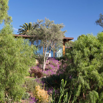 Klopf Architecture
Malibu Glass Box House by Klopf Architecture
Following the devastating Woolsey Fire of 2018, the site in Malibu offered a unique opportunity to rebuild not just a home, but a new architectural composition that highlighted the property’s potential while navigating strict fire-rebuild codes in the area. Designed by Klopf Architecture, this project embraced a set of limitations and translated them into an architectural asset.
The city’s fire-rebuild process required the new structure to remain close to the original footprint, size and bulk, a constraint that ultimately clarified the architectural direction. Perched near the front of a long, narrow lot, the new home frames and overlooks a private, park-like rear expanse, an uncommon luxury especially in this part of Malibu .
Without a fixed program, the design process allowed for a different kind of creative focus allowing Klopf Architecture the opportunity to explore how a modernist home could best respond to this site. The team approached the project not with a list of requirements, but with a question: How might a modernist live here? What spatial qualities would inspire calm, connection, and a sense of wonder in this setting? The process became less about problem-solving and more about architectural storytelling—letting the site, the light, and the principles of modern design guide the form and flow of the home.
The response emerged in the form of a glass-box pavilion, an open, Mid-Century Modern inspired living, dining, and kitchen space that floats at the edge of the property’s natural descent. Connected to the more enclosed, private areas of the home by a glass-walled hallway, the living pavilion becomes a distinct centerpiece of the design. It opens on all four sides to the landscape with decks and patios on the flanks, an internal garden and water feature to the north, and a dramatic unguarded view of the expansive backyard and ocean horizon to the south.
Because of the mandated footprint, careful planning was required to ensure every space could still engage with light, landscape, or both. Strategic voids in the form of atriums and courtyards allow daylight to filter deep into the home’s core, while offering moments of surprise and retreat. These design gestures allow natural light to filter deep into the interior, creating a sense of brightness and openness throughout the day. At the same time, they expand the perceptual boundaries between inside and out, making the home feel more expansive while anchoring its connection to the surrounding landscape.
The siting of the house is what gives it its unique character. Rather than receding into the backyard like the neighboring homes, the house holds a slight prominence. From the central living pavilion, stepping down into the landscape feels more like entering a secluded park where a separate existing accessory structure, trail, and recreational areas await. The home’s modest street presence gives way to this unfolding drama of space, view, and nature.
Fire-resilient materials and assemblies are integrated seamlessly throughout including triple-pane glazing, under-slab and roof insulation, and locally sourced fire-rated cladding ensure the house not only meets Calfornia’s rigorous wildland-urban interface (WUI) standards, but feels effortlessly aligned with them. While technical decisions like fire-hardening and mechanical systems presented some construction challenges, particularly around the cantilevered glass box, the team found a functional compromise that preserved the integrity of the design.
Inside, a restrained palette and exposed post and beam design celebrate the ethos of mid-century modernism. A central circulation spine extends from the entry to the rear glass wall, offering a continuous visual link from street to ocean. Spaces such as the library and office, though more intimate in scale, are never cut off from nature as each opens to its own unique courtyard or garden view.
Though born out of a strict regulatory framework and developed without a specific client, the rebuild design unfolded with remarkable clarity. Grounded in site logic, refined by limitations and an emphasis on timeless spatial relationships – light, proportion, and a strong connection to nature, the resulting design feels both effortless and uplifting. The home lives lightly on the land, opens generously to its surroundings, and strikes a careful balance between privacy, openness, and calm. For Klopf Architecture, it stands as a compelling case study in how site, code, and circumstantial constraints can inspire enduring, modernist architecture. With years of experience reimagining mid-century modern design for how people live today, the firm took the project’s limitations as an opportunity. The result is a home shaped by open, flowing spaces, strong indoor-outdoor connections, and a calm, clear sense of structure. It’s a good reminder that even with strict constraints, there’s still room for architecture to breathe—and for modernism to keep moving forward.
Klopf Architecture project team: Geoff Campen, John Klopf, AIA, and Sherry Tan
Structural Engineer: ZFA
Contractor: Maison D’Artiste
Photography: ©2025 Mariko Reed
Year Completed: 2023
 Artisan Builders LLC
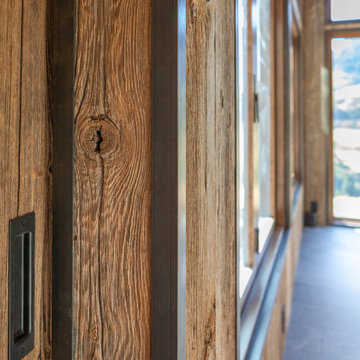
Sunroom wall showing weathered barn wood walls and metal trim details around windows and doors. The design build system that is used by Artisan Builders allows for creative problem solving leading to unique solutions.
 Simply Home Decorating
This beautiful North Vancouver home belongs to a nature-loving and health-conscious couple, Emma and Vince (names changed), their two young children, and their dog, Jasper. When they contacted us about renovating and furnishing their kitchen and family room, we walked in and saw a world of potential waiting to be uncovered.
Before: Larkhall Crescent Home:
Like many original North Vancouver homes, the interior was definitely dated. We encountered late ‘80s finishes in powder pink and teal green, old carpet, and a kitchen that wasn’t maximized to suit this family’s modern-day lifestyle. However, the size of the rooms offered us a ton of space with which to get creative.
Knowing our clients’ love of cooking, need for work spaces (Emma and Vince both work remotely), and growing family, we developed a design concept that would increase usable space, optimize storage, and create intimacy in this large area. As for the style, we were inspired by their European roots, inventing a new and modern take on “Belgian Farmhouse” style. Now, the home is truly one-of-a-kind.
After: Warm & Cozy Family Room:
Fresh, bright, and comfortable, this living area has been transformed! We started with the fireplace as a focal point, selecting aged brick tiles for added texture and a crisp wood mantle. The taupe-coloured sectional infuses the room with visual warmth and serves the added purpose of separating the family room from the kitchen.
Emma and Vince were also keen on using non-toxic materials in their home, and we were happy to oblige. To meet their needs, we sourced natural wood elements and sought out Canadian-made products - that adhere to high health standards - whenever possible.
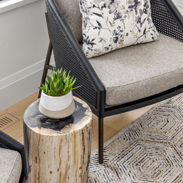
Look closer at the elements of this space, and you will find this stunning, honeycomb-patterned rug in earthy gold, beige, and charcoal tones. It’s plush to the touch and full of visual texture that brings this room’s colour palette together. We sourced these two-tone chairs with caning, petrified wood side table, black sconces, and botanical prints in greyscale from local artist, Heather Johnston.
We topped off the space with this dark wood and rattan console that offers storage facing the kitchen and presents an opportunity to display cherished items. The result is a cozy lounging space brimming with comfort and functionality. It’s perfect for enjoying quality family time, or Emma can simply slide the coffee table away to make room for her morning yoga practice.
Now, let’s turn around and give some attention to the kitchen. Do you remember what the original kitchen looked like? If not, scroll back up, because the transformation is shocking…
Moody & Welcoming Kitchen for Healthy Living:
This kitchen looks very different from how it started, right? Though we didn’t touch any walls, the kitchen has almost doubled in usable space! We created a long, extended island with storage, an outlet for small appliances, and seating for comfortable prep, after-school snacking, or mingling among friends.
On the other side of the island, the family has even more storage and an integrated dishwasher within easy reach of the sink, perfect for quick clean-up. From this angle, you can also see the expansive custom Shaker cabinetry in white and the integrated double ovens. These facilitate their cooking experience and gave us the opportunity to add an additional surprise…
A coffee garage station and more hidden storage! Keeping these items located along the perimeter allows them to be accessed by the family or their guests without someone getting under the cook’s feet. These are the little details that make everyday life easier and more enjoyable.
Moving deeper into the kitchen, the seamless induction cooktop topped with a freestanding concealed hood fan commands attention in a soft yet prominent way. The natural wood accent mirrors the fireplace mantle, and the choice of off-black wood-grain cabinets not only continues our black-and-white colour palette but adds a sense of depth and contrast. The corner sink is located to the right and perfectly positioned with a view of their thriving backyard.
To invite more of this family’s character into the space, we mixed metals for interest — matte black, dark pewter, and warm brass — and created open shelves in white oak for their plants and decor. You can also glimpse the tumbled edge of the backsplash tile, which echoes the rustic brick of the fireplace. It adds that farmhouse charm while still feeling timeless and sophisticated.
Last but not least, we designed this dining banquette in the bay window (with integrated bench storage, of course), where the family can share a meal together, the kids can do homework, or Emma and Vince can work and enjoy a change of scenery from their offices. Like the other spaces in the home, it was designed to be beautiful, multi-functional, and long-lasting.
Praise from Our Clients:
It is clear that we love this home, but what did our clients have to say?
“Lori is a visionary and masters execution to the finest detail all at the same time. When she first met us to know more about who we are and how we live, she could right away envision how we could use the space in our kitchen and living room…The results exceeded our expectations.
Lori and her team were also a delight to work with — coordination with all the trades, fast problem-solving, regular updates, professional and friendly attitude of her entire team — made it the dream team. Thank you SHD for making our space so beautiful!”
In turn, we are so grateful for this family’s trust, their open communication, and for being wonderful people with whom to work. (So, thank you!)
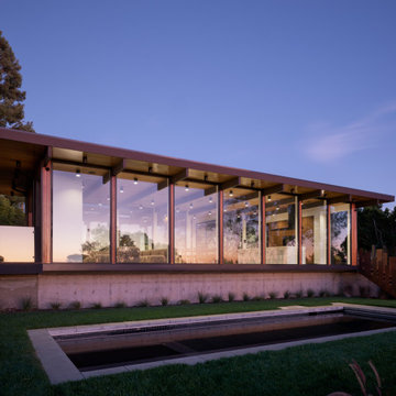 Klopf Architecture
Malibu Glass Box House by Klopf Architecture
Following the devastating Woolsey Fire of 2018, the site in Malibu offered a unique opportunity to rebuild not just a home, but a new architectural composition that highlighted the property’s potential while navigating strict fire-rebuild codes in the area. Designed by Klopf Architecture, this project embraced a set of limitations and translated them into an architectural asset.
The city’s fire-rebuild process required the new structure to remain close to the original footprint, size and bulk, a constraint that ultimately clarified the architectural direction. Perched near the front of a long, narrow lot, the new home frames and overlooks a private, park-like rear expanse, an uncommon luxury especially in this part of Malibu .
Without a fixed program, the design process allowed for a different kind of creative focus allowing Klopf Architecture the opportunity to explore how a modernist home could best respond to this site. The team approached the project not with a list of requirements, but with a question: How might a modernist live here? What spatial qualities would inspire calm, connection, and a sense of wonder in this setting? The process became less about problem-solving and more about architectural storytelling—letting the site, the light, and the principles of modern design guide the form and flow of the home.
The response emerged in the form of a glass-box pavilion, an open, Mid-Century Modern inspired living, dining, and kitchen space that floats at the edge of the property’s natural descent. Connected to the more enclosed, private areas of the home by a glass-walled hallway, the living pavilion becomes a distinct centerpiece of the design. It opens on all four sides to the landscape with decks and patios on the flanks, an internal garden and water feature to the north, and a dramatic unguarded view of the expansive backyard and ocean horizon to the south.
Because of the mandated footprint, careful planning was required to ensure every space could still engage with light, landscape, or both. Strategic voids in the form of atriums and courtyards allow daylight to filter deep into the home’s core, while offering moments of surprise and retreat. These design gestures allow natural light to filter deep into the interior, creating a sense of brightness and openness throughout the day. At the same time, they expand the perceptual boundaries between inside and out, making the home feel more expansive while anchoring its connection to the surrounding landscape.
The siting of the house is what gives it its unique character. Rather than receding into the backyard like the neighboring homes, the house holds a slight prominence. From the central living pavilion, stepping down into the landscape feels more like entering a secluded park where a separate existing accessory structure, trail, and recreational areas await. The home’s modest street presence gives way to this unfolding drama of space, view, and nature.
Fire-resilient materials and assemblies are integrated seamlessly throughout including triple-pane glazing, under-slab and roof insulation, and locally sourced fire-rated cladding ensure the house not only meets Calfornia’s rigorous wildland-urban interface (WUI) standards, but feels effortlessly aligned with them. While technical decisions like fire-hardening and mechanical systems presented some construction challenges, particularly around the cantilevered glass box, the team found a functional compromise that preserved the integrity of the design.
Inside, a restrained palette and exposed post and beam design celebrate the ethos of mid-century modernism. A central circulation spine extends from the entry to the rear glass wall, offering a continuous visual link from street to ocean. Spaces such as the library and office, though more intimate in scale, are never cut off from nature as each opens to its own unique courtyard or garden view.
Though born out of a strict regulatory framework and developed without a specific client, the rebuild design unfolded with remarkable clarity. Grounded in site logic, refined by limitations and an emphasis on timeless spatial relationships – light, proportion, and a strong connection to nature, the resulting design feels both effortless and uplifting. The home lives lightly on the land, opens generously to its surroundings, and strikes a careful balance between privacy, openness, and calm. For Klopf Architecture, it stands as a compelling case study in how site, code, and circumstantial constraints can inspire enduring, modernist architecture. With years of experience reimagining mid-century modern design for how people live today, the firm took the project’s limitations as an opportunity. The result is a home shaped by open, flowing spaces, strong indoor-outdoor connections, and a calm, clear sense of structure. It’s a good reminder that even with strict constraints, there’s still room for architecture to breathe—and for modernism to keep moving forward.
Klopf Architecture project team: Geoff Campen, John Klopf, AIA, and Sherry Tan
Structural Engineer: ZFA
Contractor: Maison D’Artiste
Photography: ©2025 Mariko Reed
Year Completed: 2023
 Grade A Millwork & Renovations
Here's what our client had to say about this project which is taken from our review page:
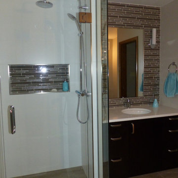
We have hired Grade A Millwork to renovate our family room, ensuite and main bathrooms. In setting up the original contract, our needs were listened to and a realistic work schedule was established. In each of our 3 projects, the workmanship was excellent, with attention to detail and delivered in a timely manner. The level of knowledge of all of the team members was especially evident when challenged to problem solve unforeseen issues in the renovations. All of our questions were also answered in a timely and professional manner. All three project were completed within the budget. We highly recommend Grade A Millwork.
 F9 Productions Inc.
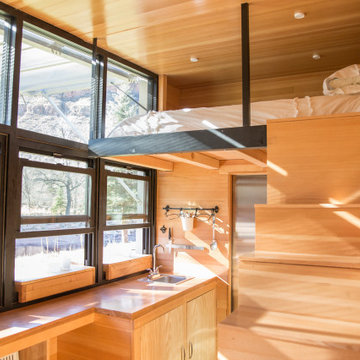
Envision a tiny home that packs adventure into every inch, inspired by rainy park days and built for nature lovers. Atlas Tiny House by F9 blends old-school straw ideas with modern mobility, creating a sustainable escape that's compact yet feels wide open to the world.
Client and Brief
Born from RV frustrations, the vision was a movable home with real craftsmanship – solar for power, rain collection for water, and a glass wall for endless views. It's designed for simple, off-grid living that connects you to the outdoors.
Problems Solved
Traditional RVs lack charm and eco-friendliness; Atlas fixes that with strong materials and green systems, making it durable, fire-safe, and self-reliant for worry-free travels.
Design Concept and Form
The core draws from nature – steel for a tough frame, wood for warmth, glass for immersion. Fold-out deck and awning turn it into an outdoor room, maximizing space and connection.
Construction and Materials
Tube steel keeps it light yet sturdy, with wood accents and sustainable features like filtered rainwater storage for practical, planet-friendly living.
Interior Design
Main level flows with futon, kitchen, bath, and clever storage including batteries. Loft upstairs holds a queen bed with extra room, all efficient and inviting.
Outcome
Showcased on HGTV, Atlas redefines tiny homes with sustainability and style. It's a mobile haven that brings freedom, nature, and comfort together for inspired, eco-conscious adventures.
 THE Remodel Group
Built in the 1970s by a hardworking family patriarch, this Portland-area ranch home had been the backdrop for generations of memories. When the homeowners inherited the property from their grandparents, they saw an opportunity to honor its history while creating a modern sanctuary for their growing family. Through a thoughtful whole-home renovation, this once dark and compartmentalized ranch was transformed into a bright, open, and welcoming home designed for the next generation.
With a toddler at home and another child on the way, the family's goal was to create spaces that felt connected, functional, and built to last. The heart of the renovation centered on opening the home's main living areas, replacing disconnected rooms with a spacious open-concept kitchen and living room designed for gathering and everyday life. Enlarged windows flood the interior with natural light, while carefully selected finishes bring warmth, durability, and timeless appeal.
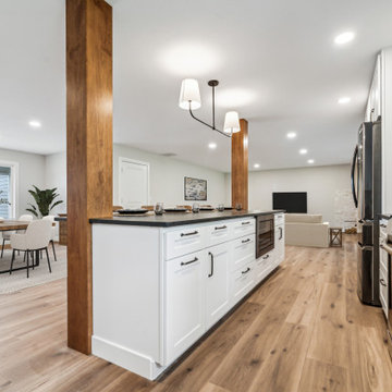
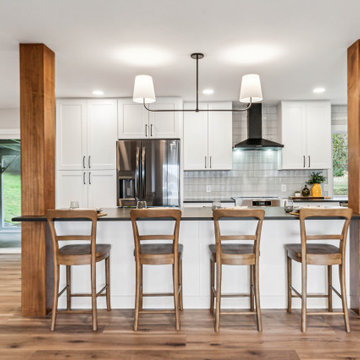
The kitchen became the focal point of the transformation. Stock cabinetry was elevated through custom details including floating wood shelves and stained wood-wrapped columns that add warmth and character. At the center, a striking quartz island serves as both a gathering place and a clever structural solution, seamlessly incorporating support elements required for the newly opened floor plan.
Creating this open-concept layout required significant structural modifications, including the removal of six walls, three of them load-bearing. Engineered beams were recessed into the ceiling to maintain clean sightlines, while new footings were carefully installed within the crawlspace to support the redistributed loads. Additional improvements included relocating the furnace to eliminate a major circulation obstacle and installing a new garage access door that required modifications to the existing foundation.
Throughout the project, thoughtful planning helped maximize both budget and performance. Luxury vinyl plank flooring provides the look of hardwood while standing up to children and large pets, while stain-resistant carpeting offers comfort in the bedrooms. Existing window locations were retained and enlarged to increase natural light without the expense of major structural changes. Even the structural columns required for the new beams were integrated into the island design, transforming a necessity into an architectural feature.
Completed two weeks ahead of schedule, this Portland metro ranch remodel demonstrates how thoughtful design-build remodeling can preserve a home's heritage while adapting it for modern family living. Through strategic planning, creative problem-solving, and quality craftsmanship, a beloved family home was transformed into a bright, functional retreat ready to create decades of new memories.
 THE Remodel Group
Built in the 1970s by a hardworking family patriarch, this Portland-area ranch home had been the backdrop for generations of memories. When the homeowners inherited the property from their grandparents, they saw an opportunity to honor its history while creating a modern sanctuary for their growing family. Through a thoughtful whole-home renovation, this once dark and compartmentalized ranch was transformed into a bright, open, and welcoming home designed for the next generation.
With a toddler at home and another child on the way, the family's goal was to create spaces that felt connected, functional, and built to last. The heart of the renovation centered on opening the home's main living areas, replacing disconnected rooms with a spacious open-concept kitchen and living room designed for gathering and everyday life. Enlarged windows flood the interior with natural light, while carefully selected finishes bring warmth, durability, and timeless appeal.
The kitchen became the focal point of the transformation. Stock cabinetry was elevated through custom details including floating wood shelves and stained wood-wrapped columns that add warmth and character. At the center, a striking quartz island serves as both a gathering place and a clever structural solution, seamlessly incorporating support elements required for the newly opened floor plan.
Creating this open-concept layout required significant structural modifications, including the removal of six walls, three of them load-bearing. Engineered beams were recessed into the ceiling to maintain clean sightlines, while new footings were carefully installed within the crawlspace to support the redistributed loads. Additional improvements included relocating the furnace to eliminate a major circulation obstacle and installing a new garage access door that required modifications to the existing foundation.
Throughout the project, thoughtful planning helped maximize both budget and performance. Luxury vinyl plank flooring provides the look of hardwood while standing up to children and large pets, while stain-resistant carpeting offers comfort in the bedrooms. Existing window locations were retained and enlarged to increase natural light without the expense of major structural changes. Even the structural columns required for the new beams were integrated into the island design, transforming a necessity into an architectural feature.
Completed two weeks ahead of schedule, this Portland metro ranch remodel demonstrates how thoughtful design-build remodeling can preserve a home's heritage while adapting it for modern family living. Through strategic planning, creative problem-solving, and quality craftsmanship, a beloved family home was transformed into a bright, functional retreat ready to create decades of new memories.
 THE Remodel Group
Built in the 1970s by a hardworking family patriarch, this Portland-area ranch home had been the backdrop for generations of memories. When the homeowners inherited the property from their grandparents, they saw an opportunity to honor its history while creating a modern sanctuary for their growing family. Through a thoughtful whole-home renovation, this once dark and compartmentalized ranch was transformed into a bright, open, and welcoming home designed for the next generation.
With a toddler at home and another child on the way, the family's goal was to create spaces that felt connected, functional, and built to last. The heart of the renovation centered on opening the home's main living areas, replacing disconnected rooms with a spacious open-concept kitchen and living room designed for gathering and everyday life. Enlarged windows flood the interior with natural light, while carefully selected finishes bring warmth, durability, and timeless appeal.
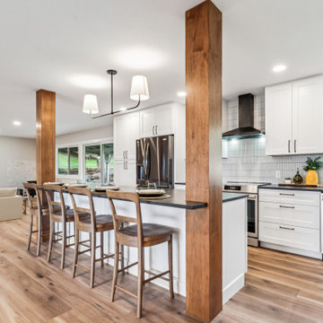
The kitchen became the focal point of the transformation. Stock cabinetry was elevated through custom details including floating wood shelves and stained wood-wrapped columns that add warmth and character. At the center, a striking quartz island serves as both a gathering place and a clever structural solution, seamlessly incorporating support elements required for the newly opened floor plan.
Creating this open-concept layout required significant structural modifications, including the removal of six walls, three of them load-bearing. Engineered beams were recessed into the ceiling to maintain clean sightlines, while new footings were carefully installed within the crawlspace to support the redistributed loads. Additional improvements included relocating the furnace to eliminate a major circulation obstacle and installing a new garage access door that required modifications to the existing foundation.
Throughout the project, thoughtful planning helped maximize both budget and performance. Luxury vinyl plank flooring provides the look of hardwood while standing up to children and large pets, while stain-resistant carpeting offers comfort in the bedrooms. Existing window locations were retained and enlarged to increase natural light without the expense of major structural changes. Even the structural columns required for the new beams were integrated into the island design, transforming a necessity into an architectural feature.
Completed two weeks ahead of schedule, this Portland metro ranch remodel demonstrates how thoughtful design-build remodeling can preserve a home's heritage while adapting it for modern family living. Through strategic planning, creative problem-solving, and quality craftsmanship, a beloved family home was transformed into a bright, functional retreat ready to create decades of new memories.
 THE Remodel Group
Built in the 1970s by a hardworking family patriarch, this Portland-area ranch home had been the backdrop for generations of memories. When the homeowners inherited the property from their grandparents, they saw an opportunity to honor its history while creating a modern sanctuary for their growing family. Through a thoughtful whole-home renovation, this once dark and compartmentalized ranch was transformed into a bright, open, and welcoming home designed for the next generation.
With a toddler at home and another child on the way, the family's goal was to create spaces that felt connected, functional, and built to last. The heart of the renovation centered on opening the home's main living areas, replacing disconnected rooms with a spacious open-concept kitchen and living room designed for gathering and everyday life. Enlarged windows flood the interior with natural light, while carefully selected finishes bring warmth, durability, and timeless appeal.
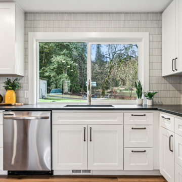
The kitchen became the focal point of the transformation. Stock cabinetry was elevated through custom details including floating wood shelves and stained wood-wrapped columns that add warmth and character. At the center, a striking quartz island serves as both a gathering place and a clever structural solution, seamlessly incorporating support elements required for the newly opened floor plan.
Creating this open-concept layout required significant structural modifications, including the removal of six walls, three of them load-bearing. Engineered beams were recessed into the ceiling to maintain clean sightlines, while new footings were carefully installed within the crawlspace to support the redistributed loads. Additional improvements included relocating the furnace to eliminate a major circulation obstacle and installing a new garage access door that required modifications to the existing foundation.
Throughout the project, thoughtful planning helped maximize both budget and performance. Luxury vinyl plank flooring provides the look of hardwood while standing up to children and large pets, while stain-resistant carpeting offers comfort in the bedrooms. Existing window locations were retained and enlarged to increase natural light without the expense of major structural changes. Even the structural columns required for the new beams were integrated into the island design, transforming a necessity into an architectural feature.
Completed two weeks ahead of schedule, this Portland metro ranch remodel demonstrates how thoughtful design-build remodeling can preserve a home's heritage while adapting it for modern family living. Through strategic planning, creative problem-solving, and quality craftsmanship, a beloved family home was transformed into a bright, functional retreat ready to create decades of new memories.
 THE Remodel Group
Built in the 1970s by a hardworking family patriarch, this Portland-area ranch home had been the backdrop for generations of memories. When the homeowners inherited the property from their grandparents, they saw an opportunity to honor its history while creating a modern sanctuary for their growing family. Through a thoughtful whole-home renovation, this once dark and compartmentalized ranch was transformed into a bright, open, and welcoming home designed for the next generation.
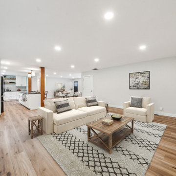
With a toddler at home and another child on the way, the family's goal was to create spaces that felt connected, functional, and built to last. The heart of the renovation centered on opening the home's main living areas, replacing disconnected rooms with a spacious open-concept kitchen and living room designed for gathering and everyday life. Enlarged windows flood the interior with natural light, while carefully selected finishes bring warmth, durability, and timeless appeal.
The kitchen became the focal point of the transformation. Stock cabinetry was elevated through custom details including floating wood shelves and stained wood-wrapped columns that add warmth and character. At the center, a striking quartz island serves as both a gathering place and a clever structural solution, seamlessly incorporating support elements required for the newly opened floor plan.
Creating this open-concept layout required significant structural modifications, including the removal of six walls, three of them load-bearing. Engineered beams were recessed into the ceiling to maintain clean sightlines, while new footings were carefully installed within the crawlspace to support the redistributed loads. Additional improvements included relocating the furnace to eliminate a major circulation obstacle and installing a new garage access door that required modifications to the existing foundation.
Throughout the project, thoughtful planning helped maximize both budget and performance. Luxury vinyl plank flooring provides the look of hardwood while standing up to children and large pets, while stain-resistant carpeting offers comfort in the bedrooms. Existing window locations were retained and enlarged to increase natural light without the expense of major structural changes. Even the structural columns required for the new beams were integrated into the island design, transforming a necessity into an architectural feature.
Completed two weeks ahead of schedule, this Portland metro ranch remodel demonstrates how thoughtful design-build remodeling can preserve a home's heritage while adapting it for modern family living. Through strategic planning, creative problem-solving, and quality craftsmanship, a beloved family home was transformed into a bright, functional retreat ready to create decades of new memories.
28