
Search results for "Boosted problem solving" in Home Design Ideas
 Simply Home Decorating
This beautiful North Vancouver home belongs to a nature-loving and health-conscious couple, Emma and Vince (names changed), their two young children, and their dog, Jasper. When they contacted us about renovating and furnishing their kitchen and family room, we walked in and saw a world of potential waiting to be uncovered.
Before: Larkhall Crescent Home:
Like many original North Vancouver homes, the interior was definitely dated. We encountered late ‘80s finishes in powder pink and teal green, old carpet, and a kitchen that wasn’t maximized to suit this family’s modern-day lifestyle. However, the size of the rooms offered us a ton of space with which to get creative.
Knowing our clients’ love of cooking, need for work spaces (Emma and Vince both work remotely), and growing family, we developed a design concept that would increase usable space, optimize storage, and create intimacy in this large area. As for the style, we were inspired by their European roots, inventing a new and modern take on “Belgian Farmhouse” style. Now, the home is truly one-of-a-kind.
After: Warm & Cozy Family Room:
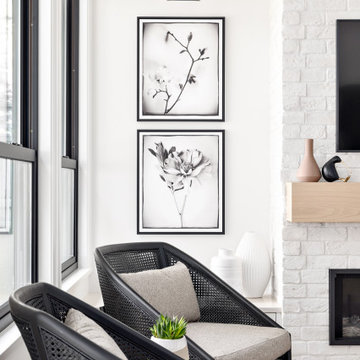
Fresh, bright, and comfortable, this living area has been transformed! We started with the fireplace as a focal point, selecting aged brick tiles for added texture and a crisp wood mantle. The taupe-coloured sectional infuses the room with visual warmth and serves the added purpose of separating the family room from the kitchen.
Emma and Vince were also keen on using non-toxic materials in their home, and we were happy to oblige. To meet their needs, we sourced natural wood elements and sought out Canadian-made products - that adhere to high health standards - whenever possible.
Look closer at the elements of this space, and you will find this stunning, honeycomb-patterned rug in earthy gold, beige, and charcoal tones. It’s plush to the touch and full of visual texture that brings this room’s colour palette together. We sourced these two-tone chairs with caning, petrified wood side table, black sconces, and botanical prints in greyscale from local artist, Heather Johnston.
We topped off the space with this dark wood and rattan console that offers storage facing the kitchen and presents an opportunity to display cherished items. The result is a cozy lounging space brimming with comfort and functionality. It’s perfect for enjoying quality family time, or Emma can simply slide the coffee table away to make room for her morning yoga practice.
Now, let’s turn around and give some attention to the kitchen. Do you remember what the original kitchen looked like? If not, scroll back up, because the transformation is shocking…
Moody & Welcoming Kitchen for Healthy Living:
This kitchen looks very different from how it started, right? Though we didn’t touch any walls, the kitchen has almost doubled in usable space! We created a long, extended island with storage, an outlet for small appliances, and seating for comfortable prep, after-school snacking, or mingling among friends.
On the other side of the island, the family has even more storage and an integrated dishwasher within easy reach of the sink, perfect for quick clean-up. From this angle, you can also see the expansive custom Shaker cabinetry in white and the integrated double ovens. These facilitate their cooking experience and gave us the opportunity to add an additional surprise…
A coffee garage station and more hidden storage! Keeping these items located along the perimeter allows them to be accessed by the family or their guests without someone getting under the cook’s feet. These are the little details that make everyday life easier and more enjoyable.
Moving deeper into the kitchen, the seamless induction cooktop topped with a freestanding concealed hood fan commands attention in a soft yet prominent way. The natural wood accent mirrors the fireplace mantle, and the choice of off-black wood-grain cabinets not only continues our black-and-white colour palette but adds a sense of depth and contrast. The corner sink is located to the right and perfectly positioned with a view of their thriving backyard.
To invite more of this family’s character into the space, we mixed metals for interest — matte black, dark pewter, and warm brass — and created open shelves in white oak for their plants and decor. You can also glimpse the tumbled edge of the backsplash tile, which echoes the rustic brick of the fireplace. It adds that farmhouse charm while still feeling timeless and sophisticated.
Last but not least, we designed this dining banquette in the bay window (with integrated bench storage, of course), where the family can share a meal together, the kids can do homework, or Emma and Vince can work and enjoy a change of scenery from their offices. Like the other spaces in the home, it was designed to be beautiful, multi-functional, and long-lasting.
Praise from Our Clients:
It is clear that we love this home, but what did our clients have to say?
“Lori is a visionary and masters execution to the finest detail all at the same time. When she first met us to know more about who we are and how we live, she could right away envision how we could use the space in our kitchen and living room…The results exceeded our expectations.
Lori and her team were also a delight to work with — coordination with all the trades, fast problem-solving, regular updates, professional and friendly attitude of her entire team — made it the dream team. Thank you SHD for making our space so beautiful!”
In turn, we are so grateful for this family’s trust, their open communication, and for being wonderful people with whom to work. (So, thank you!)
 N Sabella Inc
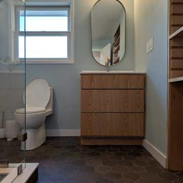
This bathroom converted from a small bedroom in a ranch-style home on a concrete slab, is now a beautiful, light-filled retreat. One of the biggest challenges in this transformation was the plumbing. With the home built on a slab, running new lines required creative problem-solving. But the result was worth it: a custom walk-in shower with frameless glass that keeps the space feeling airy and expansive.
The client gravitated toward natural finishes, so we balanced modern simplicity with warm wood tones. Custom-built open shelving features sliding pull-out shelves for easy access and a clean, tailored look. The vanity’s natural woodgrain adds warmth, while brushed nickel fixtures maintain a streamlined, modern aesthetic.
 Lars Remodeling & Design
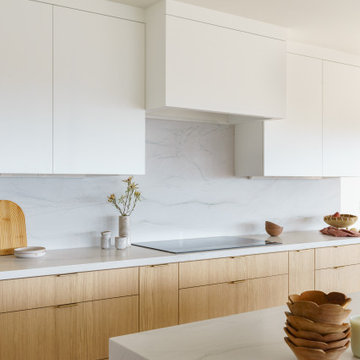
The completely reimagined floorplan included relocating the kitchen and Master Suite to the opposite side of the home to take better advantage of the views and natural light. All bathrooms and the laundry room were completely remodeled along with installing new doors, windows, and flooring throughout the home and completely upgrading all electrical and plumbing.
The end result is simply stunning. Light, bright, and modern, the new version of this home demonstrates the power of thoughtful architectural planning, creative problem solving, and expert design details.
Find the right local pro for your project
 User
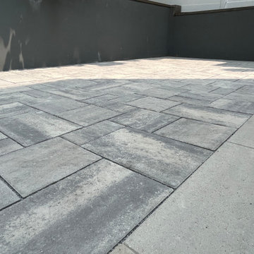
UserOpen Graded crushed stone base with proper drainage grid was installed to effectively address water accumulation. Quality Permeable Concrete Paver Patio was installed to successfully absorb any rain water AND re-route raising ground water to the new drainage system. Another water problem solved, and Owners gained a beautiful hard surface patio to enjoy.

 Klopf Architecture
Malibu Glass Box House by Klopf Architecture
Following the devastating Woolsey Fire of 2018, the site in Malibu offered a unique opportunity to rebuild not just a home, but a new architectural composition that highlighted the property’s potential while navigating strict fire-rebuild codes in the area. Designed by Klopf Architecture, this project embraced a set of limitations and translated them into an architectural asset.
The city’s fire-rebuild process required the new structure to remain close to the original footprint, size and bulk, a constraint that ultimately clarified the architectural direction. Perched near the front of a long, narrow lot, the new home frames and overlooks a private, park-like rear expanse, an uncommon luxury especially in this part of Malibu .
Without a fixed program, the design process allowed for a different kind of creative focus allowing Klopf Architecture the opportunity to explore how a modernist home could best respond to this site. The team approached the project not with a list of requirements, but with a question: How might a modernist live here? What spatial qualities would inspire calm, connection, and a sense of wonder in this setting? The process became less about problem-solving and more about architectural storytelling—letting the site, the light, and the principles of modern design guide the form and flow of the home.
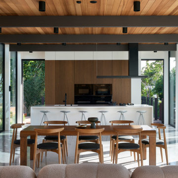
The response emerged in the form of a glass-box pavilion, an open, Mid-Century Modern inspired living, dining, and kitchen space that floats at the edge of the property’s natural descent. Connected to the more enclosed, private areas of the home by a glass-walled hallway, the living pavilion becomes a distinct centerpiece of the design. It opens on all four sides to the landscape with decks and patios on the flanks, an internal garden and water feature to the north, and a dramatic unguarded view of the expansive backyard and ocean horizon to the south.
Because of the mandated footprint, careful planning was required to ensure every space could still engage with light, landscape, or both. Strategic voids in the form of atriums and courtyards allow daylight to filter deep into the home’s core, while offering moments of surprise and retreat. These design gestures allow natural light to filter deep into the interior, creating a sense of brightness and openness throughout the day. At the same time, they expand the perceptual boundaries between inside and out, making the home feel more expansive while anchoring its connection to the surrounding landscape.
The siting of the house is what gives it its unique character. Rather than receding into the backyard like the neighboring homes, the house holds a slight prominence. From the central living pavilion, stepping down into the landscape feels more like entering a secluded park where a separate existing accessory structure, trail, and recreational areas await. The home’s modest street presence gives way to this unfolding drama of space, view, and nature.
Fire-resilient materials and assemblies are integrated seamlessly throughout including triple-pane glazing, under-slab and roof insulation, and locally sourced fire-rated cladding ensure the house not only meets Calfornia’s rigorous wildland-urban interface (WUI) standards, but feels effortlessly aligned with them. While technical decisions like fire-hardening and mechanical systems presented some construction challenges, particularly around the cantilevered glass box, the team found a functional compromise that preserved the integrity of the design.
Inside, a restrained palette and exposed post and beam design celebrate the ethos of mid-century modernism. A central circulation spine extends from the entry to the rear glass wall, offering a continuous visual link from street to ocean. Spaces such as the library and office, though more intimate in scale, are never cut off from nature as each opens to its own unique courtyard or garden view.
Though born out of a strict regulatory framework and developed without a specific client, the rebuild design unfolded with remarkable clarity. Grounded in site logic, refined by limitations and an emphasis on timeless spatial relationships – light, proportion, and a strong connection to nature, the resulting design feels both effortless and uplifting. The home lives lightly on the land, opens generously to its surroundings, and strikes a careful balance between privacy, openness, and calm. For Klopf Architecture, it stands as a compelling case study in how site, code, and circumstantial constraints can inspire enduring, modernist architecture. With years of experience reimagining mid-century modern design for how people live today, the firm took the project’s limitations as an opportunity. The result is a home shaped by open, flowing spaces, strong indoor-outdoor connections, and a calm, clear sense of structure. It’s a good reminder that even with strict constraints, there’s still room for architecture to breathe—and for modernism to keep moving forward.
Klopf Architecture project team: Geoff Campen, John Klopf, AIA, and Sherry Tan
Structural Engineer: ZFA
Contractor: Maison D’Artiste
Photography: ©2025 Mariko Reed
Year Completed: 2023
 Barbara Miller
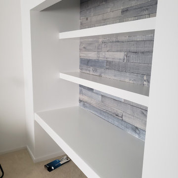
Prior to COVID-19, this space was a bypass closet in a spare bedroom. After the pandemic started, the owner was working from home and needed an inexpensive home office. Problem solved. Added a desk height workspace, and some shelving. Electric for the computer and phone!
 Abigail Shea Interiors
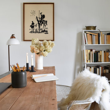
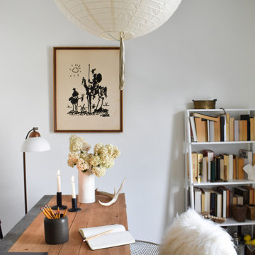
I had a blast working on this personal project. My partner, Alex, is working from home and I needed a space where I could be creative but also put in the hard work. We had 100sf, a budget of "as-cheap-as-possible," and tons of rental restrictions--but good design always starts with a little problem solving, right?
I infused the space with lots of neutral colors and tons of texture to keep it warm. I threw in my favorite vintage pieces, a big oversized paper lantern, and a bookshelf bar for some soul. & just like that, it's our favorite spot in town.
 Boxwood Avenue
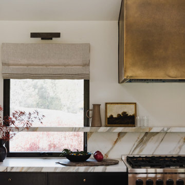
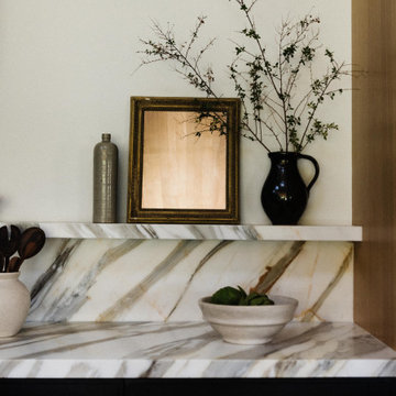
Discover the heart of this stunning mid-century modern home – a meticulously designed kitchen that seamlessly blends style and functionality. This mid-century modern kitchen features two expansive islands, zellige-tiled support beams, brass accents, and luxurious marble countertops. The exquisite marble veining extends up the wall, creating a floating shelf for practical storage and décor. Warm wood tones in architectural details and a sleek metal hood beautifully complement the design. The second island offers casual dining with elegant black metal stools, uniting the kitchen and living areas. This kitchen is a testament to creative problem-solving and the seamless fusion of style and function.
 JJB Home Improvements, LLC
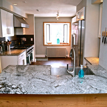
This entire 1st floor, gut renovation came with many surprises. Fortunately, one of METRO R3's strengths is that we love problem solving. Creating high functioning and stylish solutions is what we're all about!
 Total Fitouts | Australia
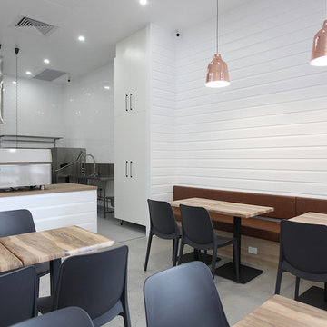
Our Gold Coast shopfitters created an outstanding cafe fitout for these small business owners. This being the second of two cafes, the owners of Kaffe Co. wanted something a little different to their original space, opening up the kitchen and front counter area to allow customers to see right into the kitchen and preparation spaces.
The client’s hope for the fitout was to have all the space well utilised to allow for a full kitchen while catering for plenty of dine-in customers. The cafe design was all about creating an inviting and relaxing space for customers to sit and enjoy a meal on a break from shopping.
Our Gold Coast shopfitters worked around many other builds happening in the new shopping centre at the time which called for a high level of organisation and some problem solving to ensure the smooth operation of the build.
The cafe offers a clean, minimalistic style with polished concrete floors, Hamptons inspired white timber walls and a beautiful timber bench top – all finished off with on-trend copper light fixtures creating a comfortable and pleasant eatery for shoppers in the midst of a busy arena. The cafe owners are now all set with a fresh new look – a space ready to be filled with coffee aromas, delicious foods and plenty of chatter!
Love this cafe fitout? Get in touch with our Hope Island shopfitters or call 1300 654 634 to find a Total Fitouts near you.
 F9 Productions Inc.
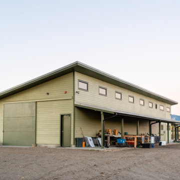
Imagine a barn that's also a home, overlooking Boulder's iconic Flatirons. The Boulder Barndominium mixes farm practicality with modern coziness, designed for efficiency and those stunning views that make every day feel special.
Client and Brief
The owners sought a simple, smart building that saves materials and energy. They wanted light-filled spaces, a west-facing unit for mountain sights, and a patio to relax outside.
Problems Solved
Energy costs and weather can add up, but solar roofs and clever orientation make it net-zero – using the sun for power and keeping things comfortable without extra bills.
Design Concept and Form
The concept is straightforward – a long rectangle with sloping roofs for panels, and high windows to bring in daylight. It feels balanced and connected to the land.
Construction and Materials
Wood framing provides strength and tradition, built to endure while staying budget-friendly.
Energy Efficiency
Solar arrays power everything, with radiant heating and east/west setup for natural warmth and light – sustainable living that's easy and effective.
Interior Design
Barn space for work and storage, dwelling with bedroom, bath, and open areas leading to the patio for seamless inside-out flow.
Outcome
Since 2020, this barndominium has been a functional, green haven. It blends utility with beauty, offering savings, views, and a sense of peace in Boulder's landscape.
 Sloan Polish Design
Working in small or awkward spaces is often the most rewarding because the problem solving required calls on one’s creativity. The slanted ceiling nook in this tween bedroom is a great example of how to turn a demerit into an asset. Instead of trying to ignore it, the feature is played up here with the bold stripe treatment. The nook’s utility is maximized by using a corner desk and creating custom wood shelves affixed to the wall using plumbing piping.
Storage space remained a challenge in the room, and if we added a tall storage unit to the wall where one could fit, we would be blocking the light and views of the windows. The solution was to create a long, built-in bench with drawer storage below and two long wooden shelves, higher up the wall, for books and personal items. To bring in an industrial vibe and complement the iron bed, we distressed the wood and used plumbing pipes and fixtures for shelf support.
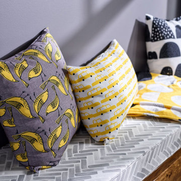
Pops of yellow as a repeating element bring energy and personality to the space. Custom bedding, pillows, and window seat fabric from Spoonflower.
Images ©Spoonflower and ©Sloan Polish Design.
 Unpatterned
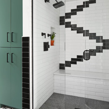
First we helped this family make their traditional first floor their own by adding a custom painted entry design, designer wallpaper, fresh paint on the fireplace and bookshelves, and a dining accent wall. We even helped procure furniture, including the custom designed record cabinet and commissioned painting and completed the look with hands-on styling. Less than a year later we were back for a master suite overhaul, including a new floor plan, an expanded master bath, his/hers closets, a fresh look for the hall bath, some bedroom, nursery and office decor and new floors throughout. From space planning problem solving, to project management during construction, and down to styling the details, Unpatterned was involved every step of the way.
FUN FACT The master bathroom used to just have a pedestal sink and no door!
Photography 2nd Floor: Dustin Halleck/1st Floor: Michael Kaskel
 Boxwood Avenue
Discover the heart of this stunning mid-century modern home – a meticulously designed kitchen that seamlessly blends style and functionality. This mid-century modern kitchen features two expansive islands, zellige-tiled support beams, brass accents, and luxurious marble countertops. The exquisite marble veining extends up the wall, creating a floating shelf for practical storage and décor. Warm wood tones in architectural details and a sleek metal hood beautifully complement the design. The second island offers casual dining with elegant black metal stools, uniting the kitchen and living areas. This kitchen is a testament to creative problem-solving and the seamless fusion of style and function.
 Sun Shore Construction
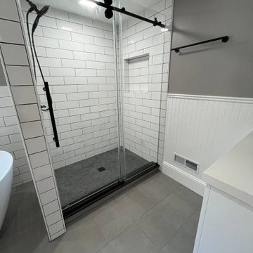
At Sun Shore Construction, every project we take on is more than just renovation—it’s a journey of transformation. Our recent project in Dedham, MA, is a story of meticulous craftsmanship, creative problem-solving, and dedication to creating a home the homeowners will love for years to come. This was not just about reimagining two bathrooms—it was about elevating the entire home.
 Klopf Architecture
Malibu Glass Box House by Klopf Architecture
Following the devastating Woolsey Fire of 2018, the site in Malibu offered a unique opportunity to rebuild not just a home, but a new architectural composition that highlighted the property’s potential while navigating strict fire-rebuild codes in the area. Designed by Klopf Architecture, this project embraced a set of limitations and translated them into an architectural asset.
The city’s fire-rebuild process required the new structure to remain close to the original footprint, size and bulk, a constraint that ultimately clarified the architectural direction. Perched near the front of a long, narrow lot, the new home frames and overlooks a private, park-like rear expanse, an uncommon luxury especially in this part of Malibu .
Without a fixed program, the design process allowed for a different kind of creative focus allowing Klopf Architecture the opportunity to explore how a modernist home could best respond to this site. The team approached the project not with a list of requirements, but with a question: How might a modernist live here? What spatial qualities would inspire calm, connection, and a sense of wonder in this setting? The process became less about problem-solving and more about architectural storytelling—letting the site, the light, and the principles of modern design guide the form and flow of the home.
The response emerged in the form of a glass-box pavilion, an open, Mid-Century Modern inspired living, dining, and kitchen space that floats at the edge of the property’s natural descent. Connected to the more enclosed, private areas of the home by a glass-walled hallway, the living pavilion becomes a distinct centerpiece of the design. It opens on all four sides to the landscape with decks and patios on the flanks, an internal garden and water feature to the north, and a dramatic unguarded view of the expansive backyard and ocean horizon to the south.
Because of the mandated footprint, careful planning was required to ensure every space could still engage with light, landscape, or both. Strategic voids in the form of atriums and courtyards allow daylight to filter deep into the home’s core, while offering moments of surprise and retreat. These design gestures allow natural light to filter deep into the interior, creating a sense of brightness and openness throughout the day. At the same time, they expand the perceptual boundaries between inside and out, making the home feel more expansive while anchoring its connection to the surrounding landscape.
The siting of the house is what gives it its unique character. Rather than receding into the backyard like the neighboring homes, the house holds a slight prominence. From the central living pavilion, stepping down into the landscape feels more like entering a secluded park where a separate existing accessory structure, trail, and recreational areas await. The home’s modest street presence gives way to this unfolding drama of space, view, and nature.
Fire-resilient materials and assemblies are integrated seamlessly throughout including triple-pane glazing, under-slab and roof insulation, and locally sourced fire-rated cladding ensure the house not only meets Calfornia’s rigorous wildland-urban interface (WUI) standards, but feels effortlessly aligned with them. While technical decisions like fire-hardening and mechanical systems presented some construction challenges, particularly around the cantilevered glass box, the team found a functional compromise that preserved the integrity of the design.
Inside, a restrained palette and exposed post and beam design celebrate the ethos of mid-century modernism. A central circulation spine extends from the entry to the rear glass wall, offering a continuous visual link from street to ocean. Spaces such as the library and office, though more intimate in scale, are never cut off from nature as each opens to its own unique courtyard or garden view.
Though born out of a strict regulatory framework and developed without a specific client, the rebuild design unfolded with remarkable clarity. Grounded in site logic, refined by limitations and an emphasis on timeless spatial relationships – light, proportion, and a strong connection to nature, the resulting design feels both effortless and uplifting. The home lives lightly on the land, opens generously to its surroundings, and strikes a careful balance between privacy, openness, and calm. For Klopf Architecture, it stands as a compelling case study in how site, code, and circumstantial constraints can inspire enduring, modernist architecture. With years of experience reimagining mid-century modern design for how people live today, the firm took the project’s limitations as an opportunity. The result is a home shaped by open, flowing spaces, strong indoor-outdoor connections, and a calm, clear sense of structure. It’s a good reminder that even with strict constraints, there’s still room for architecture to breathe—and for modernism to keep moving forward.
Klopf Architecture project team: Geoff Campen, John Klopf, AIA, and Sherry Tan
Structural Engineer: ZFA
Contractor: Maison D’Artiste
Photography: ©2025 Mariko Reed
Year Completed: 2023
 Abigail Shea Interiors
I had a blast working on this personal project. My partner, Alex, is working from home and I needed a space where I could be creative but also put in the hard work. We had 100sf, a budget of "as-cheap-as-possible," and tons of rental restrictions--but good design always starts with a little problem solving, right?
I infused the space with lots of neutral colors and tons of texture to keep it warm. I threw in my favorite vintage pieces, a big oversized paper lantern, and a bookshelf bar for some soul. & just like that, it's our favorite spot in town.
 Klopf Architecture
Malibu Glass Box House by Klopf Architecture
Following the devastating Woolsey Fire of 2018, the site in Malibu offered a unique opportunity to rebuild not just a home, but a new architectural composition that highlighted the property’s potential while navigating strict fire-rebuild codes in the area. Designed by Klopf Architecture, this project embraced a set of limitations and translated them into an architectural asset.
The city’s fire-rebuild process required the new structure to remain close to the original footprint, size and bulk, a constraint that ultimately clarified the architectural direction. Perched near the front of a long, narrow lot, the new home frames and overlooks a private, park-like rear expanse, an uncommon luxury especially in this part of Malibu .
Without a fixed program, the design process allowed for a different kind of creative focus allowing Klopf Architecture the opportunity to explore how a modernist home could best respond to this site. The team approached the project not with a list of requirements, but with a question: How might a modernist live here? What spatial qualities would inspire calm, connection, and a sense of wonder in this setting? The process became less about problem-solving and more about architectural storytelling—letting the site, the light, and the principles of modern design guide the form and flow of the home.
The response emerged in the form of a glass-box pavilion, an open, Mid-Century Modern inspired living, dining, and kitchen space that floats at the edge of the property’s natural descent. Connected to the more enclosed, private areas of the home by a glass-walled hallway, the living pavilion becomes a distinct centerpiece of the design. It opens on all four sides to the landscape with decks and patios on the flanks, an internal garden and water feature to the north, and a dramatic unguarded view of the expansive backyard and ocean horizon to the south.
Because of the mandated footprint, careful planning was required to ensure every space could still engage with light, landscape, or both. Strategic voids in the form of atriums and courtyards allow daylight to filter deep into the home’s core, while offering moments of surprise and retreat. These design gestures allow natural light to filter deep into the interior, creating a sense of brightness and openness throughout the day. At the same time, they expand the perceptual boundaries between inside and out, making the home feel more expansive while anchoring its connection to the surrounding landscape.
The siting of the house is what gives it its unique character. Rather than receding into the backyard like the neighboring homes, the house holds a slight prominence. From the central living pavilion, stepping down into the landscape feels more like entering a secluded park where a separate existing accessory structure, trail, and recreational areas await. The home’s modest street presence gives way to this unfolding drama of space, view, and nature.
Fire-resilient materials and assemblies are integrated seamlessly throughout including triple-pane glazing, under-slab and roof insulation, and locally sourced fire-rated cladding ensure the house not only meets Calfornia’s rigorous wildland-urban interface (WUI) standards, but feels effortlessly aligned with them. While technical decisions like fire-hardening and mechanical systems presented some construction challenges, particularly around the cantilevered glass box, the team found a functional compromise that preserved the integrity of the design.
Inside, a restrained palette and exposed post and beam design celebrate the ethos of mid-century modernism. A central circulation spine extends from the entry to the rear glass wall, offering a continuous visual link from street to ocean. Spaces such as the library and office, though more intimate in scale, are never cut off from nature as each opens to its own unique courtyard or garden view.
Though born out of a strict regulatory framework and developed without a specific client, the rebuild design unfolded with remarkable clarity. Grounded in site logic, refined by limitations and an emphasis on timeless spatial relationships – light, proportion, and a strong connection to nature, the resulting design feels both effortless and uplifting. The home lives lightly on the land, opens generously to its surroundings, and strikes a careful balance between privacy, openness, and calm. For Klopf Architecture, it stands as a compelling case study in how site, code, and circumstantial constraints can inspire enduring, modernist architecture. With years of experience reimagining mid-century modern design for how people live today, the firm took the project’s limitations as an opportunity. The result is a home shaped by open, flowing spaces, strong indoor-outdoor connections, and a calm, clear sense of structure. It’s a good reminder that even with strict constraints, there’s still room for architecture to breathe—and for modernism to keep moving forward.
Klopf Architecture project team: Geoff Campen, John Klopf, AIA, and Sherry Tan
Structural Engineer: ZFA
Contractor: Maison D’Artiste
Photography: ©2025 Mariko Reed
Year Completed: 2023
 Wild Child
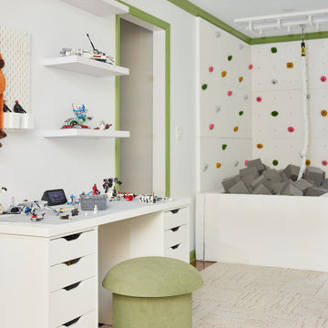
This playroom features multiple distinct zones for a 4-year-old and a 6-year-old, including a Lego area where the 6-year-old enjoys building Lego creations while sharpening his problem-solving skills, a glam dress up station where the 4-year-old can fully express herself, and a gross motor area with a foam pit, monkey bars, a cargo net tunnel, and a climbing wall. The layout keeps things open for free play while offering much-needed storage and organization. A custom window seat with built-in cabinetry adds both function and style. It’s no surprise that this playroom quickly became the family’s favorite spot, offering a kids indoor play zone that supports all kinds of developmental play and fun.
 Che Bella Interiors Design + Remodeling
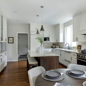
This kitchen renovation began with the clients questioning whether an addition was needed to meet their wishlist. By carefully rethinking the layout, the design team showed that everything could be accomplished within the existing footprint, maximizing function, storage, and flow while keeping the home’s balance intact. Small but strategic moves, like borrowing a touch of space from the laundry room and resizing a dining room window, opened the door to a larger island, improved circulation, and better placement for the range and sink.
The result is a kitchen that feels expansive and beautifully composed. Thoughtful adjustments to the structure created just enough breathing room for a layout that now supports daily life. A natural marble braided mosaic backsplash, soft and organic in texture, carries gracefully to the ceiling as a focal point, complemented by classic subway tile on adjacent wall. Every detail was executed with craftsmanship in mind, from the refined cabinetry to the layered finishes that give the space its timeless character.
Blending problem-solving with design, this kitchen delivers everything the homeowners envisioned, a bright, functional centerpiece that enhances both everyday living and special occasions alike.
30