
Search results for "Brightener" in Home Design Ideas
 Michael Nash Design, Build & Homes
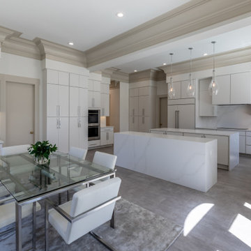
This custom home in heart of Great Falls Village, has been an elder couple's home for years. Since moving to this large home, they had a different vision for the main level of the home, specifically the kitchen, sunroom and laundry area.
The wife loves modern arts, modern cabinets, sleek counter tops and floors.
The breakfast room was separated by a bearing wall from the kitchen space. The kitchen was confined with surrounding walls and disconnected from rest of the main level.
Tall eleven foot ceiling with large scale coved crown molding was a signature mark of this home and she wanted to continue that look throughout the new remodeled area.
We took down the middle bearing wall by inserting structural beams, moved the back wall into the laundry space to create a pantry and a space for wall cabinets, and on the opposite side created space for a desk area.
We implemented two large scale islands with all kinds of amenities such as an espresso maker, warming drawer, steam oven all wrapped in waterfall quartz.
We relocated major soil stack and duct chases to allow taller cabinetry and open the flow between the two new spaces,
Our expert designers cleverly implemented French doors and used long plank porcelain tile for seamless connections among all new space.
Modern style glossy white cabinetry with exquisite selection of hardware and carefully selected quartz top brightens up this new kitchen.
A new and modern laundry room was designed and got added to front side of the kitchen.
Clever placement of LED lighting, pendent lights and under cabinet lights, brightens up this kitchen.
The new kitchen space is perfectly suited for friendly gatherings.
 HaylieRead Design LLC
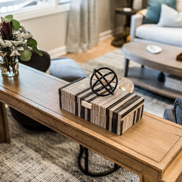
First impressions do matter. This beautiful Downers Grove home had such an inviting and comfortable atmosphere, but the entry into the home was lacking. We took the beautiful bones and added to the character to brighten and add function to the space. By replacing the lighting, brightening the walls, and adding comfortable furniture, the first impression of this home is now welcoming and inviting.
 One Kings Lane
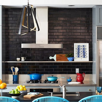
Inspired by the color-blocked wooden necklace, we kept pops of color in set zones in the kitchen.
Brightening Up the Kitchen: Two growing children means the kitchen is in constant use. The goal was to give it an overarching style to better contain the daily chaos that every family-filled household has. This didn’t require major changes, just lots of little ones. A palette of blue, light gray, and glowing brass was created. Spotlight-like lighting was swapped out for modern black and brass fixtures, which diffuse light throughout the space, and all the hardware was changed to brass. The dark gray walls were lightened up a few shades, which made the tilework pop and brightened the entire space.
Photo by Manuel Rodriguez
Find the right local pro for your project
 All American Painting Plus
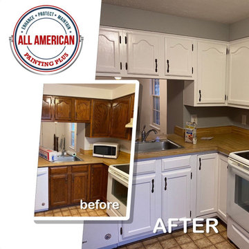
For this series of projects, we transformed kitchen spaces by refinishing cabinets with fresh, high-quality paint. Whether updating with classic whites, modern grays, or bold statement colors, each kitchen received a refreshed look that enhances both style and functionality. Our process included thorough surface preparation, expert application, and a durable finish to ensure long-lasting beauty. These upgrades not only brighten and modernize the space but also add value and character to every home.
 Cape Associates, Inc.
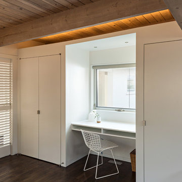
Overthinking a situation isn’t always a bad thing, particularly when the home in question is one in which the past is suddenly meeting the present. Originally designed by Finnish architect Olav Hammarstrom in 1952 for fellow architect Eero Saarinen, this unique home recently received its first transformation in decades. Still in its 1950s skin, it was completely gutted, inside and out. It was a serious undertaking, as the homeowner wanted modern upgrades, while keeping an eye toward retaining the home’s 1950s charm. She had a vision for her home, and she stuck to it from beginning to end.
Perched on a rise of land and overlooking the tranquil Wellfleet Herring Pond, the home initially appears split, with the guest house on the left, and the main house of the right, but both ends are connected with a breezeway. The original home’s bones were in good shape, but many upgrades and replacements were necessary to bring the house up to date.
New siding, roofing, gutters, insulation and mechanical systems were all replaced. Doors and windows with metal frames were custom made by a company in Long Island that fabricates doors for office buildings. Modern heating and cooling systems were added, and the three bathrooms were all updated. The footprint of the home remained unchanged. Inside, the only expansion was more closet space.
The attention to detail in retaining the 50s-style look took a lot of online searching, from handles and knobs to lighting fixtures, with bits and pieces arriving from all over the world, including a doorstop from New Zealand. The homeowner selected many of the fixtures herself, while a very detail-oriented foreman exhaustively researched as well, looking for just the right piece for each and every location.
High-end appliances were purchased to modernize the kitchen and all of the old cabinetry was removed, replaced and refaced with NUVACOR, a versatile surfacing material that not only provided a sleek, modern look, but added convenience and ease of use.
Bare, wood-beamed ceilings throughout give a nod to the home’s natural surroundings, while the main living area (formerly a fisherman’s cabin), with a brick fireplace, was completely trimmed in walnut, while multiple windows of varying sizes welcome sunlight to brighten the home. Here, the sheetrock ceiling with faux rafters provides an interesting and room-brightening feature.
Behind the house sits the serene pond, which can now be enjoyed from the stunning new deck. Here, decking material was not laid out side by side, as it typically is but, instead, meticulously laid out on edge, creating an unusual and eye-catching effect. A railing of tempered glass panels allows unobstructed views of the surrounding natural beauty, and keeps consistent with the open, airy feel of the place. A new outdoor shower is accessible via the deck and left open to the wilderness and the pond below, completing the bold yet sophisticated feeling of this retro-modern home.
 Platinum Companies
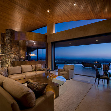
This home was custom built by Platinum Homes in Scottsdale, Arizona. The living room has Venetian plaster on the walls and a tongue and groove ceiling, highlighted with can lights. Jura Beige limestone was used on the floor, and a carpet insert added. The power glass door pockets under the soffit to open the room to the outside, where mountain and desert views can be enjoyed.
 Drury Design
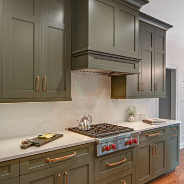
Design objectives for the remodel were aimed at maximizing the flow and functionality of a foodie-level kitchen with multiple cooks, while enhancing the family’s preferences for spending time in the space together:
Create a better workflow
Space out the appliances for better use of the kitchen area
Make the space feel larger visually
Update all materials so the kitchen isn’t all wood
No seating at an island or peninsula
Larger walkways
Brighten up the space with more lights and lighter colors
THE REMODEL
Design challenges to be solved:
The idea was to work within the current walls of the kitchen. Without removing walls, it was more of a challenge to give the kitchen a larger, new feel.
An island in the middle area was part of the original vision. Could a different countertop arrangement incorporate the same purpose?
The homeowners are big cooks so creating room for a larger refrigerator and more countertop space by the range were musts!
The sink and range were originally right next to each other, making things tough for two cooks to work at the same time. How could the new space allow for two work areas while minimizing traffic jams?
THE RENEWED SPACE
Design solutions fell into place once the overall layout was revamped to improve flow and functionality:
The refrigerator was originally in the middle of the main walkway. To gain more walk space and room for a larger refrigerator, we moved this appliance to the back wall.
The final design still has a peninsula but we flipped it to the opposite wall. This way, the walkway is more accommodating for traffic entering and exiting through the back garage door. This also gave way to a longer run of countertop space along the cooking wall.
To take cooking to another level, we implemented a speed oven!
The large window by the eating area is also nice for cooks to see, so we kept the sink in the peninsula.
To gain space for storage and make the kitchen feel larger, we brought the wall cabinets all the way to the ceiling. What once felt tight now feels grand!
 Cape Associates, Inc.
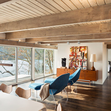
Overthinking a situation isn’t always a bad thing, particularly when the home in question is one in which the past is suddenly meeting the present. Originally designed by Finnish architect Olav Hammarstrom in 1952 for fellow architect Eero Saarinen, this unique home recently received its first transformation in decades. Still in its 1950s skin, it was completely gutted, inside and out. It was a serious undertaking, as the homeowner wanted modern upgrades, while keeping an eye toward retaining the home’s 1950s charm. She had a vision for her home, and she stuck to it from beginning to end.
Perched on a rise of land and overlooking the tranquil Wellfleet Herring Pond, the home initially appears split, with the guest house on the left, and the main house of the right, but both ends are connected with a breezeway. The original home’s bones were in good shape, but many upgrades and replacements were necessary to bring the house up to date.
New siding, roofing, gutters, insulation and mechanical systems were all replaced. Doors and windows with metal frames were custom made by a company in Long Island that fabricates doors for office buildings. Modern heating and cooling systems were added, and the three bathrooms were all updated. The footprint of the home remained unchanged. Inside, the only expansion was more closet space.
The attention to detail in retaining the 50s-style look took a lot of online searching, from handles and knobs to lighting fixtures, with bits and pieces arriving from all over the world, including a doorstop from New Zealand. The homeowner selected many of the fixtures herself, while a very detail-oriented foreman exhaustively researched as well, looking for just the right piece for each and every location.
High-end appliances were purchased to modernize the kitchen and all of the old cabinetry was removed, replaced and refaced with NUVACOR, a versatile surfacing material that not only provided a sleek, modern look, but added convenience and ease of use.
Bare, wood-beamed ceilings throughout give a nod to the home’s natural surroundings, while the main living area (formerly a fisherman’s cabin), with a brick fireplace, was completely trimmed in walnut, while multiple windows of varying sizes welcome sunlight to brighten the home. Here, the sheetrock ceiling with faux rafters provides an interesting and room-brightening feature.
Behind the house sits the serene pond, which can now be enjoyed from the stunning new deck. Here, decking material was not laid out side by side, as it typically is but, instead, meticulously laid out on edge, creating an unusual and eye-catching effect. A railing of tempered glass panels allows unobstructed views of the surrounding natural beauty, and keeps consistent with the open, airy feel of the place. A new outdoor shower is accessible via the deck and left open to the wilderness and the pond below, completing the bold yet sophisticated feeling of this retro-modern home.
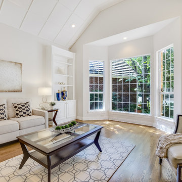
 Enhanced Home Staging & Redesign, LLC
Example of a classic formal and open concept medium tone wood floor and beige floor living room design in Other with white walls
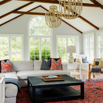
 Cummings Architecture + Interiors
Chinoise botanical wallpaper and bamboo lights present a lively textural contrast within this 1753 home’s historic structure. The young family who lives here craved rich colors and vibrant patterns, influenced by their appreciation for Asian art and love of gardening. Sculptural lighting pieces brighten the previously-dark interiors with an interplay between contemporary and traditional aesthetics. Custom built-ins provide important function for the family while serving to divide large open spaces and offer degrees of privacy. A playful adult bar was created in the original dining room, featuring bold blue “Garden Pagoda” wallpaper, a custom cut Carrara marble bar top, and furnishings and accessories in contrasting and complimentary styles.
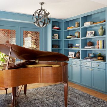
 Joy Street Design
Our Oakland studio used an interplay of printed wallpaper, metal accents, and sleek furniture to give this home a new, chic look:
---
Designed by Oakland interior design studio Joy Street Design. Serving Alameda, Berkeley, Orinda, Walnut Creek, Piedmont, and San Francisco.
For more about Joy Street Design, click here:
https://www.joystreetdesign.com/
To learn more about this project, click here:
https://www.joystreetdesign.com/portfolio/oakland-home-facelift
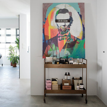
 Studio Roundtop
The brief was to transform the apartment into a home that was suited to our client’s (a young married couple) needs of entertainment and desire for an open plan.
By reimagining the spatial hierarchy of a typical Singaporean home, the existing living room was converted nto a guest room, 2 bedrooms were also transformed into a single living space centered in the heart of the apartment.
White frameless doors were used in the master and guest bedrooms, extending and brightening the hallway when left open. Accents of graphic and color were also used against a pared down material palette to form the backdrop for the owners’ collection of objects and artwork that was a reflection of the young couple’s vibrant personalities.
Photographer: Tessa Choo

 User
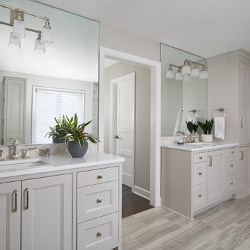
UserThe master bathroom boasts Repose Gray cabinets in Grabill's Devonshire door style. The use of varying gray wall and floor tiles along with chrome finishes really brighten this luxurious space.
 Nicole Arnold Interiors
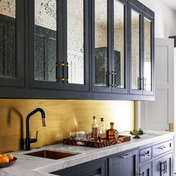
Purchased as a fixer-upper, this 1998 home underwent significant aesthetic updates to modernize its amazing bones. The interior had to live up to the coveted 1/2 acre wooded lot that sprawls with landscaping and amenities. In addition to the typical paint, tile, and lighting updates, the kitchen was completely reworked to lighten and brighten an otherwise dark room. The staircase was reinvented to boast an iron railing and updated designer carpeting. Traditionally planned rooms were reimagined to suit the needs of the family, i.e. the dining room is actually located in the intended living room space and the piano room Is in the intended dining room area. The live edge table is the couple’s main brag as they entertain and feature their vast wine collection while admiring the beautiful outdoors. Now, each room feels like “home” to this family.


 Faust Construction
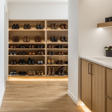
Small trendy light wood floor and brown floor closet photo in Kansas City with flat-panel cabinets
 Irene Brady Barber Greenscapes Design
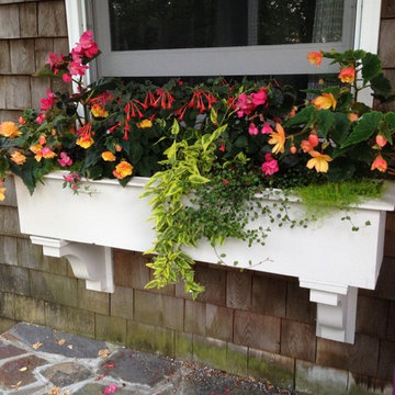
variegated solomon jasminoides, meulenbachia, tuberous begonia, garten meister, lime scotch moss.
Example of a tuscan home design design in Portland Maine
Example of a tuscan home design design in Portland Maine

 Wittman Estes Landscape
Evergreen acorus brightens this Northwest garden.
photo: grant wilds
This is an example of a modern landscaping in Seattle.
This is an example of a modern landscaping in Seattle.
76