
Search results for "Caught feeling" in Home Design Ideas
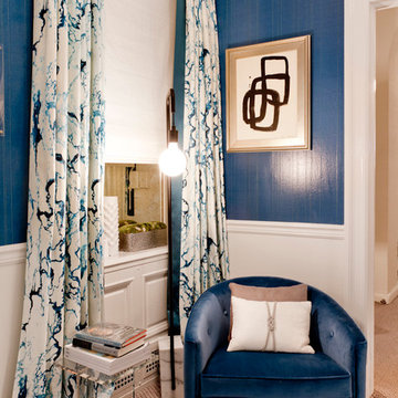
 Rikki Snyder
Rachel Laxer Interiors, Foyer
Holiday: Midsummer Holiday
Photo: Rikki Snyder © 2014 Houzz
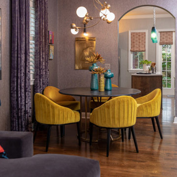
 In Detail Interiors
Colorful and rich style
When a repeat client shows up on your doorstep with his third home to furnish and wants to start from scratch and go really bold, you just embrace him, scoot him right up to the resource room, and don’t ask questions! I mean, who does not love a client that embraces velvet, leather, silk and wallcoverings?
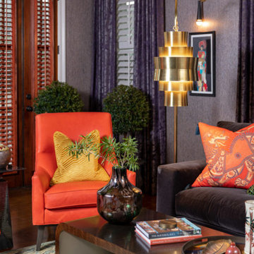
This lush, vibrant lounge space was all created from the want to really deep dive into something different, eclectic and more traveled. The original small, narrow, dimly lit room totally delivered on helping accomplish that mood. Mixing a little of that Ming dynasty-inspired strawberry red with a deep chocolate mohair on the sectional and cladding the room in a soft, amethyst woven wallcovering. We loved the interplay and “non-matchiness” that this space embraced.
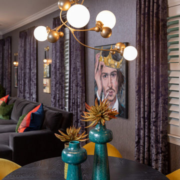
Lighting and art were both about telling a story in this room – accenting conversational opportunities and an almost gallery-esque feel. Designating a more dynamic and unusual, sculptural feel – from the harder lines of the statement floor lamp in the living room across to the sprawling, slightly modern bloom of the dining area fixture.
Jewel of a space
The area rug had to ground the already bold furniture and lend itself to the darker wood floors, and a dusky green wool proved the ticket. We loved the almost pixelated pattern the hand-knotted wool lent to the overall design. A little hint of oxblood, chocolate and blue picked up in accents elsewhere, but the tone of almost jade really caught us about this piece.
Not enough can be said about the accent of a dining space either (which in terms of space planning was the only way to balance this long, narrow “hallway” of a room off the kitchen). Citron velvet on the low-profile chairs left the space feeling open, but fun for games and cocktail parties. Plus, the cerused wood dining table was a great complement – offering depth without a conflict to the existing flooring or nearby sectional.
Being able to view this space as a whole was very important to us! From the selection of sconces carried throughout (that wonky placement was existing and with so little opportunity to add cans we had to play up the new fixtures in a way that make them feel purposeful and desirable.), to the balance of color and temperature in each furniture grouping. Sometimes working floor to ceiling in an existing space can pose a lot of unique challenges when it comes to furnishing projects. However, we loved that the client embraced our drive to really punch up the visual feel of this living/dining combo. Also, we know the enjoyment he gets from the finished product is a testament to hunting for the right pieces, designing with unusual and luxe fabric combinations, and managing the inclusion of budget-friendly surprises that always balance a job well done.
What the client says
“From the moment that Cheryl arrived, I felt that she was definitely the designer that I needed to help facilitate & execute my vision for the space. I’m not the “cookie cutter” type, and I immediately realized that Cheryl had a knack for envisioning ideas that were unique, yet tasteful, timeless, and sophisticated.”
From its beginnings as a plain Jane envelope, this combination living/dining space becomes a study in texture and color!
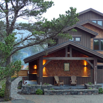
 Studio Good Architects
A block from the beach in the quaint seaside village of Neskowin, our clients wanted a home that was comfortable when they were alone or with family and friends. They also wanted to integrate salvaged Douglas-fir lumber from a deconstructed 1938 warehouse. Influenced by the reclaimed wood and our mutual appreciation of old wood buildings, barns, and historic lodges, the project used the recycled lumber throughout for columns and beams, roof framing, flooring, cabinetry, wall paneling, interior trim, doors and furniture.
At the same time, we designed the home to endure the harsh environment of the Oregon coast. As a LEED™ Gold home, the building envelope is both durable and well insulated. The mechanical systems, which include radiant-heat flooring and an ultra-efficient Heat Recovery Ventilator, make this home comfortable and healthy regardless of the weather. With its lodge-like simplicity and unique design details, this home is a joyful blend of old and new.
The design of the home and the energy efficient features caught the attention of several publications, including Fine Homebuilding, who featured it in their August/September 2011 issue.
Paula Watts
Find the right local pro for your project
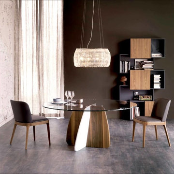
 eurofurniture
The Glenn dining table by Cattelan Italia showcases three materials - Canaletto walnut wood, Carrara marble, and glass - working in harmony to create a true contemporary masterpiece. A stunner in any environment.
Available in different shapes and sizes.
 Skill Construction & Design, LLC
If you are looking for twice your normal bath experience, look no more. This master bath has plenty of room for two with double the storage, double the mirrors, sinks and faucets, and bathing is done two-way. The colors are warm and inviting, but it’s the subtle patterning that caught my eye. The overall effect is of a soft wash, yet on closer examination, the striations travel across the walls and criss-cross on the floor.
This expansive vanity was created with our homeowner’s needs in mind. Each “side” has a bank of drawers and under sink cabinet storage. A large undermount sink dips below the gorgeous stone counter top. Gently arching faucets in brushed nickel adorn each sink with a framed mirror above for reflection. Individual task lighting shine upon each sink and is reflected back into the room. For additional storage and to keep elbows from connecting, a large shared bank of drawers separate the two areas.
The vanities are rich with color and texture, from the swirling grain of the wood, to the raised panels and beading. The subtle beading is repeated on the drawers for a custom look. Our wood color is a deeper, more intense tone of the colors in our tiling.
Whether in a hurry or needing to relax and unwind, this bath can do both. Despite having two substantial pieces in the same area, the open glass panel that separate leaves each feeling open and airy.
This tub was made for soaking. The sides and back gently mold into arm and neck support for a truly relaxing experience. The lineal movement in the tile backsplash lend a long and lean feeling. For easy reach, toiletries are stored in a niche with accent multicolored mosaics.
On the other side of the half wall a roomy shower awaits. The long tiles were installed in a brick pattern with striations of color wrapping the walls. The oversized tiles reduce the amount of grout, for a cleaner look. Here too we added a niche for maximum storage and a sprinkle more of the accenting mosaic. We capped the half wall and the generous bench with our vanity’s stone for a rich contrast.
We installed the tile up to the ceiling, which adds to the visual height of the room. We went with clean simple controls and showerhead, enhanced in a brushed nickel finish. So as to not obscure the view, we went frameless on our shower door and panels, using brushed nickel hinges and a simple handle.
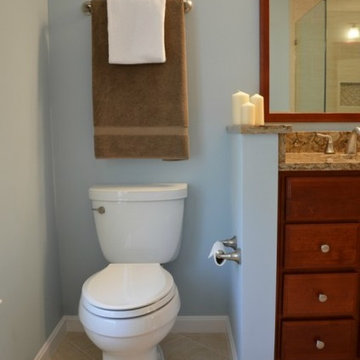
At the end of our vanity, a half wall adds backsplash on the vanity side and a bit of privacy on the other. A simple toilet in crisp white is out of sight but functional in its own “alcove”.
Despite all the patterning, there is nothing busy about the room. For the floor we decided to change things up, using a large square version of the wall tiles. To keep the room from feeling too long, we installed them on the diagonal and then criss-crossed the lines for a dramatic look.
This bath is twice as nice and ready to be shared!
http://www.designsbyskill.com/
http://www.rjkconstructioninc.com/

 In Detail Interiors
Colorful and rich style
When a repeat client shows up on your doorstep with his third home to furnish and wants to start from scratch and go really bold, you just embrace him, scoot him right up to the resource room, and don’t ask questions! I mean, who does not love a client that embraces velvet, leather, silk and wallcoverings?
This lush, vibrant lounge space was all created from the want to really deep dive into something different, eclectic and more traveled. The original small, narrow, dimly lit room totally delivered on helping accomplish that mood. Mixing a little of that Ming dynasty-inspired strawberry red with a deep chocolate mohair on the sectional and cladding the room in a soft, amethyst woven wallcovering. We loved the interplay and “non-matchiness” that this space embraced.
Lighting and art were both about telling a story in this room – accenting conversational opportunities and an almost gallery-esque feel. Designating a more dynamic and unusual, sculptural feel – from the harder lines of the statement floor lamp in the living room across to the sprawling, slightly modern bloom of the dining area fixture.
Jewel of a space
The area rug had to ground the already bold furniture and lend itself to the darker wood floors, and a dusky green wool proved the ticket. We loved the almost pixelated pattern the hand-knotted wool lent to the overall design. A little hint of oxblood, chocolate and blue picked up in accents elsewhere, but the tone of almost jade really caught us about this piece.
Not enough can be said about the accent of a dining space either (which in terms of space planning was the only way to balance this long, narrow “hallway” of a room off the kitchen). Citron velvet on the low-profile chairs left the space feeling open, but fun for games and cocktail parties. Plus, the cerused wood dining table was a great complement – offering depth without a conflict to the existing flooring or nearby sectional.
Being able to view this space as a whole was very important to us! From the selection of sconces carried throughout (that wonky placement was existing and with so little opportunity to add cans we had to play up the new fixtures in a way that make them feel purposeful and desirable.), to the balance of color and temperature in each furniture grouping. Sometimes working floor to ceiling in an existing space can pose a lot of unique challenges when it comes to furnishing projects. However, we loved that the client embraced our drive to really punch up the visual feel of this living/dining combo. Also, we know the enjoyment he gets from the finished product is a testament to hunting for the right pieces, designing with unusual and luxe fabric combinations, and managing the inclusion of budget-friendly surprises that always balance a job well done.
What the client says
“From the moment that Cheryl arrived, I felt that she was definitely the designer that I needed to help facilitate & execute my vision for the space. I’m not the “cookie cutter” type, and I immediately realized that Cheryl had a knack for envisioning ideas that were unique, yet tasteful, timeless, and sophisticated.”
From its beginnings as a plain Jane envelope, this combination living/dining space becomes a study in texture and color!

Sponsored
Columbus, OH
Free consultation for landscape design!

Peabody Landscape Group
Franklin County's Reliable Landscape Design & Contracting
 In Detail Interiors
Colorful and rich style
When a repeat client shows up on your doorstep with his third home to furnish and wants to start from scratch and go really bold, you just embrace him, scoot him right up to the resource room, and don’t ask questions! I mean, who does not love a client that embraces velvet, leather, silk and wallcoverings?
This lush, vibrant lounge space was all created from the want to really deep dive into something different, eclectic and more traveled. The original small, narrow, dimly lit room totally delivered on helping accomplish that mood. Mixing a little of that Ming dynasty-inspired strawberry red with a deep chocolate mohair on the sectional and cladding the room in a soft, amethyst woven wallcovering. We loved the interplay and “non-matchiness” that this space embraced.
Lighting and art were both about telling a story in this room – accenting conversational opportunities and an almost gallery-esque feel. Designating a more dynamic and unusual, sculptural feel – from the harder lines of the statement floor lamp in the living room across to the sprawling, slightly modern bloom of the dining area fixture.
Jewel of a space
The area rug had to ground the already bold furniture and lend itself to the darker wood floors, and a dusky green wool proved the ticket. We loved the almost pixelated pattern the hand-knotted wool lent to the overall design. A little hint of oxblood, chocolate and blue picked up in accents elsewhere, but the tone of almost jade really caught us about this piece.
Not enough can be said about the accent of a dining space either (which in terms of space planning was the only way to balance this long, narrow “hallway” of a room off the kitchen). Citron velvet on the low-profile chairs left the space feeling open, but fun for games and cocktail parties. Plus, the cerused wood dining table was a great complement – offering depth without a conflict to the existing flooring or nearby sectional.
Being able to view this space as a whole was very important to us! From the selection of sconces carried throughout (that wonky placement was existing and with so little opportunity to add cans we had to play up the new fixtures in a way that make them feel purposeful and desirable.), to the balance of color and temperature in each furniture grouping. Sometimes working floor to ceiling in an existing space can pose a lot of unique challenges when it comes to furnishing projects. However, we loved that the client embraced our drive to really punch up the visual feel of this living/dining combo. Also, we know the enjoyment he gets from the finished product is a testament to hunting for the right pieces, designing with unusual and luxe fabric combinations, and managing the inclusion of budget-friendly surprises that always balance a job well done.
What the client says
“From the moment that Cheryl arrived, I felt that she was definitely the designer that I needed to help facilitate & execute my vision for the space. I’m not the “cookie cutter” type, and I immediately realized that Cheryl had a knack for envisioning ideas that were unique, yet tasteful, timeless, and sophisticated.”
From its beginnings as a plain Jane envelope, this combination living/dining space becomes a study in texture and color!
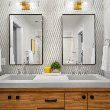
 LEVEL UP Design LLC
Bathroom - mid-sized 1960s kids' white tile ceramic tile, gray floor and double-sink bathroom idea in Jacksonville with flat-panel cabinets, medium tone wood cabinets, an integrated sink, concrete countertops, gray countertops and a freestanding vanity
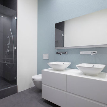
 Axis Mundi
When the Gimbels department store chain closed in 1986, many of its selling floors were converted into luxury apartments, including those of this branch at 86th Street and Lexington Avenue. The retailer’s soaring ceilings allowed Axis Mundi to create bedroom mezzanine spaces overlooking the living and dining rooms. Defining them with translucent glass welcomed natural light while retaining privacy. Downstairs, spaces bleed one into another, their basic monochromatic black-and-white palette acting as a unifying leitmotif. Yet each space feels distinct, with its own programmatic purpose, a feat largely achieved by varying floor and wall treatments—a graphic tile pattern in the entry, a red wall in the hall leading to the master suite, a colorful area rug in the living room. In the retailer’s heyday, the then-common saying, “Would Macy’s tell Gimbels?” implied the strategies the competitors kept from each other to gain the upper hand. Here, a structure iconic in its day also conceals something: a handsome, wholly contemporary repurposing that represents just the sort of innovation that made Gimbels the celebrated name that it was.
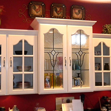
 CabinetGlass.com
Why Communication is so Important.....
With just a tiny bit more effort, we could have aligned the Custom Beveled Glass Cluster we made, with the horizontal line created by the Glass Shelves.
Unfortunately we all got caught up a bit and did not step back to look at the overall bigger picture....
We could have easily moved the Beveled Glass Cluster up a few inches, and it would not have made a penny difference to the pricing..... Anyways...
The Two Cabinet Glass Panels in this photo measure; 10- 7/16" x 30- 7/8".
We Custom-Made the Clear Beveled Glass Tulip Clusters In-House, as we always do. so that they can be the Very Best Proportions to the sizes of your cabinet doors. These are not " Off The Shelf " Clusters, as they would have been just too small....
We used a fairly clear and simple Background Glass from Spectrum Glass called - 100A - Clear Artique Glass.
We also used our Dark Antique Lead Came which works fairly well with their Antiqued Brass Hardware, unfortunately, our only other choice would have been a Bright Brass.... we all feel we made the better choice.
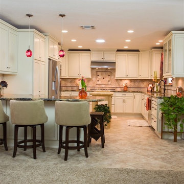
 DreamMaker Bath & Kitchen
Canyon Creek Cabinetry showcases this traditional kitchen with soft cream cabinets and an open gathering space to give a larger feel and maximize their area for entertaining family and friends. Staggered cabinetry breaks up the ceiling line to give the kitchen more aesthetic appeal. Photographer Brian Brumley -
 Caden Lane
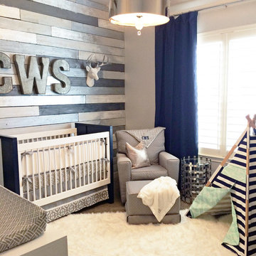
Cash's rustic woodland nursery was designed around Caden Lane's Mod Gray baby bedding. I know what caught your eye was that amazing metallic silver and navy wood wall behind the crib. The fux deer head, fux fur rug, and teepee gives this room a trendy woodlands feel about it. The simplistic look in the baby bedding and changing pad cover allows you to do funky things throughout the rest of your nursery.
Katy Mimari


 Chi Renovation & Design
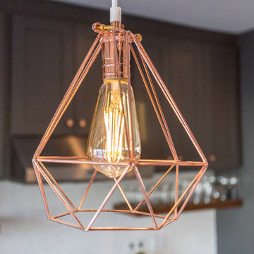
Our client's kitchen was in need of a new and refreshing feel. We wanted to open up the kitchen and dining room, and offer a more inviting and cohesive set-up. We opted for a neutral color palette of dark grays, whites, and blues. A unique hexagon mosaic backsplash adds depth and interest, especially as it contrasts against the thunderstorm gray cabinets. Rustic wooden display shelves add extra surface space and warmth, while complementing the gold hardware and light fixtures.
We were able to fit in a simple yet chic dining area, which is incorporated perfectly just outside of the cooking area. This new & improved set-up is perfect for entertaining and bringing the whole party together.
Lastly, we designed a subtle, yet elegant mudroom. With cabinets & bench seating that match the dark gray cabinets of the kitchen, these two areas merge effortlessly and ensure one cohesive design throughout.
Designed by Chi Renovation & Design who serve Chicago and its surrounding suburbs, with an emphasis on the North Side and North Shore. You'll find their work from the Loop through Lincoln Park, Skokie, Wilmette, and all the way up to Lake Forest.
For more about Chi Renovation & Design, click here: https://www.chirenovation.com/
To learn more about this project, click here: https://www.chirenovation.com/portfolio/luxury-open-concept-kitchen-remodel/#kitchen-remodeling
 In Detail Interiors
Colorful and rich style
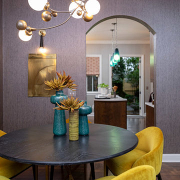
When a repeat client shows up on your doorstep with his third home to furnish and wants to start from scratch and go really bold, you just embrace him, scoot him right up to the resource room, and don’t ask questions! I mean, who does not love a client that embraces velvet, leather, silk and wallcoverings?
This lush, vibrant lounge space was all created from the want to really deep dive into something different, eclectic and more traveled. The original small, narrow, dimly lit room totally delivered on helping accomplish that mood. Mixing a little of that Ming dynasty-inspired strawberry red with a deep chocolate mohair on the sectional and cladding the room in a soft, amethyst woven wallcovering. We loved the interplay and “non-matchiness” that this space embraced.
Lighting and art were both about telling a story in this room – accenting conversational opportunities and an almost gallery-esque feel. Designating a more dynamic and unusual, sculptural feel – from the harder lines of the statement floor lamp in the living room across to the sprawling, slightly modern bloom of the dining area fixture.
Jewel of a space
The area rug had to ground the already bold furniture and lend itself to the darker wood floors, and a dusky green wool proved the ticket. We loved the almost pixelated pattern the hand-knotted wool lent to the overall design. A little hint of oxblood, chocolate and blue picked up in accents elsewhere, but the tone of almost jade really caught us about this piece.
Not enough can be said about the accent of a dining space either (which in terms of space planning was the only way to balance this long, narrow “hallway” of a room off the kitchen). Citron velvet on the low-profile chairs left the space feeling open, but fun for games and cocktail parties. Plus, the cerused wood dining table was a great complement – offering depth without a conflict to the existing flooring or nearby sectional.
Being able to view this space as a whole was very important to us! From the selection of sconces carried throughout (that wonky placement was existing and with so little opportunity to add cans we had to play up the new fixtures in a way that make them feel purposeful and desirable.), to the balance of color and temperature in each furniture grouping. Sometimes working floor to ceiling in an existing space can pose a lot of unique challenges when it comes to furnishing projects. However, we loved that the client embraced our drive to really punch up the visual feel of this living/dining combo. Also, we know the enjoyment he gets from the finished product is a testament to hunting for the right pieces, designing with unusual and luxe fabric combinations, and managing the inclusion of budget-friendly surprises that always balance a job well done.
What the client says
“From the moment that Cheryl arrived, I felt that she was definitely the designer that I needed to help facilitate & execute my vision for the space. I’m not the “cookie cutter” type, and I immediately realized that Cheryl had a knack for envisioning ideas that were unique, yet tasteful, timeless, and sophisticated.”
From its beginnings as a plain Jane envelope, this combination living/dining space becomes a study in texture and color!
 CabinetGlass.com
Why Communication is so Important.....
With just a tiny bit more effort, we could have aligned the Custom Beveled Glass Cluster we made, with the horizontal line created by the Glass Shelves.
Unfortunately we all got caught up a bit and did not step back to look at the overall bigger picture....
We could have easily moved the Beveled Glass Cluster up a few inches, and it would not have made a penny difference to the pricing..... Anyways...
The Two Cabinet Glass Panels in this photo measure; 10- 7/16" x 30- 7/8".
We Custom-Made the Clear Beveled Glass Tulip Clusters In-House, as we always do. so that they can be the Very Best Proportions to the sizes of your cabinet doors. These are not " Off The Shelf " Clusters, as they would have been just too small....
We used a fairly clear and simple Background Glass from Spectrum Glass called - 100A - Clear Artique Glass.
We also used our Dark Antique Lead Came which works fairly well with their Antiqued Brass Hardware, unfortunately, our only other choice would have been a Bright Brass.... we all feel we made the better choice.
 EDR Design Build
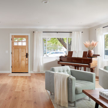
Bright modern living room created during this Sunnyvale addition and complete remodel project.
Example of a transitional living room design in San Francisco
Example of a transitional living room design in San Francisco

Sponsored
Columbus, OH

Wannemacher Interiors
Customized Award-Winning Interior Design Solutions in Franklin Cnty OH
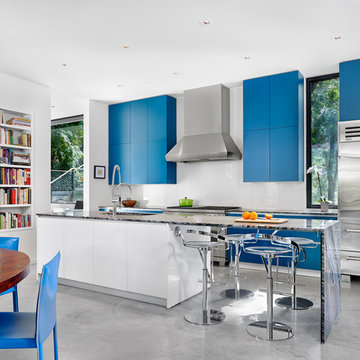
 Matt Garcia Design
Photo by Casey Dunn
Trendy galley eat-in kitchen photo in Austin with flat-panel cabinets, blue cabinets, stainless steel appliances and an island
Trendy galley eat-in kitchen photo in Austin with flat-panel cabinets, blue cabinets, stainless steel appliances and an island

7