
Search results for "Challenger" in Home Design Ideas

 TEW Design Studio
This home is a true gem in the heart of MacGregor Downs community in Cary, NC. Built in the 1980's in true Modernist design and architecture, the new owners wanted to keep the integrity of the original design. We redesigned the Half Bath, created floor plan layouts for new furniture, spec'd out furniture, accessories, flooring material, lighting, and artwork, as well as worked on brightening the wall and ceiling paint colors. One challenge we faced during the design process were the very tall ceilings, the very wide walls, and unusual angles. We chose interesting , engaging, and minimalistic artwork for the walls, which proved a successful solution. Another challenge was having a large open angled living room space; we created the perfect layout with separate functional gathering areas and eliminated unused corners.
Photo credit: Bob Fortner

 Chad Hemphill Construction
Photos by Wyatt Poindexter; Design by Aline Designs
Inspiration for a country laundry room remodel in Oklahoma City
Inspiration for a country laundry room remodel in Oklahoma City

 Fran Kerzner- DESIGN SYNTHESIS
The client wanted to update her tired, dated family room. They had grown accustomed to having reclining seats so one challenge was to create a new reclining sectional that looked fresh and contemporary. This one has three reclining seats plus convenient USB ports.
The clients also wanted to be able to eat dinner in the room while watching TV but there was no room for a regular dining table so we designed a custom silver leaf bar table to sit behind the sectional with a custom 1 1/2" Thinkglass art glass top.
New dark wood floors were installed and a custom wool and silk area rug was designed that ties all the pieces together.
We designed a new coffered ceiling with lighting in each bay. And built out the fireplace with dimensional tile to the ceiling.
The color scheme was kept intentionally monochromatic to show off the different textures with the only color being touches of blue in the pillows and accessories to pick up the art glass.
Find the right local pro for your project

 JMR Home Services
A freshly painted exterior. The dark grey and white combination give this home a clean and renewed look.
Inspiration for a mid-sized timeless gray two-story stucco gable roof remodel in Atlanta with a shingle roof
Inspiration for a mid-sized timeless gray two-story stucco gable roof remodel in Atlanta with a shingle roof

 TVL Creative Ltd.
Cramped kitchen be gone! That was the project motto and top priority. The goal was to transform the current layout from multiple smaller spaces into a connected whole that would activate the main level for our clients, a young family of four.
The biggest obstacle was the wall dividing the kitchen and the dining room. Removing this wall was central to opening up and integrating the main living spaces, but the existing ductwork that ran right through the center of the wall posed a design challenge, er design opportunity. The resulting design solution features a central pantry that captures the ductwork and provides valuable storage- especially when compared to the original kitchen's 18" wide pantry cabinet. The pantry also anchors the kitchen island and serves as a visual separation of space between the kitchen and homework area.
Through our design development process, we learned the formal living room was of no service to their lifestyle and therefore space they rarely spent time in. With that in mind, we proposed to eliminate the unused living room and make it the new dining room. Relocating the dining room to this space inherently felt right given the soaring ceiling and ample room for holiday dinners and celebrations. The new dining room was spacious enough for us to incorporate a conversational seating area in the warm, south-facing window alcove.
Now what to do with the old dining room?! To answer that question we took inspiration from our clients' shared profession in education and developed a craft area/homework station for both of their boys. The semi-custom cabinetry of the desk area carries over to the adjacent wall and forms window bench base with storage that we topped with butcher block for a touch of warmth. While the boys are young, the bench drawers are the perfect place for a stash of toys close to the kitchen.
The kitchen begins just beyond the window seat with their refrigerator enclosure. Opposite the refrigerator is the new pantry with twenty linear feet of shelving and space for brooms and a stick vacuum. Extending from the backside of the pantry the kitchen island design incorporates counter seating on the family room side and a cabinetry configuration on the kitchen side with drawer storage, a trashcan center, farmhouse sink, and dishwasher.
We took careful time in design and execution to align the range and sink because while it might seem like a small detail, it plays an important role in supporting the symmetrical configuration of the back wall of the kitchen. The rear wall design utilizes an appliance garage mirrors the visual impact of the refrigerator enclosure and helps keep the now open kitchen tidy. Between the appliance garage and refrigerator enclosure is the cooking zone with 30" of cabinetry and work surface on either side of the range, a chimney style vent hood, and a bold graphic tile backsplash.
The backsplash is just one of many personal touches we added to the space to reflect our client's modern eclectic style and love of color. Swooping lines of the mid-mod style barstools compliment the pendants and backsplash pattern. A pop of vibrant green on the frame of the pantry door adds a fresh wash of color to an otherwise neutral space. The big show stopper is the custom charcoal gray and copper chevron wall installation in the dining room. This was an idea our clients softly suggested, and we excitedly embraced the opportunity. It is also a kickass solution to the head-scratching design dilemma of how to fill a large and lofty wall.
We are so grateful to bring this design to life for our clients and now dear friends.

 JM Carpets
Kitchen - large country u-shaped medium tone wood floor kitchen idea in Milwaukee with white cabinets and a peninsula

 K&L Interiors
The 70th Street project started as an empty and non-functional attic space. We designed a completely new master suite, including a new bathroom, walk-in closet, bedroom and nursery for our clients. The space had many challenges because of its sloped and low ceilings. We embraced those challenges and used the ceiling slopes to our advantage to make the attic feel more spacious overall, as well as more functional for our clients.
Photography: Mike Duryea


 SkB Architects
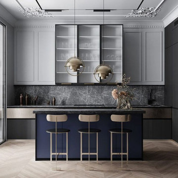
Originally built in 1955, this modest penthouse apartment typified the small, separated living spaces of its era. The design challenge was how to create a home that reflected contemporary taste and the client’s desire for an environment rich in materials and textures. The keys to updating the space were threefold: break down the existing divisions between rooms; emphasize the connection to the adjoining 850-square-foot terrace; and establish an overarching visual harmony for the home through the use of simple, elegant materials.
The renovation preserves and enhances the home’s mid-century roots while bringing the design into the 21st century—appropriate given the apartment’s location just a few blocks from the fairgrounds of the 1962 World’s Fair.

 ZeroEnergy Design
Eric Roth Photography
Inspiration for a mid-sized farmhouse brown two-story wood exterior home remodel in Boston
Inspiration for a mid-sized farmhouse brown two-story wood exterior home remodel in Boston

 Michael Nash Design, Build & Homes
2013 CHRYSALIS AWARD SOUTH REGION WINNER, RESIDENTIAL EXTERIOR
This 1970’s split-level single-family home in an upscale Arlington neighborhood had been neglected for years. With his surrounding neighbors all doing major exterior and interior remodeling, however, the owner decided it was time to renovate his property as well. After several consultation meetings with the design team at Michael Nash Design, Build & Homes, he settled on an exterior layout to create an Art & Craft design for the home.
It all got started by excavating the front and left side of the house and attaching a wrap-around stone porch. Key design attributes include a black metal roof, large tapered columns, blue and grey random style flag stone, beaded stain ceiling paneling and an octagonal seating area on the left side of this porch. The front porch has a wide stairway and another set of stairs leads to the back yard.
All exterior walls of homes were modified with new headers to allow much larger custom-made windows, new front doors garage doors, and French side and back doors. A custom-designed mahogany front door with leaded glass provides more light and offers a wider entrance into the home’s living area.
Design challenges included removing the entire face of the home and then adding new insulation, Tyvek and Hardiplank siding. The use of high-efficiency low-e windows makes the home air tight.
The Arts & Crafts design touches include the front gable over the front porch, the prairie-style grill pattern on the windows and doors, the use of tapered columns sitting over stone columns and the leaded glass front door. Decorative exterior lighting provides the finishing touches to this look.

 Shelley Zatsky Photography
Shelley Zatsky © 2016 Houzz
Example of a cottage chic living room design in Boston
Example of a cottage chic living room design in Boston
 Kimberlee Marie Interiors
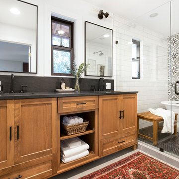
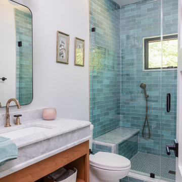
It’s always a blessing when your clients become friends - and that’s exactly what blossomed out of this two-phase remodel (along with three transformed spaces!). These clients were such a joy to work with and made what, at times, was a challenging job feel seamless. This project consisted of two phases, the first being a reconfiguration and update of their master bathroom, guest bathroom, and hallway closets, and the second a kitchen remodel.
In keeping with the style of the home, we decided to run with what we called “traditional with farmhouse charm” – warm wood tones, cement tile, traditional patterns, and you can’t forget the pops of color! The master bathroom airs on the masculine side with a mostly black, white, and wood color palette, while the powder room is very feminine with pastel colors.
When the bathroom projects were wrapped, it didn’t take long before we moved on to the kitchen. The kitchen already had a nice flow, so we didn’t need to move any plumbing or appliances. Instead, we just gave it the facelift it deserved! We wanted to continue the farmhouse charm and landed on a gorgeous terracotta and ceramic hand-painted tile for the backsplash, concrete look-alike quartz countertops, and two-toned cabinets while keeping the existing hardwood floors. We also removed some upper cabinets that blocked the view from the kitchen into the dining and living room area, resulting in a coveted open concept floor plan.
Our clients have always loved to entertain, but now with the remodel complete, they are hosting more than ever, enjoying every second they have in their home.

 Cummings Architecture + Interiors
Situated on the edge of New Hampshire’s beautiful Lake Sunapee, this Craftsman-style shingle lake house peeks out from the towering pine trees that surround it. When the clients approached Cummings Architects, the lot consisted of 3 run-down buildings. The challenge was to create something that enhanced the property without overshadowing the landscape, while adhering to the strict zoning regulations that come with waterfront construction. The result is a design that encompassed all of the clients’ dreams and blends seamlessly into the gorgeous, forested lake-shore, as if the property was meant to have this house all along.
The ground floor of the main house is a spacious open concept that flows out to the stone patio area with fire pit. Wood flooring and natural fir bead-board ceilings pay homage to the trees and rugged landscape that surround the home. The gorgeous views are also captured in the upstairs living areas and third floor tower deck. The carriage house structure holds a cozy guest space with additional lake views, so that extended family and friends can all enjoy this vacation retreat together. Photo by Eric Roth

 User
A Vermont second home renovation used for an active family who skis. Photos by Matthew Niemann Photography.
Inspiration for a contemporary light wood floor and beige floor great room remodel in Dallas with white walls
Inspiration for a contemporary light wood floor and beige floor great room remodel in Dallas with white walls


 TKS Design Group
Free ebook, Creating the Ideal Kitchen. DOWNLOAD NOW
This Chicago client was tired of living with her outdated and not-so-functional kitchen and came in for an update. The goals were to update the look of the space, enclose the washer/dryer, upgrade the appliances and the cabinets.
The space is located in turn-of-the-century brownstone, so we tried to stay in keeping with that era but provide an updated and functional space.
One of the primary challenges of this project was a chimney that jutted into the space. The old configuration meandered around the chimney creating some strange configurations and odd depths for the countertop.
We finally decided that just flushing out the wall along the chimney instead would create a cleaner look and in the end a better functioning space. It also created the opportunity to access those new pockets of space behind the wall with appliance garages to create a unique and functional feature.
The new galley kitchen has the sink on one side and the range opposite with the refrigerator on the end of the run. This very functional layout also provides large runs of counter space and plenty of storage. The washer/dryer were relocated to the opposite side of the kitchen per the client's request, and hide behind a large custom bi-fold door when not in use.
A wine fridge and microwave are tucked under the counter so that the primary visual is the custom mullioned doors with antique glass and custom marble backsplash design. White cabinetry, Carrera countertops and an apron sink complete the vintage feel of the space, and polished nickel hardware and light fixtures add a little bit of bling.
Designed by: Susan Klimala, CKD, CBD
Photography by: Carlos Vergara
For more information on kitchen and bath design ideas go to: www.kitchenstudio-ge.com

 Mason & Son Design & Build
Vestibule - mid-sized contemporary concrete floor and gray floor vestibule idea in Atlanta with blue walls and a blue front door
 User
Located in one of the Ritz residential towers in Boston, the project was a complete renovation. The design and scope of work included the entire residence from marble flooring throughout, to movement of walls, new kitchen, bathrooms, all furnishings, lighting, closets, artwork and accessories. Smart home sound and wifi integration throughout including concealed electronic window treatments.
The challenge for the final project design was multifaceted. First and foremost to maintain a light, sheer appearance in the main open areas, while having a considerable amount of seating for living, dining and entertaining purposes. All the while giving an inviting peaceful feel,
and never interfering with the view which was of course the piece de resistance throughout.
Bringing a unique, individual feeling to each of the private rooms to surprise and stimulate the eye while navigating through the residence was also a priority and great pleasure to work on, while incorporating small details within each room to bind the flow from area to area which would not be necessarily obvious to the eye, but palpable in our minds in a very suttle manner. The combination of luxurious textures throughout brought a third dimension into the environments, and one of the many aspects that made the project so exceptionally unique, and a true pleasure to have created. Reach us www.themorsoncollection.com
Photography by Elevin Studio.
 Haus Interior Design
**Featured in Home & Design Magazine!
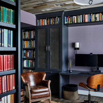
The inspiration for this unique project draws on the clients’ love of Paris and the city’s vibrant romanticism and mix of architectural styles. Our challenge was to elevate builder-grade finishes in a newly-constructed townhome to create an urban retreat with aged patina for this young couple. Soft industrial elements were layered over Old-World inspired details on nearly every surface for maximum impact. We added rustic wood ceilings and industrial beams to create drama, texture, and value throughout.
A Parisian-inspired glass/iron wall divider relieves the open concept floor plan, creating a more intimate seating space. Oversized pendants of steel, blown glass, horsehair and faux horn provide soft illumination while drawing the eye upward to architectural ceiling details. Custom midnight blue built-ins create a library that frames the entry and study. The deep and dramatic color palette of paint and wallpaper that adorns the walls is a vibrant mix of cobalt, citron, teal and smoky lavender. Light pours into the rooms from the large windows, reflects off the oversized acid-wash mirror, and forms dramatic shadows on the walls, setting the mood for this home.

 Knickerbocker Group
Whitten Architects | ARCHITECT
Knickerbocker Group | INTERIOR DESIGN
Knickerbocker Group | MILLWORK & CABINETRY
Knickerbocker Group | CONSTRUCTION
Darren Setlow | PHOTOGRAPHER
140