
Search results for "Challenges faced" in Home Design Ideas
 Flavin Architects
New Additions to Hoover + Hill
This project is a continuation of the renovation and updating work Flavin Architects had previously completed at the 1958 Wales house, designed by architect Henry Hoover and Walter Hill. Our clients, a young family, desired more space for guests, a home office, a yoga studio, and covered car parking. The challenge was to respect the architects’ original vision and not to interfere with the perfect cruciform plan of the house. To accomplish these goals, we converted the existing garage/workshop structure into a guest house and then designed a new, separate carport/storage building.
The new carport building shares the low-slope gable of the original Hoover structure. The post and beam structure characteristic of Hoover’s design is updated through the use of galvanized steel posts and I beams. The galvanized beams cantilever to support a sheltered walkway leading from the parking to a guest house terrace defined in relationship to the three structures surrounding it. The terrace is paved in slate with a central rain garden. Wood lattice clads the carport, providing good ventilation and letting the building glow like a lantern at night. Our guest house renovation celebrates the unique structural timber ceiling of the original garage. We replaced opaque plywood trusses with a slender cable truss structurally engineered by Webb Structural Services. This cable truss allows for a view of the timber ceiling. A wall of glass facing the courtyard replaced the original garage door. A murphy bed in the rear room enables quick conversion from guest quarters to weight room.
 Vetter Architects
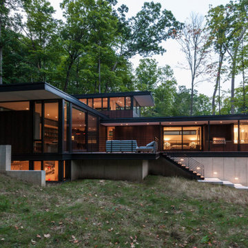
The client’s request was quite common - a typical 2800 sf builder home with 3 bedrooms, 2 baths, living space, and den. However, their desire was for this to be “anything but common.” The result is an innovative update on the production home for the modern era, and serves as a direct counterpoint to the neighborhood and its more conventional suburban housing stock, which focus views to the backyard and seeks to nullify the unique qualities and challenges of topography and the natural environment.
The Terraced House cautiously steps down the site’s steep topography, resulting in a more nuanced approach to site development than cutting and filling that is so common in the builder homes of the area. The compact house opens up in very focused views that capture the natural wooded setting, while masking the sounds and views of the directly adjacent roadway. The main living spaces face this major roadway, effectively flipping the typical orientation of a suburban home, and the main entrance pulls visitors up to the second floor and halfway through the site, providing a sense of procession and privacy absent in the typical suburban home.
Clad in a custom rain screen that reflects the wood of the surrounding landscape - while providing a glimpse into the interior tones that are used. The stepping “wood boxes” rest on a series of concrete walls that organize the site, retain the earth, and - in conjunction with the wood veneer panels - provide a subtle organic texture to the composition.
The interior spaces wrap around an interior knuckle that houses public zones and vertical circulation - allowing more private spaces to exist at the edges of the building. The windows get larger and more frequent as they ascend the building, culminating in the upstairs bedrooms that occupy the site like a tree house - giving views in all directions.
The Terraced House imports urban qualities to the suburban neighborhood and seeks to elevate the typical approach to production home construction, while being more in tune with modern family living patterns.
Overview:
Elm Grove
Size:
2,800 sf,
3 bedrooms, 2 bathrooms
Completion Date:
September 2014
Services:
Architecture, Landscape Architecture
Interior Consultants: Amy Carman Design
 Vetter Architects
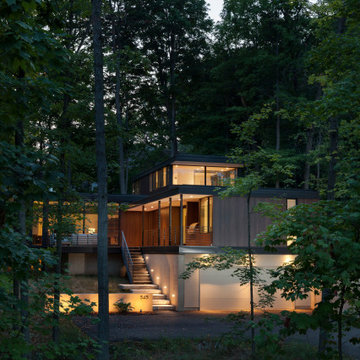
The client’s request was quite common - a typical 2800 sf builder home with 3 bedrooms, 2 baths, living space, and den. However, their desire was for this to be “anything but common.” The result is an innovative update on the production home for the modern era, and serves as a direct counterpoint to the neighborhood and its more conventional suburban housing stock, which focus views to the backyard and seeks to nullify the unique qualities and challenges of topography and the natural environment.
The Terraced House cautiously steps down the site’s steep topography, resulting in a more nuanced approach to site development than cutting and filling that is so common in the builder homes of the area. The compact house opens up in very focused views that capture the natural wooded setting, while masking the sounds and views of the directly adjacent roadway. The main living spaces face this major roadway, effectively flipping the typical orientation of a suburban home, and the main entrance pulls visitors up to the second floor and halfway through the site, providing a sense of procession and privacy absent in the typical suburban home.
Clad in a custom rain screen that reflects the wood of the surrounding landscape - while providing a glimpse into the interior tones that are used. The stepping “wood boxes” rest on a series of concrete walls that organize the site, retain the earth, and - in conjunction with the wood veneer panels - provide a subtle organic texture to the composition.
The interior spaces wrap around an interior knuckle that houses public zones and vertical circulation - allowing more private spaces to exist at the edges of the building. The windows get larger and more frequent as they ascend the building, culminating in the upstairs bedrooms that occupy the site like a tree house - giving views in all directions.
The Terraced House imports urban qualities to the suburban neighborhood and seeks to elevate the typical approach to production home construction, while being more in tune with modern family living patterns.
Overview:
Elm Grove
Size:
2,800 sf,
3 bedrooms, 2 bathrooms
Completion Date:
September 2014
Services:
Architecture, Landscape Architecture
Interior Consultants: Amy Carman Design
Find the right local pro for your project
 Simply Home Decorating
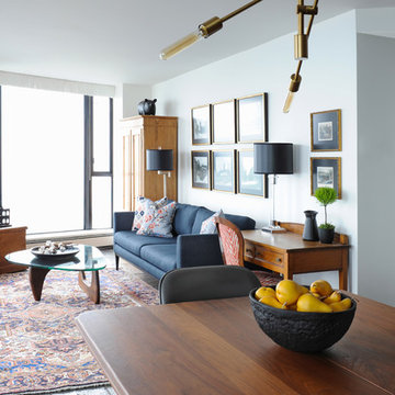
The homeowners of this condo sought our assistance when downsizing from a large family home on Howe Sound to a small urban condo in Lower Lonsdale, North Vancouver. They asked us to incorporate many of their precious antiques and art pieces into the new design. Our challenges here were twofold; first, how to deal with the unconventional curved floor plan with vast South facing windows that provide a 180 degree view of downtown Vancouver, and second, how to successfully merge an eclectic collection of antique pieces into a modern setting. We began by updating most of their artwork with new matting and framing. We created a gallery effect by grouping like artwork together and displaying larger pieces on the sections of wall between the windows, lighting them with black wall sconces for a graphic effect. We re-upholstered their antique seating with more contemporary fabrics choices - a gray flannel on their Victorian fainting couch and a fun orange chenille animal print on their Louis style chairs. We selected black as an accent colour for many of the accessories as well as the dining room wall to give the space a sophisticated modern edge. The new pieces that we added, including the sofa, coffee table and dining light fixture are mid century inspired, bridging the gap between old and new. White walls and understated wallpaper provide the perfect backdrop for the colourful mix of antique pieces. Interior Design by Lori Steeves, Simply Home Decorating. Photos by Tracey Ayton Photography
 Wiedemann Architects LLC
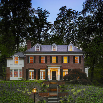
Our client was drawn to the property in Wesley Heights as it was in an established neighborhood of stately homes, on a quiet street with views of park. They wanted a traditional home for their young family with great entertaining spaces that took full advantage of the site.
The site was the challenge. The natural grade of the site was far from traditional. The natural grade at the rear of the property was about thirty feet above the street level. Large mature trees provided shade and needed to be preserved.
The solution was sectional. The first floor level was elevated from the street by 12 feet, with French doors facing the park. We created a courtyard at the first floor level that provide an outdoor entertaining space, with French doors that open the home to the courtyard.. By elevating the first floor level, we were able to allow on-grade parking and a private direct entrance to the lower level pub "Mulligans". An arched passage affords access to the courtyard from a shared driveway with the neighboring homes, while the stone fountain provides a focus.
A sweeping stone stair anchors one of the existing mature trees that was preserved and leads to the elevated rear garden. The second floor master suite opens to a sitting porch at the level of the upper garden, providing the third level of outdoor space that can be used for the children to play.
The home's traditional language is in context with its neighbors, while the design allows each of the three primary levels of the home to relate directly to the outside.
Builder: Peterson & Collins, Inc
Photos © Anice Hoachlander
 Absolute Shower Doors
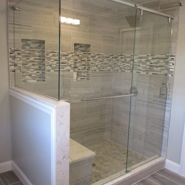
This is our Deus™ Everglide barn style slider. This particular shower consists of a single sliding door, a notched stationary panel, and a 90° return panel on a half wall. A Header and u-channel secure the 3/8” clear tempered glass. A matching ladder pull towel bar and handle is displayed perfectly on this enclosure. All of the hardware chosen for this shower is chrome.
 TVL Creative Ltd.
Cramped kitchen be gone! That was the project motto and top priority. The goal was to transform the current layout from multiple smaller spaces into a connected whole that would activate the main level for our clients, a young family of four.
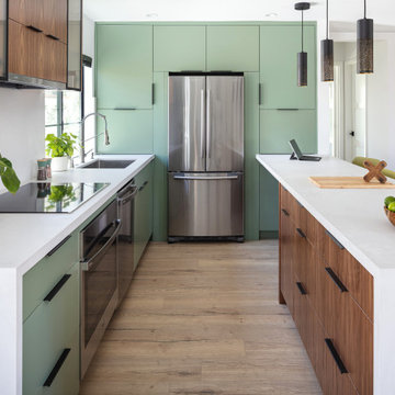
The biggest obstacle was the wall dividing the kitchen and the dining room. Removing this wall was central to opening up and integrating the main living spaces, but the existing ductwork that ran right through the center of the wall posed a design challenge, er design opportunity. The resulting design solution features a central pantry that captures the ductwork and provides valuable storage- especially when compared to the original kitchen's 18" wide pantry cabinet. The pantry also anchors the kitchen island and serves as a visual separation of space between the kitchen and homework area.
Through our design development process, we learned the formal living room was of no service to their lifestyle and therefore space they rarely spent time in. With that in mind, we proposed to eliminate the unused living room and make it the new dining room. Relocating the dining room to this space inherently felt right given the soaring ceiling and ample room for holiday dinners and celebrations. The new dining room was spacious enough for us to incorporate a conversational seating area in the warm, south-facing window alcove.
Now what to do with the old dining room?! To answer that question we took inspiration from our clients' shared profession in education and developed a craft area/homework station for both of their boys. The semi-custom cabinetry of the desk area carries over to the adjacent wall and forms window bench base with storage that we topped with butcher block for a touch of warmth. While the boys are young, the bench drawers are the perfect place for a stash of toys close to the kitchen.
The kitchen begins just beyond the window seat with their refrigerator enclosure. Opposite the refrigerator is the new pantry with twenty linear feet of shelving and space for brooms and a stick vacuum. Extending from the backside of the pantry the kitchen island design incorporates counter seating on the family room side and a cabinetry configuration on the kitchen side with drawer storage, a trashcan center, farmhouse sink, and dishwasher.
We took careful time in design and execution to align the range and sink because while it might seem like a small detail, it plays an important role in supporting the symmetrical configuration of the back wall of the kitchen. The rear wall design utilizes an appliance garage mirrors the visual impact of the refrigerator enclosure and helps keep the now open kitchen tidy. Between the appliance garage and refrigerator enclosure is the cooking zone with 30" of cabinetry and work surface on either side of the range, a chimney style vent hood, and a bold graphic tile backsplash.
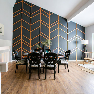
The backsplash is just one of many personal touches we added to the space to reflect our client's modern eclectic style and love of color. Swooping lines of the mid-mod style barstools compliment the pendants and backsplash pattern. A pop of vibrant green on the frame of the pantry door adds a fresh wash of color to an otherwise neutral space. The big show stopper is the custom charcoal gray and copper chevron wall installation in the dining room. This was an idea our clients softly suggested, and we excitedly embraced the opportunity. It is also a kickass solution to the head-scratching design dilemma of how to fill a large and lofty wall.
We are so grateful to bring this design to life for our clients and now dear friends.


 Metropolis Drafting and Construction Inc
Who said that a Burbank bungalow home needs to be doll and old fashioned.
In this Burbank remodeling project we took this 1200sq. bungalow home and turned it to a wonderful mixture of European modern kitchen space and calm transitional modern farmhouse furniture and flooring.
The kitchen was a true challenge since space was a rare commodity, but with the right layout storage and work space became abundant.
A floating 5' long sitting area was constructed and even the back face of the cabinets was used for wine racks.
Exterior was updated as well with new black windows, new stucco over layer and new light fixtures all around.
both bedrooms were fitted with huge 10' sliding doors overlooking the green backyard.
 Prentiss Balance Wickline Architects
Eirik Johnson
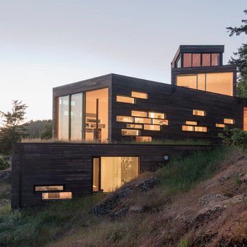
Mid-sized trendy brown three-story wood exterior home photo in Seattle with a green roof
Mid-sized trendy brown three-story wood exterior home photo in Seattle with a green roof
 Michael Nash Design, Build & Homes
2011 NARI CAPITAL COTY FINALIST AWARD WINNER
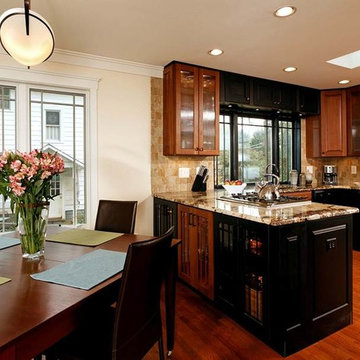
This 1970’s split-level single-family home in an upscale Arlington neighborhood had been neglected for years. With his surrounding neighbors all doing major exterior and interior remodeling, however, the owner decided it was time to renovate his property as well. After several consultation meetings with the design team at Michael Nash Design, Build & Homes, he settled on an exterior layout to create an Art & Craft design for the home.
It all got started by excavating the front and left side of the house and attaching a wrap-around stone porch. Key design attributes include a black metal roof, large tapered columns, blue and grey random style flag stone, beaded stain ceiling paneling and an octagonal seating area on the left side of this porch. The front porch has a wide stairway and another set of stairs leads to the back yard.
All exterior walls of the home were modified with new headers to allow much larger custom-made windows, new front doors garage doors, and French side and back doors. A custom-designed mahogany front door with leaded glass provides more light and offers a wider entrance into the home’s living area.
Design challenges included removing the entire face of the home and then adding new insulation, Tyvek and Hardiplank siding. The use of high-efficiency low-e windows makes the home air tight.
The Arts & Crafts design touches include the front gable over the front porch, the prairie-style grill pattern on the windows and doors, the use of tapered columns sitting over stone columns and the leaded glass front door. Decorative exterior lighting provides the finishing touches to this look.
Inside, custom woodwork, crown molding, custom glass cabinets and interior pillars carry the design. Upon entering the space, visitors face a large partition that separates the living area from a gourmet Arts & Crafts kitchen and dining room.
The home’s signature space, the kitchen offers contrasting dark and light cherry cabinets. Wide plank hard wood floors, exotic granite counters and stainless steel professional-grade appliances make this a kitchen fit for any chef.

 Landis Architects | Builders
Michael K. Wilkinson
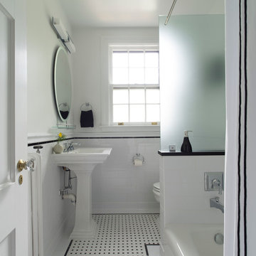
Though the footprint of the hall bath did not change, we did gut the entire room. The client had the idea of a classic black and white look for this bathroom. The designer added add interest with a thin black border on the white tile chair rail. The same thin border was also used on the floor to create a basket weave tile inset. A strip of Absolute Black granite tops off the white knee wall that separates the tub and toilet. Relocating plumbing is always a challenge in existing apartments. That is why we try to work with existing stacks and pipes. In this case, the new tub filler faucet was relocated 12-inches from the existing location and placed on the knee wall.
To accommodate the small footprint of the bathroom we used a 24-inch pedestal sink, round (not elongated) toilet and tub that is 4-feet 6-inches long (rather than a 5-foot standard tub. However, the new tub is 32-inches wide (the old one was narrower) which is more convenient for a shower tub.
A frosted glass panel was placed on the knee wall to give the owners privacy while taking a shower—as you can see the window is across from the tub. A new showerhead was reinstalled in place of the existing one. We used a special rod with a cap–in addition to its use as a curtain rod, it also acts as a support for the glass panel.
 Robeson Design
Modern Bedroom Design.
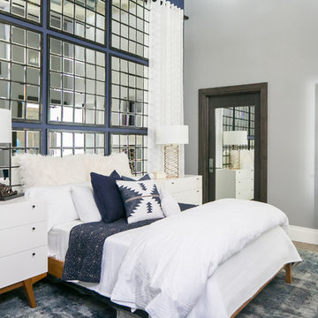
Bedroom in downtown loft with NO windows! This was the challenge Interior Designer Rebecca Robeson faced when beginning this Denver Loft Remodel.
Rebecca began by identifying the focal-point wall and addressing the overall dark feel of the room. She painted 3 walls a soft grey and one wall a dark navy blue. Rebecca applied her creative genius to the space by hanging nine beveled mirrors on the dark wall above the bed as a clever way to fool the eye into thinking the mirrors were windows. To further indulge the concept, Rebecca added crisp white linen panels to mimic window treatments on either side. This design idea created a dramatic symmetrical backdrop for the Bedroom furniture... A spectacular oversized blue and white rug (Aja Rugs) sets a perfect foundation for the queen size bed with two oversize nightstands in crisp white, the Bedroom was complete.
Tech Lighting - Black Whale Lighting
Photos by Ryan Garvin Photography
 Michael Nash Design, Build & Homes
2013 CHRYSALIS AWARD SOUTH REGION WINNER, RESIDENTIAL EXTERIOR
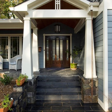
This 1970’s split-level single-family home in an upscale Arlington neighborhood had been neglected for years. With his surrounding neighbors all doing major exterior and interior remodeling, however, the owner decided it was time to renovate his property as well. After several consultation meetings with the design team at Michael Nash Design, Build & Homes, he settled on an exterior layout to create an Art & Craft design for the home.
It all got started by excavating the front and left side of the house and attaching a wrap-around stone porch. Key design attributes include a black metal roof, large tapered columns, blue and grey random style flag stone, beaded stain ceiling paneling and an octagonal seating area on the left side of this porch. The front porch has a wide stairway and another set of stairs leads to the back yard.
All exterior walls of homes were modified with new headers to allow much larger custom-made windows, new front doors garage doors, and French side and back doors. A custom-designed mahogany front door with leaded glass provides more light and offers a wider entrance into the home’s living area.
Design challenges included removing the entire face of the home and then adding new insulation, Tyvek and Hardiplank siding. The use of high-efficiency low-e windows makes the home air tight.
The Arts & Crafts design touches include the front gable over the front porch, the prairie-style grill pattern on the windows and doors, the use of tapered columns sitting over stone columns and the leaded glass front door. Decorative exterior lighting provides the finishing touches to this look.
 Michael Nash Design, Build & Homes
2013 CHRYSALIS AWARD SOUTH REGION WINNER, RESIDENTIAL EXTERIOR
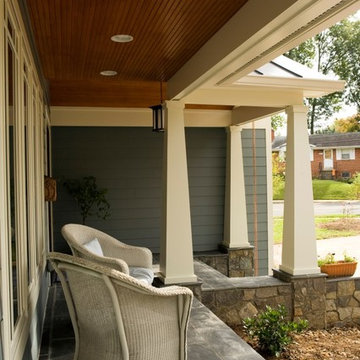
This 1970’s split-level single-family home in an upscale Arlington neighborhood had been neglected for years. With his surrounding neighbors all doing major exterior and interior remodeling, however, the owner decided it was time to renovate his property as well. After several consultation meetings with the design team at Michael Nash Design, Build & Homes, he settled on an exterior layout to create an Art & Craft design for the home.
It all got started by excavating the front and left side of the house and attaching a wrap-around stone porch. Key design attributes include a black metal roof, large tapered columns, blue and grey random style flag stone, beaded stain ceiling paneling and an octagonal seating area on the left side of this porch. The front porch has a wide stairway and another set of stairs leads to the back yard.
All exterior walls of homes were modified with new headers to allow much larger custom-made windows, new front doors garage doors, and French side and back doors. A custom-designed mahogany front door with leaded glass provides more light and offers a wider entrance into the home’s living area.
Design challenges included removing the entire face of the home and then adding new insulation, Tyvek and Hardiplank siding. The use of high-efficiency low-e windows makes the home air tight.
The Arts & Crafts design touches include the front gable over the front porch, the prairie-style grill pattern on the windows and doors, the use of tapered columns sitting over stone columns and the leaded glass front door. Decorative exterior lighting provides the finishing touches to this look.

 Deco Design
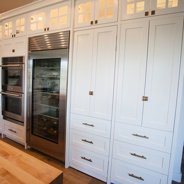
Closeup of the door to the hidden pantry. False panels and hardware to match the rest of the bank of cabinets.
We custom made all of the kitchen cabinetry and shelving. The kitchen was a small area so maximizing usable space with function and design was crucial.
The transitional design features a pantry wall with the Sub Zero all glass door refrigerator and oven cabinet centered and equal size pantry cabinets to either side with 3 large storage drawers below and rollout shelves and work surfaces behind the door cabinets above in each with a hidden walk-in pantry door next to the Sub Zero. The cabinets on the range wall all have large storage drawers with wood organizers in the top drawer for spices and utensils. The client also wanted floating shelves to either side of the steel hood which were made from re-sawn maple to look like cut pieces from an old beam, each shelf is lit from the underside with LED flush mounted puck lights.
The island was our biggest challenge. It needed to house several appliances of different size, a farmhouse sink and be able to have function from all 4 sides and still have room for seating space on the backside. The sink side has the farmhouse sink centered with storage drawers to the right that feature wood organizers and a double middle drawer to help hold all the small utensils and still maintain the 3 drawer look from the front view that matches the integrated dishwasher to the left. The right side contains both the integrated soft close trash unit and an icemaker with a third false panel door to maintain the size balance for all three. The left side houses the Sub Zero undercounter freezer. I wanted the face to look like six equal sized drawers, which left the integrated drawer fronts for the freezer overlapping the side panel for the dishwasher. The back of the island has storage tucked up under the seating space. The quartz countertop meets up against the maple butcher block to create a stunning island top. All in all the end result of this kitchen is a beautiful space with wonderful function.
We finished the false beams in our exclusive hand-rubbed cappuccino stain.
Photos: Kimball Ungerman
 Simply Home Decorating
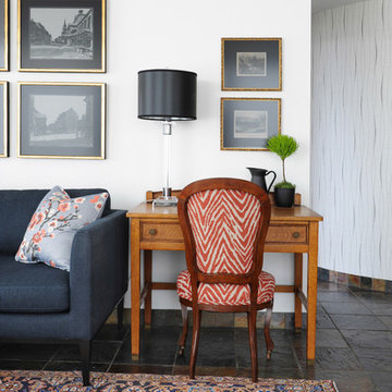
The homeowners of this condo sought our assistance when downsizing from a large family home on Howe Sound to a small urban condo in Lower Lonsdale, North Vancouver. They asked us to incorporate many of their precious antiques and art pieces into the new design. Our challenges here were twofold; first, how to deal with the unconventional curved floor plan with vast South facing windows that provide a 180 degree view of downtown Vancouver, and second, how to successfully merge an eclectic collection of antique pieces into a modern setting. We began by updating most of their artwork with new matting and framing. We created a gallery effect by grouping like artwork together and displaying larger pieces on the sections of wall between the windows, lighting them with black wall sconces for a graphic effect. We re-upholstered their antique seating with more contemporary fabrics choices - a gray flannel on their Victorian fainting couch and a fun orange chenille animal print on their Louis style chairs. We selected black as an accent colour for many of the accessories as well as the dining room wall to give the space a sophisticated modern edge. The new pieces that we added, including the sofa, coffee table and dining light fixture are mid century inspired, bridging the gap between old and new. White walls and understated wallpaper provide the perfect backdrop for the colourful mix of antique pieces. Interior Design by Lori Steeves, Simply Home Decorating. Photos by Tracey Ayton Photography
 Nancy Finneson | DeMane Design
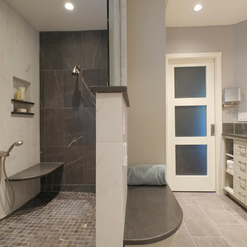
The owners of this remodel desired a refreshing new master bathroom. The original layout was poorly designed with minimal storage, a small shower, a rarely used bathtub and a water closet that was difficult to access. The old vanity flanked a curved wall of glass block (the main challenge with this space) which didn’t allow for mirrors and was always cluttered because of limited storage.
With smart space planning and attention to detail this well-appointed bathroom is now a uniquely personal space that functions brilliantly and balanced for the homeowners.
Photo: DeMane Design
 lisa furey interiors
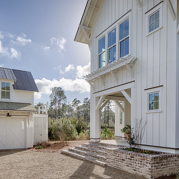
Duck Crossing is a mini compound built over time for our family in Palmetto Bluff, Bluffton, SC. We began with the small one story guest cottage, added the carriage house for our daughters and then, as we determined we needed one gathering space for friends and family, the main house. The challenge was to build a light and bright home that would take full advantage of the lake and preserve views and have enough room for everyone to congregate.
We decided to build an upside down/reverse floorplan home, where the main living areas are on the 2nd floor. We built one great room, encompassing kitchen, dining, living, deck and design studio - added tons of windows and an open staircase, vaulted the ceilings, painted everything white and did whatever else we could to make the small space feel open and welcoming - we think we accomplished this, and then some. The kitchen appliances are behind doors, the island is great for serving and gathering, the tv is hidden - all attention is to the view. When everyone needs their separate space, there are 2 bedrooms below and then additional sleeping, bathing and eating spaces in the cottage and carriage house - it is all just perfect!
37