
Search results for "Challenges faced" in Home Design Ideas
 Flavin Architects
New Additions to Hoover + Hill
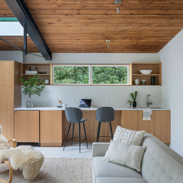
This project is a continuation of the renovation and updating work Flavin Architects had previously completed at the 1958 Wales house, designed by architect Henry Hoover and Walter Hill. Our clients, a young family, desired more space for guests, a home office, a yoga studio, and covered car parking. The challenge was to respect the architects’ original vision and not to interfere with the perfect cruciform plan of the house. To accomplish these goals, we converted the existing garage/workshop structure into a guest house and then designed a new, separate carport/storage building.
The new carport building shares the low-slope gable of the original Hoover structure. The post and beam structure characteristic of Hoover’s design is updated through the use of galvanized steel posts and I beams. The galvanized beams cantilever to support a sheltered walkway leading from the parking to a guest house terrace defined in relationship to the three structures surrounding it. The terrace is paved in slate with a central rain garden. Wood lattice clads the carport, providing good ventilation and letting the building glow like a lantern at night. Our guest house renovation celebrates the unique structural timber ceiling of the original garage. We replaced opaque plywood trusses with a slender cable truss structurally engineered by Webb Structural Services. This cable truss allows for a view of the timber ceiling. A wall of glass facing the courtyard replaced the original garage door. A murphy bed in the rear room enables quick conversion from guest quarters to weight room.
 Carolina V. Gentry, RID
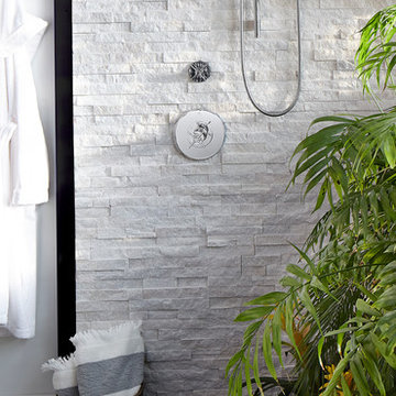
Timeless Palm Springs glamour meets modern in Pulp Design Studios' bathroom design created for the DXV Design Panel 2016. The design is one of four created by an elite group of celebrated designers for DXV's national ad campaign. Faced with the challenge of creating a beautiful space from nothing but an empty stage, Beth and Carolina paired mid-century touches with bursts of colors and organic patterns. The result is glamorous with touches of quirky fun -- the definition of splendid living.

Find the right local pro for your project
 Wiedemann Architects LLC
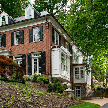
Our client was drawn to the property in Wesley Heights as it was in an established neighborhood of stately homes, on a quiet street with views of park. They wanted a traditional home for their young family with great entertaining spaces that took full advantage of the site.
The site was the challenge. The natural grade of the site was far from traditional. The natural grade at the rear of the property was about thirty feet above the street level. Large mature trees provided shade and needed to be preserved.
The solution was sectional. The first floor level was elevated from the street by 12 feet, with French doors facing the park. We created a courtyard at the first floor level that provide an outdoor entertaining space, with French doors that open the home to the courtyard.. By elevating the first floor level, we were able to allow on-grade parking and a private direct entrance to the lower level pub "Mulligans". An arched passage affords access to the courtyard from a shared driveway with the neighboring homes, while the stone fountain provides a focus.
A sweeping stone stair anchors one of the existing mature trees that was preserved and leads to the elevated rear garden. The second floor master suite opens to a sitting porch at the level of the upper garden, providing the third level of outdoor space that can be used for the children to play.
The home's traditional language is in context with its neighbors, while the design allows each of the three primary levels of the home to relate directly to the outside.
Builder: Peterson & Collins, Inc
Photos © Anice Hoachlander
 J Design Group - Interior Designers Miami - Modern
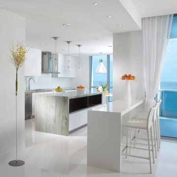
AVENTURA MAGAZINE selected our client’s luxury 5000 Sf ocean front apartment in Miami Beach, to publish it in their issue and they Said:
Story by Linda Marx, Photography by Daniel Newcomb
Light & Bright
New York snowbirds redesigned their Miami Beach apartment to take advantage of the tropical lifestyle.
WHEN INTERIOR DESIGNER JENNIFER CORREDOR was asked to recreate a four-bedroom, six-bath condominium at The Bath Club in Miami Beach, she seized the opportunity to open the rooms and better utilize the vast ocean views.
In five months last year, the designer transformed a dark and closed 5,000-square-foot unit located on a high floor into a series of sweeping waterfront spaces and updated the well located apartment into a light and airy retreat for a sports-loving family of five.
“They come down from New York every other weekend and wanted to make their waterfront home a series of grand open spaces,” says Corrredor, of the J. Design Group in Coral Gables, a firm specializing in modern and contemporary interiors. “Since many of the rooms face the ocean, it made sense to open and lighten up the home, taking advantage of the awesome views of the sea and the bay.”
The designer used 40 x 40 all white tile throughout the apartment as a clean base. This way, her sophisticated use of color would stand out and bring the outdoors in.
The close-knit family members—two parents and three boys in college—like to do things together. But there were situations to overcome in the process of modernizing and opening the space. When Corredor was briefed on their desires, nothing seemed too daunting. The confident designer was ready to delve in. For example, she fixed an area at the front door
that was curved. “The wood was concave so I straightened it out,” she explains of a request from the clients. “It was an obstacle that I overcame as part of what I do in a redesign. I don’t consider it a difficult challenge. Improving what I see is part of the process.”
She also tackled the kitchen with gusto by demolishing a wall. The kitchen had formerly been enclosed, which was a waste of space and poor use of available waterfront ambience. To create a grand space linking the kitchen to the living room and dining room area, something had to go. Once the wall was yesterday’s news, she relocated the refrigerator and freezer (two separate appliances) to the other side of the room. This change was a natural functionality in the new open space. “By tearing out the wall, the family has a better view of the kitchen from the living and dining rooms,” says Corredor, who also made it easier to walk in and out of one area and into the other. “The views of the larger public space and the surrounding water are breathtaking.
Opening it up changed everything.”
They clients can now see the kitchen from the living and dining areas, and at the same time, dwell in an airy and open space instead of feeling stuck in a dark enclosed series of rooms. In fact, the high-top bar stools that Corredor selected for the kitchen can be twirled around to use for watching TV in the living room.
In keeping with the theme of moving seamlessly from one room to the other, Corredor designed a subtle wall of glass in the living room along with lots of comfortable seating. This way, all family members feel at ease while relaxing, talking, or watching sporting events on the large flat screen television. “For this room, I wanted more open space, light and a supreme airy feeling,” she says. “With the glass design making a statement, it quickly became the star of the show.”…….
….. To add texture and depth, Jennifer Corredor custom created wood doors here, and in other areas of the home. They provide a nice contrast to the open Florida tropical feel. “I added character to the openness by using exotic cherry wood,” she says. “I repeated this throughout the home and it works well.”
Known for capturing the client’s vision while adding her own innovative twists, Jennifer Corredor lightened the family room, giving it a contemporary and modern edge with colorful art and matching throw pillows on the sofas. She added a large beige leather ottoman as the center coffee table in the room. This round piece was punctuated with a bold-toned flowering plant atop. It effortlessly matches the pillows and colors of the contemporary canvas.
Miami,
Miami Interior Designers,
Miami Interior Designer,
Interior Designers Miami,
Interior Designer Miami,
Modern Interior Designers,
Modern Interior Designer,
Modern interior decorators,
Modern interior decorator,
Contemporary Interior Designers,
Contemporary Interior Designer,
Interior design decorators,
Interior design decorator,
Interior Decoration and Design,
Black Interior Designers,
Black Interior Designer,
Interior designer,
Interior designers,
Interior design decorators,
Interior design decorator,
Home interior designers,
Home interior designer,
Interior design companies,
Interior decorators,
Interior decorator,
Decorators,
Decorator,
Miami Decorators,
Miami Decorator,
Decorators Miami,
Decorator Miami,
Interior Design Firm,
Interior Design Firms,
Interior Designer Firm,
Interior Designer Firms,
Interior design,
Interior designs,
Home decorators,
Interior decorating Miami,
Best Interior Designers,
Interior design decorator,
Miami Beach
 Vetter Architects
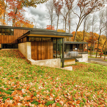
The client’s request was quite common - a typical 2800 sf builder home with 3 bedrooms, 2 baths, living space, and den. However, their desire was for this to be “anything but common.” The result is an innovative update on the production home for the modern era, and serves as a direct counterpoint to the neighborhood and its more conventional suburban housing stock, which focus views to the backyard and seeks to nullify the unique qualities and challenges of topography and the natural environment.
The Terraced House cautiously steps down the site’s steep topography, resulting in a more nuanced approach to site development than cutting and filling that is so common in the builder homes of the area. The compact house opens up in very focused views that capture the natural wooded setting, while masking the sounds and views of the directly adjacent roadway. The main living spaces face this major roadway, effectively flipping the typical orientation of a suburban home, and the main entrance pulls visitors up to the second floor and halfway through the site, providing a sense of procession and privacy absent in the typical suburban home.
Clad in a custom rain screen that reflects the wood of the surrounding landscape - while providing a glimpse into the interior tones that are used. The stepping “wood boxes” rest on a series of concrete walls that organize the site, retain the earth, and - in conjunction with the wood veneer panels - provide a subtle organic texture to the composition.
The interior spaces wrap around an interior knuckle that houses public zones and vertical circulation - allowing more private spaces to exist at the edges of the building. The windows get larger and more frequent as they ascend the building, culminating in the upstairs bedrooms that occupy the site like a tree house - giving views in all directions.
The Terraced House imports urban qualities to the suburban neighborhood and seeks to elevate the typical approach to production home construction, while being more in tune with modern family living patterns.
Overview:
Elm Grove
Size:
2,800 sf,
3 bedrooms, 2 bathrooms
Completion Date:
September 2014
Services:
Architecture, Landscape Architecture
Interior Consultants: Amy Carman Design
 Michael Nash Design, Build & Homes
2013 CHRYSALIS AWARD SOUTH REGION WINNER, RESIDENTIAL EXTERIOR
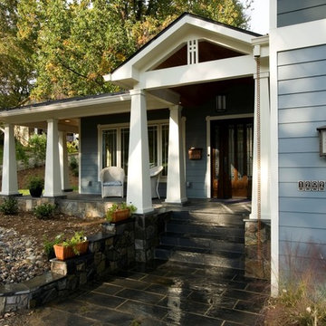
This 1970’s split-level single-family home in an upscale Arlington neighborhood had been neglected for years. With his surrounding neighbors all doing major exterior and interior remodeling, however, the owner decided it was time to renovate his property as well. After several consultation meetings with the design team at Michael Nash Design, Build & Homes, he settled on an exterior layout to create an Art & Craft design for the home.
It all got started by excavating the front and left side of the house and attaching a wrap-around stone porch. Key design attributes include a black metal roof, large tapered columns, blue and grey random style flag stone, beaded stain ceiling paneling and an octagonal seating area on the left side of this porch. The front porch has a wide stairway and another set of stairs leads to the back yard.
All exterior walls of homes were modified with new headers to allow much larger custom-made windows, new front doors garage doors, and French side and back doors. A custom-designed mahogany front door with leaded glass provides more light and offers a wider entrance into the home’s living area.
Design challenges included removing the entire face of the home and then adding new insulation, Tyvek and Hardiplank siding. The use of high-efficiency low-e windows makes the home air tight.
The Arts & Crafts design touches include the front gable over the front porch, the prairie-style grill pattern on the windows and doors, the use of tapered columns sitting over stone columns and the leaded glass front door. Decorative exterior lighting provides the finishing touches to this look.



 Metropolis Drafting and Construction Inc
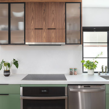
Who said that a Burbank bungalow home needs to be doll and old fashioned.
In this Burbank remodeling project we took this 1200sq. bungalow home and turned it to a wonderful mixture of European modern kitchen space and calm transitional modern farmhouse furniture and flooring.
The kitchen was a true challenge since space was a rare commodity, but with the right layout storage and work space became abundant.
A floating 5' long sitting area was constructed and even the back face of the cabinets was used for wine racks.
Exterior was updated as well with new black windows, new stucco over layer and new light fixtures all around.
both bedrooms were fitted with huge 10' sliding doors overlooking the green backyard.
 Metropolis Drafting and Construction Inc
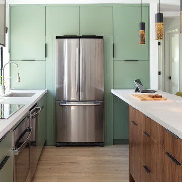
Who said that a Burbank bungalow home needs to be doll and old fashioned.
In this Burbank remodeling project we took this 1200sq. bungalow home and turned it to a wonderful mixture of European modern kitchen space and calm transitional modern farmhouse furniture and flooring.
The kitchen was a true challenge since space was a rare commodity, but with the right layout storage and work space became abundant.
A floating 5' long sitting area was constructed and even the back face of the cabinets was used for wine racks.
Exterior was updated as well with new black windows, new stucco over layer and new light fixtures all around.
both bedrooms were fitted with huge 10' sliding doors overlooking the green backyard.
 Flavin Architects
New Additions to Hoover + Hill
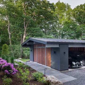
This project is a continuation of the renovation and updating work Flavin Architects had previously completed at the 1958 Wales house, designed by architect Henry Hoover and Walter Hill. Our clients, a young family, desired more space for guests, a home office, a yoga studio, and covered car parking. The challenge was to respect the architects’ original vision and not to interfere with the perfect cruciform plan of the house. To accomplish these goals, we converted the existing garage/workshop structure into a guest house and then designed a new, separate carport/storage building.
The new carport building shares the low-slope gable of the original Hoover structure. The post and beam structure characteristic of Hoover’s design is updated through the use of galvanized steel posts and I beams. The galvanized beams cantilever to support a sheltered walkway leading from the parking to a guest house terrace defined in relationship to the three structures surrounding it. The terrace is paved in slate with a central rain garden. Wood lattice clads the carport, providing good ventilation and letting the building glow like a lantern at night. Our guest house renovation celebrates the unique structural timber ceiling of the original garage. We replaced opaque plywood trusses with a slender cable truss structurally engineered by Webb Structural Services. This cable truss allows for a view of the timber ceiling. A wall of glass facing the courtyard replaced the original garage door. A murphy bed in the rear room enables quick conversion from guest quarters to weight room.
 ZeroEnergy Design
Lincoln Farmhouse
LEED-H Platinum, Net-Positive Energy
OVERVIEW. This LEED Platinum certified modern farmhouse ties into the cultural landscape of Lincoln, Massachusetts - a town known for its rich history, farming traditions, conservation efforts, and visionary architecture. The goal was to design and build a new single family home on 1.8 acres that respects the neighborhood’s agrarian roots, produces more energy than it consumes, and provides the family with flexible spaces to live-play-work-entertain. The resulting 2,800 SF home is proof that families do not need to compromise on style, space or comfort in a highly energy-efficient and healthy home.
CONNECTION TO NATURE. The attached garage is ubiquitous in new construction in New England’s cold climate. This home’s barn-inspired garage is intentionally detached from the main dwelling. A covered walkway connects the two structures, creating an intentional connection with the outdoors between auto and home.
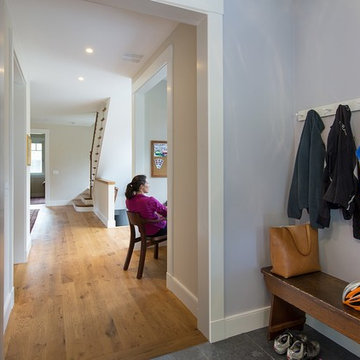
FUNCTIONAL FLEXIBILITY. With a modest footprint, each space must serve a specific use, but also be flexible for atypical scenarios. The Mudroom serves everyday use for the couple and their children, but is also easy to tidy up to receive guests, eliminating the need for two entries found in most homes. A workspace is conveniently located off the mudroom; it looks out on to the back yard to supervise the children and can be closed off with a sliding door when not in use. The Away Room opens up to the Living Room for everyday use; it can be closed off with its oversized pocket door for secondary use as a guest bedroom with en suite bath.
NET POSITIVE ENERGY. The all-electric home consumes 70% less energy than a code-built house, and with measured energy data produces 48% more energy annually than it consumes, making it a 'net positive' home. Thick walls and roofs lack thermal bridging, windows are high performance, triple-glazed, and a continuous air barrier yields minimal leakage (0.27ACH50) making the home among the tightest in the US. Systems include an air source heat pump, an energy recovery ventilator, and a 13.1kW photovoltaic system to offset consumption and support future electric cars.
ACTUAL PERFORMANCE. -6.3 kBtu/sf/yr Energy Use Intensity (Actual monitored project data reported for the firm’s 2016 AIA 2030 Commitment. Average single family home is 52.0 kBtu/sf/yr.)
o 10,900 kwh total consumption (8.5 kbtu/ft2 EUI)
o 16,200 kwh total production
o 5,300 kwh net surplus, equivalent to 15,000-25,000 electric car miles per year. 48% net positive.
WATER EFFICIENCY. Plumbing fixtures and water closets consume a mere 60% of the federal standard, while high efficiency appliances such as the dishwasher and clothes washer also reduce consumption rates.
FOOD PRODUCTION. After clearing all invasive species, apple, pear, peach and cherry trees were planted. Future plans include blueberry, raspberry and strawberry bushes, along with raised beds for vegetable gardening. The house also offers a below ground root cellar, built outside the home's thermal envelope, to gain the passive benefit of long term energy-free food storage.
RESILIENCY. The home's ability to weather unforeseen challenges is predictable - it will fare well. The super-insulated envelope means during a winter storm with power outage, heat loss will be slow - taking days to drop to 60 degrees even with no heat source. During normal conditions, reduced energy consumption plus energy production means shelter from the burden of utility costs. Surplus production can power electric cars & appliances. The home exceeds snow & wind structural requirements, plus far surpasses standard construction for long term durability planning.
ARCHITECT: ZeroEnergy Design http://zeroenergy.com/lincoln-farmhouse
CONTRACTOR: Thoughtforms http://thoughtforms-corp.com/
PHOTOGRAPHER: Chuck Choi http://www.chuckchoi.com/
 Land2c Landscape Architecture
Land2c photos
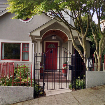
Entry is now crisply defined with a surround of fenced walls with an arched metal door repeating the home's architecture, The old porch support columns were reclad to create a grander entry. A lit address light was added, smooth new concrete walk, and welcoming plantings greet guests. The old maple tree has been well-pruned to allow more light into the entry. Plants are bright and have four seasons interest. The red fence will be painted matching black soon. The new entry was poured to meet the angle of the stair risers and the city sidewalk. The existing exposed aggregate concrete retaining walls were skimmed and painted to mimic the stucco finish of the house. The iron fencing will be all black.
All now appears to be original to the home's era.
 Robert M. Cain, Architect
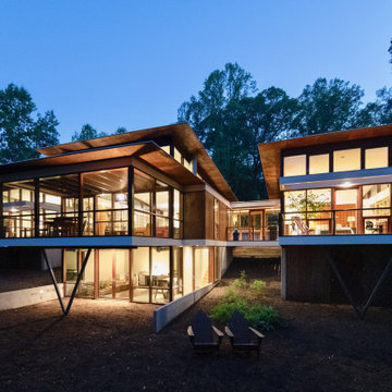
Holly Hill, a retirement home, whose owner's hobbies are gardening and restoration of classic cars, is nestled into the site contours to maximize views of the lake and minimize impact on the site.
Holly Hill is comprised of three wings joined by bridges: A wing facing a master garden to the east, another wing with workshop and a central activity, living, dining wing. Similar to a radiator the design increases the amount of exterior wall maximizing opportunities for natural ventilation during temperate months.
Other passive solar design features will include extensive eaves, sheltering porches and high-albedo roofs, as strategies for considerably reducing solar heat gain.
Daylighting with clerestories and solar tubes reduce daytime lighting requirements. Ground source geothermal heat pumps and superior to code insulation ensure minimal space conditioning costs. Corten steel siding and concrete foundation walls satisfy client requirements for low maintenance and durability. All light fixtures are LEDs.
Open and screened porches are strategically located to allow pleasant outdoor use at any time of day, particular season or, if necessary, insect challenge. Dramatic cantilevers allow the porches to project into the site’s beautiful mixed hardwood tree canopy without damaging root systems.
Guest arrive by vehicle with glimpses of the house and grounds through penetrations in the concrete wall enclosing the garden. One parked they are led through a garden composed of pavers, a fountain, benches, sculpture and plants. Views of the lake can be seen through and below the bridges.
Primary client goals were a sustainable low-maintenance house, primarily single floor living, orientation to views, natural light to interiors, maximization of individual privacy, creation of a formal outdoor space for gardening, incorporation of a full workshop for cars, generous indoor and outdoor social space for guests and parties.
 Living with Lolo
Bathroom in Lexington Ave | Room Type:
Primary Bathroom (Master Bath Remodel) |
Project Name:
Lexington Ave |
Key Feature:
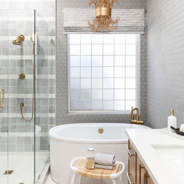
A modern, luxury bathroom with a subtle boho influence, featuring unique tile placement, statement lighting, and layered materials that create visual interest in a compact footprint.
Challenge:
The client wanted a full bathroom transformation while keeping all plumbing in its existing locations to minimize renovation costs, requiring creative design solutions within structural limitations.
Solution:
The design team reimagined the space by introducing updated finishes, distinctive tile layouts, wallpaper, and statement lighting to elevate the bathroom while working within the existing layout. The project was executed entirely remotely, demonstrating a seamless virtual design process.
Materials:
Bedrosians tile, Thibaut wallpaper, Arteriors lighting, Kohler plumbing fixtures, Jaipur Living rugs, Made Goods bath mirrors, and Bungalow5 bath stool.
Budget:
Not specified
Timeline:
Completed April 2021.
 Tradition Outdoor Living
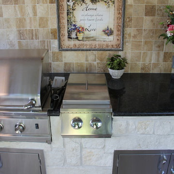
The outdoor kitchen boasts a Travertine backsplash stone with a custom ceramic mosaic, the focal point of the room. Wall Sconce Lighting illuminate the kitchen with a warm glow and reveal the depth of the dark Onyx Black Granite bar and countertops. Providing stark contrast to the granite, the bar and kitchen are faced with Austin Chop Limestone, a lovely and light natural stone.
The kitchen houses a 30” grill with a motorized rotisserie featuring LED lighting, perfect for serving a crisped-to-perfection chicken! Completing the meal is no challenge with the double side burner, an ideal spot for sautéing vegetables. The two sets of double doors provide underneath counter space allowing for plenty of storage. And, of course, electrical outlets are placed for convenience and afford access for a Margarita machine or other necessary appliances!
Pulling from the original brick color is the Flagstone Stamped Overlay with custom coloring. Fashioning a natural feel to the patio while replacing the previous plain concrete slab surface.
The gas-powered fire pit filled with Lava Rock Aggregate is faced with matching stone to the kitchen/bar and requires no maintenance or ash cleanup.
 Eurodale Developments Inc
Valerie Wilcox
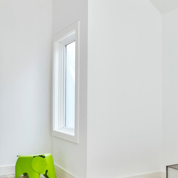
With a jog in the wall of the new addition, we were able to create a window for the Master bedroom facing the side yard. We were also able to create a cubby for maintaining a window in the bedroom that used to face the rear yard. Building code limits openings due to fire safety - which creates a design challenge and creating solutions!
 Klopf Architecture
Built for the Bluff, A Sea Ranch Home is Remade from the Inside Out
The house had always been grounded, on an ocean bluff at The Sea Ranch. It sits unencumbered, adjacent to one of the most dramatic stretches of the Sonoma coast with protected commons meadow to the east, uninterrupted Pacific views to the west, and a bluff trail running alongside. What it lacked was the feeling of home, one that could hold up its own against the natural landscape.
The owners are entrepreneurs with deep involvement across tech, real estate, and development and they know how things are built. The Sea Ranch house had been in their lives for years, a second residence and a place for family to gather. Built for a different time, it felt more compromising than comfortable. Sitting in a closed off nook, the kitchen fit one cook at a time and turned its back on the rest of the house. The entry was dim and compressed, divided by a structural column that presented itself at exactly the wrong moment. The primary suite was small relative to the view outside it. A large rear bedroom sat behind a lowered ceiling with a bathroom that had never been added. The house was certainly worth the trouble of doing it right.
What followed was not one project but four, each with its own design challenge, each addressed over a period of time.
Where the House Meets the Ocean
The most complex piece of the project, in both structural and spatial terms, was the kitchen expansion. The existing room was a single-person galley squeezed in as an afterthought with no meaningful connection to the dining room, the living space, or the deck outside. To make it useful for a family that cooks and gathers, it needed to grow outward into an existing patio and flow into the rooms around it.
A big challenge was the roofline. Several planes at different pitches and angles converged directly where additional volume was needed. A new form had to join that geometry without reading as a correction. The solution found the simplest possible connection between the existing angles, a roofline that from outside the structure, appears entirely original. From the bluff trail where the addition is visible, there is no discernible seam.
Inside, the kitchen is now open to the living and dining rooms without interruption. A large sliding glass door connects the space onto the rear deck. The deck itself was expanded and oriented so that the body of the house shields it from the coastal wind which is a common consideration that determines whether outdoor space at The Sea Ranch actually gets used. The result is a room that works for large family gatherings where no one feels cutoff, and one that makes the boundary between being inside and outside easy to ignore.
Welcoming Light
A structural column stood at the convergence of eight distinct roof planes in the entry. It was load-bearing, but it was also the reason the entry had always felt like a hallway rather than a welcoming arrival.
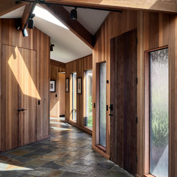
With the structural engineer, a custom steel connector was designed to receive beams from six separate directions, redistributing the load through a single new continuous beam. The column was surgically removed. Three triangular skylights were then cut into the roof above, their shapes drawn from the
existing geometry of the planes around them. The entry is now bright and open. The skylights feel native to the structure because they follow the logic already present in the roof.
Two Suites, Two Views
At opposite ends of the house, the two bedroom suites were each reconfigured, and each found a different way to introduce more of the landscape into the room.
An addition to the primary suite extended the structure outward to create a wraparound plan with a loop from the bedroom through bath and closet that had not been possible before. The expansion opened a slot view from the tub and shower toward the ocean. The view is precise and private. The ocean view is present and deliberate.
The rear bedroom absorbed an adjacent storage room to transform it into a full second suite with a vaulted ceiling, a large bathroom with a tub, a shower, and a sauna. A private fenced garden courtyard sits just beyond the glass bringing the outdoors inside. The tub was placed so that, looking past the courtyard and through the bedroom beyond, the ocean is visible at the far end. It is a long view and it makes the room feel larger and more settled than its footprint would suggest.
Glass on Four Sides, Fire at the Center
The main living and gathering room had always been caught between two competing facts: glass on four sides meant exceptional views but at The Sea Ranch, it also meant a cold room. A 360-degree cylindrical fireplace was added at the center on a raised stone base, providing radiant heat in every direction and giving the room a focal point around which a group naturally orients itself, whether that means two people at the end of the day or the whole family after dinner.
Owners Who Picked Up the Tools
The owner was not a passive client. they came with construction knowledge, specific ideas, and the desire to be an active part of the process, a dynamic that other architects may had found difficult, which Klopf Architecture accepted as an asset. They took it upon themselves to complete some of the work during construction, including the installation of a new radiant heating system beneath the floors.
The radiant system added to the older and less-desirable forced-air setup. At The Sea Ranch, that change matters as the house sits close enough to the ocean and moving air competes with the sound of it, where radiant heat does not. Solar panels were added to the roof as part of the new system. Insulation was upgraded throughout the walls, roof, and crawl space. The house that had always had the right setting now holds warmth the way a house on the bluff should.
They were also deeply involved in the design and selections throughout, and the finished house reflects both of them in ways that are specific rather than generic. The process took longer and moved through more iterations than a more arms-length relationship might have allowed. The result is more defined and personal because of it.
The Landscape Holds Priority
Every exterior decision was shaped by The Sea Ranch Design Standards, which require that buildings defer to the landscape around them rather than compete with it. Because this house sits on the bluff and is visible from the public trail, the additions faced a close review. Existing materials were matched. Geometries were resolved. The additions had to become indistinguishable from the original building.
From the trail, the house reads exactly as it always has — low, cedar-clad, secondary to the meadow and the water. The setting holds priority. Inside, the house has been remade.
Klopf Architecture Project Team: Geoff Campen and Trenton Jewett
Contractor: Shawn Bettega Construction
Photography: ©2025 Mariko Reed
Year Completed: 2023
Location: The Sea Ranch, CA
 Klopf Architecture
Built for the Bluff, A Sea Ranch Home is Remade from the Inside Out
The house had always been grounded, on an ocean bluff at The Sea Ranch. It sits unencumbered, adjacent to one of the most dramatic stretches of the Sonoma coast with protected commons meadow to the east, uninterrupted Pacific views to the west, and a bluff trail running alongside. What it lacked was the feeling of home, one that could hold up its own against the natural landscape.
The owners are entrepreneurs with deep involvement across tech, real estate, and development and they know how things are built. The Sea Ranch house had been in their lives for years, a second residence and a place for family to gather. Built for a different time, it felt more compromising than comfortable. Sitting in a closed off nook, the kitchen fit one cook at a time and turned its back on the rest of the house. The entry was dim and compressed, divided by a structural column that presented itself at exactly the wrong moment. The primary suite was small relative to the view outside it. A large rear bedroom sat behind a lowered ceiling with a bathroom that had never been added. The house was certainly worth the trouble of doing it right.
What followed was not one project but four, each with its own design challenge, each addressed over a period of time.
Where the House Meets the Ocean
The most complex piece of the project, in both structural and spatial terms, was the kitchen expansion. The existing room was a single-person galley squeezed in as an afterthought with no meaningful connection to the dining room, the living space, or the deck outside. To make it useful for a family that cooks and gathers, it needed to grow outward into an existing patio and flow into the rooms around it.
A big challenge was the roofline. Several planes at different pitches and angles converged directly where additional volume was needed. A new form had to join that geometry without reading as a correction. The solution found the simplest possible connection between the existing angles, a roofline that from outside the structure, appears entirely original. From the bluff trail where the addition is visible, there is no discernible seam.
Inside, the kitchen is now open to the living and dining rooms without interruption. A large sliding glass door connects the space onto the rear deck. The deck itself was expanded and oriented so that the body of the house shields it from the coastal wind which is a common consideration that determines whether outdoor space at The Sea Ranch actually gets used. The result is a room that works for large family gatherings where no one feels cutoff, and one that makes the boundary between being inside and outside easy to ignore.
Welcoming Light
A structural column stood at the convergence of eight distinct roof planes in the entry. It was load-bearing, but it was also the reason the entry had always felt like a hallway rather than a welcoming arrival.
With the structural engineer, a custom steel connector was designed to receive beams from six separate directions, redistributing the load through a single new continuous beam. The column was surgically removed. Three triangular skylights were then cut into the roof above, their shapes drawn from the
existing geometry of the planes around them. The entry is now bright and open. The skylights feel native to the structure because they follow the logic already present in the roof.
Two Suites, Two Views
At opposite ends of the house, the two bedroom suites were each reconfigured, and each found a different way to introduce more of the landscape into the room.
An addition to the primary suite extended the structure outward to create a wraparound plan with a loop from the bedroom through bath and closet that had not been possible before. The expansion opened a slot view from the tub and shower toward the ocean. The view is precise and private. The ocean view is present and deliberate.
The rear bedroom absorbed an adjacent storage room to transform it into a full second suite with a vaulted ceiling, a large bathroom with a tub, a shower, and a sauna. A private fenced garden courtyard sits just beyond the glass bringing the outdoors inside. The tub was placed so that, looking past the courtyard and through the bedroom beyond, the ocean is visible at the far end. It is a long view and it makes the room feel larger and more settled than its footprint would suggest.
Glass on Four Sides, Fire at the Center
The main living and gathering room had always been caught between two competing facts: glass on four sides meant exceptional views but at The Sea Ranch, it also meant a cold room. A 360-degree cylindrical fireplace was added at the center on a raised stone base, providing radiant heat in every direction and giving the room a focal point around which a group naturally orients itself, whether that means two people at the end of the day or the whole family after dinner.
Owners Who Picked Up the Tools
The owner was not a passive client. they came with construction knowledge, specific ideas, and the desire to be an active part of the process, a dynamic that other architects may had found difficult, which Klopf Architecture accepted as an asset. They took it upon themselves to complete some of the work during construction, including the installation of a new radiant heating system beneath the floors.
The radiant system added to the older and less-desirable forced-air setup. At The Sea Ranch, that change matters as the house sits close enough to the ocean and moving air competes with the sound of it, where radiant heat does not. Solar panels were added to the roof as part of the new system. Insulation was upgraded throughout the walls, roof, and crawl space. The house that had always had the right setting now holds warmth the way a house on the bluff should.
They were also deeply involved in the design and selections throughout, and the finished house reflects both of them in ways that are specific rather than generic. The process took longer and moved through more iterations than a more arms-length relationship might have allowed. The result is more defined and personal because of it.
The Landscape Holds Priority
Every exterior decision was shaped by The Sea Ranch Design Standards, which require that buildings defer to the landscape around them rather than compete with it. Because this house sits on the bluff and is visible from the public trail, the additions faced a close review. Existing materials were matched. Geometries were resolved. The additions had to become indistinguishable from the original building.
From the trail, the house reads exactly as it always has — low, cedar-clad, secondary to the meadow and the water. The setting holds priority. Inside, the house has been remade.
Klopf Architecture Project Team: Geoff Campen and Trenton Jewett
Contractor: Shawn Bettega Construction
Photography: ©2025 Mariko Reed
Year Completed: 2023
Location: The Sea Ranch, CA
 Sosna Inc
This project centered on helping a wonderful client and her equally fantastic dog transform her condo into a space that truly reflected her style and simplified her life. Eager to create a home that was both beautiful and functional, she envisioned a haven in the heart of the city.
Before: Feeling Disconnected
Before the renovation, our client felt disconnected from her condo. The builder-grade kitchen was a constant source of frustration, with an awkward peninsula that hindered the flow of the space. The condo overall felt outdated and no longer captured her vibrant personality. The foyer and laundry areas were cramped and lacked organization, while the mismatched hardwood flooring only added to the disjointed atmosphere. As for the bathrooms, they felt frozen in time, desperately needing an update.
Worries and Concerns
Like many homeowners, our client had heard her fair share of renovation horror stories—tales of projects gone awry and the frustrations of managing multiple contractors. She was understandably cautious and needed a trustworthy, experienced team she could rely on to handle the project with care and expertise.
The Solution: A Personalized Transformation
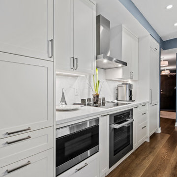
We took the time to listen carefully to our client’s needs and concerns and developed a tailored plan to address each of her pain points. For the kitchen, we preserved the existing layout but reimagined the space entirely. The awkward peninsula was redesigned to improve traffic flow and provide much-needed storage and counter space. Clever storage solutions, such as pull-outs, shelving, concealed drawers in the toe kicks, and an appliance garage, were incorporated. The kitchen now boasts a warm and inviting atmosphere, with light wood-tone lower cabinetry, off-white upper cabinets, and brushed nickel hardware that ties it all together.
The laundry room, once cramped and chaotic, was transformed into an organized, efficient space. We added custom cabinetry with pull-outs for hanging clothes, open storage above, a laundry sink, and a spacious counter for folding—no more piles of laundry!
Both the en-suite and shared bathrooms underwent complete renovations. Custom cabinetry was installed, including a floor-to-ceiling linen closet, and light grey and brown-toned tiles were selected, with contrasting hexagonal tiles for the shower floor. A heated flooring system was added for luxury and comfort year-round.
The mismatched flooring throughout the condo was replaced with cohesive vinyl and porcelain tiles, creating a seamless, modern aesthetic throughout the space.
Overcoming Challenges
As with any renovation, there were challenges to navigate. One of the key obstacles was managing the condo board’s renovation rules and policies while coordinating the delivery schedules for finishes and fixtures, especially during the busy holiday season. With careful planning, we ensured the project stayed on track. Additionally, we encountered a height variation between the tile and vinyl flooring. To resolve this, we used self-leveling material under the vinyl, ensuring a smooth and seamless transition between the two flooring types.
The Grand Reveal: A Dream Come True
The final result is simply stunning. The kitchen is now a chef’s dream, with custom-built cabinets, smooth quartz countertops, and a matching stone backsplash. Brushed nickel and stainless steel plumbing fixtures, elegant cabinet hardware, and LED lighting under the upper cabinets add the perfect finishing touches. Custom organizers in the foyer and laundry closets provide ample storage and keep everything neatly in place. The bathrooms have been transformed into spa-like retreats, with beautiful porcelain tiles and custom cabinetry. The new vinyl flooring throughout the main living areas and bedroom unifies the space, creating a cohesive and modern atmosphere.
Life Transformed
Our client’s life has been completely transformed. As a passionate cook, she now relishes spending time in her beautiful and functional kitchen. The single-bowl sink makes cleanup a breeze, and the thoughtfully designed storage solutions have brought a sense of calm and order to her home. The refreshed flooring and neutral paint palette have created a relaxing, comfortable environment she truly loves.
A Memorable Journey
This project was more than just a renovation—it was a collaboration. Our client valued our guidance throughout the design process, particularly when faced with the overwhelming number of decisions. We built a strong relationship with her, and we are immensely grateful for the trust she placed in our team.
41