
Search results for "Challenges" in Home Design Ideas

 Secret Gardens
 is regularly presented with new and challenging designs. This warehouse renovation required a complete overhaul of the internal warehouse courtyard and front entrance. Previous renovations had ‘domesticated’ the building, a poor departure from its warehouse origins. The front was given a sophisticated finish with balconies added onto bedrooms and large garage and entrance doors created with a bronze/copper finish. The internal courtyard pool was modernised, BBQ and cabinetry added and the finishing touches of plants added in pots and hanging from the beams to bring greenery to this industrial space. The end result has enhanced the warehouse appeal with a modern touch.

 Jasper + Phoenix
Amber works from home and was sacrificing a dining room for her home office. By utilizing the double wide closet space in her guest bedroom, she now walks into her home without the reminder of work, and can have guests over for a meal in her dining room (dining room reveal coming soon). The walls were freshly painted Sea Salt by Sherwin Williams. This gives the room a fresh, clean look and also adds contrast to the beige carpet.
Amber had her homework assignments cut out for her as she had to do some major purging in her throw all guest room. Once she started letting go, she was on a roll and continually surprised me as she cleaned out closets throughout the house. One dresser was filled with cds, dvds, books, albums, scrap-booking materials; items taking up precious real estate in her life that she didn't even know were there. There really wasn't a storage problem after-all, she was just holding on to a collection of things that no longer served her. Each time I would visit, and her space would become more open, I could see the weight lifting off her and her self love building. Amber had a recent breakup with her boyfriend and this makeover helped her not only focus on making a home sanctuary for herself, but helped her let go of the pains of the past and focus on the exciting future ahead. At one point when we were moving sofas in the living room (which we will also reveal soon), we found an ex's flip-flop. We were figuratively and literally sweeping away the past. Editing your home and your life makes room for your future; for new people and things. We are so happy to finally reveal the room to you! We can't wait to unveil the rest of Amber's home, once we complete the finishing touches.
Challenges:
Amber's home was filled with mix-matched furniture from family and college. She had no idea what her decorating style was. After shopping together and exchanging somepinterest boards, I was finally able to get a sense of what she loves.
I had to work on a tight budget, which meant really digging out the creativity and utilizing other items in the home. See how I transformed a table from the discard pile into a faux marble bedside table by clicking web link.
Amber's dad was able to help with the desk materials and building to cut costs.
We wanted to save the closet doors in the event she sold her home or no longer needed an office someday. There wasn't any extra space to store these closet doors, so I used them as a headboard.
The only items purchased were: Curtains, Curtain Rod, Bedspread Set, Throw Pillows, 2 Lamps and Paint.

 The Brooklyn Studio
This Cobble Hill Brownstone for a family of five is a fun and captivating design, the perfect blend of the wife’s love of English country style and the husband’s preference for modern. The young power couple, her the co-founder of Maisonette and him an investor, have three children and a dog, requiring that all the surfaces, finishes and, materials used throughout the home are both beautiful and durable to make every room a carefree space the whole family can enjoy.
The primary design challenge for this project was creating both distinct places for the family to live their day to day lives and also a whole floor dedicated to formal entertainment. The clients entertain large dinners on a monthly basis as part of their profession. We solved this by adding an extension on the Garden and Parlor levels. This allowed the Garden level to function as the daily family operations center and the Parlor level to be party central. The kitchen on the garden level is large enough to dine in and accommodate a large catering crew.
On the parlor level, we created a large double parlor in the front of the house; this space is dedicated to cocktail hour and after-dinner drinks. The rear of the parlor is a spacious formal dining room that can seat up to 14 guests. The middle "library" space contains a bar and facilitates access to both the front and rear rooms; in this way, it can double as a staging area for the parties.
The remaining three floors are sleeping quarters for the family and frequent out of town guests. Designing a row house for private and public functions programmatically returns the building to a configuration in line with its original design.
This project was published in Architectural Digest.
Photography by Sam Frost
Find the right local pro for your project

 Robeson Design
Designing a completely round home is challenging! Add to that, the two tubes are merely 8' wide. This requires EVERY piece of furniture to be custom built to fit the continuous rounding walls, floors and ceiling. We used every possible inch to provide storage for our clients personal belongings and household needs... sustainable for 3 years!
Solid walnut wood paneling and custom built shelving was used throughout as well as tons of hidden storage... in, under and atop every possible inch of this project was locate and utilized! Backsplash above the Kitchen sink is super thinly cut mosaic tile made out of MIRROR! It's reflective, creates an illusion of space and light, It sparkles and looks AMAZING!
MMM Photography

 Blue Heron Signature Homes
Designed and built by Terramor Homes in Raleigh, NC. This open design concept was an exciting challenge. Kitchen, Family Room and Large Eat in Kitchen are entirely open to each other for family enjoyment. When we enjoy a large family gathering, we envisioned it to be while enjoying the view of the woods, greenway and river seen from the back of the home. Since most of our gatherings extend past single table seating spaces, we wanted to plan properly for spill over onto the huge screened porch that adjoins all of the rooms for extended seating that remains all-inclusive. The screened porch is accessible from the dining area, but more impressively, by a 16 foot wide sliding glass door across the back wall of the Family Room. When fully opened, an 8 foot wide opening is created- making a complete extension of our living and eating areas fully integrated.
M. Eric Honeycutt

 Adrienne DeRosa
When it comes to craft supplies, it can be a challenge to keep everything well organized. One thing that Chelsea can't get enough of is the wire basket. " I just can't seem to get rid of [them]', she explains. "I have way more than I need at the moment, but I can't bare to part with them because they can be so handy". In her upstairs craft room, she uses them to contain fabric samples as well as other goods, such as card stock and small boxes.
Photo: Adrienne DeRosa Photography © 2014 Houzz

 Landis Architects | Builders
Pak Cheung
This section is a new gable dormer that adds much-needed volume to this attic. The choice of paint color added bright and playful feel to the space. The challenge when adding a dormer is maintaining structural support of the ridge beam. In this case, given the age of the house, finding point loads to support the existing beam would have created unknown conditions and required renovation work on the first and basement levels. The engineer's solution was to create an A-frame girder (see the triangle shape on the top left of photo) supported on existing exterior bearing walls. The new gable dormer is tied into this girder. We installed new hardwood flooring throughout the space. Though the attic had two large existing skylights, to bring in more natural light we added two more skylights—one in the bathroom and one in the hallway. We also installed new recessed lights throughout the entire space and in the bathroom.


 Bilotta Kitchen & Home
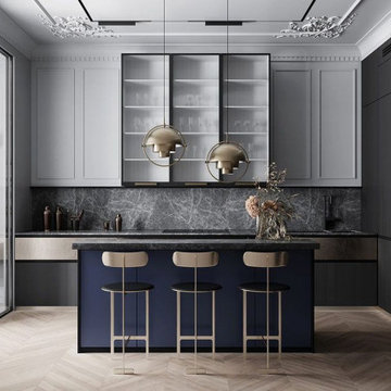
This expansive traditional kitchen by senior designer, Randy O'Kane and Architect, Clark Neuringer, features Bilotta Collection cabinet in a custom color. Randy says, the best part about working with this client was that she loves design – and not just interior but she also loves holiday decorating and she has a beautiful sense of aesthetic (and does everything to the nines). For her kitchen she wanted a barn-like feel and it absolutely had to be functional because she both bakes and cooks for her family and neighbors every day. And as the mother of four teenage girls she has a lot of people coming in and out of her home all the time. She wanted her kitchen to be comfortable – not untouchable and not too “done”. When she first met with Bilotta senior designer Randy O’Kane, her #1 comment was: “I’m experiencing white kitchen fatigue”. So right from the start finding the perfect color was the prime focus. The challenge was infusing a center hall colonial with a sense of warmth, comfort and that barn aesthetic without being too rustic which is why they went with a straight greenish grey paint vs. something distressed. The flooring, by Artisan Wood floors, looks reclaimed with its wider long planks and fumed finish. The barn door separating the laundry room and the kitchen was made from hand selected barn wood, made custom according to the client’s detailed specifications, and hung with sliding hardware. The kitchen hardware was really a window sash pull from Rocky Mountain that was repurposed as handles in a living bronze finish mounted horizontally. Glazed brick tile, by Ann Sacks, really helped to embrace the overall concept. Since a lot of parties are hosted out of that space, the kitchen, and butler’s pantry off to the side, needed a good flow as well as areas to bake and stage the creations. Double ovens were a must as well as a 48” Wolf Range and a Rangecraft hood – four ovens are going all the time. Beverage drawers were added to allow others to flow through the kitchen without disturbing the cook. Lots of storage was added for a well-stocked kitchen. A unique detail is double door wall cabinets, some with wire mesh to allow to see their dishes for easy access. In the butler’s pantry, instead of mesh they opted for antique mirror glass fronts. Countertops are a natural quartzite for care free use and a solid wood table, by Brooks Custom, extends of the island, removable for flexibility, making the kitchen and dining area very functional. One of the client’s antique pieces (a hutch) was incorporated into the kitchen to give it a more authentic look as well as another surface to decorate and provide storage. The lighting over the island and breakfast table has exposed Edison bulbs which hearkens to that “barn” lighting. For the sinks, they used a fireclay Herbeau farmhouse on the perimeter and an undermount Rohl sink on the island. Faucets are by Waterworks. Standing back and taking it all in it’s a wonderful collaboration of carefully designed working space and a warm gathering space for family and guests. Bilotta Designer: Randy O’Kane, Architect: Clark Neuringer Architects, posthumously. Photo Credit: Peter Krupenye

 Mason & Son Design & Build
Inspiration for a mid-sized contemporary gray two-story stucco house exterior remodel in Atlanta with a shed roof


 Framestudio
This project began as a design-build proposal to build an addition for an indoor swim spa and exercise room to a ranch style house. The Clients were seeking a functional and inviting space reminiscent of the luxury resorts and space they have visited during their international travels.
One of the biggest challenges was to fit the program within the site and buildable area constraints. In order to maximize floor area, the exterior walls of the addition were located parallel to the property lines along the required setbacks, which resulted in a non-orthagonal geometry in plan. The volume of the addition began to take shape with large floor to ceiling openings strengthening the connection to the outdoors with roof line that rises northward to capture daylight. A series of operable skylights ventilate the room and allow more daylight to penetrate into the adjacent existing den.
Inspired by modern additions made to historic structures in Europe, we made a conscious decision to not try to blend the addition into the language of the existing ranch house, choosing instead to juxtapose a structure that was layered and felt light next to the cement tile roof and framed picture windows. The interior walls were finished with a marine grade plywood to withstand a humid environment, and the exteriors were clad with a cedar rainscreen to give privacy where needed and gradually reduced to allow for more glass and visibility.
The Clients are immersed in the technological environment of Silicon Valley and appreciated the simple geometries and aesthetics of modern design.
david wakely

 Level Studio
This modern townhome in Vaughan received some mid-century modern flair and some really fun wallpaper.
The large open concept living room was challenging in terms of creating a successful layout and we addressed it by bringing a large sectional closer to the center of the room rather than anchoring it against walls. Plenty of circulation space for a sideboard with a beautiful vinyl player, a collection of tall architectural prints and an eight foot tall floor lamp bring the eye up a double story living space.
Fun wallpaper creates a long feature wall in the living and dining area with a geometric pattern that brings some movement to the room and is also mirrored in the kitchen backsplash and sideboard veneer.
We designed a bedroom with the perfect shade of blue that will age nicely with our client’s young son along with a calming study perfect for getting some work done.

 Hierarchy Architecture + Design, PLLC
This Second Empire Victorian, was built with a unique, modern, open floor plan for an active young family. The challenge was to design a Transitional Victorian home, honoring the past and creating its own future story. A variety of windows, such as lancet arched, basket arched, round, and the twin half round infused whimsy and authenticity as a nod to the period. Dark blue shingles on the Mansard roof, characteristic of Second Empire Victorians, contrast the white exterior, while the quarter wrap around porch pays homage to the former home.
Architect: T.J. Costello - Hierarchy Architecture + Design
Photographer: Amanda Kirkpatrick

 Siding Express (Maintenance Free Siding)
Side of house with Gray Slate Hardie Board & Batten Siding
Inspiration for a large timeless gray two-story concrete fiberboard exterior home remodel in St Louis
Inspiration for a large timeless gray two-story concrete fiberboard exterior home remodel in St Louis

 Closet Solutions
Our challenge on this project was to accommodate the client's large shoe collection in her small walk-in. To do that, we utilized some deep slide-out shelves that allowed the customer to store more than she otherwise would have had space for.
 Flavin Architects
New Additions to Hoover + Hill
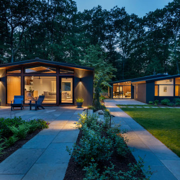
This project is a continuation of the renovation and updating work Flavin Architects had previously completed at the 1958 Wales house, designed by architect Henry Hoover and Walter Hill. Our clients, a young family, desired more space for guests, a home office, a yoga studio, and covered car parking. The challenge was to respect the architects’ original vision and not to interfere with the perfect cruciform plan of the house. To accomplish these goals, we converted the existing garage/workshop structure into a guest house and then designed a new, separate carport/storage building.
The new carport building shares the low-slope gable of the original Hoover structure. The post and beam structure characteristic of Hoover’s design is updated through the use of galvanized steel posts and I beams. The galvanized beams cantilever to support a sheltered walkway leading from the parking to a guest house terrace defined in relationship to the three structures surrounding it. The terrace is paved in slate with a central rain garden. Wood lattice clads the carport, providing good ventilation and letting the building glow like a lantern at night. Our guest house renovation celebrates the unique structural timber ceiling of the original garage. We replaced opaque plywood trusses with a slender cable truss structurally engineered by Webb Structural Services. This cable truss allows for a view of the timber ceiling. A wall of glass facing the courtyard replaced the original garage door. A murphy bed in the rear room enables quick conversion from guest quarters to weight room.

 Fredman Design Group
The juxtaposition of raw, weathered and finished woods with sleek whites, mixed metals and soft textured elements strike a fabulous balance between industrial, rustic and glamorous – exactly what the designers envisioned for this dream retreat. This unique home’s design combines recycled shipping containers with traditional stick-building methods and resulted in a luxury hybrid home, inside and out. The design team was particularly challenged with overcoming various preconceived notions about containers to truly create something new, luxurious and sustainable.

 Flegel's Construction Co., Inc.
Living Room and Family Room are one large room with a vaulted ceiling separated by a brick fireplace pillar. This room divider element was reconfigured to allow for a wide-screen TV on the family room side.
New skylights are double insulated with safety glass. The challenge was the technical work required to install a vaulted skylight.
All new trims, baseboards and doors in the redone living room. All new, modern lighting was installed.
Heated du chateau flooring was added.
Bruce Damonte Photography

 StudioLAB
Boasting views of the Museum of Natural History and Central Park, the Beaux Arts and French Renaissance style building built in 1900 was once home to a luxury hotel. Over the years multiple hotel rooms were combined into the larger apartment residences that exist today. The resulting units, while large in size, lacked the continuity of a single formed space. StudioLAB was presented with the challenge of re-designing the space to fit a modern family’s lifestyle today with the flexibility to adjust as they evolve into their tomorrow. Thus, the existing configuration was completely abandoned with new programmatic elements being relocated in each and every corner of the space. For clients that are big wine connoisseurs, the focal point of entry and circulation lies in a 400 bottle, custom built, blackened steel and glass, temperature controlled wine cabinet. The once enclosed living room was demolished to create one main entertaining space that includes a new dining area and open kitchen. Hafele bi-folding pocket door slides were used in the Living room wall unit to conceal the television, bar and display shelves when not in use. Posing as kitchen cabinetry, a hidden integrated door opens to reveal a guest bedroom with an en suite bathroom. Down the hallway of wide plank ebony stained walnut flooring, a compact powder room was built to house an original Paul Villinski installation of small butterflies cut from recycled aluminum cans, entitled Mistral. Continuing down the hall, and through one of the walnut veneered doors, is the shared kids bedroom where a custom-built bunk bed with integrated storage steps and desk was designed to allow for play space and a reading corner. The kids bathroom across the hall is decorated with custom Lego inspired hand cast concrete tiles and integrated pull-out footstools residing underneath the floating vanity. The master suite features a bio-ethanol fireplace wrapped in blackened steel and integrated into the Tabu veneered built-in. The spacious walk-in closet serves several purposes, which include housing the apartment’s new central HVAC system as well as a sleeping spot for the family’s dog. An integrated URC control system paired with Lutron Radio RA lighting keypads were installed to control the AV, HVAC, lighting and solar shades all by the use of smartphones.

 Newschool Builders LLC
Lindsay Raymondjack
Inspiration for a contemporary bathroom remodel in Burlington
Inspiration for a contemporary bathroom remodel in Burlington
133