
Search results for "Circulate" in Home Design Ideas
 Level Studio
This modern townhome in Vaughan received some mid-century modern flair and some really fun wallpaper.
The large open concept living room was challenging in terms of creating a successful layout and we addressed it by bringing a large sectional closer to the center of the room rather than anchoring it against walls. Plenty of circulation space for a sideboard with a beautiful vinyl player, a collection of tall architectural prints and an eight foot tall floor lamp bring the eye up a double story living space.
Fun wallpaper creates a long feature wall in the living and dining area with a geometric pattern that brings some movement to the room and is also mirrored in the kitchen backsplash and sideboard veneer.
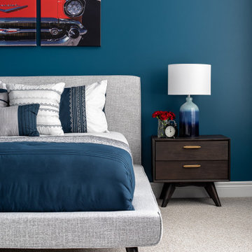
We designed a bedroom with the perfect shade of blue that will age nicely with our client’s young son along with a calming study perfect for getting some work done.
 Stack + Co.
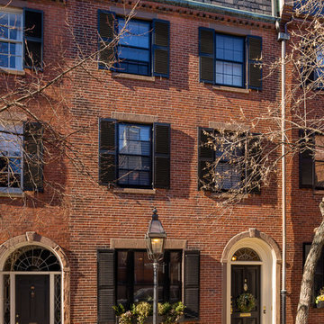
This 1826 Beacon Hill single-family townhouse received upgrades that were seamlessly integrated into the reproduction Georgian-period interior. feature ceiling exposing the existing rough-hewn timbers of the floor above, and custom-sawn black walnut flooring. Circulation for the new master suite was created by a rotunda element, incorporating arched openings through curving walls to access the different program areas. The client’s antique Chinese screen panels were incorporated into new custom closet casework doors, and all new partitions and casework were blended expertly into the existing wainscot and moldings.
 Custom Design & Construction
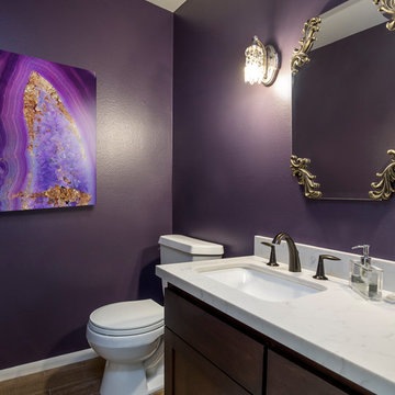
This Playa Del Rey, CA. design / build project began after our client had a terrible flood ruin her kitchen. In truth, she had been unhappy with her galley kitchen prior to the flood. She felt it was dark and deep with poor air conditioning circulating through it. She enjoys entertaining and hosting dinner parties and felt that this was the perfect opportunity to reimagine her galley kitchen into a space that would reflect her lifestyle. Since this is a condominium, we decided the best way to open up the floorplan was to wrap the counter around the wall into the dining area and make the peninsula the same height as the work surface. The result is an open kitchen with extensive counter space. Keeping it light and bright was important but she also wanted some texture and color too. The stacked stone backsplash has slivers of glass that reflect the light. Her vineyard palette was tied into the backsplash and accented by the painted walls. The floating glass shelves are highlighted with LED lights on a dimmer switch. We were able to space plan to incorporate her wine rack into the peninsula. We reconfigured the HVAC vent so more air circulated into the far end of the kitchen and added a ceiling fan. This project also included replacing the carpet and 12X12 beige tile with some “wood look” porcelain tile throughout the first floor. Since the powder room was receiving new flooring our client decided to add the powder room project which included giving it a deep plum paint job and a new chocolate cherry vanity. The white quartz counter and crystal hardware balance the dark hues in the wall and vanity.
Find the right local pro for your project
 YS BUILT, LLC
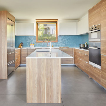
A new custom residence in the Harrison Views neighborhood of Issaquah Highlands.
The home incorporates high-performance envelope elements (a few of the strategies so far include alum-clad windows, rock wall house wrap insulation, green-roofs and provision for photovoltaic panels).
The building site has a unique upper bench and lower bench with a steep slope between them. The siting of the house takes advantage of this topography, creating a linear datum line that not only serves as a retaining wall but also as an organizing element for the home’s circulation.
The massing of the home is designed to maximize views, natural daylight and compliment the scale of the surrounding community. The living spaces are oriented to capture the panoramic views to the southwest and northwest, including Lake Washington and the Olympic mountain range as well as Seattle and Bellevue skylines.
A series of green roofs and protected outdoor spaces will allow the homeowners to extend their living spaces year-round.
With an emphasis on durability, the material palette will consist of a gray stained cedar siding, corten steel panels, cement board siding, T&G fir soffits, exposed wood beams, black fiberglass windows, board-formed concrete, glass railings and a standing seam metal roof.
A careful site analysis was done early on to suss out the best views and determine how unbuilt adjacent lots might be developed.
The total area is 3,425 SF of living space plus 575 SF for the garage.
Photos by Benjamin Benschneider. Architecture by Studio Zerbey Architecture + Design. Cabinets by LEICHT SEATTLE.
 Miriam Moore Design Studio LLC
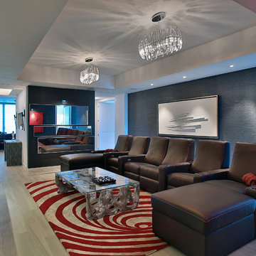
MIRIAM MOORE has a Bachelor of Fine Arts degree in Interior Design from Miami International University of Art and Design. She has been responsible for numerous residential and commercial projects and her work is featured in design publications with national circulation. Before turning her attention to interior design, Miriam worked for many years in the fashion industry, owning several high-end boutiques. Miriam is an active member of the American Society of Interior Designers (ASID).
 StudioLAB
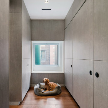
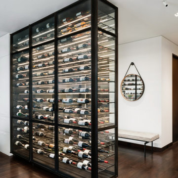
Boasting views of the Museum of Natural History and Central Park, the Beaux Arts and French Renaissance style building built in 1900 was once home to a luxury hotel. Over the years multiple hotel rooms were combined into the larger apartment residences that exist today. The resulting units, while large in size, lacked the continuity of a single formed space. StudioLAB was presented with the challenge of re-designing the space to fit a modern family’s lifestyle today with the flexibility to adjust as they evolve into their tomorrow. Thus, the existing configuration was completely abandoned with new programmatic elements being relocated in each and every corner of the space. For clients that are big wine connoisseurs, the focal point of entry and circulation lies in a 400 bottle, custom built, blackened steel and glass, temperature controlled wine cabinet. The once enclosed living room was demolished to create one main entertaining space that includes a new dining area and open kitchen. Hafele bi-folding pocket door slides were used in the Living room wall unit to conceal the television, bar and display shelves when not in use. Posing as kitchen cabinetry, a hidden integrated door opens to reveal a guest bedroom with an en suite bathroom. Down the hallway of wide plank ebony stained walnut flooring, a compact powder room was built to house an original Paul Villinski installation of small butterflies cut from recycled aluminum cans, entitled Mistral. Continuing down the hall, and through one of the walnut veneered doors, is the shared kids bedroom where a custom-built bunk bed with integrated storage steps and desk was designed to allow for play space and a reading corner. The kids bathroom across the hall is decorated with custom Lego inspired hand cast concrete tiles and integrated pull-out footstools residing underneath the floating vanity. The master suite features a bio-ethanol fireplace wrapped in blackened steel and integrated into the Tabu veneered built-in. The spacious walk-in closet serves several purposes, which include housing the apartment’s new central HVAC system as well as a sleeping spot for the family’s dog. An integrated URC control system paired with Lutron Radio RA lighting keypads were installed to control the AV, HVAC, lighting and solar shades all by the use of smartphones.
 Dynia Architects
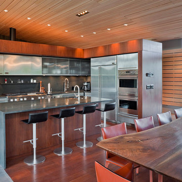
Located near the foot of the Teton Mountains, the site and a modest program led to placing the main house and guest quarters in separate buildings configured to form outdoor spaces. With mountains rising to the northwest and a stream cutting through the southeast corner of the lot, this placement of the main house and guest cabin distinctly responds to the two scales of the site. The public and private wings of the main house define a courtyard, which is visually enclosed by the prominence of the mountains beyond. At a more intimate scale, the garden walls of the main house and guest cabin create a private entry court.
A concrete wall, which extends into the landscape marks the entrance and defines the circulation of the main house. Public spaces open off this axis toward the views to the mountains. Secondary spaces branch off to the north and south forming the private wing of the main house and the guest cabin. With regulation restricting the roof forms, the structural trusses are shaped to lift the ceiling planes toward light and the views of the landscape.
A.I.A Wyoming Chapter Design Award of Citation 2017
Project Year: 2008
 Miriam Moore Design Studio LLC
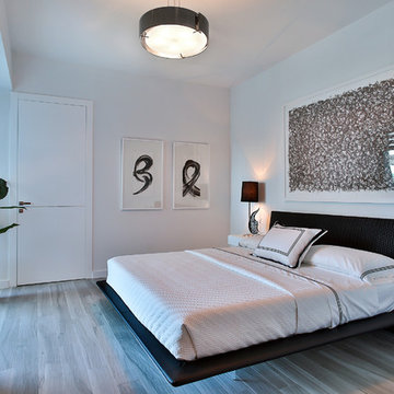
MIRIAM MOORE has a Bachelor of Fine Arts degree in Interior Design from Miami International University of Art and Design. She has been responsible for numerous residential and commercial projects and her work is featured in design publications with national circulation. Before turning her attention to interior design, Miriam worked for many years in the fashion industry, owning several high-end boutiques. Miriam is an active member of the American Society of Interior Designers (ASID).
 JAMES DIXON ARCHITECT PC
Laura Resen
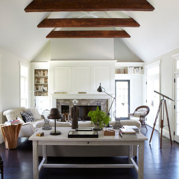
Inspiration for a transitional living room remodel in Boston with white walls and a stone fireplace
Inspiration for a transitional living room remodel in Boston with white walls and a stone fireplace
 Rhodes Architecture + Light
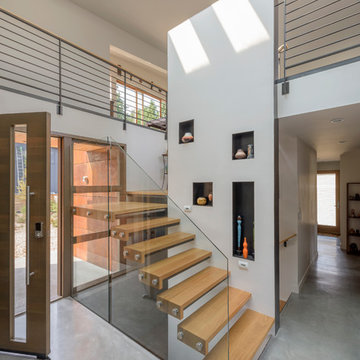
The home shelters the owners and both sets of their parents on three levels. A central atrium open to all three stories connects and combines entries from north and south, circulation space, and a twenty-foot-high climbing wall. The upper floor takes advantage of views, the middle level connects to the rear yard, landscaping, and a storm water mitigating rain garden, allowing private outdoor access and terraces for the older generation using the home.

 Miriam Moore Design Studio LLC
MIRIAM MOORE has a Bachelor of Fine Arts degree in Interior Design from Miami International University of Art and Design. She has been responsible for numerous residential and commercial projects and her work is featured in design publications with national circulation. Before turning her attention to interior design, Miriam worked for many years in the fashion industry, owning several high-end boutiques. Miriam is an active member of the American Society of Interior Designers (ASID).
 Garret Cord Werner Architects & Interior Designers
Andrew Giammarco
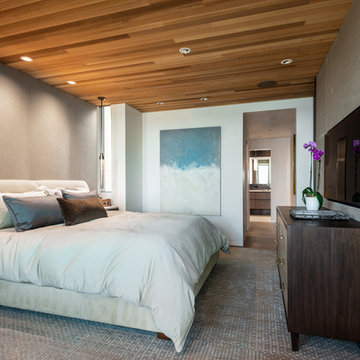
Inspiration for a contemporary medium tone wood floor and brown floor bedroom remodel in Seattle with gray walls
Inspiration for a contemporary medium tone wood floor and brown floor bedroom remodel in Seattle with gray walls
 Interiors For Modern Living
Photography by: Bob Jansons H&H Productions
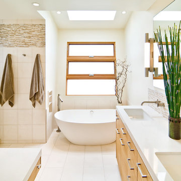
Example of a trendy master brown tile and matchstick tile freestanding bathtub design in San Francisco with an undermount sink, flat-panel cabinets and light wood cabinets
Example of a trendy master brown tile and matchstick tile freestanding bathtub design in San Francisco with an undermount sink, flat-panel cabinets and light wood cabinets

 Vision Interiors
As a conceptual urban infill project, the Wexley is designed for a narrow lot in the center of a city block. The 26’x48’ floor plan is divided into thirds from front to back and from left to right. In plan, the left third is reserved for circulation spaces and is reflected in elevation by a monolithic block wall in three shades of gray. Punching through this block wall, in three distinct parts, are the main levels windows for the stair tower, bathroom, and patio. The right two-thirds of the main level are reserved for the living room, kitchen, and dining room. At 16’ long, front to back, these three rooms align perfectly with the three-part block wall façade. It’s this interplay between plan and elevation that creates cohesion between each façade, no matter where it’s viewed. Given that this project would have neighbors on either side, great care was taken in crafting desirable vistas for the living, dining, and master bedroom. Upstairs, with a view to the street, the master bedroom has a pair of closets and a skillfully planned bathroom complete with soaker tub and separate tiled shower. Main level cabinetry and built-ins serve as dividing elements between rooms and framing elements for views outside.
Architect: Visbeen Architects
Builder: J. Peterson Homes
Photographer: Ashley Avila Photography
 StudioLAB
Boasting views of the Museum of Natural History and Central Park, the Beaux Arts and French Renaissance style building built in 1900 was once home to a luxury hotel. Over the years multiple hotel rooms were combined into the larger apartment residences that exist today. The resulting units, while large in size, lacked the continuity of a single formed space. StudioLAB was presented with the challenge of re-designing the space to fit a modern family’s lifestyle today with the flexibility to adjust as they evolve into their tomorrow. Thus, the existing configuration was completely abandoned with new programmatic elements being relocated in each and every corner of the space. For clients that are big wine connoisseurs, the focal point of entry and circulation lies in a 400 bottle, custom built, blackened steel and glass, temperature controlled wine cabinet. The once enclosed living room was demolished to create one main entertaining space that includes a new dining area and open kitchen. Hafele bi-folding pocket door slides were used in the Living room wall unit to conceal the television, bar and display shelves when not in use. Posing as kitchen cabinetry, a hidden integrated door opens to reveal a guest bedroom with an en suite bathroom. Down the hallway of wide plank ebony stained walnut flooring, a compact powder room was built to house an original Paul Villinski installation of small butterflies cut from recycled aluminum cans, entitled Mistral. Continuing down the hall, and through one of the walnut veneered doors, is the shared kids bedroom where a custom-built bunk bed with integrated storage steps and desk was designed to allow for play space and a reading corner. The kids bathroom across the hall is decorated with custom Lego inspired hand cast concrete tiles and integrated pull-out footstools residing underneath the floating vanity. The master suite features a bio-ethanol fireplace wrapped in blackened steel and integrated into the Tabu veneered built-in. The spacious walk-in closet serves several purposes, which include housing the apartment’s new central HVAC system as well as a sleeping spot for the family’s dog. An integrated URC control system paired with Lutron Radio RA lighting keypads were installed to control the AV, HVAC, lighting and solar shades all by the use of smartphones.
 Matt Fajkus Architecture
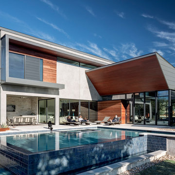
The Control/Shift House is perched on the high side of the site which takes advantage of the view to the southeast. A gradual descending path navigates the change in terrain from the street to the entry of the house. A series of low retaining walls/planter beds gather and release the earth upon the descent resulting in a fairly flat level for the house to sit on the top one third of the site. The entry axis is aligned with the celebrated stair volume and then re-centers on the actual entry axis once you approach the forecourt of the house.
The initial desire was for an “H” scheme house with common entertaining spaces bridging the gap between the more private spaces. After an investigation considering the site, program, and view, a key move was made: unfold the east wing of the “H” scheme to open all rooms to the southeast view resulting in a “T” scheme. The new derivation allows for both a swim pool which is on axis with the entry and main gathering space and a lap pool which occurs on the cross axis extending along the lengthy edge of the master suite, providing direct access for morning exercise and a view of the water throughout the day.
The Control/Shift House was derived from a clever way of following the “rules.” Strict HOA guidelines required very specific exterior massing restrictions which limits the lengths of unbroken elevations and promotes varying sizes of masses. The solution most often used in this neighborhood is one of addition - an aggregation of masses and program randomly attached to the inner core of the house which often results in a parasitic plan. The approach taken with the Control/Shift House was to push and pull program/massing to delineate and define the layout of the house. Massing is intentional and reiterated by the careful selection of materiality that tracks through the house. Voids and relief in the plan are a natural result of this method and allow for light and air to circulate throughout every space of the house, even into the most inner core.
Photography: Charles Davis Smith
 Miriam Moore Design Studio LLC
MIRIAM MOORE has a Bachelor of Fine Arts degree in Interior Design from Miami International University of Art and Design. She has been responsible for numerous residential and commercial projects and her work is featured in design publications with national circulation. Before turning her attention to interior design, Miriam worked for many years in the fashion industry, owning several high-end boutiques. Miriam is an active member of the American Society of Interior Designers (ASID).
 Andre Rothblatt Architecture
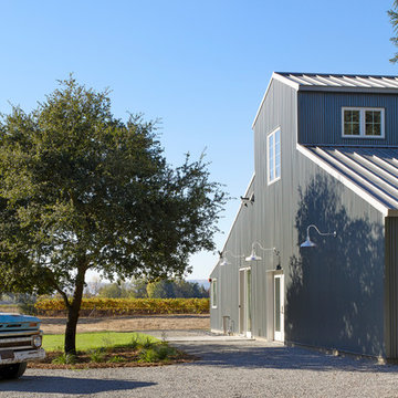
Example of a cottage gray two-story metal exterior home design in San Francisco with a metal roof
26