
Search results for "Circulate" in Home Design Ideas
 Jordan Design Build Group
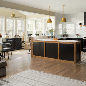
This client came to us with a very clear vision of what she wanted, but she needed help to refine and execute the design. At our first meeting she described her style as somewhere between modern rustic and ‘granny chic’ – she likes cozy spaces with nods to the past, but also wanted to blend that with the more contemporary tastes of her husband and children. Functionally, the old layout was less than ideal with an oddly placed 3-sided fireplace and angled island creating traffic jams in and around the kitchen. By creating a U-shaped layout, we clearly defined the chef’s domain and created a circulation path that limits disruptions in the heart of the kitchen. While still an open concept, the black cabinets, bar height counter and change in flooring all add definition to the space. The vintage inspired black and white tile is a nod to the past while the black stainless range and matte black faucet are unmistakably modern.
High on our client’s wish list was eliminating upper cabinets and keeping the countertops clear. In order to achieve this, we needed to ensure there was ample room in the base cabinets and reconfigured pantry for items typically stored above. The full height tile backsplash evokes exposed brick and serves as the backdrop for the custom wood-clad hood and decorative brass sconces – a perfect blend of rustic, modern and chic. Black and brass elements are repeated throughout the main floor in new hardware, lighting, and open shelves as well as the owners’ curated collection of family heirlooms and furnishings. In addition to renovating the kitchen, we updated the entire first floor with refinished hardwoods, new paint, wainscoting, wallcovering and beautiful new stained wood doors. Our client had been dreaming and planning this kitchen for 17 years and we’re thrilled we were able to bring it to life.
 Alvarez Homes
Photography by Jorge Alvarez.
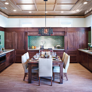
Eat-in kitchen - contemporary u-shaped eat-in kitchen idea in Tampa with recessed-panel cabinets, dark wood cabinets, green backsplash, subway tile backsplash and stainless steel appliances
Eat-in kitchen - contemporary u-shaped eat-in kitchen idea in Tampa with recessed-panel cabinets, dark wood cabinets, green backsplash, subway tile backsplash and stainless steel appliances
 Matt Fajkus Architecture
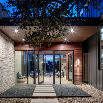
The Control/Shift House is perched on the high side of the site which takes advantage of the view to the southeast. A gradual descending path navigates the change in terrain from the street to the entry of the house. A series of low retaining walls/planter beds gather and release the earth upon the descent resulting in a fairly flat level for the house to sit on the top one third of the site. The entry axis is aligned with the celebrated stair volume and then re-centers on the actual entry axis once you approach the forecourt of the house.
The initial desire was for an “H” scheme house with common entertaining spaces bridging the gap between the more private spaces. After an investigation considering the site, program, and view, a key move was made: unfold the east wing of the “H” scheme to open all rooms to the southeast view resulting in a “T” scheme. The new derivation allows for both a swim pool which is on axis with the entry and main gathering space and a lap pool which occurs on the cross axis extending along the lengthy edge of the master suite, providing direct access for morning exercise and a view of the water throughout the day.
The Control/Shift House was derived from a clever way of following the “rules.” Strict HOA guidelines required very specific exterior massing restrictions which limits the lengths of unbroken elevations and promotes varying sizes of masses. The solution most often used in this neighborhood is one of addition - an aggregation of masses and program randomly attached to the inner core of the house which often results in a parasitic plan. The approach taken with the Control/Shift House was to push and pull program/massing to delineate and define the layout of the house. Massing is intentional and reiterated by the careful selection of materiality that tracks through the house. Voids and relief in the plan are a natural result of this method and allow for light and air to circulate throughout every space of the house, even into the most inner core.
Photography: Charles Davis Smith
Find the right local pro for your project
 Kate Roos Design LLC
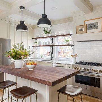
The original kitchen layout was disjointed and created a zig-zag traffic flow that disrupted the work triangle. The efficient layout of the new kitchen provides improved circulation, ample counter space, as well as island seating.
 Architect Heather Johnston
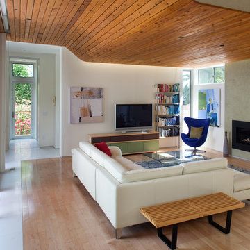
Living Room - all main spaces have operable openings, all four sides.
Living room library - mid-sized contemporary living room library idea in San Diego with white walls, a standard fireplace and a tv stand
Living room library - mid-sized contemporary living room library idea in San Diego with white walls, a standard fireplace and a tv stand
 Wright Design
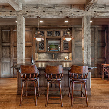
This charming European-inspired home juxtaposes old-world architecture with more contemporary details. The exterior is primarily comprised of granite stonework with limestone accents. The stair turret provides circulation throughout all three levels of the home, and custom iron windows afford expansive lake and mountain views. The interior features custom iron windows, plaster walls, reclaimed heart pine timbers, quartersawn oak floors and reclaimed oak millwork.
 Emeritus
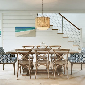
Dining room - coastal light wood floor and beige floor dining room idea in Other with white walls
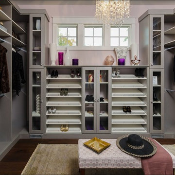
Example of a mid-sized transitional women's dark wood floor and brown floor dressing room design in Houston with open cabinets and gray cabinets
 Burnham Design
photo credit: laura hull
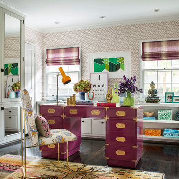
Study room - transitional freestanding desk dark wood floor study room idea in Los Angeles with multicolored walls
Study room - transitional freestanding desk dark wood floor study room idea in Los Angeles with multicolored walls
 Mitchell Wall Architecture and Design
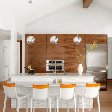
The homeowners of this Mid Century Modern home in Creve Coeur are a young Architect and his wife and their two young sons. Being avid collectors of Mid Century Modern furniture and furnishings, they purchased their Atomic Ranch home, built in the 1970s, and saw in it a perfect future vessel for their lifestyle. Nothing had been done to the home in 40 years but they saw it as a fresh palette. The walls separating the kitchen from the dining, living, and entry areas were removed. Support beams and columns were created to hold the loads. The kitchen and laundry facilities were gutted and the living areas refurbished. They saw open space with great light, just waiting to be used. As they waited for the perfect time, they continued collecting. The Architect purchased their Claritone, of which less than 50 are in circulation: two are in the Playboy Mansion, and Frank Sinatra had four. They found their Bertoia wire chairs, and Eames and Baby Eames rockers. The chandelier over the dining room was found in a Los Angeles prop studio. The dining table and benches were made from the reclaimed wood of a beam that was removed, custom designed and made by Mwanzi and Co. The flooring is white oak with a white stain. Chairs are by Kartell. The lighting pendants over the island are by Tom Dixon and were found at Centro in St. Louis. Appliances were collected as they found them on sale and were stored in the garage along with the collections, until the time was right.. Even the dog was curated...from a South Central Los Angeles Animal Shelter!
 Duncan McRoberts Associates, LLC
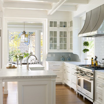
Laurie Black Photography. Classic "Martha's Vineyard" shingle style with traditional Palladian molding profiles "in the antique" uplifting the sophistication and décor to its urban context. Design by Duncan McRoberts
 B Fein Interiors LLC
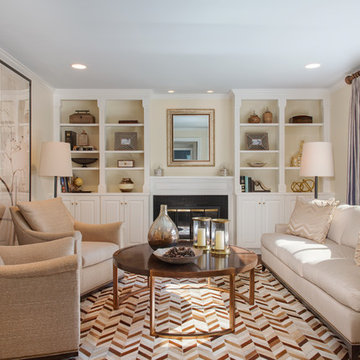
A tiny room appears to be large when furnished with over-sized elements. The large round cocktail table provides adequate circulation and pulls the room together. while the large triptych creates interest. The pieced hide rug feels modern within the otherwise traditional space. The gray draperies resonate with the blue ceiling in the Living Room.
 Kala Performance Homes
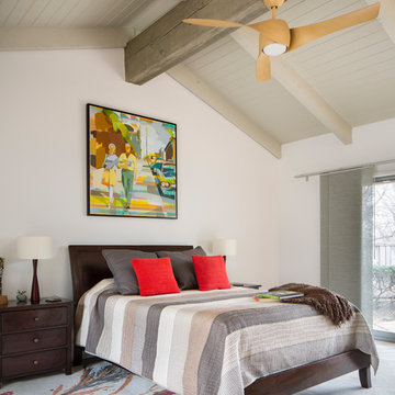
Mid-sized transitional master medium tone wood floor and brown floor bedroom photo in Other with white walls and no fireplace
 Eminent Interior Design
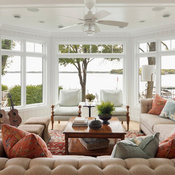
Sunroom - coastal light wood floor sunroom idea in Minneapolis with a standard ceiling
 Craftsman Design and Renovation
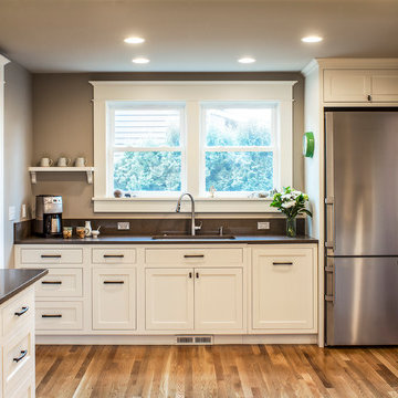
Craftsman style house opens up for better connection and more contemporary living. Removing a wall between the kitchen and dinning room and reconfiguring the stair layout allowed for more usable space and better circulation through the home. The double dormer addition upstairs allowed for a true Master Suite, complete with steam shower!
Photo: Pete Eckert
 Ezra Lee Design+Build
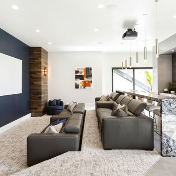
Masculine Meets Elegance - Sconce Lighting accenting the wood columns, satin nickel and bubble glass pendants hang over the bar, while recessed art lighting highlights the wallpaper and cabinetry shelves. The leather sofas were chosen for their form meets function. This theater was designed as an epic multi-entertainment space!
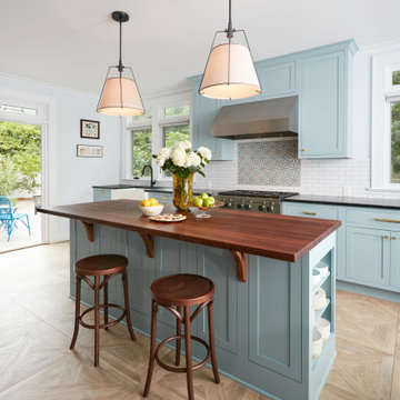
 Clawson Cabinets
Once a finishing school for girls this expansive Victorian had a kitchen in desperate need of updating. The new owners wanted something cheerful, that picked up on the details of the original home, and yet they wanted it to honor their more modern lifestyle.
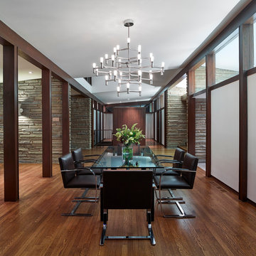
 k YODER design
A view of the dining room from the exterior exemplifies the four-square plan and cruciform circulation, and shows the use of post and beam construction to reinforces connectivity between rooms. © Jeffrey Totaro, photographer
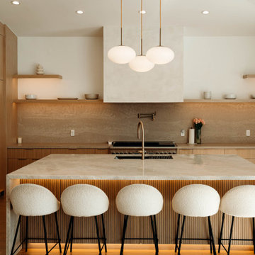
 RnD Builders Inc
RnD Builders Inc - Custom Home Builders | Woodland Hills
Trendy kitchen photo in Los Angeles
Trendy kitchen photo in Los Angeles
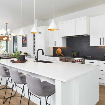
 Vision Interiors
As a conceptual urban infill project, the Wexley is designed for a narrow lot in the center of a city block. The 26’x48’ floor plan is divided into thirds from front to back and from left to right. In plan, the left third is reserved for circulation spaces and is reflected in elevation by a monolithic block wall in three shades of gray. Punching through this block wall, in three distinct parts, are the main levels windows for the stair tower, bathroom, and patio. The right two-thirds of the main level are reserved for the living room, kitchen, and dining room. At 16’ long, front to back, these three rooms align perfectly with the three-part block wall façade. It’s this interplay between plan and elevation that creates cohesion between each façade, no matter where it’s viewed. Given that this project would have neighbors on either side, great care was taken in crafting desirable vistas for the living, dining, and master bedroom. Upstairs, with a view to the street, the master bedroom has a pair of closets and a skillfully planned bathroom complete with soaker tub and separate tiled shower. Main level cabinetry and built-ins serve as dividing elements between rooms and framing elements for views outside.
Architect: Visbeen Architects
Builder: J. Peterson Homes
Photographer: Ashley Avila Photography
22